09Toast xếp chồng
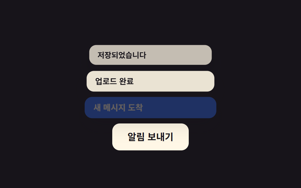
Mỗi toast mới đẩy các toast cũ lên một bậc và thu nhỏ nhẹ, để nhiều thông báo xếp chồng thay vì đè nhau.
Dùng choThông báo lưu thành công, thông báo tiến trình tải nhiều file
translateY 밀림scale 축소순차 스택
<main class="stage">
  <div class="toasts">
    <button class="toasts__trigger" type="button">Gửi thông báo</button>
    <div class="toasts__list is-demo" aria-live="polite">
      <div class="toast toast--1">Đã lưu</div>
      <div class="toast toast--2">Tải lên hoàn tất</div>
      <div class="toast toast--3">Tin nhắn mới</div>
    </div>
  </div>
</main>
@use "../../../../site/static/demo-tokens" as *;
// ── 변수 3개 ──────────────────────────────────────────
$duration: $dur-loop; // 세 개가 다 쌓이는 한 주기
$easing: $ease-spring; // 밀려나는 곡선
$color: $subject-blue; // 새 토스트 강조색
// ── 데모 무대 ──────────────────────────────────────────
@include stage($stage-ink);
.toasts {
display: flex;
flex-direction: column-reverse; // 트리거를 아래에 둬서 위로 쌓이는 스택과 안 겹친다
align-items: center;
gap: clamp(14px, 4vw, 20px);
}
.toasts__trigger {
border: 0;
border-radius: $r-control;
padding: clamp(10px, 3.4vw, 14px) clamp(18px, 5.6vw, 24px);
font-weight: 700;
font-size: clamp(13px, 3.8vw, 15px);
line-height: 1;
font-family: inherit;
color: $stage-ink;
background: $subject-cream;
cursor: pointer;
}
.toasts__list {
position: relative;
width: min(210px, 78vw);
height: 118px; // 슬롯 하나(34px) + 두 칸 밀려 올라갈 여유(42px × 2)
}
.toast {
position: absolute;
left: 0; right: 0; bottom: 0;
box-sizing: border-box;
padding: 9px 14px;
border-radius: $r-control;
background: $subject-cream;
color: $stage-ink;
font-weight: 600;
font-size: clamp(11.5px, 3.2vw, 13px);
line-height: 1.2;
font-family: inherit;
box-shadow: $shadow-raised;
opacity: 0;
transform: translateY(16px);
}
.toast--3 { background: $color; color: $subject-cream; } // 가장 새 토스트만 강조색
.toasts__list.is-demo {
.toast--1 { animation: slot-1 $duration $easing infinite; }
.toast--2 { animation: slot-2 $duration $easing infinite; }
.toast--3 { animation: slot-3 $duration $easing infinite; }
}
.toasts__list.is-replaying {
.toast--1 { animation: slot-1 $duration $easing 1; }
.toast--2 { animation: slot-2 $duration $easing 1; }
.toast--3 { animation: slot-3 $duration $easing 1; }
}
// 1번(가장 오래됨): 맨 처음 슬롯0 에 등장 → 2번이 오면 슬롯1 로, 3번이 오면 슬롯2 로 밀려 올라간다
@keyframes slot-1 {
0%, 4% { opacity: 0; transform: translateY(16px) scale(1); }
12%, 38% { opacity: 1; transform: translateY(0) scale(1); }
50%, 68% { opacity: .88; transform: translateY(-42px) scale(.96); }
80%, 92% { opacity: .7; transform: translateY(-84px) scale(.92); }
98%, 100% { opacity: 0; transform: translateY(-84px) scale(.92); }
}
// 2번: 슬롯0 에 늦게 등장 → 3번이 오면 슬롯1 로 밀려 올라간다
@keyframes slot-2 {
0%, 40% { opacity: 0; transform: translateY(16px) scale(1); }
50%, 68% { opacity: 1; transform: translateY(0) scale(1); }
80%, 92% { opacity: .88; transform: translateY(-42px) scale(.96); }
98%, 100% { opacity: 0; transform: translateY(-42px) scale(.96); }
}
// 3번(가장 새 토스트): 가장 늦게 슬롯0 에 등장해 끝까지 자리를 지킨다
@keyframes slot-3 {
0%, 70% { opacity: 0; transform: translateY(16px) scale(1); }
80%, 92% { opacity: 1; transform: translateY(0) scale(1); }
98%, 100% { opacity: 0; transform: translateY(0) scale(1); }
}
// ── 접근성: 움직임 줄이기 설정이면 최종 스택 상태로 고정 ────────
@media (prefers-reduced-motion: reduce) {
.toasts__list.is-demo .toast,
.toasts__list.is-replaying .toast { animation: none !important; }
.toast--1 { opacity: .7; transform: translateY(-84px); }
.toast--2 { opacity: .88; transform: translateY(-42px); }
.toast--3 { opacity: 1; transform: translateY(0); }
}html, body {
margin: 0;
overflow: hidden;
}
.stage {
box-sizing: border-box;
min-height: 100vh;
display: grid;
place-items: center;
margin: 0;
background: #17141a;
font-family: -apple-system, "Segoe UI", "Noto Sans KR", sans-serif;
padding: clamp(8px, 4vw, 24px);
}
.toasts {
display: flex;
flex-direction: column-reverse;
align-items: center;
gap: clamp(14px, 4vw, 20px);
}
.toasts__trigger {
border: 0;
border-radius: 12px;
padding: clamp(10px, 3.4vw, 14px) clamp(18px, 5.6vw, 24px);
font-weight: 700;
font-size: clamp(13px, 3.8vw, 15px);
line-height: 1;
font-family: inherit;
color: #17141a;
background: #fff7e6;
cursor: pointer;
}
.toasts__list {
position: relative;
width: min(210px, 78vw);
height: 118px;
}
.toast {
position: absolute;
left: 0;
right: 0;
bottom: 0;
box-sizing: border-box;
padding: 9px 14px;
border-radius: 12px;
background: #fff7e6;
color: #17141a;
font-weight: 600;
font-size: clamp(11.5px, 3.2vw, 13px);
line-height: 1.2;
font-family: inherit;
box-shadow: 0 14px 24px rgba(23, 20, 26, 0.32);
opacity: 0;
transform: translateY(16px);
}
.toast--3 {
background: #2f6df6;
color: #fff7e6;
}
.toasts__list.is-demo .toast--1 {
animation: slot-1 2s cubic-bezier(0.2, 0.8, 0.2, 1) infinite;
}
.toasts__list.is-demo .toast--2 {
animation: slot-2 2s cubic-bezier(0.2, 0.8, 0.2, 1) infinite;
}
.toasts__list.is-demo .toast--3 {
animation: slot-3 2s cubic-bezier(0.2, 0.8, 0.2, 1) infinite;
}
.toasts__list.is-replaying .toast--1 {
animation: slot-1 2s cubic-bezier(0.2, 0.8, 0.2, 1) 1;
}
.toasts__list.is-replaying .toast--2 {
animation: slot-2 2s cubic-bezier(0.2, 0.8, 0.2, 1) 1;
}
.toasts__list.is-replaying .toast--3 {
animation: slot-3 2s cubic-bezier(0.2, 0.8, 0.2, 1) 1;
}
@keyframes slot-1 {
0%, 4% {
opacity: 0;
transform: translateY(16px) scale(1);
}
12%, 38% {
opacity: 1;
transform: translateY(0) scale(1);
}
50%, 68% {
opacity: 0.88;
transform: translateY(-42px) scale(0.96);
}
80%, 92% {
opacity: 0.7;
transform: translateY(-84px) scale(0.92);
}
98%, 100% {
opacity: 0;
transform: translateY(-84px) scale(0.92);
}
}
@keyframes slot-2 {
0%, 40% {
opacity: 0;
transform: translateY(16px) scale(1);
}
50%, 68% {
opacity: 1;
transform: translateY(0) scale(1);
}
80%, 92% {
opacity: 0.88;
transform: translateY(-42px) scale(0.96);
}
98%, 100% {
opacity: 0;
transform: translateY(-42px) scale(0.96);
}
}
@keyframes slot-3 {
0%, 70% {
opacity: 0;
transform: translateY(16px) scale(1);
}
80%, 92% {
opacity: 1;
transform: translateY(0) scale(1);
}
98%, 100% {
opacity: 0;
transform: translateY(0) scale(1);
}
}
@media (prefers-reduced-motion: reduce) {
.toasts__list.is-demo .toast,
.toasts__list.is-replaying .toast {
animation: none !important;
}
.toast--1 {
opacity: 0.7;
transform: translateY(-84px);
}
.toast--2 {
opacity: 0.88;
transform: translateY(-42px);
}
.toast--3 {
opacity: 1;
transform: translateY(0);
}
}// 실제 클릭 한 번마다 토스트를 하나씩 다시 쌓는다. 데모(.is-demo) 자동 루프는 손을 대면 멈춘다.
var list = document.querySelector('.toasts__list');
document.querySelector('.toasts__trigger').addEventListener('click', function () {
list.classList.remove('is-demo');
list.classList.remove('is-replaying');
void list.offsetWidth;
list.classList.add('is-replaying');
});import { useState } from "react";
import type { CSSProperties } from "react";
import styles from "./ToastStack.module.scss";
export type ToastStackProps = {
messages: string[];
triggerLabel: string;
/** 세 개가 다 쌓이는 시간 (기본 260ms 씩 순차) */
duration?: number;
easing?: string;
color?: string;
};
type Vars = CSSProperties & { "--duration"?: string; "--easing"?: string; "--color"?: string };
export default function ToastStack({
messages,
triggerLabel,
duration = 260,
easing = "cubic-bezier(.2,.8,.2,1)",
color = "#2f6df6",
}: ToastStackProps) {
const [visible, setVisible] = useState<number[]>([]);
const vars: Vars = { "--duration": `${duration}ms`, "--easing": easing, "--color": color };
const push = () => {
setVisible([]);
messages.forEach((_, i) => {
setTimeout(() => setVisible((v) => [...v, i]), i * duration);
});
};
return (
<div className={styles.toasts} style={vars}>
<button type="button" className={styles.trigger} onClick={push}>{triggerLabel}</button>
<div className={styles.list} aria-live="polite">
{messages.map((msg, i) => {
const shown = visible.includes(i);
const depth = visible.length - 1 - i; // 도착 순서가 곧 인덱스 순서라 뺄셈만으로 깊이가 나온다
return (
<div
key={msg}
className={i === messages.length - 1 ? `${styles.toast} ${styles.newest}` : styles.toast}
style={{
opacity: shown ? Math.max(1 - depth * .12, 0) : 0,
transform: shown ? `translateY(${-depth * 42}px) scale(${1 - depth * .04})` : "translateY(16px) scale(1)",
}}
>
{msg}
</div>
);
})}
</div>
</div>
);
}09 Toast xếp chồng — Diện tích đo được 19.122% · khung hình chuyển động 10/23Nguyên tác GODRICH · SCSS và React nằm trong tệp zip · 9 micro interactions css — dán 1 dòng chạy ngay
Bài viết chứa demo này
 9 micro interactions css — dán 1 dòng chạy ngayMicro interactions css là những phản hồi cực nhỏ trên giao diện — nút lún xuống, icon đổi hình, toast xếp chồng — báo ch Xem tất cả demo trong bài này