02Text shimmer status
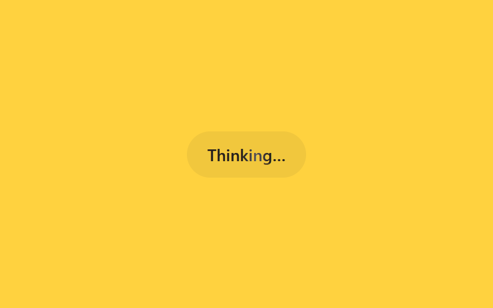
Only a status word like "Thinking…" sits on screen while a bright band sweeps across the letters left to right via a background-position animation.
Best forStatus text while searching or summarizing, inline status line during tool use
background-positionbackground-clip: text1.6s
<main class="stage">
  <div class="sh-status is-demo">
    <span class="sh-label">Thinking…</span>
  </div>
</main>
@use "../../../../site/static/demo-tokens" as *;
// ── 변수 3개 ──────────────────────────────────────────
$duration: 1.6s;
$easing: linear;
$color: $subject-ink;
@include stage($stage-yellow);
.sh-status {
padding: $sp-3 $sp-5;
border-radius: $r-pill;
background: rgba(23, 20, 26, .06);
}
.sh-label {
display: inline-block;
font: 600 16px/1 -apple-system, "Segoe UI", sans-serif;
background-image: linear-gradient(
90deg,
rgba($subject-ink, .72) 0%,
rgba($subject-ink, .72) 42%,
$subject-cream 50%,
rgba($subject-ink, .72) 58%,
rgba($subject-ink, .72) 100%
);
background-size: 220% 100%;
-webkit-background-clip: text;
background-clip: text;
color: rgba($subject-ink, .72);
}
// 실사용: 상태 문구가 바뀔 때마다 JS 가 텍스트만 교체한다. 쉬머는 항상 재생
@keyframes sh-sweep {
0% { background-position: 120% 0; }
100% { background-position: -20% 0; }
}
.sh-status.is-demo .sh-label {
animation: sh-sweep $duration $easing infinite;
}
@media (prefers-reduced-motion: reduce) {
.sh-status.is-demo .sh-label {
animation: none !important;
background-position: 0 0 !important;
color: $color !important;
}
}html, body {
margin: 0;
overflow: hidden;
}
.stage {
box-sizing: border-box;
min-height: 100vh;
display: grid;
place-items: center;
margin: 0;
background: #ffd23f;
font-family: -apple-system, "Segoe UI", "Noto Sans KR", sans-serif;
padding: clamp(8px, 4vw, 24px);
}
.sh-status {
padding: 12px 20px;
border-radius: 999px;
background: rgba(23, 20, 26, 0.06);
}
.sh-label {
display: inline-block;
font: 600 16px/1 -apple-system, "Segoe UI", sans-serif;
background-image: linear-gradient(90deg, rgba(23, 20, 26, 0.72) 0%, rgba(23, 20, 26, 0.72) 42%, #fff7e6 50%, rgba(23, 20, 26, 0.72) 58%, rgba(23, 20, 26, 0.72) 100%);
background-size: 220% 100%;
-webkit-background-clip: text;
background-clip: text;
color: rgba(23, 20, 26, 0.72);
}
@keyframes sh-sweep {
0% {
background-position: 120% 0;
}
100% {
background-position: -20% 0;
}
}
.sh-status.is-demo .sh-label {
animation: sh-sweep 1.6s linear infinite;
}
@media (prefers-reduced-motion: reduce) {
.sh-status.is-demo .sh-label {
animation: none !important;
background-position: 0 0 !important;
color: #17141a !important;
}
}import { CSSProperties } from "react";
import styles from "./TextShimmerStatus.module.scss";
type Vars = CSSProperties & {
"--duration"?: string;
"--easing"?: string;
"--color"?: string;
};
export interface TextShimmerStatusProps {
duration?: string;
easing?: string;
color?: string;
label?: string;
}
export default function TextShimmerStatus({
duration = "1.6s",
easing = "linear",
color = "#17141a",
label = "Thinking…",
}: TextShimmerStatusProps) {
const style: Vars = {
"--duration": duration,
"--easing": easing,
"--color": color,
};
return (
<div className={styles.status} style={style}>
<span className={styles.label}>{label}</span>
</div>
);
}02 Text shimmer status — Measured area 0.287% · moving frames 17/23Original by GODRICH · SCSS and React ship in the zip · 9 CSS AI Chat Loading Animations to Copy-Paste
The post this demo lives in
 9 CSS AI Chat Loading Animations to Copy-PasteOpen ChatGPT or Claude and watch dots, a shimmering word, or a blinking line appear before any reply text does. That mov See all demos in this post
If you like this effect - similar demos
 Loaders02 Animated stripes9 CSS Progress Bar Circle Gauges, Copy-Paste Ready
 Loaders08 Button Whose Label Text Cycles Through Steps While LoadingLoading Button UI — 9 States, Spinner to Success
 Loaders01 Text That Swaps a Fallback Font for the Real One via Lazy LoadingLazy Loading Images: 9 CSS Placeholder Patterns