02Animated stripes
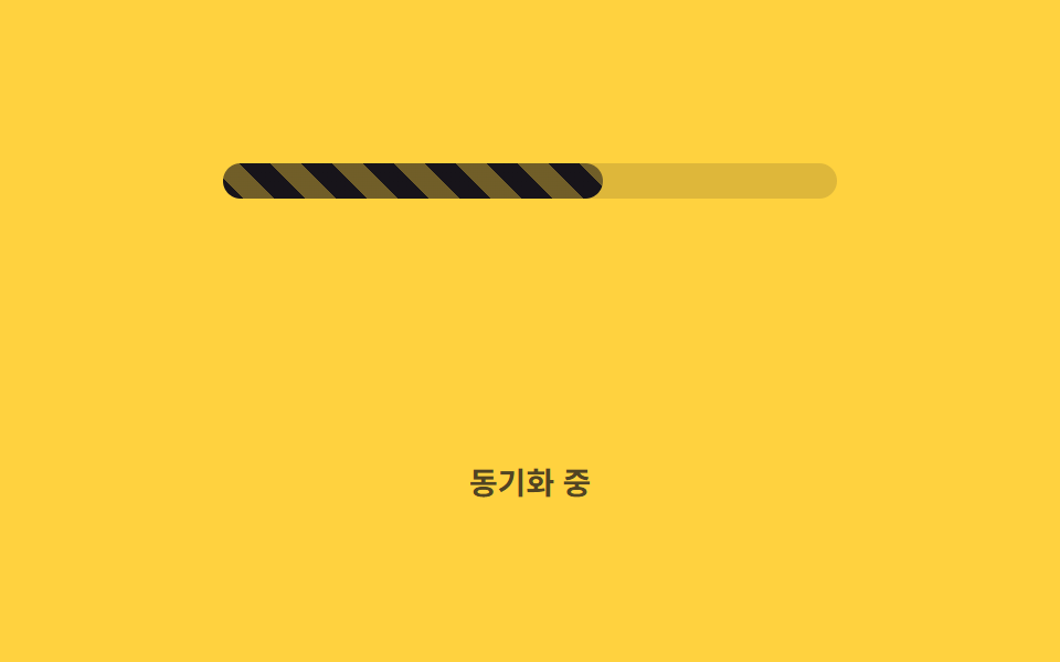
A diagonal stripe background keeps flowing via background-position, signaling ongoing activity even while the value itself holds steady.
Best forBulk data-processing indicators, background sync bars
background-positionrepeating-linear-gradient1초 루프
<main class="stage">
  <div class="track" role="progressbar" aria-valuemin="0" aria-valuemax="100" aria-valuenow="62" aria-label="Syncing">
    <div class="bar is-demo"></div>
  </div>
  <p class="cap">Syncing</p>
</main>
@use "../../../../site/static/demo-tokens" as *;
// ── 변수 3개 ──────────────────────────────────────────
$duration: 1s; // 줄무늬가 한 칸 흐르는 시간
$easing: linear;
$color: $subject-ink; // 줄무늬 색
@include stage($stage-yellow);
.track {
position: relative;
width: clamp(200px, 58vw, 280px);
height: 16px;
border-radius: $r-pill;
background: rgba(23, 20, 26, .14);
overflow: hidden;
}
// 값은 62% 로 고정, 줄무늬만 background-position 으로 흐른다 (026 의 배경 애니메이션과 같은 예외 — 레이아웃이 아니라 페인트만 다시 한다)
.bar {
position: absolute;
inset: 0;
width: 62%;
border-radius: inherit;
background-image: repeating-linear-gradient(45deg, $color 0 10px, rgba($color, .55) 10px 20px);
background-size: 28px 28px;
}
.bar.is-demo { animation: stripe-move $duration $easing infinite; }
@keyframes stripe-move {
from { background-position: 0 0; }
to { background-position: 28px 0; }
}
.cap {
margin: 14px 0 0;
color: rgba(23, 20, 26, .75);
font: 600 clamp(12px, 3.2vw, 14px)/1 -apple-system, "Segoe UI", "Noto Sans KR", sans-serif;
}
@media (prefers-reduced-motion: reduce) {
.bar.is-demo { animation: none; }
}html, body {
margin: 0;
overflow: hidden;
}
.stage {
box-sizing: border-box;
min-height: 100vh;
display: grid;
place-items: center;
margin: 0;
background: #ffd23f;
font-family: -apple-system, "Segoe UI", "Noto Sans KR", sans-serif;
padding: clamp(8px, 4vw, 24px);
}
.track {
position: relative;
width: clamp(200px, 58vw, 280px);
height: 16px;
border-radius: 999px;
background: rgba(23, 20, 26, 0.14);
overflow: hidden;
}
.bar {
position: absolute;
inset: 0;
width: 62%;
border-radius: inherit;
background-image: repeating-linear-gradient(45deg, #17141a 0 10px, rgba(23, 20, 26, 0.55) 10px 20px);
background-size: 28px 28px;
}
.bar.is-demo {
animation: stripe-move 1s linear infinite;
}
@keyframes stripe-move {
from {
background-position: 0 0;
}
to {
background-position: 28px 0;
}
}
.cap {
margin: 14px 0 0;
color: rgba(23, 20, 26, 0.75);
font: 600 clamp(12px, 3.2vw, 14px)/1 -apple-system, "Segoe UI", "Noto Sans KR", sans-serif;
}
@media (prefers-reduced-motion: reduce) {
.bar.is-demo {
animation: none;
}
}import type { CSSProperties } from "react";
import styles from "./StripedBar.module.scss";
export type StripedBarProps = {
/** 0~100 */
percent: number;
duration?: number;
easing?: string;
color?: string;
label?: string;
};
type Vars = CSSProperties & {
"--duration"?: string;
"--easing"?: string;
"--color"?: string;
"--percent"?: number;
};
export default function StripedBar({
percent,
duration = 1000,
easing = "linear",
color = "#17141a",
label,
}: StripedBarProps) {
const p = Math.max(0, Math.min(100, percent));
const vars: Vars = { "--duration": `${duration}ms`, "--easing": easing, "--color": color, "--percent": p };
return (
<div
className={styles.track}
style={vars}
role="progressbar"
aria-valuemin={0}
aria-valuemax={100}
aria-valuenow={p}
aria-label={label}
>
<div className={styles.bar} />
</div>
);
}02 Animated stripes — Measured area 1.883% · moving frames 23/23Original by GODRICH · SCSS and React ship in the zip · 9 CSS Progress Bar Circle Gauges, Copy-Paste Ready
The post this demo lives in
 9 CSS Progress Bar Circle Gauges, Copy-Paste ReadyA css progress bar circle is a ring or arc that fills toward a value with conic-gradient and a custom property instead o See all demos in this post
If you like this effect - similar demos
 Loaders02 Text shimmer status9 CSS AI Chat Loading Animations to Copy-Paste
 Loaders01 Route progress bar that crosses the top of the screenPage Loading Animation CSS: 9 Route-Change Demos
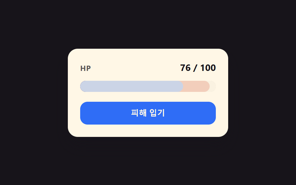 Loaders01 Damage-flash deplete toggle — when a value drops, the bar narrows first while a red afterglow trails behind, narrowing more slowlyCSS Progress Bar: 9 Game-Style Fill Patterns