08Lightbox With a Thumbnail Strip That Follows Along
In the small thumbnail strip along the lightbox's bottom edge, only the thumbnail for the currently viewed photo gets an outline, and each time the image changes the whole strip re-centers around that outlined thumbnail (a different demo from 082's own slider thumbnail track — this strip is a companion to an already-open lightbox, not the slider body itself).
Best forBottom navigation for multi-photo lightboxes
centerOffsetFor()transform: translateXscroll sync
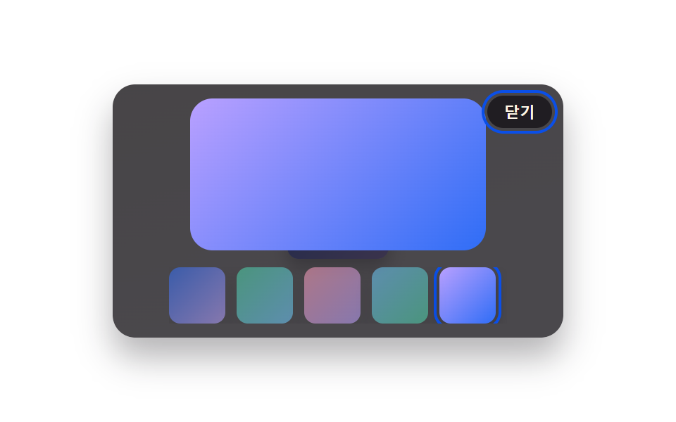
<main class="stage">
<div class="scene is-demo" id="scene">
  <ul class="grid" id="grid">
    <li><button class="thumb" id="thumb0" type="button" aria-haspopup="dialog"><span class="thumbImg thumbImg--a"></span></button></li>
  </ul>
  <div class="backdrop" id="backdrop"></div>
  <div class="lightbox" id="lightbox" role="dialog" aria-modal="true" aria-hidden="true" aria-label="View with thumbnail strip">
    <span class="fullImg" id="fullImg"></span>
    <div class="strip" id="strip">
      <div class="stripTrack" id="stripTrack">
        <button class="stripThumb" id="stripThumb0" type="button" aria-label="Photo 1"><span class="thumbImg thumbImg--a"></span></button>
        <button class="stripThumb" id="stripThumb1" type="button" aria-label="Photo 2"><span class="thumbImg thumbImg--b"></span></button>
        <button class="stripThumb" id="stripThumb2" type="button" aria-label="Photo 3"><span class="thumbImg thumbImg--c"></span></button>
        <button class="stripThumb" id="stripThumb3" type="button" aria-label="Photo 4"><span class="thumbImg thumbImg--d"></span></button>
        <button class="stripThumb" id="stripThumb4" type="button" aria-label="Photo 5"><span class="thumbImg thumbImg--e"></span></button>
      </div>
    </div>
    <button class="closeBtn" id="closeBtn" type="button">Close</button>
  </div>
</div>
</main>
@use "../../../../site/static/demo-tokens" as *;
// 변수 3개
$duration: $dur-base;
$easing: $ease-out;
$color: $subject-blue-deep;
// 계산 겹: index.html 의 centerOffsetFor() 가 활성 썸네일의 실측 offsetLeft·offsetWidth 와
// 스트립의 실측 clientWidth 로 "가운데로 오는 이동량"을 매 전환마다 다시 계산한다(index*고정폭 아님).
@include stage($stage-paper);
.scene {
position: relative;
width: 320px;
height: 180px;
border-radius: $r-card;
overflow: hidden;
box-shadow: $shadow-raised;
background: linear-gradient(160deg, #f3f1ea, $stage-paper 70%);
}
.grid {
position: absolute;
inset: 0;
margin: 0;
padding: 0;
list-style: none;
display: flex;
align-items: center;
justify-content: center;
}
.thumb {
appearance: none;
border: none;
background: none;
padding: 0;
cursor: pointer;
&:focus-visible .thumbImg { outline: 2px solid $color; outline-offset: 2px; }
}
.thumbImg {
display: block;
width: 72px;
height: 72px;
border-radius: $r-sm;
box-shadow: $shadow-press;
&--a { background: linear-gradient(135deg, $subject-blue, $subject-lilac); }
&--b { background: linear-gradient(135deg, $subject-mint, $subject-sky); }
&--c { background: linear-gradient(135deg, $subject-pink, $subject-lilac); }
&--d { background: linear-gradient(135deg, $subject-sky, $subject-mint); }
&--e { background: linear-gradient(135deg, $subject-lilac, $subject-blue); }
}
.backdrop {
position: absolute;
inset: 0;
background: $subject-ink;
opacity: 0;
visibility: hidden;
pointer-events: none;
}
.lightbox {
position: absolute;
inset: 0;
display: flex;
flex-direction: column;
align-items: center;
justify-content: center;
gap: $sp-3;
visibility: hidden;
}
.fullImg {
display: block;
width: 210px;
height: 108px;
border-radius: $r-card;
&--a { background: linear-gradient(135deg, $subject-blue, $subject-lilac); }
&--b { background: linear-gradient(135deg, $subject-mint, $subject-sky); }
&--c { background: linear-gradient(135deg, $subject-pink, $subject-lilac); }
&--d { background: linear-gradient(135deg, $subject-sky, $subject-mint); }
&--e { background: linear-gradient(135deg, $subject-lilac, $subject-blue); }
}
.strip {
position: relative;
width: 240px;
overflow: hidden;
}
.stripTrack {
display: flex;
gap: $sp-2;
width: max-content;
will-change: transform;
}
.stripThumb {
appearance: none;
border: none;
background: none;
padding: 0;
cursor: pointer;
flex: 0 0 auto;
border-radius: $r-sm;
.thumbImg { width: 40px; height: 40px; opacity: .55; }
&.is-active .thumbImg {
opacity: 1;
outline: 2px solid $color;
outline-offset: 2px;
}
&:focus-visible .thumbImg { outline: 2px solid $color; outline-offset: 2px; }
}
.closeBtn {
position: absolute;
top: $sp-2;
right: $sp-2;
appearance: none;
border: none;
border-radius: $r-pill;
padding: $sp-1 $sp-3;
font-size: 11px;
font-weight: 600;
color: $subject-cream;
background: rgba($subject-ink, .82);
cursor: pointer;
&:focus-visible { outline: 2px solid $color; outline-offset: 2px; }
}
@media (max-width: 340px) {
.scene { width: 220px; height: 124px; }
.fullImg { width: 150px; height: 80px; }
.strip { width: 170px; }
.stripThumb .thumbImg { width: 30px; height: 30px; }
}
@media (prefers-reduced-motion: reduce) {
// 실사용 경로 적용 — 스트립 중앙 정렬 이동은 index.html 의 animate() 가 reduce 시 즉시 최종 위치로 처리한다.
.closeBtn, .thumb, .stripThumb { transition: none; }
}html, body {
margin: 0;
overflow: hidden;
}
.stage {
box-sizing: border-box;
min-height: 100vh;
display: grid;
place-items: center;
margin: 0;
background: #ffffff;
font-family: -apple-system, "Segoe UI", "Noto Sans KR", sans-serif;
padding: clamp(8px, 4vw, 24px);
}
.scene {
position: relative;
width: 320px;
height: 180px;
border-radius: 16px;
overflow: hidden;
box-shadow: 0 14px 24px rgba(23, 20, 26, 0.32);
background: linear-gradient(160deg, #f3f1ea, #ffffff 70%);
}
.grid {
position: absolute;
inset: 0;
margin: 0;
padding: 0;
list-style: none;
display: flex;
align-items: center;
justify-content: center;
}
.thumb {
appearance: none;
border: none;
background: none;
padding: 0;
cursor: pointer;
}
.thumb:focus-visible .thumbImg {
outline: 2px solid #0a4fe8;
outline-offset: 2px;
}
.thumbImg {
display: block;
width: 72px;
height: 72px;
border-radius: 8px;
box-shadow: 0 6px 12px rgba(23, 20, 26, 0.32);
}
.thumbImg--a {
background: linear-gradient(135deg, #2f6df6, #b9a0ff);
}
.thumbImg--b {
background: linear-gradient(135deg, #4cd4a6, #6ec8ff);
}
.thumbImg--c {
background: linear-gradient(135deg, #ff9ebb, #b9a0ff);
}
.thumbImg--d {
background: linear-gradient(135deg, #6ec8ff, #4cd4a6);
}
.thumbImg--e {
background: linear-gradient(135deg, #b9a0ff, #2f6df6);
}
.backdrop {
position: absolute;
inset: 0;
background: #17141a;
opacity: 0;
visibility: hidden;
pointer-events: none;
}
.lightbox {
position: absolute;
inset: 0;
display: flex;
flex-direction: column;
align-items: center;
justify-content: center;
gap: 12px;
visibility: hidden;
}
.fullImg {
display: block;
width: 210px;
height: 108px;
border-radius: 16px;
}
.fullImg--a {
background: linear-gradient(135deg, #2f6df6, #b9a0ff);
}
.fullImg--b {
background: linear-gradient(135deg, #4cd4a6, #6ec8ff);
}
.fullImg--c {
background: linear-gradient(135deg, #ff9ebb, #b9a0ff);
}
.fullImg--d {
background: linear-gradient(135deg, #6ec8ff, #4cd4a6);
}
.fullImg--e {
background: linear-gradient(135deg, #b9a0ff, #2f6df6);
}
.strip {
position: relative;
width: 240px;
overflow: hidden;
}
.stripTrack {
display: flex;
gap: 8px;
width: max-content;
will-change: transform;
}
.stripThumb {
appearance: none;
border: none;
background: none;
padding: 0;
cursor: pointer;
flex: 0 0 auto;
border-radius: 8px;
}
.stripThumb .thumbImg {
width: 40px;
height: 40px;
opacity: 0.55;
}
.stripThumb.is-active .thumbImg {
opacity: 1;
outline: 2px solid #0a4fe8;
outline-offset: 2px;
}
.stripThumb:focus-visible .thumbImg {
outline: 2px solid #0a4fe8;
outline-offset: 2px;
}
.closeBtn {
position: absolute;
top: 8px;
right: 8px;
appearance: none;
border: none;
border-radius: 999px;
padding: 4px 12px;
font-size: 11px;
font-weight: 600;
color: #fff7e6;
background: rgba(23, 20, 26, 0.82);
cursor: pointer;
}
.closeBtn:focus-visible {
outline: 2px solid #0a4fe8;
outline-offset: 2px;
}
@media (max-width: 340px) {
.scene {
width: 220px;
height: 124px;
}
.fullImg {
width: 150px;
height: 80px;
}
.strip {
width: 170px;
}
.stripThumb .thumbImg {
width: 30px;
height: 30px;
}
}
@media (prefers-reduced-motion: reduce) {
.closeBtn, .thumb, .stripThumb {
transition: none;
}
}(function () {
var SYNC_MS = 320;
var HOLD_MS = 340;
var LOOP_MS = 2000;
var scene = document.getElementById('scene');
var backdrop = document.getElementById('backdrop');
var lightbox = document.getElementById('lightbox');
var fullImg = document.getElementById('fullImg');
var strip = document.getElementById('strip');
var stripTrack = document.getElementById('stripTrack');
var closeBtn = document.getElementById('closeBtn');
var thumb = document.getElementById('thumb0');
var reduce = window.matchMedia('(prefers-reduced-motion: reduce)').matches;
var stripThumbs = [].slice.call(document.querySelectorAll('.stripThumb'));
var imgClassByIdx = ['a', 'b', 'c', 'd', 'e'];
var COUNT = stripThumbs.length;
var open = false;
var idx = 0;
var currentX = 0;
var timers = [];
function clamp(v, lo, hi) { return Math.min(hi, Math.max(lo, v)); }
function easeOutCubic(t) { return 1 - Math.pow(1 - t, 3); }
function animate(duration, onFrame, onDone) {
if (reduce) { onFrame(1); if (onDone) onDone(); return; }
var start = performance.now();
function frame(now) {
var p = clamp((now - start) / duration, 0, 1);
onFrame(easeOutCubic(p));
if (p < 1) requestAnimationFrame(frame);
else if (onDone) onDone();
}
requestAnimationFrame(frame);
}
// 활성 썸네일을 줄 가운데로 오게 하는 이동량을 그때그때 실측한다 — index * 고정폭이 아니다.
// (082/256 의 정적 배열형 스트립과 다른 지점: 여기는 화면 폭이 바뀌거나 썸네일 크기가 달라져도
// offsetLeft·clientWidth 실측으로 다시 계산되므로 항상 정중앙에 맞는다.)
function centerOffsetFor(el) {
var thumbLeft = el.offsetLeft;
var thumbW = el.offsetWidth;
var stripW = strip.clientWidth;
var trackW = stripTrack.scrollWidth;
var target = stripW / 2 - thumbLeft - thumbW / 2;
var minOffset = Math.min(0, stripW - trackW);
return clamp(target, minOffset, 0);
}
function setStripX(px) { stripTrack.style.transform = 'translateX(' + px.toFixed(2) + 'px)'; }
function goTo(nextIdx, onDone) {
nextIdx = clamp(nextIdx, 0, COUNT - 1);
idx = nextIdx;
fullImg.className = 'fullImg fullImg--' + imgClassByIdx[idx];
stripThumbs.forEach(function (t, i) { t.classList.toggle('is-active', i === idx); });
var target = centerOffsetFor(stripThumbs[idx]);
var fromX = currentX;
animate(SYNC_MS, function (e) {
var x = fromX + (target - fromX) * e;
setStripX(x);
}, function () {
currentX = target;
if (onDone) onDone();
});
}
function openFrom() {
if (open) return;
open = true;
idx = 0;
currentX = 0;
setStripX(0);
fullImg.className = 'fullImg fullImg--a';
stripThumbs.forEach(function (t, i) { t.classList.toggle('is-active', i === 0); });
lightbox.style.visibility = 'visible';
lightbox.setAttribute('aria-hidden', 'false');
backdrop.style.visibility = 'visible';
animate(220, function (e) { backdrop.style.opacity = (e * 0.78).toFixed(3); }, function () {
closeBtn.focus({ preventScroll: true });
});
}
function closeLightbox() {
if (!open) return;
animate(200, function (e) { backdrop.style.opacity = (0.78 * (1 - e)).toFixed(3); }, function () {
lightbox.style.visibility = 'hidden';
lightbox.setAttribute('aria-hidden', 'true');
backdrop.style.visibility = 'hidden';
open = false;
thumb.focus({ preventScroll: true });
});
}
function human() {
if (scene.classList.contains('is-demo')) {
scene.classList.remove('is-demo');
timers.forEach(function (id) { clearTimeout(id); clearInterval(id); });
timers = [];
}
}
thumb.addEventListener('click', function () { human(); openFrom(); });
closeBtn.addEventListener('click', function () { human(); closeLightbox(); });
backdrop.addEventListener('click', function () { human(); closeLightbox(); });
stripThumbs.forEach(function (t, i) {
t.addEventListener('click', function () { human(); goTo(i); });
});
document.addEventListener('keydown', function (e) {
if (!open) return;
if (e.key === 'Escape') { human(); closeLightbox(); }
else if (e.key === 'ArrowRight') { human(); goTo(idx + 1); }
else if (e.key === 'ArrowLeft') { human(); goTo(idx - 1); }
});
function cycle() {
openFrom();
timers.push(setTimeout(function () { goTo(2); }, 300));
timers.push(setTimeout(function () { goTo(4); }, 300 + SYNC_MS + HOLD_MS));
timers.push(setTimeout(closeLightbox, 300 + (SYNC_MS + HOLD_MS) * 2));
}
if (!reduce) {
cycle();
timers.push(setInterval(function () {
if (scene.classList.contains('is-demo')) cycle();
}, LOOP_MS));
}
})();import { useEffect, useRef } from 'react';
import styles from './ThumbnailStripSync.module.scss';
const SYNC_MS = 320;
const HOLD_MS = 340;
const LOOP_MS = 2000;
export default function ThumbnailStripSync() {
const sceneRef = useRef<HTMLDivElement>(null);
useEffect(() => {
const scene0 = sceneRef.current;
if (!scene0) return undefined;
const backdrop0 = scene0.querySelector<HTMLDivElement>('.' + styles.backdrop);
const lightbox0 = scene0.querySelector<HTMLDivElement>('.' + styles.lightbox);
const fullImg0 = scene0.querySelector<HTMLSpanElement>('.' + styles.fullImg);
const strip0 = scene0.querySelector<HTMLDivElement>('.' + styles.strip);
const stripTrack0 = scene0.querySelector<HTMLDivElement>('.' + styles.stripTrack);
const closeBtn0 = scene0.querySelector<HTMLButtonElement>('.' + styles.closeBtn);
const thumb0 = scene0.querySelector<HTMLButtonElement>('.' + styles.thumb);
const stripThumbs = Array.from(scene0.querySelectorAll<HTMLButtonElement>('.' + styles.stripThumb));
if (!backdrop0 || !lightbox0 || !fullImg0 || !strip0 || !stripTrack0 || !closeBtn0 || !thumb0 || stripThumbs.length === 0) return undefined;
const scene = scene0;
const backdrop = backdrop0;
const lightbox = lightbox0;
const fullImg = fullImg0;
const strip = strip0;
const stripTrack = stripTrack0;
const closeBtn = closeBtn0;
const thumb = thumb0;
const reduce = window.matchMedia('(prefers-reduced-motion: reduce)').matches;
const imgClassByIdx = ['a', 'b', 'c', 'd', 'e'];
const fullImgClassByIdx = [styles['fullImg--a'], styles['fullImg--b'], styles['fullImg--c'], styles['fullImg--d'], styles['fullImg--e']];
const COUNT = stripThumbs.length;
let open = false;
let idx = 0;
let currentX = 0;
let timers: number[] = [];
function clamp(v: number, lo: number, hi: number) { return Math.min(hi, Math.max(lo, v)); }
function easeOutCubic(t: number) { return 1 - Math.pow(1 - t, 3); }
function animate(duration: number, onFrame: (e: number) => void, onDone?: () => void) {
if (reduce) { onFrame(1); if (onDone) onDone(); return; }
const start = performance.now();
function frame(now: number) {
const p = clamp((now - start) / duration, 0, 1);
onFrame(easeOutCubic(p));
if (p < 1) requestAnimationFrame(frame);
else if (onDone) onDone();
}
requestAnimationFrame(frame);
}
// 활성 썸네일을 줄 가운데로 오게 하는 이동량을 그때그때 실측한다 — index * 고정폭이 아니다.
function centerOffsetFor(el: HTMLElement) {
const thumbLeft = el.offsetLeft;
const thumbW = el.offsetWidth;
const stripW = strip.clientWidth;
const trackW = stripTrack.scrollWidth;
const target = stripW / 2 - thumbLeft - thumbW / 2;
const minOffset = Math.min(0, stripW - trackW);
return clamp(target, minOffset, 0);
}
function setStripX(px: number) { stripTrack.style.transform = 'translateX(' + px.toFixed(2) + 'px)'; }
function goTo(nextIdxRaw: number, onDone?: () => void) {
const nextIdx = clamp(nextIdxRaw, 0, COUNT - 1);
idx = nextIdx;
fullImg.className = styles.fullImg + ' ' + fullImgClassByIdx[idx];
stripThumbs.forEach((t, i) => { t.classList.toggle(styles['is-active'], i === idx); });
const target = centerOffsetFor(stripThumbs[idx]);
const fromX = currentX;
animate(SYNC_MS, (e) => {
const x = fromX + (target - fromX) * e;
setStripX(x);
}, () => {
currentX = target;
if (onDone) onDone();
});
}
function openFrom() {
if (open) return;
open = true;
idx = 0;
currentX = 0;
setStripX(0);
fullImg.className = styles.fullImg + ' ' + styles['fullImg--a'];
stripThumbs.forEach((t, i) => { t.classList.toggle(styles['is-active'], i === 0); });
lightbox.style.visibility = 'visible';
lightbox.setAttribute('aria-hidden', 'false');
backdrop.style.visibility = 'visible';
animate(220, (e) => { backdrop.style.opacity = (e * 0.78).toFixed(3); }, () => {
closeBtn.focus({ preventScroll: true });
});
}
function closeLightbox() {
if (!open) return;
animate(200, (e) => { backdrop.style.opacity = (0.78 * (1 - e)).toFixed(3); }, () => {
lightbox.style.visibility = 'hidden';
lightbox.setAttribute('aria-hidden', 'true');
backdrop.style.visibility = 'hidden';
open = false;
thumb.focus({ preventScroll: true });
});
}
function human() {
if (scene.classList.contains(styles['is-demo'])) {
scene.classList.remove(styles['is-demo']);
timers.forEach((id) => { window.clearTimeout(id); window.clearInterval(id); });
timers = [];
}
}
function onThumbClick() { human(); openFrom(); }
function onCloseClick() { human(); closeLightbox(); }
function onBackdropClick() { human(); closeLightbox(); }
thumb.addEventListener('click', onThumbClick);
closeBtn.addEventListener('click', onCloseClick);
backdrop.addEventListener('click', onBackdropClick);
const stripHandlers = stripThumbs.map((_, i) => () => { human(); goTo(i); });
stripThumbs.forEach((t, i) => t.addEventListener('click', stripHandlers[i]));
function onKeydown(e: KeyboardEvent) {
if (!open) return;
if (e.key === 'Escape') { human(); closeLightbox(); }
else if (e.key === 'ArrowRight') { human(); goTo(idx + 1); }
else if (e.key === 'ArrowLeft') { human(); goTo(idx - 1); }
}
document.addEventListener('keydown', onKeydown);
function cycle() {
openFrom();
timers.push(window.setTimeout(() => { goTo(2); }, 300));
timers.push(window.setTimeout(() => { goTo(4); }, 300 + SYNC_MS + HOLD_MS));
timers.push(window.setTimeout(closeLightbox, 300 + (SYNC_MS + HOLD_MS) * 2));
}
if (!reduce) {
cycle();
timers.push(window.setInterval(() => {
if (scene.classList.contains(styles['is-demo'])) cycle();
}, LOOP_MS));
}
return () => {
timers.forEach((id) => { window.clearTimeout(id); window.clearInterval(id); });
thumb.removeEventListener('click', onThumbClick);
closeBtn.removeEventListener('click', onCloseClick);
backdrop.removeEventListener('click', onBackdropClick);
stripThumbs.forEach((t, i) => t.removeEventListener('click', stripHandlers[i]));
document.removeEventListener('keydown', onKeydown);
};
}, []);
return (
<div className={`${styles.scene} ${styles['is-demo']}`} ref={sceneRef}>
<ul className={styles.grid}>
<li><button className={styles.thumb} type="button" aria-haspopup="dialog"><span className={`${styles.thumbImg} ${styles['thumbImg--a']}`} /></button></li>
</ul>
<div className={styles.backdrop} />
<div className={styles.lightbox} role="dialog" aria-modal="true" aria-hidden="true" aria-label="썸네일 줄과 함께 보기">
<span className={styles.fullImg} />
<div className={styles.strip}>
<div className={styles.stripTrack}>
<button className={styles.stripThumb} type="button" aria-label="1번째 사진"><span className={`${styles.thumbImg} ${styles['thumbImg--a']}`} /></button>
<button className={styles.stripThumb} type="button" aria-label="2번째 사진"><span className={`${styles.thumbImg} ${styles['thumbImg--b']}`} /></button>
<button className={styles.stripThumb} type="button" aria-label="3번째 사진"><span className={`${styles.thumbImg} ${styles['thumbImg--c']}`} /></button>
<button className={styles.stripThumb} type="button" aria-label="4번째 사진"><span className={`${styles.thumbImg} ${styles['thumbImg--d']}`} /></button>
<button className={styles.stripThumb} type="button" aria-label="5번째 사진"><span className={`${styles.thumbImg} ${styles['thumbImg--e']}`} /></button>
</div>
</div>
<button className={styles.closeBtn} type="button">닫기</button>
</div>
</div>
);
}08 Lightbox With a Thumbnail Strip That Follows Along — Measured area 39.872% · moving frames 10/23Original by GODRICH · SCSS and React ship in the zip · CSS Lightbox Gallery Animation — 9 Transitions
The post this demo lives in
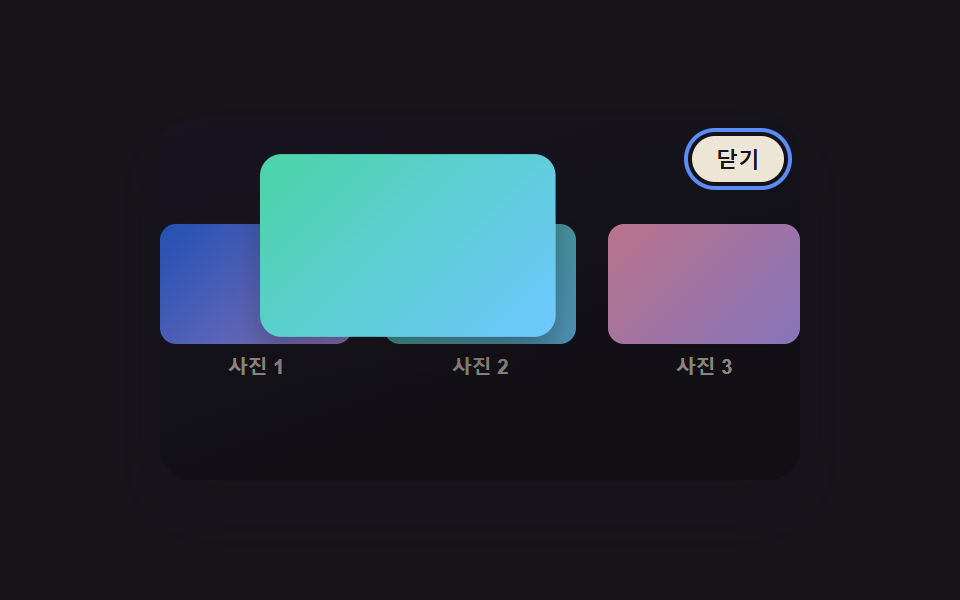 CSS Lightbox Gallery Animation — 9 TransitionsAmong nine css lightbox gallery ideas, one grows from the clicked thumbnail's spot, one times a downward flick to decide See all demos in this post
If you like this effect - similar demos
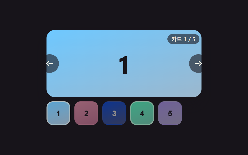 Transitions06 Carousel Whose Thumbnail Strip Highlights the Active CardCarousel Slider UI Design — 9 Transitions
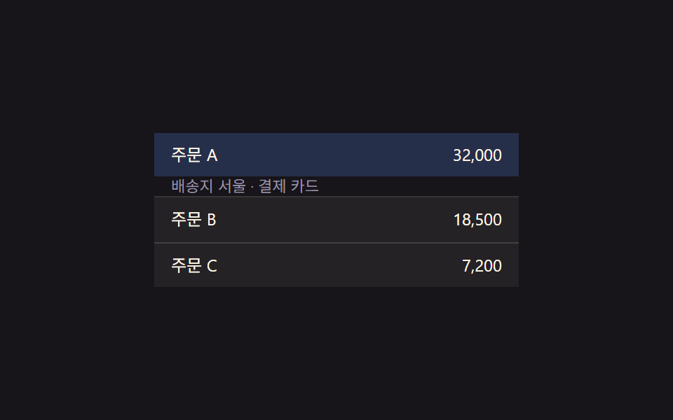 Transitions01 Row expand-value toggle — when an item's expand value changes, the detail area's height value grows or shrinks along with itCollapsible Table Row: 9 UI Patterns
 Transitions07 Swipe-follow toggle — while a horizontal drag-distance value grows, the highlight's position value follows toward the side tab by that same ratioCSS Bottom Navigation Bar: 9 Transition Patterns