07A Card Whose Layout Changes Clothes As the Width Moves
The card width is read as a container-width condition, switching between stacked, row and grid at three ranges, with the live width and range name shown below.
Best forResponsive component checks
BREAK_ABREAK_BRANGE_LABELcontainer-type
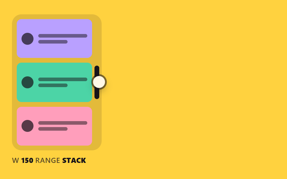
<main class="stage">
<div class="rh is-demo" id="rh" data-demo="1">
  <div class="rh__box" data-r="box">
    <div class="rh__cards">
      <div class="rh__card"><i></i><span><b></b><b></b></span></div>
      <div class="rh__card"><i></i><span><b></b><b></b></span></div>
      <div class="rh__card"><i></i><span><b></b><b></b></span></div>
    </div>
    <button class="rh__grip" data-r="grip" type="button" aria-label="Resize handle"></button>
  </div>
  <p class="rh__meta"><span class="rh__tag">W</span> <b data-r="w">0</b> <span class="rh__tag">RANGE</span> <b data-r="range">STACK</b></p>
  <i class="rh__cursor" data-r="cursor"></i>
</div>
</main>
@use "../../../../site/static/demo-tokens" as *;
// 핵심: 상자 폭이 container-type: inline-size 의 기준이다. 폭 구간(150px, 250px)마다 카드 배치가 CSS 만으로 바뀐다.
@include stage($stage-yellow);
.rh {
position: relative;
box-sizing: border-box;
width: min(100%, 440px);
height: min(252px, calc(100vh - 2 * clamp(8px, 4vw, 24px)));
color: $subject-ink;
font-size: 12px;
line-height: 16px;
font-weight: 600;
user-select: none;
}
.rh b { font-weight: 800; font-variant-numeric: tabular-nums; }
.rh__tag { color: rgba($subject-ink, .72); letter-spacing: .5px; }
.rh__cursor {
position: absolute;
left: -10px;
top: -10px;
width: 20px;
height: 20px;
border-radius: 50%;
background: $subject-cream;
box-shadow: 0 0 0 3px rgba($subject-ink, .55), $shadow-press;
opacity: 0;
pointer-events: none;
z-index: 6;
}
.rh[data-demo] .rh__cursor { opacity: 1; }
.rh button:focus-visible { outline: 3px solid $subject-ink; outline-offset: 2px; }
@media (prefers-reduced-motion: reduce) {
.rh__cursor { display: none; }
}
// JS 의 BREAK_A·BREAK_B 와 아래 두 @container 경계는 같은 숫자다.
.rh__box {
position: absolute;
left: 0;
top: 0;
box-sizing: border-box;
height: calc(100% - 24px);
container-type: inline-size;
border-radius: $r-card;
background: rgba($subject-ink, .12);
}
.rh__cards {
position: absolute;
inset: $sp-2 $sp-4 $sp-2 $sp-2;
display: grid;
grid-template-columns: 1fr;
grid-auto-rows: 1fr;
gap: $sp-2;
overflow: hidden;
}
.rh__card {
box-sizing: border-box;
min-width: 0;
min-height: 0;
display: flex;
flex-direction: row;
align-items: center;
gap: $sp-2;
padding: $sp-2;
overflow: hidden;
border-radius: $r-sm;
background: $subject-lilac;
}
.rh__card:nth-child(2) { background: $subject-mint; }
.rh__card:nth-child(3) { background: $subject-pink; }
.rh__card i {
flex: none;
width: 20px;
height: 20px;
border-radius: 50%;
background: rgba($subject-ink, .72);
}
.rh__card span { display: grid; gap: $sp-1; min-width: 0; flex: 1; }
.rh__card b { display: block; height: 6px; border-radius: $r-xs; background: rgba($subject-ink, .5); }
.rh__card b:last-child { width: 60%; }
@container (min-width: 150px) {
.rh__cards { grid-template-columns: repeat(3, 1fr); grid-auto-rows: auto; }
.rh__card { flex-direction: column; align-items: flex-start; justify-content: flex-start; }
.rh__card span { width: 100%; flex: none; }
}
@container (min-width: 250px) {
.rh__cards { grid-template-columns: 1fr 1fr; grid-template-rows: 1.2fr 1fr; }
.rh__card:first-child { grid-column: 1 / -1; flex-direction: row; align-items: center; }
.rh__card:first-child i { width: 40px; height: 40px; }
.rh__card span { flex: 1; width: auto; }
}
.rh__grip {
position: absolute;
right: $sp-1;
top: 50%;
width: 8px;
height: 56px;
padding: 0;
border: 0;
border-radius: $r-pill;
background: $subject-ink;
transform: translateY(-50%);
cursor: ew-resize;
touch-action: none;
}
.rh__meta { position: absolute; left: 0; bottom: 0; margin: 0; }html, body {
margin: 0;
overflow: hidden;
}
.stage {
box-sizing: border-box;
min-height: 100vh;
display: grid;
place-items: center;
margin: 0;
background: #ffd23f;
font-family: -apple-system, "Segoe UI", "Noto Sans KR", sans-serif;
padding: clamp(8px, 4vw, 24px);
}
.rh {
position: relative;
box-sizing: border-box;
width: min(100%, 440px);
height: min(252px, 100vh - 2 * clamp(8px, 4vw, 24px));
color: #17141a;
font-size: 12px;
line-height: 16px;
font-weight: 600;
user-select: none;
}
.rh b {
font-weight: 800;
font-variant-numeric: tabular-nums;
}
.rh__tag {
color: rgba(23, 20, 26, 0.72);
letter-spacing: 0.5px;
}
.rh__cursor {
position: absolute;
left: -10px;
top: -10px;
width: 20px;
height: 20px;
border-radius: 50%;
background: #fff7e6;
box-shadow: 0 0 0 3px rgba(23, 20, 26, 0.55), 0 6px 12px rgba(23, 20, 26, 0.32);
opacity: 0;
pointer-events: none;
z-index: 6;
}
.rh[data-demo] .rh__cursor {
opacity: 1;
}
.rh button:focus-visible {
outline: 3px solid #17141a;
outline-offset: 2px;
}
@media (prefers-reduced-motion: reduce) {
.rh__cursor {
display: none;
}
}
.rh__box {
position: absolute;
left: 0;
top: 0;
box-sizing: border-box;
height: calc(100% - 24px);
container-type: inline-size;
border-radius: 16px;
background: rgba(23, 20, 26, 0.12);
}
.rh__cards {
position: absolute;
inset: 8px 16px 8px 8px;
display: grid;
grid-template-columns: 1fr;
grid-auto-rows: 1fr;
gap: 8px;
overflow: hidden;
}
.rh__card {
box-sizing: border-box;
min-width: 0;
min-height: 0;
display: flex;
flex-direction: row;
align-items: center;
gap: 8px;
padding: 8px;
overflow: hidden;
border-radius: 8px;
background: #b9a0ff;
}
.rh__card:nth-child(2) {
background: #4cd4a6;
}
.rh__card:nth-child(3) {
background: #ff9ebb;
}
.rh__card i {
flex: none;
width: 20px;
height: 20px;
border-radius: 50%;
background: rgba(23, 20, 26, 0.72);
}
.rh__card span {
display: grid;
gap: 4px;
min-width: 0;
flex: 1;
}
.rh__card b {
display: block;
height: 6px;
border-radius: 4px;
background: rgba(23, 20, 26, 0.5);
}
.rh__card b:last-child {
width: 60%;
}
@container (min-width: 150px) {
.rh__cards {
grid-template-columns: repeat(3, 1fr);
grid-auto-rows: auto;
}
.rh__card {
flex-direction: column;
align-items: flex-start;
justify-content: flex-start;
}
.rh__card span {
width: 100%;
flex: none;
}
}
@container (min-width: 250px) {
.rh__cards {
grid-template-columns: 1fr 1fr;
grid-template-rows: 1.2fr 1fr;
}
.rh__card:first-child {
grid-column: 1/-1;
flex-direction: row;
align-items: center;
}
.rh__card:first-child i {
width: 40px;
height: 40px;
}
.rh__card span {
flex: 1;
width: auto;
}
}
.rh__grip {
position: absolute;
right: 4px;
top: 50%;
width: 8px;
height: 56px;
padding: 0;
border: 0;
border-radius: 999px;
background: #17141a;
transform: translateY(-50%);
cursor: ew-resize;
touch-action: none;
}
.rh__meta {
position: absolute;
left: 0;
bottom: 0;
margin: 0;
}(function () {
const root = document.getElementById("rh");
const reduce = window.matchMedia("(prefers-reduced-motion: reduce)").matches;
let demo = !reduce;
let raf = 0;
let t0 = -1;
let last = -1;
const offs = [];
function q(sel) {
return root.querySelector(sel);
}
function clamp(v, lo, hi) {
return Math.max(lo, Math.min(hi, v));
}
function seg(t, a, b) {
const c = clamp((t - a) / (b - a), 0, 1);
return c * c * (3 - 2 * c);
}
function on(el, type, fn) {
el.addEventListener(type, fn);
offs.push(() => el.removeEventListener(type, fn));
}
function stopDemo() {
demo = false;
root.removeAttribute("data-demo");
root.classList.remove("is-demo");
}
function pos(e) {
const r = root.getBoundingClientRect();
return { x: e.clientX - r.left, y: e.clientY - r.top };
}
function spring(x, v, to, k, c, dt) {
const n = Math.max(1, Math.ceil(dt / 0.008));
const h = dt / n;
for (let i = 0; i < n; i += 1) {
v += (-k * (x - to) - c * v) * h;
x += v * h;
}
return [x, v];
}
function sync() {
if (reduce) {
snap();
render();
}
}
// 기법: 상자 너비 하나(cw)를 JS 가 끌고, 안쪽 배치는 CSS @container 가 너비 구간으로 바꾼다.
// 구간 이름은 JS 가 같은 경계값(BREAK_A, BREAK_B)으로 읽어 화면 밑에 적는다.
const BREAK_A = 150;
const BREAK_B = 250;
const RANGE_LABEL = ["STACK", "ROW", "GRID"];
const MIN_W = 96;
const FOLLOW = 16;
const box = q("[data-r=box]");
const grip = q("[data-r=grip]");
const wEl = q("[data-r=w]");
const rangeEl = q("[data-r=range]");
const cursor = q("[data-r=cursor]");
let cw = 0;
let tw = 0;
let px = 0;
let py = 0;
let gx = 0;
let dragging = false;
let ready = false;
function maxW() { return root.clientWidth - 8; }
function init() {
if (ready)
return;
ready = true;
tw = cw = root.clientWidth * 0.34;
}
function rangeOf(width) { return width < BREAK_A ? 0 : width < BREAK_B ? 1 : 2; }
function userTakes() {
stopDemo();
dragging = false;
init();
}
function script(now) {
const W = root.clientWidth;
const ph = now % 2000;
const a = W * 0.34;
const b = maxW();
let x = a;
if (ph >= 200 && ph < 760)
x = a + (b - a) * seg(ph, 200, 760);
else if (ph >= 760 && ph < 1100)
x = b;
else if (ph >= 1100 && ph < 1800)
x = b + (a - b) * seg(ph, 1100, 1800);
dragging = true;
px = x - 4;
py = root.clientHeight * 0.45;
gx = 4;
}
function snap() {
init();
cw = tw;
}
function step(dt, now) {
init();
if (demo)
script(now);
if (dragging)
tw = clamp(px + gx, MIN_W, maxW());
cw += (tw - cw) * (1 - Math.exp(-FOLLOW * dt));
}
function render() {
box.style.width = cw.toFixed(1) + "px";
wEl.textContent = String(Math.round(cw));
rangeEl.textContent = RANGE_LABEL[rangeOf(cw)];
cursor.style.transform = "translate(" + px.toFixed(1) + "px," + py.toFixed(1) + "px)";
}
on(grip, "pointerdown", (e) => {
userTakes();
grip.setPointerCapture(e.pointerId);
const p = pos(e);
px = p.x;
py = p.y;
gx = cw - p.x;
dragging = true;
});
on(grip, "pointermove", (e) => {
if (!dragging)
return;
px = pos(e).x;
tw = clamp(px + gx, MIN_W, maxW());
sync();
});
on(grip, "pointerup", () => { dragging = false; });
on(grip, "pointercancel", () => { dragging = false; });
on(grip, "keydown", (e) => {
if (e.key !== "ArrowLeft" && e.key !== "ArrowRight")
return;
e.preventDefault();
userTakes();
tw = clamp(tw + (e.key === "ArrowRight" ? 16 : -16), MIN_W, maxW());
sync();
});
function frame(ts) {
if (t0 < 0) {
t0 = ts;
last = ts;
}
const dt = Math.min(0.05, (ts - last) / 1000);
last = ts;
step(dt, ts - t0);
render();
raf = requestAnimationFrame(frame);
}
if (reduce) {
stopDemo();
snap();
render();
}
else {
raf = requestAnimationFrame(frame);
}
return () => {
cancelAnimationFrame(raf);
offs.forEach((f) => f());
};
})();// ContainerReflowReadout - vanilla 판(07-rh-container-reflow-readout) 의 React 포트. 같은 계산을 useEffect 안에서 돌린다.
import { useEffect, useRef } from "react";
import styles from "./ContainerReflowReadout.module.scss";
export default function ContainerReflowReadout() {
const rootRef = useRef<HTMLDivElement | null>(null);
useEffect(() => {
const rootEl = rootRef.current;
if (!rootEl) return;
const root: HTMLElement = rootEl;
const reduce = window.matchMedia("(prefers-reduced-motion: reduce)").matches;
let demo = !reduce;
let raf = 0;
let t0 = -1;
let last = -1;
const offs: Array<() => void> = [];
function q<T extends Element>(sel: string): T {
return root.querySelector(sel) as T;
}
function clamp(v: number, lo: number, hi: number): number {
return Math.max(lo, Math.min(hi, v));
}
function seg(t: number, a: number, b: number): number {
const c = clamp((t - a) / (b - a), 0, 1);
return c * c * (3 - 2 * c);
}
function on(el: EventTarget, type: string, fn: (e: any) => void): void {
el.addEventListener(type, fn);
offs.push(() => el.removeEventListener(type, fn));
}
function stopDemo(): void {
demo = false;
root.removeAttribute("data-demo");
root.classList.remove("is-demo");
}
function pos(e: PointerEvent): { x: number; y: number } {
const r = root.getBoundingClientRect();
return { x: e.clientX - r.left, y: e.clientY - r.top };
}
function spring(x: number, v: number, to: number, k: number, c: number, dt: number): number[] {
const n = Math.max(1, Math.ceil(dt / 0.008));
const h = dt / n;
for (let i = 0; i < n; i += 1) {
v += (-k * (x - to) - c * v) * h;
x += v * h;
}
return [x, v];
}
function sync(): void {
if (reduce) {
snap();
render();
}
}
// 기법: 상자 너비 하나(cw)를 JS 가 끌고, 안쪽 배치는 CSS @container 가 너비 구간으로 바꾼다.
// 구간 이름은 JS 가 같은 경계값(BREAK_A, BREAK_B)으로 읽어 화면 밑에 적는다.
const BREAK_A = 150;
const BREAK_B = 250;
const RANGE_LABEL = ["STACK", "ROW", "GRID"];
const MIN_W = 96;
const FOLLOW = 16;
const box = q<HTMLElement>("[data-r=box]");
const grip = q<HTMLElement>("[data-r=grip]");
const wEl = q<HTMLElement>("[data-r=w]");
const rangeEl = q<HTMLElement>("[data-r=range]");
const cursor = q<HTMLElement>("[data-r=cursor]");
let cw = 0;
let tw = 0;
let px = 0;
let py = 0;
let gx = 0;
let dragging = false;
let ready = false;
function maxW(): number { return root.clientWidth - 8; }
function init(): void {
if (ready) return;
ready = true;
tw = cw = root.clientWidth * 0.34;
}
function rangeOf(width: number): number { return width < BREAK_A ? 0 : width < BREAK_B ? 1 : 2; }
function userTakes(): void {
stopDemo();
dragging = false;
init();
}
function script(now: number): void {
const W = root.clientWidth;
const ph = now % 2000;
const a = W * 0.34;
const b = maxW();
let x = a;
if (ph >= 200 && ph < 760) x = a + (b - a) * seg(ph, 200, 760);
else if (ph >= 760 && ph < 1100) x = b;
else if (ph >= 1100 && ph < 1800) x = b + (a - b) * seg(ph, 1100, 1800);
dragging = true;
px = x - 4;
py = root.clientHeight * 0.45;
gx = 4;
}
function snap(): void {
init();
cw = tw;
}
function step(dt: number, now: number): void {
init();
if (demo) script(now);
if (dragging) tw = clamp(px + gx, MIN_W, maxW());
cw += (tw - cw) * (1 - Math.exp(-FOLLOW * dt));
}
function render(): void {
box.style.width = cw.toFixed(1) + "px";
wEl.textContent = String(Math.round(cw));
rangeEl.textContent = RANGE_LABEL[rangeOf(cw)];
cursor.style.transform = "translate(" + px.toFixed(1) + "px," + py.toFixed(1) + "px)";
}
on(grip, "pointerdown", (e: PointerEvent) => {
userTakes();
grip.setPointerCapture(e.pointerId);
const p = pos(e);
px = p.x;
py = p.y;
gx = cw - p.x;
dragging = true;
});
on(grip, "pointermove", (e: PointerEvent) => {
if (!dragging) return;
px = pos(e).x;
tw = clamp(px + gx, MIN_W, maxW());
sync();
});
on(grip, "pointerup", () => { dragging = false; });
on(grip, "pointercancel", () => { dragging = false; });
on(grip, "keydown", (e: KeyboardEvent) => {
if (e.key !== "ArrowLeft" && e.key !== "ArrowRight") return;
e.preventDefault();
userTakes();
tw = clamp(tw + (e.key === "ArrowRight" ? 16 : -16), MIN_W, maxW());
sync();
});
function frame(ts: number): void {
if (t0 < 0) {
t0 = ts;
last = ts;
}
const dt = Math.min(0.05, (ts - last) / 1000);
last = ts;
step(dt, ts - t0);
render();
raf = requestAnimationFrame(frame);
}
if (reduce) {
stopDemo();
snap();
render();
} else {
raf = requestAnimationFrame(frame);
}
return () => {
cancelAnimationFrame(raf);
offs.forEach((f) => f());
};
}, []);
return (
<main className={styles["stage"]}>
<div ref={rootRef} className={styles["rh"] + " is-demo"} data-demo="1">
<div className={styles["rh__box"]} data-r="box">
<div className={styles["rh__cards"]}>
<div className={styles["rh__card"]}><i></i><span><b></b><b></b></span></div>
<div className={styles["rh__card"]}><i></i><span><b></b><b></b></span></div>
<div className={styles["rh__card"]}><i></i><span><b></b><b></b></span></div>
</div>
<button className={styles["rh__grip"]} data-r="grip" type="button" aria-label="크기 조절 손잡이"></button>
</div>
<p className={styles["rh__meta"]}><span className={styles["rh__tag"]}>W</span> <b data-r="w">0</b> <span className={styles["rh__tag"]}>RANGE</span> <b data-r="range">STACK</b></p>
<i className={styles["rh__cursor"]} data-r="cursor"></i>
</div>
</main>
);
}07 A Card Whose Layout Changes Clothes As the Width Moves — Measured area 65.505% · moving frames 23/23Original by GODRICH · SCSS and React ship in the zip · CSS Resize Handle: 9 Demos That Follow Your Grip
The post this demo lives in
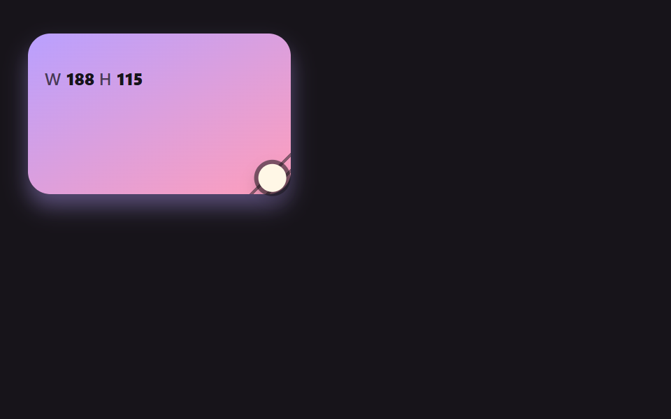 CSS Resize Handle: 9 Demos That Follow Your GripA css resize handle left to the resize property alone cannot change its shape, ignores line height and just stops at the See all demos in this post
If you like this effect - similar demos
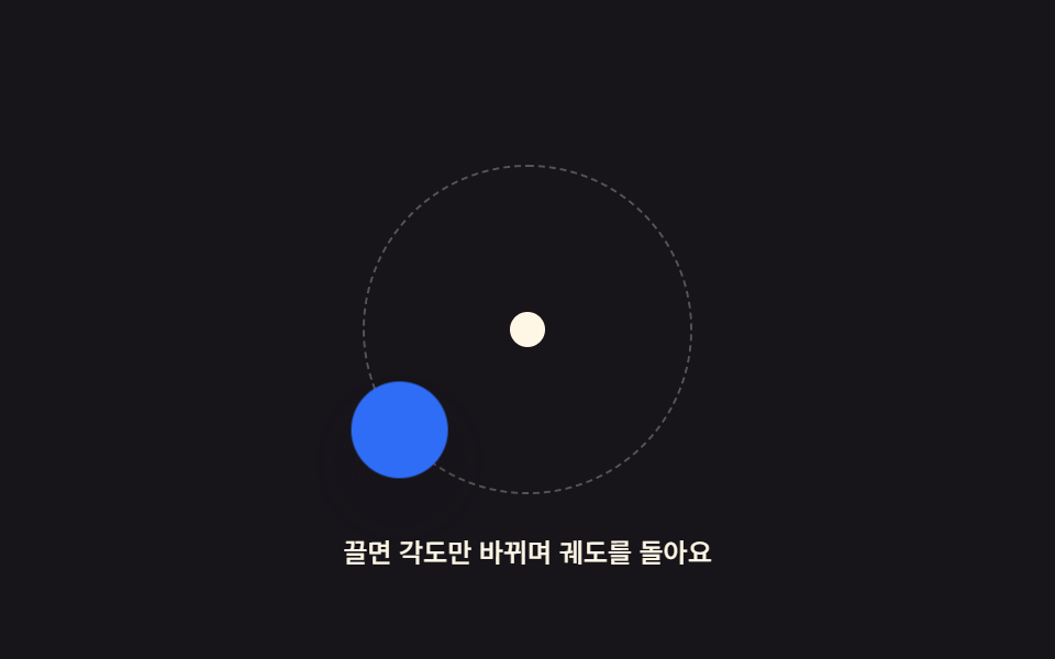 drag05 Orbit-Handle Drag Where Only the Angle Around a Center ChangesDrag and Drop Animation CSS: 9 Physics Patterns
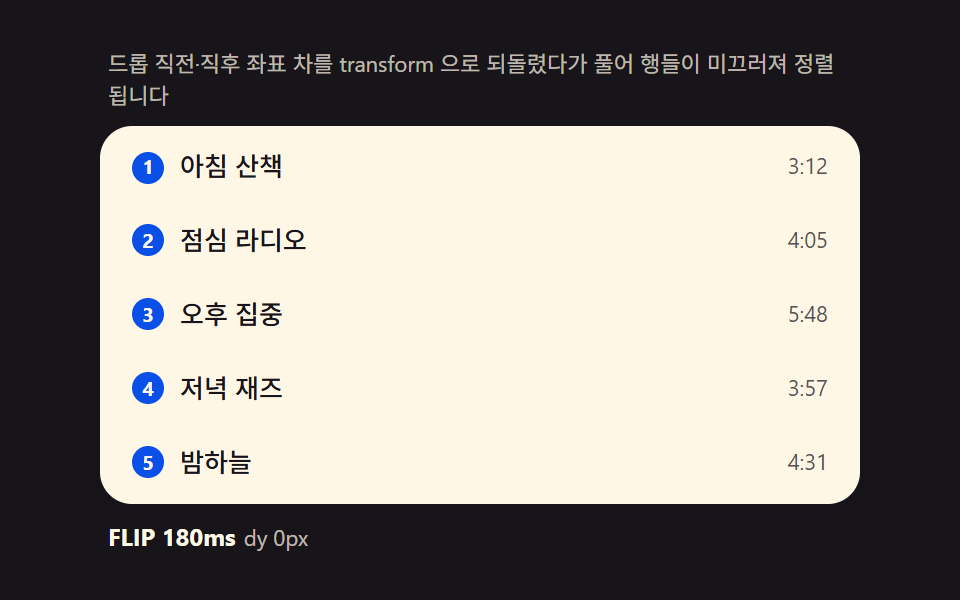 drag01 FLIP list — computing the before/after offset and releasing it into a transitionDrag to Reorder UI: 9 Lists, One Drop Index
 drag01 Image drop — an instant preview drawn from an object URL the moment it landsDrag and Drop File Upload UI: 9 Computed Dropzones