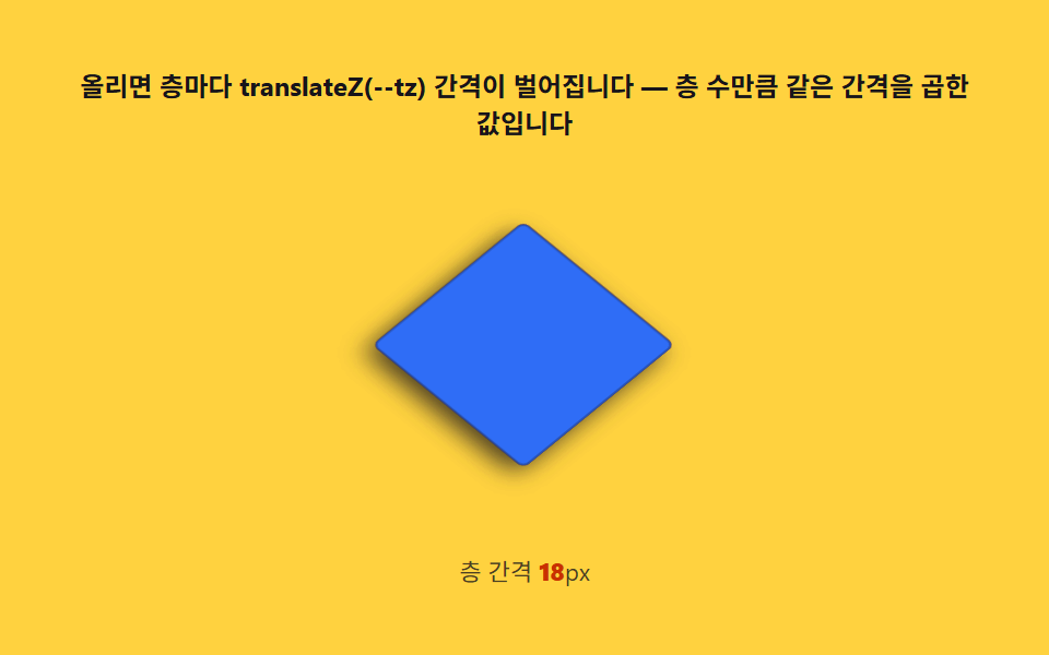
06Exploded view — a hover that reuses depth order as spread distance
Multiply the layer number from item 04 by a spread step to set each translateZ target, so on hover, higher layers push out farther — an exploded diagram. Reversing uses the same layer numbers to guarantee order, so layers never pop through each other.
Best forProduct structure explainers, onboarding
translateZtransitionCSS custom properties
<main class="stage">
<div class="ev" id="ev">
  <p class="ev__hint">On hover, each layer separates by a translateZ(--tz) gap — the same gap multiplied by its layer index</p>
  <div class="ev__field" role="group" tabindex="0" aria-label="Scene where four layers explode apart on hover and collapse back when released" id="field">
    <div class="ev__world" id="world"></div>
  </div>
  <p class="ev__meta">Layer gap  <b id="gap">0</b>px</p>
</div>
</main>
@use "../../../../site/static/demo-tokens" as *;
// 분해도 호버(06) — 무대는 노랑. 네 층을 겹쳐 두고 --tz-open 값(층마다 GAP 배수, 한 번만
// 계산)까지 translateZ 로 밀어 올린다. 실제 사용자는 :hover·:focus-visible 로, 캡처는
// is-open 클래스 토글로 같은 transition 을 재생한다.
$duration: $dur-enter;
$easing: $ease-spring;
$color: $subject-ink;
@include stage($stage-yellow);
.ev {
display: flex; flex-direction: column; align-items: center; gap: $sp-2;
width: 100%; max-width: 420px;
}
.ev__hint {
margin: 0; font-weight: 700; font-size: clamp(10px, 2.6vw, 12px); line-height: 1.35;
color: $subject-ink; text-align: center;
}
.ev__field {
position: relative;
width: clamp(160px, 38vw, 200px); height: clamp(150px, 36vw, 180px);
display: grid; place-items: center;
border-radius: $r-sm;
outline: none;
}
.ev__field:focus-visible { box-shadow: 0 0 0 2px rgba($subject-ink, .5); }
.ev__world {
position: relative;
transform-style: preserve-3d;
transform: rotateX(-35.264deg) rotateZ(45deg);
width: 1px; height: 1px;
}
.ev__layer {
position: absolute; left: 0; top: 0;
width: var(--w); height: var(--w);
transform: translate3d(-50%, -50%, 0);
transition: transform $duration $easing;
border: 1px solid rgba($subject-ink, .3);
border-radius: $r-xs;
box-shadow: $shadow-press;
}
.ev__layer--roof { background: $subject-orange-deep; }
.ev__layer--attic { background: $subject-cream; }
.ev__layer--room { background: $subject-sky; }
.ev__layer--floor { background: $subject-blue; }
.ev__field:hover .ev__layer,
.ev__field:focus-visible .ev__layer,
.ev__field.is-open .ev__layer {
transform: translate3d(-50%, -50%, var(--tz-open));
}
.ev__meta { margin: 0; font-size: clamp(9px, 2.4vw, 11px); color: rgba($subject-ink, .78); }
.ev__meta b { font-weight: 800; color: $subject-orange-deep; font-variant-numeric: tabular-nums; }
@media (max-width: 340px) {
.ev { gap: $sp-1; }
.ev__field { width: 140px; height: 128px; }
.ev__hint { font-size: 8px; }
.ev__meta { font-size: 7px; }
}
// reduce — 열고 닫는 transition 이 멎는다. 겹친(닫힌) 정지 상태만 남긴다.
@media (prefers-reduced-motion: reduce) {
.ev.is-still .ev__layer { transition: none; }
}html, body {
margin: 0;
overflow: hidden;
}
.stage {
box-sizing: border-box;
min-height: 100vh;
display: grid;
place-items: center;
margin: 0;
background: #ffd23f;
font-family: -apple-system, "Segoe UI", "Noto Sans KR", sans-serif;
padding: clamp(8px, 4vw, 24px);
}
.ev {
display: flex;
flex-direction: column;
align-items: center;
gap: 8px;
width: 100%;
max-width: 420px;
}
.ev__hint {
margin: 0;
font-weight: 700;
font-size: clamp(10px, 2.6vw, 12px);
line-height: 1.35;
color: #17141a;
text-align: center;
}
.ev__field {
position: relative;
width: clamp(160px, 38vw, 200px);
height: clamp(150px, 36vw, 180px);
display: grid;
place-items: center;
border-radius: 8px;
outline: none;
}
.ev__field:focus-visible {
box-shadow: 0 0 0 2px rgba(23, 20, 26, 0.5);
}
.ev__world {
position: relative;
transform-style: preserve-3d;
transform: rotateX(-35.264deg) rotateZ(45deg);
width: 1px;
height: 1px;
}
.ev__layer {
position: absolute;
left: 0;
top: 0;
width: var(--w);
height: var(--w);
transform: translate3d(-50%, -50%, 0);
transition: transform 600ms cubic-bezier(0.2, 0.8, 0.2, 1);
border: 1px solid rgba(23, 20, 26, 0.3);
border-radius: 4px;
box-shadow: 0 6px 12px rgba(23, 20, 26, 0.32);
}
.ev__layer--roof {
background: #c93000;
}
.ev__layer--attic {
background: #fff7e6;
}
.ev__layer--room {
background: #6ec8ff;
}
.ev__layer--floor {
background: #2f6df6;
}
.ev__field:hover .ev__layer,
.ev__field:focus-visible .ev__layer,
.ev__field.is-open .ev__layer {
transform: translate3d(-50%, -50%, var(--tz-open));
}
.ev__meta {
margin: 0;
font-size: clamp(9px, 2.4vw, 11px);
color: rgba(23, 20, 26, 0.78);
}
.ev__meta b {
font-weight: 800;
color: #c93000;
font-variant-numeric: tabular-nums;
}
@media (max-width: 340px) {
.ev {
gap: 4px;
}
.ev__field {
width: 140px;
height: 128px;
}
.ev__hint {
font-size: 8px;
}
.ev__meta {
font-size: 7px;
}
}
@media (prefers-reduced-motion: reduce) {
.ev.is-still .ev__layer {
transition: none;
}
}// 분해도 호버(06) — 층 i 의 목표 translateZ 는 i * GAP 로 한 번만 정해 둔다. 실제 사용자는
// :hover/:focus-visible 로 켠다(진짜 transition). 캡처(headless)에는 포인터가 없으므로
// setInterval 로 같은 클래스(is-open)를 2초 주기로 여닫아 같은 transition 을 재생시킨다 —
// 페이지 로드 150ms 시점엔 아직 켜지지 않아 애니메이션 0개로 시작하고, 실시간으로 진행된다.
(function () {
var root = document.getElementById('ev');
var field = document.getElementById('field');
var world = document.getElementById('world');
var gapEl = document.getElementById('gap');
if (!root || !field || !world || !gapEl) return;
var mm = window.matchMedia('(max-width: 340px)').matches;
var GAP = mm ? 12 : 18;
gapEl.textContent = String(GAP);
var LAYERS = [
{ name: 'roof', w: 96 },
{ name: 'attic', w: 84 },
{ name: 'room', w: 84 },
{ name: 'floor', w: 96 }
];
for (var i = 0; i < LAYERS.length; i++) {
var layer = document.createElement('div');
layer.className = 'ev__layer ev__layer--' + LAYERS[i].name;
layer.style.setProperty('--w', (mm ? LAYERS[i].w * 0.78 : LAYERS[i].w) + 'px');
// 역순 — 지붕(roof)이 가장 위 층이라 벌어질 때 가장 많이 올라가야 한다
layer.style.setProperty('--tz-open', (GAP * (LAYERS.length - i)) + 'px');
world.appendChild(layer);
}
var reduce = window.matchMedia('(prefers-reduced-motion: reduce)').matches;
if (reduce) {
root.classList.add('is-still');
return;
}
var open = false;
function toggle() {
open = !open;
field.classList.toggle('is-open', open);
}
setInterval(toggle, 1000); // 1초마다 여닫기 — 2초 캡처 창에 정확히 한 번의 열림+닫힘
})();// IsometricExplodedViewHover — vanilla 판(run/333/demo/06-isometric-exploded-view-hover/index.html)
// 의 React 포트. 층마다 --tz-open = GAP * (층 수 - i) 를 한 번만 계산해 고정하고,
// 실제 hover/focus-visible 로 열리게 두되, 캡처용으로 1초 간격 setInterval 토글을 더한다.
import { useEffect, useRef } from "react";
import styles from "./IsometricExplodedViewHover.module.scss";
export type IsometricExplodedViewHoverProps = {
duration?: string;
easing?: string;
color?: string;
};
type Box<T> = { current: T };
const HINT = "올리면 층마다 translateZ(--tz) 간격이 벌어집니다 — 층 수만큼 같은 간격을 곱한 값입니다";
const ARIA_FIELD = "올리면 네 개 층이 위로 벌어지는 분해도, 떼면 다시 겹치는 장면";
const LABEL_GAP = "층 간격 ";
const LAYERS = [
{ key: "roof", width: 96, cls: styles.layerRoof },
{ key: "attic", width: 84, cls: styles.layerAttic },
{ key: "room", width: 84, cls: styles.layerRoom },
{ key: "floor", width: 96, cls: styles.layerFloor }
];
export default function IsometricExplodedViewHover({
duration = "600ms",
easing = "cubic-bezier(.2,.8,.2,1)",
color = "#c93000"
}: IsometricExplodedViewHoverProps) {
const rootRef = useRef<HTMLDivElement | null>(null);
const fieldRef = useRef<HTMLDivElement | null>(null);
const gapRef = useRef<HTMLElement | null>(null);
const timerRef = useRef(0) as Box<number>;
useEffect(() => {
const field = fieldRef.current;
const root = rootRef.current;
if (!field || !root) return;
const mm = window.matchMedia("(max-width: 340px)").matches;
const GAP = mm ? 12 : 18;
if (gapRef.current) gapRef.current.textContent = String(GAP);
const layerEls = Array.from(field.querySelectorAll<HTMLDivElement>("[data-layer]"));
layerEls.forEach((el, i) => {
const tz = GAP * (LAYERS.length - i);
el.style.setProperty("--tz-open", tz + "px");
});
const reduce = window.matchMedia("(prefers-reduced-motion: reduce)").matches;
if (reduce) {
root.classList.add(styles.isStill);
return;
}
function toggle(): void {
if (!field) return;
field.classList.toggle(styles.isOpen);
}
timerRef.current = window.setInterval(toggle, 1000);
return () => window.clearInterval(timerRef.current);
// eslint-disable-next-line react-hooks/exhaustive-deps
}, []);
return (
<main className={styles.stage}>
<div className={styles.ev} ref={rootRef} data-duration={duration} data-easing={easing} data-color={color}>
<p className={styles.hint}>{HINT}</p>
<div className={styles.field} ref={fieldRef} role="img" aria-label={ARIA_FIELD} tabIndex={0}>
{LAYERS.map((l) => (
<div
key={l.key}
data-layer={l.key}
className={styles.layer + " " + l.cls}
style={{ width: l.width + "px" }}
></div>
))}
</div>
<p className={styles.meta}>
<span className={styles.metaLabel}>{LABEL_GAP}</span>
<b className={styles.gapVal} ref={gapRef}>18</b>px
</p>
</div>
</main>
);
}06 Exploded view — a hover that reuses depth order as spread distance — Measured area 11.103% · moving frames 12/23Original by GODRICH · SCSS and React ship in the zip · Isometric CSS: 9 True-Projection 3D Dioramas
The post this demo lives in
 Isometric CSS: 9 True-Projection 3D DioramasIsometric css done right: Each cube face shades by a light-angle calc, grid coords map to screen via the 2:1 isometric f See all demos in this post