07The room diorama — a finished scene assembled from 01-04
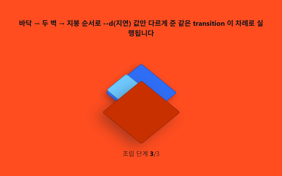
Desk, chair, window and lamp blocks are placed on the grid coordinate system, each carrying the same face shading and depth order to complete one room. Only the lamp block animates color, giving the still scene a pulse of life.
Best forPortfolio heroes, about sections
matrix3dCSS custom propertiestransition
<main class="stage">
<div class="rb" id="rb">
  <p class="rb__hint">Floor → two walls → roof — the same transition runs in sequence, each with only its --d (delay) value different</p>
  <div class="rb__field" role="group" tabindex="0" aria-label="Scene where two walls rise on a floor and a roof closes to assemble a room" id="field">
    <div class="rb__world" id="world">
      <div class="rb__floor"></div>
      <div class="rb__wall rb__wall--left" style="--d:0ms"></div>
      <div class="rb__wall rb__wall--right" style="--d:140ms"></div>
      <div class="rb__roof" style="--d:320ms"></div>
    </div>
  </div>
  <p class="rb__meta">Build step  <b id="step">0</b>/3</p>
</div>
</main>
@use "../../../../site/static/demo-tokens" as *;
// 방 조립(07) — 무대는 주황. 세계 좌표계(matrix3d) 는 고정, 바닥은 그대로 두고 두 벽은
// scaleY(바닥 기준 transform-origin: bottom) 로 눕힌 상태에서 서는 상태로, 지붕은
// translateZ 로 위에서 내려앉는다. 셋 다 같은 transition 이고 --d(지연) 만 다르다.
$duration: $dur-enter;
$easing: $ease-spring;
$color: $subject-cream;
@include stage($stage-orange);
.rb {
display: flex; flex-direction: column; align-items: center; gap: $sp-2;
width: 100%; max-width: 420px;
}
.rb__hint {
margin: 0; font-weight: 700; font-size: clamp(10px, 2.6vw, 12px); line-height: 1.35;
color: $subject-ink; text-align: center;
}
.rb__field {
position: relative;
width: clamp(180px, 42vw, 220px); height: clamp(150px, 36vw, 178px);
display: grid; place-items: center;
border-radius: $r-sm;
outline: none;
}
.rb__field:focus-visible { box-shadow: 0 0 0 2px rgba($subject-ink, .5); }
.rb__world { position: relative; transform-style: preserve-3d; width: 1px; height: 1px; }
.rb__floor {
position: absolute; left: 0; top: 0;
width: 84px; height: 84px;
transform: translate3d(-50%, -50%, 0);
background: $subject-blue;
border: 1px solid rgba($subject-ink, .3);
border-radius: $r-xs;
box-shadow: $shadow-press;
}
.rb__wall {
position: absolute; left: 0; top: 0;
width: 56px; height: 46px;
transform-origin: bottom center;
transition: transform $duration $easing;
transition-delay: var(--d, 0ms);
border: 1px solid rgba($subject-ink, .3);
border-radius: $r-xs;
}
.rb__wall--left {
background: $subject-sky;
transform: translate3d(-46px, -10px, 0) scaleY(.06);
}
.rb__wall--right {
background: $subject-mint;
transform: translate3d(2px, -10px, 0) scaleY(.06);
}
.rb__field.is-open .rb__wall--left { transform: translate3d(-46px, -10px, 0) scaleY(1); }
.rb__field.is-open .rb__wall--right { transform: translate3d(2px, -10px, 0) scaleY(1); }
.rb__roof {
position: absolute; left: 0; top: 0;
width: 92px; height: 92px;
transform: translate3d(-50%, -50%, 120px);
transition: transform $duration $easing;
transition-delay: var(--d, 0ms);
background: $subject-orange-deep;
border: 1px solid rgba($subject-ink, .3);
border-radius: $r-xs;
box-shadow: $shadow-raised;
}
.rb__field.is-open .rb__roof { transform: translate3d(-50%, -50%, 58px); }
.rb__meta { margin: 0; font-size: clamp(9px, 2.4vw, 11px); color: rgba($subject-ink, .82); }
.rb__meta b { font-weight: 800; color: $subject-ink; font-variant-numeric: tabular-nums; }
@media (max-width: 340px) {
.rb { gap: $sp-1; }
.rb__field { width: 156px; height: 124px; }
.rb__hint { font-size: 8px; }
.rb__meta { font-size: 7px; }
}
// reduce — 조립 transition 이 멎는다. 접힌(해체) 정지 상태만 남긴다.
@media (prefers-reduced-motion: reduce) {
.rb.is-still .rb__wall,
.rb.is-still .rb__roof { transition: none; }
}html, body {
margin: 0;
overflow: hidden;
}
.stage {
box-sizing: border-box;
min-height: 100vh;
display: grid;
place-items: center;
margin: 0;
background: #ff4d1f;
font-family: -apple-system, "Segoe UI", "Noto Sans KR", sans-serif;
padding: clamp(8px, 4vw, 24px);
}
.rb {
display: flex;
flex-direction: column;
align-items: center;
gap: 8px;
width: 100%;
max-width: 420px;
}
.rb__hint {
margin: 0;
font-weight: 700;
font-size: clamp(10px, 2.6vw, 12px);
line-height: 1.35;
color: #17141a;
text-align: center;
}
.rb__field {
position: relative;
width: clamp(180px, 42vw, 220px);
height: clamp(150px, 36vw, 178px);
display: grid;
place-items: center;
border-radius: 8px;
outline: none;
}
.rb__field:focus-visible {
box-shadow: 0 0 0 2px rgba(23, 20, 26, 0.5);
}
.rb__world {
position: relative;
transform-style: preserve-3d;
width: 1px;
height: 1px;
}
.rb__floor {
position: absolute;
left: 0;
top: 0;
width: 84px;
height: 84px;
transform: translate3d(-50%, -50%, 0);
background: #2f6df6;
border: 1px solid rgba(23, 20, 26, 0.3);
border-radius: 4px;
box-shadow: 0 6px 12px rgba(23, 20, 26, 0.32);
}
.rb__wall {
position: absolute;
left: 0;
top: 0;
width: 56px;
height: 46px;
transform-origin: bottom center;
transition: transform 600ms cubic-bezier(0.2, 0.8, 0.2, 1);
transition-delay: var(--d, 0ms);
border: 1px solid rgba(23, 20, 26, 0.3);
border-radius: 4px;
}
.rb__wall--left {
background: #6ec8ff;
transform: translate3d(-46px, -10px, 0) scaleY(0.06);
}
.rb__wall--right {
background: #4cd4a6;
transform: translate3d(2px, -10px, 0) scaleY(0.06);
}
.rb__field.is-open .rb__wall--left {
transform: translate3d(-46px, -10px, 0) scaleY(1);
}
.rb__field.is-open .rb__wall--right {
transform: translate3d(2px, -10px, 0) scaleY(1);
}
.rb__roof {
position: absolute;
left: 0;
top: 0;
width: 92px;
height: 92px;
transform: translate3d(-50%, -50%, 120px);
transition: transform 600ms cubic-bezier(0.2, 0.8, 0.2, 1);
transition-delay: var(--d, 0ms);
background: #c93000;
border: 1px solid rgba(23, 20, 26, 0.3);
border-radius: 4px;
box-shadow: 0 14px 24px rgba(23, 20, 26, 0.32);
}
.rb__field.is-open .rb__roof {
transform: translate3d(-50%, -50%, 58px);
}
.rb__meta {
margin: 0;
font-size: clamp(9px, 2.4vw, 11px);
color: rgba(23, 20, 26, 0.82);
}
.rb__meta b {
font-weight: 800;
color: #17141a;
font-variant-numeric: tabular-nums;
}
@media (max-width: 340px) {
.rb {
gap: 4px;
}
.rb__field {
width: 156px;
height: 124px;
}
.rb__hint {
font-size: 8px;
}
.rb__meta {
font-size: 7px;
}
}
@media (prefers-reduced-motion: reduce) {
.rb.is-still .rb__wall,
.rb.is-still .rb__roof {
transition: none;
}
}// 방 조립(07) — 세계 좌표계 자체는 matrix3d(고정 등각 행렬, JS 로 한 번 계산)로 눕혀 두고,
// 그 안의 바닥·벽·지붕은 각자 --d(지연) 만 다르게 받은 같은 transition 으로 차례로 선다.
// 계산은 지연값 배정 한 번뿐 — 실행은 CSS 가 한다. 캡처는 06 과 같은 방식으로 1초마다
// is-open 을 토글해 2초 창에 조립 1회를 재생한다.
(function () {
var root = document.getElementById('rb');
var field = document.getElementById('field');
var world = document.getElementById('world');
var stepEl = document.getElementById('step');
if (!root || !field || !world || !stepEl) return;
function mat4RotateX(deg) {
var r = deg * Math.PI / 180, c = Math.cos(r), s = Math.sin(r);
return [1, 0, 0, 0, 0, c, s, 0, 0, -s, c, 0, 0, 0, 0, 1];
}
function mat4RotateZ(deg) {
var r = deg * Math.PI / 180, c = Math.cos(r), s = Math.sin(r);
return [c, s, 0, 0, -s, c, 0, 0, 0, 0, 1, 0, 0, 0, 0, 1];
}
function mat4Mul(a, b) {
var out = new Array(16);
for (var col = 0; col < 4; col++) {
for (var row = 0; row < 4; row++) {
var sum = 0;
for (var k = 0; k < 4; k++) sum += a[k * 4 + row] * b[col * 4 + k];
out[col * 4 + row] = sum;
}
}
return out;
}
function mat4ToCss(m) {
var s = '';
for (var i = 0; i < m.length; i++) s += (i ? ',' : '') + m[i].toFixed(6);
return 'matrix3d(' + s + ')';
}
// 세계 좌표계는 한 번만 계산해 고정한다 — 조립 애니메이션과는 무관한 값
world.style.transform = mat4ToCss(mat4Mul(mat4RotateX(-35.264), mat4RotateZ(45)));
var reduce = window.matchMedia('(prefers-reduced-motion: reduce)').matches;
if (reduce) {
root.classList.add('is-still');
stepEl.textContent = '3';
return;
}
var open = false;
function toggle() {
open = !open;
field.classList.toggle('is-open', open);
stepEl.textContent = open ? '3' : '0';
}
setInterval(toggle, 1000); // 1초마다 조립/해체 — 2초 캡처 창에 한 번의 조립을 담는다
})();// IsometricRoomSceneBuild — vanilla 판(run/333/demo/07-isometric-room-scene-build/index.html)
// 의 React 포트. 등각 세계 행렬은 한 번만 계산해 고정하고, 바닥 → 두 벽 → 지붕 순서로
// --d(지연)만 다르게 준 같은 transition 을 setInterval 토글로 반복 재생한다.
import { useEffect, useRef } from "react";
import type { CSSProperties } from "react";
import styles from "./IsometricRoomSceneBuild.module.scss";
export type IsometricRoomSceneBuildProps = {
duration?: string;
easing?: string;
color?: string;
};
type Vars = CSSProperties & { "--d"?: string };
type Box<T> = { current: T };
const HINT = "바닥 → 두 벽 → 지붕 순서로 --d(지연) 값만 다르게 준 같은 transition 이 차례로 실행됩니다";
const ARIA_FIELD = "바닥 위에 두 벽이 서고 지붕이 닫히며 방이 조립되는 장면";
const LABEL_STEP = "조립 단계 ";
const DELAYS = { left: 0, right: 140, roof: 320 };
export default function IsometricRoomSceneBuild({
duration = "600ms",
easing = "cubic-bezier(.2,.8,.2,1)",
color = "#2f6df6"
}: IsometricRoomSceneBuildProps) {
const rootRef = useRef<HTMLDivElement | null>(null);
const fieldRef = useRef<HTMLDivElement | null>(null);
const stepRef = useRef<HTMLElement | null>(null);
const timerRef = useRef(0) as Box<number>;
useEffect(() => {
const field = fieldRef.current;
const root = rootRef.current;
if (!field || !root) return;
const reduce = window.matchMedia("(prefers-reduced-motion: reduce)").matches;
if (reduce) {
field.classList.add(styles.isOpen);
if (stepRef.current) stepRef.current.textContent = "3";
root.classList.add(styles.isStill);
return;
}
function toggle(): void {
if (!field) return;
const open = field.classList.toggle(styles.isOpen);
if (stepRef.current) stepRef.current.textContent = open ? "3" : "0";
}
timerRef.current = window.setInterval(toggle, 1400);
return () => window.clearInterval(timerRef.current);
// eslint-disable-next-line react-hooks/exhaustive-deps
}, []);
return (
<main className={styles.stage}>
<div className={styles.rb} ref={rootRef} data-duration={duration} data-easing={easing} data-color={color}>
<p className={styles.hint}>{HINT}</p>
<div className={styles.field} ref={fieldRef} role="img" aria-label={ARIA_FIELD} tabIndex={0}>
<div className={styles.floor}></div>
<div className={styles.wallLeft} style={{ "--d": DELAYS.left + "ms" } as Vars}></div>
<div className={styles.wallRight} style={{ "--d": DELAYS.right + "ms" } as Vars}></div>
<div className={styles.roof} style={{ "--d": DELAYS.roof + "ms" } as Vars}></div>
</div>
<p className={styles.meta}>
<span className={styles.metaLabel}>{LABEL_STEP}</span>
<b className={styles.stepVal} ref={stepRef}>0</b>
<span className={styles.metaUnit}>/3</span>
</p>
</div>
</main>
);
}07 The room diorama — a finished scene assembled from 01-04 — Measured area 9.435% · moving frames 16/23Original by GODRICH · SCSS and React ship in the zip · Isometric CSS: 9 True-Projection 3D Dioramas
The post this demo lives in
 Isometric CSS: 9 True-Projection 3D DioramasIsometric css done right: Each cube face shades by a light-angle calc, grid coords map to screen via the 2:1 isometric f See all demos in this post