05A fancy particle mouse — DOM confetti
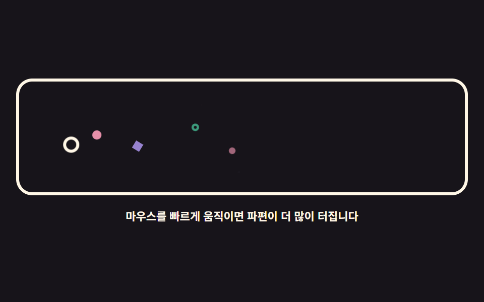
No canvas: span shards burst in proportion to cursor speed and fly off with an element.animate() call, then vanish.
Best forDecorative cursor over sale and festival banners
element.animate()pointermoveopacity
<main class="stage">
<div class="pb is-demo" id="pb">
  <div class="pb__field" role="img" aria-label="A white ring moves the cursor and colorful shards burst behind it">
    <span class="pb__cursor" id="pbCursor" aria-hidden="true"></span>
    <span class="pb__p pb__p--dot" aria-hidden="true"></span>
    <span class="pb__p pb__p--ring" aria-hidden="true"></span>
    <span class="pb__p pb__p--dot" aria-hidden="true"></span>
    <span class="pb__p pb__p--gem" aria-hidden="true"></span>
    <span class="pb__p pb__p--dot" aria-hidden="true"></span>
    <span class="pb__p pb__p--ring" aria-hidden="true"></span>
    <span class="pb__p pb__p--gem" aria-hidden="true"></span>
    <span class="pb__p pb__p--dot" aria-hidden="true"></span>
  </div>
  <p class="pb__hint">Move the mouse faster and more shards burst</p>
</div>
</main>
@use "../../../../site/static/demo-tokens" as *;
// 화려한 파티클 마우스 — 캔버스 없이 span 파편을 pool 로 돌려 쓴다.
// 실제 조작은 커서 이동 거리를 쌓아 26px마다 파편 하나를 Element.animate(WAAPI)로 터뜨린다.
// 격자 미리보기(.is-demo)는 커서 고리가 좌우로 지나가고 파편 여덟이 그 자리에서 흩어지는 루프다.
$duration: $dur-loop;
$easing: $ease-out;
$color: $subject-cream;
@include stage($stage-ink);
.pb { display: grid; justify-items: center; gap: $sp-3; width: 100%; }
.pb__field {
position: relative; overflow: hidden;
width: 100%; height: clamp(110px, 32vh, 160px);
border: 3px solid $color; border-radius: $r-card;
}
.pb__cursor {
position: absolute; left: 0; top: 0;
width: 16px; height: 16px; box-sizing: border-box;
border: 3px solid $color; border-radius: 50%;
will-change: transform;
}
// 파편 세 모양 — 점·고리·마름모 (아이콘이 아니라 기하 도형이다). 색은 --pc 로 받는다
.pb__p {
position: absolute; left: 0; top: 0;
width: 10px; height: 10px;
opacity: 0;
will-change: transform, opacity;
}
.pb__p--dot { background: var(--pc, $subject-pink); border-radius: 50%; }
.pb__p--ring {
box-sizing: border-box;
background: transparent; border: 3px solid var(--pc, $subject-mint); border-radius: 50%;
}
.pb__p--gem { background: var(--pc, $subject-lilac); transform: rotate(45deg); }
.pb__hint { margin: 0; color: $color; font-weight: 700; font-size: clamp(9px, 2.4vw, 11px); }
// ── 미리보기 루프: 커서 고리가 왼쪽 → 오른쪽으로 지나가고, 파편이 그 뒤에서 흩어진다
.pb.is-demo .pb__cursor { animation: pbCursor $duration $ease-spring infinite; }
.pb.is-demo .pb__p { animation: pbFly $duration $easing infinite; }
@keyframes pbCursor {
0%, 4% { transform: translate3d(24px, 56px, 0); }
46%, 52% { transform: translate3d(236px, 42px, 0); }
88%, 100% { transform: translate3d(24px, 56px, 0); }
}
// 파편마다 시작점(키프레임 안 px)과 delay 를 달리해 한 번에 쏟아지지 않게 한다
.pb.is-demo .pb__p:nth-child(2) { animation-delay: 0ms; animation-name: pbA; }
.pb.is-demo .pb__p:nth-child(3) { animation-delay: 90ms; animation-name: pbB; }
.pb.is-demo .pb__p:nth-child(4) { animation-delay: 180ms; animation-name: pbC; }
.pb.is-demo .pb__p:nth-child(5) { animation-delay: 250ms; animation-name: pbD; }
.pb.is-demo .pb__p:nth-child(6) { animation-delay: 1000ms; animation-name: pbE; }
.pb.is-demo .pb__p:nth-child(7) { animation-delay: 1090ms; animation-name: pbF; }
.pb.is-demo .pb__p:nth-child(8) { animation-delay: 1170ms; animation-name: pbG; }
.pb.is-demo .pb__p:nth-child(9) { animation-delay: 1250ms; animation-name: pbH; }
@keyframes pbA {
0% { transform: translate3d(60px, 56px, 0) rotate(0deg) scale(1); opacity: 1; }
62%, 100% { transform: translate3d(96px, 20px, 0) rotate(160deg) scale(.15); opacity: 0; }
}
@keyframes pbB {
0% { transform: translate3d(100px, 48px, 0) rotate(0deg) scale(1); opacity: 1; }
62%, 100% { transform: translate3d(140px, 92px, 0) rotate(200deg) scale(.15); opacity: 0; }
}
@keyframes pbC {
0% { transform: translate3d(140px, 54px, 0) rotate(0deg) scale(1); opacity: 1; }
62%, 100% { transform: translate3d(176px, 18px, 0) rotate(140deg) scale(.15); opacity: 0; }
}
@keyframes pbD {
0% { transform: translate3d(180px, 46px, 0) rotate(0deg) scale(1); opacity: 1; }
62%, 100% { transform: translate3d(214px, 86px, 0) rotate(220deg) scale(.15); opacity: 0; }
}
@keyframes pbE {
0% { transform: translate3d(220px, 46px, 0) rotate(0deg) scale(1); opacity: 1; }
62%, 100% { transform: translate3d(186px, 90px, 0) rotate(180deg) scale(.15); opacity: 0; }
}
@keyframes pbF {
0% { transform: translate3d(180px, 52px, 0) rotate(0deg) scale(1); opacity: 1; }
62%, 100% { transform: translate3d(146px, 14px, 0) rotate(210deg) scale(.15); opacity: 0; }
}
@keyframes pbG {
0% { transform: translate3d(120px, 50px, 0) rotate(0deg) scale(1); opacity: 1; }
62%, 100% { transform: translate3d(84px, 94px, 0) rotate(150deg) scale(.15); opacity: 0; }
}
@keyframes pbH {
0% { transform: translate3d(76px, 52px, 0) rotate(0deg) scale(1); opacity: 1; }
62%, 100% { transform: translate3d(40px, 16px, 0) rotate(190deg) scale(.15); opacity: 0; }
}
@media (max-width: 340px) {
.pb { gap: $sp-2; }
.pb__field { height: clamp(96px, 28vh, 130px); }
.pb__p { width: 8px; height: 8px; }
.pb__p--ring { border-width: 2px; }
}
@media (prefers-reduced-motion: reduce) {
.pb.is-demo .pb__cursor,
.pb.is-demo .pb__p { animation: none !important; }
// reduce 에서는 파편이 바닥에 흩어진 정물로 남고 커서 고리만 가운데 있다
.pb.is-demo .pb__cursor { transform: translate3d(120px, 48px, 0) !important; }
.pb.is-demo .pb__p:nth-child(2) { transform: translate3d(60px, 84px, 0) rotate(20deg) scale(1) !important; opacity: 1 !important; }
.pb.is-demo .pb__p:nth-child(4) { transform: translate3d(112px, 92px, 0) rotate(-14deg) scale(1) !important; opacity: 1 !important; }
.pb.is-demo .pb__p:nth-child(6) { transform: translate3d(164px, 88px, 0) rotate(30deg) scale(1) !important; opacity: 1 !important; }
.pb.is-demo .pb__p:nth-child(8) { transform: translate3d(206px, 84px, 0) rotate(-24deg) scale(1) !important; opacity: 1 !important; }
}html, body {
margin: 0;
overflow: hidden;
}
.stage {
box-sizing: border-box;
min-height: 100vh;
display: grid;
place-items: center;
margin: 0;
background: #17141a;
font-family: -apple-system, "Segoe UI", "Noto Sans KR", sans-serif;
padding: clamp(8px, 4vw, 24px);
}
.pb {
display: grid;
justify-items: center;
gap: 12px;
width: 100%;
}
.pb__field {
position: relative;
overflow: hidden;
width: 100%;
height: clamp(110px, 32vh, 160px);
border: 3px solid #fff7e6;
border-radius: 16px;
}
.pb__cursor {
position: absolute;
left: 0;
top: 0;
width: 16px;
height: 16px;
box-sizing: border-box;
border: 3px solid #fff7e6;
border-radius: 50%;
will-change: transform;
}
.pb__p {
position: absolute;
left: 0;
top: 0;
width: 10px;
height: 10px;
opacity: 0;
will-change: transform, opacity;
}
.pb__p--dot {
background: var(--pc, #ff9ebb);
border-radius: 50%;
}
.pb__p--ring {
box-sizing: border-box;
background: transparent;
border: 3px solid var(--pc, #4cd4a6);
border-radius: 50%;
}
.pb__p--gem {
background: var(--pc, #b9a0ff);
transform: rotate(45deg);
}
.pb__hint {
margin: 0;
color: #fff7e6;
font-weight: 700;
font-size: clamp(9px, 2.4vw, 11px);
}
.pb.is-demo .pb__cursor {
animation: pbCursor 2s cubic-bezier(0.2, 0.8, 0.2, 1) infinite;
}
.pb.is-demo .pb__p {
animation: pbFly 2s ease-out infinite;
}
@keyframes pbCursor {
0%, 4% {
transform: translate3d(24px, 56px, 0);
}
46%, 52% {
transform: translate3d(236px, 42px, 0);
}
88%, 100% {
transform: translate3d(24px, 56px, 0);
}
}
.pb.is-demo .pb__p:nth-child(2) {
animation-delay: 0ms;
animation-name: pbA;
}
.pb.is-demo .pb__p:nth-child(3) {
animation-delay: 90ms;
animation-name: pbB;
}
.pb.is-demo .pb__p:nth-child(4) {
animation-delay: 180ms;
animation-name: pbC;
}
.pb.is-demo .pb__p:nth-child(5) {
animation-delay: 250ms;
animation-name: pbD;
}
.pb.is-demo .pb__p:nth-child(6) {
animation-delay: 1000ms;
animation-name: pbE;
}
.pb.is-demo .pb__p:nth-child(7) {
animation-delay: 1090ms;
animation-name: pbF;
}
.pb.is-demo .pb__p:nth-child(8) {
animation-delay: 1170ms;
animation-name: pbG;
}
.pb.is-demo .pb__p:nth-child(9) {
animation-delay: 1250ms;
animation-name: pbH;
}
@keyframes pbA {
0% {
transform: translate3d(60px, 56px, 0) rotate(0deg) scale(1);
opacity: 1;
}
62%, 100% {
transform: translate3d(96px, 20px, 0) rotate(160deg) scale(0.15);
opacity: 0;
}
}
@keyframes pbB {
0% {
transform: translate3d(100px, 48px, 0) rotate(0deg) scale(1);
opacity: 1;
}
62%, 100% {
transform: translate3d(140px, 92px, 0) rotate(200deg) scale(0.15);
opacity: 0;
}
}
@keyframes pbC {
0% {
transform: translate3d(140px, 54px, 0) rotate(0deg) scale(1);
opacity: 1;
}
62%, 100% {
transform: translate3d(176px, 18px, 0) rotate(140deg) scale(0.15);
opacity: 0;
}
}
@keyframes pbD {
0% {
transform: translate3d(180px, 46px, 0) rotate(0deg) scale(1);
opacity: 1;
}
62%, 100% {
transform: translate3d(214px, 86px, 0) rotate(220deg) scale(0.15);
opacity: 0;
}
}
@keyframes pbE {
0% {
transform: translate3d(220px, 46px, 0) rotate(0deg) scale(1);
opacity: 1;
}
62%, 100% {
transform: translate3d(186px, 90px, 0) rotate(180deg) scale(0.15);
opacity: 0;
}
}
@keyframes pbF {
0% {
transform: translate3d(180px, 52px, 0) rotate(0deg) scale(1);
opacity: 1;
}
62%, 100% {
transform: translate3d(146px, 14px, 0) rotate(210deg) scale(0.15);
opacity: 0;
}
}
@keyframes pbG {
0% {
transform: translate3d(120px, 50px, 0) rotate(0deg) scale(1);
opacity: 1;
}
62%, 100% {
transform: translate3d(84px, 94px, 0) rotate(150deg) scale(0.15);
opacity: 0;
}
}
@keyframes pbH {
0% {
transform: translate3d(76px, 52px, 0) rotate(0deg) scale(1);
opacity: 1;
}
62%, 100% {
transform: translate3d(40px, 16px, 0) rotate(190deg) scale(0.15);
opacity: 0;
}
}
@media (max-width: 340px) {
.pb {
gap: 8px;
}
.pb__field {
height: clamp(96px, 28vh, 130px);
}
.pb__p {
width: 8px;
height: 8px;
}
.pb__p--ring {
border-width: 2px;
}
}
@media (prefers-reduced-motion: reduce) {
.pb.is-demo .pb__cursor,
.pb.is-demo .pb__p {
animation: none !important;
}
.pb.is-demo .pb__cursor {
transform: translate3d(120px, 48px, 0) !important;
}
.pb.is-demo .pb__p:nth-child(2) {
transform: translate3d(60px, 84px, 0) rotate(20deg) scale(1) !important;
opacity: 1 !important;
}
.pb.is-demo .pb__p:nth-child(4) {
transform: translate3d(112px, 92px, 0) rotate(-14deg) scale(1) !important;
opacity: 1 !important;
}
.pb.is-demo .pb__p:nth-child(6) {
transform: translate3d(164px, 88px, 0) rotate(30deg) scale(1) !important;
opacity: 1 !important;
}
.pb.is-demo .pb__p:nth-child(8) {
transform: translate3d(206px, 84px, 0) rotate(-24deg) scale(1) !important;
opacity: 1 !important;
}
}var root = document.getElementById('pb');
var field = root.querySelector('.pb__field');
var cursorEl = document.getElementById('pbCursor');
var pool = Array.prototype.slice.call(root.querySelectorAll('.pb__p'));
var reduce = window.matchMedia('(prefers-reduced-motion: reduce)').matches;
// 오래된 브라우저에서는 파편 없이 커서 고리만 움직이게 둔다 (animate 는 인스턴스 메서드다)
var canAnimate = typeof document.body.animate === 'function';
var colors = ['#ff9ebb', '#4cd4a6', '#b9a0ff', '#6ec8ff', '#ffd23f'];
var shapes = ['pb__p--dot', 'pb__p--ring', 'pb__p--gem'];
var last = null;
var travel = 0;
var next = 0;
// 커서가 이동한 거리를 쌓아 두었다가 26px마다 파편 하나를 터뜨린다 — 속도에 비례한다
function spawn(x, y, dx, dy) {
var element = pool[next];
next = (next + 1) % pool.length;
element.className = 'pb__p ' + shapes[(Math.random() * shapes.length) | 0];
// 모양마다 --pc 를 색으로 쓴다 (점은 배경, 고리는 테두리, 마름모는 배경)
element.style.setProperty('--pc', colors[(Math.random() * colors.length) | 0]);
var ang = Math.atan2(dy, dx) + (Math.random() - 0.5) * 2.4;
var dist = 34 + Math.random() * 46;
var tx = x + Math.cos(ang) * dist;
var ty = y + Math.sin(ang) * dist;
element.animate([
{ transform: 'translate3d(' + (x - 5) + 'px,' + (y - 5) + 'px,0) rotate(0deg) scale(1)', opacity: 1 },
{ transform: 'translate3d(' + (tx - 5) + 'px,' + (ty - 5) + 'px,0) rotate(200deg) scale(.15)', opacity: 0 }
], { duration: 620 + Math.random() * 320, easing: 'cubic-bezier(.2,.8,.2,1)' });
}
function place(cx, cy) {
var r = field.getBoundingClientRect();
var x = cx - r.left;
var y = cy - r.top;
cursorEl.style.transform = 'translate3d(' + (x - 8) + 'px,' + (y - 8) + 'px,0)';
if (last) {
var dx = x - last.x, dy = y - last.y;
travel += Math.sqrt(dx * dx + dy * dy);
while (travel > 26) {
travel -= 26;
if (!reduce && canAnimate) { spawn(x, y, dx, dy); }
}
}
last = { x: x, y: y };
}
window.addEventListener('pointermove', function (e) {
root.classList.remove('is-demo');
place(e.clientX, e.clientY);
});
window.addEventListener('pointerdown', function (e) {
root.classList.remove('is-demo');
last = null;
place(e.clientX, e.clientY);
});// ParticleBurst — vanilla 판(run/079/demo/05-follow-particle-burst/index.html) 의 React 포트.
// 캔버스 없이 span 파편을 pool 로 돌려 쓴다. 커서 이동 거리를 쌓아 26px마다 파편 하나를
// element.animate(WAAPI)로 터뜨린다 — 색 배열·모양·거리·시간은 vanilla 와 같은 값이다.
import { useEffect, useRef, useState } from "react";
import type { CSSProperties } from "react";
import styles from "./ParticleBurst.module.scss";
export type ParticleBurstProps = {
duration?: number;
easing?: string;
color?: string;
};
type Vars = CSSProperties & { "--duration"?: string; "--easing"?: string; "--color"?: string };
// useRef 는 T | null 을 돌려준다. 처음부터 값이 있고 절대 비지 않는 상자는 이렇게 좁혀 쓴다
type Box<T> = { current: T };
// 전역 DOM 타입에 기대지 않는다 — 포인터 이벤트에서 실제로 읽는 것만 적는다
type PtrEvt = { clientX: number; clientY: number };
const FIELD_LABEL = "커서를 흰 고리가 움직이고 그 뒤로 색색의 파편이 터지는 그림";
const HINT = "마우스를 빠르게 움직이면 파편이 더 많이 터집니다";
const POOL_SIZE = 8;
// 커서가 이동한 거리를 쌓아 두었다가 이만큼마다 파편 하나를 터뜨린다 — 속도에 비례한다
const SPAWN_EVERY = 26;
const COLORS = ["#ff9ebb", "#4cd4a6", "#b9a0ff", "#6ec8ff", "#ffd23f"];
// 파편 세 모양 — 점·고리·마름모. module.scss 의 로컬 클래스 이름과 짝이다
const SHAPES = [styles.pDot, styles.pRing, styles.pGem];
export default function ParticleBurst({
duration = 2000,
easing = "ease-out",
color = "#fff7e6",
}: ParticleBurstProps) {
const fieldRef = useRef<HTMLDivElement | null>(null) as Box<HTMLDivElement>;
const cursorRef = useRef<HTMLSpanElement | null>(null);
const poolRef = useRef<(HTMLSpanElement | null)[]>(new Array(POOL_SIZE).fill(null)) as Box<(HTMLSpanElement | null)[]>;
const [demo, setDemo] = useState(true);
const vars: Vars = { "--duration": `${duration}ms`, "--easing": easing, "--color": color };
function setPool(index: number) {
return (el: HTMLSpanElement | null): void => {
poolRef.current[index] = el;
};
}
useEffect(() => {
const field = fieldRef.current;
if (!field) return;
const reduce = window.matchMedia("(prefers-reduced-motion: reduce)").matches;
// 오래된 브라우저에서는 파편 없이 커서 고리만 움직이게 둔다 (animate 는 인스턴스 메서드다)
const canAnimate = typeof document.body.animate === "function";
let last: { x: number; y: number } | null = null;
let travel = 0;
let next = 0;
function spawn(x: number, y: number, dx: number, dy: number): void {
const element = poolRef.current[next];
next = (next + 1) % poolRef.current.length;
if (!element) return;
element.className = styles.p + " " + SHAPES[(Math.random() * SHAPES.length) | 0];
// 모양마다 --pc 를 색으로 쓴다 (점은 배경, 고리는 테두리, 마름모는 배경)
element.style.setProperty("--pc", COLORS[(Math.random() * COLORS.length) | 0]);
const ang = Math.atan2(dy, dx) + (Math.random() - 0.5) * 2.4;
const dist = 34 + Math.random() * 46;
const tx = x + Math.cos(ang) * dist;
const ty = y + Math.sin(ang) * dist;
element.animate(
[
{ transform: "translate3d(" + (x - 5) + "px," + (y - 5) + "px,0) rotate(0deg) scale(1)", opacity: 1 },
{ transform: "translate3d(" + (tx - 5) + "px," + (ty - 5) + "px,0) rotate(200deg) scale(.15)", opacity: 0 },
],
{ duration: 620 + Math.random() * 320, easing: "cubic-bezier(.2,.8,.2,1)" }
);
}
function place(cx: number, cy: number): void {
const r = field.getBoundingClientRect();
const x = cx - r.left;
const y = cy - r.top;
const cursor = cursorRef.current;
if (cursor) cursor.style.transform = "translate3d(" + (x - 8) + "px," + (y - 8) + "px,0)";
if (last) {
const dx = x - last.x;
const dy = y - last.y;
travel += Math.sqrt(dx * dx + dy * dy);
while (travel > SPAWN_EVERY) {
travel -= SPAWN_EVERY;
if (!reduce && canAnimate) {
spawn(x, y, dx, dy);
}
}
}
last = { x: x, y: y };
}
function onMove(event: PtrEvt): void {
setDemo(false);
place(event.clientX, event.clientY);
}
function onDown(event: PtrEvt): void {
setDemo(false);
last = null;
place(event.clientX, event.clientY);
}
window.addEventListener("pointermove", onMove);
window.addEventListener("pointerdown", onDown);
return () => {
window.removeEventListener("pointermove", onMove);
window.removeEventListener("pointerdown", onDown);
};
}, []);
return (
<main className={styles.stage}>
<div className={styles.root + (demo ? " " + styles.isDemo : "")} style={vars}>
<div className={styles.field} ref={fieldRef} role="img" aria-label={FIELD_LABEL}>
<span className={styles.cursor} aria-hidden="true" ref={cursorRef}></span>
<span className={styles.p + " " + styles.pDot} aria-hidden="true" ref={setPool(0)}></span>
<span className={styles.p + " " + styles.pRing} aria-hidden="true" ref={setPool(1)}></span>
<span className={styles.p + " " + styles.pDot} aria-hidden="true" ref={setPool(2)}></span>
<span className={styles.p + " " + styles.pGem} aria-hidden="true" ref={setPool(3)}></span>
<span className={styles.p + " " + styles.pDot} aria-hidden="true" ref={setPool(4)}></span>
<span className={styles.p + " " + styles.pRing} aria-hidden="true" ref={setPool(5)}></span>
<span className={styles.p + " " + styles.pGem} aria-hidden="true" ref={setPool(6)}></span>
<span className={styles.p + " " + styles.pDot} aria-hidden="true" ref={setPool(7)}></span>
</div>
<p className={styles.hint}>{HINT}</p>
</div>
</main>
);
}05 A fancy particle mouse — DOM confetti — Measured area 2.71% · moving frames 23/23Original by GODRICH · SCSS and React ship in the zip · Mouse Follow Effect CSS — 9 Cursor Chasers
The post this demo lives in
 Mouse Follow Effect CSS — 9 Cursor ChasersA mouse follow effect css reads the pointer each frame and lets an element trail it by a beat — the core is one lerp lin See all demos in this post