02Horizontal splitter
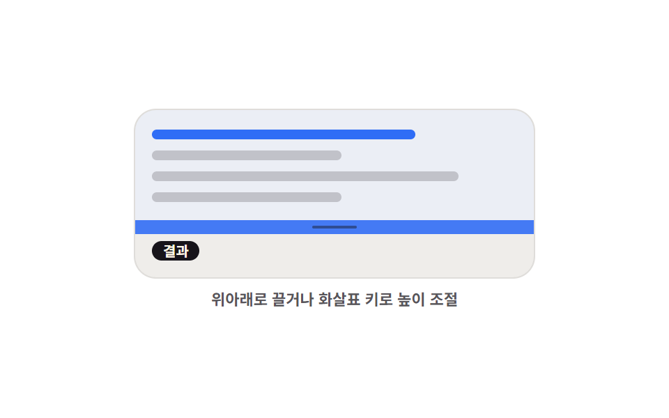
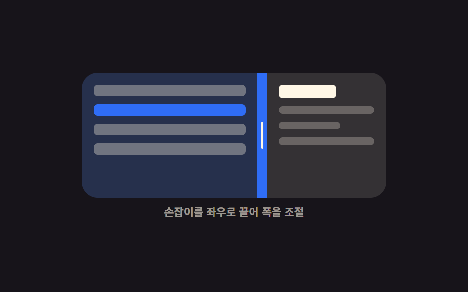
Dragging the handle up or down trades height between the editor area above and the result area below, and the up and down arrow keys move it the same amount.
Best forPlaygrounds and query consoles that stack code above its output
pointermoveclamparia-orientation
<main class="stage">
  <div class="hs is-demo" id="hs-root">
    <div class="hs__box" id="hs-box">
      <section class="hs__pane hs__pane--code" aria-label="Editor area">
        <span class="hs__tok hs__tok--a"></span>
        <span class="hs__tok hs__tok--b"></span>
        <span class="hs__tok hs__tok--c"></span>
        <span class="hs__tok hs__tok--b"></span>
      </section>
      <div class="hs__bar" id="hs-bar" role="separator" tabindex="0"
           aria-orientation="horizontal" aria-label="Editor area height" aria-valuemin="20" aria-valuemax="80" aria-valuenow="50">
        <i class="hs__grip" aria-hidden="true"></i>
      </div>
      <section class="hs__pane hs__pane--out" aria-label="Result area">
        <span class="hs__chip">Result</span>
        <span class="hs__bars"><i></i><i></i><i></i><i></i><i></i></span>
      </section>
    </div>
    <p class="hs__cap">Drag up and down, or use the arrow keys</p>
  </div>
</main>
@use "../../../../site/static/demo-tokens" as *;
$duration: $dur-quick;
$easing: $ease-spring;
$color: $subject-blue;
@include stage($stage-paper);
@property --splitY {
syntax: "<percentage>";
inherits: true;
initial-value: 50%;
}
.hs {
--splitY: 50%;
width: min(288px, 86vw);
display: flex;
flex-direction: column;
gap: $sp-2;
}
.hs__box {
display: grid;
grid-template-rows: var(--splitY) 10px 1fr;
height: clamp(112px, 40vh, 132px);
border-radius: $r-card;
overflow: hidden;
border: 1px solid rgba(23, 20, 26, .12);
background: #fbf9f5;
}
.hs__pane {
box-sizing: border-box;
display: flex;
flex-direction: column;
justify-content: center;
gap: $sp-2;
padding: $sp-2 $sp-3;
overflow: hidden;
}
.hs__pane--code { background: rgba(47, 109, 246, .08); }
.hs__pane--out {
align-items: flex-start;
justify-content: center;
background: rgba(23, 20, 26, .05);
}
.hs__tok {
flex: 0 0 auto;
height: 7px;
border-radius: $r-xs;
background: rgba(23, 20, 26, .2);
}
.hs__tok--a { width: 72%; background: $color; }
.hs__tok--b { width: 52%; }
.hs__tok--c { width: 84%; }
.hs__chip {
flex: 0 0 auto;
padding: 0 $sp-2;
border-radius: $r-pill;
background: $subject-ink;
color: $subject-cream;
font-size: 10px;
line-height: 14px;
font-weight: 700;
}
.hs__bars {
display: flex;
align-items: flex-end;
gap: $sp-1;
height: 24px;
}
.hs__bars i {
display: block;
width: 12px;
border-radius: $r-xs $r-xs 0 0;
background: $color;
}
.hs__bars i:nth-child(1) { height: 40%; }
.hs__bars i:nth-child(2) { height: 76%; }
.hs__bars i:nth-child(3) { height: 56%; }
.hs__bars i:nth-child(4) { height: 96%; background: $subject-ink; }
.hs__bars i:nth-child(5) { height: 64%; }
.hs__bar {
display: grid;
place-items: center;
background: rgba(23, 20, 26, .1);
cursor: row-resize;
touch-action: none;
transition: background $duration $easing;
}
.hs__grip {
display: block;
width: 32px;
height: 2px;
border-radius: $r-pill;
background: rgba(23, 20, 26, .45);
transition: transform $duration $easing;
}
.hs__bar:hover,
.hs.is-drag .hs__bar { background: $color; }
.hs__bar:hover .hs__grip,
.hs.is-drag .hs__grip { transform: scaleX(1.4); background: #ffffff; }
.hs__bar:focus-visible { outline: 2px solid $subject-ink; outline-offset: -2px; }
.hs__cap {
margin: 0;
font-size: 11px;
line-height: 14px;
font-weight: 600;
color: rgba(23, 20, 26, .72); // AA 4.5 (blog-design)
text-align: center;
}
// ── 자동 루프: 위 칸이 커졌다 작아졌다. 86% 에 제자리 ──
.hs.is-demo { animation: hs-split $dur-loop $easing infinite; }
@keyframes hs-split {
0%, 8% { --splitY: 50%; }
34% { --splitY: 76%; }
62% { --splitY: 24%; }
86%, 100% { --splitY: 50%; }
}
.hs.is-demo .hs__bar { animation: hs-hot $dur-loop $easing infinite; }
@keyframes hs-hot {
0%, 8% { background: rgba(23, 20, 26, .1); }
20%, 74% { background: $subject-blue; }
86%, 100% { background: rgba(23, 20, 26, .1); }
}
@media (prefers-reduced-motion: reduce) {
.hs.is-demo,
.hs.is-demo .hs__bar { animation: none !important; }
.hs__bar, .hs__grip { transition: none; }
}
@media (max-width: 340px) {
.hs__box { height: 108px; }
.hs__pane { padding: $sp-1 $sp-2; }
}html, body {
margin: 0;
overflow: hidden;
}
.stage {
box-sizing: border-box;
min-height: 100vh;
display: grid;
place-items: center;
margin: 0;
background: #ffffff;
font-family: -apple-system, "Segoe UI", "Noto Sans KR", sans-serif;
padding: clamp(8px, 4vw, 24px);
}
@property --splitY {
syntax: "<percentage>";
inherits: true;
initial-value: 50%;
}
.hs {
--splitY: 50%;
width: min(288px, 86vw);
display: flex;
flex-direction: column;
gap: 8px;
}
.hs__box {
display: grid;
grid-template-rows: var(--splitY) 10px 1fr;
height: clamp(112px, 40vh, 132px);
border-radius: 16px;
overflow: hidden;
border: 1px solid rgba(23, 20, 26, 0.12);
background: #fbf9f5;
}
.hs__pane {
box-sizing: border-box;
display: flex;
flex-direction: column;
justify-content: center;
gap: 8px;
padding: 8px 12px;
overflow: hidden;
}
.hs__pane--code {
background: rgba(47, 109, 246, 0.08);
}
.hs__pane--out {
align-items: flex-start;
justify-content: center;
background: rgba(23, 20, 26, 0.05);
}
.hs__tok {
flex: 0 0 auto;
height: 7px;
border-radius: 4px;
background: rgba(23, 20, 26, 0.2);
}
.hs__tok--a {
width: 72%;
background: #2f6df6;
}
.hs__tok--b {
width: 52%;
}
.hs__tok--c {
width: 84%;
}
.hs__chip {
flex: 0 0 auto;
padding: 0 8px;
border-radius: 999px;
background: #17141a;
color: #fff7e6;
font-size: 10px;
line-height: 14px;
font-weight: 700;
}
.hs__bars {
display: flex;
align-items: flex-end;
gap: 4px;
height: 24px;
}
.hs__bars i {
display: block;
width: 12px;
border-radius: 4px 4px 0 0;
background: #2f6df6;
}
.hs__bars i:nth-child(1) {
height: 40%;
}
.hs__bars i:nth-child(2) {
height: 76%;
}
.hs__bars i:nth-child(3) {
height: 56%;
}
.hs__bars i:nth-child(4) {
height: 96%;
background: #17141a;
}
.hs__bars i:nth-child(5) {
height: 64%;
}
.hs__bar {
display: grid;
place-items: center;
background: rgba(23, 20, 26, 0.1);
cursor: row-resize;
touch-action: none;
transition: background 220ms cubic-bezier(0.2, 0.8, 0.2, 1);
}
.hs__grip {
display: block;
width: 32px;
height: 2px;
border-radius: 999px;
background: rgba(23, 20, 26, 0.45);
transition: transform 220ms cubic-bezier(0.2, 0.8, 0.2, 1);
}
.hs__bar:hover,
.hs.is-drag .hs__bar {
background: #2f6df6;
}
.hs__bar:hover .hs__grip,
.hs.is-drag .hs__grip {
transform: scaleX(1.4);
background: #ffffff;
}
.hs__bar:focus-visible {
outline: 2px solid #17141a;
outline-offset: -2px;
}
.hs__cap {
margin: 0;
font-size: 11px;
line-height: 14px;
font-weight: 600;
color: rgba(23, 20, 26, 0.72);
text-align: center;
}
.hs.is-demo {
animation: hs-split 2s cubic-bezier(0.2, 0.8, 0.2, 1) infinite;
}
@keyframes hs-split {
0%, 8% {
--splitY: 50%;
}
34% {
--splitY: 76%;
}
62% {
--splitY: 24%;
}
86%, 100% {
--splitY: 50%;
}
}
.hs.is-demo .hs__bar {
animation: hs-hot 2s cubic-bezier(0.2, 0.8, 0.2, 1) infinite;
}
@keyframes hs-hot {
0%, 8% {
background: rgba(23, 20, 26, 0.1);
}
20%, 74% {
background: #2f6df6;
}
86%, 100% {
background: rgba(23, 20, 26, 0.1);
}
}
@media (prefers-reduced-motion: reduce) {
.hs.is-demo,
.hs.is-demo .hs__bar {
animation: none !important;
}
.hs__bar, .hs__grip {
transition: none;
}
}
@media (max-width: 340px) {
.hs__box {
height: 108px;
}
.hs__pane {
padding: 4px 8px;
}
}// 실제 동작: 포인터 Y 델타 → 위 트랙 높이(--splitY). 최소 40px 을 clamp 로 지킨다.
var root = document.getElementById('hs-root');
var box = document.getElementById('hs-box');
var bar = document.getElementById('hs-bar');
var MIN = 40, BAR = 10, dragging = false;
function clamp(v, lo, hi) { return Math.max(lo, Math.min(v, hi)); }
function set(pct) {
var h = box.clientHeight;
var v = clamp(pct, MIN / h * 100, (h - MIN - BAR) / h * 100);
root.style.setProperty('--splitY', v.toFixed(1) + '%');
bar.setAttribute('aria-valuenow', String(Math.round(v)));
}
function stop() { root.classList.remove('is-demo'); }
bar.addEventListener('pointerdown', function (e) {
stop();
dragging = true;
bar.setPointerCapture(e.pointerId);
root.classList.add('is-drag');
e.preventDefault();
});
bar.addEventListener('pointermove', function (e) {
if (!dragging) return;
set((e.clientY - box.getBoundingClientRect().top) / box.clientHeight * 100);
});
function drop() { dragging = false; root.classList.remove('is-drag'); }
bar.addEventListener('pointerup', drop);
bar.addEventListener('pointercancel', drop);
bar.addEventListener('keydown', function (e) {
var d = e.key === 'ArrowUp' ? -5 : e.key === 'ArrowDown' ? 5 : 0;
if (!d) return;
stop();
set(Number(bar.getAttribute('aria-valuenow')) + d);
bar.focus({ preventScroll: true });
e.preventDefault();
});import { useRef, useState } from "react";
import type { CSSProperties } from "react";
import styles from "./HorizontalSplitter.module.scss";
export type HorizontalSplitterProps = {
start?: number;
minHeight?: number;
duration?: number;
easing?: string;
color?: string;
};
type PEvt = { clientY: number; pointerId: number; preventDefault(): void; currentTarget: { setPointerCapture(id: number): void } };
type KeyEvt = { key: string; preventDefault(): void };
type Vars = CSSProperties & { "--splitY"?: string; "--duration"?: string; "--easing"?: string; "--color"?: string };
const BAR = 10;
function clamp(v: number, lo: number, hi: number): number { return Math.max(lo, Math.min(v, hi)); }
export default function HorizontalSplitter({
start = 50,
minHeight = 40,
duration = 220,
easing = "cubic-bezier(.2,.8,.2,1)",
color = "#2f6df6",
}: HorizontalSplitterProps) {
const [split, setSplit] = useState(start);
const [drag, setDrag] = useState(false);
const boxRef = useRef<HTMLDivElement>(null);
function set(pct: number): void {
const box = boxRef.current;
if (!box) return;
const h = box.clientHeight;
setSplit(clamp(pct, (minHeight / h) * 100, ((h - minHeight - BAR) / h) * 100));
}
function onDown(e: PEvt): void {
setDrag(true);
e.currentTarget.setPointerCapture(e.pointerId);
e.preventDefault();
}
function onMove(e: PEvt): void {
const box = boxRef.current;
if (!drag || !box) return;
set(((e.clientY - box.getBoundingClientRect().top) / box.clientHeight) * 100);
}
function onUp(): void { setDrag(false); }
function onKey(e: KeyEvt): void {
const d = e.key === "ArrowUp" ? -5 : e.key === "ArrowDown" ? 5 : 0;
if (!d) return;
set(split + d);
e.preventDefault();
}
const vars: Vars = {
"--splitY": `${split.toFixed(1)}%`,
"--duration": `${duration}ms`,
"--easing": easing,
"--color": color,
};
return (
<div className={drag ? `${styles.hs} ${styles.isDrag}` : styles.hs} style={vars}>
<div className={styles.box} ref={boxRef}>
<section className={`${styles.pane} ${styles.paneCode}`} aria-label="Editor area">
<span className={`${styles.tok} ${styles.tokA}`} />
<span className={`${styles.tok} ${styles.tokB}`} />
<span className={`${styles.tok} ${styles.tokC}`} />
<span className={`${styles.tok} ${styles.tokB}`} />
</section>
<div
className={styles.bar}
role="separator"
tabIndex={0}
aria-orientation="horizontal"
aria-label="Editor area height"
aria-valuemin={20}
aria-valuemax={80}
aria-valuenow={Math.round(split)}
onPointerDown={onDown}
onPointerMove={onMove}
onPointerUp={onUp}
onPointerCancel={onUp}
onKeyDown={onKey}
>
<i className={styles.grip} aria-hidden="true" />
</div>
<section className={`${styles.pane} ${styles.paneOut}`} aria-label="Result area">
<span className={styles.chip}>Result</span>
<span className={styles.bars}>
<i /><i /><i /><i /><i />
</span>
</section>
</div>
<p className={styles.cap}>Drag up and down, or use the arrow keys</p>
</div>
);
}02 Horizontal splitter — Measured area 17.602% · moving frames 18/23Original by GODRICH · SCSS and React ship in the zip · 9 Resizable Split Pane Layouts With No Library
The post this demo lives in
 9 Resizable Split Pane Layouts With No LibraryA resizable split pane is a layout whose panes share one draggable boundary, so widening one side narrows the other. Eig See all demos in this post