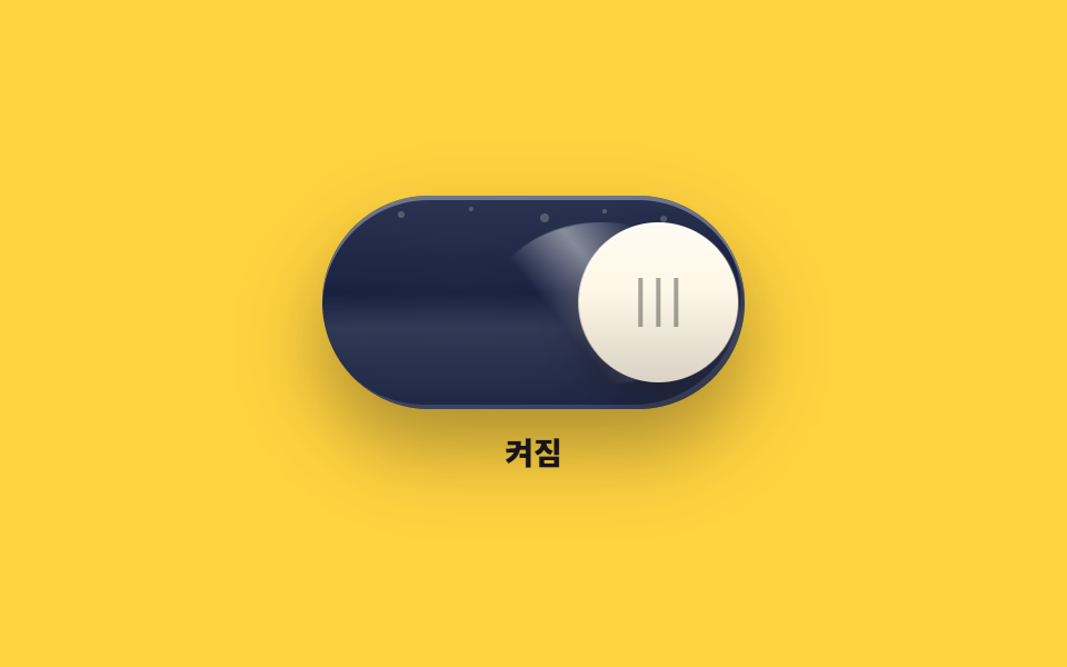
06Glass toggle with a light sweep
While the knob crosses, a pool of light sweeps diagonally over the glass and the specks scattered on its surface brighten as it arrives, with the light flowing long instead of cutting.
Best forOne large switch in the middle of a dark screen
radial-gradienttranslateXbox-shadow
<main class="stage">
<div class="onx is-demo" id="onx">
  <div class="onx__col">
    <button class="onx__track" id="onxSwitch" type="button" role="switch" aria-checked="false" aria-label="Night mode">
      <span class="onx__light" aria-hidden="true"></span>
      <span class="onx__sweep" aria-hidden="true"></span>
      <span class="onx__star onx__star--1" aria-hidden="true"></span>
      <span class="onx__star onx__star--2" aria-hidden="true"></span>
      <span class="onx__star onx__star--3" aria-hidden="true"></span>
      <span class="onx__star onx__star--4" aria-hidden="true"></span>
      <span class="onx__star onx__star--5" aria-hidden="true"></span>
      <span class="onx__knob" aria-hidden="true"><span class="onx__grip" aria-hidden="true"></span></span>
    </button>
    <p class="onx__state" role="status"><span class="onx__wordOn">On</span><span class="onx__wordOff">Off</span></p>
  </div>
</div>
</main>
@use "../../../../site/static/demo-tokens" as *;
// 빛이 쓸려 가는 유리 토글 — 노란 무대 위에 뒤집힌 짙은 잉크 유리(어두운 면이 무대와 대비된다).
// 켜질 때 트랙 안 빛이 $subject-blue-deep 면에서 밝은 중심으로 차오르고(radial-gradient 층, opacity 축),
// 사선 반사광 덩어리(sweep)는 노브와 별개 요소로 반대편으로 천천히 흘러 간다($dur-enter 성격의 light sweep).
// 별 점 다섯 개는 노브 도착 시점에 steps(1, end) 컷으로 밝아지고, 상태 글자(꺼짐/켜짐)도 같은 컷.
// 림 라이트는 위·우하 가장자리의 inset 줄, 바깥 글로우는 상태별 box-shadow 두 벌.
$duration: $dur-base;
$easing: $ease-pop;
$color: $subject-blue;
@include stage($stage-yellow);
.onx { display: grid; place-items: center; width: 100%; }
.onx__col { display: flex; flex-direction: column; align-items: center; gap: $sp-3; }
// ── 유리 트랭(= 스위치 버튼) ────────────────────────────────
.onx__track {
--travel: 94px; // 트랙 190 − 노브 72 − 좌우 여백 24. 좁은 화면에서는 74px
position: relative;
display: block; overflow: hidden;
width: 190px; height: 96px; margin: 0; padding: 0;
border: 0; border-radius: $r-pill; cursor: pointer;
background: linear-gradient(180deg, rgba($subject-cream, .1), rgba($subject-cream, 0) 46%, rgba($subject-cream, .12) 62%, rgba($subject-cream, .03)), $subject-ink;
box-shadow: inset 0 2px 0 rgba($subject-cream, .4), inset -2px -2px 0 rgba($subject-cream, .16), 0 18px 34px rgba($subject-ink, .35);
transition: box-shadow $duration $ease-out;
}
.onx__track:focus-visible { outline: 2px solid $subject-ink; outline-offset: 3px; }
// 안쪽 빛 — 꺼짐에는 완전히 비어 있고 켜지면 진한 파란 면 위 밝은 중심이 차오른다
.onx__light {
position: absolute; inset: 0; border-radius: inherit; pointer-events: none;
background: radial-gradient(120% 150% at 32% 50%, rgba($color, .96), rgba($subject-blue-deep, .92) 62%, rgba($subject-blue-deep, .8));
opacity: 0;
transition: opacity $dur-enter $ease-out;
}
// 사선 반사광 덩어리 — 곡면을 따라 휘는 타원 띠. 켜지면 반대편(왼쪽) 으로 천천히 밀린다
.onx__sweep {
position: absolute; left: 44%; top: 12%; width: 52%; height: 76%;
border-radius: 50%; pointer-events: none;
background: linear-gradient(52deg, rgba($stage-paper, 0) 34%, rgba($stage-paper, .46) 56%, rgba($stage-paper, 0) 78%);
transform: translateX(0) rotate(0deg);
transition: transform $dur-enter $ease-out;
}
// 별 점 다섯 개 — 노브 위단(노브 시작 y 12) 위쪽 띠에 흩뿌려 어느 상태에서든 보인다
.onx__star {
position: absolute; border-radius: 50%; pointer-events: none;
background-color: rgba($subject-cream, .22);
transition: background-color $dur-quick $ease-out, box-shadow $dur-quick $ease-out;
}
.onx__star--1 { left: 34px; top: 7px; width: 3px; height: 3px; }
.onx__star--2 { left: 66px; top: 5px; width: 2px; height: 2px; }
.onx__star--3 { left: 98px; top: 8px; width: 4px; height: 4px; }
.onx__star--4 { left: 126px; top: 6px; width: 2px; height: 2px; }
.onx__star--5 { left: 152px; top: 9px; width: 3px; height: 3px; }
// 큰 노브(트랙 높이의 75%) — 유리 위를 건너가는 크림 원. 표면에 세로 3줄 그립
.onx__knob {
position: absolute; left: 12px; top: 12px;
display: flex; align-items: center; justify-content: center;
width: 72px; height: 72px; border-radius: 50%;
background: linear-gradient(180deg, rgba($stage-paper, .5), rgba($stage-paper, .05) 42%, rgba($subject-ink, .16)), $subject-cream;
box-shadow: 0 10px 18px rgba($subject-ink, .42), inset 0 1px 0 rgba($stage-paper, .9);
transform: translateX(0);
transition: transform $duration $easing;
}
.onx__grip {
width: 18px; height: 22px;
background-image: linear-gradient(90deg, rgba($subject-ink, .38) 0 2px, transparent 2px 8px, rgba($subject-ink, .38) 8px 10px, transparent 10px 16px, rgba($subject-ink, .38) 16px 18px);
}
// ── 켜짐 ────────────────────────────────────────────────────
.onx.is-on .onx__track {
box-shadow: inset 0 2px 0 rgba($subject-cream, .4), inset -2px -2px 0 rgba($subject-cream, .16), 0 18px 34px rgba($subject-ink, .35), 0 0 34px rgba($color, .55);
}
.onx.is-on .onx__knob { transform: translateX(var(--travel)); }
.onx.is-on .onx__light { opacity: 1; }
.onx.is-on .onx__sweep { transform: translateX(-76%) rotate(-9deg); }
.onx.is-on .onx__star { background-color: rgba($stage-paper, .95); box-shadow: 0 0 6px rgba($stage-paper, .75); }
// ── 상태 글자(노란 무대 위 잉크) ─────────────────────────────
.onx__state { position: relative; margin: 0; width: 60px; height: 16px; }
.onx__wordOn, .onx__wordOff {
position: absolute; inset: 0; display: flex; align-items: center; justify-content: center;
font-weight: 800; font-size: clamp(12px, 3vw, 14px); line-height: 1; color: rgba($subject-ink, .72);
}
.onx__wordOn { display: none; color: $subject-ink; }
.onx.is-on .onx__wordOn { display: flex; }
.onx.is-on .onx__wordOff { display: none; }
// ── 미리보기 루프(2초 한 바퀴) ────────────────────────────────
// 노브(탄성) → 빛 채움·스윕(길고 유체) → 별 점등 컷 → 글자 컷. 복귀는 90% 안에 끝난다.
.onx.is-demo .onx__knob {
animation-name: onxKnobLoop; animation-duration: $dur-loop;
animation-timing-function: $easing; animation-iteration-count: infinite;
}
@keyframes onxKnobLoop {
0%, 6% { transform: translateX(0); }
19% { transform: translateX(calc(var(--travel) + 4px)); }
25%, 56% { transform: translateX(var(--travel)); }
69% { transform: translateX(-4px); }
75%, 100% { transform: translateX(0); }
}
.onx.is-demo .onx__light {
animation-name: onxLightLoop; animation-duration: $dur-loop;
animation-timing-function: $ease-out; animation-iteration-count: infinite;
}
@keyframes onxLightLoop {
0%, 8% { opacity: 0; }
46%, 58% { opacity: 1; }
88%, 100% { opacity: 0; }
}
.onx.is-demo .onx__sweep {
animation-name: onxSweepLoop; animation-duration: $dur-loop;
animation-timing-function: $ease-out; animation-iteration-count: infinite;
}
@keyframes onxSweepLoop {
0%, 10% { transform: translateX(0) rotate(0deg); }
48%, 58% { transform: translateX(-76%) rotate(-9deg); }
86%, 100% { transform: translateX(0) rotate(0deg); }
}
// 별 점등 — 노브 도착(25%) 뒤 컷으로 밝아지고, 끄기 시작(56~58%) 과 함께 컷으로 든다
.onx.is-demo .onx__star {
animation-name: onxStarLoop; animation-duration: $dur-loop;
animation-timing-function: steps(1, end); animation-iteration-count: infinite;
}
@keyframes onxStarLoop {
0%, 28% { background-color: rgba($subject-cream, .22); box-shadow: 0 0 0 rgba($stage-paper, 0); }
32%, 58% { background-color: rgba($stage-paper, .95); box-shadow: 0 0 6px rgba($stage-paper, .75); }
62%, 100% { background-color: rgba($subject-cream, .22); box-shadow: 0 0 0 rgba($stage-paper, 0); }
}
// 상태 글자 컷 — 겹치는 유령 프레임이 없게 steps 로 한 프레임에 갈린다
.onx.is-demo .onx__wordOn { display: flex; opacity: 0; }
.onx.is-demo .onx__wordOff { opacity: 1; }
.onx.is-demo .onx__wordOn {
animation-name: onxWordOnLoop; animation-duration: $dur-loop;
animation-timing-function: steps(1, end); animation-iteration-count: infinite;
}
@keyframes onxWordOnLoop {
0%, 8% { opacity: 0; }
12%, 58% { opacity: 1; }
62%, 100% { opacity: 0; }
}
.onx.is-demo .onx__wordOff {
animation-name: onxWordOffLoop; animation-duration: $dur-loop;
animation-timing-function: steps(1, end); animation-iteration-count: infinite;
}
@keyframes onxWordOffLoop {
0%, 8% { opacity: 1; }
12%, 58% { opacity: 0; }
62%, 100% { opacity: 1; }
}
@media (max-width: 340px) {
.onx__col { gap: $sp-2; }
.onx__track { --travel: 74px; width: 150px; height: 76px; }
.onx__knob { left: 10px; top: 10px; width: 56px; height: 56px; }
.onx__grip { width: 14px; height: 18px; }
.onx__star--1 { left: 26px; top: 5px; }
.onx__star--2 { left: 48px; top: 4px; }
.onx__star--3 { left: 72px; top: 6px; }
.onx__star--4 { left: 94px; top: 4px; }
.onx__star--5 { left: 114px; top: 6px; }
.onx__state { width: 48px; height: 14px; }
}
@media (prefers-reduced-motion: reduce) {
.onx .onx__track { transition: none !important; }
.onx .onx__knob { transition: none !important; }
.onx .onx__light { transition: none !important; }
.onx .onx__sweep { transition: none !important; }
.onx .onx__star { transition: none !important; }
.onx.is-demo .onx__knob { animation: none !important; }
.onx.is-demo .onx__light { animation: none !important; }
.onx.is-demo .onx__sweep { animation: none !important; }
.onx.is-demo .onx__star { animation: none !important; }
.onx.is-demo .onx__wordOn { animation: none !important; opacity: 0 !important; }
.onx.is-demo .onx__wordOff { animation: none !important; opacity: 1 !important; }
}html, body {
margin: 0;
overflow: hidden;
}
.stage {
box-sizing: border-box;
min-height: 100vh;
display: grid;
place-items: center;
margin: 0;
background: #ffd23f;
font-family: -apple-system, "Segoe UI", "Noto Sans KR", sans-serif;
padding: clamp(8px, 4vw, 24px);
}
.onx {
display: grid;
place-items: center;
width: 100%;
}
.onx__col {
display: flex;
flex-direction: column;
align-items: center;
gap: 12px;
}
.onx__track {
--travel: 94px;
position: relative;
display: block;
overflow: hidden;
width: 190px;
height: 96px;
margin: 0;
padding: 0;
border: 0;
border-radius: 999px;
cursor: pointer;
background: linear-gradient(180deg, rgba(255, 247, 230, 0.1), rgba(255, 247, 230, 0) 46%, rgba(255, 247, 230, 0.12) 62%, rgba(255, 247, 230, 0.03)), #17141a;
box-shadow: inset 0 2px 0 rgba(255, 247, 230, 0.4), inset -2px -2px 0 rgba(255, 247, 230, 0.16), 0 18px 34px rgba(23, 20, 26, 0.35);
transition: box-shadow 300ms ease-out;
}
.onx__track:focus-visible {
outline: 2px solid #17141a;
outline-offset: 3px;
}
.onx__light {
position: absolute;
inset: 0;
border-radius: inherit;
pointer-events: none;
background: radial-gradient(120% 150% at 32% 50%, rgba(47, 109, 246, 0.96), rgba(10, 79, 232, 0.92) 62%, rgba(10, 79, 232, 0.8));
opacity: 0;
transition: opacity 600ms ease-out;
}
.onx__sweep {
position: absolute;
left: 44%;
top: 12%;
width: 52%;
height: 76%;
border-radius: 50%;
pointer-events: none;
background: linear-gradient(52deg, rgba(255, 255, 255, 0) 34%, rgba(255, 255, 255, 0.46) 56%, rgba(255, 255, 255, 0) 78%);
transform: translateX(0) rotate(0deg);
transition: transform 600ms ease-out;
}
.onx__star {
position: absolute;
border-radius: 50%;
pointer-events: none;
background-color: rgba(255, 247, 230, 0.22);
transition: background-color 220ms ease-out, box-shadow 220ms ease-out;
}
.onx__star--1 {
left: 34px;
top: 7px;
width: 3px;
height: 3px;
}
.onx__star--2 {
left: 66px;
top: 5px;
width: 2px;
height: 2px;
}
.onx__star--3 {
left: 98px;
top: 8px;
width: 4px;
height: 4px;
}
.onx__star--4 {
left: 126px;
top: 6px;
width: 2px;
height: 2px;
}
.onx__star--5 {
left: 152px;
top: 9px;
width: 3px;
height: 3px;
}
.onx__knob {
position: absolute;
left: 12px;
top: 12px;
display: flex;
align-items: center;
justify-content: center;
width: 72px;
height: 72px;
border-radius: 50%;
background: linear-gradient(180deg, rgba(255, 255, 255, 0.5), rgba(255, 255, 255, 0.05) 42%, rgba(23, 20, 26, 0.16)), #fff7e6;
box-shadow: 0 10px 18px rgba(23, 20, 26, 0.42), inset 0 1px 0 rgba(255, 255, 255, 0.9);
transform: translateX(0);
transition: transform 300ms cubic-bezier(0.2, 1.4, 0.4, 1);
}
.onx__grip {
width: 18px;
height: 22px;
background-image: linear-gradient(90deg, rgba(23, 20, 26, 0.38) 0 2px, transparent 2px 8px, rgba(23, 20, 26, 0.38) 8px 10px, transparent 10px 16px, rgba(23, 20, 26, 0.38) 16px 18px);
}
.onx.is-on .onx__track {
box-shadow: inset 0 2px 0 rgba(255, 247, 230, 0.4), inset -2px -2px 0 rgba(255, 247, 230, 0.16), 0 18px 34px rgba(23, 20, 26, 0.35), 0 0 34px rgba(47, 109, 246, 0.55);
}
.onx.is-on .onx__knob {
transform: translateX(var(--travel));
}
.onx.is-on .onx__light {
opacity: 1;
}
.onx.is-on .onx__sweep {
transform: translateX(-76%) rotate(-9deg);
}
.onx.is-on .onx__star {
background-color: rgba(255, 255, 255, 0.95);
box-shadow: 0 0 6px rgba(255, 255, 255, 0.75);
}
.onx__state {
position: relative;
margin: 0;
width: 60px;
height: 16px;
}
.onx__wordOn, .onx__wordOff {
position: absolute;
inset: 0;
display: flex;
align-items: center;
justify-content: center;
font-weight: 800;
font-size: clamp(12px, 3vw, 14px);
line-height: 1;
color: rgba(23, 20, 26, 0.72);
}
.onx__wordOn {
display: none;
color: #17141a;
}
.onx.is-on .onx__wordOn {
display: flex;
}
.onx.is-on .onx__wordOff {
display: none;
}
.onx.is-demo .onx__knob {
animation-name: onxKnobLoop;
animation-duration: 2s;
animation-timing-function: cubic-bezier(0.2, 1.4, 0.4, 1);
animation-iteration-count: infinite;
}
@keyframes onxKnobLoop {
0%, 6% {
transform: translateX(0);
}
19% {
transform: translateX(calc(var(--travel) + 4px));
}
25%, 56% {
transform: translateX(var(--travel));
}
69% {
transform: translateX(-4px);
}
75%, 100% {
transform: translateX(0);
}
}
.onx.is-demo .onx__light {
animation-name: onxLightLoop;
animation-duration: 2s;
animation-timing-function: ease-out;
animation-iteration-count: infinite;
}
@keyframes onxLightLoop {
0%, 8% {
opacity: 0;
}
46%, 58% {
opacity: 1;
}
88%, 100% {
opacity: 0;
}
}
.onx.is-demo .onx__sweep {
animation-name: onxSweepLoop;
animation-duration: 2s;
animation-timing-function: ease-out;
animation-iteration-count: infinite;
}
@keyframes onxSweepLoop {
0%, 10% {
transform: translateX(0) rotate(0deg);
}
48%, 58% {
transform: translateX(-76%) rotate(-9deg);
}
86%, 100% {
transform: translateX(0) rotate(0deg);
}
}
.onx.is-demo .onx__star {
animation-name: onxStarLoop;
animation-duration: 2s;
animation-timing-function: steps(1, end);
animation-iteration-count: infinite;
}
@keyframes onxStarLoop {
0%, 28% {
background-color: rgba(255, 247, 230, 0.22);
box-shadow: 0 0 0 rgba(255, 255, 255, 0);
}
32%, 58% {
background-color: rgba(255, 255, 255, 0.95);
box-shadow: 0 0 6px rgba(255, 255, 255, 0.75);
}
62%, 100% {
background-color: rgba(255, 247, 230, 0.22);
box-shadow: 0 0 0 rgba(255, 255, 255, 0);
}
}
.onx.is-demo .onx__wordOn {
display: flex;
opacity: 0;
}
.onx.is-demo .onx__wordOff {
opacity: 1;
}
.onx.is-demo .onx__wordOn {
animation-name: onxWordOnLoop;
animation-duration: 2s;
animation-timing-function: steps(1, end);
animation-iteration-count: infinite;
}
@keyframes onxWordOnLoop {
0%, 8% {
opacity: 0;
}
12%, 58% {
opacity: 1;
}
62%, 100% {
opacity: 0;
}
}
.onx.is-demo .onx__wordOff {
animation-name: onxWordOffLoop;
animation-duration: 2s;
animation-timing-function: steps(1, end);
animation-iteration-count: infinite;
}
@keyframes onxWordOffLoop {
0%, 8% {
opacity: 1;
}
12%, 58% {
opacity: 0;
}
62%, 100% {
opacity: 1;
}
}
@media (max-width: 340px) {
.onx__col {
gap: 8px;
}
.onx__track {
--travel: 74px;
width: 150px;
height: 76px;
}
.onx__knob {
left: 10px;
top: 10px;
width: 56px;
height: 56px;
}
.onx__grip {
width: 14px;
height: 18px;
}
.onx__star--1 {
left: 26px;
top: 5px;
}
.onx__star--2 {
left: 48px;
top: 4px;
}
.onx__star--3 {
left: 72px;
top: 6px;
}
.onx__star--4 {
left: 94px;
top: 4px;
}
.onx__star--5 {
left: 114px;
top: 6px;
}
.onx__state {
width: 48px;
height: 14px;
}
}
@media (prefers-reduced-motion: reduce) {
.onx .onx__track {
transition: none !important;
}
.onx .onx__knob {
transition: none !important;
}
.onx .onx__light {
transition: none !important;
}
.onx .onx__sweep {
transition: none !important;
}
.onx .onx__star {
transition: none !important;
}
.onx.is-demo .onx__knob {
animation: none !important;
}
.onx.is-demo .onx__light {
animation: none !important;
}
.onx.is-demo .onx__sweep {
animation: none !important;
}
.onx.is-demo .onx__star {
animation: none !important;
}
.onx.is-demo .onx__wordOn {
animation: none !important;
opacity: 0 !important;
}
.onx.is-demo .onx__wordOff {
animation: none !important;
opacity: 1 !important;
}
}var onxRoot = document.getElementById('onx');
var onxSwitch = document.getElementById('onxSwitch');
function onxSet(on) {
onxSwitch.setAttribute('aria-checked', on ? 'true' : 'false');
onxRoot.classList.toggle('is-on', on);
}
onxSwitch.addEventListener('pointerdown', function () { onxRoot.classList.remove('is-demo'); });
onxSwitch.addEventListener('click', function () {
onxRoot.classList.remove('is-demo');
onxSet(onxSwitch.getAttribute('aria-checked') !== 'true');
});// LightSweepGlassToggle — vanilla 판(run/076/demo/06-real-oneui-toggle/index.html) 의 React 포트.
// 켜질 때 트랙 안 빛이 차오르고 사선 반사광 덩어리(sweep)는 노브와 별개로 반대편으로 흘러 간다.
// 값·키프레임은 vanilla 와 같다(다시 타이핑하지 않는다). 누르면 미리보기 루프를 뗀다.
import { useState } from "react";
import styles from "./LightSweepGlassToggle.module.scss";
export type LightSweepGlassToggleProps = {
duration?: number;
easing?: string;
color?: string;
};
type Vars = { [k: string]: any };
const ARIA_LABEL = "야간 모드";
const STATE_ON = "켜짐";
const STATE_OFF = "꺼짐";
export default function LightSweepGlassToggle({
duration = 300,
easing = "cubic-bezier(.2, 1.4, .4, 1)", // = $ease-pop
color = "#2f6df6",
}: LightSweepGlassToggleProps) {
const [on, setOn] = useState(false);
const [demo, setDemo] = useState(true);
const vars: Vars = {
"--duration": `${duration}ms`,
"--easing": easing,
"--color": color,
};
const cls = [styles.root, demo ? styles.isDemo : "", on ? styles.isOn : ""].filter(Boolean).join(" ");
function wake() {
setDemo(false);
}
function toggle() {
setDemo(false);
setOn((prev) => !prev);
}
return (
<main className={styles.stage}>
<div className={cls} style={vars}>
<div className={styles.col}>
<button
className={styles.track}
type="button"
role="switch"
aria-checked={on}
aria-label={ARIA_LABEL}
onPointerDown={wake}
onClick={toggle}
>
<span className={styles.light} aria-hidden="true"></span>
<span className={styles.sweep} aria-hidden="true"></span>
<span className={[styles.star, styles.star1].join(" ")} aria-hidden="true"></span>
<span className={[styles.star, styles.star2].join(" ")} aria-hidden="true"></span>
<span className={[styles.star, styles.star3].join(" ")} aria-hidden="true"></span>
<span className={[styles.star, styles.star4].join(" ")} aria-hidden="true"></span>
<span className={[styles.star, styles.star5].join(" ")} aria-hidden="true"></span>
<span className={styles.knob} aria-hidden="true"><span className={styles.grip} aria-hidden="true"></span></span>
</button>
<p className={styles.state} role="status">
<span className={styles.wordOn}>{STATE_ON}</span>
<span className={styles.wordOff}>{STATE_OFF}</span>
</p>
</div>
</div>
</main>
);
}06 Glass toggle with a light sweep — Measured area 11.507% · moving frames 19/23Original by GODRICH · SCSS and React ship in the zip · CSS Toggle Switch: 9 Realistic Switches to Paste
The post this demo lives in
 CSS Toggle Switch: 9 Realistic Switches to PasteA css toggle switch is the small on-off control visitors flip without thinking, and here are nine built with no library, See all demos in this post