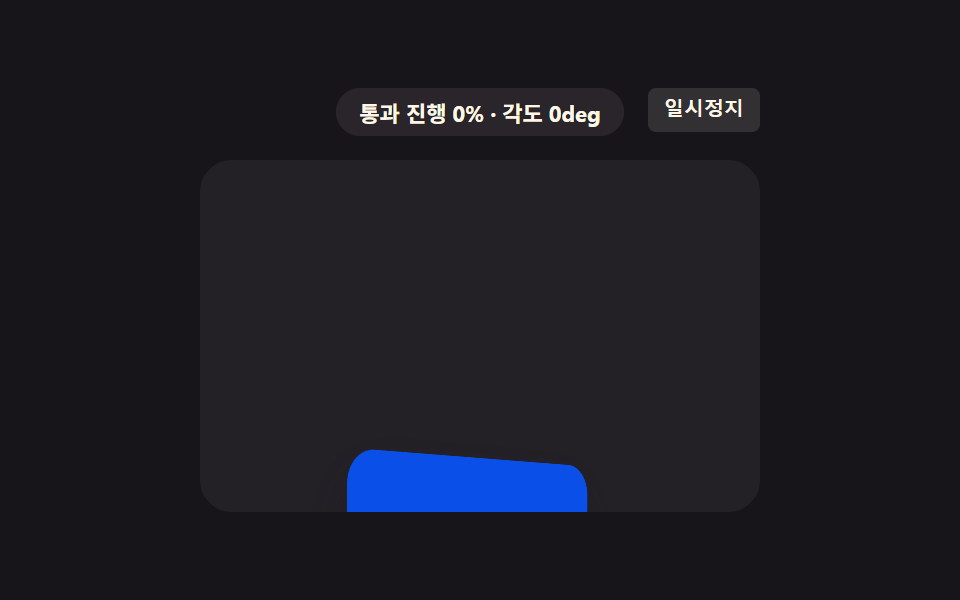
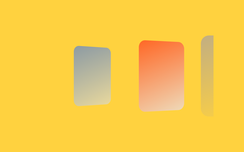
08Chapter page turn
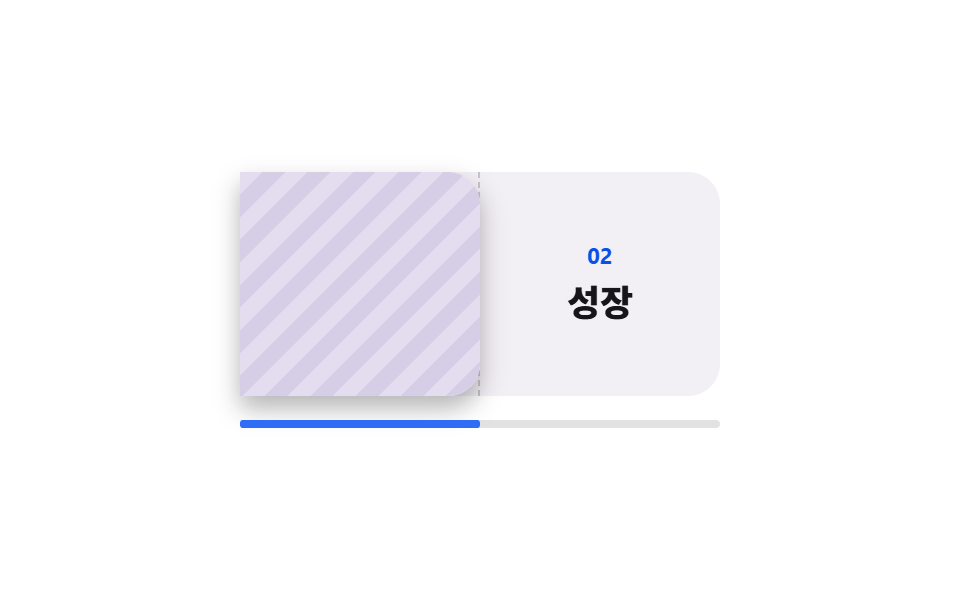
A sheet turns on its left edge to uncover the next one, and the back of the sheet is hidden so the front text never shows through.
Best forSections that want exactly one chapter on screen at a time, like brand stories and annual reports with clear divisions
rotateYbackface-visibilitysteps(1, end)
<main class="stage">
  <div class="pt is-demo">
    <div class="pt__scroller">
      <div class="pt__pad">
        <div class="pt__pin">
          <div class="pt__book">
            <div class="pt__half pt__half--left">
              <svg viewBox="0 0 256 256" width="28" height="28" aria-hidden="true"><g fill="currentColor"><path d="M232 56v144h-72a32 32 0 0 0-32 32a32 32 0 0 0-32-32H24V56h72a32 32 0 0 1 32 32a32 32 0 0 1 32-32Z" opacity=".2"/><path d="M232 48h-72a40 40 0 0 0-32 16a40 40 0 0 0-32-16H24a8 8 0 0 0-8 8v144a8 8 0 0 0 8 8h72a24 24 0 0 1 24 24a8 8 0 0 0 16 0a24 24 0 0 1 24-24h72a8 8 0 0 0 8-8V56a8 8 0 0 0-8-8M96 192H32V64h64a24 24 0 0 1 24 24v112a39.8 39.8 0 0 0-24-8m128 0h-64a39.8 39.8 0 0 0-24 8V88a24 24 0 0 1 24-24h64Z"/></g></svg>
              <span class="pt__small">Contents</span>
            </div>
            <div class="pt__half pt__half--right">
              <span class="pt__no">02</span>
              <span class="pt__title">Growth</span>
            </div>
            <div class="pt__page">
              <div class="pt__face pt__face--front">
                <span class="pt__no">01</span>
                <span class="pt__title">Beginning</span>
              </div>
              <div class="pt__face pt__face--back" aria-hidden="true"></div>
            </div>
          </div>
          <div class="pt__rail" aria-hidden="true"><span class="pt__fill"></span></div>
        </div>
      </div>
    </div>
  </div>
</main>@use "../../../../site/static/demo-tokens" as *;
// ── 변수 3개 ──────────────────────────────────────────
$duration: 1s; // alternate 라 한 바퀴(넘김 → 되넘김)는 2s
$easing: linear; // 스크롤 스크럽은 등속이라야 스크롤 양과 회전각이 1:1 로 맞는다
$color: $subject-blue;
@include stage($stage-paper);
.pt {
--h: clamp(148px, 58vh, 176px);
width: min(340px, 92vw);
}
.pt__scroller {
height: var(--h);
overflow-y: auto;
scrollbar-width: none;
&::-webkit-scrollbar { display: none; }
}
// ⚠ 여기는 padding-bottom 이 아니라 height 다. sticky 가 붙어 있을 수 있는 범위는 부모의
// **콘텐츠 박스**라, padding 으로만 늘린 자리는 안 쳐준다 — 창이 곧바로 위로 흘러나간다 (실측)
.pt__pad { height: calc(var(--h) * 2.2); }
.pt__pin {
position: sticky;
top: 0;
display: grid;
justify-items: center;
align-content: center;
gap: $sp-3;
height: var(--h);
}
.pt__book {
position: relative;
display: grid;
grid-template-columns: 1fr 1fr;
width: 240px;
height: 112px;
border-radius: $r-card;
background: #f2eff5;
perspective: 900px;
}
.pt__half {
display: grid;
place-content: center;
justify-items: center;
gap: $sp-1;
color: rgba(23, 20, 26, .72);
}
.pt__half--left { border-right: 1px dashed rgba(23, 20, 26, .2); }
.pt__no {
color: $subject-blue-deep; // 크림 면 위 파란 글자 4.25:1 → deep 5.98:1
font-size: 11px;
line-height: 14px;
font-weight: 700;
}
.pt__title {
color: $subject-ink;
font-size: 18px;
line-height: 24px;
font-weight: 800;
}
.pt__small {
font-size: 11px;
line-height: 14px;
font-weight: 700;
}
// ── 실제 동작: 오른쪽 장이 왼쪽 모서리를 축으로 넘어간다.
// 스크롤 진행이 곧 회전각이고, 뒷면은 가려 둬서 앞면 글자가 비치지 않는다 ──
.pt__page {
position: absolute;
top: 0;
right: 0;
width: 120px;
height: 112px;
transform-origin: left center; // 규칙8: 책장 왼쪽 경첩 회전
transform-style: preserve-3d;
animation-name: pt-turn;
animation-duration: 1s;
animation-timing-function: $easing;
animation-fill-mode: both;
animation-timeline: scroll(nearest block);
}
@keyframes pt-turn {
from { transform: rotateY(0deg); }
to { transform: rotateY(-180deg); }
}
.pt__face {
position: absolute;
inset: 0;
display: grid;
place-content: center;
justify-items: center;
gap: $sp-1;
border-radius: 0 $r-card $r-card 0;
backface-visibility: hidden;
box-shadow: $shadow-press;
}
.pt__face--front { background: $subject-cream; }
.pt__face--back {
background: repeating-linear-gradient(135deg, #e3ddef 0 8px, #d6cee6 8px 16px);
transform: rotateY(180deg);
}
.pt__rail {
width: 240px;
height: 4px;
border-radius: $r-pill;
background: rgba(23, 20, 26, .12);
}
.pt__fill {
display: block;
height: 4px;
border-radius: $r-pill;
background: $color;
transform: scaleX(0);
transform-origin: left center; // 규칙8: 읽기막대 left 채움
animation-name: pt-read;
animation-duration: 1s;
animation-timing-function: linear;
animation-fill-mode: both;
animation-timeline: scroll(nearest block);
}
@keyframes pt-read {
from { transform: scaleX(0); }
to { transform: scaleX(1); }
}
// ── 격자 미리보기 루프 ────────────────────────────────
// 넘김만 steps(1, end) 로 끊는다. 회전한 면의 폭은 |cos θ| 라 프레임당 변화율이 90° 에서
// 언제나 최대라, 부드럽게 두면 대표 이미지가 늘 모서리뷰로 뽑힌다(252 실측).
// 진행 막대는 그대로 이어져 프레임을 채운다 — transform 이라 반투명 유령이 안 생긴다.
.pt.is-demo .pt__page {
animation-name: pt-cut;
animation-duration: $duration;
animation-timing-function: steps(1, end);
animation-direction: alternate;
animation-iteration-count: infinite;
animation-timeline: auto;
}
.pt.is-demo .pt__fill {
animation-duration: $duration;
animation-direction: alternate;
animation-iteration-count: infinite;
animation-timeline: auto;
}
@keyframes pt-cut {
0%, 49% { transform: rotateY(0deg); }
50%, 100% { transform: rotateY(-180deg); }
}
@media (prefers-reduced-motion: reduce) {
.pt__page { animation: none !important; transform: rotateY(0deg); }
.pt__fill { animation: none !important; transform: scaleX(.5); }
}html, body {
margin: 0;
overflow: hidden;
}
.stage {
box-sizing: border-box;
min-height: 100vh;
display: grid;
place-items: center;
margin: 0;
background: #ffffff;
font-family: -apple-system, "Segoe UI", "Noto Sans KR", sans-serif;
padding: clamp(8px, 4vw, 24px);
}
.pt {
--h: clamp(148px, 58vh, 176px);
width: min(340px, 92vw);
}
.pt__scroller {
height: var(--h);
overflow-y: auto;
scrollbar-width: none;
}
.pt__scroller::-webkit-scrollbar {
display: none;
}
.pt__pad {
height: calc(var(--h) * 2.2);
}
.pt__pin {
position: sticky;
top: 0;
display: grid;
justify-items: center;
align-content: center;
gap: 12px;
height: var(--h);
}
.pt__book {
position: relative;
display: grid;
grid-template-columns: 1fr 1fr;
width: 240px;
height: 112px;
border-radius: 16px;
background: #f2eff5;
perspective: 900px;
}
.pt__half {
display: grid;
place-content: center;
justify-items: center;
gap: 4px;
color: rgba(23, 20, 26, 0.72);
}
.pt__half--left {
border-right: 1px dashed rgba(23, 20, 26, 0.2);
}
.pt__no {
color: #0a4fe8;
font-size: 11px;
line-height: 14px;
font-weight: 700;
}
.pt__title {
color: #17141a;
font-size: 18px;
line-height: 24px;
font-weight: 800;
}
.pt__small {
font-size: 11px;
line-height: 14px;
font-weight: 700;
}
.pt__page {
position: absolute;
top: 0;
right: 0;
width: 120px;
height: 112px;
transform-origin: left center;
transform-style: preserve-3d;
animation-name: pt-turn;
animation-duration: 1s;
animation-timing-function: linear;
animation-fill-mode: both;
animation-timeline: scroll(nearest block);
}
@keyframes pt-turn {
from {
transform: rotateY(0deg);
}
to {
transform: rotateY(-180deg);
}
}
.pt__face {
position: absolute;
inset: 0;
display: grid;
place-content: center;
justify-items: center;
gap: 4px;
border-radius: 0 16px 16px 0;
backface-visibility: hidden;
box-shadow: 0 6px 12px rgba(23, 20, 26, 0.32);
}
.pt__face--front {
background: #fff7e6;
}
.pt__face--back {
background: repeating-linear-gradient(135deg, #e3ddef 0 8px, #d6cee6 8px 16px);
transform: rotateY(180deg);
}
.pt__rail {
width: 240px;
height: 4px;
border-radius: 999px;
background: rgba(23, 20, 26, 0.12);
}
.pt__fill {
display: block;
height: 4px;
border-radius: 999px;
background: #2f6df6;
transform: scaleX(0);
transform-origin: left center;
animation-name: pt-read;
animation-duration: 1s;
animation-timing-function: linear;
animation-fill-mode: both;
animation-timeline: scroll(nearest block);
}
@keyframes pt-read {
from {
transform: scaleX(0);
}
to {
transform: scaleX(1);
}
}
.pt.is-demo .pt__page {
animation-name: pt-cut;
animation-duration: 1s;
animation-timing-function: steps(1, end);
animation-direction: alternate;
animation-iteration-count: infinite;
animation-timeline: auto;
}
.pt.is-demo .pt__fill {
animation-duration: 1s;
animation-direction: alternate;
animation-iteration-count: infinite;
animation-timeline: auto;
}
@keyframes pt-cut {
0%, 49% {
transform: rotateY(0deg);
}
50%, 100% {
transform: rotateY(-180deg);
}
}
@media (prefers-reduced-motion: reduce) {
.pt__page {
animation: none !important;
transform: rotateY(0deg);
}
.pt__fill {
animation: none !important;
transform: scaleX(0.5);
}
}// 실제 동작: 스크롤이 rotateY 를 0 → -180deg 로 끌고 간다(animation-timeline: scroll()).
// 격자 미리보기 루프만 steps(1, end) 로 끊는다 — 3D 플립은 90° 부근이 항상 최대 변화라
// 그대로 두면 대표 이미지가 늘 모서리뷰(선 한 줄)가 된다.
var r = document.querySelector('.pt');
var s = r.querySelector('.pt__scroller');
function stopDemo(){ r.classList.remove('is-demo'); }
r.addEventListener('pointerdown', stopDemo);
s.addEventListener('scroll', stopDemo, { passive: true });import type { CSSProperties, ReactNode } from "react";
import styles from "./PageTurnChapters.module.scss";
export type PageTurnChaptersProps = {
tocLabel?: string;
frontTitle?: string;
backTitle?: string;
preview?: boolean;
duration?: number;
easing?: string;
color?: string;
};
type Vars = CSSProperties & { "--duration"?: string; "--easing"?: string; "--color"?: string };
const IconBook = (): ReactNode => (
<svg viewBox="0 0 256 256" width="28" height="28" aria-hidden="true"><g fill="currentColor"><path d="M232 56v144h-72a32 32 0 0 0-32 32a32 32 0 0 0-32-32H24V56h72a32 32 0 0 1 32 32a32 32 0 0 1 32-32Z" opacity=".2"/><path d="M232 48h-72a40 40 0 0 0-32 16a40 40 0 0 0-32-16H24a8 8 0 0 0-8 8v144a8 8 0 0 0 8 8h72a24 24 0 0 1 24 24a8 8 0 0 0 16 0a24 24 0 0 1 24-24h72a8 8 0 0 0 8-8V56a8 8 0 0 0-8-8M96 192H32V64h64a24 24 0 0 1 24 24v112a39.8 39.8 0 0 0-24-8m128 0h-64a39.8 39.8 0 0 0-24 8V88a24 24 0 0 1 24-24h64Z"/></g></svg>
);
export default function PageTurnChapters({
tocLabel = "Contents",
frontTitle = "Beginning",
backTitle = "Growth",
preview = true,
duration = 1000,
easing = "linear",
color = "#2f6df6",
}: PageTurnChaptersProps): ReactNode {
const vars: Vars = { "--duration": `${duration}ms`, "--easing": easing, "--color": color };
const cls = preview ? `${styles.pt} ${styles.isDemo}` : styles.pt;
return (
<div className={cls} style={vars}>
<div className={styles.scroller}>
<div className={styles.pad}>
<div className={styles.pin}>
<div className={styles.book}>
<div className={`${styles.half} ${styles.halfLeft}`}>
<IconBook />
<span className={styles.small}>{tocLabel}</span>
</div>
<div className={`${styles.half} ${styles.halfRight}`}>
<span className={styles.no}>02</span>
<span className={styles.title}>{backTitle}</span>
</div>
<div className={styles.page}>
<div className={`${styles.face} ${styles.faceFront}`}>
<span className={styles.no}>01</span>
<span className={styles.title}>{frontTitle}</span>
</div>
<div className={`${styles.face} ${styles.faceBack}`} aria-hidden="true" />
</div>
</div>
<div className={styles.rail} aria-hidden="true"><span className={styles.fill} /></div>
</div>
</div>
</div>
</div>
);
}08 Chapter page turn — Measured area 21.651% · moving frames 23/23Original by GODRICH · SCSS and React ship in the zip · 9 Scrollytelling CSS Section Patterns, Copy-Paste
The post this demo lives in
 9 Scrollytelling CSS Section Patterns, Copy-PasteScrollytelling CSS makes scroll position the clock that drives a scene: one section, several states, advanced by how far See all demos in this post