053D Card Whose Range Value Becomes an Angle Value
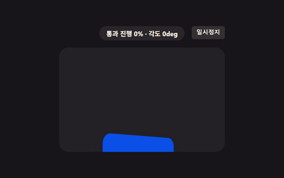
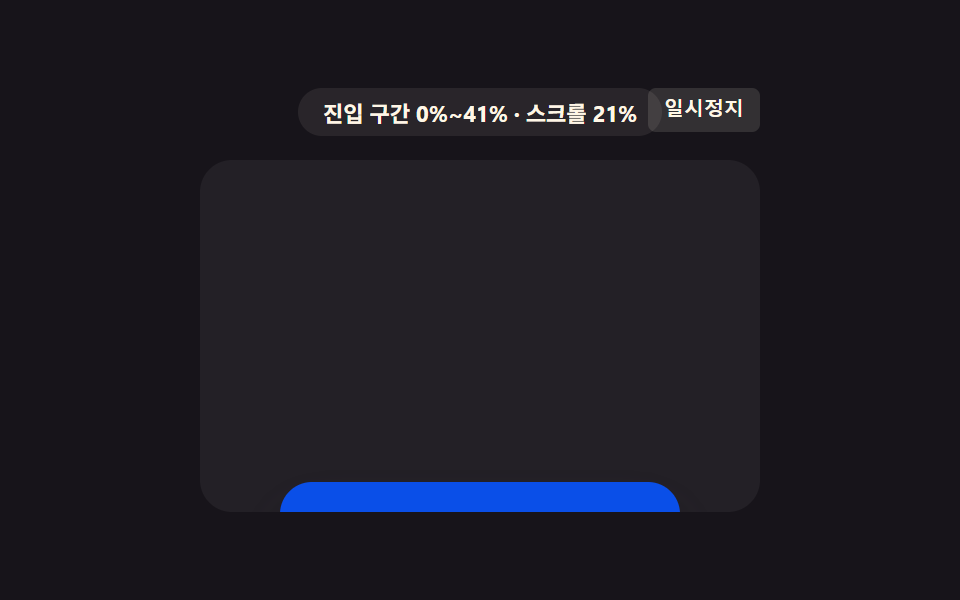
The same range value is converted into an angle value that flips the card in 3D, and the card's back face shows as the range passes its midpoint.
Best forService card 3D rotate intro
preserve-3drotateYbackface-visibility
<main class="stage">
<div class="r3f is-demo" id="r3fRoot">
  <div class="r3f__badge" id="r3fBadge">cover range 0%~100%</div>
  <button class="r3f__ctrl" id="r3fCtrl" type="button">Pause</button>
  <div class="r3f__view" id="r3fView">
    <div class="r3f__track" id="r3fTrack">
      <div class="r3f__spacer r3f__spacer--top"></div>
      <div class="r3f__flip">
        <div class="r3f__inner" id="r3fInner">
          <div class="r3f__face r3f__face--front">Service</div>
          <div class="r3f__face r3f__face--back">Details</div>
        </div>
      </div>
      <div class="r3f__spacer r3f__spacer--bottom"></div>
    </div>
  </div>
</div>
</main>
@use "../../../../site/static/demo-tokens" as *;
// 핵심: animation-timeline: view() + animation-range: cover 로 요소가 뷰포트를
// 통과하는 전체 구간 값(0~1)을 그대로 각도 값(0~180deg)으로 바꿔 카드를 입체적으로
// 뒤집는다. 미지원 환경은 스크롤 위치로 같은 통과 진행 값을 계산해 같은 각도를 적용한다.
$duration: $dur-loop;
$easing: linear;
$color: $subject-blue-deep;
@include stage($stage-ink);
.r3f {
position: relative;
width: min(100%, 280px);
display: flex;
flex-direction: column;
align-items: center;
gap: $sp-3;
}
.r3f__badge {
padding: $sp-1 $sp-3;
border-radius: $r-pill;
background: rgba(255, 247, 230, .08);
color: $subject-cream;
font-weight: 700;
font-size: 11px;
font-variant-numeric: tabular-nums;
}
.r3f__ctrl {
position: absolute;
top: 0;
right: 0;
border: 0;
border-radius: $r-xs;
padding: $sp-1 $sp-2;
background: rgba(255, 247, 230, .12);
color: $subject-cream;
font-weight: 600;
font-size: 10px;
line-height: 1.4;
cursor: pointer;
}
.r3f__ctrl:focus-visible { outline: 2px solid $subject-blue-light; outline-offset: 2px; }
.r3f__view {
box-sizing: border-box;
width: 100%;
height: 176px;
overflow-y: auto;
overflow-x: hidden;
border-radius: $r-card;
background: rgba(255, 255, 255, .05);
scrollbar-width: thin;
}
.r3f__track {
display: flex;
flex-direction: column;
align-items: center;
}
.r3f__spacer--top { height: 200px; flex: 0 0 auto; }
.r3f__spacer--bottom { height: 200px; flex: 0 0 auto; }
.r3f__flip {
flex: 0 0 auto;
width: 168px;
height: 88px;
perspective: 560px;
}
.r3f__inner {
position: relative;
width: 100%;
height: 100%;
transform-style: preserve-3d;
transform: rotateY(0deg);
}
.r3f__face {
position: absolute;
inset: 0;
display: grid;
place-items: center;
border-radius: $r-card;
box-shadow: $shadow-raised;
backface-visibility: hidden;
color: $subject-cream;
font-weight: 700;
font-size: 14px;
}
.r3f__face--front { background: $color; }
.r3f__face--back { background: $subject-orange-deep; transform: rotateY(180deg); }
.supports-vt .r3f__inner {
animation-name: r3fFlip;
animation-duration: 1s;
animation-timing-function: linear;
animation-fill-mode: both;
animation-timeline: view();
animation-range: cover;
}
@keyframes r3fFlip {
0% { transform: rotateY(0deg); }
100% { transform: rotateY(180deg); }
}
@media (max-width: 340px) {
.r3f { gap: $sp-2; }
.r3f__view { height: 130px; }
.r3f__spacer--top { height: 150px; }
.r3f__spacer--bottom { height: 150px; }
.r3f__flip { width: 140px; height: 72px; }
}
@media (prefers-reduced-motion: reduce) {
.r3f__inner { animation: none !important; transform: rotateY(0deg) !important; }
}html, body {
margin: 0;
overflow: hidden;
}
.stage {
box-sizing: border-box;
min-height: 100vh;
display: grid;
place-items: center;
margin: 0;
background: #17141a;
font-family: -apple-system, "Segoe UI", "Noto Sans KR", sans-serif;
padding: clamp(8px, 4vw, 24px);
}
.r3f {
position: relative;
width: min(100%, 280px);
display: flex;
flex-direction: column;
align-items: center;
gap: 12px;
}
.r3f__badge {
padding: 4px 12px;
border-radius: 999px;
background: rgba(255, 247, 230, 0.08);
color: #fff7e6;
font-weight: 700;
font-size: 11px;
font-variant-numeric: tabular-nums;
}
.r3f__ctrl {
position: absolute;
top: 0;
right: 0;
border: 0;
border-radius: 4px;
padding: 4px 8px;
background: rgba(255, 247, 230, 0.12);
color: #fff7e6;
font-weight: 600;
font-size: 10px;
line-height: 1.4;
cursor: pointer;
}
.r3f__ctrl:focus-visible {
outline: 2px solid #5b8cf8;
outline-offset: 2px;
}
.r3f__view {
box-sizing: border-box;
width: 100%;
height: 176px;
overflow-y: auto;
overflow-x: hidden;
border-radius: 16px;
background: rgba(255, 255, 255, 0.05);
scrollbar-width: thin;
}
.r3f__track {
display: flex;
flex-direction: column;
align-items: center;
}
.r3f__spacer--top {
height: 200px;
flex: 0 0 auto;
}
.r3f__spacer--bottom {
height: 200px;
flex: 0 0 auto;
}
.r3f__flip {
flex: 0 0 auto;
width: 168px;
height: 88px;
perspective: 560px;
}
.r3f__inner {
position: relative;
width: 100%;
height: 100%;
transform-style: preserve-3d;
transform: rotateY(0deg);
}
.r3f__face {
position: absolute;
inset: 0;
display: grid;
place-items: center;
border-radius: 16px;
box-shadow: 0 14px 24px rgba(23, 20, 26, 0.32);
backface-visibility: hidden;
color: #fff7e6;
font-weight: 700;
font-size: 14px;
}
.r3f__face--front {
background: #0a4fe8;
}
.r3f__face--back {
background: #c93000;
transform: rotateY(180deg);
}
.supports-vt .r3f__inner {
animation-name: r3fFlip;
animation-duration: 1s;
animation-timing-function: linear;
animation-fill-mode: both;
animation-timeline: view();
animation-range: cover;
}
@keyframes r3fFlip {
0% {
transform: rotateY(0deg);
}
100% {
transform: rotateY(180deg);
}
}
@media (max-width: 340px) {
.r3f {
gap: 8px;
}
.r3f__view {
height: 130px;
}
.r3f__spacer--top {
height: 150px;
}
.r3f__spacer--bottom {
height: 150px;
}
.r3f__flip {
width: 140px;
height: 72px;
}
}
@media (prefers-reduced-motion: reduce) {
.r3f__inner {
animation: none !important;
transform: rotateY(0deg) !important;
}
}(function () {
var supportsVt = CSS.supports('animation-timeline: view()');
var root = document.getElementById('r3fRoot');
var view = document.getElementById('r3fView');
var inner = document.getElementById('r3fInner');
var badge = document.getElementById('r3fBadge');
var ctrl = document.getElementById('r3fCtrl');
root.classList.add(supportsVt ? 'supports-vt' : 'no-vt');
// 계산 한 겹: 요소가 뷰포트를 통과하는 구간(cover) 진행 값을 요소 높이·뷰포트
// 높이·스크롤 위치로 계산해, 같은 값을 각도 값으로 바꾼다.
function coverProgress() {
var elTop = inner.parentElement.offsetTop;
var elH = inner.parentElement.offsetHeight;
var viewH = view.clientHeight;
var raw = (view.scrollTop - elTop + viewH) / (elH + viewH);
return Math.min(1, Math.max(0, raw));
}
function render(cov) {
var angle = cov * 180;
if (!supportsVt) {
inner.style.transform = 'rotateY(' + angle.toFixed(1) + 'deg)';
}
badge.textContent = 'cover progress ' + Math.round(cov * 100) + '% · angle ' + Math.round(angle) + 'deg';
}
view.addEventListener('scroll', function () {
render(coverProgress());
}, { passive: true });
render(coverProgress());
// 자동 시연: rAF 로 프레임을 누적해 컨테이너를 왕복 스크롤한다.
var playing = true;
var frame = 0;
var PERIOD = 80;
function tick() {
if (playing) {
frame += 1;
var max = view.scrollHeight - view.clientHeight;
var t = frame % (PERIOD * 2);
var f = t < PERIOD ? (t / PERIOD) : ((PERIOD * 2 - t) / PERIOD);
view.scrollTop = f * max;
render(coverProgress());
}
requestAnimationFrame(tick);
}
requestAnimationFrame(tick);
function stopAuto() {
if (root.classList.contains('is-demo')) { root.classList.remove('is-demo'); }
playing = false;
ctrl.textContent = 'Play';
}
view.addEventListener('wheel', stopAuto, { passive: true });
view.addEventListener('touchstart', stopAuto, { passive: true });
ctrl.addEventListener('click', function () {
playing = !playing;
ctrl.textContent = playing ? 'Pause' : 'Play';
if (playing) { root.classList.add('is-demo'); }
render(coverProgress());
});
ctrl.addEventListener('keydown', function (e) {
if (e.key === 'r' || e.key === 'R') {
frame = 0;
view.scrollTop = 0;
playing = true;
root.classList.add('is-demo');
ctrl.textContent = 'Pause';
render(coverProgress());
}
});
window.addEventListener('resize', function () {
render(coverProgress());
});
var reduce = window.matchMedia('(prefers-reduced-motion: reduce)').matches;
if (reduce) {
playing = false;
root.classList.remove('is-demo');
inner.style.transform = 'rotateY(0deg)';
badge.textContent = 'cover progress 0% · angle 0deg';
}
})();import { useEffect, useRef, useState } from "react";
import styles from "./Rotate3dFlip.module.scss";
// 핵심: animation-timeline: view() + animation-range: cover 로 요소가 뷰포트를
// 통과하는 전체 구간 값(0~1)을 그대로 각도 값(0~180deg)으로 바꿔 카드를 입체적으로
// 뒤집는다. 미지원 환경은 스크롤 위치로 같은 통과 진행 값을 계산해 같은 각도를 적용한다.
export default function Rotate3dFlip() {
const rootRef = useRef<HTMLDivElement>(null);
const viewRef = useRef<HTMLDivElement>(null);
const flipRef = useRef<HTMLDivElement>(null);
const innerRef = useRef<HTMLDivElement>(null);
const [badge, setBadge] = useState("통과 구간 0%~100%");
const [demo, setDemo] = useState(true);
const [supportsVt, setSupportsVt] = useState(false);
useEffect(() => {
const view = viewRef.current;
const flip = flipRef.current;
const inner = innerRef.current;
const root = rootRef.current;
if (!view || !flip || !inner || !root) { return; }
const vt = CSS.supports("animation-timeline: view()");
setSupportsVt(vt);
function coverProgress() {
const elTop = flip!.offsetTop;
const elH = flip!.offsetHeight;
const viewH = view!.clientHeight;
const raw = (view!.scrollTop - elTop + viewH) / (elH + viewH);
return Math.min(1, Math.max(0, raw));
}
function render(cov: number) {
const angle = cov * 180;
if (!vt) {
inner!.style.transform = "rotateY(" + angle.toFixed(1) + "deg)";
}
setBadge("통과 진행 " + Math.round(cov * 100) + "% · 각도 " + Math.round(angle) + "deg");
}
function onScroll() { render(coverProgress()); }
view.addEventListener("scroll", onScroll, { passive: true });
render(coverProgress());
let playing = true;
let frame = 0;
const PERIOD = 80;
let rafId = 0;
function tick() {
if (playing) {
frame += 1;
const max = view!.scrollHeight - view!.clientHeight;
const t = frame % (PERIOD * 2);
const f = t < PERIOD ? (t / PERIOD) : ((PERIOD * 2 - t) / PERIOD);
view!.scrollTop = f * max;
render(coverProgress());
}
rafId = requestAnimationFrame(tick);
}
rafId = requestAnimationFrame(tick);
function stopAuto() {
setDemo(false);
playing = false;
}
view.addEventListener("wheel", stopAuto, { passive: true });
view.addEventListener("touchstart", stopAuto, { passive: true });
function onClick() {
playing = !playing;
setDemo(playing);
render(coverProgress());
}
function onKeyDown(e: KeyboardEvent) {
if (e.key === "r" || e.key === "R") {
frame = 0;
view!.scrollTop = 0;
playing = true;
setDemo(true);
render(coverProgress());
}
}
root.addEventListener("keydown", onKeyDown);
function onResize() { render(coverProgress()); }
window.addEventListener("resize", onResize);
const reduce = window.matchMedia("(prefers-reduced-motion: reduce)").matches;
if (reduce) {
playing = false;
setDemo(false);
inner.style.transform = "rotateY(0deg)";
setBadge("통과 진행 0% · 각도 0deg");
}
const ctrl = root.querySelector("button");
ctrl?.addEventListener("click", onClick);
return () => {
cancelAnimationFrame(rafId);
view.removeEventListener("scroll", onScroll);
view.removeEventListener("wheel", stopAuto);
view.removeEventListener("touchstart", stopAuto);
root.removeEventListener("keydown", onKeyDown);
window.removeEventListener("resize", onResize);
ctrl?.removeEventListener("click", onClick);
};
// eslint-disable-next-line react-hooks/exhaustive-deps
}, []);
return (
<main className={styles.stage}>
<div ref={rootRef} className={`${styles.r3f} ${demo ? styles["is-demo"] : ""} ${supportsVt ? styles["supports-vt"] : styles["no-vt"]}`}>
<div className={styles["r3f__badge"]}>{badge}</div>
<button className={styles["r3f__ctrl"]} type="button">{demo ? "일시정지" : "재생"}</button>
<div ref={viewRef} className={styles["r3f__view"]}>
<div className={styles["r3f__track"]}>
<div className={`${styles["r3f__spacer"]} ${styles["r3f__spacer--top"]}`} />
<div ref={flipRef} className={styles["r3f__flip"]}>
<div ref={innerRef} className={styles["r3f__inner"]}>
<div className={`${styles["r3f__face"]} ${styles["r3f__face--front"]}`}>서비스</div>
<div className={`${styles["r3f__face"]} ${styles["r3f__face--back"]}`}>자세히</div>
</div>
</div>
<div className={`${styles["r3f__spacer"]} ${styles["r3f__spacer--bottom"]}`} />
</div>
</div>
</div>
</main>
);
}05 3D Card Whose Range Value Becomes an Angle Value — Measured area 17.417% · moving frames 23/23Original by GODRICH · SCSS and React ship in the zip · CSS Scroll Animation: 9 View-Timeline Examples
The post this demo lives in
 CSS Scroll Animation: 9 View-Timeline ExamplesNine css scroll animation demos, one idea: A card sits blurred, then sharpens as you scroll past it — one range value dr See all demos in this post
If you like this effect - similar demos
 Scroll08 Chapter page turn9 Scrollytelling CSS Section Patterns, Copy-Paste
 Scroll08 3D curved marquee9 CSS Marquee Infinite Loop — No JS, Scroll-Driven
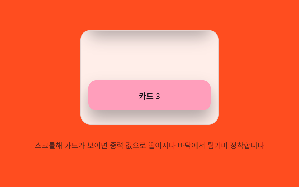 Scroll06 Gravity settle — on scroll entry, an element's position value falls under a gravity value and settles after bouncing off a floor valueScroll Inertia CSS — 9 Value Patterns