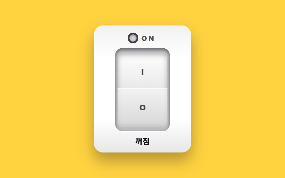
02Rocker power switch
Press the top face of the rocker and the pressed side sinks while its shadow thins and the far side rises. The live side reads without color too, through an amber light and the word ON.
Best forA back-panel power switch mockup, a wireless mouse settings card
role="switch"aria-checkedtranslateYinset
<main class="stage">
<div class="rs is-demo" id="rs">
  <section class="rs__plate">
    <p class="rs__head"><span class="rs__lamp" aria-hidden="true"></span><span class="rs__onWord">ON</span></p>
    <div class="rs__bezel">
      <button class="rs__rocker" id="rsRocker" type="button" role="switch" aria-checked="false" aria-label="Power rocker">
        <span class="rs__cap rs__capTop"><b class="rs__io">I</b></span>
        <span class="rs__cap rs__capBottom"><b class="rs__io">O</b></span>
      </button>
    </div>
    <p class="rs__state" role="status"><span class="rs__wordOff">Off</span><span class="rs__wordOn">On</span></p>
  </section>
</div>
</main>
@use "../../../../site/static/demo-tokens" as *;
// 로커 전원 스위치 — 윗면(I)을 누르면 누른 쪽이 translateY 로 가라앉으며
// inset 그림자가 깊어지고 반대쪽(O)이 떠오른다. 두 cap 의 그림자 리스트는
// 구조를 맞춰(둘 다 inset 2장) 보간이 되게 했다. 켜짐은 주황 표시등과 ON 글자로 —
// 색만으로 상태를 알리지 않는다. role="switch" + aria-checked.
// 미리보기(.is-demo)는 위·아래를 번갈아 눌러 보고 LED·단어는 steps(1,end) 컷.
$duration: $dur-quick;
$easing: $ease-spring;
$color: $stage-paper;
@include stage($stage-yellow);
.rs { display: grid; place-items: center; width: 100%; }
.rs__plate {
box-sizing: border-box; width: clamp(136px, 44vw, 164px);
display: flex; flex-direction: column; align-items: center; gap: $sp-2;
padding: $sp-3; border-radius: $r-card;
background: linear-gradient(180deg, rgba($subject-ink, .06), rgba($subject-ink, 0) 26%, rgba($subject-ink, 0) 74%, rgba($subject-ink, .10)), $color;
box-shadow: $shadow-raised, inset 0 1px 0 rgba($stage-paper, .9);
}
.rs__head { display: flex; align-items: center; gap: $sp-2; margin: 0; height: 18px; }
.rs__lamp {
width: 12px; height: 12px; border-radius: 50%; flex: 0 0 auto;
background: rgba($subject-ink, .16);
box-shadow: inset 0 1px 3px rgba($subject-ink, .5), 0 0 0 3px rgba($subject-ink, .82);
}
.rs__onWord {
font-weight: 800; font-size: clamp(10px, 2.6vw, 12px); line-height: 1;
letter-spacing: .2em; color: rgba($subject-ink, .74);
}
// ── 로커 ─────────────────────────────────────────────────────
.rs__bezel {
padding: $sp-1; border-radius: $r-control;
background: rgba($subject-ink, .26);
box-shadow: inset 0 3px 6px rgba($subject-ink, .55), 0 1px 0 rgba($stage-paper, .8);
}
.rs__rocker {
display: flex; flex-direction: column; margin: 0; padding: 0; border: 0;
width: 84px; height: 132px; background: transparent; cursor: pointer;
}
.rs__rocker:focus-visible { outline: 2px solid $subject-ink; outline-offset: 2px; border-radius: $r-control; }
.rs__cap {
display: flex; align-items: center; justify-content: center;
width: 84px; height: 66px;
transition: transform $duration $easing, box-shadow $duration $easing;
}
.rs__capTop {
border-radius: $r-sm $r-sm 0 0;
background: linear-gradient(180deg, $color, rgba($subject-ink, .10)), $color;
transform: translateY(-3px);
box-shadow: inset 0 -3px 6px rgba($subject-ink, .10), inset 0 2px 0 rgba($stage-paper, .85);
}
.rs__capBottom {
border-radius: 0 0 $r-sm $r-sm;
background: linear-gradient(180deg, rgba($subject-ink, .05), rgba($subject-ink, .17)), $color;
transform: translateY(3px);
box-shadow: inset 0 4px 8px rgba($subject-ink, .32), inset 0 -1px 0 rgba($stage-paper, .40);
}
.rs__io {
font-weight: 800; font-size: 13px; line-height: 1; color: rgba($subject-ink, .76);
}
// 켜짐 — 윗 cap 이 가라앉고 아랫cap 이 뜬다. 표시등·ON 글자·상태 단어가 함께 바뀐다
.rs.is-on .rs__capTop {
transform: translateY(3px);
box-shadow: inset 0 4px 8px rgba($subject-ink, .32), inset 0 -1px 0 rgba($stage-paper, .40);
}
.rs.is-on .rs__capBottom {
transform: translateY(-3px);
box-shadow: inset 0 -3px 6px rgba($subject-ink, .10), inset 0 2px 0 rgba($stage-paper, .85);
}
.rs.is-on .rs__lamp {
background: $stage-orange;
box-shadow: 0 0 12px rgba($stage-orange, .8), 0 0 0 3px rgba($subject-ink, .82);
}
.rs.is-on .rs__onWord { color: $subject-orange-deep; }
.rs__state { position: relative; margin: 0; width: 60px; height: 16px; }
.rs__wordOff, .rs__wordOn {
position: absolute; inset: 0; display: flex; align-items: center; justify-content: center;
font-weight: 800; font-size: clamp(11px, 2.8vw, 13px); line-height: 1;
}
.rs__wordOff { color: $subject-ink; }
.rs__wordOn { display: none; }
.rs.is-on .rs__wordOn { display: flex; }
.rs.is-on .rs__wordOff { display: none; }
// ── 미리보기 루프(2초 한 바퀴) ────────────────────────────────
// 위를 누름(오버슈트 4px) → 유지 → 놓음(튕겨 올라옴) → 유지. 컷 요소는 steps(1,end).
.rs.is-demo .rs__capTop {
animation-name: rsPressTop; animation-duration: $dur-loop;
animation-timing-function: $easing; animation-iteration-count: infinite;
}
@keyframes rsPressTop {
0% { transform: translateY(-3px); box-shadow: inset 0 -3px 6px rgba($subject-ink, .10), inset 0 2px 0 rgba($stage-paper, .85); }
12% { transform: translateY(4px); box-shadow: inset 0 5px 9px rgba($subject-ink, .38), inset 0 -1px 0 rgba($stage-paper, .35); }
18% { transform: translateY(3px); box-shadow: inset 0 4px 8px rgba($subject-ink, .32), inset 0 -1px 0 rgba($stage-paper, .40); }
46% { transform: translateY(3px); box-shadow: inset 0 4px 8px rgba($subject-ink, .32), inset 0 -1px 0 rgba($stage-paper, .40); }
58% { transform: translateY(-4px); box-shadow: inset 0 -4px 7px rgba($subject-ink, .08), inset 0 3px 0 rgba($stage-paper, .9); }
64% { transform: translateY(-3px); box-shadow: inset 0 -3px 6px rgba($subject-ink, .10), inset 0 2px 0 rgba($stage-paper, .85); }
100% { transform: translateY(-3px); box-shadow: inset 0 -3px 6px rgba($subject-ink, .10), inset 0 2px 0 rgba($stage-paper, .85); }
}
.rs.is-demo .rs__capBottom {
animation-name: rsPressBottom; animation-duration: $dur-loop;
animation-timing-function: $easing; animation-iteration-count: infinite;
}
@keyframes rsPressBottom {
0% { transform: translateY(3px); box-shadow: inset 0 4px 8px rgba($subject-ink, .32), inset 0 -1px 0 rgba($stage-paper, .40); }
12% { transform: translateY(-4px); box-shadow: inset 0 -4px 7px rgba($subject-ink, .08), inset 0 3px 0 rgba($stage-paper, .9); }
18% { transform: translateY(-3px); box-shadow: inset 0 -3px 6px rgba($subject-ink, .10), inset 0 2px 0 rgba($stage-paper, .85); }
46% { transform: translateY(-3px); box-shadow: inset 0 -3px 6px rgba($subject-ink, .10), inset 0 2px 0 rgba($stage-paper, .85); }
58% { transform: translateY(4px); box-shadow: inset 0 5px 9px rgba($subject-ink, .38), inset 0 -1px 0 rgba($stage-paper, .35); }
64% { transform: translateY(3px); box-shadow: inset 0 4px 8px rgba($subject-ink, .32), inset 0 -1px 0 rgba($stage-paper, .40); }
100% { transform: translateY(3px); box-shadow: inset 0 4px 8px rgba($subject-ink, .32), inset 0 -1px 0 rgba($stage-paper, .40); }
}
.rs.is-demo .rs__lamp {
animation-name: rsLamp; animation-duration: $dur-loop;
animation-timing-function: steps(1, end); animation-iteration-count: infinite;
}
@keyframes rsLamp {
0% { background: rgba($subject-ink, .16); box-shadow: inset 0 1px 3px rgba($subject-ink, .5), 0 0 0 3px rgba($subject-ink, .82); }
16% { background: $stage-orange; box-shadow: 0 0 12px rgba($stage-orange, .8), 0 0 0 3px rgba($subject-ink, .82); }
62% { background: rgba($subject-ink, .16); box-shadow: inset 0 1px 3px rgba($subject-ink, .5), 0 0 0 3px rgba($subject-ink, .82); }
100% { background: rgba($subject-ink, .16); box-shadow: inset 0 1px 3px rgba($subject-ink, .5), 0 0 0 3px rgba($subject-ink, .82); }
}
.rs.is-demo .rs__onWord {
animation-name: rsOnWord; animation-duration: $dur-loop;
animation-timing-function: steps(1, end); animation-iteration-count: infinite;
}
@keyframes rsOnWord {
0% { color: rgba($subject-ink, .74); }
16% { color: $subject-orange-deep; }
62% { color: rgba($subject-ink, .74); }
100% { color: rgba($subject-ink, .74); }
}
.rs.is-demo .rs__wordOn { display: flex; opacity: 0; }
.rs.is-demo .rs__wordOff { opacity: 1; }
.rs.is-demo .rs__wordOn {
animation-name: rsWordOn; animation-duration: $dur-loop;
animation-timing-function: steps(1, end); animation-iteration-count: infinite;
}
@keyframes rsWordOn {
0% { opacity: 0; }
16% { opacity: 1; }
62% { opacity: 0; }
100% { opacity: 0; }
}
.rs.is-demo .rs__wordOff {
animation-name: rsWordOff; animation-duration: $dur-loop;
animation-timing-function: steps(1, end); animation-iteration-count: infinite;
}
@keyframes rsWordOff {
0% { opacity: 1; }
16% { opacity: 0; }
62% { opacity: 1; }
100% { opacity: 1; }
}
@media (max-width: 340px) {
.rs__plate { gap: $sp-1; padding: $sp-2; }
.rs__head { height: 14px; }
.rs__rocker { width: 68px; height: 104px; }
.rs__cap { width: 68px; height: 52px; }
.rs__io { font-size: 11px; }
.rs__state { height: 14px; }
}
@media (prefers-reduced-motion: reduce) {
.rs.is-demo .rs__capTop { animation: none !important; transform: translateY(-3px) !important; }
.rs.is-demo .rs__capBottom { animation: none !important; transform: translateY(3px) !important; }
.rs.is-demo .rs__lamp { animation: none !important; }
.rs.is-demo .rs__onWord { animation: none !important; }
.rs.is-demo .rs__wordOn { animation: none !important; opacity: 0 !important; }
.rs.is-demo .rs__wordOff { animation: none !important; opacity: 1 !important; }
}html, body {
margin: 0;
overflow: hidden;
}
.stage {
box-sizing: border-box;
min-height: 100vh;
display: grid;
place-items: center;
margin: 0;
background: #ffd23f;
font-family: -apple-system, "Segoe UI", "Noto Sans KR", sans-serif;
padding: clamp(8px, 4vw, 24px);
}
.rs {
display: grid;
place-items: center;
width: 100%;
}
.rs__plate {
box-sizing: border-box;
width: clamp(136px, 44vw, 164px);
display: flex;
flex-direction: column;
align-items: center;
gap: 8px;
padding: 12px;
border-radius: 16px;
background: linear-gradient(180deg, rgba(23, 20, 26, 0.06), rgba(23, 20, 26, 0) 26%, rgba(23, 20, 26, 0) 74%, rgba(23, 20, 26, 0.1)), #ffffff;
box-shadow: 0 14px 24px rgba(23, 20, 26, 0.32), inset 0 1px 0 rgba(255, 255, 255, 0.9);
}
.rs__head {
display: flex;
align-items: center;
gap: 8px;
margin: 0;
height: 18px;
}
.rs__lamp {
width: 12px;
height: 12px;
border-radius: 50%;
flex: 0 0 auto;
background: rgba(23, 20, 26, 0.16);
box-shadow: inset 0 1px 3px rgba(23, 20, 26, 0.5), 0 0 0 3px rgba(23, 20, 26, 0.82);
}
.rs__onWord {
font-weight: 800;
font-size: clamp(10px, 2.6vw, 12px);
line-height: 1;
letter-spacing: 0.2em;
color: rgba(23, 20, 26, 0.74);
}
.rs__bezel {
padding: 4px;
border-radius: 12px;
background: rgba(23, 20, 26, 0.26);
box-shadow: inset 0 3px 6px rgba(23, 20, 26, 0.55), 0 1px 0 rgba(255, 255, 255, 0.8);
}
.rs__rocker {
display: flex;
flex-direction: column;
margin: 0;
padding: 0;
border: 0;
width: 84px;
height: 132px;
background: transparent;
cursor: pointer;
}
.rs__rocker:focus-visible {
outline: 2px solid #17141a;
outline-offset: 2px;
border-radius: 12px;
}
.rs__cap {
display: flex;
align-items: center;
justify-content: center;
width: 84px;
height: 66px;
transition: transform 220ms cubic-bezier(0.2, 0.8, 0.2, 1), box-shadow 220ms cubic-bezier(0.2, 0.8, 0.2, 1);
}
.rs__capTop {
border-radius: 8px 8px 0 0;
background: linear-gradient(180deg, #ffffff, rgba(23, 20, 26, 0.1)), #ffffff;
transform: translateY(-3px);
box-shadow: inset 0 -3px 6px rgba(23, 20, 26, 0.1), inset 0 2px 0 rgba(255, 255, 255, 0.85);
}
.rs__capBottom {
border-radius: 0 0 8px 8px;
background: linear-gradient(180deg, rgba(23, 20, 26, 0.05), rgba(23, 20, 26, 0.17)), #ffffff;
transform: translateY(3px);
box-shadow: inset 0 4px 8px rgba(23, 20, 26, 0.32), inset 0 -1px 0 rgba(255, 255, 255, 0.4);
}
.rs__io {
font-weight: 800;
font-size: 13px;
line-height: 1;
color: rgba(23, 20, 26, 0.76);
}
.rs.is-on .rs__capTop {
transform: translateY(3px);
box-shadow: inset 0 4px 8px rgba(23, 20, 26, 0.32), inset 0 -1px 0 rgba(255, 255, 255, 0.4);
}
.rs.is-on .rs__capBottom {
transform: translateY(-3px);
box-shadow: inset 0 -3px 6px rgba(23, 20, 26, 0.1), inset 0 2px 0 rgba(255, 255, 255, 0.85);
}
.rs.is-on .rs__lamp {
background: #ff4d1f;
box-shadow: 0 0 12px rgba(255, 77, 31, 0.8), 0 0 0 3px rgba(23, 20, 26, 0.82);
}
.rs.is-on .rs__onWord {
color: #c93000;
}
.rs__state {
position: relative;
margin: 0;
width: 60px;
height: 16px;
}
.rs__wordOff, .rs__wordOn {
position: absolute;
inset: 0;
display: flex;
align-items: center;
justify-content: center;
font-weight: 800;
font-size: clamp(11px, 2.8vw, 13px);
line-height: 1;
}
.rs__wordOff {
color: #17141a;
}
.rs__wordOn {
display: none;
}
.rs.is-on .rs__wordOn {
display: flex;
}
.rs.is-on .rs__wordOff {
display: none;
}
.rs.is-demo .rs__capTop {
animation-name: rsPressTop;
animation-duration: 2s;
animation-timing-function: cubic-bezier(0.2, 0.8, 0.2, 1);
animation-iteration-count: infinite;
}
@keyframes rsPressTop {
0% {
transform: translateY(-3px);
box-shadow: inset 0 -3px 6px rgba(23, 20, 26, 0.1), inset 0 2px 0 rgba(255, 255, 255, 0.85);
}
12% {
transform: translateY(4px);
box-shadow: inset 0 5px 9px rgba(23, 20, 26, 0.38), inset 0 -1px 0 rgba(255, 255, 255, 0.35);
}
18% {
transform: translateY(3px);
box-shadow: inset 0 4px 8px rgba(23, 20, 26, 0.32), inset 0 -1px 0 rgba(255, 255, 255, 0.4);
}
46% {
transform: translateY(3px);
box-shadow: inset 0 4px 8px rgba(23, 20, 26, 0.32), inset 0 -1px 0 rgba(255, 255, 255, 0.4);
}
58% {
transform: translateY(-4px);
box-shadow: inset 0 -4px 7px rgba(23, 20, 26, 0.08), inset 0 3px 0 rgba(255, 255, 255, 0.9);
}
64% {
transform: translateY(-3px);
box-shadow: inset 0 -3px 6px rgba(23, 20, 26, 0.1), inset 0 2px 0 rgba(255, 255, 255, 0.85);
}
100% {
transform: translateY(-3px);
box-shadow: inset 0 -3px 6px rgba(23, 20, 26, 0.1), inset 0 2px 0 rgba(255, 255, 255, 0.85);
}
}
.rs.is-demo .rs__capBottom {
animation-name: rsPressBottom;
animation-duration: 2s;
animation-timing-function: cubic-bezier(0.2, 0.8, 0.2, 1);
animation-iteration-count: infinite;
}
@keyframes rsPressBottom {
0% {
transform: translateY(3px);
box-shadow: inset 0 4px 8px rgba(23, 20, 26, 0.32), inset 0 -1px 0 rgba(255, 255, 255, 0.4);
}
12% {
transform: translateY(-4px);
box-shadow: inset 0 -4px 7px rgba(23, 20, 26, 0.08), inset 0 3px 0 rgba(255, 255, 255, 0.9);
}
18% {
transform: translateY(-3px);
box-shadow: inset 0 -3px 6px rgba(23, 20, 26, 0.1), inset 0 2px 0 rgba(255, 255, 255, 0.85);
}
46% {
transform: translateY(-3px);
box-shadow: inset 0 -3px 6px rgba(23, 20, 26, 0.1), inset 0 2px 0 rgba(255, 255, 255, 0.85);
}
58% {
transform: translateY(4px);
box-shadow: inset 0 5px 9px rgba(23, 20, 26, 0.38), inset 0 -1px 0 rgba(255, 255, 255, 0.35);
}
64% {
transform: translateY(3px);
box-shadow: inset 0 4px 8px rgba(23, 20, 26, 0.32), inset 0 -1px 0 rgba(255, 255, 255, 0.4);
}
100% {
transform: translateY(3px);
box-shadow: inset 0 4px 8px rgba(23, 20, 26, 0.32), inset 0 -1px 0 rgba(255, 255, 255, 0.4);
}
}
.rs.is-demo .rs__lamp {
animation-name: rsLamp;
animation-duration: 2s;
animation-timing-function: steps(1, end);
animation-iteration-count: infinite;
}
@keyframes rsLamp {
0% {
background: rgba(23, 20, 26, 0.16);
box-shadow: inset 0 1px 3px rgba(23, 20, 26, 0.5), 0 0 0 3px rgba(23, 20, 26, 0.82);
}
16% {
background: #ff4d1f;
box-shadow: 0 0 12px rgba(255, 77, 31, 0.8), 0 0 0 3px rgba(23, 20, 26, 0.82);
}
62% {
background: rgba(23, 20, 26, 0.16);
box-shadow: inset 0 1px 3px rgba(23, 20, 26, 0.5), 0 0 0 3px rgba(23, 20, 26, 0.82);
}
100% {
background: rgba(23, 20, 26, 0.16);
box-shadow: inset 0 1px 3px rgba(23, 20, 26, 0.5), 0 0 0 3px rgba(23, 20, 26, 0.82);
}
}
.rs.is-demo .rs__onWord {
animation-name: rsOnWord;
animation-duration: 2s;
animation-timing-function: steps(1, end);
animation-iteration-count: infinite;
}
@keyframes rsOnWord {
0% {
color: rgba(23, 20, 26, 0.74);
}
16% {
color: #c93000;
}
62% {
color: rgba(23, 20, 26, 0.74);
}
100% {
color: rgba(23, 20, 26, 0.74);
}
}
.rs.is-demo .rs__wordOn {
display: flex;
opacity: 0;
}
.rs.is-demo .rs__wordOff {
opacity: 1;
}
.rs.is-demo .rs__wordOn {
animation-name: rsWordOn;
animation-duration: 2s;
animation-timing-function: steps(1, end);
animation-iteration-count: infinite;
}
@keyframes rsWordOn {
0% {
opacity: 0;
}
16% {
opacity: 1;
}
62% {
opacity: 0;
}
100% {
opacity: 0;
}
}
.rs.is-demo .rs__wordOff {
animation-name: rsWordOff;
animation-duration: 2s;
animation-timing-function: steps(1, end);
animation-iteration-count: infinite;
}
@keyframes rsWordOff {
0% {
opacity: 1;
}
16% {
opacity: 0;
}
62% {
opacity: 1;
}
100% {
opacity: 1;
}
}
@media (max-width: 340px) {
.rs__plate {
gap: 4px;
padding: 8px;
}
.rs__head {
height: 14px;
}
.rs__rocker {
width: 68px;
height: 104px;
}
.rs__cap {
width: 68px;
height: 52px;
}
.rs__io {
font-size: 11px;
}
.rs__state {
height: 14px;
}
}
@media (prefers-reduced-motion: reduce) {
.rs.is-demo .rs__capTop {
animation: none !important;
transform: translateY(-3px) !important;
}
.rs.is-demo .rs__capBottom {
animation: none !important;
transform: translateY(3px) !important;
}
.rs.is-demo .rs__lamp {
animation: none !important;
}
.rs.is-demo .rs__onWord {
animation: none !important;
}
.rs.is-demo .rs__wordOn {
animation: none !important;
opacity: 0 !important;
}
.rs.is-demo .rs__wordOff {
animation: none !important;
opacity: 1 !important;
}
}var root = document.getElementById('rs');
var rocker = document.getElementById('rsRocker');
function setOn(on) {
rocker.setAttribute('aria-checked', on ? 'true' : 'false');
root.classList.toggle('is-on', on);
}
function toggle() {
root.classList.remove('is-demo');
setOn(rocker.getAttribute('aria-checked') !== 'true');
}
rocker.addEventListener('pointerdown', function () { root.classList.remove('is-demo'); });
rocker.addEventListener('click', toggle);// RockerSwitch — vanilla 판(run/013/demo/02-skeuo-rocker-switch/index.html) 의 React 포트.
// 윗면(I)을 누르면 그쪽이 가라앉고 반대쪽(O)이 뜬다. 값·키프레임은 vanilla 와 같다.
import { useState } from "react";
import styles from "./RockerSwitch.module.scss";
export type RockerSwitchProps = {
duration?: number;
easing?: string;
color?: string;
};
type Vars = { [k: string]: any };
const ROCKER_LABEL = "전원 로커";
const STATE_OFF = "꺼짐";
const STATE_ON = "켜짐";
export default function RockerSwitch({
duration = 220,
easing = "cubic-bezier(.2, .8, .2, 1)", // = $ease-spring
color = "#ffffff",
}: RockerSwitchProps) {
const [on, setOn] = useState(false);
const [demo, setDemo] = useState(true);
const vars: Vars = {
"--duration": `${duration}ms`,
"--easing": easing,
"--color": color,
};
const cls = [styles.root, demo ? styles.isDemo : "", on ? styles.isOn : ""].filter(Boolean).join(" ");
function toggle() {
setDemo(false);
setOn((prev) => !prev);
}
function wake() {
setDemo(false);
}
return (
<main className={styles.stage}>
<div className={cls} style={vars}>
<section className={styles.plate}>
<p className={styles.head}><span className={styles.lamp} aria-hidden="true"></span><span className={styles.onWord}>ON</span></p>
<div className={styles.bezel}>
<button
className={styles.rocker}
type="button"
role="switch"
aria-checked={on}
aria-label={ROCKER_LABEL}
onPointerDown={wake}
onClick={toggle}
>
<span className={`${styles.cap} ${styles.capTop}`}><b className={styles.io}>I</b></span>
<span className={`${styles.cap} ${styles.capBottom}`}><b className={styles.io}>O</b></span>
</button>
</div>
<p className={styles.state} role="status">
<span className={styles.wordOff}>{STATE_OFF}</span>
<span className={styles.wordOn}>{STATE_ON}</span>
</p>
</section>
</div>
</main>
);
}02 Rocker power switch — Measured area 3.633% · moving frames 8/23Original by GODRICH · SCSS and React ship in the zip · CSS Switch Button 9 Ways — Rocker to Tape Eject
The post this demo lives in
 CSS Switch Button 9 Ways — Rocker to Tape EjectA css switch button is a control drawn to behave like the physical switch it stands in for: a lever that tilts, a knob t See all demos in this post