08ステッパー進捗
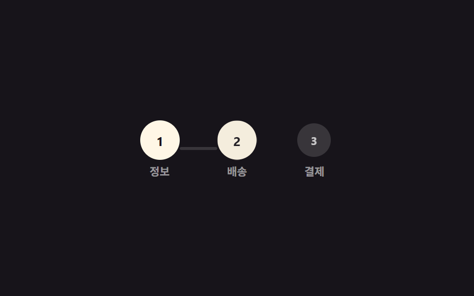
番号付きの丸3つが線でつながり、完了した段階ごとに丸が塗りつぶされ、その間の連結線が scaleX で伸びる。
使いどころ会員登録の複数ステップフォーム、チェックアウトの段階表示
scaleX 연결선원 채움단계 3개
<main class="stage">
  <div class="stepper is-demo" role="list" aria-label="進行ステップ">
    <div class="step" role="listitem"><span class="step__dot">1</span><span class="step__label">情報</span></div>
    <div class="line"></div>
    <div class="step" role="listitem"><span class="step__dot">2</span><span class="step__label">配送</span></div>
    <div class="line"></div>
    <div class="step" role="listitem"><span class="step__dot">3</span><span class="step__label">決済</span></div>
  </div>
</main>
@use "../../../../site/static/demo-tokens" as *;
// ── 변수 3개 ──────────────────────────────────────────
$duration: 400ms; // 원 하나·선 하나가 채워지는 시간
$easing: $ease-spring;
$color: $subject-cream; // 완료된 원·선 색
@include stage($stage-ink);
.stepper { display: flex; align-items: center; }
.step { display: flex; flex-direction: column; align-items: center; gap: 6px; }
.step__dot {
width: clamp(30px, 9vw, 40px);
height: clamp(30px, 9vw, 40px);
border-radius: 50%;
display: grid;
place-items: center;
background: rgba(255, 255, 255, .14);
color: rgba(255, 255, 255, .72);
font-weight: 700; font-size: 13px; line-height: 1; font-family: inherit;
transform: scale(.85);
}
.step__label { font-weight: 600; font-size: 11px; line-height: 1; font-family: inherit; color: rgba(255, 255, 255, .55); }
.line {
width: clamp(30px, 8vw, 44px);
height: 3px;
border-radius: 2px;
background: rgba(255, 255, 255, .14);
transform: scaleX(0);
transform-origin: left; // 규칙8: 좌변서 차오름
}
// 원 → 선 → 원 → 선 → 원 순서로, 앞 단계가 끝나야 다음이 채워진다 (동시에 시작하지 않는다)
.stepper.is-demo .step__dot { animation: dot-fill $duration $easing both; }
.stepper.is-demo .line { animation: line-grow $duration linear both; }
.stepper.is-demo > :nth-child(1) .step__dot { animation-delay: 0ms; }
.stepper.is-demo > :nth-child(2) { animation-delay: 400ms; }
.stepper.is-demo > :nth-child(3) .step__dot { animation-delay: 800ms; }
.stepper.is-demo > :nth-child(4) { animation-delay: 1200ms; }
.stepper.is-demo > :nth-child(5) .step__dot { animation-delay: 1600ms; }
@keyframes dot-fill {
from { background: rgba(255, 255, 255, .14); color: rgba(255, 255, 255, .72); transform: scale(.85); }
to { background: $color; color: $stage-ink; transform: scale(1); }
}
@keyframes line-grow { from { transform: scaleX(0); } to { transform: scaleX(1); } }
@media (prefers-reduced-motion: reduce) {
.stepper.is-demo .step__dot,
.stepper.is-demo .line { animation: none; background: $color; transform: none; }
.stepper.is-demo .step__dot { color: $stage-ink; }
}html, body {
margin: 0;
overflow: hidden;
}
.stage {
box-sizing: border-box;
min-height: 100vh;
display: grid;
place-items: center;
margin: 0;
background: #17141a;
font-family: -apple-system, "Segoe UI", "Noto Sans KR", sans-serif;
padding: clamp(8px, 4vw, 24px);
}
.stepper {
display: flex;
align-items: center;
}
.step {
display: flex;
flex-direction: column;
align-items: center;
gap: 6px;
}
.step__dot {
width: clamp(30px, 9vw, 40px);
height: clamp(30px, 9vw, 40px);
border-radius: 50%;
display: grid;
place-items: center;
background: rgba(255, 255, 255, 0.14);
color: rgba(255, 255, 255, 0.72);
font-weight: 700;
font-size: 13px;
line-height: 1;
font-family: inherit;
transform: scale(0.85);
}
.step__label {
font-weight: 600;
font-size: 11px;
line-height: 1;
font-family: inherit;
color: rgba(255, 255, 255, 0.55);
}
.line {
width: clamp(30px, 8vw, 44px);
height: 3px;
border-radius: 2px;
background: rgba(255, 255, 255, 0.14);
transform: scaleX(0);
transform-origin: left;
}
.stepper.is-demo .step__dot {
animation: dot-fill 400ms cubic-bezier(0.2, 0.8, 0.2, 1) both;
}
.stepper.is-demo .line {
animation: line-grow 400ms linear both;
}
.stepper.is-demo > :nth-child(1) .step__dot {
animation-delay: 0ms;
}
.stepper.is-demo > :nth-child(2) {
animation-delay: 400ms;
}
.stepper.is-demo > :nth-child(3) .step__dot {
animation-delay: 800ms;
}
.stepper.is-demo > :nth-child(4) {
animation-delay: 1200ms;
}
.stepper.is-demo > :nth-child(5) .step__dot {
animation-delay: 1600ms;
}
@keyframes dot-fill {
from {
background: rgba(255, 255, 255, 0.14);
color: rgba(255, 255, 255, 0.72);
transform: scale(0.85);
}
to {
background: #fff7e6;
color: #17141a;
transform: scale(1);
}
}
@keyframes line-grow {
from {
transform: scaleX(0);
}
to {
transform: scaleX(1);
}
}
@media (prefers-reduced-motion: reduce) {
.stepper.is-demo .step__dot,
.stepper.is-demo .line {
animation: none;
background: #fff7e6;
transform: none;
}
.stepper.is-demo .step__dot {
color: #17141a;
}
}import type { CSSProperties, ReactNode } from "react";
import styles from "./StepperProgress.module.scss";
export type StepperProgressProps = {
/** 완료된 단계 수 (0~labels.length) */
step: number;
labels?: string[];
duration?: number;
easing?: string;
color?: string;
};
type Vars = CSSProperties & {
"--duration"?: string;
"--easing"?: string;
"--color"?: string;
};
export default function StepperProgress({
step,
labels = ["Info", "Shipping", "Payment"],
duration = 400,
easing = "cubic-bezier(.2,.8,.2,1)",
color = "#fff7e6",
}: StepperProgressProps) {
const vars: Vars = { "--duration": `${duration}ms`, "--easing": easing, "--color": color };
const nodes: ReactNode[] = [];
labels.forEach((l, i) => {
if (i > 0) {
nodes.push(<span key={`line-${i}`} className={i <= step - 1 ? `${styles.line} ${styles.on}` : styles.line} />);
}
nodes.push(
<div key={`step-${i}`} className={styles.step} role="listitem">
<span className={i < step ? `${styles.dot} ${styles.on}` : styles.dot}>{i + 1}</span>
<span className={styles.label}>{l}</span>
</div>
);
});
return (
<div className={styles.stepper} style={vars} role="list" aria-label="progress steps">
{nodes}
</div>
);
}08 ステッパー進捗 — 計測 累積面積 2.911% · 動いたフレーム 23/23GODRICH オリジナル · SCSS と React は zip に同梱 · CSS プログレスバー 円形ゲージ9選 — 数値を変えるだけ
このデモが属する記事
 CSS プログレスバー 円形ゲージ9選 — 数値を変えるだけcss プログレスバー 円で探している人が見たいのは、直線の帯ではなく丸いリングやゲージで割合を示すCSS部品です。今回は実際に動く9種類を用意し、どれもwidthではなくtransformとconic-gradientだけで値を表現してい この記事のデモをすべて見る