09Vòng focus có animation
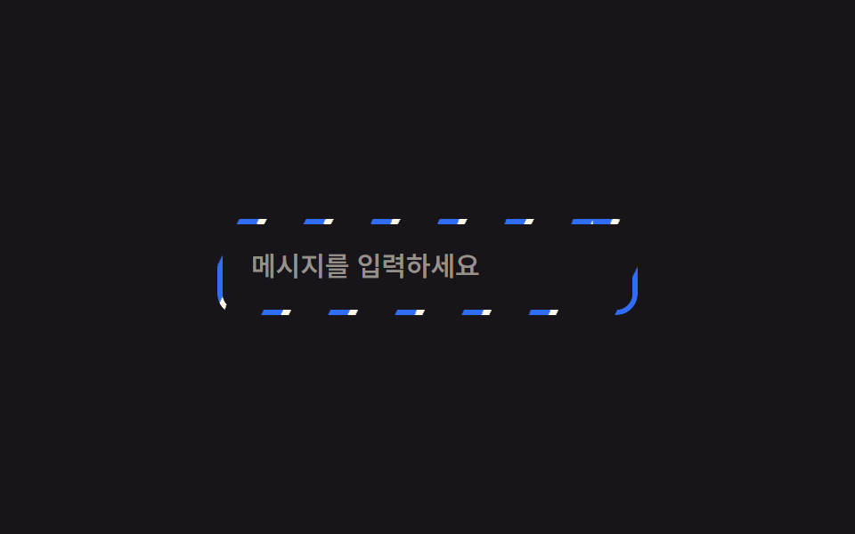
Khi focus bằng bàn phím, outline-offset mở rộng từ 0 lên 4px trong khi outline chuyển từ trong suốt sang có màu, khiến vòng trông như bật ra rồi ổn định.
Dùng choFocus bàn phím trên trường form, nút cần chỉ báo tiếp cận rõ ràng
outline-offset:focus-visible0.22초
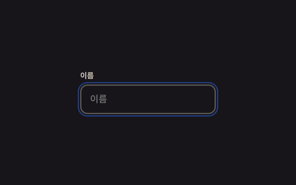
<main class="stage">
  <div class="field">
    <label class="field__label" for="name">Tên</label>
    <input class="field__input is-demo" id="name" type="text" placeholder="Tên">
  </div>
</main>
@use "../../../../site/static/demo-tokens" as *;
$duration: $dur-quick; // 실제 포커스 시 링이 벌어지는 시간
$easing: $ease-out;
$color: $subject-blue; // 링 색
@include stage($stage-ink);
.stage { padding: clamp(6px, 2.4vw, 16px); }
.field { width: min(220px, 70vw); }
.field__label {
display: block;
margin-bottom: 6px;
font-weight: 600; font-size: clamp(11px, 3vw, 12px); line-height: 1.3; font-family: inherit;
color: rgba($subject-cream, .7);
}
.field__input {
box-sizing: border-box;
width: 100%;
border: 2px solid rgba($subject-cream, .3);
border-radius: $r-control;
padding: 12px 14px;
font-weight: 500; font-size: clamp(13px, 3.6vw, 15px); line-height: 1.3; font-family: inherit;
color: $subject-cream;
background: transparent;
outline: 2px solid transparent;
outline-offset: 0;
transition: outline-color $duration $easing, outline-offset $duration $easing;
}
.field__input:focus-visible { outline-color: $color; outline-offset: 4px; }
// 데모 루프: 링이 붙어 있다가 튀어나오듯 벌어지고 다시 붙는다
.field__input.is-demo { animation: ring $dur-loop $easing infinite; }
@keyframes ring {
0%, 10% { outline-offset: 0; outline-color: rgba($color, .9); }
45%, 65% { outline-offset: 4px; outline-color: rgba($color, .2); }
100% { outline-offset: 0; outline-color: rgba($color, .9); }
}
@media (prefers-reduced-motion: reduce) {
.field__input { transition: none; }
.field__input.is-demo { animation: none; outline-color: rgba($color, .9); }
}html, body {
margin: 0;
overflow: hidden;
}
.stage {
box-sizing: border-box;
min-height: 100vh;
display: grid;
place-items: center;
margin: 0;
background: #17141a;
font-family: -apple-system, "Segoe UI", "Noto Sans KR", sans-serif;
padding: clamp(8px, 4vw, 24px);
}
.stage {
padding: clamp(6px, 2.4vw, 16px);
}
.field {
width: min(220px, 70vw);
}
.field__label {
display: block;
margin-bottom: 6px;
font-weight: 600;
font-size: clamp(11px, 3vw, 12px);
line-height: 1.3;
font-family: inherit;
color: rgba(255, 247, 230, 0.7);
}
.field__input {
box-sizing: border-box;
width: 100%;
border: 2px solid rgba(255, 247, 230, 0.3);
border-radius: 12px;
padding: 12px 14px;
font-weight: 500;
font-size: clamp(13px, 3.6vw, 15px);
line-height: 1.3;
font-family: inherit;
color: #fff7e6;
background: transparent;
outline: 2px solid transparent;
outline-offset: 0;
transition: outline-color 220ms ease-out, outline-offset 220ms ease-out;
}
.field__input:focus-visible {
outline-color: #2f6df6;
outline-offset: 4px;
}
.field__input.is-demo {
animation: ring 2s ease-out infinite;
}
@keyframes ring {
0%, 10% {
outline-offset: 0;
outline-color: rgba(47, 109, 246, 0.9);
}
45%, 65% {
outline-offset: 4px;
outline-color: rgba(47, 109, 246, 0.2);
}
100% {
outline-offset: 0;
outline-color: rgba(47, 109, 246, 0.9);
}
}
@media (prefers-reduced-motion: reduce) {
.field__input {
transition: none;
}
.field__input.is-demo {
animation: none;
outline-color: rgba(47, 109, 246, 0.9);
}
}import type { CSSProperties } from "react";
import styles from "./FocusRingField.module.scss";
export type FocusRingFieldProps = {
label: string;
placeholder: string;
/** 실제 포커스 시 링이 벌어지는 시간 (기본 220ms) */
duration?: number;
easing?: string;
/** 링 색 */
color?: string;
};
type Vars = CSSProperties & { "--duration"?: string; "--easing"?: string; "--color"?: string };
export default function FocusRingField({
label,
placeholder,
duration = 220,
easing = "ease-out",
color = "#2f6df6",
}: FocusRingFieldProps) {
const vars: Vars = { "--duration": `${duration}ms`, "--easing": easing, "--color": color };
const id = "focus-" + label.replace(/\s+/g, "-").toLowerCase();
return (
<div className={styles.field} style={vars}>
<label className={styles.label} htmlFor={id}>{label}</label>
<input className={styles.input} id={id} type="text" placeholder={placeholder} />
</div>
);
}09 Vòng focus có animation — Diện tích đo được 2.264% · khung hình chuyển động 15/23Nguyên tác GODRICH · SCSS và React nằm trong tệp zip · 9 CSS Border Animations — dán 1 dòng là chạy
Bài viết chứa demo này
 9 CSS Border Animations — dán 1 dòng là chạyCSS border animation là hiệu ứng viền của card hay ô nhập di chuyển, phát sáng hoặc đổi màu bằng thuần CSS để báo một tr Xem tất cả demo trong bài này