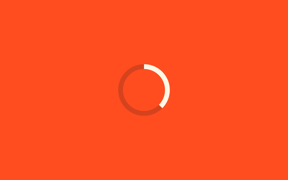
07Vòng % với @property
Custom property dạng số đăng ký bằng @property chạy từ 0 đến 100 để lấp đầy vòng tròn.
Dùng choTiến độ upload có % thực, hiển thị tỷ lệ hoàn thành onboarding
@property0~100%conic-gradient
<main class="stage">
  <div class="ring" role="progressbar" aria-valuemin="0" aria-valuemax="100" aria-label="Tiến độ"></div>
</main>
@use "../../../../site/static/demo-tokens" as *;
$duration: 1.8s; // 0 → 100 → 0 한 사이클
$easing: ease-in-out;
$color: $subject-cream; // 채워지는 색
@include stage($stage-orange);
@property --percent {
syntax: "<number>";
inherits: false;
initial-value: 0;
}
.ring {
--percent: 0;
position: relative;
width: clamp(64px, 18vw, 96px);
height: clamp(64px, 18vw, 96px);
border-radius: 50%;
background: conic-gradient($color calc(var(--percent) * 1%), rgba($subject-ink, .18) 0);
animation: fill $duration $easing infinite;
}
.ring::before {
content: "";
position: absolute;
inset: 8px;
border-radius: 50%;
background: $stage-orange; // 안쪽을 뚫어 링으로 보이게
}
@keyframes fill {
0% { --percent: 0; }
50% { --percent: 100; }
100% { --percent: 0; }
}
@media (prefers-reduced-motion: reduce) {
.ring { animation: none; --percent: 62; }
}html, body {
margin: 0;
overflow: hidden;
}
.stage {
box-sizing: border-box;
min-height: 100vh;
display: grid;
place-items: center;
margin: 0;
background: #ff4d1f;
font-family: -apple-system, "Segoe UI", "Noto Sans KR", sans-serif;
padding: clamp(8px, 4vw, 24px);
}
@property --percent {
syntax: "<number>";
inherits: false;
initial-value: 0;
}
.ring {
--percent: 0;
position: relative;
width: clamp(64px, 18vw, 96px);
height: clamp(64px, 18vw, 96px);
border-radius: 50%;
background: conic-gradient(#fff7e6 calc(var(--percent) * 1%), rgba(23, 20, 26, 0.18) 0);
animation: fill 1.8s ease-in-out infinite;
}
.ring::before {
content: "";
position: absolute;
inset: 8px;
border-radius: 50%;
background: #ff4d1f;
}
@keyframes fill {
0% {
--percent: 0;
}
50% {
--percent: 100;
}
100% {
--percent: 0;
}
}
@media (prefers-reduced-motion: reduce) {
.ring {
animation: none;
--percent: 62;
}
}import type { CSSProperties } from "react";
import styles from "./PropertyProgressRing.module.scss";
export type PropertyProgressRingProps = {
/** 스피너 지름 (기본 80px) */
size?: number;
/** 0 → 100 → 0 한 사이클 시간 (기본 1800ms) */
duration?: number;
/** 채워지는 색 */
color?: string;
label?: string;
};
type Vars = CSSProperties & { "--size"?: string; "--duration"?: string; "--color"?: string };
export default function PropertyProgressRing({
size = 80,
duration = 1800,
color = "#fff7e6",
label = "Progress",
}: PropertyProgressRingProps) {
const vars: Vars = {
"--size": `${size}px`,
"--duration": `${duration}ms`,
"--color": color,
};
return (
<div
className={styles.ring}
style={vars}
role="progressbar"
aria-valuemin={0}
aria-valuemax={100}
aria-label={label}
/>
);
}07 Vòng % với @property — Diện tích đo được 1.508% · khung hình chuyển động 23/23Nguyên tác GODRICH · SCSS và React nằm trong tệp zip · 9 hiệu ứng css loading spinner animation gọn nhẹ
Bài viết chứa demo này
 9 hiệu ứng css loading spinner animation gọn nhẹCSS loading spinner animation là một khối nhỏ tự xoay, tự nảy hoặc tự đổi độ sáng bằng thuần CSS để báo cho người dùng b Xem tất cả demo trong bài này