07Nhãn phần trăm đồng bộ
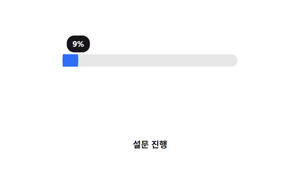
Trên thanh ngang chứ không phải vòng tròn, nhãn bong bóng bám theo mép chạy của phần đã đầy qua translateX, hiện giá trị hiện tại khi nó di chuyển.
Dùng choTheo dõi tiến trình khảo sát hoặc onboarding, xem trước input kiểu slider
translateX 동기말풍선CSS 변수
<main class="stage">
  <div class="track is-demo" role="progressbar" aria-valuemin="0" aria-valuemax="100" aria-valuenow="76" aria-label="Tiến trình khảo sát">
    <div class="bar"></div>
    <div class="bubble"><span class="bubble__num" aria-hidden="true"></span></div>
  </div>
  <p class="cap">Tiến trình khảo sát</p>
</main>
@use "../../../../site/static/demo-tokens" as *;
// ── 변수 3개 ──────────────────────────────────────────
$duration: $dur-loop;
$easing: $ease-out;
$color: $subject-blue; // 바·말풍선 공통 색
@include stage($stage-paper);
// 정수로 등록해야 counter() 가 자릿수를 깔끔하게 읽는다. 자식(bar·bubble)이 같이 읽으므로 inherits: true
@property --percent {
syntax: "<integer>";
inherits: true;
initial-value: 0;
}
.track {
--percent: 0;
position: relative;
width: clamp(220px, 62vw, 280px);
height: 20px;
margin-top: 26px;
border-radius: $r-pill;
background: rgba(23, 20, 26, .1);
container-type: inline-size; // 말풍선이 이 폭을 기준으로 움직인다
}
.bar {
position: absolute;
inset: 0;
border-radius: inherit;
background: $color;
transform: scaleX(calc(var(--percent) / 100));
transform-origin: left center; // 규칙8: 좌변서 차오름
}
// 링이 아니라 막대 위에서, 채움의 끝자락을 translateX(cqw) 로 따라간다 — 1cqw = 컨테이너 폭의 1%
.bubble {
position: absolute;
top: -30px;
left: 0;
transform: translateX(calc(var(--percent) * 1cqw - 50%));
background: $subject-ink;
color: #fff;
border-radius: $r-control;
padding: 3px 9px;
font: 700 clamp(11px, 3vw, 13px)/1.6 -apple-system, "Segoe UI", "Noto Sans KR", sans-serif;
}
.bubble__num {
counter-reset: p var(--percent);
&::before { content: counter(p) "%"; }
}
.track.is-demo { animation: fill $duration $easing infinite; }
@keyframes fill { 0% { --percent: 0; } 60% { --percent: 76; } 100% { --percent: 76; } }
.cap {
margin: 34px 0 0;
color: $subject-ink;
font: 600 clamp(12px, 3.2vw, 14px)/1 -apple-system, "Segoe UI", "Noto Sans KR", sans-serif;
}
@media (prefers-reduced-motion: reduce) {
.track.is-demo { animation: none; --percent: 76; }
}html, body {
margin: 0;
overflow: hidden;
}
.stage {
box-sizing: border-box;
min-height: 100vh;
display: grid;
place-items: center;
margin: 0;
background: #ffffff;
font-family: -apple-system, "Segoe UI", "Noto Sans KR", sans-serif;
padding: clamp(8px, 4vw, 24px);
}
@property --percent {
syntax: "<integer>";
inherits: true;
initial-value: 0;
}
.track {
--percent: 0;
position: relative;
width: clamp(220px, 62vw, 280px);
height: 20px;
margin-top: 26px;
border-radius: 999px;
background: rgba(23, 20, 26, 0.1);
container-type: inline-size;
}
.bar {
position: absolute;
inset: 0;
border-radius: inherit;
background: #2f6df6;
transform: scaleX(calc(var(--percent) / 100));
transform-origin: left center;
}
.bubble {
position: absolute;
top: -30px;
left: 0;
transform: translateX(calc(var(--percent) * 1cqw - 50%));
background: #17141a;
color: #fff;
border-radius: 12px;
padding: 3px 9px;
font: 700 clamp(11px, 3vw, 13px)/1.6 -apple-system, "Segoe UI", "Noto Sans KR", sans-serif;
}
.bubble__num {
counter-reset: p var(--percent);
}
.bubble__num::before {
content: counter(p) "%";
}
.track.is-demo {
animation: fill 2s ease-out infinite;
}
@keyframes fill {
0% {
--percent: 0;
}
60% {
--percent: 76;
}
100% {
--percent: 76;
}
}
.cap {
margin: 34px 0 0;
color: #17141a;
font: 600 clamp(12px, 3.2vw, 14px)/1 -apple-system, "Segoe UI", "Noto Sans KR", sans-serif;
}
@media (prefers-reduced-motion: reduce) {
.track.is-demo {
animation: none;
--percent: 76;
}
}import type { CSSProperties } from "react";
import styles from "./PercentLabel.module.scss";
export type PercentLabelProps = {
/** 0~100 */
percent: number;
duration?: number;
easing?: string;
color?: string;
label?: string;
};
type Vars = CSSProperties & {
"--duration"?: string;
"--easing"?: string;
"--color"?: string;
"--percent"?: number;
};
export default function PercentLabel({
percent,
duration = 600,
easing = "ease-out",
color = "#2f6df6",
label,
}: PercentLabelProps) {
const p = Math.max(0, Math.min(100, percent));
const vars: Vars = { "--duration": `${duration}ms`, "--easing": easing, "--color": color, "--percent": p };
return (
<div
className={styles.track}
style={vars}
role="progressbar"
aria-valuemin={0}
aria-valuemax={100}
aria-valuenow={p}
aria-label={label}
>
<div className={styles.bar} />
<div className={styles.bubble}>{Math.round(p)}%</div>
</div>
);
}07 Nhãn phần trăm đồng bộ — Diện tích đo được 7.601% · khung hình chuyển động 14/23Nguyên tác GODRICH · SCSS và React nằm trong tệp zip · 9 CSS Progress Bar Circle Gauges — chỉ cần đổi số
Bài viết chứa demo này
 9 CSS Progress Bar Circle Gauges — chỉ cần đổi sốCSS progress bar circle là thanh và vòng tiến trình chỉ cần đổi một con số để vẽ lại toàn bộ. Chín kiểu dưới đây đều chạ Xem tất cả demo trong bài này