09Delay giả ngẫu nhiên (SCSS random())
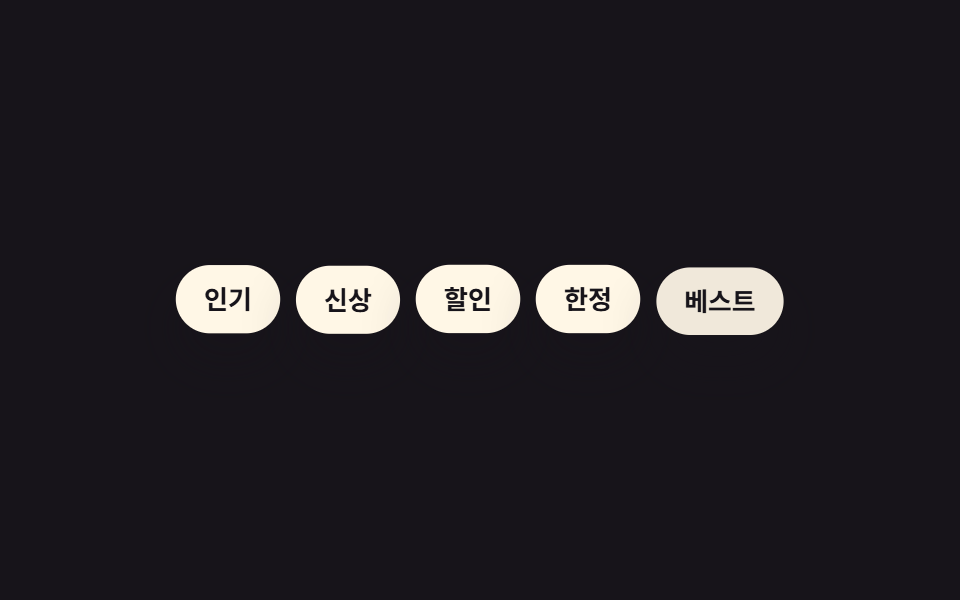
Hàm random() của SCSS chốt sẵn một giá trị delay khác nhau cho từng phần tử ngay lúc biên dịch, thay vì khoảng cách đều đặn.
Dùng choTập hợp badge/tag, danh sách kiểu hạt rải rác
SCSS random()비선형 지연컴파일타임 고정
<main class="stage">
  <div class="badges is-demo">
    <span class="badge">Phổ biến</span>
    <span class="badge">Mới</span>
    <span class="badge">Giảm giá</span>
    <span class="badge">Giới hạn</span>
    <span class="badge">Tốt nhất</span>
  </div>
</main>
@use "../../../../site/static/demo-tokens" as *;
$duration: $dur-quick; // 배지 하나가 나타나는 시간
$easing: $ease-pop; // 톡 튀어 올라오는 느낌
$max-delay: 420; // 랜덤 지연 상한(ms) — SCSS random() 이 컴파일 시점에 고정한다
@include stage($stage-ink);
.badges {
display: flex;
flex-wrap: wrap;
justify-content: center;
gap: 8px;
max-width: min(380px, 90vw);
font-weight: 700; font-size: clamp(11px, 3vw, 13px); line-height: 1.2; font-family: inherit;
}
.badge {
padding: clamp(7px, 2.2vw, 9px) clamp(11px, 3vw, 14px);
border-radius: $r-pill;
background: $subject-cream;
color: $stage-ink;
box-shadow: $shadow-raised;
animation: badge-loop $dur-loop $easing infinite;
}
// 항목마다 컴파일 시점에 고정된 서로 다른 지연 — 균일 간격이 아니라 흩뿌려진 느낌
@for $i from 1 through 5 {
.badge:nth-child(#{$i}) { animation-delay: random($max-delay) * 1ms; }
}
@keyframes badge-loop {
0%, 4% { opacity: 0; transform: translateY(10px) scale(.9); }
16%, 60% { opacity: 1; transform: translateY(0) scale(1); }
84%, 100% { opacity: 0; transform: translateY(-6px) scale(.95); }
}
@media (prefers-reduced-motion: reduce) {
.badge { animation: none; opacity: 1; transform: none; }
}html, body {
margin: 0;
overflow: hidden;
}
.stage {
box-sizing: border-box;
min-height: 100vh;
display: grid;
place-items: center;
margin: 0;
background: #17141a;
font-family: -apple-system, "Segoe UI", "Noto Sans KR", sans-serif;
padding: clamp(8px, 4vw, 24px);
}
.badges {
display: flex;
flex-wrap: wrap;
justify-content: center;
gap: 8px;
max-width: min(380px, 90vw);
font-weight: 700;
font-size: clamp(11px, 3vw, 13px);
line-height: 1.2;
font-family: inherit;
}
.badge {
padding: clamp(7px, 2.2vw, 9px) clamp(11px, 3vw, 14px);
border-radius: 999px;
background: #fff7e6;
color: #17141a;
box-shadow: 0 14px 24px rgba(23, 20, 26, 0.32);
animation: badge-loop 2s cubic-bezier(0.2, 1.4, 0.4, 1) infinite;
}
.badge:nth-child(1) {
animation-delay: 160ms;
}
.badge:nth-child(2) {
animation-delay: 175ms;
}
.badge:nth-child(3) {
animation-delay: 136ms;
}
.badge:nth-child(4) {
animation-delay: 122ms;
}
.badge:nth-child(5) {
animation-delay: 193ms;
}
@keyframes badge-loop {
0%, 4% {
opacity: 0;
transform: translateY(10px) scale(0.9);
}
16%, 60% {
opacity: 1;
transform: translateY(0) scale(1);
}
84%, 100% {
opacity: 0;
transform: translateY(-6px) scale(0.95);
}
}
@media (prefers-reduced-motion: reduce) {
.badge {
animation: none;
opacity: 1;
transform: none;
}
}import styles from "./RandomDelayBadges.module.scss";
export type RandomDelayBadgesProps = {
badges: string[];
};
export default function RandomDelayBadges({ badges }: RandomDelayBadgesProps) {
return (
<div className={styles.badges}>
{badges.map((label) => (
<span key={label} className={styles.badge}>
{label}
</span>
))}
</div>
);
}09 Delay giả ngẫu nhiên (SCSS random()) — Diện tích đo được 6.827% · khung hình chuyển động 9/23Nguyên tác GODRICH · SCSS và React nằm trong tệp zip · 9 CSS Stagger Animation Demos Copy-Paste Là Chạy
Bài viết chứa demo này
 9 CSS Stagger Animation Demos Copy-Paste Là ChạyCSS stagger animation là kỹ thuật khiến các phần tử trong danh sách hay lưới xuất hiện trễ nhau, thay vì bung ra cùng lú Xem tất cả demo trong bài này