CSS アコーディオン アニメーション 9選 — JS最小・CSSだけ
css アコーディオン アニメーション は、クリックした項目だけが高さごと開閉するUI部品を、JavaScriptなしでCSSだけで動かす技術です。この記事では9種類を選び、interpolate-size と calc-size() という2つの仕組みだけで実装しました。
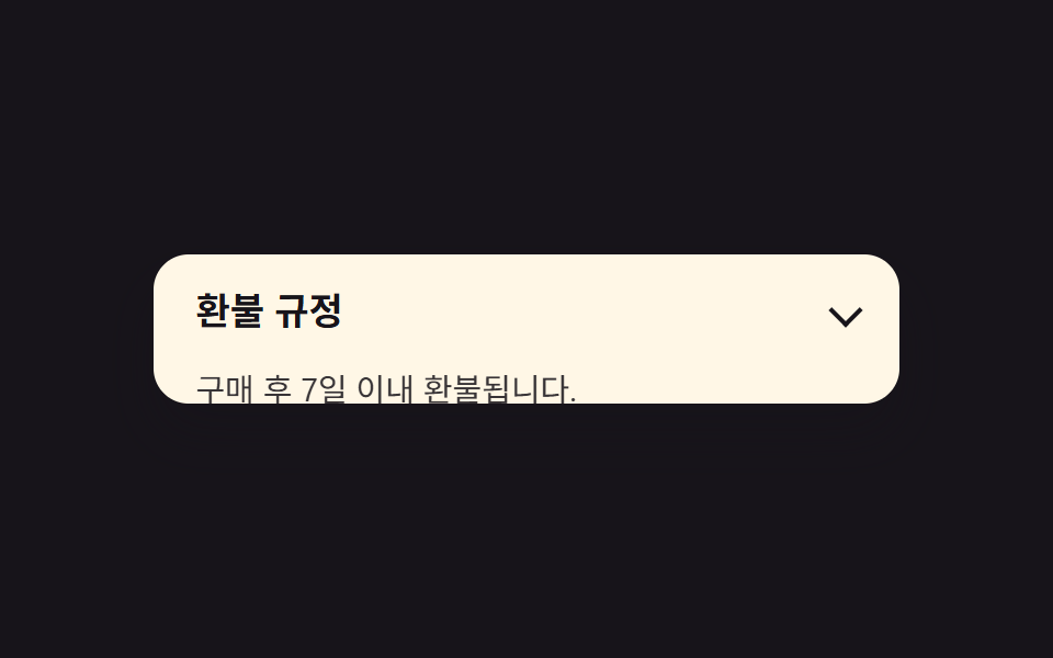 01 accordion-height-auto-interpolate
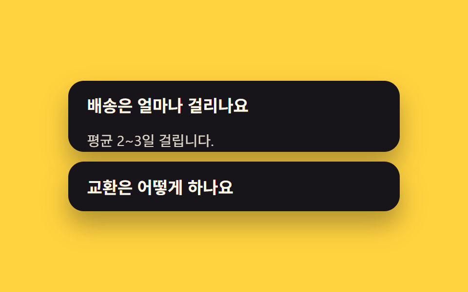 02 accordion-exclusive-open
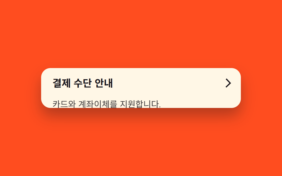 03 accordion-chevron-rotate
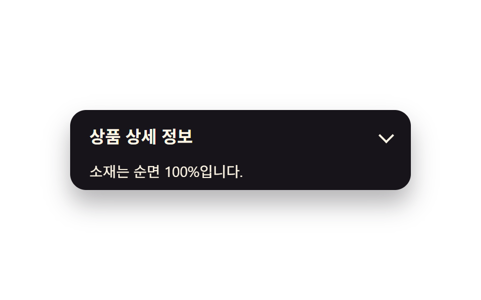 04 accordion-fade-slide-content
 05 accordion-border-highlight-open
 06 accordion-nested-accordion
 07 accordion-calc-size-fallback
 08 accordion-elastic-bounce-open
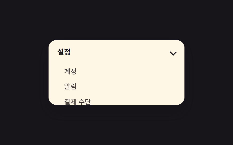 09 accordion-sidebar-nav-reuse
自動再生 · タイルを押すとその項目へ · すべて1つのzip
- 01 interpolate-sizeでheight:auto
- 02 name属性で1つだけ開く
- 03 矢印マーカー回転
- 04 本文がフェード+スライド
- 05 開いた項目を強調
- 06 入れ子アコーディオン
- 07 calc-size()フォールバック
- 08 弾性バウンスで開く
- 09 サイドバーメニューに転用
並び順は効果の種類ではなく、実際にアコーディオンを組み立てるときの手順です。まず高さの開閉そのものを動かし(01)、次に一度に1つだけ開く制御を足し(02)、そこへ矢印や本文の登場、強調表示を重ね(03〜05)、最後に入れ子・フォールバック・特別な演出・別の場面への転用という応用を並べました(06〜09)。HTMLとCSSだけでアコーディオンを完結させるため、JavaScriptのファイルは開閉のクラス付け替え以外に入っていません。項目ごとに要点となるコードだけを載せ、完全なファイルはzipの中です。 09のサイドバーのように開閉がナビゲーションへ移ると、アイコン側も一緒に変わる必要が出てきます。その部分はcss ハンバーガーメニュー アニメーション9選にあり、下へ伸びるのではなく浮いて重なる形はCSS ドロップダウン メニュー アニメーション 9選が扱っています。
01interpolate-sizeでheight:auto
動きの内容
「開く」ボタンを押すと、閉じていたパネルが interpolate-size: allow-keywords と calc-size(auto, size) の組み合わせだけで、内容の高さまで滑らかに伸びます。
<main class="stage">
  <section class="accordion">
    <button class="accordion__header" type="button" aria-expanded="false">
      <span class="accordion__title">返金ポリシー</span>
      <span class="accordion__chevron" aria-hidden="true"></span>
    </button>
    <div class="accordion__panel is-demo">
      <p class="accordion__body">購入後7日以内は返金できます。</p>
    </div>
  </section>
</main>
@use "../../../../site/static/demo-tokens" as *;
$duration: $dur-base; // 열리는 데 걸리는 시간
$easing: $ease-spring; // 전환 곡선
$color: $subject-blue; // 강조 색
@include stage($stage-ink);
.accordion {
width: clamp(220px, 78vw, 340px);
background: $subject-cream;
border-radius: $r-card;
box-shadow: $shadow-raised;
overflow: hidden;
font-family: inherit;
}
.accordion__header {
display: flex;
align-items: center;
justify-content: space-between;
gap: 12px;
width: 100%;
border: 0;
background: none;
padding: clamp(12px, 3vw, 18px) clamp(14px, 4vw, 20px);
cursor: pointer;
color: $subject-ink;
font-weight: 600;
font-size: clamp(14px, 3.6vw, 17px);
line-height: 1.3;
font-family: inherit;
text-align: left;
}
.accordion__chevron {
flex: none;
width: 9px;
height: 9px;
border-right: 2px solid currentColor;
border-bottom: 2px solid currentColor;
transform: rotate(45deg);
}
.accordion__body {
margin: 0;
padding: 0 clamp(14px, 4vw, 20px) clamp(12px, 3vw, 18px);
color: $subject-ink;
opacity: .86;
font-weight: 400;
font-size: clamp(12px, 3.2vw, 14.5px);
line-height: 1.5;
font-family: inherit;
}
.accordion__panel {
height: 0;
overflow: hidden;
interpolate-size: allow-keywords;
}
// 실사용: 클릭하면 열림 상태(.is-open)가 붙고 목표 높이까지 전환된다
.accordion.is-open .accordion__panel {
height: calc-size(auto, size);
transition: height $duration $easing;
}
@supports not (height: calc-size(auto, size)) {
.accordion.is-open .accordion__panel { height: auto; }
}
// 데모: 2초 주기로 스스로 열고 닫힌다. WAAPI 시계로 재생 위치를 잡으려면
// transition 이 아니라 keyframes 여야 한다 (blog-demo 측정 규칙)
.accordion__panel.is-demo {
animation: accordion-loop $dur-loop $easing infinite;
}
@keyframes accordion-loop {
0%, 8% { height: 0; }
42%, 58% { height: calc-size(auto, size); }
92%, 100% { height: 0; }
}
@supports not (height: calc-size(auto, size)) {
@keyframes accordion-loop {
0%, 8% { height: 0; }
42%, 58% { height: 220px; }
92%, 100% { height: 0; }
}
}
@media (prefers-reduced-motion: reduce) {
.accordion__panel,
.accordion__panel.is-demo,
.accordion__chevron,
.accordion__body,
.accordion.is-open .accordion__panel {
animation: none !important;
transition: none !important;
}
.accordion__panel.is-demo { height: auto; }
}html, body {
margin: 0;
overflow: hidden;
}
.stage {
box-sizing: border-box;
min-height: 100vh;
display: grid;
place-items: center;
margin: 0;
background: #17141a;
font-family: -apple-system, "Segoe UI", "Noto Sans KR", sans-serif;
padding: clamp(8px, 4vw, 24px);
}
.accordion {
width: clamp(220px, 78vw, 340px);
background: #fff7e6;
border-radius: 16px;
box-shadow: 0 14px 24px rgba(23, 20, 26, 0.32);
overflow: hidden;
font-family: inherit;
}
.accordion__header {
display: flex;
align-items: center;
justify-content: space-between;
gap: 12px;
width: 100%;
border: 0;
background: none;
padding: clamp(12px, 3vw, 18px) clamp(14px, 4vw, 20px);
cursor: pointer;
color: #17141a;
font-weight: 600;
font-size: clamp(14px, 3.6vw, 17px);
line-height: 1.3;
font-family: inherit;
text-align: left;
}
.accordion__chevron {
flex: none;
width: 9px;
height: 9px;
border-right: 2px solid currentColor;
border-bottom: 2px solid currentColor;
transform: rotate(45deg);
}
.accordion__body {
margin: 0;
padding: 0 clamp(14px, 4vw, 20px) clamp(12px, 3vw, 18px);
color: #17141a;
opacity: 0.86;
font-weight: 400;
font-size: clamp(12px, 3.2vw, 14.5px);
line-height: 1.5;
font-family: inherit;
}
.accordion__panel {
height: 0;
overflow: hidden;
interpolate-size: allow-keywords;
}
.accordion.is-open .accordion__panel {
height: calc-size(auto, size);
transition: height 300ms cubic-bezier(0.2, 0.8, 0.2, 1);
}
@supports not (height: calc-size(auto, size)) {
.accordion.is-open .accordion__panel {
height: auto;
}
}
.accordion__panel.is-demo {
animation: accordion-loop 2s cubic-bezier(0.2, 0.8, 0.2, 1) infinite;
}
@keyframes accordion-loop {
0%, 8% {
height: 0;
}
42%, 58% {
height: calc-size(auto, size);
}
92%, 100% {
height: 0;
}
}
@supports not (height: calc-size(auto, size)) {
@keyframes accordion-loop {
0%, 8% {
height: 0;
}
42%, 58% {
height: 220px;
}
92%, 100% {
height: 0;
}
}
}
@media (prefers-reduced-motion: reduce) {
.accordion__panel,
.accordion__panel.is-demo,
.accordion__chevron,
.accordion__body,
.accordion.is-open .accordion__panel {
animation: none !important;
transition: none !important;
}
.accordion__panel.is-demo {
height: auto;
}
}(function () {
document.querySelectorAll('.accordion').forEach(function (acc) {
var header = acc.querySelector('.accordion__header');
var panel = acc.querySelector('.accordion__panel');
header.addEventListener('click', function () {
panel.classList.remove('is-demo');
var open = acc.classList.toggle('is-open');
header.setAttribute('aria-expanded', String(open));
});
});
})();import { useState } from "react";
import type { CSSProperties, ReactNode } from "react";
import styles from "./AccordionHeightAuto.module.scss";
export type AccordionHeightAutoProps = {
/** 헤더에 보이는 제목 */
header?: ReactNode;
/** 열렸을 때 보이는 본문 */
children?: ReactNode;
/** height:auto 전환 시간 (기본 300ms) */
duration?: number;
/** CSS easing */
easing?: string;
/** 강조 색 */
color?: string;
defaultOpen?: boolean;
};
type Vars = CSSProperties & { "--duration"?: string; "--easing"?: string; "--color"?: string };
export default function AccordionHeightAuto({
header = "Refund policy",
children = "Refunds within 7 days of purchase.",
duration = 300,
easing = "cubic-bezier(.2,.8,.2,1)",
color = "#2f6df6",
defaultOpen = false,
}: AccordionHeightAutoProps) {
const [open, setOpen] = useState(defaultOpen);
const vars: Vars = { "--duration": `${duration}ms`, "--easing": easing, "--color": color };
return (
<section className={styles.accordion} style={vars}>
<button
type="button"
className={styles.header}
aria-expanded={open}
onClick={() => setOpen((v) => !v)}
>
<span>{header}</span>
<span className={`${styles.chevron} ${open ? styles.chevronOpen : ""}`} aria-hidden="true" />
</button>
<div className={`${styles.panel} ${open ? styles.panelOpen : ""}`}>
<p className={styles.body}>{children}</p>
</div>
</section>
);
}01 · interpolate-sizeでheight:auto — 計測 累積面積 11.691% · 動いたフレーム 17/23GODRICH オリジナル · SCSS と React は zip に同梱 · パスワードを見る
アコーディオン メニュー css アニメーションの使いどころ
JavaScriptで本文の実際の高さを測る必要がなく、FAQ一覧や規約の詳細表示に向いています。
.accordion__panel {
  height: 0;
  overflow: hidden;
  interpolate-size: allow-keywords;
}

.accordion.is-open .accordion__panel {
  height: calc-size(auto, size);
  transition: height 300ms cubic-bezier(.2, .8, .2, 1);
}

@supports not (height: calc-size(auto, size)) {
  .accordion.is-open .accordion__panel {
    height: auto;
  }
}
02name属性で1つだけ開く
どんな動きか
他の項目を開くと、直前に開いていた項目が自動的に閉じます。
<main class="stage">
  <section class="accordion-group">
    <div class="accordion accordion--a">
      <div class="accordion__header" role="button" tabindex="0" aria-expanded="false">
        <span class="accordion__title">配送にはどれくらいかかりますか</span>
        <span class="accordion__chevron" aria-hidden="true"></span>
      </div>
      <div class="accordion__panel is-demo-a">
        <p class="accordion__body">通常2〜3日かかります。</p>
      </div>
    </div>
    <div class="accordion accordion--b">
      <div class="accordion__header" role="button" tabindex="0" aria-expanded="false">
        <span class="accordion__title">交換はどうすればいいですか</span>
        <span class="accordion__chevron" aria-hidden="true"></span>
      </div>
      <div class="accordion__panel is-demo-b">
        <p class="accordion__body">マイページからお申し込みください。</p>
      </div>
    </div>
  </section>
</main>
@use "../../../../site/static/demo-tokens" as *;
$duration: $dur-quick;
$easing: $ease-out;
$color: $subject-cream;
@include stage($stage-yellow);
.accordion-group {
width: clamp(220px, 78vw, 340px);
display: flex;
flex-direction: column;
gap: 10px;
}
.accordion {
width: clamp(220px, 78vw, 340px);
background: $subject-ink;
border-radius: $r-card;
box-shadow: $shadow-raised;
overflow: hidden;
font-family: inherit;
}
.accordion__header {
display: flex;
align-items: center;
justify-content: space-between;
gap: 12px;
width: 100%;
border: 0;
background: none;
padding: clamp(12px, 3vw, 18px) clamp(14px, 4vw, 20px);
cursor: pointer;
color: $subject-cream;
font-weight: 600;
font-size: clamp(14px, 3.6vw, 17px);
line-height: 1.3;
font-family: inherit;
text-align: left;
}
.accordion__chevron {
flex: none;
width: 9px;
height: 9px;
border-right: 2px solid currentColor;
border-bottom: 2px solid currentColor;
transform: rotate(45deg);
}
.accordion__body {
margin: 0;
padding: 0 clamp(14px, 4vw, 20px) clamp(12px, 3vw, 18px);
color: $subject-cream;
opacity: .86;
font-weight: 400;
font-size: clamp(12px, 3.2vw, 14.5px);
line-height: 1.5;
font-family: inherit;
}
.accordion__panel {
height: 0;
overflow: hidden;
interpolate-size: allow-keywords;
}
.accordion.is-open .accordion__panel {
height: calc-size(auto, size);
transition: height $duration $easing;
}
@supports not (height: calc-size(auto, size)) {
.accordion.is-open .accordion__panel { height: auto; }
}
// 데모: name 속성처럼 하나가 열리는 동안 나머지는 닫혀 있다 (2초 주기, 위상만 반대)
.accordion__panel.is-demo-a { animation: accordion-loop-a $dur-loop $easing infinite; }
.accordion__panel.is-demo-b { animation: accordion-loop-b $dur-loop $easing infinite; }
@keyframes accordion-loop-a {
0%, 4% { height: 0; }
20%, 46% { height: calc-size(auto, size); }
62%, 100% { height: 0; }
}
@keyframes accordion-loop-b {
0%, 54% { height: 0; }
70%, 96% { height: calc-size(auto, size); }
100% { height: 0; }
}
@supports not (height: calc-size(auto, size)) {
@keyframes accordion-loop-a { 0%, 4% { height: 0; } 20%, 46% { height: 160px; } 62%, 100% { height: 0; } }
@keyframes accordion-loop-b { 0%, 54% { height: 0; } 70%, 96% { height: 160px; } 100% { height: 0; } }
}
@media (prefers-reduced-motion: reduce) {
.accordion__panel,
.accordion__panel.is-demo,
.accordion__chevron,
.accordion__body,
.accordion.is-open .accordion__panel {
animation: none !important;
transition: none !important;
}
.accordion__panel.is-demo { height: auto; }
}html, body {
margin: 0;
overflow: hidden;
}
.stage {
box-sizing: border-box;
min-height: 100vh;
display: grid;
place-items: center;
margin: 0;
background: #ffd23f;
font-family: -apple-system, "Segoe UI", "Noto Sans KR", sans-serif;
padding: clamp(8px, 4vw, 24px);
}
.accordion-group {
width: clamp(220px, 78vw, 340px);
display: flex;
flex-direction: column;
gap: 10px;
}
.accordion {
width: clamp(220px, 78vw, 340px);
background: #17141a;
border-radius: 16px;
box-shadow: 0 14px 24px rgba(23, 20, 26, 0.32);
overflow: hidden;
font-family: inherit;
}
.accordion__header {
display: flex;
align-items: center;
justify-content: space-between;
gap: 12px;
width: 100%;
border: 0;
background: none;
padding: clamp(12px, 3vw, 18px) clamp(14px, 4vw, 20px);
cursor: pointer;
color: #fff7e6;
font-weight: 600;
font-size: clamp(14px, 3.6vw, 17px);
line-height: 1.3;
font-family: inherit;
text-align: left;
}
.accordion__chevron {
flex: none;
width: 9px;
height: 9px;
border-right: 2px solid currentColor;
border-bottom: 2px solid currentColor;
transform: rotate(45deg);
}
.accordion__body {
margin: 0;
padding: 0 clamp(14px, 4vw, 20px) clamp(12px, 3vw, 18px);
color: #fff7e6;
opacity: 0.86;
font-weight: 400;
font-size: clamp(12px, 3.2vw, 14.5px);
line-height: 1.5;
font-family: inherit;
}
.accordion__panel {
height: 0;
overflow: hidden;
interpolate-size: allow-keywords;
}
.accordion.is-open .accordion__panel {
height: calc-size(auto, size);
transition: height 220ms ease-out;
}
@supports not (height: calc-size(auto, size)) {
.accordion.is-open .accordion__panel {
height: auto;
}
}
.accordion__panel.is-demo-a {
animation: accordion-loop-a 2s ease-out infinite;
}
.accordion__panel.is-demo-b {
animation: accordion-loop-b 2s ease-out infinite;
}
@keyframes accordion-loop-a {
0%, 4% {
height: 0;
}
20%, 46% {
height: calc-size(auto, size);
}
62%, 100% {
height: 0;
}
}
@keyframes accordion-loop-b {
0%, 54% {
height: 0;
}
70%, 96% {
height: calc-size(auto, size);
}
100% {
height: 0;
}
}
@supports not (height: calc-size(auto, size)) {
@keyframes accordion-loop-a {
0%, 4% {
height: 0;
}
20%, 46% {
height: 160px;
}
62%, 100% {
height: 0;
}
}
@keyframes accordion-loop-b {
0%, 54% {
height: 0;
}
70%, 96% {
height: 160px;
}
100% {
height: 0;
}
}
}
@media (prefers-reduced-motion: reduce) {
.accordion__panel,
.accordion__panel.is-demo,
.accordion__chevron,
.accordion__body,
.accordion.is-open .accordion__panel {
animation: none !important;
transition: none !important;
}
.accordion__panel.is-demo {
height: auto;
}
}(function () {
var group = document.querySelector('.accordion-group');
var accs = Array.prototype.slice.call(group.querySelectorAll('.accordion'));
accs.forEach(function (acc) {
var header = acc.querySelector('.accordion__header');
var panel = acc.querySelector('.accordion__panel');
header.addEventListener('click', function () {
panel.classList.remove('is-demo-a', 'is-demo-b');
var willOpen = !acc.classList.contains('is-open');
accs.forEach(function (other) {
other.classList.remove('is-open');
other.querySelector('.accordion__header').setAttribute('aria-expanded', 'false');
other.querySelector('.accordion__panel').classList.remove('is-demo-a', 'is-demo-b');
});
if (willOpen) {
acc.classList.add('is-open');
header.setAttribute('aria-expanded', 'true');
}
});
});
})();import { useState } from "react";
import type { CSSProperties, ReactNode } from "react";
import styles from "./AccordionExclusiveOpen.module.scss";
export type AccordionExclusiveOpenProps = {
/** 헤더에 보이는 제목 */
header?: ReactNode;
/** 열렸을 때 보이는 본문 */
children?: ReactNode;
/** height:auto 전환 시간 (기본 300ms) */
duration?: number;
/** CSS easing */
easing?: string;
/** 강조 색 */
color?: string;
defaultOpen?: boolean;
};
type Vars = CSSProperties & { "--duration"?: string; "--easing"?: string; "--color"?: string };
export default function AccordionExclusiveOpen({
header = "How long does shipping take?",
children = "Usually 2-3 days.",
duration = 300,
easing = "cubic-bezier(.2,.8,.2,1)",
color = "#17141a",
defaultOpen = false,
}: AccordionExclusiveOpenProps) {
const [open, setOpen] = useState(defaultOpen);
const vars: Vars = { "--duration": `${duration}ms`, "--easing": easing, "--color": color };
return (
<section className={styles.accordion} style={vars}>
<button
type="button"
className={styles.header}
aria-expanded={open}
onClick={() => setOpen((v) => !v)}
>
<span>{header}</span>
<span className={`${styles.chevron} ${open ? styles.chevronOpen : ""}`} aria-hidden="true" />
</button>
<div className={`${styles.panel} ${open ? styles.panelOpen : ""}`}>
<p className={styles.body}>{children}</p>
</div>
</section>
);
}02 · name属性で1つだけ開く — 計測 累積面積 32.087% · 動いたフレーム 11/23GODRICH オリジナル · SCSS と React は zip に同梱 · パスワードを見る
使いどころ
ネイティブの <details> 要素にも同じ動きをする name 属性がありますが、このデモでは開閉の速度と曲線を自分で決めたいため、あえてそれを使わずクラスの付け替えで同じ挙動を再現しています。
accs.forEach(function (acc) {
  var header = acc.querySelector('.accordion__header');
  header.addEventListener('click', function () {
    var willOpen = !acc.classList.contains('is-open');
    accs.forEach(function (other) {
      other.classList.remove('is-open');
      other.querySelector('.accordion__header')
        .setAttribute('aria-expanded', 'false');
    });
    if (willOpen) {
      acc.classList.add('is-open');
      header.setAttribute('aria-expanded', 'true');
    }
  });
});
03矢印マーカー回転
何が起きるか
ヘッダー右側の矢印が、開閉に合わせて45度から-135度まで180度回転し、今どちらの状態かを一目で伝えます。
<main class="stage">
  <section class="accordion">
    <button class="accordion__header" type="button" aria-expanded="false">
      <span class="accordion__title">お支払い方法</span>
      <span class="accordion__chevron is-demo" aria-hidden="true"></span>
    </button>
    <div class="accordion__panel is-demo">
      <p class="accordion__body">カードと銀行振込に対応しています。</p>
    </div>
  </section>
</main>
@use "../../../../site/static/demo-tokens" as *;
$duration: $dur-base;
$easing: $ease-spring;
$color: $subject-ink;
@include stage($stage-orange);
.accordion {
width: clamp(220px, 78vw, 340px);
background: $subject-cream;
border-radius: $r-card;
box-shadow: $shadow-raised;
overflow: hidden;
font-family: inherit;
}
.accordion__header {
display: flex;
align-items: center;
justify-content: space-between;
gap: 12px;
width: 100%;
border: 0;
background: none;
padding: clamp(12px, 3vw, 18px) clamp(14px, 4vw, 20px);
cursor: pointer;
color: $subject-ink;
font-weight: 600;
font-size: clamp(14px, 3.6vw, 17px);
line-height: 1.3;
font-family: inherit;
text-align: left;
}
.accordion__chevron {
flex: none;
width: 9px;
height: 9px;
border-right: 2px solid currentColor;
border-bottom: 2px solid currentColor;
transform: rotate(45deg);
}
.accordion__body {
margin: 0;
padding: 0 clamp(14px, 4vw, 20px) clamp(12px, 3vw, 18px);
color: $subject-ink;
opacity: .86;
font-weight: 400;
font-size: clamp(12px, 3.2vw, 14.5px);
line-height: 1.5;
font-family: inherit;
}
.accordion__panel {
height: 0;
overflow: hidden;
interpolate-size: allow-keywords;
}
// 실사용: 클릭하면 열림 상태(.is-open)가 붙고 목표 높이까지 전환된다
.accordion.is-open .accordion__panel {
height: calc-size(auto, size);
transition: height $duration $easing;
}
@supports not (height: calc-size(auto, size)) {
.accordion.is-open .accordion__panel { height: auto; }
}
// 데모: 2초 주기로 스스로 열고 닫힌다. WAAPI 시계로 재생 위치를 잡으려면
// transition 이 아니라 keyframes 여야 한다 (blog-demo 측정 규칙)
.accordion__panel.is-demo {
animation: accordion-loop $dur-loop $easing infinite;
}
@keyframes accordion-loop {
0%, 8% { height: 0; }
42%, 58% { height: calc-size(auto, size); }
92%, 100% { height: 0; }
}
@supports not (height: calc-size(auto, size)) {
@keyframes accordion-loop {
0%, 8% { height: 0; }
42%, 58% { height: 220px; }
92%, 100% { height: 0; }
}
}
// 화살표가 패널과 같은 리듬으로 180도 돈다
.accordion__chevron.is-demo {
animation: chevron-loop $dur-loop $easing infinite;
}
@keyframes chevron-loop {
0%, 8% { transform: rotate(45deg); }
42%, 58% { transform: rotate(-135deg); }
92%, 100% { transform: rotate(45deg); }
}
@media (prefers-reduced-motion: reduce) {
.accordion__panel,
.accordion__panel.is-demo,
.accordion__chevron,
.accordion__body,
.accordion.is-open .accordion__panel {
animation: none !important;
transition: none !important;
}
.accordion__panel.is-demo { height: auto; }
}html, body {
margin: 0;
overflow: hidden;
}
.stage {
box-sizing: border-box;
min-height: 100vh;
display: grid;
place-items: center;
margin: 0;
background: #ff4d1f;
font-family: -apple-system, "Segoe UI", "Noto Sans KR", sans-serif;
padding: clamp(8px, 4vw, 24px);
}
.accordion {
width: clamp(220px, 78vw, 340px);
background: #fff7e6;
border-radius: 16px;
box-shadow: 0 14px 24px rgba(23, 20, 26, 0.32);
overflow: hidden;
font-family: inherit;
}
.accordion__header {
display: flex;
align-items: center;
justify-content: space-between;
gap: 12px;
width: 100%;
border: 0;
background: none;
padding: clamp(12px, 3vw, 18px) clamp(14px, 4vw, 20px);
cursor: pointer;
color: #17141a;
font-weight: 600;
font-size: clamp(14px, 3.6vw, 17px);
line-height: 1.3;
font-family: inherit;
text-align: left;
}
.accordion__chevron {
flex: none;
width: 9px;
height: 9px;
border-right: 2px solid currentColor;
border-bottom: 2px solid currentColor;
transform: rotate(45deg);
}
.accordion__body {
margin: 0;
padding: 0 clamp(14px, 4vw, 20px) clamp(12px, 3vw, 18px);
color: #17141a;
opacity: 0.86;
font-weight: 400;
font-size: clamp(12px, 3.2vw, 14.5px);
line-height: 1.5;
font-family: inherit;
}
.accordion__panel {
height: 0;
overflow: hidden;
interpolate-size: allow-keywords;
}
.accordion.is-open .accordion__panel {
height: calc-size(auto, size);
transition: height 300ms cubic-bezier(0.2, 0.8, 0.2, 1);
}
@supports not (height: calc-size(auto, size)) {
.accordion.is-open .accordion__panel {
height: auto;
}
}
.accordion__panel.is-demo {
animation: accordion-loop 2s cubic-bezier(0.2, 0.8, 0.2, 1) infinite;
}
@keyframes accordion-loop {
0%, 8% {
height: 0;
}
42%, 58% {
height: calc-size(auto, size);
}
92%, 100% {
height: 0;
}
}
@supports not (height: calc-size(auto, size)) {
@keyframes accordion-loop {
0%, 8% {
height: 0;
}
42%, 58% {
height: 220px;
}
92%, 100% {
height: 0;
}
}
}
.accordion__chevron.is-demo {
animation: chevron-loop 2s cubic-bezier(0.2, 0.8, 0.2, 1) infinite;
}
@keyframes chevron-loop {
0%, 8% {
transform: rotate(45deg);
}
42%, 58% {
transform: rotate(-135deg);
}
92%, 100% {
transform: rotate(45deg);
}
}
@media (prefers-reduced-motion: reduce) {
.accordion__panel,
.accordion__panel.is-demo,
.accordion__chevron,
.accordion__body,
.accordion.is-open .accordion__panel {
animation: none !important;
transition: none !important;
}
.accordion__panel.is-demo {
height: auto;
}
}(function () {
var acc = document.querySelector('.accordion');
var header = acc.querySelector('.accordion__header');
var panel = acc.querySelector('.accordion__panel');
var chevron = acc.querySelector('.accordion__chevron');
header.addEventListener('click', function () {
panel.classList.remove('is-demo');
chevron.classList.remove('is-demo');
var open = acc.classList.toggle('is-open');
header.setAttribute('aria-expanded', String(open));
chevron.style.transform = open ? 'rotate(-135deg)' : 'rotate(45deg)';
});
})();import { useState } from "react";
import type { CSSProperties, ReactNode } from "react";
import styles from "./AccordionChevronRotate.module.scss";
export type AccordionChevronRotateProps = {
/** 헤더에 보이는 제목 */
header?: ReactNode;
/** 열렸을 때 보이는 본문 */
children?: ReactNode;
/** height:auto 전환 시간 (기본 300ms) */
duration?: number;
/** CSS easing */
easing?: string;
/** 강조 색 */
color?: string;
defaultOpen?: boolean;
};
type Vars = CSSProperties & { "--duration"?: string; "--easing"?: string; "--color"?: string };
export default function AccordionChevronRotate({
header = "Payment methods",
children = "We accept cards and bank transfer.",
duration = 300,
easing = "cubic-bezier(.2,.8,.2,1)",
color = "#17141a",
defaultOpen = false,
}: AccordionChevronRotateProps) {
const [open, setOpen] = useState(defaultOpen);
const vars: Vars = { "--duration": `${duration}ms`, "--easing": easing, "--color": color };
return (
<section className={styles.accordion} style={vars}>
<button
type="button"
className={styles.header}
aria-expanded={open}
onClick={() => setOpen((v) => !v)}
>
<span>{header}</span>
<span className={`${styles.chevron} ${open ? styles.chevronOpen : ""}`} aria-hidden="true" />
</button>
<div className={`${styles.panel} ${open ? styles.panelOpen : ""}`}>
<p className={styles.body}>{children}</p>
</div>
</section>
);
}03 · 矢印マーカー回転 — 計測 累積面積 18.795% · 動いたフレーム 19/23GODRICH オリジナル · SCSS と React は zip に同梱 · パスワードを見る
向いている場面
回転だけでなく currentColor を使っているので、見出しの文字色を変えれば矢印の色も自動でそろいます。
.accordion__chevron {
  flex: none;
  width: 9px;
  height: 9px;
  border-right: 2px solid currentColor;
  border-bottom: 2px solid currentColor;
  transform: rotate(45deg);
}

.accordion.is-open .accordion__chevron {
  transform: rotate(-135deg);
  transition: transform 300ms cubic-bezier(.2, .8, .2, 1);
}
04本文がフェード+スライド
動きの内容
パネルが開くと、本文が上へ8px浮いた位置からフェードインしながら本来の位置に収まります。
<main class="stage">
  <section class="accordion">
    <button class="accordion__header" type="button" aria-expanded="false">
      <span class="accordion__title">商品の詳細</span>
      <span class="accordion__chevron" aria-hidden="true"></span>
    </button>
    <div class="accordion__panel is-demo">
      <p class="accordion__body is-demo">素材は綿100%です。</p>
    </div>
  </section>
</main>
@use "../../../../site/static/demo-tokens" as *;
$duration: $dur-enter;
$easing: $ease-out;
$color: $subject-blue;
@include stage($stage-paper);
.accordion {
width: clamp(220px, 78vw, 340px);
background: $subject-ink;
border-radius: $r-card;
box-shadow: $shadow-raised;
overflow: hidden;
font-family: inherit;
}
.accordion__header {
display: flex;
align-items: center;
justify-content: space-between;
gap: 12px;
width: 100%;
border: 0;
background: none;
padding: clamp(12px, 3vw, 18px) clamp(14px, 4vw, 20px);
cursor: pointer;
color: $subject-cream;
font-weight: 600;
font-size: clamp(14px, 3.6vw, 17px);
line-height: 1.3;
font-family: inherit;
text-align: left;
}
.accordion__chevron {
flex: none;
width: 9px;
height: 9px;
border-right: 2px solid currentColor;
border-bottom: 2px solid currentColor;
transform: rotate(45deg);
}
.accordion__body {
margin: 0;
padding: 0 clamp(14px, 4vw, 20px) clamp(12px, 3vw, 18px);
color: $subject-cream;
opacity: .86;
font-weight: 400;
font-size: clamp(12px, 3.2vw, 14.5px);
line-height: 1.5;
font-family: inherit;
}
.accordion__panel {
height: 0;
overflow: hidden;
interpolate-size: allow-keywords;
}
// 실사용: 클릭하면 열림 상태(.is-open)가 붙고 목표 높이까지 전환된다
.accordion.is-open .accordion__panel {
height: calc-size(auto, size);
transition: height $duration $easing;
}
@supports not (height: calc-size(auto, size)) {
.accordion.is-open .accordion__panel { height: auto; }
}
// 데모: 2초 주기로 스스로 열고 닫힌다. WAAPI 시계로 재생 위치를 잡으려면
// transition 이 아니라 keyframes 여야 한다 (blog-demo 측정 규칙)
.accordion__panel.is-demo {
animation: accordion-loop $dur-loop $easing infinite;
}
@keyframes accordion-loop {
0%, 8% { height: 0; }
42%, 58% { height: calc-size(auto, size); }
92%, 100% { height: 0; }
}
@supports not (height: calc-size(auto, size)) {
@keyframes accordion-loop {
0%, 8% { height: 0; }
42%, 58% { height: 220px; }
92%, 100% { height: 0; }
}
}
// 본문이 살짝 위에서 내려오며 페이드인 (패널이 열리는 구간과 같은 리듬)
.accordion__body.is-demo {
animation: content-loop $dur-loop $easing infinite;
}
@keyframes content-loop {
0%, 8% { opacity: 0; transform: translateY(-8px); }
30%, 70% { opacity: 1; transform: translateY(0); }
92%, 100% { opacity: 0; transform: translateY(-8px); }
}
@media (prefers-reduced-motion: reduce) {
.accordion__panel,
.accordion__panel.is-demo,
.accordion__chevron,
.accordion__body,
.accordion.is-open .accordion__panel {
animation: none !important;
transition: none !important;
}
.accordion__panel.is-demo { height: auto; }
}html, body {
margin: 0;
overflow: hidden;
}
.stage {
box-sizing: border-box;
min-height: 100vh;
display: grid;
place-items: center;
margin: 0;
background: #ffffff;
font-family: -apple-system, "Segoe UI", "Noto Sans KR", sans-serif;
padding: clamp(8px, 4vw, 24px);
}
.accordion {
width: clamp(220px, 78vw, 340px);
background: #17141a;
border-radius: 16px;
box-shadow: 0 14px 24px rgba(23, 20, 26, 0.32);
overflow: hidden;
font-family: inherit;
}
.accordion__header {
display: flex;
align-items: center;
justify-content: space-between;
gap: 12px;
width: 100%;
border: 0;
background: none;
padding: clamp(12px, 3vw, 18px) clamp(14px, 4vw, 20px);
cursor: pointer;
color: #fff7e6;
font-weight: 600;
font-size: clamp(14px, 3.6vw, 17px);
line-height: 1.3;
font-family: inherit;
text-align: left;
}
.accordion__chevron {
flex: none;
width: 9px;
height: 9px;
border-right: 2px solid currentColor;
border-bottom: 2px solid currentColor;
transform: rotate(45deg);
}
.accordion__body {
margin: 0;
padding: 0 clamp(14px, 4vw, 20px) clamp(12px, 3vw, 18px);
color: #fff7e6;
opacity: 0.86;
font-weight: 400;
font-size: clamp(12px, 3.2vw, 14.5px);
line-height: 1.5;
font-family: inherit;
}
.accordion__panel {
height: 0;
overflow: hidden;
interpolate-size: allow-keywords;
}
.accordion.is-open .accordion__panel {
height: calc-size(auto, size);
transition: height 600ms ease-out;
}
@supports not (height: calc-size(auto, size)) {
.accordion.is-open .accordion__panel {
height: auto;
}
}
.accordion__panel.is-demo {
animation: accordion-loop 2s ease-out infinite;
}
@keyframes accordion-loop {
0%, 8% {
height: 0;
}
42%, 58% {
height: calc-size(auto, size);
}
92%, 100% {
height: 0;
}
}
@supports not (height: calc-size(auto, size)) {
@keyframes accordion-loop {
0%, 8% {
height: 0;
}
42%, 58% {
height: 220px;
}
92%, 100% {
height: 0;
}
}
}
.accordion__body.is-demo {
animation: content-loop 2s ease-out infinite;
}
@keyframes content-loop {
0%, 8% {
opacity: 0;
transform: translateY(-8px);
}
30%, 70% {
opacity: 1;
transform: translateY(0);
}
92%, 100% {
opacity: 0;
transform: translateY(-8px);
}
}
@media (prefers-reduced-motion: reduce) {
.accordion__panel,
.accordion__panel.is-demo,
.accordion__chevron,
.accordion__body,
.accordion.is-open .accordion__panel {
animation: none !important;
transition: none !important;
}
.accordion__panel.is-demo {
height: auto;
}
}(function () {
document.querySelectorAll('.accordion').forEach(function (acc) {
var header = acc.querySelector('.accordion__header');
var panel = acc.querySelector('.accordion__panel');
header.addEventListener('click', function () {
panel.classList.remove('is-demo');
var open = acc.classList.toggle('is-open');
header.setAttribute('aria-expanded', String(open));
});
});
})();import { useState } from "react";
import type { CSSProperties, ReactNode } from "react";
import styles from "./AccordionFadeSlideContent.module.scss";
export type AccordionFadeSlideContentProps = {
/** 헤더에 보이는 제목 */
header?: ReactNode;
/** 열렸을 때 보이는 본문 */
children?: ReactNode;
/** height:auto 전환 시간 (기본 300ms) */
duration?: number;
/** CSS easing */
easing?: string;
/** 강조 색 */
color?: string;
defaultOpen?: boolean;
};
type Vars = CSSProperties & { "--duration"?: string; "--easing"?: string; "--color"?: string };
export default function AccordionFadeSlideContent({
header = "Product details",
children = "Made of 100% cotton.",
duration = 300,
easing = "cubic-bezier(.2,.8,.2,1)",
color = "#2f6df6",
defaultOpen = false,
}: AccordionFadeSlideContentProps) {
const [open, setOpen] = useState(defaultOpen);
const vars: Vars = { "--duration": `${duration}ms`, "--easing": easing, "--color": color };
return (
<section className={styles.accordion} style={vars}>
<button
type="button"
className={styles.header}
aria-expanded={open}
onClick={() => setOpen((v) => !v)}
>
<span>{header}</span>
<span className={`${styles.chevron} ${open ? styles.chevronOpen : ""}`} aria-hidden="true" />
</button>
<div className={`${styles.panel} ${open ? styles.panelOpen : ""}`}>
<p className={styles.body}>{children}</p>
</div>
</section>
);
}04 · 本文がフェード+スライド — 計測 累積面積 18.717% · 動いたフレーム 19/23GODRICH オリジナル · SCSS と React は zip に同梱 · パスワードを見る
使う場面
パネルの高さが伸びる動きより本文の登場を少し遅らせて重ねているため、二段階で開いた印象になります。
.accordion__body {
  opacity: 0;
  transform: translateY(-8px);
}

.accordion.is-open .accordion__body {
  opacity: 1;
  transform: translateY(0);
  transition:
    opacity 200ms ease-out 80ms,
    transform 200ms ease-out 80ms;
}
05開いた項目を強調
どんな動きか
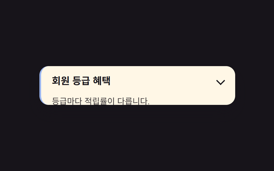
開いている項目だけ、左側に3px幅の色付き枠と背景色が付き、リストの中でどれが開いているかすぐ分かります。
<main class="stage">
  <section class="accordion is-demo-border">
    <button class="accordion__header" type="button" aria-expanded="false">
      <span class="accordion__title">会員ランク特典</span>
      <span class="accordion__chevron" aria-hidden="true"></span>
    </button>
    <div class="accordion__panel is-demo">
      <p class="accordion__body">ランクごとにポイント還元率が異なります。</p>
    </div>
  </section>
</main>
@use "../../../../site/static/demo-tokens" as *;
$duration: $dur-base;
$easing: $ease-spring;
$color: $subject-blue;
@include stage($stage-ink);
.accordion {
width: clamp(220px, 78vw, 340px);
background: $subject-cream;
border-radius: $r-card;
border-left: 3px solid transparent;
box-shadow: $shadow-raised;
overflow: hidden;
font-family: inherit;
}
.accordion__header {
display: flex;
align-items: center;
justify-content: space-between;
gap: 12px;
width: 100%;
border: 0;
background: none;
padding: clamp(12px, 3vw, 18px) clamp(14px, 4vw, 20px);
cursor: pointer;
color: $subject-ink;
font-weight: 600;
font-size: clamp(14px, 3.6vw, 17px);
line-height: 1.3;
font-family: inherit;
text-align: left;
}
.accordion__chevron {
flex: none; width: 9px; height: 9px;
border-right: 2px solid currentColor;
border-bottom: 2px solid currentColor;
transform: rotate(45deg);
}
.accordion__body {
margin: 0;
padding: 0 clamp(14px, 4vw, 20px) clamp(12px, 3vw, 18px);
color: $subject-ink;
opacity: .86;
font-weight: 400;
font-size: clamp(12px, 3.2vw, 14.5px);
line-height: 1.5;
font-family: inherit;
}
.accordion__panel {
height: 0;
overflow: hidden;
interpolate-size: allow-keywords;
}
// 실사용: 클릭하면 열림 상태(.is-open)가 붙고 목표 높이까지 전환된다
.accordion.is-open .accordion__panel {
height: calc-size(auto, size);
transition: height $duration $easing;
}
@supports not (height: calc-size(auto, size)) {
.accordion.is-open .accordion__panel { height: auto; }
}
// 데모: 2초 주기로 스스로 열고 닫힌다. WAAPI 시계로 재생 위치를 잡으려면
// transition 이 아니라 keyframes 여야 한다 (blog-demo 측정 규칙)
.accordion__panel.is-demo {
animation: accordion-loop $dur-loop $easing infinite;
}
@keyframes accordion-loop {
0%, 8% { height: 0; }
42%, 58% { height: calc-size(auto, size); }
92%, 100% { height: 0; }
}
@supports not (height: calc-size(auto, size)) {
@keyframes accordion-loop {
0%, 8% { height: 0; }
42%, 58% { height: 220px; }
92%, 100% { height: 0; }
}
}
// 열려 있는 동안만 왼쪽 테두리와 배경이 강조된다 (패널과 같은 리듬)
.accordion.is-demo-border {
animation: border-loop $dur-loop $easing infinite;
}
@keyframes border-loop {
0%, 8% { border-left-color: transparent; background: $subject-cream; }
42%, 58% { border-left-color: $color; background: $subject-cream; }
92%, 100% { border-left-color: transparent; background: $subject-cream; }
}
@media (prefers-reduced-motion: reduce) {
.accordion__panel,
.accordion__panel.is-demo,
.accordion__chevron,
.accordion__body,
.accordion.is-open .accordion__panel {
animation: none !important;
transition: none !important;
}
.accordion__panel.is-demo { height: auto; }
}html, body {
margin: 0;
overflow: hidden;
}
.stage {
box-sizing: border-box;
min-height: 100vh;
display: grid;
place-items: center;
margin: 0;
background: #17141a;
font-family: -apple-system, "Segoe UI", "Noto Sans KR", sans-serif;
padding: clamp(8px, 4vw, 24px);
}
.accordion {
width: clamp(220px, 78vw, 340px);
background: #fff7e6;
border-radius: 16px;
border-left: 3px solid transparent;
box-shadow: 0 14px 24px rgba(23, 20, 26, 0.32);
overflow: hidden;
font-family: inherit;
}
.accordion__header {
display: flex;
align-items: center;
justify-content: space-between;
gap: 12px;
width: 100%;
border: 0;
background: none;
padding: clamp(12px, 3vw, 18px) clamp(14px, 4vw, 20px);
cursor: pointer;
color: #17141a;
font-weight: 600;
font-size: clamp(14px, 3.6vw, 17px);
line-height: 1.3;
font-family: inherit;
text-align: left;
}
.accordion__chevron {
flex: none;
width: 9px;
height: 9px;
border-right: 2px solid currentColor;
border-bottom: 2px solid currentColor;
transform: rotate(45deg);
}
.accordion__body {
margin: 0;
padding: 0 clamp(14px, 4vw, 20px) clamp(12px, 3vw, 18px);
color: #17141a;
opacity: 0.86;
font-weight: 400;
font-size: clamp(12px, 3.2vw, 14.5px);
line-height: 1.5;
font-family: inherit;
}
.accordion__panel {
height: 0;
overflow: hidden;
interpolate-size: allow-keywords;
}
.accordion.is-open .accordion__panel {
height: calc-size(auto, size);
transition: height 300ms cubic-bezier(0.2, 0.8, 0.2, 1);
}
@supports not (height: calc-size(auto, size)) {
.accordion.is-open .accordion__panel {
height: auto;
}
}
.accordion__panel.is-demo {
animation: accordion-loop 2s cubic-bezier(0.2, 0.8, 0.2, 1) infinite;
}
@keyframes accordion-loop {
0%, 8% {
height: 0;
}
42%, 58% {
height: calc-size(auto, size);
}
92%, 100% {
height: 0;
}
}
@supports not (height: calc-size(auto, size)) {
@keyframes accordion-loop {
0%, 8% {
height: 0;
}
42%, 58% {
height: 220px;
}
92%, 100% {
height: 0;
}
}
}
.accordion.is-demo-border {
animation: border-loop 2s cubic-bezier(0.2, 0.8, 0.2, 1) infinite;
}
@keyframes border-loop {
0%, 8% {
border-left-color: transparent;
background: #fff7e6;
}
42%, 58% {
border-left-color: #2f6df6;
background: #fff7e6;
}
92%, 100% {
border-left-color: transparent;
background: #fff7e6;
}
}
@media (prefers-reduced-motion: reduce) {
.accordion__panel,
.accordion__panel.is-demo,
.accordion__chevron,
.accordion__body,
.accordion.is-open .accordion__panel {
animation: none !important;
transition: none !important;
}
.accordion__panel.is-demo {
height: auto;
}
}(function () {
var acc = document.querySelector('.accordion');
var header = acc.querySelector('.accordion__header');
var panel = acc.querySelector('.accordion__panel');
header.addEventListener('click', function () {
panel.classList.remove('is-demo');
acc.classList.remove('is-demo-border');
var open = acc.classList.toggle('is-open');
header.setAttribute('aria-expanded', String(open));
});
})();import { useState } from "react";
import type { CSSProperties, ReactNode } from "react";
import styles from "./AccordionBorderHighlight.module.scss";
export type AccordionBorderHighlightProps = {
/** 헤더에 보이는 제목 */
header?: ReactNode;
/** 열렸을 때 보이는 본문 */
children?: ReactNode;
/** height:auto 전환 시간 (기본 300ms) */
duration?: number;
/** CSS easing */
easing?: string;
/** 강조 색 */
color?: string;
defaultOpen?: boolean;
};
type Vars = CSSProperties & { "--duration"?: string; "--easing"?: string; "--color"?: string };
export default function AccordionBorderHighlight({
header = "Membership tier perks",
children = "Points rates vary by tier.",
duration = 300,
easing = "cubic-bezier(.2,.8,.2,1)",
color = "#2f6df6",
defaultOpen = false,
}: AccordionBorderHighlightProps) {
const [open, setOpen] = useState(defaultOpen);
const vars: Vars = { "--duration": `${duration}ms`, "--easing": easing, "--color": color };
return (
<section className={styles.accordion} style={vars}>
<button
type="button"
className={styles.header}
aria-expanded={open}
onClick={() => setOpen((v) => !v)}
>
<span>{header}</span>
<span className={`${styles.chevron} ${open ? styles.chevronOpen : ""}`} aria-hidden="true" />
</button>
<div className={`${styles.panel} ${open ? styles.panelOpen : ""}`}>
<p className={styles.body}>{children}</p>
</div>
</section>
);
}05 · 開いた項目を強調 — 計測 累積面積 12.473% · 動いたフレーム 17/23GODRICH オリジナル · SCSS と React は zip に同梱 · パスワードを見る
使いどころ
枠線だけを目立たせる設定と、背景色も一緒に変える設定の2通りを選べます。
.accordion {
  border-left: 3px solid transparent;
}

.accordion.is-open {
  border-left-color: #2f6df6;
  background: #fff7e6;
  transition: border-color 300ms cubic-bezier(.2, .8, .2, 1);
}
06入れ子アコーディオン
何が起きるか
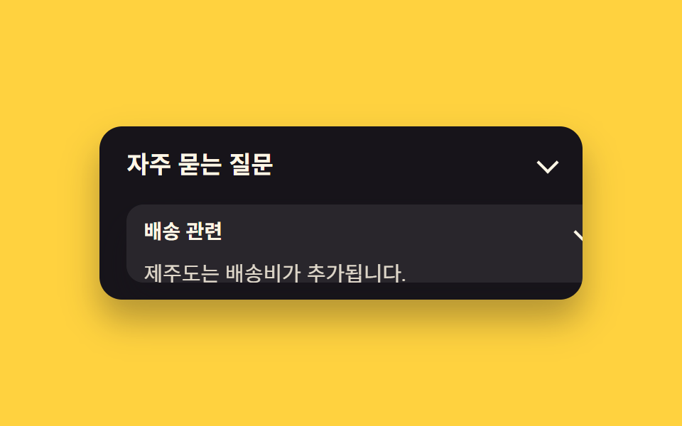
小さな入れ子のアコーディオンが親パネルの中に入っていて、親が開いている間だけ操作できます。
<main class="stage">
  <section class="accordion">
    <button class="accordion__header" type="button" aria-expanded="false">
      <span class="accordion__title">よくある質問</span>
      <span class="accordion__chevron" aria-hidden="true"></span>
    </button>
    <div class="accordion__panel is-demo">
      <div class="accordion accordion--inner">
        <button class="accordion__header accordion__header--inner" type="button" aria-expanded="false">
          <span class="accordion__title">配送について</span>
          <span class="accordion__chevron" aria-hidden="true"></span>
        </button>
        <div class="accordion__panel accordion__panel--inner is-demo-inner">
          <p class="accordion__body">済州島は追加送料がかかります。</p>
        </div>
      </div>
    </div>
  </section>
</main>
@use "../../../../site/static/demo-tokens" as *;
$duration: $dur-quick;
$easing: $ease-out;
$color: $subject-cream;
@include stage($stage-yellow);
.accordion {
width: clamp(220px, 78vw, 340px);
background: $subject-ink;
border-radius: $r-card;
box-shadow: $shadow-raised;
overflow: hidden;
font-family: inherit;
}
.accordion__header {
display: flex;
align-items: center;
justify-content: space-between;
gap: 12px;
width: 100%;
border: 0;
background: none;
padding: clamp(12px, 3vw, 18px) clamp(14px, 4vw, 20px);
cursor: pointer;
color: $subject-cream;
font-weight: 600;
font-size: clamp(14px, 3.6vw, 17px);
line-height: 1.3;
font-family: inherit;
text-align: left;
}
.accordion__chevron {
flex: none;
width: 9px;
height: 9px;
border-right: 2px solid currentColor;
border-bottom: 2px solid currentColor;
transform: rotate(45deg);
}
.accordion__body {
margin: 0;
padding: 0 clamp(14px, 4vw, 20px) clamp(12px, 3vw, 18px);
color: $subject-cream;
opacity: .86;
font-weight: 400;
font-size: clamp(12px, 3.2vw, 14.5px);
line-height: 1.5;
font-family: inherit;
}
.accordion__panel {
height: 0;
overflow: hidden;
interpolate-size: allow-keywords;
}
// 실사용: 클릭하면 열림 상태(.is-open)가 붙고 목표 높이까지 전환된다
.accordion.is-open .accordion__panel {
height: calc-size(auto, size);
transition: height $duration $easing;
}
@supports not (height: calc-size(auto, size)) {
.accordion.is-open .accordion__panel { height: auto; }
}
// 데모: 2초 주기로 스스로 열고 닫힌다. WAAPI 시계로 재생 위치를 잡으려면
// transition 이 아니라 keyframes 여야 한다 (blog-demo 측정 규칙)
.accordion__panel.is-demo {
animation: accordion-loop $dur-loop $easing infinite;
}
@keyframes accordion-loop {
0%, 8% { height: 0; }
42%, 58% { height: calc-size(auto, size); }
92%, 100% { height: 0; }
}
@supports not (height: calc-size(auto, size)) {
@keyframes accordion-loop {
0%, 8% { height: 0; }
42%, 58% { height: 220px; }
92%, 100% { height: 0; }
}
}
.accordion--inner {
margin: 4px clamp(14px, 4vw, 20px) 12px;
background: rgba(255, 255, 255, .08);
border-radius: $r-control;
}
.accordion__header--inner {
padding: 10px 12px;
font-weight: 600;
font-size: clamp(12px, 3vw, 14px);
line-height: 1.3;
font-family: inherit;
}
.accordion__panel--inner {
height: 0;
overflow: hidden;
interpolate-size: allow-keywords;
}
.accordion__panel--inner .accordion__body {
padding: 0 12px 10px;
}
// 안쪽 아코디언은 바깥이 열려 있는 구간(8%~58%) 안에서 더 짧게 열린다
.accordion__panel--inner.is-demo-inner {
animation: accordion-loop-inner $dur-loop $easing infinite;
}
@keyframes accordion-loop-inner {
0%, 20% { height: 0; }
32%, 46% { height: calc-size(auto, size); }
58%, 100% { height: 0; }
}
@supports not (height: calc-size(auto, size)) {
@keyframes accordion-loop-inner { 0%, 20% { height: 0; } 32%, 46% { height: 90px; } 58%, 100% { height: 0; } }
}
@media (prefers-reduced-motion: reduce) {
.accordion__panel,
.accordion__panel.is-demo,
.accordion__chevron,
.accordion__body,
.accordion.is-open .accordion__panel {
animation: none !important;
transition: none !important;
}
.accordion__panel.is-demo { height: auto; }
}html, body {
margin: 0;
overflow: hidden;
}
.stage {
box-sizing: border-box;
min-height: 100vh;
display: grid;
place-items: center;
margin: 0;
background: #ffd23f;
font-family: -apple-system, "Segoe UI", "Noto Sans KR", sans-serif;
padding: clamp(8px, 4vw, 24px);
}
.accordion {
width: clamp(220px, 78vw, 340px);
background: #17141a;
border-radius: 16px;
box-shadow: 0 14px 24px rgba(23, 20, 26, 0.32);
overflow: hidden;
font-family: inherit;
}
.accordion__header {
display: flex;
align-items: center;
justify-content: space-between;
gap: 12px;
width: 100%;
border: 0;
background: none;
padding: clamp(12px, 3vw, 18px) clamp(14px, 4vw, 20px);
cursor: pointer;
color: #fff7e6;
font-weight: 600;
font-size: clamp(14px, 3.6vw, 17px);
line-height: 1.3;
font-family: inherit;
text-align: left;
}
.accordion__chevron {
flex: none;
width: 9px;
height: 9px;
border-right: 2px solid currentColor;
border-bottom: 2px solid currentColor;
transform: rotate(45deg);
}
.accordion__body {
margin: 0;
padding: 0 clamp(14px, 4vw, 20px) clamp(12px, 3vw, 18px);
color: #fff7e6;
opacity: 0.86;
font-weight: 400;
font-size: clamp(12px, 3.2vw, 14.5px);
line-height: 1.5;
font-family: inherit;
}
.accordion__panel {
height: 0;
overflow: hidden;
interpolate-size: allow-keywords;
}
.accordion.is-open .accordion__panel {
height: calc-size(auto, size);
transition: height 220ms ease-out;
}
@supports not (height: calc-size(auto, size)) {
.accordion.is-open .accordion__panel {
height: auto;
}
}
.accordion__panel.is-demo {
animation: accordion-loop 2s ease-out infinite;
}
@keyframes accordion-loop {
0%, 8% {
height: 0;
}
42%, 58% {
height: calc-size(auto, size);
}
92%, 100% {
height: 0;
}
}
@supports not (height: calc-size(auto, size)) {
@keyframes accordion-loop {
0%, 8% {
height: 0;
}
42%, 58% {
height: 220px;
}
92%, 100% {
height: 0;
}
}
}
.accordion--inner {
margin: 4px clamp(14px, 4vw, 20px) 12px;
background: rgba(255, 255, 255, 0.08);
border-radius: 12px;
}
.accordion__header--inner {
padding: 10px 12px;
font-weight: 600;
font-size: clamp(12px, 3vw, 14px);
line-height: 1.3;
font-family: inherit;
}
.accordion__panel--inner {
height: 0;
overflow: hidden;
interpolate-size: allow-keywords;
}
.accordion__panel--inner .accordion__body {
padding: 0 12px 10px;
}
.accordion__panel--inner.is-demo-inner {
animation: accordion-loop-inner 2s ease-out infinite;
}
@keyframes accordion-loop-inner {
0%, 20% {
height: 0;
}
32%, 46% {
height: calc-size(auto, size);
}
58%, 100% {
height: 0;
}
}
@supports not (height: calc-size(auto, size)) {
@keyframes accordion-loop-inner {
0%, 20% {
height: 0;
}
32%, 46% {
height: 90px;
}
58%, 100% {
height: 0;
}
}
}
@media (prefers-reduced-motion: reduce) {
.accordion__panel,
.accordion__panel.is-demo,
.accordion__chevron,
.accordion__body,
.accordion.is-open .accordion__panel {
animation: none !important;
transition: none !important;
}
.accordion__panel.is-demo {
height: auto;
}
}(function () {
document.querySelectorAll('.accordion').forEach(function (acc) {
var header = acc.querySelector(':scope > .accordion__header');
var panel = acc.querySelector(':scope > .accordion__panel');
header.addEventListener('click', function () {
panel.classList.remove('is-demo', 'is-demo-inner');
var open = acc.classList.toggle('is-open');
header.setAttribute('aria-expanded', String(open));
});
});
})();import { useState } from "react";
import type { CSSProperties, ReactNode } from "react";
import styles from "./AccordionNestedAccordion.module.scss";
export type AccordionNestedAccordionProps = {
/** 헤더에 보이는 제목 */
header?: ReactNode;
/** 열렸을 때 보이는 본문 */
children?: ReactNode;
/** height:auto 전환 시간 (기본 300ms) */
duration?: number;
/** CSS easing */
easing?: string;
/** 강조 색 */
color?: string;
defaultOpen?: boolean;
};
type Vars = CSSProperties & { "--duration"?: string; "--easing"?: string; "--color"?: string };
export default function AccordionNestedAccordion({
header = "Frequently asked questions",
children = "About shipping: Jeju Island has an extra fee.",
duration = 300,
easing = "cubic-bezier(.2,.8,.2,1)",
color = "#17141a",
defaultOpen = false,
}: AccordionNestedAccordionProps) {
const [open, setOpen] = useState(defaultOpen);
const vars: Vars = { "--duration": `${duration}ms`, "--easing": easing, "--color": color };
return (
<section className={styles.accordion} style={vars}>
<button
type="button"
className={styles.header}
aria-expanded={open}
onClick={() => setOpen((v) => !v)}
>
<span>{header}</span>
<span className={`${styles.chevron} ${open ? styles.chevronOpen : ""}`} aria-hidden="true" />
</button>
<div className={`${styles.panel} ${open ? styles.panelOpen : ""}`}>
<p className={styles.body}>{children}</p>
</div>
</section>
);
}06 · 入れ子アコーディオン — 計測 累積面積 37.072% · 動いたフレーム 20/23GODRICH オリジナル · SCSS と React は zip に同梱 · パスワードを見る
向いている場面
親が開いてから少し遅れて子が開き、親が閉じ始める前に子が先に閉じるよう、開始と終了の区間を親より内側にずらしています。
.accordion--inner {
  margin: 4px 20px 12px;
  background: rgba(255, 255, 255, .08);
  border-radius: 12px;
}

.accordion__panel--inner {
  height: 0;
  overflow: hidden;
  interpolate-size: allow-keywords;
}

.accordion__panel--inner.is-open {
  height: calc-size(auto, size);
  transition: height 220ms ease-out;
}
07calc-size()フォールバック
動きの内容
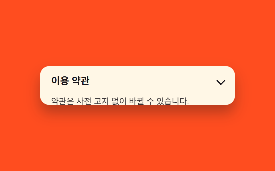
最初のブロックは calc-size(auto, size) を使う本来の書き方で、@supports not のブロックが対応していないブラウザ向けの固定高さの代わりです。
<main class="stage">
  <section class="accordion">
    <button class="accordion__header" type="button" aria-expanded="false">
      <span class="accordion__title">利用規約</span>
      <span class="accordion__chevron" aria-hidden="true"></span>
    </button>
    <div class="accordion__panel is-demo">
      <p class="accordion__body">規約は予告なく変更される場合があります。</p>
    </div>
  </section>
</main>
@use "../../../../site/static/demo-tokens" as *;
$duration: $dur-base;
$easing: $ease-spring;
$color: $subject-ink;
@include stage($stage-orange);
.accordion {
width: clamp(220px, 78vw, 340px);
background: $subject-cream;
border-radius: $r-card;
box-shadow: $shadow-raised;
overflow: hidden;
font-family: inherit;
}
.accordion__header {
display: flex;
align-items: center;
justify-content: space-between;
gap: 12px;
width: 100%;
border: 0;
background: none;
padding: clamp(12px, 3vw, 18px) clamp(14px, 4vw, 20px);
cursor: pointer;
color: $subject-ink;
font-weight: 600;
font-size: clamp(14px, 3.6vw, 17px);
line-height: 1.3;
font-family: inherit;
text-align: left;
}
.accordion__chevron {
flex: none;
width: 9px;
height: 9px;
border-right: 2px solid currentColor;
border-bottom: 2px solid currentColor;
transform: rotate(45deg);
}
.accordion__body {
margin: 0;
padding: 0 clamp(14px, 4vw, 20px) clamp(12px, 3vw, 18px);
color: $subject-ink;
opacity: .86;
font-weight: 400;
font-size: clamp(12px, 3.2vw, 14.5px);
line-height: 1.5;
font-family: inherit;
}
// calc-size() 를 모르면 이 규칙이 이긴다 (같은 클래스, 고정 높이로 대체)
.accordion__panel {
height: 0;
overflow: hidden;
interpolate-size: allow-keywords;
}
// 실사용: 클릭하면 열림 상태(.is-open)가 붙고 목표 높이까지 전환된다
.accordion.is-open .accordion__panel {
height: calc-size(auto, size);
transition: height $duration $easing;
}
@supports not (height: calc-size(auto, size)) {
.accordion.is-open .accordion__panel { height: auto; }
}
// 데모: 2초 주기로 스스로 열고 닫힌다. WAAPI 시계로 재생 위치를 잡으려면
// transition 이 아니라 keyframes 여야 한다 (blog-demo 측정 규칙)
.accordion__panel.is-demo {
animation: accordion-loop $dur-loop $easing infinite;
}
@keyframes accordion-loop {
0%, 8% { height: 0; }
42%, 58% { height: calc-size(auto, size); }
92%, 100% { height: 0; }
}
@supports not (height: calc-size(auto, size)) {
@keyframes accordion-loop {
0%, 8% { height: 0; }
42%, 58% { height: 220px; }
92%, 100% { height: 0; }
}
}
@media (prefers-reduced-motion: reduce) {
.accordion__panel,
.accordion__panel.is-demo,
.accordion__chevron,
.accordion__body,
.accordion.is-open .accordion__panel {
animation: none !important;
transition: none !important;
}
.accordion__panel.is-demo { height: auto; }
}html, body {
margin: 0;
overflow: hidden;
}
.stage {
box-sizing: border-box;
min-height: 100vh;
display: grid;
place-items: center;
margin: 0;
background: #ff4d1f;
font-family: -apple-system, "Segoe UI", "Noto Sans KR", sans-serif;
padding: clamp(8px, 4vw, 24px);
}
.accordion {
width: clamp(220px, 78vw, 340px);
background: #fff7e6;
border-radius: 16px;
box-shadow: 0 14px 24px rgba(23, 20, 26, 0.32);
overflow: hidden;
font-family: inherit;
}
.accordion__header {
display: flex;
align-items: center;
justify-content: space-between;
gap: 12px;
width: 100%;
border: 0;
background: none;
padding: clamp(12px, 3vw, 18px) clamp(14px, 4vw, 20px);
cursor: pointer;
color: #17141a;
font-weight: 600;
font-size: clamp(14px, 3.6vw, 17px);
line-height: 1.3;
font-family: inherit;
text-align: left;
}
.accordion__chevron {
flex: none;
width: 9px;
height: 9px;
border-right: 2px solid currentColor;
border-bottom: 2px solid currentColor;
transform: rotate(45deg);
}
.accordion__body {
margin: 0;
padding: 0 clamp(14px, 4vw, 20px) clamp(12px, 3vw, 18px);
color: #17141a;
opacity: 0.86;
font-weight: 400;
font-size: clamp(12px, 3.2vw, 14.5px);
line-height: 1.5;
font-family: inherit;
}
.accordion__panel {
height: 0;
overflow: hidden;
interpolate-size: allow-keywords;
}
.accordion.is-open .accordion__panel {
height: calc-size(auto, size);
transition: height 300ms cubic-bezier(0.2, 0.8, 0.2, 1);
}
@supports not (height: calc-size(auto, size)) {
.accordion.is-open .accordion__panel {
height: auto;
}
}
.accordion__panel.is-demo {
animation: accordion-loop 2s cubic-bezier(0.2, 0.8, 0.2, 1) infinite;
}
@keyframes accordion-loop {
0%, 8% {
height: 0;
}
42%, 58% {
height: calc-size(auto, size);
}
92%, 100% {
height: 0;
}
}
@supports not (height: calc-size(auto, size)) {
@keyframes accordion-loop {
0%, 8% {
height: 0;
}
42%, 58% {
height: 220px;
}
92%, 100% {
height: 0;
}
}
}
@media (prefers-reduced-motion: reduce) {
.accordion__panel,
.accordion__panel.is-demo,
.accordion__chevron,
.accordion__body,
.accordion.is-open .accordion__panel {
animation: none !important;
transition: none !important;
}
.accordion__panel.is-demo {
height: auto;
}
}(function () {
document.querySelectorAll('.accordion').forEach(function (acc) {
var header = acc.querySelector('.accordion__header');
var panel = acc.querySelector('.accordion__panel');
header.addEventListener('click', function () {
panel.classList.remove('is-demo');
var open = acc.classList.toggle('is-open');
header.setAttribute('aria-expanded', String(open));
});
});
})();import { useState } from "react";
import type { CSSProperties, ReactNode } from "react";
import styles from "./AccordionCalcSizeFallback.module.scss";
export type AccordionCalcSizeFallbackProps = {
/** 헤더에 보이는 제목 */
header?: ReactNode;
/** 열렸을 때 보이는 본문 */
children?: ReactNode;
/** height:auto 전환 시간 (기본 300ms) */
duration?: number;
/** CSS easing */
easing?: string;
/** 강조 색 */
color?: string;
defaultOpen?: boolean;
};
type Vars = CSSProperties & { "--duration"?: string; "--easing"?: string; "--color"?: string };
export default function AccordionCalcSizeFallback({
header = "Terms of service",
children = "Terms may change without prior notice.",
duration = 300,
easing = "cubic-bezier(.2,.8,.2,1)",
color = "#17141a",
defaultOpen = false,
}: AccordionCalcSizeFallbackProps) {
const [open, setOpen] = useState(defaultOpen);
const vars: Vars = { "--duration": `${duration}ms`, "--easing": easing, "--color": color };
return (
<section className={styles.accordion} style={vars}>
<button
type="button"
className={styles.header}
aria-expanded={open}
onClick={() => setOpen((v) => !v)}
>
<span>{header}</span>
<span className={`${styles.chevron} ${open ? styles.chevronOpen : ""}`} aria-hidden="true" />
</button>
<div className={`${styles.panel} ${open ? styles.panelOpen : ""}`}>
<p className={styles.body}>{children}</p>
</div>
</section>
);
}07 · calc-size()フォールバック — 計測 累積面積 18.438% · 動いたフレーム 17/23GODRICH オリジナル · SCSS と React は zip に同梱 · パスワードを見る
使う場面
MDN の calc-size() 対応表 にあるとおり、interpolate-size と calc-size() は2026年9月時点でChrome 129以降だけが対応し、SafariとFirefoxの安定版はまだ対応していません。
.accordion__panel {
  height: 0;
  overflow: hidden;
  interpolate-size: allow-keywords;
}

.accordion.is-open .accordion__panel {
  height: calc-size(auto, size);
  transition: height 300ms cubic-bezier(.2, .8, .2, 1);
}

@supports not (height: calc-size(auto, size)) {
  .accordion.is-open .accordion__panel {
    height: 220px;
    transition: height 300ms cubic-bezier(.2, .8, .2, 1);
  }
}
08弾性バウンスで開く
どんな動きか
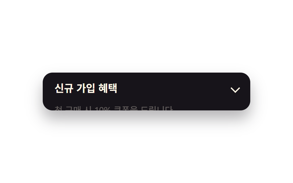
パネルが開くとき、中の本文がいったん1.06倍まで軽く膨らんでから元の大きさに戻り、弾んだような着地になります。
<main class="stage">
  <section class="accordion">
    <button class="accordion__header" type="button" aria-expanded="false">
      <span class="accordion__title">新規会員特典</span>
      <span class="accordion__chevron" aria-hidden="true"></span>
    </button>
    <div class="accordion__panel is-demo">
      <p class="accordion__body is-demo">初回購入で10%クーポンを進呈します。</p>
    </div>
  </section>
</main>
@use "../../../../site/static/demo-tokens" as *;
$duration: $dur-enter;
$easing: $ease-pop; // 튕기는 느낌의 오버슈트 곡선
$color: $subject-blue;
@include stage($stage-paper);
.accordion {
width: clamp(220px, 78vw, 340px);
background: $subject-ink;
border-radius: $r-card;
box-shadow: $shadow-raised;
overflow: hidden;
font-family: inherit;
}
.accordion__header {
display: flex;
align-items: center;
justify-content: space-between;
gap: 12px;
width: 100%;
border: 0;
background: none;
padding: clamp(12px, 3vw, 18px) clamp(14px, 4vw, 20px);
cursor: pointer;
color: $subject-cream;
font-weight: 600;
font-size: clamp(14px, 3.6vw, 17px);
line-height: 1.3;
font-family: inherit;
text-align: left;
}
.accordion__chevron {
flex: none;
width: 9px;
height: 9px;
border-right: 2px solid currentColor;
border-bottom: 2px solid currentColor;
transform: rotate(45deg);
}
.accordion__body {
margin: 0;
padding: 0 clamp(14px, 4vw, 20px) clamp(12px, 3vw, 18px);
color: $subject-cream;
opacity: .86;
font-weight: 400;
font-size: clamp(12px, 3.2vw, 14.5px);
line-height: 1.5;
font-family: inherit;
}
.accordion__panel {
height: 0;
overflow: hidden;
interpolate-size: allow-keywords;
}
.accordion.is-open .accordion__panel {
height: calc-size(auto, size);
transition: height $duration $easing;
}
@supports not (height: calc-size(auto, size)) {
.accordion.is-open .accordion__panel { height: auto; }
}
// 데모: 열릴 때 안쪽 카드가 살짝 커졌다가($ease-pop) 자리를 잡는다
.accordion__panel.is-demo {
animation: accordion-loop $dur-loop $easing infinite;
}
@keyframes accordion-loop {
0%, 8% { height: 0; }
42%, 58% { height: calc-size(auto, size); }
92%, 100% { height: 0; }
}
@supports not (height: calc-size(auto, size)) {
@keyframes accordion-loop { 0%, 8% { height: 0; } 42%, 58% { height: 220px; } 92%, 100% { height: 0; } }
}
.accordion__body.is-demo {
transform-origin: top center; // 규칙8: 헤더 아래 변 붙어 펼침 팝
animation: bounce-loop $dur-loop $easing infinite;
}
@keyframes bounce-loop {
0%, 8% { transform: scale(1); opacity: 0; }
36% { transform: scale(1.06); opacity: 1; }
50%, 58% { transform: scale(1); opacity: 1; }
92%, 100% { transform: scale(1); opacity: 0; }
}
@media (prefers-reduced-motion: reduce) {
.accordion__panel,
.accordion__panel.is-demo,
.accordion__chevron,
.accordion__body,
.accordion.is-open .accordion__panel {
animation: none !important;
transition: none !important;
}
.accordion__panel.is-demo { height: auto; }
}html, body {
margin: 0;
overflow: hidden;
}
.stage {
box-sizing: border-box;
min-height: 100vh;
display: grid;
place-items: center;
margin: 0;
background: #ffffff;
font-family: -apple-system, "Segoe UI", "Noto Sans KR", sans-serif;
padding: clamp(8px, 4vw, 24px);
}
.accordion {
width: clamp(220px, 78vw, 340px);
background: #17141a;
border-radius: 16px;
box-shadow: 0 14px 24px rgba(23, 20, 26, 0.32);
overflow: hidden;
font-family: inherit;
}
.accordion__header {
display: flex;
align-items: center;
justify-content: space-between;
gap: 12px;
width: 100%;
border: 0;
background: none;
padding: clamp(12px, 3vw, 18px) clamp(14px, 4vw, 20px);
cursor: pointer;
color: #fff7e6;
font-weight: 600;
font-size: clamp(14px, 3.6vw, 17px);
line-height: 1.3;
font-family: inherit;
text-align: left;
}
.accordion__chevron {
flex: none;
width: 9px;
height: 9px;
border-right: 2px solid currentColor;
border-bottom: 2px solid currentColor;
transform: rotate(45deg);
}
.accordion__body {
margin: 0;
padding: 0 clamp(14px, 4vw, 20px) clamp(12px, 3vw, 18px);
color: #fff7e6;
opacity: 0.86;
font-weight: 400;
font-size: clamp(12px, 3.2vw, 14.5px);
line-height: 1.5;
font-family: inherit;
}
.accordion__panel {
height: 0;
overflow: hidden;
interpolate-size: allow-keywords;
}
.accordion.is-open .accordion__panel {
height: calc-size(auto, size);
transition: height 600ms cubic-bezier(0.2, 1.4, 0.4, 1);
}
@supports not (height: calc-size(auto, size)) {
.accordion.is-open .accordion__panel {
height: auto;
}
}
.accordion__panel.is-demo {
animation: accordion-loop 2s cubic-bezier(0.2, 1.4, 0.4, 1) infinite;
}
@keyframes accordion-loop {
0%, 8% {
height: 0;
}
42%, 58% {
height: calc-size(auto, size);
}
92%, 100% {
height: 0;
}
}
@supports not (height: calc-size(auto, size)) {
@keyframes accordion-loop {
0%, 8% {
height: 0;
}
42%, 58% {
height: 220px;
}
92%, 100% {
height: 0;
}
}
}
.accordion__body.is-demo {
transform-origin: top center;
animation: bounce-loop 2s cubic-bezier(0.2, 1.4, 0.4, 1) infinite;
}
@keyframes bounce-loop {
0%, 8% {
transform: scale(1);
opacity: 0;
}
36% {
transform: scale(1.06);
opacity: 1;
}
50%, 58% {
transform: scale(1);
opacity: 1;
}
92%, 100% {
transform: scale(1);
opacity: 0;
}
}
@media (prefers-reduced-motion: reduce) {
.accordion__panel,
.accordion__panel.is-demo,
.accordion__chevron,
.accordion__body,
.accordion.is-open .accordion__panel {
animation: none !important;
transition: none !important;
}
.accordion__panel.is-demo {
height: auto;
}
}(function () {
document.querySelectorAll('.accordion').forEach(function (acc) {
var header = acc.querySelector('.accordion__header');
var panel = acc.querySelector('.accordion__panel');
header.addEventListener('click', function () {
panel.classList.remove('is-demo');
var open = acc.classList.toggle('is-open');
header.setAttribute('aria-expanded', String(open));
});
});
})();import { useState } from "react";
import type { CSSProperties, ReactNode } from "react";
import styles from "./AccordionElasticBounce.module.scss";
export type AccordionElasticBounceProps = {
/** 헤더에 보이는 제목 */
header?: ReactNode;
/** 열렸을 때 보이는 본문 */
children?: ReactNode;
/** height:auto 전환 시간 (기본 300ms) */
duration?: number;
/** CSS easing */
easing?: string;
/** 강조 색 */
color?: string;
defaultOpen?: boolean;
};
type Vars = CSSProperties & { "--duration"?: string; "--easing"?: string; "--color"?: string };
export default function AccordionElasticBounce({
header = "New member perks",
children = "Get a 10% coupon on your first purchase.",
duration = 300,
easing = "cubic-bezier(.2,.8,.2,1)",
color = "#2f6df6",
defaultOpen = false,
}: AccordionElasticBounceProps) {
const [open, setOpen] = useState(defaultOpen);
const vars: Vars = { "--duration": `${duration}ms`, "--easing": easing, "--color": color };
return (
<section className={styles.accordion} style={vars}>
<button
type="button"
className={styles.header}
aria-expanded={open}
onClick={() => setOpen((v) => !v)}
>
<span>{header}</span>
<span className={`${styles.chevron} ${open ? styles.chevronOpen : ""}`} aria-hidden="true" />
</button>
<div className={`${styles.panel} ${open ? styles.panelOpen : ""}`}>
<p className={styles.body}>{children}</p>
</div>
</section>
);
}08 · 弾性バウンスで開く — 計測 累積面積 19.022% · 動いたフレーム 15/23GODRICH オリジナル · SCSS と React は zip に同梱 · パスワードを見る
使いどころ
高さの伸び自体は他の項目と同じ曲線なので、弾む動きは本文のスケールだけが担っています。
.accordion.is-open .accordion__body {
  animation: bounce-in 340ms cubic-bezier(.2, 1.4, .4, 1) both;
}

@keyframes bounce-in {
  0%   { transform: scale(1); opacity: 0; }
  60%  { transform: scale(1.06); opacity: 1; }
  100% { transform: scale(1); opacity: 1; }
}
09サイドバーメニューに転用
何が起きるか
同じヘッダーとパネルの組み合わせを、サイドバーメニューの子項目の折りたたみにそのまま転用しました。
<main class="stage">
  <nav class="accordion sidebar">
    <button class="accordion__header" type="button" aria-expanded="false">
      <span class="accordion__title">設定</span>
      <span class="accordion__chevron" aria-hidden="true"></span>
    </button>
    <ul class="sidebar__list is-demo">
      <li>アカウント</li>
      <li>通知</li>
      <li>支払い方法</li>
    </ul>
  </nav>
</main>
@use "../../../../site/static/demo-tokens" as *;
$duration: $dur-quick;
$easing: $ease-out;
$color: $subject-blue;
@include stage($stage-ink);
.accordion.sidebar {
width: clamp(200px, 70vw, 280px);
background: $subject-cream;
border-radius: $r-card;
box-shadow: $shadow-raised;
overflow: hidden;
font-family: inherit;
}
.accordion__header {
display: flex;
align-items: center;
justify-content: space-between;
gap: 12px;
width: 100%;
border: 0;
background: none;
padding: clamp(12px, 3vw, 16px) clamp(14px, 4vw, 18px);
cursor: pointer;
color: $subject-ink;
font-weight: 600;
font-size: clamp(13px, 3.4vw, 15px);
line-height: 1.3;
font-family: inherit;
text-align: left;
}
.accordion__chevron {
flex: none; width: 8px; height: 8px;
border-right: 2px solid currentColor;
border-bottom: 2px solid currentColor;
transform: rotate(45deg);
}
.sidebar__list {
list-style: none;
margin: 0;
padding: 0 clamp(14px, 4vw, 18px) 10px clamp(26px, 8vw, 32px);
height: 0;
overflow: hidden;
interpolate-size: allow-keywords;
}
.sidebar__list li {
padding: 6px 0;
color: $subject-ink;
opacity: .86;
font-weight: 400;
font-size: clamp(12px, 3.2vw, 14px);
line-height: 1.4;
font-family: inherit;
}
.sidebar__list.is-demo {
animation: accordion-loop $dur-loop $easing infinite;
}
@keyframes accordion-loop {
0%, 8% { height: 0; }
42%, 58% { height: calc-size(auto, size); }
92%, 100% { height: 0; }
}
@supports not (height: calc-size(auto, size)) {
@keyframes accordion-loop { 0%, 8% { height: 0; } 42%, 58% { height: 130px; } 92%, 100% { height: 0; } }
}
@media (prefers-reduced-motion: reduce) {
.accordion__panel,
.accordion__panel.is-demo,
.accordion__chevron,
.accordion__body,
.accordion.is-open .accordion__panel {
animation: none !important;
transition: none !important;
}
.accordion__panel.is-demo { height: auto; }
}html, body {
margin: 0;
overflow: hidden;
}
.stage {
box-sizing: border-box;
min-height: 100vh;
display: grid;
place-items: center;
margin: 0;
background: #17141a;
font-family: -apple-system, "Segoe UI", "Noto Sans KR", sans-serif;
padding: clamp(8px, 4vw, 24px);
}
.accordion.sidebar {
width: clamp(200px, 70vw, 280px);
background: #fff7e6;
border-radius: 16px;
box-shadow: 0 14px 24px rgba(23, 20, 26, 0.32);
overflow: hidden;
font-family: inherit;
}
.accordion__header {
display: flex;
align-items: center;
justify-content: space-between;
gap: 12px;
width: 100%;
border: 0;
background: none;
padding: clamp(12px, 3vw, 16px) clamp(14px, 4vw, 18px);
cursor: pointer;
color: #17141a;
font-weight: 600;
font-size: clamp(13px, 3.4vw, 15px);
line-height: 1.3;
font-family: inherit;
text-align: left;
}
.accordion__chevron {
flex: none;
width: 8px;
height: 8px;
border-right: 2px solid currentColor;
border-bottom: 2px solid currentColor;
transform: rotate(45deg);
}
.sidebar__list {
list-style: none;
margin: 0;
padding: 0 clamp(14px, 4vw, 18px) 10px clamp(26px, 8vw, 32px);
height: 0;
overflow: hidden;
interpolate-size: allow-keywords;
}
.sidebar__list li {
padding: 6px 0;
color: #17141a;
opacity: 0.86;
font-weight: 400;
font-size: clamp(12px, 3.2vw, 14px);
line-height: 1.4;
font-family: inherit;
}
.sidebar__list.is-demo {
animation: accordion-loop 2s ease-out infinite;
}
@keyframes accordion-loop {
0%, 8% {
height: 0;
}
42%, 58% {
height: calc-size(auto, size);
}
92%, 100% {
height: 0;
}
}
@supports not (height: calc-size(auto, size)) {
@keyframes accordion-loop {
0%, 8% {
height: 0;
}
42%, 58% {
height: 130px;
}
92%, 100% {
height: 0;
}
}
}
@media (prefers-reduced-motion: reduce) {
.accordion__panel,
.accordion__panel.is-demo,
.accordion__chevron,
.accordion__body,
.accordion.is-open .accordion__panel {
animation: none !important;
transition: none !important;
}
.accordion__panel.is-demo {
height: auto;
}
}(function () {
var nav = document.querySelector('.sidebar');
var header = nav.querySelector('.accordion__header');
var list = nav.querySelector('.sidebar__list');
header.addEventListener('click', function () {
list.classList.remove('is-demo');
var open = nav.classList.toggle('is-open');
header.setAttribute('aria-expanded', String(open));
list.style.height = open ? 'calc-size(auto, size)' : '0';
});
})();import { useState } from "react";
import type { CSSProperties, ReactNode } from "react";
import styles from "./AccordionSidebarNav.module.scss";
export type AccordionSidebarNavProps = {
/** 헤더에 보이는 제목 */
header?: ReactNode;
/** 열렸을 때 보이는 본문 */
children?: ReactNode;
/** height:auto 전환 시간 (기본 300ms) */
duration?: number;
/** CSS easing */
easing?: string;
/** 강조 색 */
color?: string;
defaultOpen?: boolean;
};
type Vars = CSSProperties & { "--duration"?: string; "--easing"?: string; "--color"?: string };
export default function AccordionSidebarNav({
header = "Settings",
children = "Account, Notifications, Payment method.",
duration = 300,
easing = "cubic-bezier(.2,.8,.2,1)",
color = "#2f6df6",
defaultOpen = false,
}: AccordionSidebarNavProps) {
const [open, setOpen] = useState(defaultOpen);
const vars: Vars = { "--duration": `${duration}ms`, "--easing": easing, "--color": color };
return (
<section className={styles.accordion} style={vars}>
<button
type="button"
className={styles.header}
aria-expanded={open}
onClick={() => setOpen((v) => !v)}
>
<span>{header}</span>
<span className={`${styles.chevron} ${open ? styles.chevronOpen : ""}`} aria-hidden="true" />
</button>
<div className={`${styles.panel} ${open ? styles.panelOpen : ""}`}>
<p className={styles.body}>{children}</p>
</div>
</section>
);
}09 · サイドバーメニューに転用 — 計測 累積面積 20.065% · 動いたフレーム 18/23GODRICH オリジナル · SCSS と React は zip に同梱 · パスワードを見る
向いている場面
矢印アイコンと interpolate-size の書き方は01と共通で、違うのは横幅とインデントの数値だけです。
.sidebar__list {
  list-style: none;
  margin: 0;
  padding: 0 18px 10px 32px;
  height: 0;
  overflow: hidden;
  interpolate-size: allow-keywords;
}

.sidebar__item.is-open .sidebar__list {
  height: calc-size(auto, size);
  transition: height 220ms ease-out;
}
どこで崩れるか — 落とし穴
固定値のフォールバック
9つとも interpolate-size: allow-keywords と calc-size(auto, size) の2つだけでパネルの高さを動かしていて、JavaScriptで本文の高さを測るコードは1行もありません。1つ目の落とし穴は07のフォールバックで最初に踏んだもので、対応していないブラウザ向けに height: 220px のような固定値を書くと、本文の文字量が増えて実際の高さが変わってもフォールバックの数値だけ古いままになります。 長いFAQをこの形で畳んでも、いくつか開けばページは結局縦に長くなります。上へ戻る導線はスクロールだけで現れる形が向いていて、トップへ戻るボタン css アニメーション9選にまとめてあります。
入れ子の閉じる順番
2つ目は06の入れ子アコーディオンを組み立てたときのことです。親のパネルと子のパネルに同じ開閉区間を使ったら、親が閉じ始めても子だけ開いたまま残り、閉じる順番がそろわず二重に閉じているように見えました。子の開始と終了を親より内側の区間へ収め、子が閉じ切ってから親が閉じ始めるよう区間をずらしたところ、この崩れは直りました。修正済みの9ファイルを開くには 34fn5mpm という文字列が必要です。下のカードからzipを取ってください。
details の name 属性
3つ目はネイティブの <details> 要素です。name 属性を使えば02のような排他開閉はCSSアニメーションなしでもブラウザ標準で動きますが、MDN の details 要素の対応表 を見ると name 属性が対応しているのはChrome 120以降・Safari 17.2以降・Firefox 130以降で、対応前のブラウザでは属性そのものが無視され、複数の項目が同時に開いたままになります。zipのファイルはすべて <details> ではなくクラスの付け替えで実装しているため、この非対応の影響は受けません。
アクセシビリティ
動きを減らす設定のとき
9つとも prefers-reduced-motion: reduce で animation: none と transition: none になり、開閉の動きが止まります。デモ用のパネルだけは height: auto を残して開いた状態を表示し、情報そのものは隠しません。
@media (prefers-reduced-motion: reduce) {
  .accordion__panel,
  .accordion__chevron,
  .accordion__body { animation: none !important; transition: none !important; }
  .accordion__panel.is-demo { height: auto; }
}
css ドロップダウン メニューなどアコーディオン以外のCSSアニメーションは CSSアニメーションのカテゴリー に、このサイトについては 紹介ページ にまとめています。
FAQ
アコーディオンリストとして9つを同じページに全部置いても問題ありませんか?
問題ありません。02の排他開閉はグループ単位なので、ページ内に複数のアコーディオングループがあっても、それぞれのグループの中でだけ1つが開きます。06の入れ子だけは親と子で開閉の区間が重なりますが、同じページに何組置いても仕組みは崩れません。
Reactではクラスの付け外しの代わりに何を使いますか?
zipの react/ フォルダの各コンポーネントは、開閉状態を1つのbooleanのstateで持ち、is-open に相当するクラス名をそのstateから付け外ししているだけです。高さの計算とアニメーションのタイミングはこれまでと同じCSSの interpolate-size と calc-size() が担うので、JavaScript側に高さを測るコードはありません。 05の「今開いている項目」を枠で示すやり方をカード一覧にも持ち込みたい場合は、同じ合図をホバーで扱ったCSS カード ホバー アニメーション9選が参考になります。
スマホでも同じように開閉しますか?
はい、タップで同じように開閉します。ただしcalc-size()に対応していないiOSのSafariでは、07のフォールバックが働いて height: auto へ一瞬で切り替わり、なめらかに伸びる動きにはなりません。09のサイドバー転用だけは横幅がスマホの画面幅に合わせてclampで縮むため、矢印とテキストの間隔が詰まります。
こんな記事もどうぞ
 トランジション【コピペOK】CSS モーダル アニメーション 9選(dialog 対応)
 トランジション【JS最小・CSSだけ】css ページ遷移 アニメーション9選
 トランジション【JS最小・CSSだけ】css ハンバーガーメニュー アニメーション9選
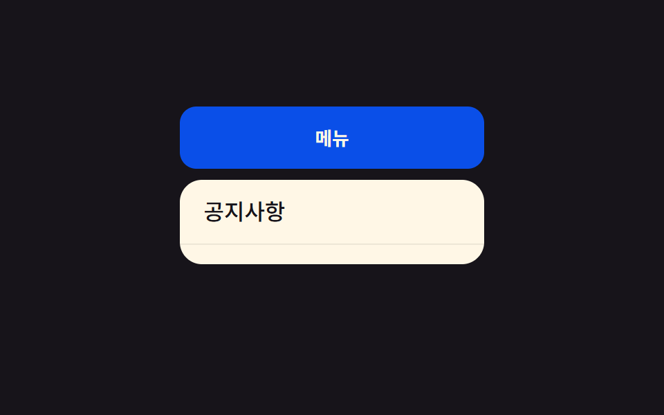 トランジションCSS ドロップダウン メニュー アニメーション 9選 — JS最小・CSSだけ
 トランジショントースト通知 css アニメーション9選 — JS最小・CSSだけ
 トランジションcss ドロワー メニュー スライド9選 — JS最小・CSSだけ
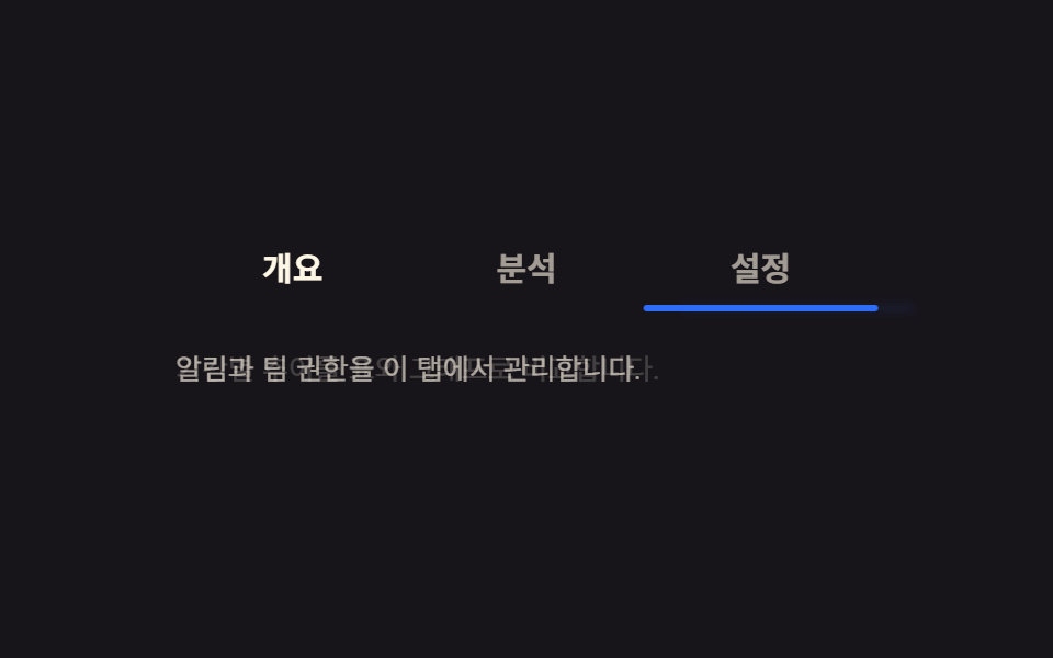 トランジションCSS タブ 切り替え アニメーション9選 — JS最小・CSSだけ
 トランジションCSS 画面切り替え アニメーション9選
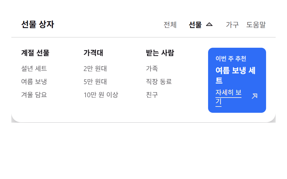 トランジションメガメニュー css 9選 — リンクの羅列からサイトの地図へ
 トランジション絞り込み ui9選 — パネルスライドからチップ削除まで