CSS 아코디언 애니메이션 9종 — JS 없이, CSS만으로
CSS 아코디언 애니메이션은 클릭한 항목만 펼쳐지고 나머지는 접힌 채로 남는 목록 UI로, 이 글은 JS 없이 CSS만으로 만드는 아홉 가지 방식을 모았습니다. 아홉 개 중 하나는 height 전환에 자바스크립트를 한 줄도 안 씁니다.
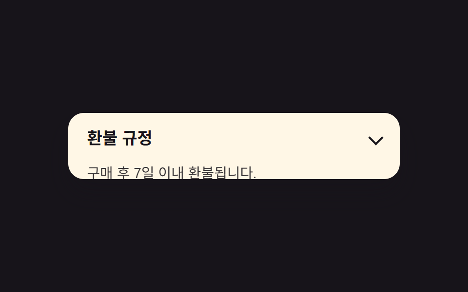 01 accordion-height-auto-interpolate
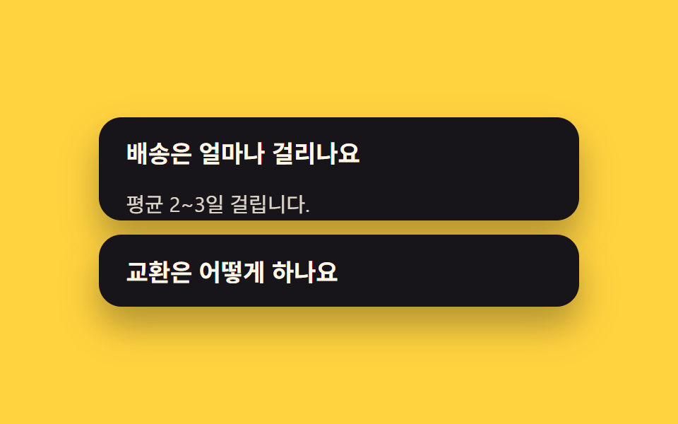 02 accordion-exclusive-open
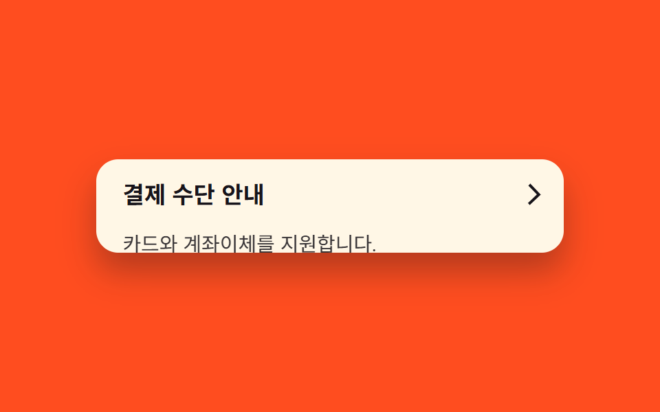 03 accordion-chevron-rotate
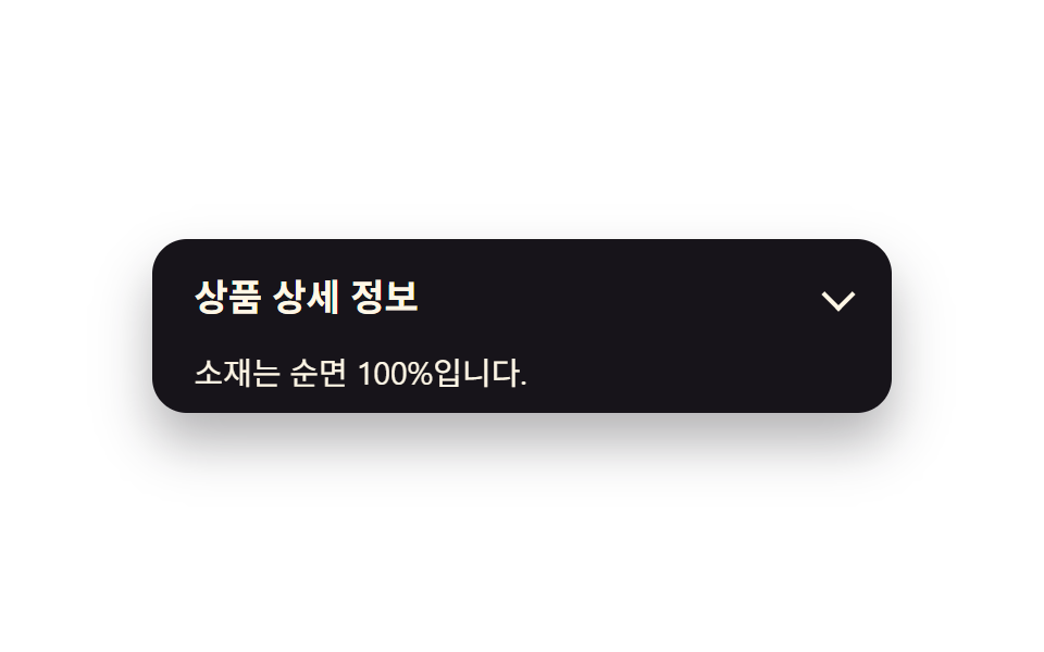 04 accordion-fade-slide-content
 05 accordion-border-highlight-open
 06 accordion-nested-accordion
 07 accordion-calc-size-fallback
 08 accordion-elastic-bounce-open
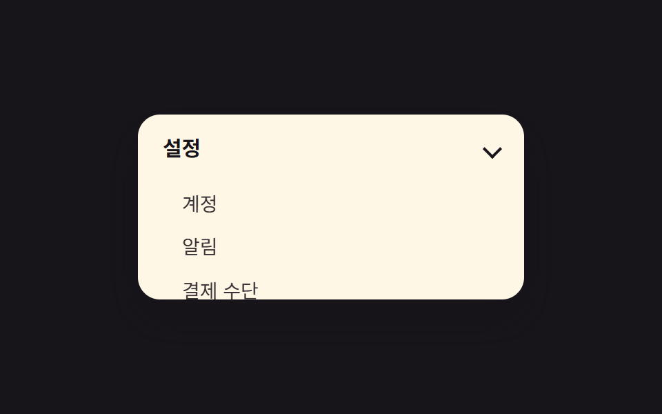 09 accordion-sidebar-nav-reuse
자동 재생 · 눌러서 해당 항목으로 · 전부 한 zip
- 01 interpolate-size로 height:auto 전환
- 02 name 속성으로 하나만 열림
- 03 화살표 마커 회전
- 04 본문 페이드+슬라이드
- 05 열린 항목 강조 테두리
- 06 중첩 아코디언
- 07 calc-size() 폴백 패턴
- 08 탄성 바운스로 열림
- 09 사이드바 메뉴로 재활용
아홉 개는 인기 순이 아니라 아코디언이 실제로 겪는 순서로 놓았습니다. 기본 열고 닫기(01~02) 다음 시각 신호(03~05), 구조 확장(06~07), 마지막으로 강조와 재활용(08~09)입니다. 항목마다 필요한 규칙 조각만 골라 실었고, 완결본은 zip 안에 통째로 들어 있습니다. 09 사이드바처럼 펼침이 내비게이션 쪽으로 넘어가면 아이콘까지 같이 바뀌어야 하는데 그건 CSS 햄버거 메뉴 애니메이션이고, 목록이 아래로 늘어나는 대신 떠서 겹치는 형태는 CSS 드롭다운 메뉴 애니메이션입니다.
01interpolate-size로 height:auto 전환
화면에서 일어나는 일
닫힌 패널이 interpolate-size 하나로 목표 높이까지 자연스럽게 늘어나며 열립니다.
<main class="stage">
  <section class="accordion">
    <button class="accordion__header" type="button" aria-expanded="false">
      <span class="accordion__title">환불 규정</span>
      <span class="accordion__chevron" aria-hidden="true"></span>
    </button>
    <div class="accordion__panel is-demo">
      <p class="accordion__body">구매 후 7일 이내 환불됩니다.</p>
    </div>
  </section>
</main>
@use "../../../../site/static/demo-tokens" as *;
$duration: $dur-base; // 열리는 데 걸리는 시간
$easing: $ease-spring; // 전환 곡선
$color: $subject-blue; // 강조 색
@include stage($stage-ink);
.accordion {
width: clamp(220px, 78vw, 340px);
background: $subject-cream;
border-radius: $r-card;
box-shadow: $shadow-raised;
overflow: hidden;
font-family: inherit;
}
.accordion__header {
display: flex;
align-items: center;
justify-content: space-between;
gap: 12px;
width: 100%;
border: 0;
background: none;
padding: clamp(12px, 3vw, 18px) clamp(14px, 4vw, 20px);
cursor: pointer;
color: $subject-ink;
font-weight: 600;
font-size: clamp(14px, 3.6vw, 17px);
line-height: 1.3;
font-family: inherit;
text-align: left;
}
.accordion__chevron {
flex: none;
width: 9px;
height: 9px;
border-right: 2px solid currentColor;
border-bottom: 2px solid currentColor;
transform: rotate(45deg);
}
.accordion__body {
margin: 0;
padding: 0 clamp(14px, 4vw, 20px) clamp(12px, 3vw, 18px);
color: $subject-ink;
opacity: .86;
font-weight: 400;
font-size: clamp(12px, 3.2vw, 14.5px);
line-height: 1.5;
font-family: inherit;
}
.accordion__panel {
height: 0;
overflow: hidden;
interpolate-size: allow-keywords;
}
// 실사용: 클릭하면 열림 상태(.is-open)가 붙고 목표 높이까지 전환된다
.accordion.is-open .accordion__panel {
height: calc-size(auto, size);
transition: height $duration $easing;
}
@supports not (height: calc-size(auto, size)) {
.accordion.is-open .accordion__panel { height: auto; }
}
// 데모: 2초 주기로 스스로 열고 닫힌다. WAAPI 시계로 재생 위치를 잡으려면
// transition 이 아니라 keyframes 여야 한다 (blog-demo 측정 규칙)
.accordion__panel.is-demo {
animation: accordion-loop $dur-loop $easing infinite;
}
@keyframes accordion-loop {
0%, 8% { height: 0; }
42%, 58% { height: calc-size(auto, size); }
92%, 100% { height: 0; }
}
@supports not (height: calc-size(auto, size)) {
@keyframes accordion-loop {
0%, 8% { height: 0; }
42%, 58% { height: 220px; }
92%, 100% { height: 0; }
}
}
@media (prefers-reduced-motion: reduce) {
.accordion__panel,
.accordion__panel.is-demo,
.accordion__chevron,
.accordion__body,
.accordion.is-open .accordion__panel {
animation: none !important;
transition: none !important;
}
.accordion__panel.is-demo { height: auto; }
}html, body {
margin: 0;
overflow: hidden;
}
.stage {
box-sizing: border-box;
min-height: 100vh;
display: grid;
place-items: center;
margin: 0;
background: #17141a;
font-family: -apple-system, "Segoe UI", "Noto Sans KR", sans-serif;
padding: clamp(8px, 4vw, 24px);
}
.accordion {
width: clamp(220px, 78vw, 340px);
background: #fff7e6;
border-radius: 16px;
box-shadow: 0 14px 24px rgba(23, 20, 26, 0.32);
overflow: hidden;
font-family: inherit;
}
.accordion__header {
display: flex;
align-items: center;
justify-content: space-between;
gap: 12px;
width: 100%;
border: 0;
background: none;
padding: clamp(12px, 3vw, 18px) clamp(14px, 4vw, 20px);
cursor: pointer;
color: #17141a;
font-weight: 600;
font-size: clamp(14px, 3.6vw, 17px);
line-height: 1.3;
font-family: inherit;
text-align: left;
}
.accordion__chevron {
flex: none;
width: 9px;
height: 9px;
border-right: 2px solid currentColor;
border-bottom: 2px solid currentColor;
transform: rotate(45deg);
}
.accordion__body {
margin: 0;
padding: 0 clamp(14px, 4vw, 20px) clamp(12px, 3vw, 18px);
color: #17141a;
opacity: 0.86;
font-weight: 400;
font-size: clamp(12px, 3.2vw, 14.5px);
line-height: 1.5;
font-family: inherit;
}
.accordion__panel {
height: 0;
overflow: hidden;
interpolate-size: allow-keywords;
}
.accordion.is-open .accordion__panel {
height: calc-size(auto, size);
transition: height 300ms cubic-bezier(0.2, 0.8, 0.2, 1);
}
@supports not (height: calc-size(auto, size)) {
.accordion.is-open .accordion__panel {
height: auto;
}
}
.accordion__panel.is-demo {
animation: accordion-loop 2s cubic-bezier(0.2, 0.8, 0.2, 1) infinite;
}
@keyframes accordion-loop {
0%, 8% {
height: 0;
}
42%, 58% {
height: calc-size(auto, size);
}
92%, 100% {
height: 0;
}
}
@supports not (height: calc-size(auto, size)) {
@keyframes accordion-loop {
0%, 8% {
height: 0;
}
42%, 58% {
height: 220px;
}
92%, 100% {
height: 0;
}
}
}
@media (prefers-reduced-motion: reduce) {
.accordion__panel,
.accordion__panel.is-demo,
.accordion__chevron,
.accordion__body,
.accordion.is-open .accordion__panel {
animation: none !important;
transition: none !important;
}
.accordion__panel.is-demo {
height: auto;
}
}(function () {
document.querySelectorAll('.accordion').forEach(function (acc) {
var header = acc.querySelector('.accordion__header');
var panel = acc.querySelector('.accordion__panel');
header.addEventListener('click', function () {
panel.classList.remove('is-demo');
var open = acc.classList.toggle('is-open');
header.setAttribute('aria-expanded', String(open));
});
});
})();import { useState } from "react";
import type { CSSProperties, ReactNode } from "react";
import styles from "./AccordionHeightAuto.module.scss";
export type AccordionHeightAutoProps = {
/** 헤더에 보이는 제목 */
header?: ReactNode;
/** 열렸을 때 보이는 본문 */
children?: ReactNode;
/** height:auto 전환 시간 (기본 300ms) */
duration?: number;
/** CSS easing */
easing?: string;
/** 강조 색 */
color?: string;
defaultOpen?: boolean;
};
type Vars = CSSProperties & { "--duration"?: string; "--easing"?: string; "--color"?: string };
export default function AccordionHeightAuto({
header = "Refund policy",
children = "Refunds within 7 days of purchase.",
duration = 300,
easing = "cubic-bezier(.2,.8,.2,1)",
color = "#2f6df6",
defaultOpen = false,
}: AccordionHeightAutoProps) {
const [open, setOpen] = useState(defaultOpen);
const vars: Vars = { "--duration": `${duration}ms`, "--easing": easing, "--color": color };
return (
<section className={styles.accordion} style={vars}>
<button
type="button"
className={styles.header}
aria-expanded={open}
onClick={() => setOpen((v) => !v)}
>
<span>{header}</span>
<span className={`${styles.chevron} ${open ? styles.chevronOpen : ""}`} aria-hidden="true" />
</button>
<div className={`${styles.panel} ${open ? styles.panelOpen : ""}`}>
<p className={styles.body}>{children}</p>
</div>
</section>
);
}01 · interpolate-size로 height:auto 전환 — 측정 누적면적 11.691% · 움직인 프레임 17/23GODRICH 원작 · zip 에 SCSS·React 포함 · 비밀번호 보기
css 아코디언 효과는 어디에 쓰나
FAQ 목록이나 약관 상세처럼 내용 길이가 정해지지 않은 곳에 씁니다.
.panel {
  height: 0;
  overflow: hidden;
  interpolate-size: allow-keywords;
}
.accordion.is-open .panel {
  height: calc-size(auto, size);
  transition: height $duration $easing;
}
@supports not (height: calc-size(auto, size)) {
  .accordion.is-open .panel { height: auto; }
}
02name 속성으로 하나만 열림
어떤 움직임인가
다른 항목을 열면 열려 있던 항목이 자동으로 닫힙니다.
<main class="stage">
  <section class="accordion-group">
    <div class="accordion accordion--a">
      <div class="accordion__header" role="button" tabindex="0" aria-expanded="false">
        <span class="accordion__title">배송은 얼마나 걸리나요</span>
        <span class="accordion__chevron" aria-hidden="true"></span>
      </div>
      <div class="accordion__panel is-demo-a">
        <p class="accordion__body">평균 2~3일 걸립니다.</p>
      </div>
    </div>
    <div class="accordion accordion--b">
      <div class="accordion__header" role="button" tabindex="0" aria-expanded="false">
        <span class="accordion__title">교환은 어떻게 하나요</span>
        <span class="accordion__chevron" aria-hidden="true"></span>
      </div>
      <div class="accordion__panel is-demo-b">
        <p class="accordion__body">마이페이지에서 신청하세요.</p>
      </div>
    </div>
  </section>
</main>
@use "../../../../site/static/demo-tokens" as *;
$duration: $dur-quick;
$easing: $ease-out;
$color: $subject-cream;
@include stage($stage-yellow);
.accordion-group {
width: clamp(220px, 78vw, 340px);
display: flex;
flex-direction: column;
gap: 10px;
}
.accordion {
width: clamp(220px, 78vw, 340px);
background: $subject-ink;
border-radius: $r-card;
box-shadow: $shadow-raised;
overflow: hidden;
font-family: inherit;
}
.accordion__header {
display: flex;
align-items: center;
justify-content: space-between;
gap: 12px;
width: 100%;
border: 0;
background: none;
padding: clamp(12px, 3vw, 18px) clamp(14px, 4vw, 20px);
cursor: pointer;
color: $subject-cream;
font-weight: 600;
font-size: clamp(14px, 3.6vw, 17px);
line-height: 1.3;
font-family: inherit;
text-align: left;
}
.accordion__chevron {
flex: none;
width: 9px;
height: 9px;
border-right: 2px solid currentColor;
border-bottom: 2px solid currentColor;
transform: rotate(45deg);
}
.accordion__body {
margin: 0;
padding: 0 clamp(14px, 4vw, 20px) clamp(12px, 3vw, 18px);
color: $subject-cream;
opacity: .86;
font-weight: 400;
font-size: clamp(12px, 3.2vw, 14.5px);
line-height: 1.5;
font-family: inherit;
}
.accordion__panel {
height: 0;
overflow: hidden;
interpolate-size: allow-keywords;
}
.accordion.is-open .accordion__panel {
height: calc-size(auto, size);
transition: height $duration $easing;
}
@supports not (height: calc-size(auto, size)) {
.accordion.is-open .accordion__panel { height: auto; }
}
// 데모: name 속성처럼 하나가 열리는 동안 나머지는 닫혀 있다 (2초 주기, 위상만 반대)
.accordion__panel.is-demo-a { animation: accordion-loop-a $dur-loop $easing infinite; }
.accordion__panel.is-demo-b { animation: accordion-loop-b $dur-loop $easing infinite; }
@keyframes accordion-loop-a {
0%, 4% { height: 0; }
20%, 46% { height: calc-size(auto, size); }
62%, 100% { height: 0; }
}
@keyframes accordion-loop-b {
0%, 54% { height: 0; }
70%, 96% { height: calc-size(auto, size); }
100% { height: 0; }
}
@supports not (height: calc-size(auto, size)) {
@keyframes accordion-loop-a { 0%, 4% { height: 0; } 20%, 46% { height: 160px; } 62%, 100% { height: 0; } }
@keyframes accordion-loop-b { 0%, 54% { height: 0; } 70%, 96% { height: 160px; } 100% { height: 0; } }
}
@media (prefers-reduced-motion: reduce) {
.accordion__panel,
.accordion__panel.is-demo,
.accordion__chevron,
.accordion__body,
.accordion.is-open .accordion__panel {
animation: none !important;
transition: none !important;
}
.accordion__panel.is-demo { height: auto; }
}html, body {
margin: 0;
overflow: hidden;
}
.stage {
box-sizing: border-box;
min-height: 100vh;
display: grid;
place-items: center;
margin: 0;
background: #ffd23f;
font-family: -apple-system, "Segoe UI", "Noto Sans KR", sans-serif;
padding: clamp(8px, 4vw, 24px);
}
.accordion-group {
width: clamp(220px, 78vw, 340px);
display: flex;
flex-direction: column;
gap: 10px;
}
.accordion {
width: clamp(220px, 78vw, 340px);
background: #17141a;
border-radius: 16px;
box-shadow: 0 14px 24px rgba(23, 20, 26, 0.32);
overflow: hidden;
font-family: inherit;
}
.accordion__header {
display: flex;
align-items: center;
justify-content: space-between;
gap: 12px;
width: 100%;
border: 0;
background: none;
padding: clamp(12px, 3vw, 18px) clamp(14px, 4vw, 20px);
cursor: pointer;
color: #fff7e6;
font-weight: 600;
font-size: clamp(14px, 3.6vw, 17px);
line-height: 1.3;
font-family: inherit;
text-align: left;
}
.accordion__chevron {
flex: none;
width: 9px;
height: 9px;
border-right: 2px solid currentColor;
border-bottom: 2px solid currentColor;
transform: rotate(45deg);
}
.accordion__body {
margin: 0;
padding: 0 clamp(14px, 4vw, 20px) clamp(12px, 3vw, 18px);
color: #fff7e6;
opacity: 0.86;
font-weight: 400;
font-size: clamp(12px, 3.2vw, 14.5px);
line-height: 1.5;
font-family: inherit;
}
.accordion__panel {
height: 0;
overflow: hidden;
interpolate-size: allow-keywords;
}
.accordion.is-open .accordion__panel {
height: calc-size(auto, size);
transition: height 220ms ease-out;
}
@supports not (height: calc-size(auto, size)) {
.accordion.is-open .accordion__panel {
height: auto;
}
}
.accordion__panel.is-demo-a {
animation: accordion-loop-a 2s ease-out infinite;
}
.accordion__panel.is-demo-b {
animation: accordion-loop-b 2s ease-out infinite;
}
@keyframes accordion-loop-a {
0%, 4% {
height: 0;
}
20%, 46% {
height: calc-size(auto, size);
}
62%, 100% {
height: 0;
}
}
@keyframes accordion-loop-b {
0%, 54% {
height: 0;
}
70%, 96% {
height: calc-size(auto, size);
}
100% {
height: 0;
}
}
@supports not (height: calc-size(auto, size)) {
@keyframes accordion-loop-a {
0%, 4% {
height: 0;
}
20%, 46% {
height: 160px;
}
62%, 100% {
height: 0;
}
}
@keyframes accordion-loop-b {
0%, 54% {
height: 0;
}
70%, 96% {
height: 160px;
}
100% {
height: 0;
}
}
}
@media (prefers-reduced-motion: reduce) {
.accordion__panel,
.accordion__panel.is-demo,
.accordion__chevron,
.accordion__body,
.accordion.is-open .accordion__panel {
animation: none !important;
transition: none !important;
}
.accordion__panel.is-demo {
height: auto;
}
}(function () {
var group = document.querySelector('.accordion-group');
var accs = Array.prototype.slice.call(group.querySelectorAll('.accordion'));
accs.forEach(function (acc) {
var header = acc.querySelector('.accordion__header');
var panel = acc.querySelector('.accordion__panel');
header.addEventListener('click', function () {
panel.classList.remove('is-demo-a', 'is-demo-b');
var willOpen = !acc.classList.contains('is-open');
accs.forEach(function (other) {
other.classList.remove('is-open');
other.querySelector('.accordion__header').setAttribute('aria-expanded', 'false');
other.querySelector('.accordion__panel').classList.remove('is-demo-a', 'is-demo-b');
});
if (willOpen) {
acc.classList.add('is-open');
header.setAttribute('aria-expanded', 'true');
}
});
});
})();import { useState } from "react";
import type { CSSProperties, ReactNode } from "react";
import styles from "./AccordionExclusiveOpen.module.scss";
export type AccordionExclusiveOpenProps = {
/** 헤더에 보이는 제목 */
header?: ReactNode;
/** 열렸을 때 보이는 본문 */
children?: ReactNode;
/** height:auto 전환 시간 (기본 300ms) */
duration?: number;
/** CSS easing */
easing?: string;
/** 강조 색 */
color?: string;
defaultOpen?: boolean;
};
type Vars = CSSProperties & { "--duration"?: string; "--easing"?: string; "--color"?: string };
export default function AccordionExclusiveOpen({
header = "How long does shipping take?",
children = "Usually 2-3 days.",
duration = 300,
easing = "cubic-bezier(.2,.8,.2,1)",
color = "#17141a",
defaultOpen = false,
}: AccordionExclusiveOpenProps) {
const [open, setOpen] = useState(defaultOpen);
const vars: Vars = { "--duration": `${duration}ms`, "--easing": easing, "--color": color };
return (
<section className={styles.accordion} style={vars}>
<button
type="button"
className={styles.header}
aria-expanded={open}
onClick={() => setOpen((v) => !v)}
>
<span>{header}</span>
<span className={`${styles.chevron} ${open ? styles.chevronOpen : ""}`} aria-hidden="true" />
</button>
<div className={`${styles.panel} ${open ? styles.panelOpen : ""}`}>
<p className={styles.body}>{children}</p>
</div>
</section>
);
}02 · name 속성으로 하나만 열림 — 측정 누적면적 32.087% · 움직인 프레임 11/23GODRICH 원작 · zip 에 SCSS·React 포함 · 비밀번호 보기
언제 쓰나
설정 메뉴나 한 번에 하나만 보여줄 FAQ에 씁니다.
header.addEventListener('click', function () {
  var willOpen = !acc.classList.contains('is-open');
  acc.parentElement.querySelectorAll('.accordion').forEach(function (other) {
    other.classList.remove('is-open');
  });
  if (willOpen) acc.classList.add('is-open');
});
03화살표 마커 회전
무엇이 보이나
열고 닫을 때 오른쪽 화살표가 180도 돌아가며 상태를 알려줍니다.
<main class="stage">
  <section class="accordion">
    <button class="accordion__header" type="button" aria-expanded="false">
      <span class="accordion__title">결제 수단 안내</span>
      <span class="accordion__chevron is-demo" aria-hidden="true"></span>
    </button>
    <div class="accordion__panel is-demo">
      <p class="accordion__body">카드와 계좌이체를 지원합니다.</p>
    </div>
  </section>
</main>
@use "../../../../site/static/demo-tokens" as *;
$duration: $dur-base;
$easing: $ease-spring;
$color: $subject-ink;
@include stage($stage-orange);
.accordion {
width: clamp(220px, 78vw, 340px);
background: $subject-cream;
border-radius: $r-card;
box-shadow: $shadow-raised;
overflow: hidden;
font-family: inherit;
}
.accordion__header {
display: flex;
align-items: center;
justify-content: space-between;
gap: 12px;
width: 100%;
border: 0;
background: none;
padding: clamp(12px, 3vw, 18px) clamp(14px, 4vw, 20px);
cursor: pointer;
color: $subject-ink;
font-weight: 600;
font-size: clamp(14px, 3.6vw, 17px);
line-height: 1.3;
font-family: inherit;
text-align: left;
}
.accordion__chevron {
flex: none;
width: 9px;
height: 9px;
border-right: 2px solid currentColor;
border-bottom: 2px solid currentColor;
transform: rotate(45deg);
}
.accordion__body {
margin: 0;
padding: 0 clamp(14px, 4vw, 20px) clamp(12px, 3vw, 18px);
color: $subject-ink;
opacity: .86;
font-weight: 400;
font-size: clamp(12px, 3.2vw, 14.5px);
line-height: 1.5;
font-family: inherit;
}
.accordion__panel {
height: 0;
overflow: hidden;
interpolate-size: allow-keywords;
}
// 실사용: 클릭하면 열림 상태(.is-open)가 붙고 목표 높이까지 전환된다
.accordion.is-open .accordion__panel {
height: calc-size(auto, size);
transition: height $duration $easing;
}
@supports not (height: calc-size(auto, size)) {
.accordion.is-open .accordion__panel { height: auto; }
}
// 데모: 2초 주기로 스스로 열고 닫힌다. WAAPI 시계로 재생 위치를 잡으려면
// transition 이 아니라 keyframes 여야 한다 (blog-demo 측정 규칙)
.accordion__panel.is-demo {
animation: accordion-loop $dur-loop $easing infinite;
}
@keyframes accordion-loop {
0%, 8% { height: 0; }
42%, 58% { height: calc-size(auto, size); }
92%, 100% { height: 0; }
}
@supports not (height: calc-size(auto, size)) {
@keyframes accordion-loop {
0%, 8% { height: 0; }
42%, 58% { height: 220px; }
92%, 100% { height: 0; }
}
}
// 화살표가 패널과 같은 리듬으로 180도 돈다
.accordion__chevron.is-demo {
animation: chevron-loop $dur-loop $easing infinite;
}
@keyframes chevron-loop {
0%, 8% { transform: rotate(45deg); }
42%, 58% { transform: rotate(-135deg); }
92%, 100% { transform: rotate(45deg); }
}
@media (prefers-reduced-motion: reduce) {
.accordion__panel,
.accordion__panel.is-demo,
.accordion__chevron,
.accordion__body,
.accordion.is-open .accordion__panel {
animation: none !important;
transition: none !important;
}
.accordion__panel.is-demo { height: auto; }
}html, body {
margin: 0;
overflow: hidden;
}
.stage {
box-sizing: border-box;
min-height: 100vh;
display: grid;
place-items: center;
margin: 0;
background: #ff4d1f;
font-family: -apple-system, "Segoe UI", "Noto Sans KR", sans-serif;
padding: clamp(8px, 4vw, 24px);
}
.accordion {
width: clamp(220px, 78vw, 340px);
background: #fff7e6;
border-radius: 16px;
box-shadow: 0 14px 24px rgba(23, 20, 26, 0.32);
overflow: hidden;
font-family: inherit;
}
.accordion__header {
display: flex;
align-items: center;
justify-content: space-between;
gap: 12px;
width: 100%;
border: 0;
background: none;
padding: clamp(12px, 3vw, 18px) clamp(14px, 4vw, 20px);
cursor: pointer;
color: #17141a;
font-weight: 600;
font-size: clamp(14px, 3.6vw, 17px);
line-height: 1.3;
font-family: inherit;
text-align: left;
}
.accordion__chevron {
flex: none;
width: 9px;
height: 9px;
border-right: 2px solid currentColor;
border-bottom: 2px solid currentColor;
transform: rotate(45deg);
}
.accordion__body {
margin: 0;
padding: 0 clamp(14px, 4vw, 20px) clamp(12px, 3vw, 18px);
color: #17141a;
opacity: 0.86;
font-weight: 400;
font-size: clamp(12px, 3.2vw, 14.5px);
line-height: 1.5;
font-family: inherit;
}
.accordion__panel {
height: 0;
overflow: hidden;
interpolate-size: allow-keywords;
}
.accordion.is-open .accordion__panel {
height: calc-size(auto, size);
transition: height 300ms cubic-bezier(0.2, 0.8, 0.2, 1);
}
@supports not (height: calc-size(auto, size)) {
.accordion.is-open .accordion__panel {
height: auto;
}
}
.accordion__panel.is-demo {
animation: accordion-loop 2s cubic-bezier(0.2, 0.8, 0.2, 1) infinite;
}
@keyframes accordion-loop {
0%, 8% {
height: 0;
}
42%, 58% {
height: calc-size(auto, size);
}
92%, 100% {
height: 0;
}
}
@supports not (height: calc-size(auto, size)) {
@keyframes accordion-loop {
0%, 8% {
height: 0;
}
42%, 58% {
height: 220px;
}
92%, 100% {
height: 0;
}
}
}
.accordion__chevron.is-demo {
animation: chevron-loop 2s cubic-bezier(0.2, 0.8, 0.2, 1) infinite;
}
@keyframes chevron-loop {
0%, 8% {
transform: rotate(45deg);
}
42%, 58% {
transform: rotate(-135deg);
}
92%, 100% {
transform: rotate(45deg);
}
}
@media (prefers-reduced-motion: reduce) {
.accordion__panel,
.accordion__panel.is-demo,
.accordion__chevron,
.accordion__body,
.accordion.is-open .accordion__panel {
animation: none !important;
transition: none !important;
}
.accordion__panel.is-demo {
height: auto;
}
}(function () {
var acc = document.querySelector('.accordion');
var header = acc.querySelector('.accordion__header');
var panel = acc.querySelector('.accordion__panel');
var chevron = acc.querySelector('.accordion__chevron');
header.addEventListener('click', function () {
panel.classList.remove('is-demo');
chevron.classList.remove('is-demo');
var open = acc.classList.toggle('is-open');
header.setAttribute('aria-expanded', String(open));
chevron.style.transform = open ? 'rotate(-135deg)' : 'rotate(45deg)';
});
})();import { useState } from "react";
import type { CSSProperties, ReactNode } from "react";
import styles from "./AccordionChevronRotate.module.scss";
export type AccordionChevronRotateProps = {
/** 헤더에 보이는 제목 */
header?: ReactNode;
/** 열렸을 때 보이는 본문 */
children?: ReactNode;
/** height:auto 전환 시간 (기본 300ms) */
duration?: number;
/** CSS easing */
easing?: string;
/** 강조 색 */
color?: string;
defaultOpen?: boolean;
};
type Vars = CSSProperties & { "--duration"?: string; "--easing"?: string; "--color"?: string };
export default function AccordionChevronRotate({
header = "Payment methods",
children = "We accept cards and bank transfer.",
duration = 300,
easing = "cubic-bezier(.2,.8,.2,1)",
color = "#17141a",
defaultOpen = false,
}: AccordionChevronRotateProps) {
const [open, setOpen] = useState(defaultOpen);
const vars: Vars = { "--duration": `${duration}ms`, "--easing": easing, "--color": color };
return (
<section className={styles.accordion} style={vars}>
<button
type="button"
className={styles.header}
aria-expanded={open}
onClick={() => setOpen((v) => !v)}
>
<span>{header}</span>
<span className={`${styles.chevron} ${open ? styles.chevronOpen : ""}`} aria-hidden="true" />
</button>
<div className={`${styles.panel} ${open ? styles.panelOpen : ""}`}>
<p className={styles.body}>{children}</p>
</div>
</section>
);
}03 · 화살표 마커 회전 — 측정 누적면적 18.795% · 움직인 프레임 19/23GODRICH 원작 · zip 에 SCSS·React 포함 · 비밀번호 보기
어디에 쓰나
아코디언 헤더와 css 드롭다운 메뉴에 두루 씁니다.
.accordion__chevron {
  transform: rotate(45deg);
  transition: transform $duration $easing;
}
.accordion.is-open .accordion__chevron {
  transform: rotate(-135deg);
}
04본문 페이드+슬라이드
화면에서 일어나는 일
본문이 위에서 살짝 밀려 내려오며 페이드인됩니다.
<main class="stage">
  <section class="accordion">
    <button class="accordion__header" type="button" aria-expanded="false">
      <span class="accordion__title">상품 상세 정보</span>
      <span class="accordion__chevron" aria-hidden="true"></span>
    </button>
    <div class="accordion__panel is-demo">
      <p class="accordion__body is-demo">소재는 순면 100%입니다.</p>
    </div>
  </section>
</main>
@use "../../../../site/static/demo-tokens" as *;
$duration: $dur-enter;
$easing: $ease-out;
$color: $subject-blue;
@include stage($stage-paper);
.accordion {
width: clamp(220px, 78vw, 340px);
background: $subject-ink;
border-radius: $r-card;
box-shadow: $shadow-raised;
overflow: hidden;
font-family: inherit;
}
.accordion__header {
display: flex;
align-items: center;
justify-content: space-between;
gap: 12px;
width: 100%;
border: 0;
background: none;
padding: clamp(12px, 3vw, 18px) clamp(14px, 4vw, 20px);
cursor: pointer;
color: $subject-cream;
font-weight: 600;
font-size: clamp(14px, 3.6vw, 17px);
line-height: 1.3;
font-family: inherit;
text-align: left;
}
.accordion__chevron {
flex: none;
width: 9px;
height: 9px;
border-right: 2px solid currentColor;
border-bottom: 2px solid currentColor;
transform: rotate(45deg);
}
.accordion__body {
margin: 0;
padding: 0 clamp(14px, 4vw, 20px) clamp(12px, 3vw, 18px);
color: $subject-cream;
opacity: .86;
font-weight: 400;
font-size: clamp(12px, 3.2vw, 14.5px);
line-height: 1.5;
font-family: inherit;
}
.accordion__panel {
height: 0;
overflow: hidden;
interpolate-size: allow-keywords;
}
// 실사용: 클릭하면 열림 상태(.is-open)가 붙고 목표 높이까지 전환된다
.accordion.is-open .accordion__panel {
height: calc-size(auto, size);
transition: height $duration $easing;
}
@supports not (height: calc-size(auto, size)) {
.accordion.is-open .accordion__panel { height: auto; }
}
// 데모: 2초 주기로 스스로 열고 닫힌다. WAAPI 시계로 재생 위치를 잡으려면
// transition 이 아니라 keyframes 여야 한다 (blog-demo 측정 규칙)
.accordion__panel.is-demo {
animation: accordion-loop $dur-loop $easing infinite;
}
@keyframes accordion-loop {
0%, 8% { height: 0; }
42%, 58% { height: calc-size(auto, size); }
92%, 100% { height: 0; }
}
@supports not (height: calc-size(auto, size)) {
@keyframes accordion-loop {
0%, 8% { height: 0; }
42%, 58% { height: 220px; }
92%, 100% { height: 0; }
}
}
// 본문이 살짝 위에서 내려오며 페이드인 (패널이 열리는 구간과 같은 리듬)
.accordion__body.is-demo {
animation: content-loop $dur-loop $easing infinite;
}
@keyframes content-loop {
0%, 8% { opacity: 0; transform: translateY(-8px); }
30%, 70% { opacity: 1; transform: translateY(0); }
92%, 100% { opacity: 0; transform: translateY(-8px); }
}
@media (prefers-reduced-motion: reduce) {
.accordion__panel,
.accordion__panel.is-demo,
.accordion__chevron,
.accordion__body,
.accordion.is-open .accordion__panel {
animation: none !important;
transition: none !important;
}
.accordion__panel.is-demo { height: auto; }
}html, body {
margin: 0;
overflow: hidden;
}
.stage {
box-sizing: border-box;
min-height: 100vh;
display: grid;
place-items: center;
margin: 0;
background: #ffffff;
font-family: -apple-system, "Segoe UI", "Noto Sans KR", sans-serif;
padding: clamp(8px, 4vw, 24px);
}
.accordion {
width: clamp(220px, 78vw, 340px);
background: #17141a;
border-radius: 16px;
box-shadow: 0 14px 24px rgba(23, 20, 26, 0.32);
overflow: hidden;
font-family: inherit;
}
.accordion__header {
display: flex;
align-items: center;
justify-content: space-between;
gap: 12px;
width: 100%;
border: 0;
background: none;
padding: clamp(12px, 3vw, 18px) clamp(14px, 4vw, 20px);
cursor: pointer;
color: #fff7e6;
font-weight: 600;
font-size: clamp(14px, 3.6vw, 17px);
line-height: 1.3;
font-family: inherit;
text-align: left;
}
.accordion__chevron {
flex: none;
width: 9px;
height: 9px;
border-right: 2px solid currentColor;
border-bottom: 2px solid currentColor;
transform: rotate(45deg);
}
.accordion__body {
margin: 0;
padding: 0 clamp(14px, 4vw, 20px) clamp(12px, 3vw, 18px);
color: #fff7e6;
opacity: 0.86;
font-weight: 400;
font-size: clamp(12px, 3.2vw, 14.5px);
line-height: 1.5;
font-family: inherit;
}
.accordion__panel {
height: 0;
overflow: hidden;
interpolate-size: allow-keywords;
}
.accordion.is-open .accordion__panel {
height: calc-size(auto, size);
transition: height 600ms ease-out;
}
@supports not (height: calc-size(auto, size)) {
.accordion.is-open .accordion__panel {
height: auto;
}
}
.accordion__panel.is-demo {
animation: accordion-loop 2s ease-out infinite;
}
@keyframes accordion-loop {
0%, 8% {
height: 0;
}
42%, 58% {
height: calc-size(auto, size);
}
92%, 100% {
height: 0;
}
}
@supports not (height: calc-size(auto, size)) {
@keyframes accordion-loop {
0%, 8% {
height: 0;
}
42%, 58% {
height: 220px;
}
92%, 100% {
height: 0;
}
}
}
.accordion__body.is-demo {
animation: content-loop 2s ease-out infinite;
}
@keyframes content-loop {
0%, 8% {
opacity: 0;
transform: translateY(-8px);
}
30%, 70% {
opacity: 1;
transform: translateY(0);
}
92%, 100% {
opacity: 0;
transform: translateY(-8px);
}
}
@media (prefers-reduced-motion: reduce) {
.accordion__panel,
.accordion__panel.is-demo,
.accordion__chevron,
.accordion__body,
.accordion.is-open .accordion__panel {
animation: none !important;
transition: none !important;
}
.accordion__panel.is-demo {
height: auto;
}
}(function () {
document.querySelectorAll('.accordion').forEach(function (acc) {
var header = acc.querySelector('.accordion__header');
var panel = acc.querySelector('.accordion__panel');
header.addEventListener('click', function () {
panel.classList.remove('is-demo');
var open = acc.classList.toggle('is-open');
header.setAttribute('aria-expanded', String(open));
});
});
})();import { useState } from "react";
import type { CSSProperties, ReactNode } from "react";
import styles from "./AccordionFadeSlideContent.module.scss";
export type AccordionFadeSlideContentProps = {
/** 헤더에 보이는 제목 */
header?: ReactNode;
/** 열렸을 때 보이는 본문 */
children?: ReactNode;
/** height:auto 전환 시간 (기본 300ms) */
duration?: number;
/** CSS easing */
easing?: string;
/** 강조 색 */
color?: string;
defaultOpen?: boolean;
};
type Vars = CSSProperties & { "--duration"?: string; "--easing"?: string; "--color"?: string };
export default function AccordionFadeSlideContent({
header = "Product details",
children = "Made of 100% cotton.",
duration = 300,
easing = "cubic-bezier(.2,.8,.2,1)",
color = "#2f6df6",
defaultOpen = false,
}: AccordionFadeSlideContentProps) {
const [open, setOpen] = useState(defaultOpen);
const vars: Vars = { "--duration": `${duration}ms`, "--easing": easing, "--color": color };
return (
<section className={styles.accordion} style={vars}>
<button
type="button"
className={styles.header}
aria-expanded={open}
onClick={() => setOpen((v) => !v)}
>
<span>{header}</span>
<span className={`${styles.chevron} ${open ? styles.chevronOpen : ""}`} aria-hidden="true" />
</button>
<div className={`${styles.panel} ${open ? styles.panelOpen : ""}`}>
<p className={styles.body}>{children}</p>
</div>
</section>
);
}04 · 본문 페이드+슬라이드 — 측정 누적면적 18.717% · 움직인 프레임 19/23GODRICH 원작 · zip 에 SCSS·React 포함 · 비밀번호 보기
쓰는 자리
옵션 설명처럼 펼쳤을 때 시선을 끌어야 하는 내용에 씁니다.
.accordion__body {
  opacity: 0;
  transform: translateY(-8px);
  transition: opacity $duration $easing, transform $duration $easing;
}
.accordion.is-open .accordion__body {
  opacity: 1;
  transform: translateY(0);
  transition-delay: 80ms;
}
05열린 항목 강조 테두리
어떤 움직임인가
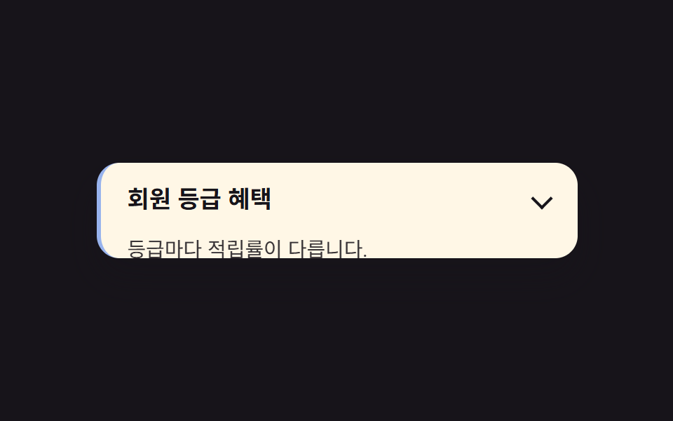
열린 항목만 왼쪽 테두리와 배경이 강조됩니다.
<main class="stage">
  <section class="accordion is-demo-border">
    <button class="accordion__header" type="button" aria-expanded="false">
      <span class="accordion__title">회원 등급 혜택</span>
      <span class="accordion__chevron" aria-hidden="true"></span>
    </button>
    <div class="accordion__panel is-demo">
      <p class="accordion__body">등급마다 적립률이 다릅니다.</p>
    </div>
  </section>
</main>
@use "../../../../site/static/demo-tokens" as *;
$duration: $dur-base;
$easing: $ease-spring;
$color: $subject-blue;
@include stage($stage-ink);
.accordion {
width: clamp(220px, 78vw, 340px);
background: $subject-cream;
border-radius: $r-card;
border-left: 3px solid transparent;
box-shadow: $shadow-raised;
overflow: hidden;
font-family: inherit;
}
.accordion__header {
display: flex;
align-items: center;
justify-content: space-between;
gap: 12px;
width: 100%;
border: 0;
background: none;
padding: clamp(12px, 3vw, 18px) clamp(14px, 4vw, 20px);
cursor: pointer;
color: $subject-ink;
font-weight: 600;
font-size: clamp(14px, 3.6vw, 17px);
line-height: 1.3;
font-family: inherit;
text-align: left;
}
.accordion__chevron {
flex: none; width: 9px; height: 9px;
border-right: 2px solid currentColor;
border-bottom: 2px solid currentColor;
transform: rotate(45deg);
}
.accordion__body {
margin: 0;
padding: 0 clamp(14px, 4vw, 20px) clamp(12px, 3vw, 18px);
color: $subject-ink;
opacity: .86;
font-weight: 400;
font-size: clamp(12px, 3.2vw, 14.5px);
line-height: 1.5;
font-family: inherit;
}
.accordion__panel {
height: 0;
overflow: hidden;
interpolate-size: allow-keywords;
}
// 실사용: 클릭하면 열림 상태(.is-open)가 붙고 목표 높이까지 전환된다
.accordion.is-open .accordion__panel {
height: calc-size(auto, size);
transition: height $duration $easing;
}
@supports not (height: calc-size(auto, size)) {
.accordion.is-open .accordion__panel { height: auto; }
}
// 데모: 2초 주기로 스스로 열고 닫힌다. WAAPI 시계로 재생 위치를 잡으려면
// transition 이 아니라 keyframes 여야 한다 (blog-demo 측정 규칙)
.accordion__panel.is-demo {
animation: accordion-loop $dur-loop $easing infinite;
}
@keyframes accordion-loop {
0%, 8% { height: 0; }
42%, 58% { height: calc-size(auto, size); }
92%, 100% { height: 0; }
}
@supports not (height: calc-size(auto, size)) {
@keyframes accordion-loop {
0%, 8% { height: 0; }
42%, 58% { height: 220px; }
92%, 100% { height: 0; }
}
}
// 열려 있는 동안만 왼쪽 테두리와 배경이 강조된다 (패널과 같은 리듬)
.accordion.is-demo-border {
animation: border-loop $dur-loop $easing infinite;
}
@keyframes border-loop {
0%, 8% { border-left-color: transparent; background: $subject-cream; }
42%, 58% { border-left-color: $color; background: $subject-cream; }
92%, 100% { border-left-color: transparent; background: $subject-cream; }
}
@media (prefers-reduced-motion: reduce) {
.accordion__panel,
.accordion__panel.is-demo,
.accordion__chevron,
.accordion__body,
.accordion.is-open .accordion__panel {
animation: none !important;
transition: none !important;
}
.accordion__panel.is-demo { height: auto; }
}html, body {
margin: 0;
overflow: hidden;
}
.stage {
box-sizing: border-box;
min-height: 100vh;
display: grid;
place-items: center;
margin: 0;
background: #17141a;
font-family: -apple-system, "Segoe UI", "Noto Sans KR", sans-serif;
padding: clamp(8px, 4vw, 24px);
}
.accordion {
width: clamp(220px, 78vw, 340px);
background: #fff7e6;
border-radius: 16px;
border-left: 3px solid transparent;
box-shadow: 0 14px 24px rgba(23, 20, 26, 0.32);
overflow: hidden;
font-family: inherit;
}
.accordion__header {
display: flex;
align-items: center;
justify-content: space-between;
gap: 12px;
width: 100%;
border: 0;
background: none;
padding: clamp(12px, 3vw, 18px) clamp(14px, 4vw, 20px);
cursor: pointer;
color: #17141a;
font-weight: 600;
font-size: clamp(14px, 3.6vw, 17px);
line-height: 1.3;
font-family: inherit;
text-align: left;
}
.accordion__chevron {
flex: none;
width: 9px;
height: 9px;
border-right: 2px solid currentColor;
border-bottom: 2px solid currentColor;
transform: rotate(45deg);
}
.accordion__body {
margin: 0;
padding: 0 clamp(14px, 4vw, 20px) clamp(12px, 3vw, 18px);
color: #17141a;
opacity: 0.86;
font-weight: 400;
font-size: clamp(12px, 3.2vw, 14.5px);
line-height: 1.5;
font-family: inherit;
}
.accordion__panel {
height: 0;
overflow: hidden;
interpolate-size: allow-keywords;
}
.accordion.is-open .accordion__panel {
height: calc-size(auto, size);
transition: height 300ms cubic-bezier(0.2, 0.8, 0.2, 1);
}
@supports not (height: calc-size(auto, size)) {
.accordion.is-open .accordion__panel {
height: auto;
}
}
.accordion__panel.is-demo {
animation: accordion-loop 2s cubic-bezier(0.2, 0.8, 0.2, 1) infinite;
}
@keyframes accordion-loop {
0%, 8% {
height: 0;
}
42%, 58% {
height: calc-size(auto, size);
}
92%, 100% {
height: 0;
}
}
@supports not (height: calc-size(auto, size)) {
@keyframes accordion-loop {
0%, 8% {
height: 0;
}
42%, 58% {
height: 220px;
}
92%, 100% {
height: 0;
}
}
}
.accordion.is-demo-border {
animation: border-loop 2s cubic-bezier(0.2, 0.8, 0.2, 1) infinite;
}
@keyframes border-loop {
0%, 8% {
border-left-color: transparent;
background: #fff7e6;
}
42%, 58% {
border-left-color: #2f6df6;
background: #fff7e6;
}
92%, 100% {
border-left-color: transparent;
background: #fff7e6;
}
}
@media (prefers-reduced-motion: reduce) {
.accordion__panel,
.accordion__panel.is-demo,
.accordion__chevron,
.accordion__body,
.accordion.is-open .accordion__panel {
animation: none !important;
transition: none !important;
}
.accordion__panel.is-demo {
height: auto;
}
}(function () {
var acc = document.querySelector('.accordion');
var header = acc.querySelector('.accordion__header');
var panel = acc.querySelector('.accordion__panel');
header.addEventListener('click', function () {
panel.classList.remove('is-demo');
acc.classList.remove('is-demo-border');
var open = acc.classList.toggle('is-open');
header.setAttribute('aria-expanded', String(open));
});
})();import { useState } from "react";
import type { CSSProperties, ReactNode } from "react";
import styles from "./AccordionBorderHighlight.module.scss";
export type AccordionBorderHighlightProps = {
/** 헤더에 보이는 제목 */
header?: ReactNode;
/** 열렸을 때 보이는 본문 */
children?: ReactNode;
/** height:auto 전환 시간 (기본 300ms) */
duration?: number;
/** CSS easing */
easing?: string;
/** 강조 색 */
color?: string;
defaultOpen?: boolean;
};
type Vars = CSSProperties & { "--duration"?: string; "--easing"?: string; "--color"?: string };
export default function AccordionBorderHighlight({
header = "Membership tier perks",
children = "Points rates vary by tier.",
duration = 300,
easing = "cubic-bezier(.2,.8,.2,1)",
color = "#2f6df6",
defaultOpen = false,
}: AccordionBorderHighlightProps) {
const [open, setOpen] = useState(defaultOpen);
const vars: Vars = { "--duration": `${duration}ms`, "--easing": easing, "--color": color };
return (
<section className={styles.accordion} style={vars}>
<button
type="button"
className={styles.header}
aria-expanded={open}
onClick={() => setOpen((v) => !v)}
>
<span>{header}</span>
<span className={`${styles.chevron} ${open ? styles.chevronOpen : ""}`} aria-hidden="true" />
</button>
<div className={`${styles.panel} ${open ? styles.panelOpen : ""}`}>
<p className={styles.body}>{children}</p>
</div>
</section>
);
}05 · 열린 항목 강조 테두리 — 측정 누적면적 12.473% · 움직인 프레임 17/23GODRICH 원작 · zip 에 SCSS·React 포함 · 비밀번호 보기
언제 쓰나
지금 보고 있는 섹션을 표시해야 하는 설정 목록에 씁니다.
.accordion {
  border-left: 3px solid transparent;
  background: $card;
  transition: border-color $duration $easing, background $duration $easing;
}
.accordion.is-open {
  border-left-color: $color;
}
06중첩 아코디언
무엇이 보이나
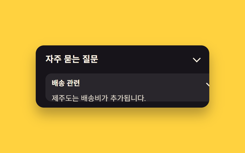
아코디언 안에 작은 아코디언이 들어 있어 두 단계로 펼쳐집니다.
<main class="stage">
  <section class="accordion">
    <button class="accordion__header" type="button" aria-expanded="false">
      <span class="accordion__title">자주 묻는 질문</span>
      <span class="accordion__chevron" aria-hidden="true"></span>
    </button>
    <div class="accordion__panel is-demo">
      <div class="accordion accordion--inner">
        <button class="accordion__header accordion__header--inner" type="button" aria-expanded="false">
          <span class="accordion__title">배송 관련</span>
          <span class="accordion__chevron" aria-hidden="true"></span>
        </button>
        <div class="accordion__panel accordion__panel--inner is-demo-inner">
          <p class="accordion__body">제주도는 배송비가 추가됩니다.</p>
        </div>
      </div>
    </div>
  </section>
</main>
@use "../../../../site/static/demo-tokens" as *;
$duration: $dur-quick;
$easing: $ease-out;
$color: $subject-cream;
@include stage($stage-yellow);
.accordion {
width: clamp(220px, 78vw, 340px);
background: $subject-ink;
border-radius: $r-card;
box-shadow: $shadow-raised;
overflow: hidden;
font-family: inherit;
}
.accordion__header {
display: flex;
align-items: center;
justify-content: space-between;
gap: 12px;
width: 100%;
border: 0;
background: none;
padding: clamp(12px, 3vw, 18px) clamp(14px, 4vw, 20px);
cursor: pointer;
color: $subject-cream;
font-weight: 600;
font-size: clamp(14px, 3.6vw, 17px);
line-height: 1.3;
font-family: inherit;
text-align: left;
}
.accordion__chevron {
flex: none;
width: 9px;
height: 9px;
border-right: 2px solid currentColor;
border-bottom: 2px solid currentColor;
transform: rotate(45deg);
}
.accordion__body {
margin: 0;
padding: 0 clamp(14px, 4vw, 20px) clamp(12px, 3vw, 18px);
color: $subject-cream;
opacity: .86;
font-weight: 400;
font-size: clamp(12px, 3.2vw, 14.5px);
line-height: 1.5;
font-family: inherit;
}
.accordion__panel {
height: 0;
overflow: hidden;
interpolate-size: allow-keywords;
}
// 실사용: 클릭하면 열림 상태(.is-open)가 붙고 목표 높이까지 전환된다
.accordion.is-open .accordion__panel {
height: calc-size(auto, size);
transition: height $duration $easing;
}
@supports not (height: calc-size(auto, size)) {
.accordion.is-open .accordion__panel { height: auto; }
}
// 데모: 2초 주기로 스스로 열고 닫힌다. WAAPI 시계로 재생 위치를 잡으려면
// transition 이 아니라 keyframes 여야 한다 (blog-demo 측정 규칙)
.accordion__panel.is-demo {
animation: accordion-loop $dur-loop $easing infinite;
}
@keyframes accordion-loop {
0%, 8% { height: 0; }
42%, 58% { height: calc-size(auto, size); }
92%, 100% { height: 0; }
}
@supports not (height: calc-size(auto, size)) {
@keyframes accordion-loop {
0%, 8% { height: 0; }
42%, 58% { height: 220px; }
92%, 100% { height: 0; }
}
}
.accordion--inner {
margin: 4px clamp(14px, 4vw, 20px) 12px;
background: rgba(255, 255, 255, .08);
border-radius: $r-control;
}
.accordion__header--inner {
padding: 10px 12px;
font-weight: 600;
font-size: clamp(12px, 3vw, 14px);
line-height: 1.3;
font-family: inherit;
}
.accordion__panel--inner {
height: 0;
overflow: hidden;
interpolate-size: allow-keywords;
}
.accordion__panel--inner .accordion__body {
padding: 0 12px 10px;
}
// 안쪽 아코디언은 바깥이 열려 있는 구간(8%~58%) 안에서 더 짧게 열린다
.accordion__panel--inner.is-demo-inner {
animation: accordion-loop-inner $dur-loop $easing infinite;
}
@keyframes accordion-loop-inner {
0%, 20% { height: 0; }
32%, 46% { height: calc-size(auto, size); }
58%, 100% { height: 0; }
}
@supports not (height: calc-size(auto, size)) {
@keyframes accordion-loop-inner { 0%, 20% { height: 0; } 32%, 46% { height: 90px; } 58%, 100% { height: 0; } }
}
@media (prefers-reduced-motion: reduce) {
.accordion__panel,
.accordion__panel.is-demo,
.accordion__chevron,
.accordion__body,
.accordion.is-open .accordion__panel {
animation: none !important;
transition: none !important;
}
.accordion__panel.is-demo { height: auto; }
}html, body {
margin: 0;
overflow: hidden;
}
.stage {
box-sizing: border-box;
min-height: 100vh;
display: grid;
place-items: center;
margin: 0;
background: #ffd23f;
font-family: -apple-system, "Segoe UI", "Noto Sans KR", sans-serif;
padding: clamp(8px, 4vw, 24px);
}
.accordion {
width: clamp(220px, 78vw, 340px);
background: #17141a;
border-radius: 16px;
box-shadow: 0 14px 24px rgba(23, 20, 26, 0.32);
overflow: hidden;
font-family: inherit;
}
.accordion__header {
display: flex;
align-items: center;
justify-content: space-between;
gap: 12px;
width: 100%;
border: 0;
background: none;
padding: clamp(12px, 3vw, 18px) clamp(14px, 4vw, 20px);
cursor: pointer;
color: #fff7e6;
font-weight: 600;
font-size: clamp(14px, 3.6vw, 17px);
line-height: 1.3;
font-family: inherit;
text-align: left;
}
.accordion__chevron {
flex: none;
width: 9px;
height: 9px;
border-right: 2px solid currentColor;
border-bottom: 2px solid currentColor;
transform: rotate(45deg);
}
.accordion__body {
margin: 0;
padding: 0 clamp(14px, 4vw, 20px) clamp(12px, 3vw, 18px);
color: #fff7e6;
opacity: 0.86;
font-weight: 400;
font-size: clamp(12px, 3.2vw, 14.5px);
line-height: 1.5;
font-family: inherit;
}
.accordion__panel {
height: 0;
overflow: hidden;
interpolate-size: allow-keywords;
}
.accordion.is-open .accordion__panel {
height: calc-size(auto, size);
transition: height 220ms ease-out;
}
@supports not (height: calc-size(auto, size)) {
.accordion.is-open .accordion__panel {
height: auto;
}
}
.accordion__panel.is-demo {
animation: accordion-loop 2s ease-out infinite;
}
@keyframes accordion-loop {
0%, 8% {
height: 0;
}
42%, 58% {
height: calc-size(auto, size);
}
92%, 100% {
height: 0;
}
}
@supports not (height: calc-size(auto, size)) {
@keyframes accordion-loop {
0%, 8% {
height: 0;
}
42%, 58% {
height: 220px;
}
92%, 100% {
height: 0;
}
}
}
.accordion--inner {
margin: 4px clamp(14px, 4vw, 20px) 12px;
background: rgba(255, 255, 255, 0.08);
border-radius: 12px;
}
.accordion__header--inner {
padding: 10px 12px;
font-weight: 600;
font-size: clamp(12px, 3vw, 14px);
line-height: 1.3;
font-family: inherit;
}
.accordion__panel--inner {
height: 0;
overflow: hidden;
interpolate-size: allow-keywords;
}
.accordion__panel--inner .accordion__body {
padding: 0 12px 10px;
}
.accordion__panel--inner.is-demo-inner {
animation: accordion-loop-inner 2s ease-out infinite;
}
@keyframes accordion-loop-inner {
0%, 20% {
height: 0;
}
32%, 46% {
height: calc-size(auto, size);
}
58%, 100% {
height: 0;
}
}
@supports not (height: calc-size(auto, size)) {
@keyframes accordion-loop-inner {
0%, 20% {
height: 0;
}
32%, 46% {
height: 90px;
}
58%, 100% {
height: 0;
}
}
}
@media (prefers-reduced-motion: reduce) {
.accordion__panel,
.accordion__panel.is-demo,
.accordion__chevron,
.accordion__body,
.accordion.is-open .accordion__panel {
animation: none !important;
transition: none !important;
}
.accordion__panel.is-demo {
height: auto;
}
}(function () {
document.querySelectorAll('.accordion').forEach(function (acc) {
var header = acc.querySelector(':scope > .accordion__header');
var panel = acc.querySelector(':scope > .accordion__panel');
header.addEventListener('click', function () {
panel.classList.remove('is-demo', 'is-demo-inner');
var open = acc.classList.toggle('is-open');
header.setAttribute('aria-expanded', String(open));
});
});
})();import { useState } from "react";
import type { CSSProperties, ReactNode } from "react";
import styles from "./AccordionNestedAccordion.module.scss";
export type AccordionNestedAccordionProps = {
/** 헤더에 보이는 제목 */
header?: ReactNode;
/** 열렸을 때 보이는 본문 */
children?: ReactNode;
/** height:auto 전환 시간 (기본 300ms) */
duration?: number;
/** CSS easing */
easing?: string;
/** 강조 색 */
color?: string;
defaultOpen?: boolean;
};
type Vars = CSSProperties & { "--duration"?: string; "--easing"?: string; "--color"?: string };
export default function AccordionNestedAccordion({
header = "Frequently asked questions",
children = "About shipping: Jeju Island has an extra fee.",
duration = 300,
easing = "cubic-bezier(.2,.8,.2,1)",
color = "#17141a",
defaultOpen = false,
}: AccordionNestedAccordionProps) {
const [open, setOpen] = useState(defaultOpen);
const vars: Vars = { "--duration": `${duration}ms`, "--easing": easing, "--color": color };
return (
<section className={styles.accordion} style={vars}>
<button
type="button"
className={styles.header}
aria-expanded={open}
onClick={() => setOpen((v) => !v)}
>
<span>{header}</span>
<span className={`${styles.chevron} ${open ? styles.chevronOpen : ""}`} aria-hidden="true" />
</button>
<div className={`${styles.panel} ${open ? styles.panelOpen : ""}`}>
<p className={styles.body}>{children}</p>
</div>
</section>
);
}06 · 중첩 아코디언 — 측정 누적면적 37.072% · 움직인 프레임 20/23GODRICH 원작 · zip 에 SCSS·React 포함 · 비밀번호 보기
어디에 쓰나
다단계 FAQ나 카테고리 트리 메뉴에 씁니다.
.accordion__panel--inner {
  height: 0;
  overflow: hidden;
  interpolate-size: allow-keywords;
}
.accordion--inner.is-open .accordion__panel--inner {
  height: calc-size(auto, size);
  transition: height $duration $easing;
}
07calc-size() 폴백 패턴
화면에서 일어나는 일
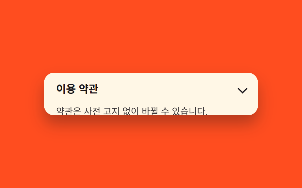
calc-size()를 모르는 브라우저는 max-height 폴백으로 똑같이 움직입니다.
<main class="stage">
  <section class="accordion">
    <button class="accordion__header" type="button" aria-expanded="false">
      <span class="accordion__title">이용 약관</span>
      <span class="accordion__chevron" aria-hidden="true"></span>
    </button>
    <div class="accordion__panel is-demo">
      <p class="accordion__body">약관은 사전 고지 없이 바뀔 수 있습니다.</p>
    </div>
  </section>
</main>
@use "../../../../site/static/demo-tokens" as *;
$duration: $dur-base;
$easing: $ease-spring;
$color: $subject-ink;
@include stage($stage-orange);
.accordion {
width: clamp(220px, 78vw, 340px);
background: $subject-cream;
border-radius: $r-card;
box-shadow: $shadow-raised;
overflow: hidden;
font-family: inherit;
}
.accordion__header {
display: flex;
align-items: center;
justify-content: space-between;
gap: 12px;
width: 100%;
border: 0;
background: none;
padding: clamp(12px, 3vw, 18px) clamp(14px, 4vw, 20px);
cursor: pointer;
color: $subject-ink;
font-weight: 600;
font-size: clamp(14px, 3.6vw, 17px);
line-height: 1.3;
font-family: inherit;
text-align: left;
}
.accordion__chevron {
flex: none;
width: 9px;
height: 9px;
border-right: 2px solid currentColor;
border-bottom: 2px solid currentColor;
transform: rotate(45deg);
}
.accordion__body {
margin: 0;
padding: 0 clamp(14px, 4vw, 20px) clamp(12px, 3vw, 18px);
color: $subject-ink;
opacity: .86;
font-weight: 400;
font-size: clamp(12px, 3.2vw, 14.5px);
line-height: 1.5;
font-family: inherit;
}
// calc-size() 를 모르면 이 규칙이 이긴다 (같은 클래스, 고정 높이로 대체)
.accordion__panel {
height: 0;
overflow: hidden;
interpolate-size: allow-keywords;
}
// 실사용: 클릭하면 열림 상태(.is-open)가 붙고 목표 높이까지 전환된다
.accordion.is-open .accordion__panel {
height: calc-size(auto, size);
transition: height $duration $easing;
}
@supports not (height: calc-size(auto, size)) {
.accordion.is-open .accordion__panel { height: auto; }
}
// 데모: 2초 주기로 스스로 열고 닫힌다. WAAPI 시계로 재생 위치를 잡으려면
// transition 이 아니라 keyframes 여야 한다 (blog-demo 측정 규칙)
.accordion__panel.is-demo {
animation: accordion-loop $dur-loop $easing infinite;
}
@keyframes accordion-loop {
0%, 8% { height: 0; }
42%, 58% { height: calc-size(auto, size); }
92%, 100% { height: 0; }
}
@supports not (height: calc-size(auto, size)) {
@keyframes accordion-loop {
0%, 8% { height: 0; }
42%, 58% { height: 220px; }
92%, 100% { height: 0; }
}
}
@media (prefers-reduced-motion: reduce) {
.accordion__panel,
.accordion__panel.is-demo,
.accordion__chevron,
.accordion__body,
.accordion.is-open .accordion__panel {
animation: none !important;
transition: none !important;
}
.accordion__panel.is-demo { height: auto; }
}html, body {
margin: 0;
overflow: hidden;
}
.stage {
box-sizing: border-box;
min-height: 100vh;
display: grid;
place-items: center;
margin: 0;
background: #ff4d1f;
font-family: -apple-system, "Segoe UI", "Noto Sans KR", sans-serif;
padding: clamp(8px, 4vw, 24px);
}
.accordion {
width: clamp(220px, 78vw, 340px);
background: #fff7e6;
border-radius: 16px;
box-shadow: 0 14px 24px rgba(23, 20, 26, 0.32);
overflow: hidden;
font-family: inherit;
}
.accordion__header {
display: flex;
align-items: center;
justify-content: space-between;
gap: 12px;
width: 100%;
border: 0;
background: none;
padding: clamp(12px, 3vw, 18px) clamp(14px, 4vw, 20px);
cursor: pointer;
color: #17141a;
font-weight: 600;
font-size: clamp(14px, 3.6vw, 17px);
line-height: 1.3;
font-family: inherit;
text-align: left;
}
.accordion__chevron {
flex: none;
width: 9px;
height: 9px;
border-right: 2px solid currentColor;
border-bottom: 2px solid currentColor;
transform: rotate(45deg);
}
.accordion__body {
margin: 0;
padding: 0 clamp(14px, 4vw, 20px) clamp(12px, 3vw, 18px);
color: #17141a;
opacity: 0.86;
font-weight: 400;
font-size: clamp(12px, 3.2vw, 14.5px);
line-height: 1.5;
font-family: inherit;
}
.accordion__panel {
height: 0;
overflow: hidden;
interpolate-size: allow-keywords;
}
.accordion.is-open .accordion__panel {
height: calc-size(auto, size);
transition: height 300ms cubic-bezier(0.2, 0.8, 0.2, 1);
}
@supports not (height: calc-size(auto, size)) {
.accordion.is-open .accordion__panel {
height: auto;
}
}
.accordion__panel.is-demo {
animation: accordion-loop 2s cubic-bezier(0.2, 0.8, 0.2, 1) infinite;
}
@keyframes accordion-loop {
0%, 8% {
height: 0;
}
42%, 58% {
height: calc-size(auto, size);
}
92%, 100% {
height: 0;
}
}
@supports not (height: calc-size(auto, size)) {
@keyframes accordion-loop {
0%, 8% {
height: 0;
}
42%, 58% {
height: 220px;
}
92%, 100% {
height: 0;
}
}
}
@media (prefers-reduced-motion: reduce) {
.accordion__panel,
.accordion__panel.is-demo,
.accordion__chevron,
.accordion__body,
.accordion.is-open .accordion__panel {
animation: none !important;
transition: none !important;
}
.accordion__panel.is-demo {
height: auto;
}
}(function () {
document.querySelectorAll('.accordion').forEach(function (acc) {
var header = acc.querySelector('.accordion__header');
var panel = acc.querySelector('.accordion__panel');
header.addEventListener('click', function () {
panel.classList.remove('is-demo');
var open = acc.classList.toggle('is-open');
header.setAttribute('aria-expanded', String(open));
});
});
})();import { useState } from "react";
import type { CSSProperties, ReactNode } from "react";
import styles from "./AccordionCalcSizeFallback.module.scss";
export type AccordionCalcSizeFallbackProps = {
/** 헤더에 보이는 제목 */
header?: ReactNode;
/** 열렸을 때 보이는 본문 */
children?: ReactNode;
/** height:auto 전환 시간 (기본 300ms) */
duration?: number;
/** CSS easing */
easing?: string;
/** 강조 색 */
color?: string;
defaultOpen?: boolean;
};
type Vars = CSSProperties & { "--duration"?: string; "--easing"?: string; "--color"?: string };
export default function AccordionCalcSizeFallback({
header = "Terms of service",
children = "Terms may change without prior notice.",
duration = 300,
easing = "cubic-bezier(.2,.8,.2,1)",
color = "#17141a",
defaultOpen = false,
}: AccordionCalcSizeFallbackProps) {
const [open, setOpen] = useState(defaultOpen);
const vars: Vars = { "--duration": `${duration}ms`, "--easing": easing, "--color": color };
return (
<section className={styles.accordion} style={vars}>
<button
type="button"
className={styles.header}
aria-expanded={open}
onClick={() => setOpen((v) => !v)}
>
<span>{header}</span>
<span className={`${styles.chevron} ${open ? styles.chevronOpen : ""}`} aria-hidden="true" />
</button>
<div className={`${styles.panel} ${open ? styles.panelOpen : ""}`}>
<p className={styles.body}>{children}</p>
</div>
</section>
);
}07 · calc-size() 폴백 패턴 — 측정 누적면적 18.438% · 움직인 프레임 17/23GODRICH 원작 · zip 에 SCSS·React 포함 · 비밀번호 보기
쓰는 자리
크로스 브라우저 지원이 필요한 폼에 씁니다.
@supports (height: calc-size(auto, size)) {
  .accordion.is-open .panel { height: calc-size(auto, size); }
}
@supports not (height: calc-size(auto, size)) {
  .panel { max-height: 0; transition: max-height $duration $easing; }
  .accordion.is-open .panel { max-height: 480px; }
}
08탄성 바운스로 열림
어떤 움직임인가
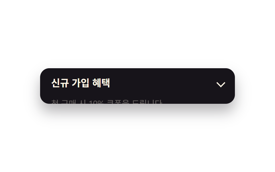
열릴 때 목표 높이를 살짝 넘었다가 튕기듯 자리를 잡습니다.
<main class="stage">
  <section class="accordion">
    <button class="accordion__header" type="button" aria-expanded="false">
      <span class="accordion__title">신규 가입 혜택</span>
      <span class="accordion__chevron" aria-hidden="true"></span>
    </button>
    <div class="accordion__panel is-demo">
      <p class="accordion__body is-demo">첫 구매 시 10% 쿠폰을 드립니다.</p>
    </div>
  </section>
</main>
@use "../../../../site/static/demo-tokens" as *;
$duration: $dur-enter;
$easing: $ease-pop; // 튕기는 느낌의 오버슈트 곡선
$color: $subject-blue;
@include stage($stage-paper);
.accordion {
width: clamp(220px, 78vw, 340px);
background: $subject-ink;
border-radius: $r-card;
box-shadow: $shadow-raised;
overflow: hidden;
font-family: inherit;
}
.accordion__header {
display: flex;
align-items: center;
justify-content: space-between;
gap: 12px;
width: 100%;
border: 0;
background: none;
padding: clamp(12px, 3vw, 18px) clamp(14px, 4vw, 20px);
cursor: pointer;
color: $subject-cream;
font-weight: 600;
font-size: clamp(14px, 3.6vw, 17px);
line-height: 1.3;
font-family: inherit;
text-align: left;
}
.accordion__chevron {
flex: none;
width: 9px;
height: 9px;
border-right: 2px solid currentColor;
border-bottom: 2px solid currentColor;
transform: rotate(45deg);
}
.accordion__body {
margin: 0;
padding: 0 clamp(14px, 4vw, 20px) clamp(12px, 3vw, 18px);
color: $subject-cream;
opacity: .86;
font-weight: 400;
font-size: clamp(12px, 3.2vw, 14.5px);
line-height: 1.5;
font-family: inherit;
}
.accordion__panel {
height: 0;
overflow: hidden;
interpolate-size: allow-keywords;
}
.accordion.is-open .accordion__panel {
height: calc-size(auto, size);
transition: height $duration $easing;
}
@supports not (height: calc-size(auto, size)) {
.accordion.is-open .accordion__panel { height: auto; }
}
// 데모: 열릴 때 안쪽 카드가 살짝 커졌다가($ease-pop) 자리를 잡는다
.accordion__panel.is-demo {
animation: accordion-loop $dur-loop $easing infinite;
}
@keyframes accordion-loop {
0%, 8% { height: 0; }
42%, 58% { height: calc-size(auto, size); }
92%, 100% { height: 0; }
}
@supports not (height: calc-size(auto, size)) {
@keyframes accordion-loop { 0%, 8% { height: 0; } 42%, 58% { height: 220px; } 92%, 100% { height: 0; } }
}
.accordion__body.is-demo {
transform-origin: top center; // 규칙8: 헤더 아래 변 붙어 펼침 팝
animation: bounce-loop $dur-loop $easing infinite;
}
@keyframes bounce-loop {
0%, 8% { transform: scale(1); opacity: 0; }
36% { transform: scale(1.06); opacity: 1; }
50%, 58% { transform: scale(1); opacity: 1; }
92%, 100% { transform: scale(1); opacity: 0; }
}
@media (prefers-reduced-motion: reduce) {
.accordion__panel,
.accordion__panel.is-demo,
.accordion__chevron,
.accordion__body,
.accordion.is-open .accordion__panel {
animation: none !important;
transition: none !important;
}
.accordion__panel.is-demo { height: auto; }
}html, body {
margin: 0;
overflow: hidden;
}
.stage {
box-sizing: border-box;
min-height: 100vh;
display: grid;
place-items: center;
margin: 0;
background: #ffffff;
font-family: -apple-system, "Segoe UI", "Noto Sans KR", sans-serif;
padding: clamp(8px, 4vw, 24px);
}
.accordion {
width: clamp(220px, 78vw, 340px);
background: #17141a;
border-radius: 16px;
box-shadow: 0 14px 24px rgba(23, 20, 26, 0.32);
overflow: hidden;
font-family: inherit;
}
.accordion__header {
display: flex;
align-items: center;
justify-content: space-between;
gap: 12px;
width: 100%;
border: 0;
background: none;
padding: clamp(12px, 3vw, 18px) clamp(14px, 4vw, 20px);
cursor: pointer;
color: #fff7e6;
font-weight: 600;
font-size: clamp(14px, 3.6vw, 17px);
line-height: 1.3;
font-family: inherit;
text-align: left;
}
.accordion__chevron {
flex: none;
width: 9px;
height: 9px;
border-right: 2px solid currentColor;
border-bottom: 2px solid currentColor;
transform: rotate(45deg);
}
.accordion__body {
margin: 0;
padding: 0 clamp(14px, 4vw, 20px) clamp(12px, 3vw, 18px);
color: #fff7e6;
opacity: 0.86;
font-weight: 400;
font-size: clamp(12px, 3.2vw, 14.5px);
line-height: 1.5;
font-family: inherit;
}
.accordion__panel {
height: 0;
overflow: hidden;
interpolate-size: allow-keywords;
}
.accordion.is-open .accordion__panel {
height: calc-size(auto, size);
transition: height 600ms cubic-bezier(0.2, 1.4, 0.4, 1);
}
@supports not (height: calc-size(auto, size)) {
.accordion.is-open .accordion__panel {
height: auto;
}
}
.accordion__panel.is-demo {
animation: accordion-loop 2s cubic-bezier(0.2, 1.4, 0.4, 1) infinite;
}
@keyframes accordion-loop {
0%, 8% {
height: 0;
}
42%, 58% {
height: calc-size(auto, size);
}
92%, 100% {
height: 0;
}
}
@supports not (height: calc-size(auto, size)) {
@keyframes accordion-loop {
0%, 8% {
height: 0;
}
42%, 58% {
height: 220px;
}
92%, 100% {
height: 0;
}
}
}
.accordion__body.is-demo {
transform-origin: top center;
animation: bounce-loop 2s cubic-bezier(0.2, 1.4, 0.4, 1) infinite;
}
@keyframes bounce-loop {
0%, 8% {
transform: scale(1);
opacity: 0;
}
36% {
transform: scale(1.06);
opacity: 1;
}
50%, 58% {
transform: scale(1);
opacity: 1;
}
92%, 100% {
transform: scale(1);
opacity: 0;
}
}
@media (prefers-reduced-motion: reduce) {
.accordion__panel,
.accordion__panel.is-demo,
.accordion__chevron,
.accordion__body,
.accordion.is-open .accordion__panel {
animation: none !important;
transition: none !important;
}
.accordion__panel.is-demo {
height: auto;
}
}(function () {
document.querySelectorAll('.accordion').forEach(function (acc) {
var header = acc.querySelector('.accordion__header');
var panel = acc.querySelector('.accordion__panel');
header.addEventListener('click', function () {
panel.classList.remove('is-demo');
var open = acc.classList.toggle('is-open');
header.setAttribute('aria-expanded', String(open));
});
});
})();import { useState } from "react";
import type { CSSProperties, ReactNode } from "react";
import styles from "./AccordionElasticBounce.module.scss";
export type AccordionElasticBounceProps = {
/** 헤더에 보이는 제목 */
header?: ReactNode;
/** 열렸을 때 보이는 본문 */
children?: ReactNode;
/** height:auto 전환 시간 (기본 300ms) */
duration?: number;
/** CSS easing */
easing?: string;
/** 강조 색 */
color?: string;
defaultOpen?: boolean;
};
type Vars = CSSProperties & { "--duration"?: string; "--easing"?: string; "--color"?: string };
export default function AccordionElasticBounce({
header = "New member perks",
children = "Get a 10% coupon on your first purchase.",
duration = 300,
easing = "cubic-bezier(.2,.8,.2,1)",
color = "#2f6df6",
defaultOpen = false,
}: AccordionElasticBounceProps) {
const [open, setOpen] = useState(defaultOpen);
const vars: Vars = { "--duration": `${duration}ms`, "--easing": easing, "--color": color };
return (
<section className={styles.accordion} style={vars}>
<button
type="button"
className={styles.header}
aria-expanded={open}
onClick={() => setOpen((v) => !v)}
>
<span>{header}</span>
<span className={`${styles.chevron} ${open ? styles.chevronOpen : ""}`} aria-hidden="true" />
</button>
<div className={`${styles.panel} ${open ? styles.panelOpen : ""}`}>
<p className={styles.body}>{children}</p>
</div>
</section>
);
}08 · 탄성 바운스로 열림 — 측정 누적면적 19.022% · 움직인 프레임 15/23GODRICH 원작 · zip 에 SCSS·React 포함 · 비밀번호 보기
언제 쓰나
강조하고 싶은 프로모션 아코디언이나 온보딩 카드에 씁니다.
.accordion.is-open .panel {
  height: calc-size(auto, size);
  transition: height $duration $ease-pop;
}
.accordion.is-open .accordion__body {
  animation: bounce-in $duration $ease-pop;
}
@keyframes bounce-in {
  from { transform: scale(1.04); opacity: 0; }
  to   { transform: scale(1); opacity: 1; }
}
09사이드바 메뉴로 재활용
무엇이 보이나
같은 아코디언 구조를 사이드바 메뉴의 하위 항목 접기·펼치기에 그대로 씁니다.
<main class="stage">
  <nav class="accordion sidebar">
    <button class="accordion__header" type="button" aria-expanded="false">
      <span class="accordion__title">설정</span>
      <span class="accordion__chevron" aria-hidden="true"></span>
    </button>
    <ul class="sidebar__list is-demo">
      <li>계정</li>
      <li>알림</li>
      <li>결제 수단</li>
    </ul>
  </nav>
</main>
@use "../../../../site/static/demo-tokens" as *;
$duration: $dur-quick;
$easing: $ease-out;
$color: $subject-blue;
@include stage($stage-ink);
.accordion.sidebar {
width: clamp(200px, 70vw, 280px);
background: $subject-cream;
border-radius: $r-card;
box-shadow: $shadow-raised;
overflow: hidden;
font-family: inherit;
}
.accordion__header {
display: flex;
align-items: center;
justify-content: space-between;
gap: 12px;
width: 100%;
border: 0;
background: none;
padding: clamp(12px, 3vw, 16px) clamp(14px, 4vw, 18px);
cursor: pointer;
color: $subject-ink;
font-weight: 600;
font-size: clamp(13px, 3.4vw, 15px);
line-height: 1.3;
font-family: inherit;
text-align: left;
}
.accordion__chevron {
flex: none; width: 8px; height: 8px;
border-right: 2px solid currentColor;
border-bottom: 2px solid currentColor;
transform: rotate(45deg);
}
.sidebar__list {
list-style: none;
margin: 0;
padding: 0 clamp(14px, 4vw, 18px) 10px clamp(26px, 8vw, 32px);
height: 0;
overflow: hidden;
interpolate-size: allow-keywords;
}
.sidebar__list li {
padding: 6px 0;
color: $subject-ink;
opacity: .86;
font-weight: 400;
font-size: clamp(12px, 3.2vw, 14px);
line-height: 1.4;
font-family: inherit;
}
.sidebar__list.is-demo {
animation: accordion-loop $dur-loop $easing infinite;
}
@keyframes accordion-loop {
0%, 8% { height: 0; }
42%, 58% { height: calc-size(auto, size); }
92%, 100% { height: 0; }
}
@supports not (height: calc-size(auto, size)) {
@keyframes accordion-loop { 0%, 8% { height: 0; } 42%, 58% { height: 130px; } 92%, 100% { height: 0; } }
}
@media (prefers-reduced-motion: reduce) {
.accordion__panel,
.accordion__panel.is-demo,
.accordion__chevron,
.accordion__body,
.accordion.is-open .accordion__panel {
animation: none !important;
transition: none !important;
}
.accordion__panel.is-demo { height: auto; }
}html, body {
margin: 0;
overflow: hidden;
}
.stage {
box-sizing: border-box;
min-height: 100vh;
display: grid;
place-items: center;
margin: 0;
background: #17141a;
font-family: -apple-system, "Segoe UI", "Noto Sans KR", sans-serif;
padding: clamp(8px, 4vw, 24px);
}
.accordion.sidebar {
width: clamp(200px, 70vw, 280px);
background: #fff7e6;
border-radius: 16px;
box-shadow: 0 14px 24px rgba(23, 20, 26, 0.32);
overflow: hidden;
font-family: inherit;
}
.accordion__header {
display: flex;
align-items: center;
justify-content: space-between;
gap: 12px;
width: 100%;
border: 0;
background: none;
padding: clamp(12px, 3vw, 16px) clamp(14px, 4vw, 18px);
cursor: pointer;
color: #17141a;
font-weight: 600;
font-size: clamp(13px, 3.4vw, 15px);
line-height: 1.3;
font-family: inherit;
text-align: left;
}
.accordion__chevron {
flex: none;
width: 8px;
height: 8px;
border-right: 2px solid currentColor;
border-bottom: 2px solid currentColor;
transform: rotate(45deg);
}
.sidebar__list {
list-style: none;
margin: 0;
padding: 0 clamp(14px, 4vw, 18px) 10px clamp(26px, 8vw, 32px);
height: 0;
overflow: hidden;
interpolate-size: allow-keywords;
}
.sidebar__list li {
padding: 6px 0;
color: #17141a;
opacity: 0.86;
font-weight: 400;
font-size: clamp(12px, 3.2vw, 14px);
line-height: 1.4;
font-family: inherit;
}
.sidebar__list.is-demo {
animation: accordion-loop 2s ease-out infinite;
}
@keyframes accordion-loop {
0%, 8% {
height: 0;
}
42%, 58% {
height: calc-size(auto, size);
}
92%, 100% {
height: 0;
}
}
@supports not (height: calc-size(auto, size)) {
@keyframes accordion-loop {
0%, 8% {
height: 0;
}
42%, 58% {
height: 130px;
}
92%, 100% {
height: 0;
}
}
}
@media (prefers-reduced-motion: reduce) {
.accordion__panel,
.accordion__panel.is-demo,
.accordion__chevron,
.accordion__body,
.accordion.is-open .accordion__panel {
animation: none !important;
transition: none !important;
}
.accordion__panel.is-demo {
height: auto;
}
}(function () {
var nav = document.querySelector('.sidebar');
var header = nav.querySelector('.accordion__header');
var list = nav.querySelector('.sidebar__list');
header.addEventListener('click', function () {
list.classList.remove('is-demo');
var open = nav.classList.toggle('is-open');
header.setAttribute('aria-expanded', String(open));
list.style.height = open ? 'calc-size(auto, size)' : '0';
});
})();import { useState } from "react";
import type { CSSProperties, ReactNode } from "react";
import styles from "./AccordionSidebarNav.module.scss";
export type AccordionSidebarNavProps = {
/** 헤더에 보이는 제목 */
header?: ReactNode;
/** 열렸을 때 보이는 본문 */
children?: ReactNode;
/** height:auto 전환 시간 (기본 300ms) */
duration?: number;
/** CSS easing */
easing?: string;
/** 강조 색 */
color?: string;
defaultOpen?: boolean;
};
type Vars = CSSProperties & { "--duration"?: string; "--easing"?: string; "--color"?: string };
export default function AccordionSidebarNav({
header = "Settings",
children = "Account, Notifications, Payment method.",
duration = 300,
easing = "cubic-bezier(.2,.8,.2,1)",
color = "#2f6df6",
defaultOpen = false,
}: AccordionSidebarNavProps) {
const [open, setOpen] = useState(defaultOpen);
const vars: Vars = { "--duration": `${duration}ms`, "--easing": easing, "--color": color };
return (
<section className={styles.accordion} style={vars}>
<button
type="button"
className={styles.header}
aria-expanded={open}
onClick={() => setOpen((v) => !v)}
>
<span>{header}</span>
<span className={`${styles.chevron} ${open ? styles.chevronOpen : ""}`} aria-hidden="true" />
</button>
<div className={`${styles.panel} ${open ? styles.panelOpen : ""}`}>
<p className={styles.body}>{children}</p>
</div>
</section>
);
}09 · 사이드바 메뉴로 재활용 — 측정 누적면적 20.065% · 움직인 프레임 18/23GODRICH 원작 · zip 에 SCSS·React 포함 · 비밀번호 보기
어디에 쓰나
대시보드 사이드바나 문서 목차에 씁니다.
.sidebar__list {
  height: 0;
  overflow: hidden;
  interpolate-size: allow-keywords;
  padding-left: 12px;
}
.sidebar.is-open .sidebar__list {
  height: calc-size(auto, size);
  transition: height $duration $easing;
}
어디서 깨지는가 — 함정 하나
height 를 직접 애니메이션하는 이유
아홉 개 전부 height를 직접 애니메이션하는데, 오랫동안 이건 금기였습니다. height를 바꾸면 브라우저가 매 프레임 레이아웃을 다시 계산하기 때문입니다. calc-size()와 interpolate-size는 이 계산을 브라우저가 미리 해 두고 전환 구간에서만 보간하는 방식이라 사정이 다릅니다. 다만 MDN의 interpolate-size 문서를 보면 이 값은 아직 일부 브라우저에만 있고, 나머지는 조용히 무시합니다. 그래서 07 항목처럼 @supports not (height: calc-size(auto, size))로 고정 max-height 폴백을 반드시 같이 넣어야 하는데, 이 폴백 없이 배포했다가 구형 브라우저에서 패널이 아예 안 열리는 걸 뒤늦게 발견했습니다. 긴 FAQ를 아코디언으로 접어 두면 페이지가 길어져 맨 위로 돌아갈 길도 같이 필요해지는데, 그 버튼은 위로가기 버튼 CSS 애니메이션에 스크롤만으로 나타나는 형태로 모여 있습니다.
max-height 폴백 값
폴백 말고 덧붙일 것이 하나 더 있습니다. max-height 폴백은 콘텐츠보다 넉넉하게 고정값을 잡아야 하는데, 너무 크면 닫히는 시간이 실제보다 길게 느껴집니다. 480px 안팎에서 시작해 콘텐츠 최대 높이에 맞춰 줄이는 걸 권하고, 이렇게 다듬은 값이 이미 반영된 아홉 개 파일의 압축 비밀번호는 문장 중간에 있는 34fn5mpm이며, 아래에서 zip으로 받을 수 있습니다.
접근성
동작 줄이기를 켰을 때
운영체제의 동작 줄이기 옵션을 켠 사람에게는 아홉 개 모두 prefers-reduced-motion: reduce로 응답합니다. 열고 닫는 과정만 없애고 열림·닫힘이라는 결과 상태는 그대로 남기는 게 원칙입니다. 08 탄성 바운스는 오버슈트 없이 즉시 상태만 바뀌고, 04 페이드+슬라이드는 위치 이동 없이 투명도만 바뀝니다. prefers-reduced-motion 자체의 문법과 브라우저 지원은 MDN 문서를 참고하십시오.
@media (prefers-reduced-motion: reduce) {
  .accordion__panel, .accordion__chevron, .accordion__body {
    animation: none !important;
    transition: none !important;
  }
}
모달·드로어 같은 다른 전환 효과는 CSS 애니메이션 카테고리에서 찾을 수 있고, 사이트 운영 방향은 소개 페이지에 적어 두었습니다.
FAQ
CSS 아코디언 애니메이션에 꼭 JS가 필요합니까?
여는 동작 자체는 네이티브 <details>나 체크박스 트릭으로 JS 없이도 가능합니다. 다만 02처럼 세 개 이상을 배타적으로 묶거나 06처럼 중첩 상태를 관리하려면 짧은 JS 한두 줄을 곁들이는 편이 안전합니다.
calc-size()는 어느 브라우저에서 됩니까?
이 글을 쓰는 시점 기준 지원이 갈리므로 실제 프로젝트에 쓰기 전에 caniuse.com에서 최신 지원표를 직접 확인하고, 07 항목의 @supports 폴백을 항상 같이 배포하십시오. 05 열린 항목 강조처럼 테두리·그림자로 지금 보는 자리를 알리는 방식을 카드 목록에도 쓰고 싶다면, 같은 신호를 호버로 다룬 CSS 카드 애니메이션 호버 효과를 참고하면 됩니다.
css 아코디언 메뉴 만들기를 아홉 개 다 한 페이지에 넣어도 됩니까?
넣을 수는 있지만 한 화면에는 한두 종류가 좋습니다. 08 탄성 바운스와 05 테두리 강조는 "이 아코디언은 특별하다"를 말하는 용도라 페이지 전체에 하나씩만 쓰는 걸 권합니다.
이런 글이랑 어울려요
 전환CSS 모달 팝업 애니메이션 9종 — JS 최소, @starting-style로
 전환CSS 페이지 전환 애니메이션 9종 — JS 없이, CSS만으로
 전환CSS 햄버거 메뉴 애니메이션 9종 — JS 없이, CSS만으로
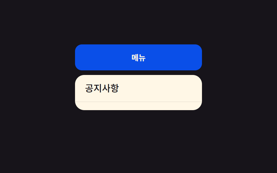 전환CSS 드롭다운 메뉴 애니메이션 9종 — JS 없이, CSS만으로
 전환웹 토스트 알림 CSS 애니메이션 9종 — JS 없이, CSS만으로
 전환CSS 사이드바 드로어 슬라이드 9종 — JS 최소로
 전환CSS 탭 메뉴 전환 애니메이션 9종 — JS 없이, CSS만으로
 전환CSS 화면 전환 효과 9종 — 화면이 바뀌는 순간 모음
 전환메가 메뉴 ui 9종 — 링크 나열이 아니라 사이트 지도
 전환필터 UI 9종 — 패널 슬라이드부터 칩 제거까지