CSS Animation Delay Between Iterations: 9 Scenes
CSS animation delay between iterations is always zero. How many seconds the last of 20 children waits when each gets its own delay, and where a pause between
animation-delay Only Postpones the Start: Positive, Negative and fill-mode
 01 delay-index-stagger
 02 delay-total-length
 03 delay-negative-wave
 04 delay-rest-between
 05 delay-grid-ripple
 06 delay-sine-ring
 07 delay-letter-jitter
 08 delay-timeline-assemble
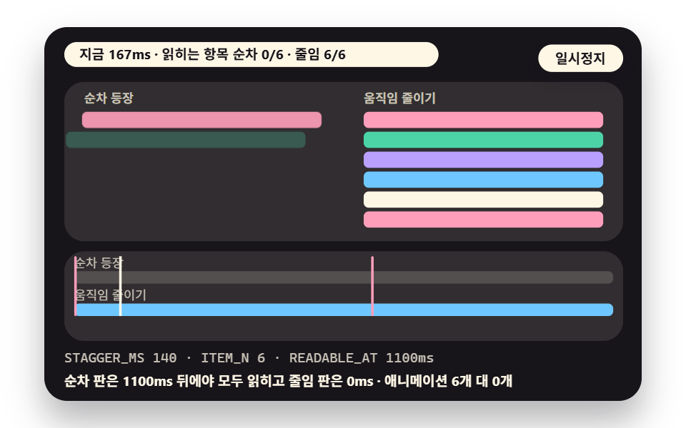 09 delay-reduced-compare
- 01 Index-Variable Stagger: Reading the Gap From One List
- 02 Gap Slider: Total Length Computed Live
- 03 Negative Delay Phase Spread: A Wave From Frame One
- 04 Rest Between Iterations: A Pulse Built From Keyframe Percentages
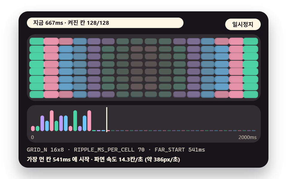
- 05 Grid Ripple: Delay Proportional to Distance From Center
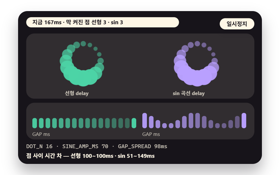
- 06 Sine-Curve Delay: A Ring of Orbiting Dots
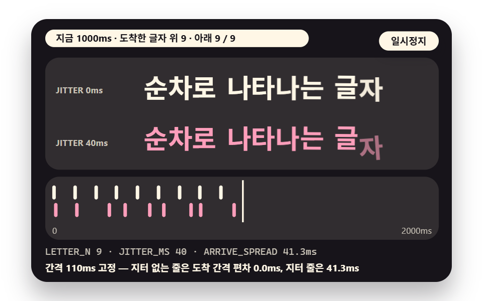
- 07 Letter-by-Letter Entrance: Adding Jitter to the Gap
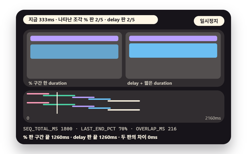
- 08 Sequence Timeline: Assembling Cards With Percentage Ranges
- 09 Reduced-Motion Compare: Sequence vs Instant
animation-delay is the time an element waits between the moment an animation is attached and the moment its first frame starts to move. It leaves the length alone and pushes only the starting line back.
So with a duration of 520ms and a delay of 300ms, the element sits still for 300ms, moves for 520ms, and finishes at 820ms. The formula for estimating a whole list's length grows out of that one sum.
What the Element Looks Like While It Waits Is Up to fill-mode
During the delay, the shape of the element is decided by animation-fill-mode, not by the delay itself. With backwards or both, the first keyframe's values apply during the wait, and with neither, the element shows its ordinary style regardless of the keyframes.
In a staggered entrance the difference is visible at once. Give a card that starts transparent a delay without both, and it sits there fully drawn, vanishes for an instant, then fades in again. Every sequence in this post uses both.
A Negative Delay Skips the Time That Has Already Passed
A negative delay means no waiting at all: the animation starts as if its absolute value had already played. A positive value says "leave a little later", while a negative one says "I left long ago and I am halfway there".
Delay does three jobs in these nine scenes. Different values per child create order, a still tail on the keyframes creates a rest, and negative values scatter phases so a wave is already moving on the first frame. The scenes take turns showing each of the three.
How to Give Each Child a Different Delay
One Index Variable and One calc() Line
The answer is to plant an index variable --i on each child and write the delay as calc(var(--i) * gap). You do not have to type a delay per child into the stylesheet, and changing the single gap value moves every child's delay together.
Planting the index is a one-time job. A script can write the number when it creates the children, or a server can put it in the style attribute while rendering, and the browser does the arithmetic. Scene 01 is exactly this structure.
How the Numbers Were Measured
The numbers in the nine scenes come from three methods, so they must not be read as one kind. The first is the value the browser itself resolved: getAnimations() returned the animations, and getComputedTiming() gave each delay and end time. The start, end and gap figures in 01, 02, 05, 06, 07 and 09 are of this kind.
The second is a value read from an off-screen copy. Keyframe percentages that make a rest or a range never show up in getComputedTiming(), so a copy with the same class had its currentTime stepped from 0 in 2ms increments while transform and opacity were read for the point where they change. Scenes 04 and 08 work this way, so their resolution is 2ms.
The third is the timestamp of live events. event.timeStamp of animationstart and animationiteration was read once in a headless browser, which mixes in about a frame interval (roughly 16.7ms) of jitter. Use these only for order and rough spacing.
Some figures are models from a formula. In 01 (ITEM_N-1)×STAGGER_MS and in 02 (N-1)×gap+400 are the side the screen compares against the engine, and the input delays of 03, 05, 06 and 07 are models too, with the result read back from the engine.
What was not checked is stated here as well. The render environment is one place, Playwright Chromium 145.0.7632.6, so values in other browsers are unverified, and support for the subtree option of getAnimations({subtree:true}) is unverified because caniuse has no entry for it.
The sentences shown in the reduced-motion view are fixed copy, not models, so no figure is quoted from them.
The Nine Scenes in Numbers
In the table, area, intensity and frames come from 도구/demo.py, which captures 24 images of the 480×300 inner box and compares 23 pairs of neighbors. Cumulative area is the share of pixels that differ from the first image at least once across the 24, intensity is the mean color difference of those pixels (0 to 255), and moving frames counts the images that differ from the one before.
| Scene | Cumulative area | Moving frames | Mean intensity | Nature of the key number |
|---|---|---|---|---|
| 01 Index stagger | 26.0% | 23/23 | 84.2 | Engine value and events |
| 02 Gap slider | 10.2% | 23/23 | 113.7 | Engine value vs formula |
| 03 Negative-delay spread | 21.3% | 23/23 | 131.9 | First frame read from a copy |
| 04 Rest between iterations | 12.3% | 23/23 | 71.2 | Copy sweep and events |
| 05 Grid ripple | 30.7% | 23/23 | 81.2 | Engine value |
| 06 Sine-curve delay | 11.3% | 23/23 | 58.8 | Engine value |
| 07 Letter-by-letter entrance | 10.0% | 23/23 | 91.6 | Engine value and fixed hash |
| 08 Sequence timeline | 18.1% | 23/23 | 92.7 | Copy sweep and engine value |
| 09 Reduced-motion compare | 14.4% | 23/23 | 94.1 | Engine value |
Scene 05 has the widest cumulative area and scene 07 the narrowest. All nine scenes read 23/23, so something moved in every frame. These figures describe change inside the box, not the performance of a real page.
01Index-Variable Stagger: Reading the Gap From One List
Demo and Explanation
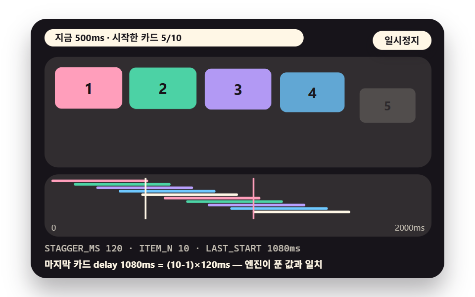
Ten cards rise while each card multiplies its --i index (0 to 9) by the --gap to build its delay, and the arrow keys cycle the gap through 120, 60, 150 and 90ms. In the 120ms version the engine resolved the last card's delay as 1080ms (9×120), and start times measured from events were off from the expected values by 13.7ms at most.
<main class="stage">
<div class="ez is-demo" id="ez">
  <div class="ez__in" data-role="inner">
    <div class="ez__pad" data-role="pad" tabindex="0" role="application" aria-label="Demo stage: Space or Enter pauses, R restarts, left and right arrows pick another value">
      <div class="ez__scene" data-role="scene" role="img" aria-label="Ten cards rise one after another at a gap set by an index variable, and each card start time is drawn as a bar in the chart below"></div>
      <div class="ez__probe" data-role="probe" aria-hidden="true"></div>
      <div class="ez__chart" data-role="chart" aria-hidden="true"></div>
      <p class="ez__status" data-role="status" aria-live="off">Scene ready</p>
      <p class="ez__reada" data-role="reada" aria-hidden="true"></p>
      <p class="ez__readb" data-role="readb" aria-hidden="true"></p>
      <div class="ez__ctrl">
        <button class="ez__pause" data-role="pause" type="button" aria-pressed="false">Pause</button>
… (총 18줄 — 아래 「전체 코드」에서 원문 전체)
@use "../../../../site/static/demo-tokens" as *;
@include stage($stage-paper);
// 지연·간격 장면 공통 — 무대 색은 어두운 먹색 위에 파스텔 막대·칸
$panel: mix($subject-cream, $subject-ink, 11%);
$line: mix($subject-cream, $subject-ink, 26%);
$dim: mix($subject-cream, $subject-ink, 76%);
.ez {
position: relative;
width: min(92vw, calc(160vh - 12.8vw));
aspect-ratio: 480 / 300;
… (총 236줄 — 아래 「전체 코드」에서 원문 전체)html, body {
margin: 0;
overflow: hidden;
}
.stage {
box-sizing: border-box;
min-height: 100vh;
display: grid;
place-items: center;
margin: 0;
background: #ffffff;
… (총 302줄 — 아래 「전체 코드」에서 원문 전체)(function () {
const rootEl = document.getElementById("ez");
if (!rootEl) return;
main(rootEl);
function cx(s) { return s; }
function main(root) {
// 무대 좌표 — 안쪽 상자는 늘 480×300 이고 화면 크기에 맞춰 통째로 축소한다
const W = 480;
const CX0 = 8;
const CW = 432;
function clamp(v, lo, hi) { return v < lo ? lo : (v > hi ? hi : v); }
// 문구 틀의 {a}·{b}·{c} 자리에 값을 끼운다 — 화면 문구는 늘 틀 한 줄이고 로케일 사전이 통째로 바꾼다
… (총 356줄 — 아래 「전체 코드」에서 원문 전체)// IndexStagger - 같은 항목 vanilla index.html 의 React 판. 같은 계산을 useEffect 안에서 돌린다
import { useEffect, useRef } from "react";
import styles from "./IndexStagger.module.scss";
const cx = (s: string): string => s.split(" ").map((n) => styles[n] ?? n).join(" ");
function main(root: HTMLElement): () => void {
// 무대 좌표 — 안쪽 상자는 늘 480×300 이고 화면 크기에 맞춰 통째로 축소한다
const W = 480;
const CX0 = 8;
const CW = 432;
function clamp(v: number, lo: number, hi: number): number { return v < lo ? lo : (v > hi ? hi : v); }
… (총 341줄 — 아래 「전체 코드」에서 원문 전체)01 · Index-Variable Stagger: Reading the Gap From One List — Measured area 26.049% · moving frames 23/23Original by GODRICH · SCSS and React ship in the zip · See the password
Where to Look in the Code
Only the delay line changes with the index, which suits menu and list entrances, but it is a poor fit when the total length would go over budget, which scene 02 measures.
.s1__c {
  display: flex;
  align-items: center;
  justify-content: center;
  border-radius: $r-sm;
  animation: s1rise var(--dur, #{$duration}) $ease-spring both;
  animation-delay: calc(var(--i) * var(--gap, #{$stagger}));
}
02Gap Slider: Total Length Computed Live
Demo and Explanation
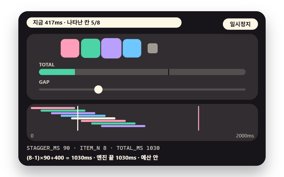
Item count and gap switch across four pairs, (N,gap) = (8,90), (12,60), (14,140) and (6,200), while the filling bar is compared with the formula (N-1)×gap+400. The engine's end times were 1030, 1060, 2220 and 1400ms, matching the formula in all four, and 2220ms is over the 1500ms budget.
<main class="stage">
<div class="ez is-demo" id="ez">
  <div class="ez__in" data-role="inner">
    <div class="ez__pad" data-role="pad" tabindex="0" role="application" aria-label="Demo stage: Space or Enter pauses, R restarts, left and right arrows pick another value">
      <div class="ez__scene" data-role="scene" role="img" aria-label="Dots pop in at a set gap while a total-length bar fills and shows whether it crosses the budget line"></div>
      <div class="ez__probe" data-role="probe" aria-hidden="true"></div>
      <div class="ez__chart" data-role="chart" aria-hidden="true"></div>
      <p class="ez__status" data-role="status" aria-live="off">Scene ready</p>
      <p class="ez__reada" data-role="reada" aria-hidden="true"></p>
      <p class="ez__readb" data-role="readb" aria-hidden="true"></p>
      <div class="ez__ctrl">
        <button class="ez__pause" data-role="pause" type="button" aria-pressed="false">Pause</button>
… (총 18줄 — 아래 「전체 코드」에서 원문 전체)
@use "../../../../site/static/demo-tokens" as *;
@include stage($stage-paper);
// 지연·간격 장면 공통 — 무대 색은 어두운 먹색 위에 파스텔 막대·칸
$panel: mix($subject-cream, $subject-ink, 11%);
$line: mix($subject-cream, $subject-ink, 26%);
$dim: mix($subject-cream, $subject-ink, 76%);
.ez {
position: relative;
width: min(92vw, calc(160vh - 12.8vw));
aspect-ratio: 480 / 300;
… (총 282줄 — 아래 「전체 코드」에서 원문 전체)html, body {
margin: 0;
overflow: hidden;
}
.stage {
box-sizing: border-box;
min-height: 100vh;
display: grid;
place-items: center;
margin: 0;
background: #ffffff;
… (총 353줄 — 아래 「전체 코드」에서 원문 전체)(function () {
const rootEl = document.getElementById("ez");
if (!rootEl) return;
main(rootEl);
function cx(s) { return s; }
function main(root) {
// 무대 좌표 — 안쪽 상자는 늘 480×300 이고 화면 크기에 맞춰 통째로 축소한다
const W = 480;
const CX0 = 8;
const CW = 432;
function clamp(v, lo, hi) { return v < lo ? lo : (v > hi ? hi : v); }
// 문구 틀의 {a}·{b}·{c} 자리에 값을 끼운다 — 화면 문구는 늘 틀 한 줄이고 로케일 사전이 통째로 바꾼다
… (총 371줄 — 아래 「전체 코드」에서 원문 전체)// TotalLength - 같은 항목 vanilla index.html 의 React 판. 같은 계산을 useEffect 안에서 돌린다
import { useEffect, useRef } from "react";
import styles from "./TotalLength.module.scss";
const cx = (s: string): string => s.split(" ").map((n) => styles[n] ?? n).join(" ");
function main(root: HTMLElement): () => void {
// 무대 좌표 — 안쪽 상자는 늘 480×300 이고 화면 크기에 맞춰 통째로 축소한다
const W = 480;
const CX0 = 8;
const CW = 432;
function clamp(v: number, lo: number, hi: number): number { return v < lo ? lo : (v > hi ? hi : v); }
… (총 360줄 — 아래 「전체 코드」에서 원문 전체)02 · Gap Slider: Total Length Computed Live — Measured area 10.201% · moving frames 23/23Original by GODRICH · SCSS and React ship in the zip · See the password
Where to Look in the Code
The delay line is the same as in 01 and the 400ms duration makes the total the last delay plus 400ms, so use it to check a list's length ahead of time, not where the gap is fixed and the item count is unknown.
.s2__d {
  display: block;
  width: var(--sz, 24px);
  height: var(--sz, 24px);
  border-radius: $r-sm;
  animation: s2pop var(--dur, #{$duration}) $ease-elastic both;
  animation-delay: calc(var(--i) * var(--gap, #{$stagger}));
}

@keyframes s2pop {
  from { opacity: 0; transform: scale(0); }
  to { opacity: 1; transform: scale(1); }
}
03Negative Delay Phase Spread: A Wave From Frame One
Demo and Explanation
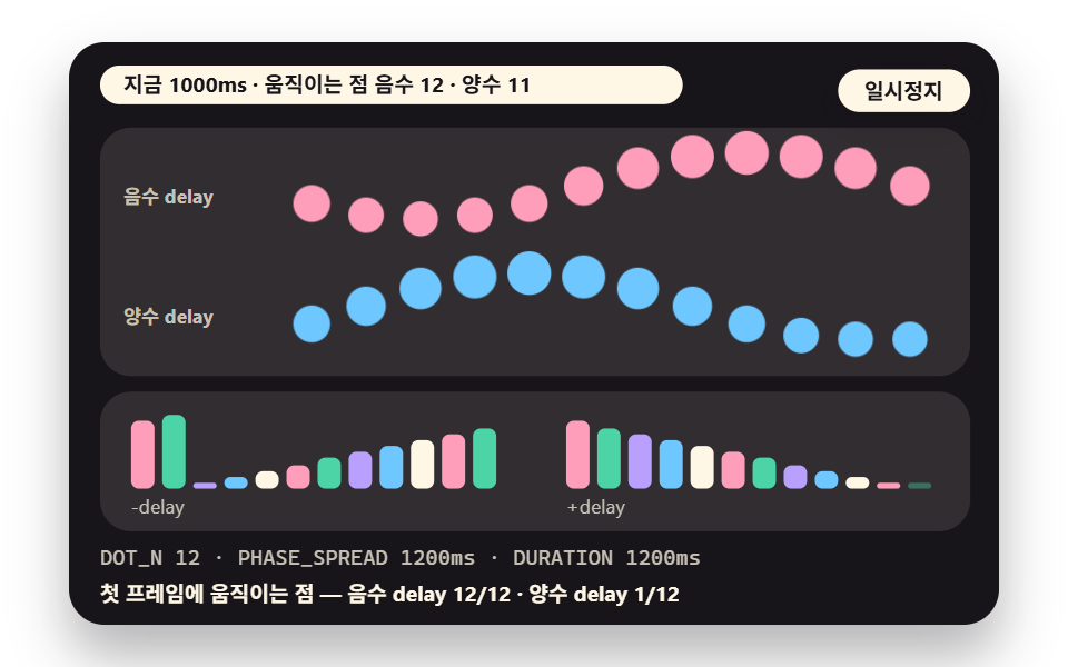
The same 12 dots get a negative delay -(n/12)×spread on the top row and a positive one on the bottom row, and the dots moving on the first frame are counted. The top row has 12 of 12 moving from the start and the bottom row only 1 of 12, and those counts stay the same when the spread changes to 1200, 600 or 240ms.
<main class="stage">
<div class="ez is-demo" id="ez">
  <div class="ez__in" data-role="inner">
    <div class="ez__pad" data-role="pad" tabindex="0" role="application" aria-label="Demo stage: Space or Enter pauses, R restarts, left and right arrows pick another value">
      <div class="ez__scene" data-role="scene" role="img" aria-label="Twelve dots bounce at one period, the top row with negative delays and the bottom row with positive ones, while the chart below shows each dot progress as a bar"></div>
      <div class="ez__probe" data-role="probe" aria-hidden="true"></div>
      <div class="ez__chart" data-role="chart" aria-hidden="true"></div>
      <p class="ez__status" data-role="status" aria-live="off">Scene ready</p>
      <p class="ez__reada" data-role="reada" aria-hidden="true"></p>
      <p class="ez__readb" data-role="readb" aria-hidden="true"></p>
      <div class="ez__ctrl">
        <button class="ez__pause" data-role="pause" type="button" aria-pressed="false">Pause</button>
… (총 18줄 — 아래 「전체 코드」에서 원문 전체)
@use "../../../../site/static/demo-tokens" as *;
@include stage($stage-paper);
// 지연·간격 장면 공통 — 무대 색은 어두운 먹색 위에 파스텔 막대·칸
$panel: mix($subject-cream, $subject-ink, 11%);
$line: mix($subject-cream, $subject-ink, 26%);
$dim: mix($subject-cream, $subject-ink, 76%);
.ez {
position: relative;
width: min(92vw, calc(160vh - 12.8vw));
aspect-ratio: 480 / 300;
… (총 229줄 — 아래 「전체 코드」에서 원문 전체)html, body {
margin: 0;
overflow: hidden;
}
.stage {
box-sizing: border-box;
min-height: 100vh;
display: grid;
place-items: center;
margin: 0;
background: #ffffff;
… (총 297줄 — 아래 「전체 코드」에서 원문 전체)(function () {
const rootEl = document.getElementById("ez");
if (!rootEl) return;
main(rootEl);
function cx(s) { return s; }
function main(root) {
// 무대 좌표 — 안쪽 상자는 늘 480×300 이고 화면 크기에 맞춰 통째로 축소한다
const W = 480;
const CX0 = 8;
const CW = 432;
function clamp(v, lo, hi) { return v < lo ? lo : (v > hi ? hi : v); }
// 문구 틀의 {a}·{b}·{c} 자리에 값을 끼운다 — 화면 문구는 늘 틀 한 줄이고 로케일 사전이 통째로 바꾼다
… (총 388줄 — 아래 「전체 코드」에서 원문 전체)// NegativeWave - 같은 항목 vanilla index.html 의 React 판. 같은 계산을 useEffect 안에서 돌린다
import { useEffect, useRef } from "react";
import styles from "./NegativeWave.module.scss";
const cx = (s: string): string => s.split(" ").map((n) => styles[n] ?? n).join(" ");
function main(root: HTMLElement): () => void {
// 무대 좌표 — 안쪽 상자는 늘 480×300 이고 화면 크기에 맞춰 통째로 축소한다
const W = 480;
const CX0 = 8;
const CW = 432;
function clamp(v: number, lo: number, hi: number): number { return v < lo ? lo : (v > hi ? hi : v); }
… (총 371줄 — 아래 「전체 코드」에서 원문 전체)03 · Negative Delay Phase Spread: A Wave From Frame One — Measured area 21.337% · moving frames 23/23Original by GODRICH · SCSS and React ship in the zip · See the password
Where to Look in the Code
Only the sign of --dl differs while the keyframes are shared, which fits loading dots and background waves that must look scattered from the first frame, but not signals where the dots have to land on one beat.
.s3__d {
  position: absolute;
  bottom: 6px;
  left: var(--x);
  width: 18px;
  height: 18px;
  border-radius: 50%;
  animation: s3bob var(--per, #{$duration}) ease-in-out infinite;
  animation-delay: var(--dl, 0ms);
}

@keyframes s3bob {
  0%, 100% { transform: translateY(0) scale(1); }
  50% { transform: translateY(-34px) scale(1.25); }
}
04Rest Between Iterations: A Pulse Built From Keyframe Percentages
Demo and Explanation
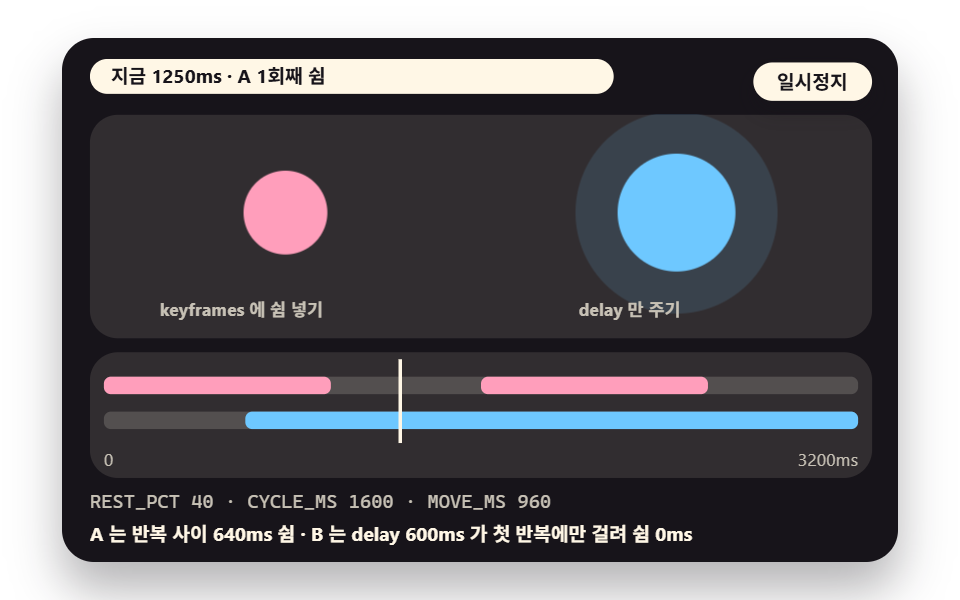
Movement lives only in the first (100-rest)% of a 1600ms cycle and the remainder is held at the same value to make the rest, with versions at 20, 40 and 60% rest placed beside a contrast dot B that only gets a 600ms delay.
The 40% version moved for 960ms and rested for 640ms, while B's delay applied before the first iteration only, so its iteration events stayed 1000ms apart.
<main class="stage">
<div class="ez is-demo" id="ez">
  <div class="ez__in" data-role="inner">
    <div class="ez__pad" data-role="pad" tabindex="0" role="application" aria-label="Demo stage: Space or Enter pauses, R restarts, left and right arrows pick another value">
      <div class="ez__scene" data-role="scene" role="img" aria-label="A pulse with its rest inside the keyframes and a pulse with only a delay both repeat, and the chart below lays out the moving and resting spans"></div>
      <div class="ez__probe" data-role="probe" aria-hidden="true"></div>
      <div class="ez__chart" data-role="chart" aria-hidden="true"></div>
      <p class="ez__status" data-role="status" aria-live="off">Scene ready</p>
      <p class="ez__reada" data-role="reada" aria-hidden="true"></p>
      <p class="ez__readb" data-role="readb" aria-hidden="true"></p>
      <div class="ez__ctrl">
        <button class="ez__pause" data-role="pause" type="button" aria-pressed="false">Pause</button>
… (총 18줄 — 아래 「전체 코드」에서 원문 전체)
@use "../../../../site/static/demo-tokens" as *;
@include stage($stage-paper);
// 지연·간격 장면 공통 — 무대 색은 어두운 먹색 위에 파스텔 막대·칸
$panel: mix($subject-cream, $subject-ink, 11%);
$line: mix($subject-cream, $subject-ink, 26%);
$dim: mix($subject-cream, $subject-ink, 76%);
.ez {
position: relative;
width: min(92vw, calc(160vh - 12.8vw));
aspect-ratio: 480 / 300;
… (총 255줄 — 아래 「전체 코드」에서 원문 전체)html, body {
margin: 0;
overflow: hidden;
}
.stage {
box-sizing: border-box;
min-height: 100vh;
display: grid;
place-items: center;
margin: 0;
background: #ffffff;
… (총 420줄 — 아래 「전체 코드」에서 원문 전체)(function () {
const rootEl = document.getElementById("ez");
if (!rootEl) return;
main(rootEl);
function cx(s) { return s; }
function main(root) {
// 무대 좌표 — 안쪽 상자는 늘 480×300 이고 화면 크기에 맞춰 통째로 축소한다
const W = 480;
const CX0 = 8;
const CW = 432;
function clamp(v, lo, hi) { return v < lo ? lo : (v > hi ? hi : v); }
// 문구 틀의 {a}·{b}·{c} 자리에 값을 끼운다 — 화면 문구는 늘 틀 한 줄이고 로케일 사전이 통째로 바꾼다
… (총 366줄 — 아래 「전체 코드」에서 원문 전체)// RestBetween - 같은 항목 vanilla index.html 의 React 판. 같은 계산을 useEffect 안에서 돌린다
import { useEffect, useRef } from "react";
import styles from "./RestBetween.module.scss";
const cx = (s: string): string => s.split(" ").map((n) => styles[n] ?? n).join(" ");
function main(root: HTMLElement): () => void {
// 무대 좌표 — 안쪽 상자는 늘 480×300 이고 화면 크기에 맞춰 통째로 축소한다
const W = 480;
const CX0 = 8;
const CW = 432;
function clamp(v: number, lo: number, hi: number): number { return v < lo ? lo : (v > hi ? hi : v); }
… (총 355줄 — 아래 「전체 코드」에서 원문 전체)04 · Rest Between Iterations: A Pulse Built From Keyframe Percentages — Measured area 12.27% · moving frames 23/23Original by GODRICH · SCSS and React ship in the zip · See the password
Where to Look in the Code
@each builds a separate keyframe per rest ratio and holds the span after #{$end} still, which suits a breathing notification dot but not a loading indicator that has to keep beating without a rest.
@each $r in (20, 40, 60) {
  $end: (100 - $r) * 1%;
  $mid: $end * .5;

  @keyframes s4pulse#{$r} {
    0% { transform: scale(1); animation-timing-function: ease-in-out; }
    #{$mid} { transform: scale(1.5); animation-timing-function: ease-in-out; }
    #{$end}, 100% { transform: scale(1); }
  }

  @keyframes s4ring#{$r} {
    0% { opacity: .8; transform: scale(1); animation-timing-function: ease-out; }
    #{$end}, 100% { opacity: 0; transform: scale(2.7); }
  }

  .s4__c.r#{$r} { animation: s4pulse#{$r} $duration infinite; }
  .s4__ring.r#{$r} { animation: s4ring#{$r} $duration infinite; }
}
05Grid Ripple: Delay Proportional to Distance From Center
Demo and Explanation
On a 16×8 grid each cell's delay is its distance --d from the center (in cell widths) times --ms, and an overlay on each cell lights up in distance order. At 70ms per cell the farthest cell started at 541ms by the engine's count, and the wavefront ran at 14.3 cells a second.
<main class="stage">
<div class="ez is-demo" id="ez">
  <div class="ez__in" data-role="inner">
    <div class="ez__pad" data-role="pad" tabindex="0" role="application" aria-label="Demo stage: Space or Enter pauses, R restarts, left and right arrows pick another value">
      <div class="ez__scene" data-role="scene" role="img" aria-label="Grid cells light later the farther they are from the center so a ripple spreads, and the bar graph below piles up the distribution of start times"></div>
      <div class="ez__probe" data-role="probe" aria-hidden="true"></div>
      <div class="ez__chart" data-role="chart" aria-hidden="true"></div>
      <p class="ez__status" data-role="status" aria-live="off">Scene ready</p>
      <p class="ez__reada" data-role="reada" aria-hidden="true"></p>
      <p class="ez__readb" data-role="readb" aria-hidden="true"></p>
      <div class="ez__ctrl">
        <button class="ez__pause" data-role="pause" type="button" aria-pressed="false">Pause</button>
… (총 18줄 — 아래 「전체 코드」에서 원문 전체)
@use "../../../../site/static/demo-tokens" as *;
@include stage($stage-paper);
// 지연·간격 장면 공통 — 무대 색은 어두운 먹색 위에 파스텔 막대·칸
$panel: mix($subject-cream, $subject-ink, 11%);
$line: mix($subject-cream, $subject-ink, 26%);
$dim: mix($subject-cream, $subject-ink, 76%);
.ez {
position: relative;
width: min(92vw, calc(160vh - 12.8vw));
aspect-ratio: 480 / 300;
… (총 238줄 — 아래 「전체 코드」에서 원문 전체)html, body {
margin: 0;
overflow: hidden;
}
.stage {
box-sizing: border-box;
min-height: 100vh;
display: grid;
place-items: center;
margin: 0;
background: #ffffff;
… (총 307줄 — 아래 「전체 코드」에서 원문 전체)(function () {
const rootEl = document.getElementById("ez");
if (!rootEl) return;
main(rootEl);
function cx(s) { return s; }
function main(root) {
// 무대 좌표 — 안쪽 상자는 늘 480×300 이고 화면 크기에 맞춰 통째로 축소한다
const W = 480;
const CX0 = 8;
const CW = 432;
function clamp(v, lo, hi) { return v < lo ? lo : (v > hi ? hi : v); }
// 문구 틀의 {a}·{b}·{c} 자리에 값을 끼운다 — 화면 문구는 늘 틀 한 줄이고 로케일 사전이 통째로 바꾼다
… (총 393줄 — 아래 「전체 코드」에서 원문 전체)// GridRipple - 같은 항목 vanilla index.html 의 React 판. 같은 계산을 useEffect 안에서 돌린다
import { useEffect, useRef } from "react";
import styles from "./GridRipple.module.scss";
const cx = (s: string): string => s.split(" ").map((n) => styles[n] ?? n).join(" ");
function main(root: HTMLElement): () => void {
// 무대 좌표 — 안쪽 상자는 늘 480×300 이고 화면 크기에 맞춰 통째로 축소한다
const W = 480;
const CX0 = 8;
const CW = 432;
function clamp(v: number, lo: number, hi: number): number { return v < lo ? lo : (v > hi ? hi : v); }
… (총 376줄 — 아래 「전체 코드」에서 원문 전체)05 · Grid Ripple: Delay Proportional to Distance From Center — Measured area 30.736% · moving frames 23/23Original by GODRICH · SCSS and React ship in the zip · See the password
Where to Look in the Code
The formula matches 01 except that a distance computed by the script replaces the index, and every cell is one animation, so this demo creates 129 of them and a much bigger grid should be measured before use.
.s5__l {
  position: absolute;
  inset: 0;
  display: block;
  border-radius: $r-xs;
  opacity: 0;
  animation: s5lit var(--dur, #{$duration}) ease-out both;
  animation-delay: calc(var(--d) * var(--ms, #{$ms-per-cell}));
}

@keyframes s5lit {
  0% { opacity: 0; transform: scale(.3); }
  22% { opacity: 1; transform: scale(1.3); }
  100% { opacity: 0; transform: scale(1); }
}
06Sine-Curve Delay: A Ring of Orbiting Dots
Demo and Explanation
The delays of 16 dots are bent as -(n×100 + amp×sin(angle)) so the ring undulates, and the neighbor gaps are compared with a linear-delay ring. The linear ring's neighbor gap is a constant 100 to 100ms, while the sin(70) version spreads from 51 to 149ms (GAP_SPREAD 98).
<main class="stage">
<div class="ez is-demo" id="ez">
  <div class="ez__in" data-role="inner">
    <div class="ez__pad" data-role="pad" tabindex="0" role="application" aria-label="Demo stage: Space or Enter pauses, R restarts, left and right arrows pick another value">
      <div class="ez__scene" data-role="scene" role="img" aria-label="Dots pulse in turn on a linear-delay ring and a sine-curve-delay ring while the bars below show the time gap between dots"></div>
      <div class="ez__probe" data-role="probe" aria-hidden="true"></div>
      <div class="ez__chart" data-role="chart" aria-hidden="true"></div>
      <p class="ez__status" data-role="status" aria-live="off">Scene ready</p>
      <p class="ez__reada" data-role="reada" aria-hidden="true"></p>
      <p class="ez__readb" data-role="readb" aria-hidden="true"></p>
      <div class="ez__ctrl">
        <button class="ez__pause" data-role="pause" type="button" aria-pressed="false">Pause</button>
… (총 18줄 — 아래 「전체 코드」에서 원문 전체)
@use "../../../../site/static/demo-tokens" as *;
@include stage($stage-paper);
// 지연·간격 장면 공통 — 무대 색은 어두운 먹색 위에 파스텔 막대·칸
$panel: mix($subject-cream, $subject-ink, 11%);
$line: mix($subject-cream, $subject-ink, 26%);
$dim: mix($subject-cream, $subject-ink, 76%);
.ez {
position: relative;
width: min(92vw, calc(160vh - 12.8vw));
aspect-ratio: 480 / 300;
… (총 235줄 — 아래 「전체 코드」에서 원문 전체)html, body {
margin: 0;
overflow: hidden;
}
.stage {
box-sizing: border-box;
min-height: 100vh;
display: grid;
place-items: center;
margin: 0;
background: #ffffff;
… (총 312줄 — 아래 「전체 코드」에서 원문 전체)(function () {
const rootEl = document.getElementById("ez");
if (!rootEl) return;
main(rootEl);
function cx(s) { return s; }
function main(root) {
// 무대 좌표 — 안쪽 상자는 늘 480×300 이고 화면 크기에 맞춰 통째로 축소한다
const W = 480;
const CX0 = 8;
const CW = 432;
function clamp(v, lo, hi) { return v < lo ? lo : (v > hi ? hi : v); }
// 문구 틀의 {a}·{b}·{c} 자리에 값을 끼운다 — 화면 문구는 늘 틀 한 줄이고 로케일 사전이 통째로 바꾼다
… (총 401줄 — 아래 「전체 코드」에서 원문 전체)// SineRing - 같은 항목 vanilla index.html 의 React 판. 같은 계산을 useEffect 안에서 돌린다
import { useEffect, useRef } from "react";
import styles from "./SineRing.module.scss";
const cx = (s: string): string => s.split(" ").map((n) => styles[n] ?? n).join(" ");
function main(root: HTMLElement): () => void {
// 무대 좌표 — 안쪽 상자는 늘 480×300 이고 화면 크기에 맞춰 통째로 축소한다
const W = 480;
const CX0 = 8;
const CW = 432;
function clamp(v: number, lo: number, hi: number): number { return v < lo ? lo : (v > hi ? hi : v); }
… (총 385줄 — 아래 「전체 코드」에서 원문 전체)06 · Sine-Curve Delay: A Ring of Orbiting Dots — Measured area 11.285% · moving frames 23/23Original by GODRICH · SCSS and React ship in the zip · See the password
Where to Look in the Code
Only --dl differs per dot and there is one keyframe, which suits spinners and logo loading, but the gap wobbles between 51 and 149ms, so it is a poor fit for step indicators that must be read dot by dot.
.s6__p {
  position: absolute;
  left: -8px;
  top: -8px;
  display: block;
  width: 16px;
  height: 16px;
  border-radius: 50%;
  animation: s6pulse var(--per, #{$duration}) ease-in-out infinite;
  animation-delay: var(--dl, 0ms);
}

@keyframes s6pulse {
  0% { transform: scale(.5); opacity: .45; }
  35% { transform: scale(2); opacity: 1; }
  100% { transform: scale(.5); opacity: .45; }
}
07Letter-by-Letter Entrance: Adding Jitter to the Gap
Demo and Explanation
Each of 9 letters gets n×110ms in --dl, and the bottom row adds an error of 0 to 2×jitter to the same gap, fixed by a sin hash so a replay looks identical. The standard deviation of arrival gaps was 41.3ms at jitter 40, 93.6ms at 90 and 0.0ms at 0.
<main class="stage">
<div class="ez is-demo" id="ez">
  <div class="ez__in" data-role="inner">
    <div class="ez__pad" data-role="pad" tabindex="0" role="application" aria-label="Demo stage: Space or Enter pauses, R restarts, left and right arrows pick another value">
      <div class="ez__scene" data-role="scene" role="img" aria-label="The same phrase rises letter by letter with a plain gap and with a jittered gap, and the chart below marks the arrival times"></div>
      <div class="ez__probe" data-role="probe" aria-hidden="true"></div>
      <div class="ez__chart" data-role="chart" aria-hidden="true"></div>
      <p class="ez__status" data-role="status" aria-live="off">Scene ready</p>
      <p class="ez__reada" data-role="reada" aria-hidden="true"></p>
      <p class="ez__readb" data-role="readb" aria-hidden="true"></p>
      <div class="ez__ctrl">
        <button class="ez__pause" data-role="pause" type="button" aria-pressed="false">Pause</button>
… (총 18줄 — 아래 「전체 코드」에서 원문 전체)
@use "../../../../site/static/demo-tokens" as *;
@include stage($stage-paper);
// 지연·간격 장면 공통 — 무대 색은 어두운 먹색 위에 파스텔 막대·칸
$panel: mix($subject-cream, $subject-ink, 11%);
$line: mix($subject-cream, $subject-ink, 26%);
$dim: mix($subject-cream, $subject-ink, 76%);
.ez {
position: relative;
width: min(92vw, calc(160vh - 12.8vw));
aspect-ratio: 480 / 300;
… (총 234줄 — 아래 「전체 코드」에서 원문 전체)html, body {
margin: 0;
overflow: hidden;
}
.stage {
box-sizing: border-box;
min-height: 100vh;
display: grid;
place-items: center;
margin: 0;
background: #ffffff;
… (총 314줄 — 아래 「전체 코드」에서 원문 전체)(function () {
const rootEl = document.getElementById("ez");
if (!rootEl) return;
main(rootEl);
function cx(s) { return s; }
function main(root) {
// 무대 좌표 — 안쪽 상자는 늘 480×300 이고 화면 크기에 맞춰 통째로 축소한다
const W = 480;
const CX0 = 8;
const CW = 432;
function clamp(v, lo, hi) { return v < lo ? lo : (v > hi ? hi : v); }
// 문구 틀의 {a}·{b}·{c} 자리에 값을 끼운다 — 화면 문구는 늘 틀 한 줄이고 로케일 사전이 통째로 바꾼다
… (총 408줄 — 아래 「전체 코드」에서 원문 전체)// LetterJitter - 같은 항목 vanilla index.html 의 React 판. 같은 계산을 useEffect 안에서 돌린다
import { useEffect, useRef } from "react";
import styles from "./LetterJitter.module.scss";
const cx = (s: string): string => s.split(" ").map((n) => styles[n] ?? n).join(" ");
function main(root: HTMLElement): () => void {
// 무대 좌표 — 안쪽 상자는 늘 480×300 이고 화면 크기에 맞춰 통째로 축소한다
const W = 480;
const CX0 = 8;
const CW = 432;
function clamp(v: number, lo: number, hi: number): number { return v < lo ? lo : (v > hi ? hi : v); }
… (총 378줄 — 아래 「전체 코드」에서 원문 전체)07 · Letter-by-Letter Entrance: Adding Jitter to the Gap — Measured area 10.047% · moving frames 23/23Original by GODRICH · SCSS and React ship in the zip · See the password
Where to Look in the Code
The letter rule takes the delay as a single variable, which suits headline entrances, but a jitter of 90 gives an error range of 0 to 180ms, wider than the 110ms gap, so letters can swap order (a formula result, not measured), and sentences read in order should avoid it.
.s7__ch {
  display: block;
  font-size: 30px;
  font-weight: 700;
  line-height: 48px;
  background: none;
  animation: s7in var(--dur, #{$duration}) $ease-pop both;
  animation-delay: var(--dl, 0ms);
}
08Sequence Timeline: Assembling Cards With Percentage Ranges
Demo and Explanation
Five card pieces are built two ways for comparison: the left uses start and end percentage ranges inside one duration, and the right gives each piece its own delay and short duration. In the 1800ms version both methods ended at 1260ms, and the overlapping time summed to 216ms.
<main class="stage">
<div class="ez is-demo" id="ez">
  <div class="ez__in" data-role="inner">
    <div class="ez__pad" data-role="pad" tabindex="0" role="application" aria-label="Demo stage: Space or Enter pauses, R restarts, left and right arrows pick another value">
      <div class="ez__scene" data-role="scene" role="img" aria-label="The same card assembles with percentage ranges in one duration and with delays, and the chart below lays out each piece span"></div>
      <div class="ez__probe" data-role="probe" aria-hidden="true"></div>
      <div class="ez__chart" data-role="chart" aria-hidden="true"></div>
      <p class="ez__status" data-role="status" aria-live="off">Scene ready</p>
      <p class="ez__reada" data-role="reada" aria-hidden="true"></p>
      <p class="ez__readb" data-role="readb" aria-hidden="true"></p>
      <div class="ez__ctrl">
        <button class="ez__pause" data-role="pause" type="button" aria-pressed="false">Pause</button>
… (총 18줄 — 아래 「전체 코드」에서 원문 전체)
@use "../../../../site/static/demo-tokens" as *;
@include stage($stage-paper);
// 지연·간격 장면 공통 — 무대 색은 어두운 먹색 위에 파스텔 막대·칸
$panel: mix($subject-cream, $subject-ink, 11%);
$line: mix($subject-cream, $subject-ink, 26%);
$dim: mix($subject-cream, $subject-ink, 76%);
.ez {
position: relative;
width: min(92vw, calc(160vh - 12.8vw));
aspect-ratio: 480 / 300;
… (총 254줄 — 아래 「전체 코드」에서 원문 전체)html, body {
margin: 0;
overflow: hidden;
}
.stage {
box-sizing: border-box;
min-height: 100vh;
display: grid;
place-items: center;
margin: 0;
background: #ffffff;
… (총 410줄 — 아래 「전체 코드」에서 원문 전체)(function () {
const rootEl = document.getElementById("ez");
if (!rootEl) return;
main(rootEl);
function cx(s) { return s; }
function main(root) {
// 무대 좌표 — 안쪽 상자는 늘 480×300 이고 화면 크기에 맞춰 통째로 축소한다
const W = 480;
const CX0 = 8;
const CW = 432;
function clamp(v, lo, hi) { return v < lo ? lo : (v > hi ? hi : v); }
// 문구 틀의 {a}·{b}·{c} 자리에 값을 끼운다 — 화면 문구는 늘 틀 한 줄이고 로케일 사전이 통째로 바꾼다
… (총 389줄 — 아래 「전체 코드」에서 원문 전체)// TimelineAssemble - 같은 항목 vanilla index.html 의 React 판. 같은 계산을 useEffect 안에서 돌린다
import { useEffect, useRef } from "react";
import styles from "./TimelineAssemble.module.scss";
const cx = (s: string): string => s.split(" ").map((n) => styles[n] ?? n).join(" ");
function main(root: HTMLElement): () => void {
// 무대 좌표 — 안쪽 상자는 늘 480×300 이고 화면 크기에 맞춰 통째로 축소한다
const W = 480;
const CX0 = 8;
const CW = 432;
function clamp(v: number, lo: number, hi: number): number { return v < lo ? lo : (v > hi ? hi : v); }
… (총 374줄 — 아래 「전체 코드」에서 원문 전체)08 · Sequence Timeline: Assembling Cards With Percentage Ranges — Measured area 18.13% · moving frames 23/23Original by GODRICH · SCSS and React ship in the zip · See the password
Where to Look in the Code
@each makes one keyframe per range and the right side uses the single .s8d rule, which suits intro assembly, but not choreography where each piece's timing needs separate adjustment, because changing the one duration stretches everything in proportion.
@each $r in $ranges {
  $idx: index($ranges, $r) - 1;
  $s: nth($r, 1) * 1%;
  $e: nth($r, 2) * 1%;

  @keyframes s8k#{$idx} {
    @if $s == 0% {
      0% { opacity: 0; transform: translateY(12px); animation-timing-function: $ease-spring; }
    } @else {
      0%, #{$s} { opacity: 0; transform: translateY(12px); }
      #{$s} { animation-timing-function: $ease-spring; }
    }
    #{$e}, 100% { opacity: 1; transform: none; }
  }

  .s8p.s8__p#{$idx} { animation: s8k#{$idx} var(--seq, #{$duration}) both; }
}

.s8d { animation: s8dd var(--pd, 300ms) $ease-spring both; animation-delay: var(--ps, 0ms); }

@keyframes s8dd {
  from { opacity: 0; transform: translateY(12px); }
  to { opacity: 1; transform: none; }
}
09Reduced-Motion Compare: Sequence vs Instant
Demo and Explanation
One list is shown as a sequence and as a reduced version with no delay, side by side, and the time at which everything is readable is compared. The sequence took 1100, 1660 and 2220ms for 6, 10 and 14 items, the reduced version took 0ms, and in a reduced-motion environment this demo's document.getAnimations().length was 0.
<main class="stage">
<div class="ez is-demo" id="ez">
  <div class="ez__in" data-role="inner">
    <div class="ez__pad" data-role="pad" tabindex="0" role="application" aria-label="Demo stage: Space or Enter pauses, R restarts, left and right arrows pick another value">
      <div class="ez__scene" data-role="scene" role="img" aria-label="The same list appears side by side as a sequence and as an instant display, and the bars below show the share of readable items"></div>
      <div class="ez__probe" data-role="probe" aria-hidden="true"></div>
      <div class="ez__chart" data-role="chart" aria-hidden="true"></div>
      <p class="ez__status" data-role="status" aria-live="off">Scene ready</p>
      <p class="ez__reada" data-role="reada" aria-hidden="true"></p>
      <p class="ez__readb" data-role="readb" aria-hidden="true"></p>
      <div class="ez__ctrl">
        <button class="ez__pause" data-role="pause" type="button" aria-pressed="false">Pause</button>
… (총 18줄 — 아래 「전체 코드」에서 원문 전체)
@use "../../../../site/static/demo-tokens" as *;
@include stage($stage-paper);
// 지연·간격 장면 공통 — 무대 색은 어두운 먹색 위에 파스텔 막대·칸
$panel: mix($subject-cream, $subject-ink, 11%);
$line: mix($subject-cream, $subject-ink, 26%);
$dim: mix($subject-cream, $subject-ink, 76%);
.ez {
position: relative;
width: min(92vw, calc(160vh - 12.8vw));
aspect-ratio: 480 / 300;
… (총 228줄 — 아래 「전체 코드」에서 원문 전체)html, body {
margin: 0;
overflow: hidden;
}
.stage {
box-sizing: border-box;
min-height: 100vh;
display: grid;
place-items: center;
margin: 0;
background: #ffffff;
… (총 303줄 — 아래 「전체 코드」에서 원문 전체)(function () {
const rootEl = document.getElementById("ez");
if (!rootEl) return;
main(rootEl);
function cx(s) { return s; }
function main(root) {
// 무대 좌표 — 안쪽 상자는 늘 480×300 이고 화면 크기에 맞춰 통째로 축소한다
const W = 480;
const CX0 = 8;
const CW = 432;
function clamp(v, lo, hi) { return v < lo ? lo : (v > hi ? hi : v); }
// 문구 틀의 {a}·{b}·{c} 자리에 값을 끼운다 — 화면 문구는 늘 틀 한 줄이고 로케일 사전이 통째로 바꾼다
… (총 377줄 — 아래 「전체 코드」에서 원문 전체)// ReducedCompare - 같은 항목 vanilla index.html 의 React 판. 같은 계산을 useEffect 안에서 돌린다
import { useEffect, useRef } from "react";
import styles from "./ReducedCompare.module.scss";
const cx = (s: string): string => s.split(" ").map((n) => styles[n] ?? n).join(" ");
function main(root: HTMLElement): () => void {
// 무대 좌표 — 안쪽 상자는 늘 480×300 이고 화면 크기에 맞춰 통째로 축소한다
const W = 480;
const CX0 = 8;
const CW = 432;
function clamp(v: number, lo: number, hi: number): number { return v < lo ? lo : (v > hi ? hi : v); }
… (총 360줄 — 아래 「전체 코드」에서 원문 전체)09 · Reduced-Motion Compare: Sequence vs Instant — Measured area 14.381% · moving frames 23/23Original by GODRICH · SCSS and React ship in the zip · See the password
Where to Look in the Code
Only the sequence side receives the .s9__go rule and the reduced side has no animation at all, so use it to check accessibility handling, and do not substitute a shortened delay for a true reduced version.
.s9__go {
  animation: s9in var(--dur, #{$duration}) $ease-spring both;
  animation-delay: calc(var(--i) * var(--gap, #{$stagger}));
}

@keyframes s9in {
  from { opacity: 0; transform: translateX(-20px); }
  to { opacity: 1; transform: none; }
}
How to Build a Pause Between Iterations
There Is No animation-iteration-delay
The first fact that hits anyone looking for css animation pause between iterations is that no property sets the rest between repeats. animation-delay applies once, before the first iteration starts, and never again.
Contrast dot B in 04 showed it. A 600ms delay made the first start event late by that amount, and after that the iteration events came 1000ms apart without any rest. Anyone who expected a rest every loop touched the wrong property.
Put the Rest in a Still Tail of the Keyframes
Instead, build the rest into one cycle. Keep the movement in the first (100-rest)% of the keyframes and use the same value from there to 100%, and that span never changes shape as time passes, so the eye reads it as a rest.
The advantage is that the cycle does not change. Moving only the rest ratio leaves animation-duration alone, so a beat matched to other elements does not break. The table below holds the values scene 04 read by sweeping its copy.
| Rest ratio | Moving time | Resting time | Cycle |
|---|---|---|---|
| 20% | 1280ms | 320ms | 1600ms |
| 40% | 960ms | 640ms | 1600ms |
| 60% | 640ms | 960ms | 1600ms |
Work Out the Moving Time From the Cycle
The moving time is the cycle times (100-rest)%. At 40% rest that is 60% of 1600ms, or 960ms, and the copy's reading was also 960ms. To land on a rest of a given length, run the multiplication backwards.
For a rest of 480ms in a 1600ms cycle, that is 30%. This line is a worked example of the same multiplication, not a measured value, so change REST_PCT in 04 and read it on screen before relying on it.
When the Rest Has to Differ From Loop to Loop
When the gap must change per repeat, for example a short first rest followed by longer ones, one keyframe cannot do it. The scenes here dealt only with the same rest every loop, and how to vary the gap by repeat count was not checked.
You could imagine catching the animationiteration event and setting the delay again from a script. This post's demos contain no such approach, so its effect and cost stay unverified.
How a Negative Delay Starts an Animation Already in Progress
The First Frame Is Already Mid-Motion
An element with a negative delay has no waiting span. A 1000ms linear move over 100px with a delay of -250ms and currentTime at 0 gave a progress of 0.25 and a translateX of 25px. It stands a quarter of the way along without ever having started.
That value is what the engine resolved in Chromium 145. Switch the same rule to a positive delay and the first frame's progress is 0, which makes the difference sharp.
Scatter the Phases to Make a Wave
Scene 03 uses this property. Give 12 dots the same keyframes and duration and split only the delay as -(n/12)×spread, and each dot is at a different point on the first frame, so the wave already looks like it is passing through.
The negative row has 12 of 12 moving on the first frame, while a positive row at the same spacing has only 1 of 12 moving. On the positive row the dots hold still waiting for their turn, so building the wave takes a long time.
Narrowing the Spread Gathers the Dots but Not the Moving Count
Cut the spread in 03 from 1200ms to 240ms and the phase gap between dots narrows from 100ms to 20ms, while the most negative delay goes from -1100ms to -220ms. The dots draw close and read as one clump.
Even so, the number of dots moving on the first frame stayed at 12 of 12 and 1 of 12. What a negative delay decides is not how many dots move but how far apart they are scattered.
When a Negative Delay Is Not Safe
When the absolute value of a negative delay exceeds the duration, the element starts already finished. This comes from the definition in the specification, and since this post's demos only used values smaller than the duration, the boundary was not measured directly.
The dots in 03 repeat forever, so the problem cannot arise there. Take care only when giving a big negative delay to an animation that plays once.
How Many Milliseconds Between Items Feels Natural
It Differs by Person, So Solve It Backwards From a Budget
The right number for a natural gap was not measured in this post, because felt speed depends on screen size and item shape. A safer method is to decide first how soon the whole list must finish and compute the gap backwards.
The total is (N-1)×gap+duration, so the gap is (budget-duration)÷(N-1). With a budget of 1500ms, a duration of 520ms and 10 items that is about 109ms, and with a budget of 1500ms, a duration of 400ms and 14 items about 85ms. Both are calculated examples, not measurements.
The Gaps These Scenes Used
Scene 01 cycled the gap through 60, 90, 120 and 150ms, so the last card started at 540, 810, 1080 and 1350ms. Scene 07 used 110ms between letters, 09 used 140ms between list items, and 05 used 50 to 70ms per cell.
The 14-item, 140ms pair in 02 reached a total of 2220ms and went over the 1500ms budget. With more items the same gap makes the total grow in direct proportion, so a list that keeps growing should fix the budget, not the gap.
Widening It Pushes the Last Item by the Same Ratio
Widen the gap 2.5 times from 60ms to 150ms and the last card's start moves from 540ms to 1350ms, by the same 2.5 times. The time the last card finishes goes from 1060ms to 1870ms, so the total gets longer even with the duration unchanged.
The longer the gap, the longer the early cards sit finished and waiting, so a longer list wants a shorter gap. Where it starts to feel slow was not checked here.
What Changes When One Timeline Drives Many Elements
The Delay Version and the Range Version Reach the Same Result Differently
Scene 08 builds the same card assembly two ways. The left gives every piece a keyframe with its own start and end percentage and the same long duration, and the right gives every piece a delay and a short duration directly.
Both ended at 1260ms in the 1800ms version. The percentages in the range version are ratios of the duration, so the same shape comes out of a simple formula.
The Range Version Scales With One Value
The range version's strength is that changing one duration changes every piece in the same proportion. Moving to 1200, 1800 and 2400ms brought the end times to 840, 1260 and 1680ms and the overlap sums to 144, 216 and 288ms.
The delay version needs both delay and duration fixed on each piece to hold the same shape. Five pieces mean ten values, so there are more places to edit. In exchange, adjusting a single piece alone is easier with the delay version.
Which to Choose
When the whole thing should stretch and shrink as one beat, the range version is simpler. When each piece needs its own gap, or some should be attached later, the delay version fits.
animation-timeline, which ties CSS to scroll, and sibling-index(), which has CSS supply the sibling number itself, come up on this topic too. This post's demos use neither and their support was not checked, so both stay unverified.
Where Sequences Break: Added Items and Runaway Total Length
The Shorthand Resets the Delay to 0
The most common trap is declaration order, and it is the usual answer when a css animation delay shorthand seems to do nothing. Write the delay first and the animation shorthand after, as in .a{animation-delay:300ms} .a{animation:x 1s}, and the shorthand rewrites the delay to 0, which the engine resolved as 0.
.a { animation-delay: 300ms; }
.a { animation: x 1s; }           /* engine delay 0 */
.b { animation: x 1s; animation-delay: 300ms; }  /* engine delay 300 */
Put the shorthand first and the delay after, and the engine value came out as 300ms. Every delay rule in this post keeps that order.
More Items Make the Total Longer
If the list grows and the gap stays, the last item appears a long time later. The 14-item, 140ms pair in 02, which reached 2220ms against a 1500ms budget, is the example.
At first glance, a last item that stays missing for over two seconds can read as an empty screen. If css animation delay not working is the complaint, check the order above first, and if the delay works but feels slow, compute the gap from the item count with calc().
The Delay Applies Before the First Iteration Only
Giving a repeating animation a delay and expecting a rest every loop is another common misunderstanding. Contrast dot B in 04 showed it, with iteration events fixed 1000ms apart. A rest between iterations has to be built with the method in the previous section.
The Two Versions Cost Different Amounts to Edit
The two methods in 08 look the same but cost differently to change. To fit everything by changing one place the range version is better, and to vary timing per piece the delay version is better.
Every trap comes from not knowing how far one changed value carries. The table below lists three variants that each change a single value.
What Changing One Value Does
Each of the three variants changes one constant, with the before and after on one line.
| Name | Changed value | Feel |
|---|---|---|
| A wider stagger gap | 01 arrow keys, STAGGER_MS 60 → 150 | The last card starts at 1350ms instead of 540ms, pushed back by the same 2.5x ratio as the gap, and it finishes at 1870ms instead of 1060ms |
| A longer rest between iterations | 04 REST_PCT 20 → 60 | Within the same 1600ms cycle the moving time drops from 1280ms to 640ms and the rest grows from 320ms to 960ms, while the cycle stays the same |
| A narrower phase spread | 03 PHASE_SPREAD 1200 → 240 | The phase gap between dots narrows from 100ms to 20ms so the dots move closer together, but the dots moving on the first frame stay at 12/12 on the negative lane and 1/12 on the positive lane |
The point is that the gap changes start times, the rest ratio changes the share of movement, and the spread changes the distance between dots, and none of them touches the others.
Download the nine scenes as HTML, CSS and JS, plus the React version, from the card below, and unzip it with the password k8w927gv.
Browser Compatibility and Accessibility: Drop the Delay With Reduced Motion
Which Browser First Supports It
These are the first unprefixed versions read directly from caniuse-lite 1.0.30001826.
CSS Animations, including animation-delay, start at Chrome 43, Firefox 16, Safari 9, Edge 12 and iOS Safari 9.0. The Web Animations API that holds getAnimations, which the measurements used, came later.
| Feature | Chrome | Firefox | Safari | Edge |
|---|---|---|---|---|
CSS Animations (animation-delay) |
43 | 16 | 9 | 12 |
Web Animations API (getAnimations) |
84 | 75 | 14 | 84 |
prefers-reduced-motion |
74 | 63 | 11 | 79 |
sibling-index() |
unverified · checked 2026-11-14 | unverified · checked 2026-11-14 | unverified · checked 2026-11-14 | unverified · checked 2026-11-14 |
animation-timeline |
unverified · checked 2026-11-14 | unverified · checked 2026-11-14 | unverified · checked 2026-11-14 | unverified · checked 2026-11-14 |
Footnote: iOS Safari supports CSS Animations from 9.0, the Web Animations API from 13.4 and prefers-reduced-motion from 10.3. The last two rows have no caniuse-lite entry, so their support was not confirmed, and usage percentages could not be read either.
Sources: MDN animation-delay · MDN animation-fill-mode · MDN Animation.startTime
Which Row to Read Before Using It
If you use only delay, the highest version in the table is Safari 9, so there is practically nothing in the way. The snag is reading time with getAnimations as this post does, where Firefox 75 and Safari 14 are the floor.
Check support yourself before using sibling-index() or animation-timeline. This post used neither and did not confirm them, so it says neither that you can use them nor that you cannot.
With Reduced Motion, Remove the Animation Instead of Shortening the Delay
The answer is not to shorten the delay but to switch the animation off and show the final state at once. In 09 the sequence took 1100, 1660 and 2220ms to become readable for 6, 10 and 14 items, and the reduced version took 0ms.
The key point is that in the reduced-motion environment this demo's document.getAnimations().length was 0. No animation was created, so there is nowhere for a delay to sit. Scenes 01 and 05 gave the same result.
This works only when the base style is the end state. If the start state (transparent) sits in the base style and both drags the keyframes to the end state, turning the animation off leaves the cards transparent.
To carry it into your own code, the lines below are all you need. Keep the base style as the end state and switch only the animation off in reduced motion.
.item { opacity: 1; transform: none; }
@media (prefers-reduced-motion: reduce) {
  .item { animation: none; }
}
Automatic Playback and the Keyboard
All nine scenes play automatically on a timetable and can be watched to the end without input. The pause control is a <button> using aria-pressed, Space and Enter pause, R restarts, and the arrow keys step through other values.
The result sentence is written into an aria-live="polite" region only on pause and value change, so it is not read out every frame during playback. The scene box has role="img" and an aria-label. Always check as well that a sequential entrance does not hide the list's content.
Related posts: the prefers-reduced-motion guide, choosing easing functions and animation rendering cost are written up separately.
animation-delay FAQ: Does It Apply Per Iteration, and Is Negative Safe
Does css animation delay between iterations apply on every repeat?
No. The delay applies once, before the first iteration starts. Contrast dot B in 04 was given a 600ms delay and its iteration events stayed 1000ms apart. A rest between iterations comes from holding the tail of the keyframes still.
Is a negative delay safe to use?
For an animation that plays once, it is safe while the absolute value stays under the duration. The 1000ms move given -250ms had a first-frame progress of 0.25. That an absolute value above the duration starts already finished was not measured in this post.
Do sequential animations need a script?
Only the index has to be planted. In these scenes a script created the elements and wrote --i, but calc() in CSS did the delay arithmetic. Writing the index rules by hand with :nth-child is possible, and css animation delay nth child is the usual search for it, but this post did not check that method.
You might also like
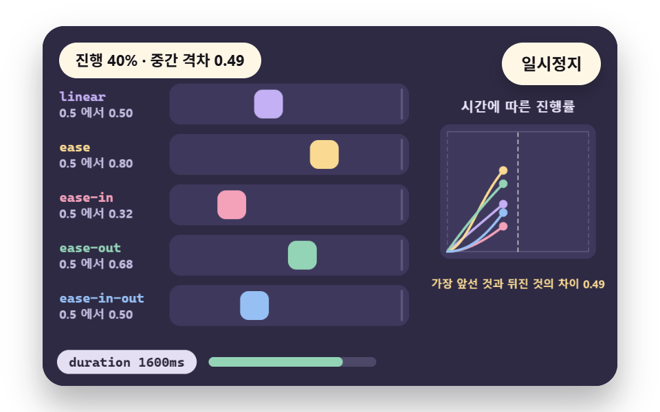 UX principlesCSS Easing Functions: Choosing a Curve in 9 Scenes
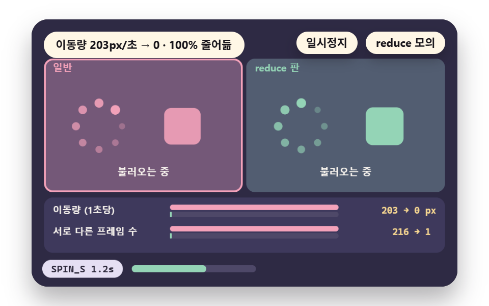 UX principlesprefers-reduced-motion: Adapting Motion, 9 Scenes
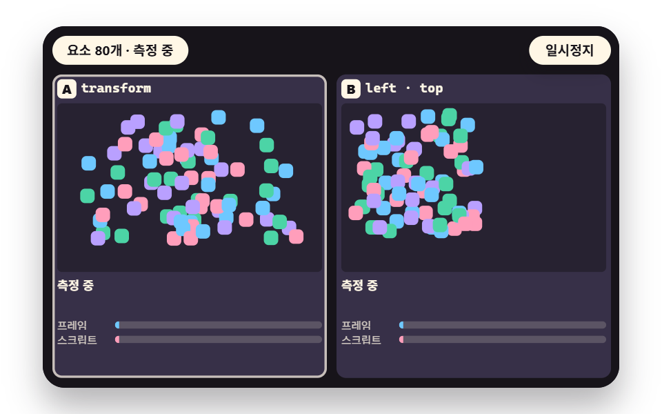 UX principlesCSS Animation Performance: Frame Cost in 9 Scenes
 UX principlesrequestAnimationFrame Delta Time in 9 Scenes
 UX principlesHover on Mobile: Mouse vs Touch, 9 Scenes
 Scroll9 CSS Animation on Scroll Effects, No JavaScript
 Scroll9 CSS Stagger Animation Demos You Can Copy-Paste
 Feedback9 CSS 3D Cube Effects — One Line, Copy-Paste
 GalleriesPortfolio Gallery HTML CSS: 9 UI Patterns
 Landing sectionsBlockquote CSS: 9 Quote Box Designs (Copy-Paste)