Hover on Mobile: Mouse vs Touch, 9 Scenes
Hover on mobile belongs to mouse screens only. The same button reacts on mouse over but only on a press with touch.
Hover Effect on Mobile Misfires on Touch
 01 hv-media
 02 hv-active
 03 hv-sticky
 04 hv-pointer
 05 hv-target
 06 hv-longpress
 07 hv-swipe
 08 hv-touchaction
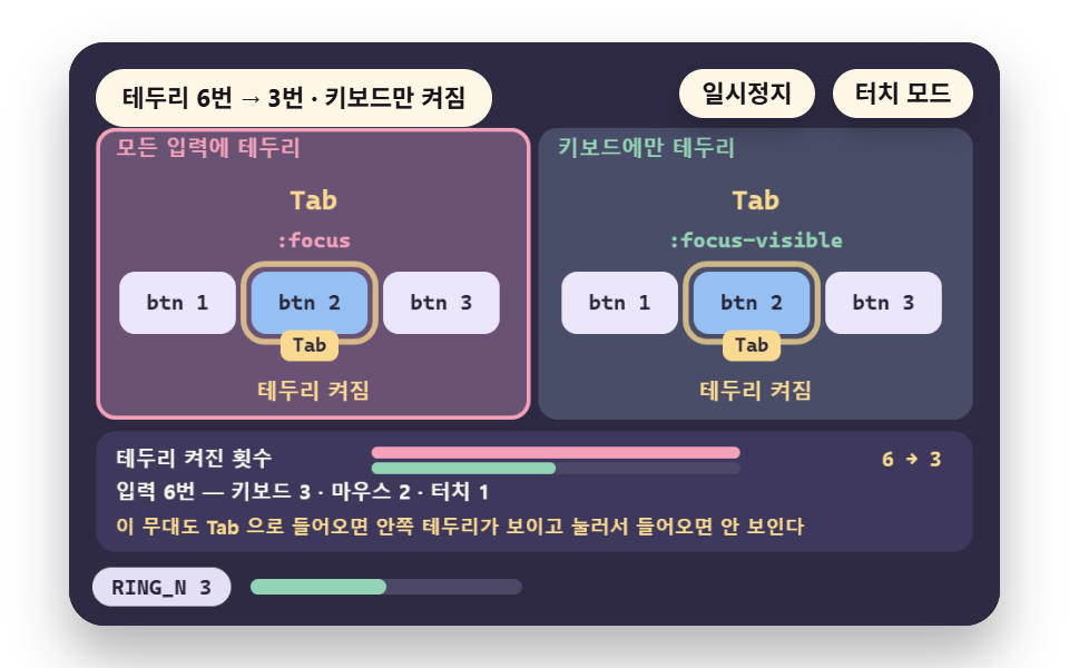 09 hv-focus
- 01 Hover Branch: Over Effects for Mouse Only
- 02 Press Feedback: Showing the Press with :active
- 03 Stuck Hover: The Effect That Stays After a Tap
- 04 Detecting Input Kind: Splitting by pointerType
- 05 Touch Target Size: Press Error at 24px and 44px
- 06 Long Press: Threshold Time and Move Tolerance
- 07 Swipe: Judging by Distance and Speed Thresholds
- 08 Splitting Gestures: Separating From Scroll With touch-action
- 09 Focus Ring: :focus-visible Per Input Kind
Hover means a pointer resting on an element, which only a mouse can do. On a touch screen a :hover rule switches on at the press and can stay on after the finger lifts.
Scenes 01 to 04 read the device, 05 to 08 are finger physics, and 09 is the focus ring for keyboard plus touch.
For the press reaction first, open the click and touch feedback scenes.
Touch Handling in 9 Scenes: Method
The table comes from 24 frames of the 480×300 stage, comparing each of the 23 differences between neighboring frames.
Cumulative area is the share of the stage that differs from the first frame, and intensity is the mean color difference of those pixels on a 0 to 255 scale.
A channel difference above 12 counts as changed. The Chrome build was not recorded, so its version is unconfirmed.
Scenes 05 to 08 are model simulations. The demo's own decision logic ran in node on fixed-seed samples (300, 200, 60 and 120).
They use assumed values such as a contact spread of 9px for touch and 2px for mouse and drag angle limits of 15 and 45 degrees.
No real device measured them, so read them as how far a result moves when one condition changes.
| Scene | Cumulative area | Moving frames | Mean intensity |
|---|---|---|---|
| 01 Hover branch | 29.2% | 9/23 | 50.2 |
| 02 Press feedback | 30.8% | 10/23 | 48.0 |
| 03 Stuck hover | 27.9% | 11/23 | 39.1 |
| 04 Input type | 16.4% | 8/23 | 37.7 |
| 05 Target size | 18.7% | 21/23 | 21.3 |
| 06 Long press | 34.0% | 22/23 | 77.7 |
| 07 Swipe | 17.2% | 20/23 | 74.5 |
| 08 Gesture split | 20.8% | 21/23 | 31.7 |
| 09 Focus ring | 22.2% | 22/23 | 52.1 |
01Hover Branch: Lift on Mouse Only
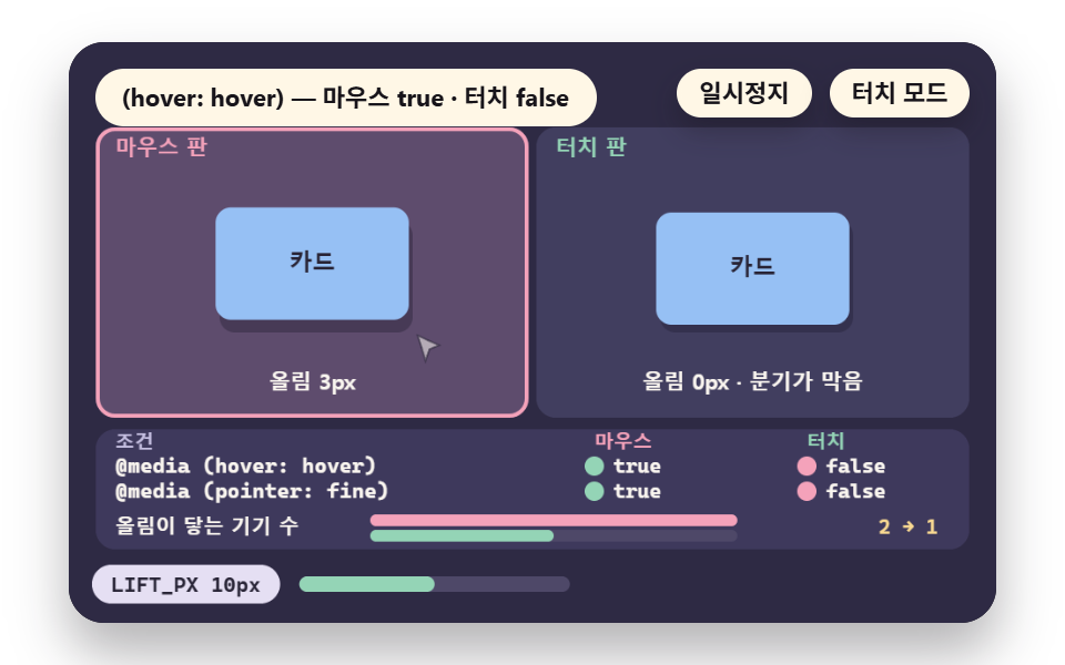
The mouse card rises LIFT_PX 10px over a 4.2-second lap, while the touch card stays still because the rule sits inside the condition.
Of four cells (two devices times HOVER_Q and POINTER_Q), MATCH counts 2 true, so the devices the lift reaches go from 2 to 1.
Use it to disable hover on mobile in two lines of CSS, and add scene 02 when the button has no press reaction.
<main class="stage">
<div class="ez is-demo" id="ez">
  <div class="ez__pad" data-role="pad" tabindex="0" role="application" aria-label="Demo stage: Space or Enter pauses, R restarts, T toggles touch mode">
    <canvas class="ez__canvas" data-role="canvas" width="480" height="300" role="img" aria-label="A mouse version and a touch version of one card with a hover query branch, reading which device each condition sends where"></canvas>
  </div>
  <p class="ez__status" data-role="status" aria-live="off">Scene ready</p>
  <div class="ez__ctrl">
    <button class="ez__pause" data-role="pause" type="button" aria-pressed="false">Pause</button>
    <button class="ez__pause" data-role="sim" type="button" aria-pressed="false">Touch mode</button>
  </div>
  <p class="ez__done" data-role="done" role="status" aria-live="polite"></p>
</div>
… (총 13줄 — 아래 「전체 코드」에서 원문 전체)
@use "../../../../site/static/demo-tokens" as *;
@include stage($stage-paper);
.ez {
position: relative;
width: min(92vw, calc(160vh - 12.8vw));
aspect-ratio: 480 / 300;
margin: 0 auto;
border-radius: $r-card;
overflow: hidden;
box-shadow: $shadow-raised;
background: $subject-ink;
… (총 122줄 — 아래 「전체 코드」에서 원문 전체)html, body {
margin: 0;
overflow: hidden;
}
.stage {
box-sizing: border-box;
min-height: 100vh;
display: grid;
place-items: center;
margin: 0;
background: #ffffff;
… (총 134줄 — 아래 「전체 코드」에서 원문 전체)(function () {
const rootEl = document.getElementById("ez");
if (!rootEl) return;
main(rootEl);
function main(root) {
// 무대 좌표 — 캔버스 안 계산은 늘 480×300. 화면에 보이는 크기와 상관없다
const W = 480;
const H = 300;
const TAU = Math.PI * 2;
function clamp(v, lo, hi) { return v < lo ? lo : (v > hi ? hi : v); }
function lerp(a, b, k) { return a + (b - a) * k; }
// 파스텔 팔레트 — 바탕은 짙은 자두색, 상자는 연한 색, 글자는 연한 색 또는 짙은 잉크
… (총 640줄 — 아래 「전체 코드」에서 원문 전체)// HoverBranch - 같은 항목 vanilla index.html 의 React 판. 같은 계산을 useEffect 안에서 돌린다
import { useEffect, useRef } from "react";
import styles from "./HoverBranch.module.scss";
const cx = (s: string): string => s.split(" ").map((n) => styles[n] ?? n).join(" ");
function main(root: HTMLElement): () => void {
type RGB = [number, number, number];
type Fn = (p: number) => number;
// 무대 좌표 — 캔버스 안 계산은 늘 480×300. 화면에 보이는 크기와 상관없다
const W = 480;
const H = 300;
… (총 608줄 — 아래 「전체 코드」에서 원문 전체)01 · Hover Branch: Over Effects for Mouse Only — Measured area 29.216% · moving frames 9/23Original by GODRICH · SCSS and React ship in the zip · See the password
    const HOVER_Q = '(hover: hover)';
    const POINTER_Q = '(pointer: fine)';
    const LIFT_PX = 10;
    const LAP_S = 4.2;
    const REST_S = 1.0;
    const DEV_MOUSE = { hover: true, fine: true };
    const DEV_TOUCH = { hover: false, fine: false };
    // does one device match condition q (0 is the hover query, 1 is the pointer query)
    function matchQ(d, q) { return q === 0 ? d.hover : d.fine; }
    // number of true cells among two devices x two conditions
    const MATCH = [DEV_MOUSE, DEV_TOUCH].reduce(function (s, d) { return s + (matchQ(d, 0) ? 1 : 0) + (matchQ(d, 1) ? 1 : 0); }, 0);
02Press Feedback: Read the Delay
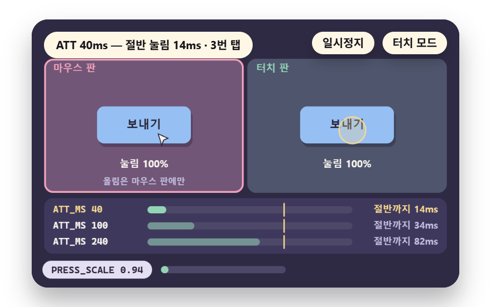
The button shrinks to PRESS_SCALE 0.94 and returns over REL_MS 160ms after release.
For delay candidates ATT_OPTS 40, 100 and 240ms, the time to halfway, halfMs, is 13.7, 34.3 and 82.2ms, all under the FEEL_MS 100ms mark.
Use it to signal a press on a screen with no lift.
<main class="stage">
<div class="ez is-demo" id="ez">
  <div class="ez__pad" data-role="pad" tabindex="0" role="application" aria-label="Demo stage: Space or Enter pauses, R restarts, T toggles touch mode, Left and right arrows change the press attack time">
    <canvas class="ez__canvas" data-role="canvas" width="480" height="300" role="img" aria-label="A scene comparing, on a gauge, the time a press takes to reach half as scale and release time change"></canvas>
  </div>
  <p class="ez__status" data-role="status" aria-live="off">Scene ready</p>
  <div class="ez__ctrl">
    <button class="ez__pause" data-role="pause" type="button" aria-pressed="false">Pause</button>
    <button class="ez__pause" data-role="sim" type="button" aria-pressed="false">Touch mode</button>
  </div>
  <p class="ez__done" data-role="done" role="status" aria-live="polite"></p>
</div>
… (총 13줄 — 아래 「전체 코드」에서 원문 전체)
@use "../../../../site/static/demo-tokens" as *;
@include stage($stage-paper);
.ez {
position: relative;
width: min(92vw, calc(160vh - 12.8vw));
aspect-ratio: 480 / 300;
margin: 0 auto;
border-radius: $r-card;
overflow: hidden;
box-shadow: $shadow-raised;
background: $subject-ink;
… (총 122줄 — 아래 「전체 코드」에서 원문 전체)html, body {
margin: 0;
overflow: hidden;
}
.stage {
box-sizing: border-box;
min-height: 100vh;
display: grid;
place-items: center;
margin: 0;
background: #ffffff;
… (총 134줄 — 아래 「전체 코드」에서 원문 전체)(function () {
const rootEl = document.getElementById("ez");
if (!rootEl) return;
main(rootEl);
function main(root) {
// 무대 좌표 — 캔버스 안 계산은 늘 480×300. 화면에 보이는 크기와 상관없다
const W = 480;
const H = 300;
const TAU = Math.PI * 2;
function clamp(v, lo, hi) { return v < lo ? lo : (v > hi ? hi : v); }
function lerp(a, b, k) { return a + (b - a) * k; }
// 파스텔 팔레트 — 바탕은 짙은 자두색, 상자는 연한 색, 글자는 연한 색 또는 짙은 잉크
… (총 666줄 — 아래 「전체 코드」에서 원문 전체)// PressFeedback - 같은 항목 vanilla index.html 의 React 판. 같은 계산을 useEffect 안에서 돌린다
import { useEffect, useRef } from "react";
import styles from "./PressFeedback.module.scss";
const cx = (s: string): string => s.split(" ").map((n) => styles[n] ?? n).join(" ");
function main(root: HTMLElement): () => void {
type RGB = [number, number, number];
type Fn = (p: number) => number;
// 무대 좌표 — 캔버스 안 계산은 늘 480×300. 화면에 보이는 크기와 상관없다
const W = 480;
const H = 300;
… (총 622줄 — 아래 「전체 코드」에서 원문 전체)02 · Press Feedback: Showing the Press with :active — Measured area 30.751% · moving frames 10/23Original by GODRICH · SCSS and React ship in the zip · See the password
    const PRESS_SCALE = 0.94;
    const REL_MS = 160;
    const ATT_OPTS = [40, 100, 240];
    let attIdx = 0;
    const TAP_AT = [0.5, 1.7, 2.9];
    const TAP_N = TAP_AT.length;
    const HOLD_S = 0.3;
    const FEEL_MS = 100;
    const LAP_S = 4.0;
    const REST_S = 0.7;
03Stuck Hover: Lift After a Tap
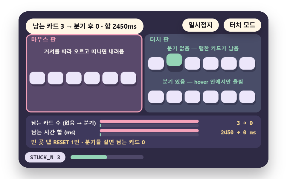
On touch a press switches the lift on and the release does not switch it off, so tapping 6 cards in the order TAP_SEQ [1,4,2] leaves each pressed card up.
Stuck cards STUCK_N are 3 without the branch and 0 with it, and the stuck time STUCK_MS is 2450ms.
Use the branch for card lists that stay lit after a tap, and skip it when STUCK_N is already 0 without it.
<main class="stage">
<div class="ez is-demo" id="ez">
  <div class="ez__pad" data-role="pad" tabindex="0" role="application" aria-label="Demo stage: Space or Enter pauses, R restarts, T toggles touch mode">
    <canvas class="ez__canvas" data-role="canvas" width="480" height="300" role="img" aria-label="A scene counting cards that stay lifted after a tap, with and without a branch"></canvas>
  </div>
  <p class="ez__status" data-role="status" aria-live="off">Scene ready</p>
  <div class="ez__ctrl">
    <button class="ez__pause" data-role="pause" type="button" aria-pressed="false">Pause</button>
    <button class="ez__pause" data-role="sim" type="button" aria-pressed="false">Touch mode</button>
  </div>
  <p class="ez__done" data-role="done" role="status" aria-live="polite"></p>
</div>
… (총 13줄 — 아래 「전체 코드」에서 원문 전체)
@use "../../../../site/static/demo-tokens" as *;
@include stage($stage-paper);
.ez {
position: relative;
width: min(92vw, calc(160vh - 12.8vw));
aspect-ratio: 480 / 300;
margin: 0 auto;
border-radius: $r-card;
overflow: hidden;
box-shadow: $shadow-raised;
background: $subject-ink;
… (총 122줄 — 아래 「전체 코드」에서 원문 전체)html, body {
margin: 0;
overflow: hidden;
}
.stage {
box-sizing: border-box;
min-height: 100vh;
display: grid;
place-items: center;
margin: 0;
background: #ffffff;
… (총 134줄 — 아래 「전체 코드」에서 원문 전체)(function () {
const rootEl = document.getElementById("ez");
if (!rootEl) return;
main(rootEl);
function main(root) {
// 무대 좌표 — 캔버스 안 계산은 늘 480×300. 화면에 보이는 크기와 상관없다
const W = 480;
const H = 300;
const TAU = Math.PI * 2;
function clamp(v, lo, hi) { return v < lo ? lo : (v > hi ? hi : v); }
function lerp(a, b, k) { return a + (b - a) * k; }
// 파스텔 팔레트 — 바탕은 짙은 자두색, 상자는 연한 색, 글자는 연한 색 또는 짙은 잉크
… (총 666줄 — 아래 「전체 코드」에서 원문 전체)// StuckHover - 같은 항목 vanilla index.html 의 React 판. 같은 계산을 useEffect 안에서 돌린다
import { useEffect, useRef } from "react";
import styles from "./StuckHover.module.scss";
const cx = (s: string): string => s.split(" ").map((n) => styles[n] ?? n).join(" ");
function main(root: HTMLElement): () => void {
type RGB = [number, number, number];
type Fn = (p: number) => number;
// 무대 좌표 — 캔버스 안 계산은 늘 480×300. 화면에 보이는 크기와 상관없다
const W = 480;
const H = 300;
… (총 615줄 — 아래 「전체 코드」에서 원문 전체)03 · Stuck Hover: The Effect That Stays After a Tap — Measured area 27.897% · moving frames 11/23Original by GODRICH · SCSS and React ship in the zip · See the password
    // stuck card count and its time total (ms) - time still raised after the finger lifted
    const STUCK_N = TAP_SEQ.length;
    let stuckSum = 0;
    for (let i = 0; i < TAP_SEQ.length; i += 1) {
        const end = i + 1 < TAP_SEQ.length ? TAP_AT[i + 1] : RESET_AT;
        stuckSum += (end - (TAP_AT[i] + TAP_HOLD)) * 1000;
    }
    const STUCK_MS = Math.round(stuckSum);
04Input Type: Branch by pointerType
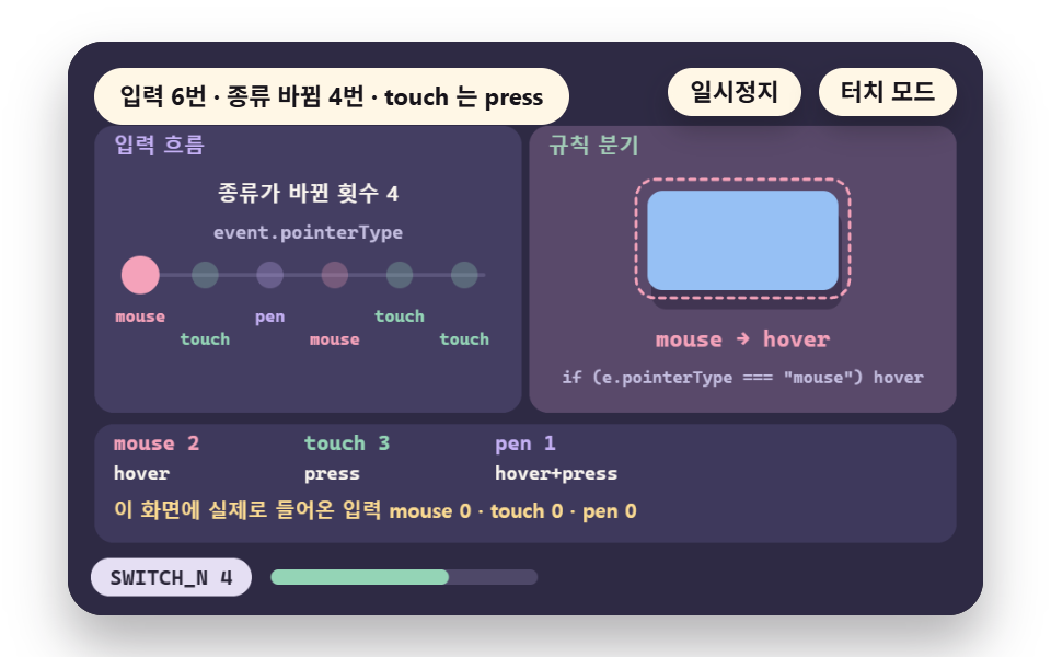
Six inputs of mouse, touch and pen arrive in the order SEQ, and routeOf sends each by one pointerType string: mouse to hover, touch to press, pen to both.
The type changes SWITCH_N 4 times, with mouse 2, touch 3 and pen 1, and the demo also counts real pointerdown events by type.
Use it when one screen takes mouse and touch together.
<main class="stage">
<div class="ez is-demo" id="ez">
  <div class="ez__pad" data-role="pad" tabindex="0" role="application" aria-label="Demo stage: Space or Enter pauses, R restarts, T toggles touch mode">
    <canvas class="ez__canvas" data-role="canvas" width="480" height="300" role="img" aria-label="A scene routing alternating mouse, touch and pen input by pointerType and counting the type changes"></canvas>
  </div>
  <p class="ez__status" data-role="status" aria-live="off">Scene ready</p>
  <div class="ez__ctrl">
    <button class="ez__pause" data-role="pause" type="button" aria-pressed="false">Pause</button>
    <button class="ez__pause" data-role="sim" type="button" aria-pressed="false">Touch mode</button>
  </div>
  <p class="ez__done" data-role="done" role="status" aria-live="polite"></p>
</div>
… (총 13줄 — 아래 「전체 코드」에서 원문 전체)
@use "../../../../site/static/demo-tokens" as *;
@include stage($stage-paper);
.ez {
position: relative;
width: min(92vw, calc(160vh - 12.8vw));
aspect-ratio: 480 / 300;
margin: 0 auto;
border-radius: $r-card;
overflow: hidden;
box-shadow: $shadow-raised;
background: $subject-ink;
… (총 122줄 — 아래 「전체 코드」에서 원문 전체)html, body {
margin: 0;
overflow: hidden;
}
.stage {
box-sizing: border-box;
min-height: 100vh;
display: grid;
place-items: center;
margin: 0;
background: #ffffff;
… (총 134줄 — 아래 「전체 코드」에서 원문 전체)(function () {
const rootEl = document.getElementById("ez");
if (!rootEl) return;
main(rootEl);
function main(root) {
// 무대 좌표 — 캔버스 안 계산은 늘 480×300. 화면에 보이는 크기와 상관없다
const W = 480;
const H = 300;
const TAU = Math.PI * 2;
function clamp(v, lo, hi) { return v < lo ? lo : (v > hi ? hi : v); }
function lerp(a, b, k) { return a + (b - a) * k; }
// 파스텔 팔레트 — 바탕은 짙은 자두색, 상자는 연한 색, 글자는 연한 색 또는 짙은 잉크
… (총 663줄 — 아래 「전체 코드」에서 원문 전체)// PointerKind - 같은 항목 vanilla index.html 의 React 판. 같은 계산을 useEffect 안에서 돌린다
import { useEffect, useRef } from "react";
import styles from "./PointerKind.module.scss";
const cx = (s: string): string => s.split(" ").map((n) => styles[n] ?? n).join(" ");
function main(root: HTMLElement): () => void {
type RGB = [number, number, number];
type Fn = (p: number) => number;
// 무대 좌표 — 캔버스 안 계산은 늘 480×300. 화면에 보이는 크기와 상관없다
const W = 480;
const H = 300;
… (총 613줄 — 아래 「전체 코드」에서 원문 전체)04 · Detecting Input Kind: Splitting by pointerType — Measured area 16.366% · moving frames 8/23Original by GODRICH · SCSS and React ship in the zip · See the password
    // number of type changes - places where two neighboring inputs differ in type
    let sw = 0;
    for (let i = 1; i < SEQ.length; i += 1) {
        if (SEQ[i] !== SEQ[i - 1]) {
            sw += 1;
        }
    }
    const SWITCH_N = sw;
    // rule branch - decided by one pointerType string
    function routeOf(pt) {
        if (pt === 'mouse') {
            return 'hover';
        }
        if (pt === 'touch') {
            return 'press';
        }
        return 'hover+press';
    }
    const ROUTE = routeOf(PTYPE[1]);
05Touch Target: 24px vs 44px Misses
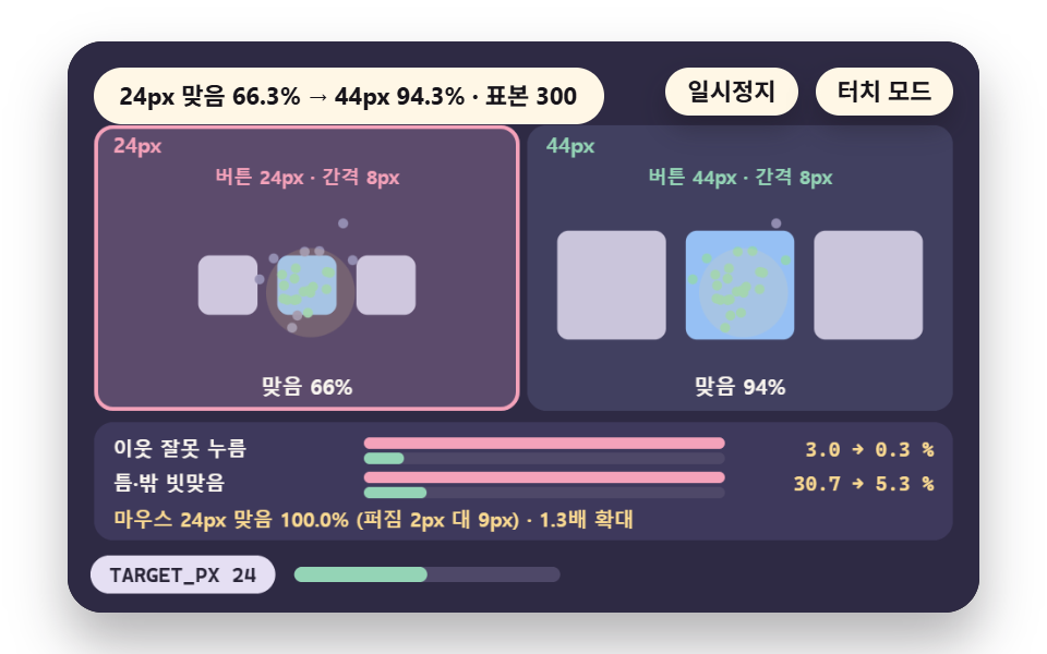
Contact centers scatter over buttons GAP_PX 8px apart, using 300 samples, a 36px contact circle (FINGER_PX) and an assumed spread of SIGMA_TOUCH 9px for touch and SIGMA_MOUSE 2px for mouse.
In the model (drawn 1.3 times larger, math in px) a 24px button gets 66.3% right, 3.0% on a neighbor and 30.7% in the gap or outside, and 44px gets 94.3%, 0.3% and 5.3%, with mouse at 100.0%.
Use 44px for rows of small icon buttons, and skip it when 24px buttons at an 8px gap are fine with you despite 30.7% of presses missing.
<main class="stage">
<div class="ez is-demo" id="ez">
  <div class="ez__pad" data-role="pad" tabindex="0" role="application" aria-label="Demo stage: Space or Enter pauses, R restarts, T toggles touch mode, Left and right arrows pick the button size to highlight">
    <canvas class="ez__canvas" data-role="canvas" width="480" height="300" role="img" aria-label="A scene scattering finger contact samples over 24px and 44px button rows to compare neighbor mispress rates"></canvas>
  </div>
  <p class="ez__status" data-role="status" aria-live="off">Scene ready</p>
  <div class="ez__ctrl">
    <button class="ez__pause" data-role="pause" type="button" aria-pressed="false">Pause</button>
    <button class="ez__pause" data-role="sim" type="button" aria-pressed="false">Touch mode</button>
  </div>
  <p class="ez__done" data-role="done" role="status" aria-live="polite"></p>
</div>
… (총 13줄 — 아래 「전체 코드」에서 원문 전체)
@use "../../../../site/static/demo-tokens" as *;
@include stage($stage-paper);
.ez {
position: relative;
width: min(92vw, calc(160vh - 12.8vw));
aspect-ratio: 480 / 300;
margin: 0 auto;
border-radius: $r-card;
overflow: hidden;
box-shadow: $shadow-raised;
background: $subject-ink;
… (총 122줄 — 아래 「전체 코드」에서 원문 전체)html, body {
margin: 0;
overflow: hidden;
}
.stage {
box-sizing: border-box;
min-height: 100vh;
display: grid;
place-items: center;
margin: 0;
background: #ffffff;
… (총 134줄 — 아래 「전체 코드」에서 원문 전체)(function () {
const rootEl = document.getElementById("ez");
if (!rootEl) return;
main(rootEl);
function main(root) {
// 무대 좌표 — 캔버스 안 계산은 늘 480×300. 화면에 보이는 크기와 상관없다
const W = 480;
const H = 300;
const TAU = Math.PI * 2;
function clamp(v, lo, hi) { return v < lo ? lo : (v > hi ? hi : v); }
function lerp(a, b, k) { return a + (b - a) * k; }
// 파스텔 팔레트 — 바탕은 짙은 자두색, 상자는 연한 색, 글자는 연한 색 또는 짙은 잉크
… (총 677줄 — 아래 「전체 코드」에서 원문 전체)// TargetSize - 같은 항목 vanilla index.html 의 React 판. 같은 계산을 useEffect 안에서 돌린다
import { useEffect, useRef } from "react";
import styles from "./TargetSize.module.scss";
const cx = (s: string): string => s.split(" ").map((n) => styles[n] ?? n).join(" ");
function main(root: HTMLElement): () => void {
type RGB = [number, number, number];
type Fn = (p: number) => number;
// 무대 좌표 — 캔버스 안 계산은 늘 480×300. 화면에 보이는 크기와 상관없다
const W = 480;
const H = 300;
… (총 627줄 — 아래 「전체 코드」에서 원문 전체)05 · Touch Target Size: Press Error at 24px and 44px — Measured area 18.692% · moving frames 21/23Original by GODRICH · SCSS and React ship in the zip · See the password
    const SIZES = [24, 44];
    let selIdx = 0;
    const TARGET_PX = SIZES[0];
    const GAP_PX = 8;
    // assumed finger contact diameter - where the contact center lands decides the press
    const FINGER_PX = 36;
    const SIGMA_TOUCH = 9;
    const SIGMA_MOUSE = 2;
    const SAMPLES = 300;
    const SHOWN = 120;
    // the screen draws 1px as 1.3 cells - the math stays in px
    const K = 1.3;
06Long Press: Hold Time and Slop
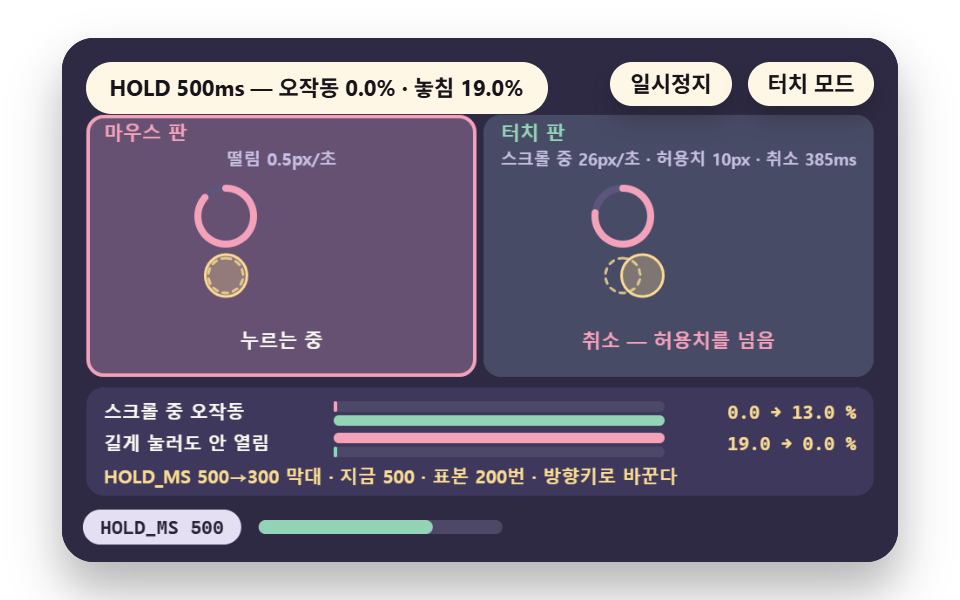
The menu opens when the press reaches HOLD_MS with under MOVE_PX 10px of movement, and a touch finger drifting at DRIFT_V 26px per second cancels at 385ms (CANCEL).
With 200 samples split between long-pressing and scrolling hands, the model gives 0.0% false opens and 19.0% not opening at a hold of 500, and 13.0% and 0.0% at 300.
Use it for a secondary menu on a screen with no right click, and skip it when the hold is cut to 300 above a long scrolling list.
<main class="stage">
<div class="ez is-demo" id="ez">
  <div class="ez__pad" data-role="pad" tabindex="0" role="application" aria-label="Demo stage: Space or Enter pauses, R restarts, T toggles touch mode, Left and right arrows switch the threshold between 500 and 300">
    <canvas class="ez__canvas" data-role="canvas" width="480" height="300" role="img" aria-label="A scene judging when a long press opens a menu by hold time and move limit, with misfire samples while scrolling"></canvas>
  </div>
  <p class="ez__status" data-role="status" aria-live="off">Scene ready</p>
  <div class="ez__ctrl">
    <button class="ez__pause" data-role="pause" type="button" aria-pressed="false">Pause</button>
    <button class="ez__pause" data-role="sim" type="button" aria-pressed="false">Touch mode</button>
  </div>
  <p class="ez__done" data-role="done" role="status" aria-live="polite"></p>
</div>
… (총 13줄 — 아래 「전체 코드」에서 원문 전체)
@use "../../../../site/static/demo-tokens" as *;
@include stage($stage-paper);
.ez {
position: relative;
width: min(92vw, calc(160vh - 12.8vw));
aspect-ratio: 480 / 300;
margin: 0 auto;
border-radius: $r-card;
overflow: hidden;
box-shadow: $shadow-raised;
background: $subject-ink;
… (총 122줄 — 아래 「전체 코드」에서 원문 전체)html, body {
margin: 0;
overflow: hidden;
}
.stage {
box-sizing: border-box;
min-height: 100vh;
display: grid;
place-items: center;
margin: 0;
background: #ffffff;
… (총 134줄 — 아래 「전체 코드」에서 원문 전체)(function () {
const rootEl = document.getElementById("ez");
if (!rootEl) return;
main(rootEl);
function main(root) {
// 무대 좌표 — 캔버스 안 계산은 늘 480×300. 화면에 보이는 크기와 상관없다
const W = 480;
const H = 300;
const TAU = Math.PI * 2;
function clamp(v, lo, hi) { return v < lo ? lo : (v > hi ? hi : v); }
function lerp(a, b, k) { return a + (b - a) * k; }
// 파스텔 팔레트 — 바탕은 짙은 자두색, 상자는 연한 색, 글자는 연한 색 또는 짙은 잉크
… (총 703줄 — 아래 「전체 코드」에서 원문 전체)// LongPress - 같은 항목 vanilla index.html 의 React 판. 같은 계산을 useEffect 안에서 돌린다
import { useEffect, useRef } from "react";
import styles from "./LongPress.module.scss";
const cx = (s: string): string => s.split(" ").map((n) => styles[n] ?? n).join(" ");
function main(root: HTMLElement): () => void {
type RGB = [number, number, number];
type Fn = (p: number) => number;
// 무대 좌표 — 캔버스 안 계산은 늘 480×300. 화면에 보이는 크기와 상관없다
const W = 480;
const H = 300;
… (총 649줄 — 아래 「전체 코드」에서 원문 전체)06 · Long Press: Threshold Time and Move Tolerance — Measured area 33.968% · moving frames 22/23Original by GODRICH · SCSS and React ship in the zip · See the password
    // samples - half are long-pressing hands (press time 350 to 1000ms, drift 0 to 8px/s), half are scrolling hands (100 to 700ms, 20 to 120px/s)
    const r6 = rng(6);
    const DUR = [];
    const VEL = [];
    const INTENT = [];
    for (let i = 0; i < N; i += 1) {
        const lp = i % 2 === 0;
        INTENT.push(lp);
        DUR.push(lp ? 350 + r6() * 650 : 100 + r6() * 600);
        VEL.push(lp ? r6() * 8 : 20 + r6() * 100);
    }
    // decision - moving past the slop within the hold time cancels (CANCEL), and releasing before the hold time does not open
    function opens(i, hold) { return DUR[i] >= hold && (VEL[i] * hold) / 1000 <= MOVE_PX; }
07Swipe: Distance and Velocity
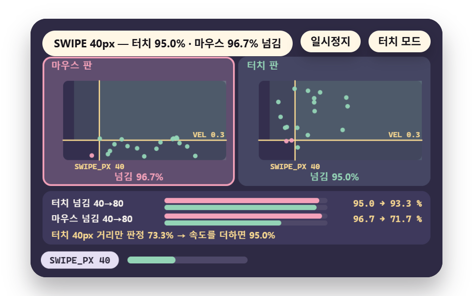
A move commits as a swipe at SWIPE_PX 40px, or at MIN_PX 12px or more with VEL 0.3px/ms, using 60 samples of slow mouse drags and quick touch flicks.
In the model touch commits 95.0% and mouse 96.7%, while distance alone gives touch 73.3%, so speed rescues the short flick.
Use it for card swiping, and skip it when distance is the only condition, since a short flick falls under 40px.
<main class="stage">
<div class="ez is-demo" id="ez">
  <div class="ez__pad" data-role="pad" tabindex="0" role="application" aria-label="Demo stage: Space or Enter pauses, R restarts, T toggles touch mode, Left and right arrows switch the distance threshold between 40 and 80">
    <canvas class="ez__canvas" data-role="canvas" width="480" height="300" role="img" aria-label="A scene splitting mouse and touch drag samples by distance and velocity thresholds to compare commit rates"></canvas>
  </div>
  <p class="ez__status" data-role="status" aria-live="off">Scene ready</p>
  <div class="ez__ctrl">
    <button class="ez__pause" data-role="pause" type="button" aria-pressed="false">Pause</button>
    <button class="ez__pause" data-role="sim" type="button" aria-pressed="false">Touch mode</button>
  </div>
  <p class="ez__done" data-role="done" role="status" aria-live="polite"></p>
</div>
… (총 13줄 — 아래 「전체 코드」에서 원문 전체)
@use "../../../../site/static/demo-tokens" as *;
@include stage($stage-paper);
.ez {
position: relative;
width: min(92vw, calc(160vh - 12.8vw));
aspect-ratio: 480 / 300;
margin: 0 auto;
border-radius: $r-card;
overflow: hidden;
box-shadow: $shadow-raised;
background: $subject-ink;
… (총 122줄 — 아래 「전체 코드」에서 원문 전체)html, body {
margin: 0;
overflow: hidden;
}
.stage {
box-sizing: border-box;
min-height: 100vh;
display: grid;
place-items: center;
margin: 0;
background: #ffffff;
… (총 134줄 — 아래 「전체 코드」에서 원문 전체)(function () {
const rootEl = document.getElementById("ez");
if (!rootEl) return;
main(rootEl);
function main(root) {
// 무대 좌표 — 캔버스 안 계산은 늘 480×300. 화면에 보이는 크기와 상관없다
const W = 480;
const H = 300;
const TAU = Math.PI * 2;
function clamp(v, lo, hi) { return v < lo ? lo : (v > hi ? hi : v); }
function lerp(a, b, k) { return a + (b - a) * k; }
// 파스텔 팔레트 — 바탕은 짙은 자두색, 상자는 연한 색, 글자는 연한 색 또는 짙은 잉크
… (총 669줄 — 아래 「전체 코드」에서 원문 전체)// SwipeCommit - 같은 항목 vanilla index.html 의 React 판. 같은 계산을 useEffect 안에서 돌린다
import { useEffect, useRef } from "react";
import styles from "./SwipeCommit.module.scss";
const cx = (s: string): string => s.split(" ").map((n) => styles[n] ?? n).join(" ");
function main(root: HTMLElement): () => void {
type RGB = [number, number, number];
type Fn = (p: number) => number;
// 무대 좌표 — 캔버스 안 계산은 늘 480×300. 화면에 보이는 크기와 상관없다
const W = 480;
const H = 300;
… (총 626줄 — 아래 「전체 코드」에서 원문 전체)07 · Swipe: Judging by Distance and Speed Thresholds — Measured area 17.194% · moving frames 20/23Original by GODRICH · SCSS and React ship in the zip · See the password
    // speed limit (px/ms) - a short move at or above this speed commits, but only after moving MIN_PX or more
    const VEL = 0.3;
    const MIN_PX = 12;
    const N = 60;
    const LAP_S = 4.4;
    const REST_S = 3.6;
    const rs = rng(7);
    // samples - mouse is a long slow drag (30 to 170px, 0.05 to 0.35px/ms), touch is a short quick flick (14 to 100px, 0.15 to 1.1px/ms)
    const MD = [];
    const MV = [];
    const TD = [];
    const TV = [];
    for (let i = 0; i < N; i += 1) {
        MD.push(30 + rs() * 140);
        MV.push(0.05 + rs() * 0.3);
        TD.push(14 + rs() * 86);
        TV.push(0.15 + rs() * 0.95);
    }
    function commit(d, v, swipe, useVel) { return d >= swipe || (useVel && v >= VEL && d >= MIN_PX); }
08Gesture Split: touch-action
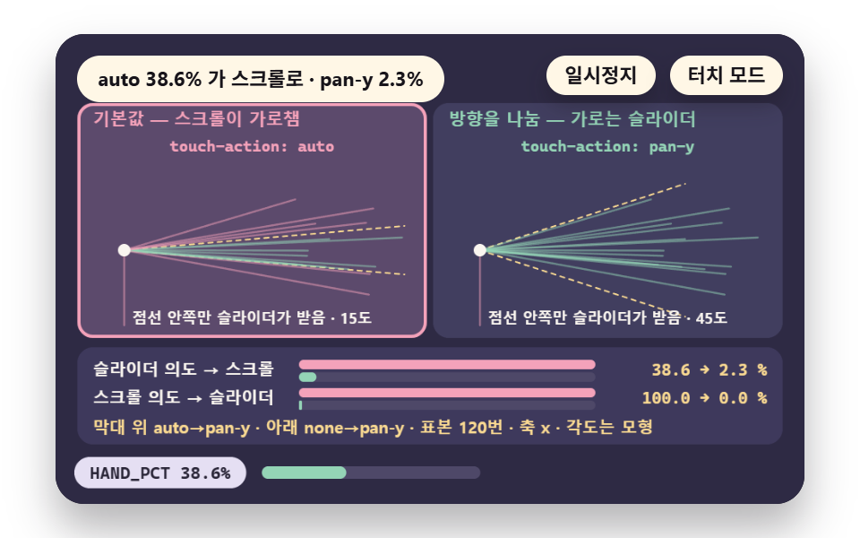
A slider that steals vertical scroll (TOUCH_ACT auto) sits beside one with the direction split (pan-y), and 120 samples are 70% slider drags and 30% page scrolls.
In the model the slider intent handed to scroll, HAND_PCT, falls from 38.6% with auto to 2.3% with pan-y, and the 15 and 45 degree limits are this demo's assumptions.
Use pan-y so a page scrolls past a horizontal slider, and skip none for sliders, since it grabbed 100.0% of the scroll intent.
<main class="stage">
<div class="ez is-demo" id="ez">
  <div class="ez__pad" data-role="pad" tabindex="0" role="application" aria-label="Demo stage: Space or Enter pauses, R restarts, T toggles touch mode">
    <canvas class="ez__canvas" data-role="canvas" width="480" height="300" role="img" aria-label="A scene comparing how drag direction samples split between scroll and slider under touch-action auto and pan-y"></canvas>
  </div>
  <p class="ez__status" data-role="status" aria-live="off">Scene ready</p>
  <div class="ez__ctrl">
    <button class="ez__pause" data-role="pause" type="button" aria-pressed="false">Pause</button>
    <button class="ez__pause" data-role="sim" type="button" aria-pressed="false">Touch mode</button>
  </div>
  <p class="ez__done" data-role="done" role="status" aria-live="polite"></p>
</div>
… (총 13줄 — 아래 「전체 코드」에서 원문 전체)
@use "../../../../site/static/demo-tokens" as *;
@include stage($stage-paper);
.ez {
position: relative;
width: min(92vw, calc(160vh - 12.8vw));
aspect-ratio: 480 / 300;
margin: 0 auto;
border-radius: $r-card;
overflow: hidden;
box-shadow: $shadow-raised;
background: $subject-ink;
… (총 122줄 — 아래 「전체 코드」에서 원문 전체)html, body {
margin: 0;
overflow: hidden;
}
.stage {
box-sizing: border-box;
min-height: 100vh;
display: grid;
place-items: center;
margin: 0;
background: #ffffff;
… (총 134줄 — 아래 「전체 코드」에서 원문 전체)(function () {
const rootEl = document.getElementById("ez");
if (!rootEl) return;
main(rootEl);
function main(root) {
// 무대 좌표 — 캔버스 안 계산은 늘 480×300. 화면에 보이는 크기와 상관없다
const W = 480;
const H = 300;
const TAU = Math.PI * 2;
function clamp(v, lo, hi) { return v < lo ? lo : (v > hi ? hi : v); }
function lerp(a, b, k) { return a + (b - a) * k; }
// 파스텔 팔레트 — 바탕은 짙은 자두색, 상자는 연한 색, 글자는 연한 색 또는 짙은 잉크
… (총 672줄 — 아래 「전체 코드」에서 원문 전체)// TouchAction - 같은 항목 vanilla index.html 의 React 판. 같은 계산을 useEffect 안에서 돌린다
import { useEffect, useRef } from "react";
import styles from "./TouchAction.module.scss";
const cx = (s: string): string => s.split(" ").map((n) => styles[n] ?? n).join(" ");
function main(root: HTMLElement): () => void {
type RGB = [number, number, number];
type Fn = (p: number) => number;
// 무대 좌표 — 캔버스 안 계산은 늘 480×300. 화면에 보이는 크기와 상관없다
const W = 480;
const H = 300;
… (총 624줄 — 아래 「전체 코드」에서 원문 전체)08 · Splitting Gestures: Separating From Scroll With touch-action — Measured area 20.799% · moving frames 21/23Original by GODRICH · SCSS and React ship in the zip · See the password
    const TOUCH_ACT = ['auto', 'pan-y'];
    // model assumption - with auto, scroll takes the gesture when the first move tilts STEAL_DEG or more off the horizontal axis. With pan-y, the slider keeps it when horizontal dominates (within 45 degrees)
    const STEAL_DEG = 15;
    const AXIS_DEG = 45;
    const AXIS = 'x';
    const N = 120;
    const LAP_S = 4.2;
    const REST_S = 3.4;
    const r8 = rng(8);
09Focus Ring: Keyboard vs Touch
Across 6 focus moves :focus shows the ring every time, while :focus-visible shows it only when ringOn sees keyboard input, so RING_N is 3.
Keyboard-only is this demo's model, and real browsers add exceptions such as text inputs, so do not carry the number over to input fields. Use it for forms used with keyboard and touch.
<main class="stage">
<div class="ez is-demo" id="ez">
  <div class="ez__pad" data-role="pad" tabindex="0" role="application" aria-label="Demo stage: Space or Enter pauses, R restarts, T toggles touch mode">
    <canvas class="ez__canvas" data-role="canvas" width="480" height="300" role="img" aria-label="A scene comparing how often :focus and :focus-visible show a ring as focus moves by keyboard, mouse and touch"></canvas>
  </div>
  <p class="ez__status" data-role="status" aria-live="off">Scene ready</p>
  <div class="ez__ctrl">
    <button class="ez__pause" data-role="pause" type="button" aria-pressed="false">Pause</button>
    <button class="ez__pause" data-role="sim" type="button" aria-pressed="false">Touch mode</button>
  </div>
  <p class="ez__done" data-role="done" role="status" aria-live="polite"></p>
</div>
… (총 13줄 — 아래 「전체 코드」에서 원문 전체)
@use "../../../../site/static/demo-tokens" as *;
@include stage($stage-paper);
.ez {
position: relative;
width: min(92vw, calc(160vh - 12.8vw));
aspect-ratio: 480 / 300;
margin: 0 auto;
border-radius: $r-card;
overflow: hidden;
box-shadow: $shadow-raised;
background: $subject-ink;
… (총 122줄 — 아래 「전체 코드」에서 원문 전체)html, body {
margin: 0;
overflow: hidden;
}
.stage {
box-sizing: border-box;
min-height: 100vh;
display: grid;
place-items: center;
margin: 0;
background: #ffffff;
… (총 134줄 — 아래 「전체 코드」에서 원문 전체)(function () {
const rootEl = document.getElementById("ez");
if (!rootEl) return;
main(rootEl);
function main(root) {
// 무대 좌표 — 캔버스 안 계산은 늘 480×300. 화면에 보이는 크기와 상관없다
const W = 480;
const H = 300;
const TAU = Math.PI * 2;
function clamp(v, lo, hi) { return v < lo ? lo : (v > hi ? hi : v); }
function lerp(a, b, k) { return a + (b - a) * k; }
// 파스텔 팔레트 — 바탕은 짙은 자두색, 상자는 연한 색, 글자는 연한 색 또는 짙은 잉크
… (총 665줄 — 아래 「전체 코드」에서 원문 전체)// FocusRing - 같은 항목 vanilla index.html 의 React 판. 같은 계산을 useEffect 안에서 돌린다
import { useEffect, useRef } from "react";
import styles from "./FocusRing.module.scss";
const cx = (s: string): string => s.split(" ").map((n) => styles[n] ?? n).join(" ");
function main(root: HTMLElement): () => void {
type RGB = [number, number, number];
type Fn = (p: number) => number;
// 무대 좌표 — 캔버스 안 계산은 늘 480×300. 화면에 보이는 크기와 상관없다
const W = 480;
const H = 300;
… (총 617줄 — 아래 「전체 코드」에서 원문 전체)09 · Focus Ring: :focus-visible Per Input Kind — Measured area 22.228% · moving frames 22/23Original by GODRICH · SCSS and React ship in the zip · See the password
    // speed of the border alpha rising and falling like breathing - once per second
    const FOCUS_VIS = ':focus-visible';
    // does the ring turn on per rule - :focus on every input, :focus-visible on keyboard only (this demo's model)
    function ringOn(rule, kind) { return rule === 0 ? true : kind === 0; }
    function ringCount(rule) {
        let n = 0;
        for (let i = 0; i < EV_KIND.length; i += 1) {
            if (ringOn(rule, EV_KIND[i])) {
                n += 1;
            }
        }
        return n;
    }
    const RING_N = ringCount(1);
    const RING_ALL = ringCount(0);
Which Input Should You Design For?
Start from the touch screen and add the hover lift for mouse. Press feedback (02) serves both inputs, and the lift stays in the query branch (01).
| Screen input | Set up first | Add on top | Scenes |
|---|---|---|---|
| Touch only | Press feedback, target size | Long press, gesture split | 02, 05, 06, 08 |
| Mouse only | Press feedback | Hover lift | 02, 01 |
| Both (laptop touch screen) | Input type detection | Query branch, focus ring | 04, 01, 09 |
The (hover: hover) query asks whether the primary input can hover, so a touch device with a mouse attached can return false. Add the pointerType check of scene 04 for that device.
For real hand movements see mobile touch gestures in 9 scenes.
The overlap with the reduce-motion setting is covered in the prefers-reduced-motion guide.
How One Input Reaches CSS and JS
A Finger Touch Rises Through Two Layers
CSS splits the whole screen in advance by media query values, while JS splits each input by pointerType when a pointer event such as pointerdown arrives.
Putting It on a Real Screen, No Library
Three Blocks Are Enough
Put the lift in a @media (hover: hover) and (pointer: fine) block and the shared press feedback outside it. Give sliders touch-action: pan-y.
Measure Long Press and Swipe in Coordinates
Remember the time and position at pointerdown, and compute distance and speed in pointermove, as scenes 06 and 07 do.
Traps: Stuck Hover and Gesture Overlap
A Stuck Hover Stays After Release
Without the branch in scene 03 the 3 tapped cards stay up. The press feedback of scene 02 keeps the reaction alive at the moment of the press.
touch-action none Blocks Scrolling
The none version in scene 08 lets the slider grab every scroll-intent sample, so the page cannot scroll. Keep none for a surface such as a drawing canvas.
Shorter Holds and Longer Swipes Drop Users
Lowering HOLD_MS from 500 to 300 removes the non-opening but adds false opens during scroll, so keep 500. Raising SWIPE_PX from 40 to 80 drops long slow mouse drags first.
What Changed When One Value Moved
| Name | Changed value | Feel |
|---|---|---|
| Hold time | 06 HOLD_MS 500 → 300 | False opens during scroll rise from 0.0% to 13.0%, and presses that fail to open fall from 19.0% to 0.0% |
| Target size | 05 TARGET_PX 24 → 44 | Right presses rise from 66.3% to 94.3%, and gap or outside falls from 30.7% to 5.3% |
| Swipe distance | 07 SWIPE_PX 40 → 80 | Touch commits dip from 95.0% to 93.3% while mouse falls from 96.7% to 71.7% |
The markup, styles and script of all nine scenes and the react version are in the zip below, and its password is 7thjut9u.
Browser Compatibility: Pointer Queries
The demo draws on a canvas, so it runs regardless. The versions come from the mdn/browser-compat-data JSON.
| Feature | Chrome | Safari | Firefox | Edge |
|---|---|---|---|---|
@media (hover) feature |
38 | 9 | 64 | 12 |
@media (pointer) feature |
41 | 9 | 64 | 12 |
@media (any-hover) feature |
41 | 9 | 64 | 16 |
:focus-visible selector |
86 | 15.4 | 85 | Same as Chrome (mirror) |
touch-action property |
36 | 13 | 52 | 12 |
PointerEvent (with pointerType) |
55 | 13 | 59 | 12 |
Each number is the first supported version. The Edge cell in the :focus-visible row is a mirror entry with no version of its own, so it follows Chrome.
Sources: MDN hover · MDN pointer
MDN touch-action · MDN PointerEvent
Version data: media.json
Which Row to Watch
The latest cell is Safari 15.4 for :focus-visible. To cover older Safari visitors, keep :focus as the base ring and override it with :focus-visible.
Touch Accessibility: Paste-Ready CSS
Below is paste-ready CSS combining the hover branch, press feedback, focus ring and minimum target size. It is not demo source, so swap .card for your own selector.
@media (hover: hover) and (pointer: fine) {
    .card:hover { transform: translateY(-4px); }
}
.card { min-height: 44px; min-width: 44px; }
.card:active { transform: scale(0.94); }
.card:focus-visible { outline: 2px solid #5b8def; outline-offset: 2px; }
This block keeps the lift on mouse screens and leaves the press and a 44px target on touch screens. Target size appears in two WCAG criteria.
24×24 CSS pixels is the minimum (AA) and 44×44 is the enhanced level (AAA).
Source: WCAG 2.5.8 Target Size (Minimum)
Source: WCAG 2.5.5 Target Size (Enhanced)
Touch Mode Switch and Auto Demo
The T key or the button flips the data-input attribute of html between mouse and touch, which highlights the touch version, enlarges buttons and turns the lift off.
Emulated Values Are Unconfirmed
With touch and mobile settings switched on in a Chrome context, matchMedia returned (hover: none) true and (pointer: coarse) true.
These are emulated, not confirmed on real devices, so the scene verdicts run on constant model values.
Narration and Pause
The status line is aria-live="off", and a role="status" paragraph is narrated only when the mode changes.
Space, Enter or P pauses and R restarts, and the loop stops while the tab is hidden. Flashing stays at 3 or fewer per second.
Touch FAQ: Remove Hover? Detect Touch?
Should I remove the hover state on mobile?
Narrow it to mouse screens instead. Moving the rule inside @media (hover: hover) takes the stuck cards to 0 in scene 03, and scene 02's press feedback takes its place.
How do I know a device is touch?
CSS splits the screen with @media (hover: none) and (pointer: coarse), and JS splits each input by the pointerType of pointer events.
For mixed devices such as a laptop touch screen, the pointerType of scene 04 fits.
How do I add a CSS touch effect?
Add the press with :active, the focus ring with :focus-visible and the slider direction with touch-action. The block in the accessibility section is a starting point.
The pointerType documentation lists the input types.
You might also like
 UX principlesCSS Easing Functions: Choosing a Curve in 9 Scenes
 UX principlesprefers-reduced-motion: Adapting Motion, 9 Scenes
 UX principlesCSS Animation Performance: Frame Cost in 9 Scenes
 UX principlesCSS Animation Delay Between Iterations: 9 Scenes
 Buttons9 css button design ideas — candy, push, loading
 UX principlesrequestAnimationFrame Delta Time in 9 Scenes
 Buttons9 CSS Button Animations (SCSS + React, copy-paste)
 Feedback9 CSS Dark Mode Toggle Animations, One Line Each
 Feedback9 Micro Interactions CSS — One Line, Copy-Paste
 Feedback9 CSS Heart Animations — One Line, Copy-Paste