CSS Easing Functions: Choosing a Curve in 9 Scenes
Pick css easing functions by role: ease-out to enter, ease-in to leave, ease-in-out in place.
What Is a CSS Easing Curve?
 01 ez-keyword-race
 02 ez-enter-exit
 03 ez-cubic-reader
 04 ez-steps
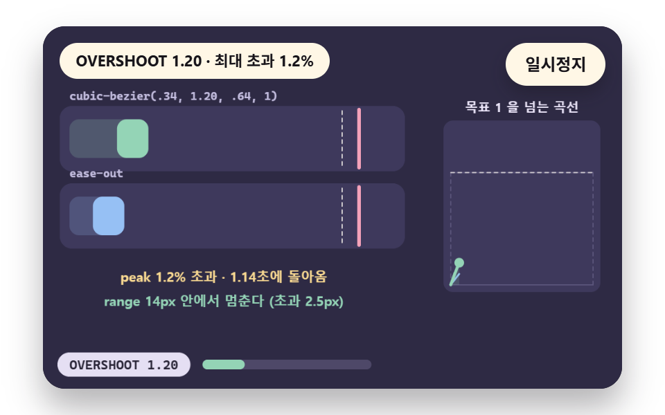 05 ez-overshoot
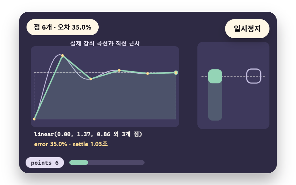 06 ez-linear-spring
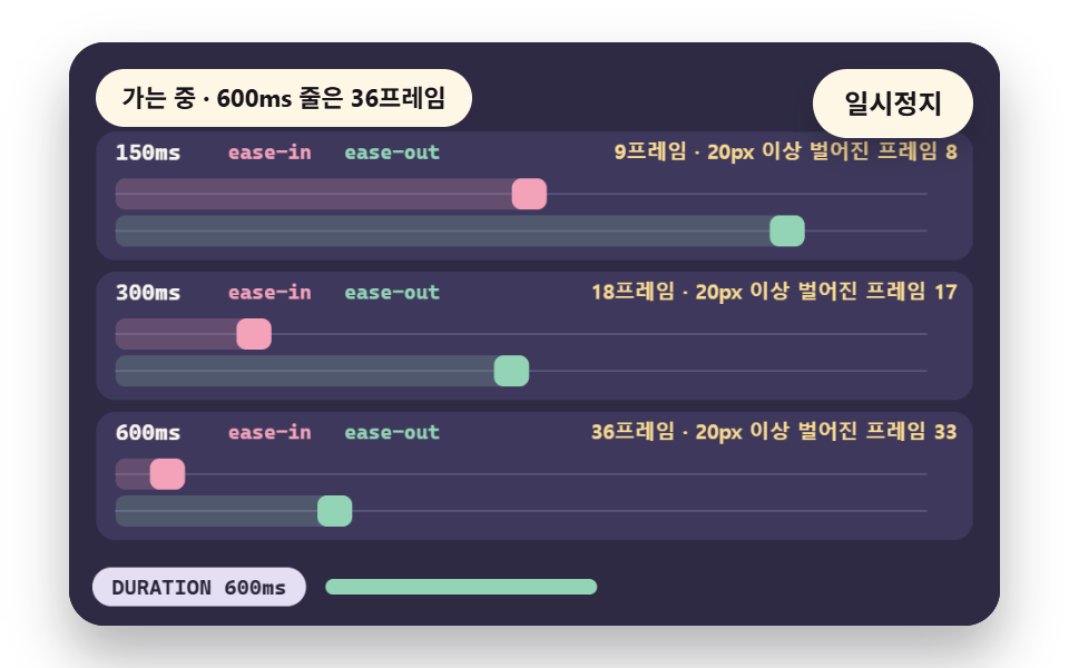 07 ez-duration-pair
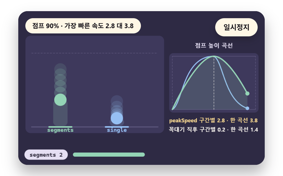 08 ez-keyframe-segment
 09 ez-per-property
- 01 A Side-by-Side Race of the Five Keywords
- 02 Decelerate In, Accelerate Out: an Enter and Exit Pair
- 03 A Reader Turning Four Cubic Curve Values Into a Speed Graph
- 04 Stepped Easing for Sprites and Typewriter Cuts
- 05 An Overshoot Curve That Passes the Target and Returns
- 06 A Spring Approximation Built From Linear Points
- 07 Pairing Easing With 150, 300 and 600 ms Durations
- 08 A Jump With a Separate Easing per Keyframe Segment
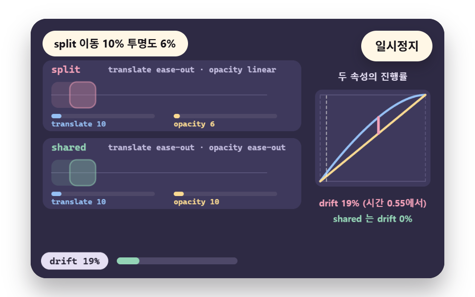
- 09 A Different Easing per Property for Move and Opacity
A transition fixes how long a property takes to travel from its start value to its end value, and the easing decides how far along it is at each moment of that time.
With the same distance and the same duration, a different curve puts the box in a different place at the halfway mark. That is why the curve is the shortest route to a different feel. Most of the nine scenes below hold distance and time fixed and change the curve, and scene 07 changes the duration instead.
A Curve Turns Progress Into Change
The input is progress, the share of the duration that has passed, from 0 to 1. The output is how much of the change is done. On a straight line the two match, and on a curve the output runs ahead of the input or falls behind it.
When the output goes above 1, the value passes the target and comes back, which is called overshoot.
The Demos Compute the Same Formula on a Canvas
Each demo solves the cubic curve by halving a parameter 32 times until it matches the elapsed time, and it computes step and linear-point easings straight from their definitions. Every frame therefore leaves its numbers on screen, so you can read curve differences off a gauge. No library and no external file is involved.
The loop below is that 32-pass approximation. It narrows lo and hi around the parameter s that matches the time p, and the last line returns the y value at that s as the change.
            let lo = 0;
            let hi = 1;
            let s = p;
            for (let i = 0; i < 32; i += 1) {
                s = (lo + hi) / 2;
                if (bz(x1, x2, s) < p) {
                    lo = s;
                }
                else {
                    hi = s;
                }
            }
            return bz(y1, y2, s);
CSS Easing Examples in Nine Scenes
The numbers for the nine scenes come from the demo.py render tool, which ran an installed Chrome on a 480×300 canvas, captured 2 seconds as 24 frames at 12 per second, and compared the 23 pairs of neighboring frames. The Chrome build and the operating system details of that render are unconfirmed.
Cumulative area is the share of the screen where a pixel differed from the first frame at least once. Intensity is the mean color difference (0 to 255) inside the changed pixels, and moved frames counts the frames that differ from the one before.
A pixel counts as changed when a color channel differs by more than 12. These scenes draw on a canvas without Web Animations, so the capture code should take the branch that photographs the screen about every 83 ms. Whether this particular run took that path is unconfirmed.
| Scene | Cumulative area | Moved frames | Mean intensity |
|---|---|---|---|
| 01 Keyword race | 16.1% | 15/23 | 132.2 |
| 02 Enter and exit pair | 11.8% | 15/23 | 116.9 |
| 03 Cubic curve reader | 14.9% | 21/23 | 76.6 |
| 04 Stepped easing | 19.8% | 17/23 | 83.5 |
| 05 Overshoot | 12.7% | 13/23 | 83.9 |
| 06 Linear-point spring | 16.3% | 17/23 | 55.9 |
| 07 Duration pairing | 22.8% | 12/23 | 73.9 |
| 08 Keyframe segments | 11.9% | 22/23 | 60.2 |
| 09 Per-property easing | 12.5% | 17/23 | 97.5 |
Scene 07 covers the widest area at 22.8% and scene 02 the narrowest at 11.8%. Scene 08 has the most moved frames at 22 of 23, and scene 07 the fewest at 12.
Scene 01 has the highest intensity at 132.2 and scene 06 the lowest at 55.9. A curve comparison shows its difference as the position of one box, so these scenes do not stretch the motion to inflate area, and the area figures stay modest.
Read frames and area together: scene 07, with few frames and a wide area, packs a large move into a short time, while scene 08, with many frames and a narrow area, spreads small moves over a long time.
The nine scenes fall into three groups. Scenes 01 to 03 show what a curve is, scenes 04 to 06 build shapes outside the ordinary curve with steps, overshoot and straight segments, and scenes 07 to 09 pair the curve with duration, segment and property.
01Five Keywords Racing Side by Side
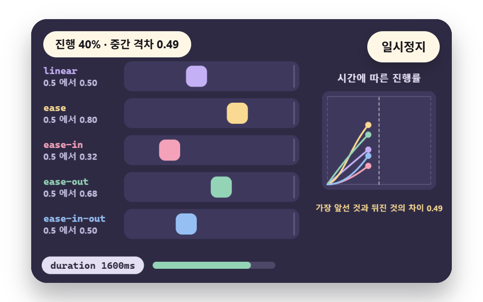
Five boxes run the same distance in the same 1.6 seconds so that only the curve differs. The halfway value, the progress at half the time, is in the table below, and the leader ease and the laggard ease-in are 0.49 apart.
| Keyword | linear | ease | ease-in | ease-out | ease-in-out |
|---|---|---|---|---|---|
| Progress at 0.5 | 0.50 | 0.80 | 0.32 | 0.68 | 0.50 |
Use this comparison to decide whether to keep the default ease, and skip it for transitions of 150 ms or less, where the gap hides between frames.
<main class="stage">
<div class="ez is-demo" id="ez">
  <div class="ez__pad" data-role="pad" tabindex="0" role="application" aria-label="Demo stage: Space or Enter pauses, R restarts">
    <canvas class="ez__canvas" data-role="canvas" width="480" height="300" role="img" aria-label="Five keyword boxes race the same distance with a curve graph and halfway progress"></canvas>
  </div>
  <p class="ez__status" data-role="status" aria-live="off">Scene ready</p>
  <div class="ez__ctrl">
    <button class="ez__pause" data-role="pause" type="button" aria-pressed="false">Pause</button>
  </div>
  <p class="ez__done" data-role="done" role="status" aria-live="polite"></p>
</div>
</main>
@use "../../../../site/static/demo-tokens" as *;
@include stage($stage-paper);
.ez {
position: relative;
width: min(92vw, calc(160vh - 12.8vw));
aspect-ratio: 480 / 300;
margin: 0 auto;
border-radius: $r-card;
overflow: hidden;
box-shadow: $shadow-raised;
background: $subject-ink;
… (총 122줄 — 아래 「전체 코드」에서 원문 전체)html, body {
margin: 0;
overflow: hidden;
}
.stage {
box-sizing: border-box;
min-height: 100vh;
display: grid;
place-items: center;
margin: 0;
background: #ffffff;
… (총 134줄 — 아래 「전체 코드」에서 원문 전체)(function () {
const rootEl = document.getElementById("ez");
if (!rootEl) return;
main(rootEl);
function main(root) {
// 무대 좌표 — 캔버스 안 계산은 늘 480×300. 화면에 보이는 크기와 상관없다
const W = 480;
const H = 300;
const TAU = Math.PI * 2;
function clamp(v, lo, hi) { return v < lo ? lo : (v > hi ? hi : v); }
function lerp(a, b, k) { return a + (b - a) * k; }
// 파스텔 팔레트 — 바탕은 짙은 자두색, 상자는 연한 색, 글자는 연한 색 또는 짙은 잉크
… (총 464줄 — 아래 「전체 코드」에서 원문 전체)// KeywordRace - 같은 항목 vanilla index.html 의 React 판. 같은 계산을 useEffect 안에서 돌린다
import { useEffect, useRef } from "react";
import styles from "./KeywordRace.module.scss";
const cx = (s: string): string => s.split(" ").map((n) => styles[n] ?? n).join(" ");
function main(root: HTMLElement): () => void {
type RGB = [number, number, number];
type Fn = (p: number) => number;
// 무대 좌표 — 캔버스 안 계산은 늘 480×300. 화면에 보이는 크기와 상관없다
const W = 480;
const H = 300;
… (총 435줄 — 아래 「전체 코드」에서 원문 전체)01 · A Side-by-Side Race of the Five Keywords — Measured area 16.076% · moving frames 15/23Original by GODRICH · SCSS and React ship in the zip · See the password
        { name: 'ease-out', fn: EASE_OUT, c: MINT },
        { name: 'ease-in-out', fn: EASE_IN_OUT, c: SKY }
    ];
    // five progress values at half the time (0.5), and their spread
    const halfway = KEYS.map(function (k) { return k.fn(0.5); });
    const gap = Math.max(...halfway) - Math.min(...halfway);
02Decelerate In, Accelerate Out
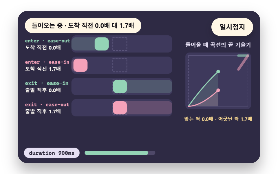
A panel that enters on ease-out and leaves on ease-in is drawn as four overlapping lanes next to the reversed pairing, and slopeAt reads the speed just before arrival and just after departure.
Ease-out arrives at 0.0 times speed and covers 90% of the distance in 74.0% of the time, while ease-in arrives at 1.7 times speed and needs 93.9% of the time. Use the pair for menus and modals that open and close, but skip it at 150 ms or less (9 frames), where the timing gap disappears between frames.
<main class="stage">
<div class="ez is-demo" id="ez">
  <div class="ez__pad" data-role="pad" tabindex="0" role="application" aria-label="Demo stage: Space or Enter pauses, R restarts">
    <canvas class="ez__canvas" data-role="canvas" width="480" height="300" role="img" aria-label="Matched and mismatched enter and exit curve pairs with speeds read at the hand-off"></canvas>
  </div>
  <p class="ez__status" data-role="status" aria-live="off">Scene ready</p>
  <div class="ez__ctrl">
    <button class="ez__pause" data-role="pause" type="button" aria-pressed="false">Pause</button>
  </div>
  <p class="ez__done" data-role="done" role="status" aria-live="polite"></p>
</div>
</main>
@use "../../../../site/static/demo-tokens" as *;
@include stage($stage-paper);
.ez {
position: relative;
width: min(92vw, calc(160vh - 12.8vw));
aspect-ratio: 480 / 300;
margin: 0 auto;
border-radius: $r-card;
overflow: hidden;
box-shadow: $shadow-raised;
background: $subject-ink;
… (총 122줄 — 아래 「전체 코드」에서 원문 전체)html, body {
margin: 0;
overflow: hidden;
}
.stage {
box-sizing: border-box;
min-height: 100vh;
display: grid;
place-items: center;
margin: 0;
background: #ffffff;
… (총 134줄 — 아래 「전체 코드」에서 원문 전체)(function () {
const rootEl = document.getElementById("ez");
if (!rootEl) return;
main(rootEl);
function main(root) {
// 무대 좌표 — 캔버스 안 계산은 늘 480×300. 화면에 보이는 크기와 상관없다
const W = 480;
const H = 300;
const TAU = Math.PI * 2;
function clamp(v, lo, hi) { return v < lo ? lo : (v > hi ? hi : v); }
function lerp(a, b, k) { return a + (b - a) * k; }
// 파스텔 팔레트 — 바탕은 짙은 자두색, 상자는 연한 색, 글자는 연한 색 또는 짙은 잉크
… (총 499줄 — 아래 「전체 코드」에서 원문 전체)// EnterExitPair - 같은 항목 vanilla index.html 의 React 판. 같은 계산을 useEffect 안에서 돌린다
import { useEffect, useRef } from "react";
import styles from "./EnterExitPair.module.scss";
const cx = (s: string): string => s.split(" ").map((n) => styles[n] ?? n).join(" ");
function main(root: HTMLElement): () => void {
type RGB = [number, number, number];
type Fn = (p: number) => number;
// 무대 좌표 — 캔버스 안 계산은 늘 480×300. 화면에 보이는 크기와 상관없다
const W = 480;
const H = 300;
… (총 459줄 — 아래 「전체 코드」에서 원문 전체)02 · Decelerate In, Accelerate Out: an Enter and Exit Pair — Measured area 11.778% · moving frames 15/23Original by GODRICH · SCSS and React ship in the zip · See the password
        { name: 'exit · ease-in', fn: pair.exit, enter: false, good: true },
        { name: 'exit · ease-out', fn: pair.enter, enter: false, good: false }
    ];
    // slope at the curve end (just before arrival) and start (just after departure); a straight line over length 1 in time 1 is 1x
    const arriveSpeed = [slopeAt(pair.enter, 1), slopeAt(pair.exit, 1)];
    const leaveSpeed = [slopeAt(pair.exit, 0), slopeAt(pair.enter, 0)];
03Reading Four Cubic Curve Values
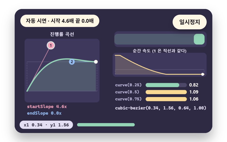
Each time you change the four curve values, a progress curve and an instantaneous speed curve are redrawn together. The first PRESETS row, the default (0.34, 1.56, 0.64, 1), gives progress of 0.82, 1.09 and 1.06 at times 0.25, 0.5 and 0.75, so it passes 1, and its start slope is 4.59 and its end slope is 0.
Use the reader as a small css easing generator when you write curve values by hand, and skip it where a keyword is enough, as with ease, whose start slope is only 0.40.
<main class="stage">
<div class="ez is-demo" id="ez">
  <div class="ez__pad" data-role="pad" tabindex="0" role="application" aria-label="Demo stage: Space or Enter pauses, R restarts, 1 or 2 picks a handle and arrow keys move it">
    <canvas class="ez__canvas" data-role="canvas" width="480" height="300" role="img" aria-label="Drag two handles of a cubic curve and watch the curve, the box and the computed values change together"></canvas>
  </div>
  <p class="ez__status" data-role="status" aria-live="off">Scene ready</p>
  <div class="ez__ctrl">
    <button class="ez__pause" data-role="pause" type="button" aria-pressed="false">Pause</button>
  </div>
  <p class="ez__done" data-role="done" role="status" aria-live="polite"></p>
</div>
</main>
@use "../../../../site/static/demo-tokens" as *;
@include stage($stage-paper);
.ez {
position: relative;
width: min(92vw, calc(160vh - 12.8vw));
aspect-ratio: 480 / 300;
margin: 0 auto;
border-radius: $r-card;
overflow: hidden;
box-shadow: $shadow-raised;
background: $subject-ink;
… (총 122줄 — 아래 「전체 코드」에서 원문 전체)html, body {
margin: 0;
overflow: hidden;
}
.stage {
box-sizing: border-box;
min-height: 100vh;
display: grid;
place-items: center;
margin: 0;
background: #ffffff;
… (총 135줄 — 아래 「전체 코드」에서 원문 전체)(function () {
const rootEl = document.getElementById("ez");
if (!rootEl) return;
main(rootEl);
function main(root) {
// 무대 좌표 — 캔버스 안 계산은 늘 480×300. 화면에 보이는 크기와 상관없다
const W = 480;
const H = 300;
const TAU = Math.PI * 2;
function clamp(v, lo, hi) { return v < lo ? lo : (v > hi ? hi : v); }
function lerp(a, b, k) { return a + (b - a) * k; }
// 파스텔 팔레트 — 바탕은 짙은 자두색, 상자는 연한 색, 글자는 연한 색 또는 짙은 잉크
… (총 574줄 — 아래 「전체 코드」에서 원문 전체)// CubicReader - 같은 항목 vanilla index.html 의 React 판. 같은 계산을 useEffect 안에서 돌린다
import { useEffect, useRef } from "react";
import styles from "./CubicReader.module.scss";
const cx = (s: string): string => s.split(" ").map((n) => styles[n] ?? n).join(" ");
function main(root: HTMLElement): () => void {
type RGB = [number, number, number];
type Fn = (p: number) => number;
// 무대 좌표 — 캔버스 안 계산은 늘 480×300. 화면에 보이는 크기와 상관없다
const W = 480;
const H = 300;
… (총 527줄 — 아래 「전체 코드」에서 원문 전체)03 · A Reader Turning Four Cubic Curve Values Into a Speed Graph — Measured area 14.908% · moving frames 21/23Original by GODRICH · SCSS and React ship in the zip · See the password
    const PRESETS = [
        [0.34, 1.56, 0.64, 1],
        [0.25, 0.1, 0.25, 1],
        [0.42, 0, 0.58, 1],
        [0.42, 0, 1, 1],
        [0, 0, 0.58, 1]
    ];
04Steps for Sprites and Typewriters
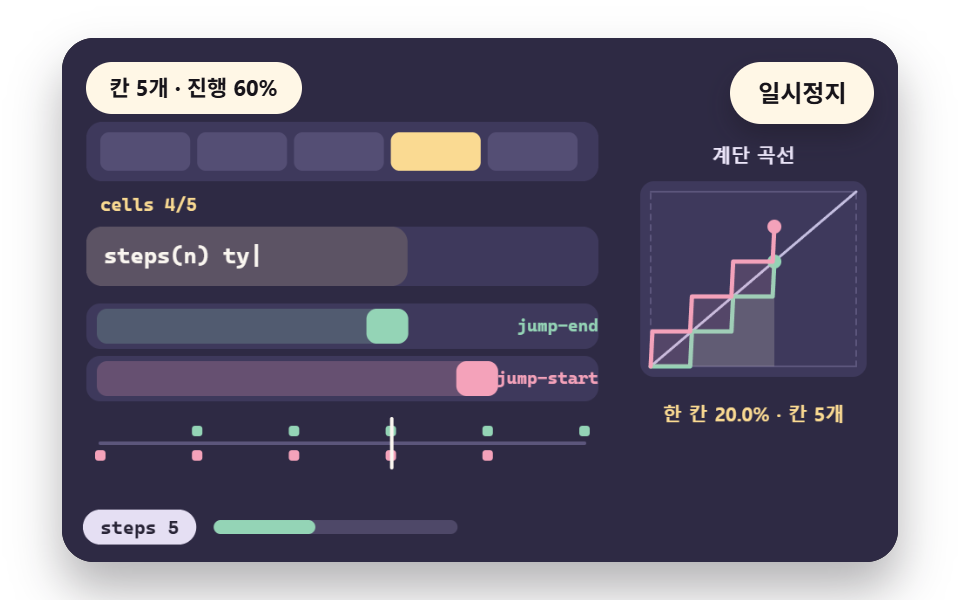
When you change the step count, the timeline marks where the value jumps, and stepsFn produces the value. With 5 steps each step is 20%, and at time 0.5 jump-end gives 0.4 while jump-start gives 0.6, and at time 0.01 they give 0 and 0.2.
Use steps for sprite sheets, typewriter text and clock hands, and skip them for smooth motion at 12 steps, where a step shrinks to 8.3% and the result is hard to tell from a straight line.
<main class="stage">
<div class="ez is-demo" id="ez">
  <div class="ez__pad" data-role="pad" tabindex="0" role="application" aria-label="Demo stage: Space or Enter pauses, R restarts, Left and right arrows change the step count">
    <canvas class="ez__canvas" data-role="canvas" width="480" height="300" role="img" aria-label="Step easing makes sprite cells and typewriter letters move in jumps"></canvas>
  </div>
  <p class="ez__status" data-role="status" aria-live="off">Scene ready</p>
  <div class="ez__ctrl">
    <button class="ez__pause" data-role="pause" type="button" aria-pressed="false">Pause</button>
  </div>
  <p class="ez__done" data-role="done" role="status" aria-live="polite"></p>
</div>
</main>
@use "../../../../site/static/demo-tokens" as *;
@include stage($stage-paper);
.ez {
position: relative;
width: min(92vw, calc(160vh - 12.8vw));
aspect-ratio: 480 / 300;
margin: 0 auto;
border-radius: $r-card;
overflow: hidden;
box-shadow: $shadow-raised;
background: $subject-ink;
… (총 122줄 — 아래 「전체 코드」에서 원문 전체)html, body {
margin: 0;
overflow: hidden;
}
.stage {
box-sizing: border-box;
min-height: 100vh;
display: grid;
place-items: center;
margin: 0;
background: #ffffff;
… (총 134줄 — 아래 「전체 코드」에서 원문 전체)(function () {
const rootEl = document.getElementById("ez");
if (!rootEl) return;
main(rootEl);
function main(root) {
// 무대 좌표 — 캔버스 안 계산은 늘 480×300. 화면에 보이는 크기와 상관없다
const W = 480;
const H = 300;
const TAU = Math.PI * 2;
function clamp(v, lo, hi) { return v < lo ? lo : (v > hi ? hi : v); }
function lerp(a, b, k) { return a + (b - a) * k; }
// 파스텔 팔레트 — 바탕은 짙은 자두색, 상자는 연한 색, 글자는 연한 색 또는 짙은 잉크
… (총 489줄 — 아래 「전체 코드」에서 원문 전체)// StepsEasing - 같은 항목 vanilla index.html 의 React 판. 같은 계산을 useEffect 안에서 돌린다
import { useEffect, useRef } from "react";
import styles from "./StepsEasing.module.scss";
const cx = (s: string): string => s.split(" ").map((n) => styles[n] ?? n).join(" ");
function main(root: HTMLElement): () => void {
type RGB = [number, number, number];
type Fn = (p: number) => number;
// 무대 좌표 — 캔버스 안 계산은 늘 480×300. 화면에 보이는 크기와 상관없다
const W = 480;
const H = 300;
… (총 449줄 — 아래 「전체 코드」에서 원문 전체)04 · Stepped Easing for Sprites and Typewriter Cuts — Measured area 19.778% · moving frames 17/23Original by GODRICH · SCSS and React ship in the zip · See the password
    function stepsFn(n, jumpStart) {
        return function (p) {
            if (p <= 0) {
                return 0;
            }
            if (p >= 1) {
                return 1;
            }
            return jumpStart ? Math.min(1, Math.ceil(p * n) / n) : Math.floor(p * n) / n;
        };
    }
05An Overshoot That Passes the Target
Setting the second curve value to 1.2 lets the box pass the target by at most 1.2% (2.5 px), peak at time 0.74, fall back under 1% at 1.14 seconds and stop inside a 14 px wall.
The backAt line of analyze finds that return time with a 1% threshold. Use this scene for a slight bounce on a button press or a toast entrance, and skip a larger second value where the margin is small (the trap section has the table).
<main class="stage">
<div class="ez is-demo" id="ez">
  <div class="ez__pad" data-role="pad" tabindex="0" role="application" aria-label="Demo stage: Space or Enter pauses, R restarts, Left and right arrows change the overshoot value">
    <canvas class="ez__canvas" data-role="canvas" width="480" height="300" role="img" aria-label="An overshoot curve passing the target and coming back with the peak excess read off"></canvas>
  </div>
  <p class="ez__status" data-role="status" aria-live="off">Scene ready</p>
  <div class="ez__ctrl">
    <button class="ez__pause" data-role="pause" type="button" aria-pressed="false">Pause</button>
  </div>
  <p class="ez__done" data-role="done" role="status" aria-live="polite"></p>
</div>
</main>
@use "../../../../site/static/demo-tokens" as *;
@include stage($stage-paper);
.ez {
position: relative;
width: min(92vw, calc(160vh - 12.8vw));
aspect-ratio: 480 / 300;
margin: 0 auto;
border-radius: $r-card;
overflow: hidden;
box-shadow: $shadow-raised;
background: $subject-ink;
… (총 122줄 — 아래 「전체 코드」에서 원문 전체)html, body {
margin: 0;
overflow: hidden;
}
.stage {
box-sizing: border-box;
min-height: 100vh;
display: grid;
place-items: center;
margin: 0;
background: #ffffff;
… (총 134줄 — 아래 「전체 코드」에서 원문 전체)(function () {
const rootEl = document.getElementById("ez");
if (!rootEl) return;
main(rootEl);
function main(root) {
// 무대 좌표 — 캔버스 안 계산은 늘 480×300. 화면에 보이는 크기와 상관없다
const W = 480;
const H = 300;
const TAU = Math.PI * 2;
function clamp(v, lo, hi) { return v < lo ? lo : (v > hi ? hi : v); }
function lerp(a, b, k) { return a + (b - a) * k; }
// 파스텔 팔레트 — 바탕은 짙은 자두색, 상자는 연한 색, 글자는 연한 색 또는 짙은 잉크
… (총 495줄 — 아래 「전체 코드」에서 원문 전체)// OvershootCurve - 같은 항목 vanilla index.html 의 React 판. 같은 계산을 useEffect 안에서 돌린다
import { useEffect, useRef } from "react";
import styles from "./OvershootCurve.module.scss";
const cx = (s: string): string => s.split(" ").map((n) => styles[n] ?? n).join(" ");
function main(root: HTMLElement): () => void {
type RGB = [number, number, number];
type Fn = (p: number) => number;
// 무대 좌표 — 캔버스 안 계산은 늘 480×300. 화면에 보이는 크기와 상관없다
const W = 480;
const H = 300;
… (총 452줄 — 아래 「전체 코드」에서 원문 전체)05 · An Overshoot Curve That Passes the Target and Returns — Measured area 12.688% · moving frames 13/23Original by GODRICH · SCSS and React ship in the zip · See the password
        let backAt = 1;
        for (let i = Math.round(peakAt * 1000); i <= 1000; i += 1) {
            if (fn(i / 1000) - 1 <= 0.01) {
                backAt = i / 1000;
                break;
            }
        }
        return { fn: fn, peak: peak, peakAt: peakAt, backAt: backAt };
    }
06A Spring Built From Linear Points
A handful of points joined by straight segments can imitate a damped oscillation, and the fewer the points the further the result strays from the real curve. The largest error is 35.0% at 6 points, 12.5% at 12 and 3.3% at 24, and the settle loop finds when the value stays within 2% of 1 at 1.03, 1.00 and 1.00 seconds.
Use it for elastic cards and shaking alerts that one cubic curve cannot produce, and skip the 6-point version where bent peaks would show.
<main class="stage">
<div class="ez is-demo" id="ez">
  <div class="ez__pad" data-role="pad" tabindex="0" role="application" aria-label="Demo stage: Space or Enter pauses, R restarts, Left and right arrows change the point count">
    <canvas class="ez__canvas" data-role="canvas" width="480" height="300" role="img" aria-label="Straight points approximate a damped oscillation with the error read per point count"></canvas>
  </div>
  <p class="ez__status" data-role="status" aria-live="off">Scene ready</p>
  <div class="ez__ctrl">
    <button class="ez__pause" data-role="pause" type="button" aria-pressed="false">Pause</button>
  </div>
  <p class="ez__done" data-role="done" role="status" aria-live="polite"></p>
</div>
</main>
@use "../../../../site/static/demo-tokens" as *;
@include stage($stage-paper);
.ez {
position: relative;
width: min(92vw, calc(160vh - 12.8vw));
aspect-ratio: 480 / 300;
margin: 0 auto;
border-radius: $r-card;
overflow: hidden;
box-shadow: $shadow-raised;
background: $subject-ink;
… (총 122줄 — 아래 「전체 코드」에서 원문 전체)html, body {
margin: 0;
overflow: hidden;
}
.stage {
box-sizing: border-box;
min-height: 100vh;
display: grid;
place-items: center;
margin: 0;
background: #ffffff;
… (총 134줄 — 아래 「전체 코드」에서 원문 전체)(function () {
const rootEl = document.getElementById("ez");
if (!rootEl) return;
main(rootEl);
function main(root) {
// 무대 좌표 — 캔버스 안 계산은 늘 480×300. 화면에 보이는 크기와 상관없다
const W = 480;
const H = 300;
const TAU = Math.PI * 2;
function clamp(v, lo, hi) { return v < lo ? lo : (v > hi ? hi : v); }
function lerp(a, b, k) { return a + (b - a) * k; }
// 파스텔 팔레트 — 바탕은 짙은 자두색, 상자는 연한 색, 글자는 연한 색 또는 짙은 잉크
… (총 508줄 — 아래 「전체 코드」에서 원문 전체)// LinearSpring - 같은 항목 vanilla index.html 의 React 판. 같은 계산을 useEffect 안에서 돌린다
import { useEffect, useRef } from "react";
import styles from "./LinearSpring.module.scss";
const cx = (s: string): string => s.split(" ").map((n) => styles[n] ?? n).join(" ");
function main(root: HTMLElement): () => void {
type RGB = [number, number, number];
type Fn = (p: number) => number;
// 무대 좌표 — 캔버스 안 계산은 늘 480×300. 화면에 보이는 크기와 상관없다
const W = 480;
const H = 300;
… (총 466줄 — 아래 「전체 코드」에서 원문 전체)06 · A Spring Approximation Built From Linear Points — Measured area 16.301% · moving frames 17/23Original by GODRICH · SCSS and React ship in the zip · See the password
        let settle = 0;
        for (let i = 1000; i >= 0; i -= 1) {
            if (Math.abs(fn(i / 1000) - 1) > 0.02) {
                settle = (i + 1) / 1000;
                break;
            }
        }
        return { pts: pts, fn: fn, error: error, settle: settle };
    }
07Pairing Easing With Duration
Running the same curve at 150, 300 and 600 ms gives 9, 18 and 36 frames in all, and the frames where ease-in and ease-out sit 20 px or more apart number 8, 17 and 33. A maxStep loop measures the largest distance ease-out covers in one frame at 71 px, 36.4 px and 18.5 px.
Use scene 07 to choose a duration, not to compare curves, because the counts of 8, 17 and 33 scale with the total frame count and are not evidence of a curve difference.
<main class="stage">
<div class="ez is-demo" id="ez">
  <div class="ez__pad" data-role="pad" tabindex="0" role="application" aria-label="Demo stage: Space or Enter pauses, R restarts">
    <canvas class="ez__canvas" data-role="canvas" width="480" height="300" role="img" aria-label="Compare how many frames show a visible gap between two curves at 150, 300 and 600 ms"></canvas>
  </div>
  <p class="ez__status" data-role="status" aria-live="off">Scene ready</p>
  <div class="ez__ctrl">
    <button class="ez__pause" data-role="pause" type="button" aria-pressed="false">Pause</button>
  </div>
  <p class="ez__done" data-role="done" role="status" aria-live="polite"></p>
</div>
</main>
@use "../../../../site/static/demo-tokens" as *;
@include stage($stage-paper);
.ez {
position: relative;
width: min(92vw, calc(160vh - 12.8vw));
aspect-ratio: 480 / 300;
margin: 0 auto;
border-radius: $r-card;
overflow: hidden;
box-shadow: $shadow-raised;
background: $subject-ink;
… (총 122줄 — 아래 「전체 코드」에서 원문 전체)html, body {
margin: 0;
overflow: hidden;
}
.stage {
box-sizing: border-box;
min-height: 100vh;
display: grid;
place-items: center;
margin: 0;
background: #ffffff;
… (총 134줄 — 아래 「전체 코드」에서 원문 전체)(function () {
const rootEl = document.getElementById("ez");
if (!rootEl) return;
main(rootEl);
function main(root) {
// 무대 좌표 — 캔버스 안 계산은 늘 480×300. 화면에 보이는 크기와 상관없다
const W = 480;
const H = 300;
const TAU = Math.PI * 2;
function clamp(v, lo, hi) { return v < lo ? lo : (v > hi ? hi : v); }
function lerp(a, b, k) { return a + (b - a) * k; }
// 파스텔 팔레트 — 바탕은 짙은 자두색, 상자는 연한 색, 글자는 연한 색 또는 짙은 잉크
… (총 475줄 — 아래 「전체 코드」에서 원문 전체)// DurationPair - 같은 항목 vanilla index.html 의 React 판. 같은 계산을 useEffect 안에서 돌린다
import { useEffect, useRef } from "react";
import styles from "./DurationPair.module.scss";
const cx = (s: string): string => s.split(" ").map((n) => styles[n] ?? n).join(" ");
function main(root: HTMLElement): () => void {
type RGB = [number, number, number];
type Fn = (p: number) => number;
// 무대 좌표 — 캔버스 안 계산은 늘 480×300. 화면에 보이는 크기와 상관없다
const W = 480;
const H = 300;
… (총 440줄 — 아래 「전체 코드」에서 원문 전체)07 · Pairing Easing With 150, 300 and 600 ms Durations — Measured area 22.826% · moving frames 12/23Original by GODRICH · SCSS and React ship in the zip · See the password
        for (let i = 1; i <= frames; i += 1) {
            const s = (EASE_OUT(i / frames) - EASE_OUT((i - 1) / frames)) * TRAVEL;
            if (s > maxStep) {
                maxStep = s;
            }
        }
        return { ms: ms, frames: frames, visible: visible, maxStep: maxStep };
    }
08Separate Easing per Keyframe Segment
A jump that rises on ease-out and falls on ease-in is compared with a jump that uses one ease curve for both legs, both driven by the jumpQ timetable. The fastest speed is 2.8 for the per-segment jump and 3.8 for the single curve (heights per second), and just after the peak (q=0.52) the speeds are 0.2 and 1.4.
Use it for bounce, drop and shake motions, and skip it for a plain move that does not need that 0.2 against 1.4 gap.
<main class="stage">
<div class="ez is-demo" id="ez">
  <div class="ez__pad" data-role="pad" tabindex="0" role="application" aria-label="Demo stage: Space or Enter pauses, R restarts">
    <canvas class="ez__canvas" data-role="canvas" width="480" height="300" role="img" aria-label="A jump compared with per-segment easing and a single curve side by side"></canvas>
  </div>
  <p class="ez__status" data-role="status" aria-live="off">Scene ready</p>
  <div class="ez__ctrl">
    <button class="ez__pause" data-role="pause" type="button" aria-pressed="false">Pause</button>
  </div>
  <p class="ez__done" data-role="done" role="status" aria-live="polite"></p>
</div>
</main>
@use "../../../../site/static/demo-tokens" as *;
@include stage($stage-paper);
.ez {
position: relative;
width: min(92vw, calc(160vh - 12.8vw));
aspect-ratio: 480 / 300;
margin: 0 auto;
border-radius: $r-card;
overflow: hidden;
box-shadow: $shadow-raised;
background: $subject-ink;
… (총 122줄 — 아래 「전체 코드」에서 원문 전체)html, body {
margin: 0;
overflow: hidden;
}
.stage {
box-sizing: border-box;
min-height: 100vh;
display: grid;
place-items: center;
margin: 0;
background: #ffffff;
… (총 134줄 — 아래 「전체 코드」에서 원문 전체)(function () {
const rootEl = document.getElementById("ez");
if (!rootEl) return;
main(rootEl);
function main(root) {
// 무대 좌표 — 캔버스 안 계산은 늘 480×300. 화면에 보이는 크기와 상관없다
const W = 480;
const H = 300;
const TAU = Math.PI * 2;
function clamp(v, lo, hi) { return v < lo ? lo : (v > hi ? hi : v); }
function lerp(a, b, k) { return a + (b - a) * k; }
// 파스텔 팔레트 — 바탕은 짙은 자두색, 상자는 연한 색, 글자는 연한 색 또는 짙은 잉크
… (총 485줄 — 아래 「전체 코드」에서 원문 전체)// KeyframeSegment - 같은 항목 vanilla index.html 의 React 판. 같은 계산을 useEffect 안에서 돌린다
import { useEffect, useRef } from "react";
import styles from "./KeyframeSegment.module.scss";
const cx = (s: string): string => s.split(" ").map((n) => styles[n] ?? n).join(" ");
function main(root: HTMLElement): () => void {
type RGB = [number, number, number];
type Fn = (p: number) => number;
// 무대 좌표 — 캔버스 안 계산은 늘 480×300. 화면에 보이는 크기와 상관없다
const W = 480;
const H = 300;
… (총 450줄 — 아래 「전체 코드」에서 원문 전체)08 · A Jump With a Separate Easing per Keyframe Segment — Measured area 11.868% · moving frames 22/23Original by GODRICH · SCSS and React ship in the zip · See the password
    function jumpQ(t) {
        if (t < T0) {
            return 0;
        }
        if (t < T1) {
            return clamp((t - T0) / JUMP_S, 0, 1);
        }
        return clamp((t - T1) / JUMP_S, 0, 1);
    }
09A Different Easing per Property
<main class="stage">
<div class="ez is-demo" id="ez">
  <div class="ez__pad" data-role="pad" tabindex="0" role="application" aria-label="Demo stage: Space or Enter pauses, R restarts">
    <canvas class="ez__canvas" data-role="canvas" width="480" height="300" role="img" aria-label="Overlaying the drift when movement and opacity use different easings versus a shared easing"></canvas>
  </div>
  <p class="ez__status" data-role="status" aria-live="off">Scene ready</p>
  <div class="ez__ctrl">
    <button class="ez__pause" data-role="pause" type="button" aria-pressed="false">Pause</button>
  </div>
  <p class="ez__done" data-role="done" role="status" aria-live="polite"></p>
</div>
</main>
@use "../../../../site/static/demo-tokens" as *;
@include stage($stage-paper);
.ez {
position: relative;
width: min(92vw, calc(160vh - 12.8vw));
aspect-ratio: 480 / 300;
margin: 0 auto;
border-radius: $r-card;
overflow: hidden;
box-shadow: $shadow-raised;
background: $subject-ink;
… (총 122줄 — 아래 「전체 코드」에서 원문 전체)html, body {
margin: 0;
overflow: hidden;
}
.stage {
box-sizing: border-box;
min-height: 100vh;
display: grid;
place-items: center;
margin: 0;
background: #ffffff;
… (총 134줄 — 아래 「전체 코드」에서 원문 전체)(function () {
const rootEl = document.getElementById("ez");
if (!rootEl) return;
main(rootEl);
function main(root) {
// 무대 좌표 — 캔버스 안 계산은 늘 480×300. 화면에 보이는 크기와 상관없다
const W = 480;
const H = 300;
const TAU = Math.PI * 2;
function clamp(v, lo, hi) { return v < lo ? lo : (v > hi ? hi : v); }
function lerp(a, b, k) { return a + (b - a) * k; }
// 파스텔 팔레트 — 바탕은 짙은 자두색, 상자는 연한 색, 글자는 연한 색 또는 짙은 잉크
… (총 492줄 — 아래 「전체 코드」에서 원문 전체)// PerPropertyEasing - 같은 항목 vanilla index.html 의 React 판. 같은 계산을 useEffect 안에서 돌린다
import { useEffect, useRef } from "react";
import styles from "./PerPropertyEasing.module.scss";
const cx = (s: string): string => s.split(" ").map((n) => styles[n] ?? n).join(" ");
function main(root: HTMLElement): () => void {
type RGB = [number, number, number];
type Fn = (p: number) => number;
// 무대 좌표 — 캔버스 안 계산은 늘 480×300. 화면에 보이는 크기와 상관없다
const W = 480;
const H = 300;
… (총 458줄 — 아래 「전체 코드」에서 원문 전체)09 · A Different Easing per Property for Move and Opacity — Measured area 12.494% · moving frames 17/23Original by GODRICH · SCSS and React ship in the zip · See the password
A card that moves on ease-out while it fades on linear drifts apart by up to 18.7% at 0.554 of the time (0.78 seconds of 1.4), and a pair that both use ease-out stays at 0%. The maxDrift loop scans a thousand slices for the peak and where it falls, so use the matched pair when a card slides in while it fades, and skip the split only if the fade should lag on purpose.
        for (let i = 0; i <= 1000; i += 1) {
            const d = Math.abs(pl.move(i / 1000) - pl.fade(i / 1000));
            if (d > best) {
                best = d;
                at = i / 1000;
            }
        }
        return [best, at];
    }
Which Easing for Enter, Leave or Change?
Start from what the element is doing. Once you know whether it enters, leaves or changes in place, two or three curves remain, and you can test them one at a time against the halfway table in scene 01.
Picking a css animation speed works the same way, because duration and curve belong together and are chosen as a pair.
Entering: a Curve That Slows Before Arrival
In scene 02, ease-out reaches the target at 0.0 times speed, so it settles softly where it stops, and it covers 90% of the distance in 74.0% of the time. A panel that starts fast and slows at the end matches those numbers.
Ease-out suits an arriving element, and ease-in suits an element that is already in place and about to leave.
Leaving: a Curve That Starts Slowly
Ease-in leaves at 0.0 times speed and arrives at 1.7 times, so it departs gently and exits fast. In scene 02 it takes 93.9% of the time to reach 90% of the distance, which means the element picks up speed as it leaves the screen.
Changing in Place: Slow at Both Ends
In scene 01, ease-in-out reaches 0.50 at half the time, the same as linear, but it starts and stops slowly. The default ease runs ahead at 0.80, so for a move from one position to another the symmetric ease-in-out starts and stops gently instead of leading.
How an Easing Turns Time Into Position
Time Becomes Progress
One scene clock runs, and the time left after subtracting the start time T0, divided by DURATION and clamped to the 0 to 1 range, is the progress. Scene 01 has a T0 of 0.3 seconds and a DURATION of 1.6 seconds, so inside its 4.2-second lap the box arrives at 1.9 seconds.
Progress Goes Through the Curve and Becomes Position
Feeding progress into the curve returns the change, and mixing that change between the start and end positions gives the box position. In scene 03 the default values return 1.09 at progress 0.5, so the position has already passed the target.
The Two Slopes Show the Shape First
A large start slope means a fast start, and an end slope of 0 means the motion stops on arrival. In scene 03 ease starts at a slope of 0.40 while the default values start at 4.59, which looks much faster from the first frame.
Using CSS Easing on a Real Screen
One Line, No Library
The demos draw the curve on a canvas, but a real page needs a single transition-timing-function line. That line carries the keyword or the four values you chose into whatever css transition easing functions you write.
For curve values you can copy, see 9 CSS easing curves you can copy-paste, and for building springs from calculation, JavaScript physics simulation: 9 demos covers it.
Hover Versus Touch
Scene 03 uses pointerdown, pointermove, pointerup, pointercancel and setPointerCapture, and it sets touch-action: none on the stage so a finger and a mouse arrive by the same path.
On a real page a mouse hover and a finger touch also take different input paths, so check one curve on both.
Choosing the Duration
Pick the duration from the frame counts in scene 07. A short transition is judged by how far it moves on the first frame more than by the curve name, while on a long one the shape of the curve becomes visible.
Do not trust curve differences near 150 ms, and choose the curve at the 600 ms end. For a worked example of open and close pairs on a real screen, see modal animation examples: 9 open and close effects.
Where an Easing Breaks: Three Traps
Overshoot Jumps Outside the Wall
Raising the second value of scene 05 enlarges the peak excess and delays the return (numbers are in the table below). The wall margin is 14 px, so 1.2 stops inside it while 1.6 reaches past it.
If the parent has overflow: hidden, the part beyond the edge is clipped, and the corner looks flat or the motion looks cut off once. Measure the margin before you raise the curve.
To measure it, multiply the peak excess ratio by the element size to get pixels and compare that with the wall margin. The gauge in scene 05 shows that peak excess directly.
Short Durations Hide the Curve
At 150 ms scene 07 has 9 frames in all, and ease-out moves 71 px in a single frame. Next to the 18.5 px of the 600 ms run, the same curve jumps almost four times as far between frames, so its shape cannot be read and only the reaction on the first frame is left.
For a short transition, do not spend long on the curve name and look only at the start reaction, meaning how far it moves on the first frame.
Properties Drift Apart
In scene 09 the move on ease-out runs ahead of the fade on linear, so the card has nearly arrived while its opacity is still catching up.
Giving both the same curve brings the drift to 0%, so use one easing for the move and the opacity of one element. The drift peaks in the middle of the transition, so it is not a brief glitch.
Few Points Show Corners
In scene 06 the 6-point spring strays from the real damped curve by up to 35.0%, so the peaks of the oscillation look bent, while the 24-point version is off by 3.3% and looks smooth. More points cost more lines of code, so add only as many as you need.
What Changes When You Change a Value
The table collects the result of changing DURATION, OVERSHOOT and STEPS one at a time. Figures already given in the trap items above are not repeated here.
| Name | Changed value | Feel |
|---|---|---|
| A shorter duration | 07 DURATION 600 → 150 | Fewer frames and a bigger move per frame, so the curve shape cannot be read (numbers in the short-duration item) |
| A bigger overshoot | 05 OVERSHOOT 1.2 → 1.6 | The peak excess grows from 1.2% (2.5 px) to 11.0% (22 px) and the return slips from 1.14 to 1.28 seconds, crossing the 14 px wall |
| More steps | 04 STEPS 5 → 12 | One step thins from 20% to 8.3% and the timeline marks grow from 5 to 12, so the staircase approaches a straight line |
The three values touch different things. DURATION changes the frame count, OVERSHOOT the size of the pass beyond the target and STEPS the thickness of the staircase, so change them one at a time to see which one changed the feel.
The nine demos of this guide are bundled as one set of HTML, CSS and JS in the zip box below, and the password that opens it is 5nyb6svh.
Browser Compatibility for Easing
The demos compute the curve on a canvas, so they run regardless of this table. The table shows from which version each feature works when you move the curve into real CSS, as read from MDN browser compatibility data.
| Feature | Chrome | Safari | Firefox | Edge |
|---|---|---|---|---|
| Easing keywords (ease and the rest) | 4 | 3.1 | 4 | 12 |
Cubic curve function cubic-bezier() |
16 | 6 | 4 | 12 |
Step function steps() |
8 | 5.1 | 4 | 12 |
jump-* keywords of steps() |
77 | 14 | 65 | Follows Chrome |
Linear points function linear() |
113 | 17.2 | 112 | Follows Chrome |
prefers-reduced-motion |
74 | 10.1 | 63 | Follows Chrome |
| Overshoot (a y value outside the range) | Unconfirmed | Unconfirmed | Unconfirmed | Unconfirmed |
Each number is the first version that supports the feature. A cell marked "Follows Chrome" is an entry that the MDN data records as mirroring the Chrome value, so no separate version is listed.
Footnote: the MDN rendered page shows Edge 79 for these entries, which is how a value that browser-compat-data marks as mirroring Chrome gets displayed on screen.
Overshoot has no separate entry in the MDN data, so it is unconfirmed, and whether an input with curve values above 1 works in the same range as the cubic curve row has to be checked by opening it in a browser.
Which Function Can You Rely On?
The linear points function has the latest versions in the table. When you ship a CSS spring built from points as in scene 06, first check whether any visitors use something older than the Safari 17.2 and Firefox 112 in that row, and if so, substitute a value approximated with one cubic curve.
The jump keywords of the step function start at Safari 14, so check that row when you use jump-start as in scene 04.
Sources: MDN easing-function compatibility table · MDN steps() · MDN linear() · MDN prefers-reduced-motion
The raw numbers are in easing-function.json of MDN browser-compat-data.
Reduced Motion and Accessibility
On a real page, three lines of CSS remove transitions when the user turns on reduced motion. It is the shortest response that does not lean on an easing curve and shows the end state at once.
@media (prefers-reduced-motion: reduce) {
    * { transition: none; }
}
Reduced Motion Draws Only the Last Frame of the Timetable
When prefers-reduced-motion is on, the demo runs no loop and draws one frame at the time REST_S where the timetable ends. The arrived state shows immediately and the curve is skipped.
That frame sits at 3.0 seconds for scene 01, 1.9 for 02, 1.5 for 03, 2.4 for 04 and 05, 4.1 for 06, 1.4 for 07, 0.9 for 08 and 1.9 for 09. Even a scene that conveyed its feel through a curve still carries its meaning in the end state and a status sentence.
Input Applies at Once and Speech Follows the Mode
Under reduced motion, changing the step or point count with the arrow keys or dragging a control point in scene 03 redraws on the spot without a loop.
The status line is aria-live="off", so nothing is read out during the demo, and a role="status" paragraph holds the easing name and duration as a sentence that is spoken only when the mode changes.
Pause is Space, Enter or P, restart is R, and there is a pause button on screen as well.
Hidden Tabs and Changing the Setting
A hidden tab stops the loop and returns to it when the tab is shown again.
If the user flips the reduced motion setting while the page is open, the change listener reads it again: on gives one final frame, off starts the motion again.
The setting name and behavior follow the MDN prefers-reduced-motion page.
    // stop when the tab hides, resync the clock and restart on return
    document.addEventListener('visibilitychange', function () {
        if (document.hidden) {
            stopLoop();
        }
        else if (!paused && !still) {
            startLoop();
        }
    }, { signal: off.signal });
    // when the setting changes: on shows one final frame, off moves again
    reduceQuery.addEventListener('change', function () {
        still = reduceQuery.matches;
        if (still) {
            stopLoop();
            redraw();
        }
        else {
            restart();
        }
    }, { signal: off.signal });
CSS Easing FAQ: Speed and Curve Values
How do I choose a css animation speed?
Look at duration and curve together instead of setting them apart, and keep the halfway table of scene 01 as a css easing functions cheat sheet. For a short reaction, rely on the start response more than the curve, and for a long transition pick from the enter and exit pair in scene 02.
Scene 07 shows how the frame count changes what you can read in the curve.
What is the difference between ease and ease-in-out?
In scene 01 the progress at half the time is 0.80 for ease and 0.50 for ease-in-out. In scene 03 ease starts at a slope of 0.40, so it leads from the start, while ease-in-out is symmetric at 0.13, 0.50 and 0.87.
What do I need to write my own css easing curve values?
Drag the control points in the scene 03 reader and read how many times the start slope and end slope are. If you use a value above 1, check the peak excess in scene 05 together with the wall margin.
The sources are the MDN pages for easing-function and transition-timing-function.
You might also like
 UX principlesprefers-reduced-motion: Adapting Motion, 9 Scenes
 UX principlesCSS Animation Performance: Frame Cost in 9 Scenes
 UX principlesCSS Animation Delay Between Iterations: 9 Scenes
 UX principlesrequestAnimationFrame Delta Time in 9 Scenes
 UX principlesHover on Mobile: Mouse vs Touch, 9 Scenes
 Scroll9 CSS Animation on Scroll Effects, No JavaScript
 Feedback9 CSS Background Animation — One Line, Copy-Paste
 Scroll9 CSS Stagger Animation Demos You Can Copy-Paste
 Feedback9 CSS Text Shine Animation Effects — Copy-Paste
 Feedback9 CSS 3D Cube Effects — One Line, Copy-Paste