skeleton loader css: 6 scenes, markup to image
skeleton loader css is arithmetic, not gray bars: paragraph widths from a text distribution, cells from column ratios, image size from aspect-ratio reservation
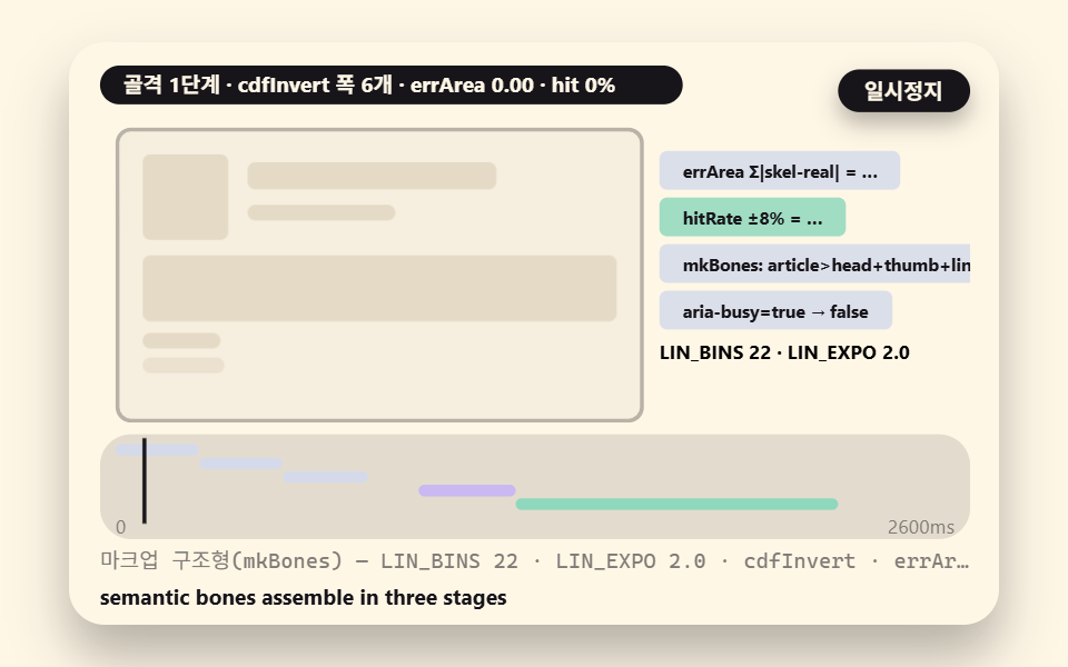 01 markup-anatomy-aria
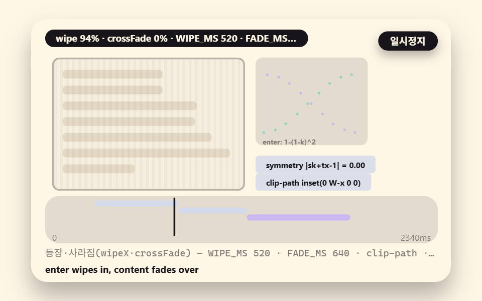 02 enter-exit-wipe-crossfade
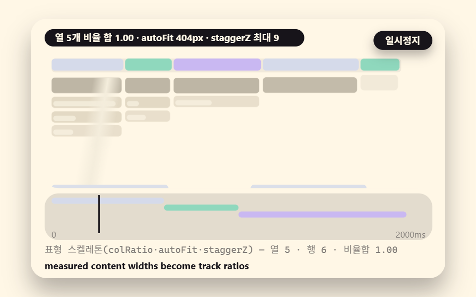 03 table-col-ratio-cells
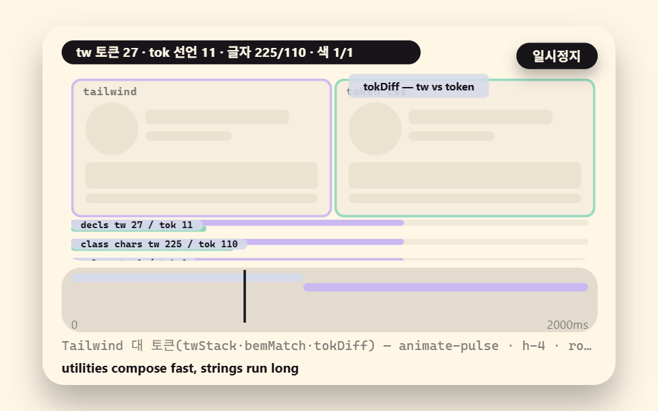 04 tailwind-utility-cost
 05 generator-param-output
 06 image-ratio-blurup
- 01 Markup Anatomy: Semantic Bones and aria-busy
- 02 Enter and Exit: The Crossfade-Wipe Symmetry
- 03 Table Skeleton: Column Ratios and Row Height Split
- 04 Tailwind Utilities: The animate-pulse Trade-off
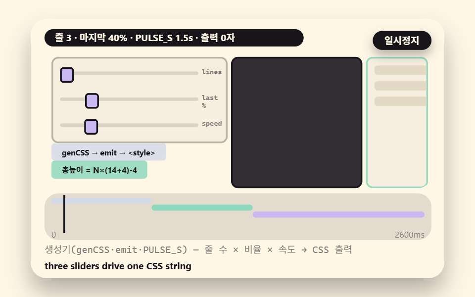
- 05 The Generator: Lines, Ratios, Speed into CSS Output
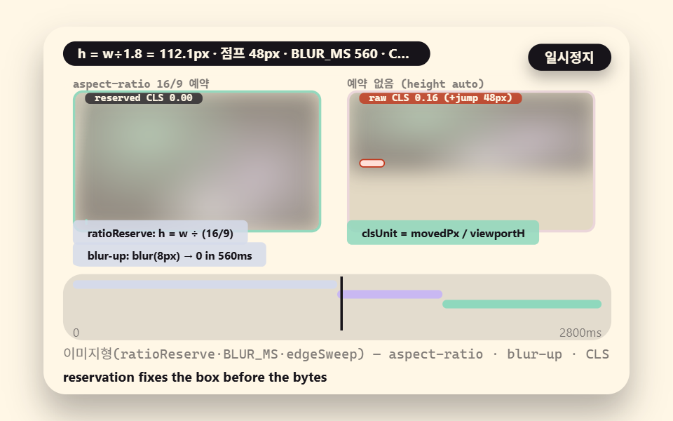
- 06 Image Skeleton: aspect-ratio Reservation and blur-up
Six scenes, one reserved layout underneath them
A skeleton screen is a stand-in drawn before the data arrives: gray bones occupying the same seats the finished content will take, so the page never flashes empty. What separates a good one from a stack of gray rectangles is that every dimension is computed from a rule the real content also follows — and that is what these six scenes demonstrate. Each one isolates a different calculation: scene 01 samples paragraph bar widths from a content-length distribution, scene 02 times the entry wipe against the exit crossfade, scene 03 fits table columns from measured ratios, scene 04 counts what utility classes actually cost, scene 05 emits ready-to-paste CSS from three parameters, and scene 06 reserves an image box with a width-over-height ratio so the layout never jumps.
What the page injects and what you measure
Nothing here touches the network. A seedHash function turns a seed into fixed random values, so the same seed rebuilds the same bones every run with no Math.random anywhere, and the demo strings are constants inside the source. Every number in the table below comes from a renderer capturing a two-second pass as 24 frames and reading motion from the 23 deltas between neighboring frames; area is the fraction of pixels that left their first-frame value at least once, intensity averages the color distance of those pixels on a 0-255 scale, and the moving-frame count tallies deltas that were nonzero at all.
What the last full render measured
| Scene | Focus | Accumulated area | Intensity | Moving frames |
|---|---|---|---|---|
| 01 | bar widths from a distribution | 10.8% | 65.6 | 23/23 |
| 02 | wipe-crossfade symmetry | 20.6% | 79.6 | 23/23 |
| 03 | column-ratio table fit | 26.1% | 54.6 | 23/23 |
| 04 | utility vs token cost meter | 13.3% | 106.2 | 23/23 |
| 05 | generator emitting CSS | 4.8% | 108.9 | 23/23 |
| 06 | aspect-ratio reservation | 26.9% | 44.3 | 23/23 |
All six scenes moved in every one of the 23 measured deltas, which is the point of a loading state: the screen should feel alive for the whole wait, not pulse once and settle. Scene 05 sits under the 10% area floor, an honest result rather than a defect — its stage is a small code panel typing text, and its 108.9 intensity is the highest of the six because typed glyphs flip dark-on-cream pixels hard. The under-10% allowance for a six-scene set is ceil(6/3) = 2, and only one scene spends it.
01How markup skeletons are built: semantic bones and aria-busy
The anatomy view for an article card: the bones assemble in stages — head block, thumbnail, then six paragraph bars — each bar's width mapped by cdfInvert through r^expo so widths cluster toward the short end the way real paragraph lengths do, the finished card carrying aria-busy so assistive tech hears loading rather than guessing from gray, and the measured real widths overlaying the bones with a mismatch band that shows exactly where the guess was wrong.
<main class="stage">
<div class="ez is-demo" id="ez">
  <div class="ez__in" data-role="inner">
    <div class="ez__pad" data-role="pad" tabindex="0" role="application" aria-label="Demo stage: Space or Enter pauses, R restarts, left and right arrows pick another value">
      <div class="ez__scene" data-role="scene" role="img" aria-label="A scene where an annotated article skeleton assembles, paragraph bar widths come from a measured distribution, then overlay real widths"></div>
      <div class="ez__probe" data-role="probe" aria-hidden="true"></div>
      <div class="ez__chart" data-role="chart" aria-hidden="true"></div>
      <p class="ez__status" data-role="status" aria-live="off">Scene ready</p>
      <p class="ez__reada" data-role="reada" aria-hidden="true"></p>
      <p class="ez__readb" data-role="readb" aria-hidden="true"></p>
      <div class="ez__ctrl">
        <button class="ez__pause" data-role="pause" type="button" aria-pressed="false">Pause</button>
… (총 18줄 — 아래 「전체 코드」에서 원문 전체)
// 535-01 마크업 구조형 스켈레톤 — 시맨틱 골격과 aria-busy (531 base 계승)
@use "../../../../site/static/demo-tokens" as *;
@include stage($subject-cream);
$panel: mix($subject-cream, $subject-ink, 88%);
$dim: mix($subject-cream, $subject-ink, 45%);
// 파스텔 액센트 — vivid 토큰 대신 (BD26)
$stroke-blue: #d5daea;
$stroke-rose: #ebd6db;
$stroke-mint: #8fd8bd;
$stroke-lilac: #c9b8f2;
… (총 267줄 — 아래 「전체 코드」에서 원문 전체)html, body {
margin: 0;
overflow: hidden;
}
.stage {
box-sizing: border-box;
min-height: 100vh;
display: grid;
place-items: center;
margin: 0;
background: #fff7e6;
… (총 344줄 — 아래 「전체 코드」에서 원문 전체)(function () {
const rootEl = document.getElementById("ez");
if (!rootEl) return;
main(rootEl);
function cx(s) { return s; }
function main(root) {
// ── 535 공통 — skeleton loading css 변형 엔진 (531 core 계승, 채팅 버블 대신 아티클 골격·CSS 조판 판)
const W = 480;
const CX0 = 8;
const CW = 432;
function clamp(v, lo, hi) { return v < lo ? lo : (v > hi ? hi : v); }
… (총 417줄 — 아래 「전체 코드」에서 원문 전체)// Skel01MarkupAnatomyAria - 같은 항목 vanilla index.html 의 React 판. 같은 계산을 useEffect 안에서 돌린다
import { useEffect, useRef } from "react";
import styles from "./Skel01MarkupAnatomyAria.module.scss";
const cx = (s: string): string => s.split(" ").map((n) => styles[n] ?? n).join(" ");
function main(root: HTMLElement): () => void {
// ── 535 공통 — skeleton loading css 변형 엔진 (531 core 계승, 채팅 버블 대신 아티클 골격·CSS 조판 판)
const W = 480;
const CX0 = 8;
const CW = 432;
… (총 442줄 — 아래 「전체 코드」에서 원문 전체)01 · Markup Anatomy: Semantic Bones and aria-busy — Measured area 10.763% · moving frames 23/23Original by GODRICH · SCSS and React ship in the zip · See the password
The width sampler is four lines of arithmetic next to a gamma sampler for the real side.
    function ema(prev, x, k) {
        return prev + (x - prev) * k;
    }
    // cdfInvert — inverse-CDF sampling. r^expo: with expo>1 the widths pile toward the short end
    function cdfInvert(r, expo, lo, hi) {
        return lo + (hi - lo) * Math.pow(r, expo);
    }
    function gammaSample(shape, scale, seed, i) {
        const d = shape - 1 / 3;
        const c = 1 / Math.sqrt(9 * d);
        let guard = 0;
        while (guard < 64) {
            guard += 1;
            const u1 = seedHash(i * 7 + guard, seed);
            const u2 = seedHash(i * 13 + guard * 5, seed);
            const rr = Math.sqrt(-2 * Math.log(Math.max(u1, 1e-9))) * Math.cos(6.28318 * u2);
            const v = Math.pow(1 + c * rr, 3);
            if (v <= 0) { continue; }
            const u3 = seedHash(i * 29 + guard * 11, seed);
            if (Math.log(Math.max(u3, 1e-9)) < 0.5 * rr * rr + d - d * v + d * Math.log(v)) {
                return d * v * scale;
            }
        }
        return shape * scale;
    }
The mismatch scoring runs on the same bars: an error area sums the absolute gap per paragraph and a hit rate counts bars landing within ±8% — so the width match reads as a number on screen instead of a feeling.
02What makes enter and exit effects differ: the crossfade-wipe symmetry
The transition view: the skeleton enters by a wipe — clipPath inset unwraps it from the left with pixel bars piling along the progress edge — while the content fades in over it through crossFade, the cubic polynomial k*k*(3-2k) that approximates the cubic-bezier(0.4, 0, 0.2, 1) ease, the two opacity curves drawn on one panel as mirrors of each other with the symmetry error — the absolute distance from sk + tx = 1 — printed live, and whichever curve finishes first sets the felt wait.
<main class="stage">
<div class="ez is-demo" id="ez">
  <div class="ez__in" data-role="inner">
    <div class="ez__pad" data-role="pad" tabindex="0" role="application" aria-label="Demo stage: Space or Enter pauses, R restarts, left and right arrows pick another value">
      <div class="ez__scene" data-role="scene" role="img" aria-label="A scene where the skeleton wipes in from the left, content crossfades over, and the two opacity curves mirror each other"></div>
      <div class="ez__probe" data-role="probe" aria-hidden="true"></div>
      <div class="ez__chart" data-role="chart" aria-hidden="true"></div>
      <p class="ez__status" data-role="status" aria-live="off">Scene ready</p>
      <p class="ez__reada" data-role="reada" aria-hidden="true"></p>
      <p class="ez__readb" data-role="readb" aria-hidden="true"></p>
      <div class="ez__ctrl">
        <button class="ez__pause" data-role="pause" type="button" aria-pressed="false">Pause</button>
… (총 18줄 — 아래 「전체 코드」에서 원문 전체)
// 535-02 등장·사라짐 이펙트 — 크로스페이드와 wipe 의 대칭 (531 base 계승)
@use "../../../../site/static/demo-tokens" as *;
@include stage($subject-cream);
$panel: mix($subject-cream, $subject-ink, 88%);
$dim: mix($subject-cream, $subject-ink, 45%);
$stroke-blue: #d5daea;
$stroke-rose: #ebd6db;
$stroke-mint: #8fd8bd;
$stroke-lilac: #c9b8f2;
… (총 286줄 — 아래 「전체 코드」에서 원문 전체)html, body {
margin: 0;
overflow: hidden;
}
.stage {
box-sizing: border-box;
min-height: 100vh;
display: grid;
place-items: center;
margin: 0;
background: #fff7e6;
… (총 348줄 — 아래 「전체 코드」에서 원문 전체)(function () {
const rootEl = document.getElementById("ez");
if (!rootEl) return;
main(rootEl);
function cx(s) { return s; }
function main(root) {
// ── 535 공통 — skeleton loading css 변형 엔진 (531 core 계승)
const W = 480;
const CX0 = 8;
const CW = 432;
function clamp(v, lo, hi) { return v < lo ? lo : (v > hi ? hi : v); }
… (총 384줄 — 아래 「전체 코드」에서 원문 전체)// Skel02EnterExitWipeCrossfade - 같은 항목 vanilla index.html 의 React 판. 같은 계산을 useEffect 안에서 돌린다
import { useEffect, useRef } from "react";
import styles from "./Skel02EnterExitWipeCrossfade.module.scss";
const cx = (s: string): string => s.split(" ").map((n) => styles[n] ?? n).join(" ");
function main(root: HTMLElement): () => void {
// ── 535 공통 — skeleton loading css 변형 엔진 (531 core 계승)
const W = 480;
const CX0 = 8;
const CW = 432;
… (총 409줄 — 아래 「전체 코드」에서 원문 전체)02 · Enter and Exit: The Crossfade-Wipe Symmetry — Measured area 20.578% · moving frames 23/23Original by GODRICH · SCSS and React ship in the zip · See the password
The timing ladder reads from four constants, and the edge gets its traction from a clamp.
        if (tt < T_IN) {
            enterK = 0;
        }
        else if (tt < T_IN + WIPE_MS) {
            enterK = clamp((tt - T_IN) / WIPE_MS, 0, 1);
        }
        else {
            enterK = 1;
        }
        // wipe progress edge — the clamp gives the edge traction (no sliding at the end)
        edgeX02 = PANEL_W * clamp(enterK * 1.12, 0, 1);
        skelPanel02.style.clipPath = 'inset(0 ' + (PANEL_W - edgeX02) + 'px 0 0)';
        if (edge02) {
            edge02.style.left = edgeX02 + 'px';
            edge02.style.opacity = enterK > 0.02 && enterK < 0.99 ? '1' : '0';
        }
        // pixel bar pile — stacked along the edge (brightness of the 3px bars near the edge)
        if (pileEl02) {
            const pile = 0.16 + 0.5 * Math.sin(enterK * 18) * (enterK > 0.02 && enterK < 0.98 ? 1 : 0);
            pileEl02.style.opacity = enterK > 0.02 && enterK < 0.98 ? String(clamp(pile, 0.15, 0.6)) : '0';
        }
        if (tt >= T_OUT) {
            exitK = clamp((tt - T_OUT) / FADE_MS, 0, 1);
        }
        const sk = 1 - crossFade(exitK);
The ladder in the source is T_IN 260ms, WIPE_MS 520ms, T_HOLD 420ms, then T_OUT = T_IN + WIPE_MS + T_HOLD, and the 640ms fade closes the cycle.
03How table skeletons are computed: column ratios and row height split
The data-table view: five columns carry measured content widths — 72, 48, 88, 96, and 40 pixels for name, status, amount, date, and admin — which colRatio normalizes into track ratios and autoFit distributes across the 404px table, its last line giving the final track total - used so the rounding residue has one home and the tracks always sum to exactly the table width with no 1px seam; cells are seated in a staggerZ diagonal order — row plus column — and each in-cell bar width is a gamma sample scaled by its column's ratio, so narrow columns get narrow bars without a special case.
<main class="stage">
<div class="ez is-demo" id="ez">
  <div class="ez__in" data-role="inner">
    <div class="ez__pad" data-role="pad" tabindex="0" role="application" aria-label="Demo stage: Space or Enter pauses, R restarts, left and right arrows pick another value">
      <div class="ez__scene" data-role="scene" role="img" aria-label="A scene where measured content widths normalize into table tracks and cells seat on the diagonal"></div>
      <div class="ez__probe" data-role="probe" aria-hidden="true"></div>
      <div class="ez__chart" data-role="chart" aria-hidden="true"></div>
      <p class="ez__status" data-role="status" aria-live="off">Scene ready</p>
      <p class="ez__reada" data-role="reada" aria-hidden="true"></p>
      <p class="ez__readb" data-role="readb" aria-hidden="true"></p>
      <div class="ez__ctrl">
        <button class="ez__pause" data-role="pause" type="button" aria-pressed="false">Pause</button>
… (총 18줄 — 아래 「전체 코드」에서 원문 전체)
// 535-03 표형 스켈레톤 — 열 비율과 행 높이 배분 (531 base 계승)
@use "../../../../site/static/demo-tokens" as *;
@include stage($subject-cream);
$panel: mix($subject-cream, $subject-ink, 88%);
$dim: mix($subject-cream, $subject-ink, 45%);
$stroke-blue: #d5daea;
$stroke-rose: #ebd6db;
$stroke-mint: #8fd8bd;
$stroke-lilac: #c9b8f2;
… (총 269줄 — 아래 「전체 코드」에서 원문 전체)html, body {
margin: 0;
overflow: hidden;
}
.stage {
box-sizing: border-box;
min-height: 100vh;
display: grid;
place-items: center;
margin: 0;
background: #fff7e6;
… (총 342줄 — 아래 「전체 코드」에서 원문 전체)(function () {
const rootEl = document.getElementById("ez");
if (!rootEl) return;
main(rootEl);
function cx(s) { return s; }
function main(root) {
// ── 535 공통 — skeleton loading css 변형 엔진 (531 core 계승)
const W = 480;
const CX0 = 8;
const CW = 432;
function clamp(v, lo, hi) { return v < lo ? lo : (v > hi ? hi : v); }
… (총 390줄 — 아래 「전체 코드」에서 원문 전체)// Skel03TableColRatioCells - 같은 항목 vanilla index.html 의 React 판. 같은 계산을 useEffect 안에서 돌린다
import { useEffect, useRef } from "react";
import styles from "./Skel03TableColRatioCells.module.scss";
const cx = (s: string): string => s.split(" ").map((n) => styles[n] ?? n).join(" ");
function main(root: HTMLElement): () => void {
// ── 535 공통 — skeleton loading css 변형 엔진 (531 core 계승)
const W = 480;
const CX0 = 8;
const CW = 432;
… (총 415줄 — 아래 「전체 코드」에서 원문 전체)03 · Table Skeleton: Column Ratios and Row Height Split — Measured area 26.054% · moving frames 23/23Original by GODRICH · SCSS and React ship in the zip · See the password
The fitter is a loop where one branch exists purely to absorb rounding error.
    function autoFit(ratios, total) {
        const out = [];
        let used = 0;
        for (let i = 0; i < ratios.length; i += 1) {
            if (i === ratios.length - 1) {
                out.push(total - used); // the last track absorbs the rounding residue
            }
            else {
                const w = Math.round(ratios[i] * total);
                out.push(w);
                used += w;
            }
        }
        return out;
    }
    function staggerZ(row, col) {
        return row + col;
    }
The header row is distinguished by fill rather than by a label, and a fit error term sums the distance between each track's pixel share and its ratio so the split is verifiable per column.
04What Tailwind skeletons buy you: the utility trade-off
The comparison view: one card skeleton built twice, side by side — the left from twStack utility strings, the right from bemMatch token classes — both pulsing in the same rhythm while a meter below counts declarations (each utility token roughly one), class length in characters, and distinct colors as overlapping bars. The utility side wins on authoring speed because the classes sit right in the markup; the token side wins on consistency because the four extra declarations the stylesheet carries are written once and reused.
<main class="stage">
<div class="ez is-demo" id="ez">
  <div class="ez__in" data-role="inner">
    <div class="ez__pad" data-role="pad" tabindex="0" role="application" aria-label="Demo stage: Space or Enter pauses, R restarts, left and right arrows pick another value">
      <div class="ez__scene" data-role="scene" role="img" aria-label="A scene where one card skeleton builds twice — Tailwind strings left, token classes right — and declaration, color, and length counts overlap as bars"></div>
      <div class="ez__probe" data-role="probe" aria-hidden="true"></div>
      <div class="ez__chart" data-role="chart" aria-hidden="true"></div>
      <p class="ez__status" data-role="status" aria-live="off">Scene ready</p>
      <p class="ez__reada" data-role="reada" aria-hidden="true"></p>
      <p class="ez__readb" data-role="readb" aria-hidden="true"></p>
      <div class="ez__ctrl">
        <button class="ez__pause" data-role="pause" type="button" aria-pressed="false">Pause</button>
… (총 18줄 — 아래 「전체 코드」에서 원문 전체)
// 535-04 Tailwind 유틸리티 — animate-pulse 구성의 득실 (531 base 계승)
@use "../../../../site/static/demo-tokens" as *;
@include stage($subject-cream);
$panel: mix($subject-cream, $subject-ink, 88%);
$dim: mix($subject-cream, $subject-ink, 45%);
$stroke-blue: #d5daea;
$stroke-rose: #ebd6db;
$stroke-mint: #8fd8bd;
$stroke-lilac: #c9b8f2;
… (총 293줄 — 아래 「전체 코드」에서 원문 전체)html, body {
margin: 0;
overflow: hidden;
}
.stage {
box-sizing: border-box;
min-height: 100vh;
display: grid;
place-items: center;
margin: 0;
background: #fff7e6;
… (총 371줄 — 아래 「전체 코드」에서 원문 전체)(function () {
const rootEl = document.getElementById("ez");
if (!rootEl) return;
main(rootEl);
function cx(s) { return s; }
function main(root) {
// ── 535 공통 — skeleton loading css 변형 엔진 (531 core 계승)
const W = 480;
const CX0 = 8;
const CW = 432;
function clamp(v, lo, hi) { return v < lo ? lo : (v > hi ? hi : v); }
… (총 390줄 — 아래 「전체 코드」에서 원문 전체)// Skel04TailwindUtilityCost - 같은 항목 vanilla index.html 의 React 판. 같은 계산을 useEffect 안에서 돌린다
import { useEffect, useRef } from "react";
import styles from "./Skel04TailwindUtilityCost.module.scss";
const cx = (s: string): string => s.split(" ").map((n) => styles[n] ?? n).join(" ");
function main(root: HTMLElement): () => void {
// ── 535 공통 — skeleton loading css 변형 엔진 (531 core 계승)
const W = 480;
const CX0 = 8;
const CW = 432;
… (총 415줄 — 아래 「전체 코드」에서 원문 전체)04 · Tailwind Utilities: The animate-pulse Trade-off — Measured area 13.308% · moving frames 23/23Original by GODRICH · SCSS and React ship in the zip · See the password
The counters are deliberately trivial, which is what makes them trustworthy, and for anyone arriving from a skeleton loader tailwind css build the meter reframes the choice: the utilities rename the skeleton, they do not change its rhythm or its geometry, and the pulse animation underneath is the same keyframes either way.
            for (let q = 0; q < parts.length; q += 1) {
                if (parts[q].length > 0) {
                    n += 1;
                }
            }
        }
        return n;
    }
    function classLen(strs) {
        let n = 0;
        for (let i = 0; i < strs.length; i += 1) {
            n += strs[i].length;
        }
        return n;
    }
    function distinctColors(strs) {
        // count of color-setting utilities/declarations — bg-*/text-*/border-* tokens
        const set = {};
        for (let i = 0; i < strs.length; i += 1) {
            const m = strs[i].match(/(bg|text|border)-[a-z0-9-]+/g);
            if (m) {
                for (let q = 0; q < m.length; q += 1) {
                    set[m[q]] = 1;
                }
            }
05What a generator computes: lines, ratios, speed into CSS output
The generator view: three sliders — line count, last-line ratio, pulse speed — drive genCSS to emit a complete, copyable stylesheet with a .skel-line selector, a :last-child width from the ratio and the keyframes themselves, the emitted text typing into a code panel character by character after a 700ms lead while a signature cache skips regeneration when the parameters have not changed. The output is not a mock — it binds straight into the preview card beside the panel, so the skeleton you watch pulsing is drawn by the CSS the generator just printed.
<main class="stage">
<div class="ez is-demo" id="ez">
  <div class="ez__in" data-role="inner">
    <div class="ez__pad" data-role="pad" tabindex="0" role="application" aria-label="Demo stage: Space or Enter pauses, R restarts, left and right arrows pick another value">
      <div class="ez__scene" data-role="scene" role="img" aria-label="A scene where line-count, ratio, and speed sliders regenerate CSS text typed into a code panel, and the preview card pulses with that very CSS"></div>
      <div class="ez__probe" data-role="probe" aria-hidden="true"></div>
      <div class="ez__chart" data-role="chart" aria-hidden="true"></div>
      <p class="ez__status" data-role="status" aria-live="off">Scene ready</p>
      <p class="ez__reada" data-role="reada" aria-hidden="true"></p>
      <p class="ez__readb" data-role="readb" aria-hidden="true"></p>
      <div class="ez__ctrl">
        <button class="ez__pause" data-role="pause" type="button" aria-pressed="false">Pause</button>
… (총 18줄 — 아래 「전체 코드」에서 원문 전체)
// 535-05 생성기 — 줄 수·비율·속도에서 CSS 출력까지 (531 base 계승)
@use "../../../../site/static/demo-tokens" as *;
@include stage($subject-cream);
$panel: mix($subject-cream, $subject-ink, 88%);
$dim: mix($subject-cream, $subject-ink, 45%);
$stroke-blue: #d5daea;
$stroke-rose: #ebd6db;
$stroke-mint: #8fd8bd;
$stroke-lilac: #c9b8f2;
… (총 285줄 — 아래 「전체 코드」에서 원문 전체)html, body {
margin: 0;
overflow: hidden;
}
.stage {
box-sizing: border-box;
min-height: 100vh;
display: grid;
place-items: center;
margin: 0;
background: #fff7e6;
… (총 360줄 — 아래 「전체 코드」에서 원문 전체)(function () {
const rootEl = document.getElementById("ez");
if (!rootEl) return;
main(rootEl);
function cx(s) { return s; }
function main(root) {
// ── 535 공통 — skeleton loading css 변형 엔진 (531 core 계승)
const W = 480;
const CX0 = 8;
const CW = 432;
function clamp(v, lo, hi) { return v < lo ? lo : (v > hi ? hi : v); }
… (총 367줄 — 아래 「전체 코드」에서 원문 전체)// Skel05GeneratorParamOutput - 같은 항목 vanilla index.html 의 React 판. 같은 계산을 useEffect 안에서 돌린다
import { useEffect, useRef } from "react";
import styles from "./Skel05GeneratorParamOutput.module.scss";
const cx = (s: string): string => s.split(" ").map((n) => styles[n] ?? n).join(" ");
function main(root: HTMLElement): () => void {
// ── 535 공통 — skeleton loading css 변형 엔진 (531 core 계승)
const W = 480;
const CX0 = 8;
const CW = 432;
… (총 393줄 — 아래 「전체 코드」에서 원문 전체)05 · The Generator: Lines, Ratios, Speed into CSS Output — Measured area 4.83% · moving frames 23/23Original by GODRICH · SCSS and React ship in the zip · See the password
The emitter is string assembly that shows the three live values — total height is N times the row height plus the gaps, so the preview and the output can never disagree about geometry, and if you would rather tune the values before copying, the same generator sits in the zip with its constants ready to edit.
        // selectors and declarations emitted as strings — exactly the paste-ready form
        let out = '.skel-line{height:' + ROW_H + 'px;margin-bottom:' + GAP_PX + 'px;border-radius:4px;background:#e3d9c4;animation:skel-pulse ' + f1(pulseS) + 's ease-in-out infinite}\n';
        out += '.skel-line:last-child{width:' + f0(last * 100) + '%}\n';
        out += '@keyframes skel-pulse{50%{opacity:.45}}';
        return out;
    }
    function emit(n, last, pulseS) {
        target05 = genCSS(n, last, pulseS);
        typed05 = '';
        lastEmit05 = 0;
    }
    function frame(t) {
        if (!codeEl05 || !prevEl05) {
            return '';
        }
        const tt = t % 2600;
        // slider values — N 3→6→4, last 0.4→0.7→0.55, pulse 1.5→2.4→1.9 within the cycle
        const presets = [
            [3, 0.40, 1.5],
            [6, 0.70, 2.4],
            [4, 0.55, 1.9]
        ];
        const pr = presets[piNow];
        const slideK = clamp(tt / 700, 0, 1);
06Why image skeletons hinge on size reservation: aspect-ratio and blur-up
The layout-shift view: the viewport width wobbles as if being resized — a sine of ±18px — while the reserved panel recalculates its height every frame through ratioReserve, width divided by the 16/9 ratio, so the box breathes without ever jumping; at T_ARRIVE 1400ms the image lands through a blur-up that resolves an 8px blur to zero over BLUR_MS 560ms, the unreserved panel beside it holds a flat 64px then jumps at the same instant, and each jump adds to a CLS counter through clsUnit — moved pixels over viewport area — so the two panels' difference accumulates as numbers, not just as a visible jolt.
<main class="stage">
<div class="ez is-demo" id="ez">
  <div class="ez__in" data-role="inner">
    <div class="ez__pad" data-role="pad" tabindex="0" role="application" aria-label="Demo stage: Space or Enter pauses, R restarts, left and right arrows pick another value">
      <div class="ez__scene" data-role="scene" role="img" aria-label="A scene where an aspect-ratio reserved box never jumps as the viewport changes, while an unreserved box jumps on image arrival and stacks its CLS bar"></div>
      <div class="ez__probe" data-role="probe" aria-hidden="true"></div>
      <div class="ez__chart" data-role="chart" aria-hidden="true"></div>
      <p class="ez__status" data-role="status" aria-live="off">Scene ready</p>
      <p class="ez__reada" data-role="reada" aria-hidden="true"></p>
      <p class="ez__readb" data-role="readb" aria-hidden="true"></p>
      <div class="ez__ctrl">
        <button class="ez__pause" data-role="pause" type="button" aria-pressed="false">Pause</button>
… (총 18줄 — 아래 「전체 코드」에서 원문 전체)
// 535-06 이미지형 — aspect-ratio 치수 예약과 blur-up (531 base 계승)
@use "../../../../site/static/demo-tokens" as *;
@include stage($subject-cream);
$panel: mix($subject-cream, $subject-ink, 88%);
$dim: mix($subject-cream, $subject-ink, 45%);
$stroke-blue: #d5daea;
$stroke-rose: #ebd6db;
$stroke-mint: #8fd8bd;
$stroke-lilac: #c9b8f2;
… (총 281줄 — 아래 「전체 코드」에서 원문 전체)html, body {
margin: 0;
overflow: hidden;
}
.stage {
box-sizing: border-box;
min-height: 100vh;
display: grid;
place-items: center;
margin: 0;
background: #fff7e6;
… (총 347줄 — 아래 「전체 코드」에서 원문 전체)(function () {
const rootEl = document.getElementById("ez");
if (!rootEl) return;
main(rootEl);
function cx(s) { return s; }
function main(root) {
// ── 535 공통 — skeleton loading css 변형 엔진 (531 core 계승)
const W = 480;
const CX0 = 8;
const CW = 432;
function clamp(v, lo, hi) { return v < lo ? lo : (v > hi ? hi : v); }
… (총 374줄 — 아래 「전체 코드」에서 원문 전체)// Skel06ImageRatioBlurup - 같은 항목 vanilla index.html 의 React 판. 같은 계산을 useEffect 안에서 돌린다
import { useEffect, useRef } from "react";
import styles from "./Skel06ImageRatioBlurup.module.scss";
const cx = (s: string): string => s.split(" ").map((n) => styles[n] ?? n).join(" ");
function main(root: HTMLElement): () => void {
// ── 535 공통 — skeleton loading css 변형 엔진 (531 core 계승)
const W = 480;
const CX0 = 8;
const CW = 432;
… (총 399줄 — 아래 「전체 코드」에서 원문 전체)06 · Image Skeleton: aspect-ratio Reservation and blur-up — Measured area 26.937% · moving frames 23/23Original by GODRICH · SCSS and React ship in the zip · See the password
Two small functions carry the whole argument.
    function clsUnit(movedPx, viewportH) {
        // CLS contribution = moved area / viewport area (web-vitals approximation — one element's vertical move)
        return movedPx / viewportH;
    }
    function frame(t) {
        if (!panelRes06 || !panelRaw06) {
            return '';
        }
        const tt = t % CYCLE;
        // viewport width wobble — resize-event approximation (±18px sine)
        viewW06 = 200 + Math.sin(tt / CYCLE * 6.28318) * 18;
        // left (reserved) — height always from ratioReserve, no jump
        const hRes = ratioReserve(viewW06, RATIO);
        panelRes06.style.width = viewW06 + 'px';
        panelRes06.style.height = hRes + 'px';
        // right (unreserved) — 64px before arrival, jumps to ratioReserve after
        const arrived = tt >= T_ARRIVE;
        const hRawFrom = 64;
        const hRawTo = ratioReserve(viewW06, RATIO);
        const jumpAt = T_ARRIVE;
        if (arrived && lastJump06 !== jumpAt) {
            lastJump06 = jumpAt;
            clsScore06 += clsUnit(Math.abs(hRawTo - hRawFrom), 300);
        }
The aspect-ratio property is the CSS-native version of ratioReserve — MDN documents that the box keeps its ratio under viewport changes, exactly what the reserved panel demonstrates while its neighbor's CLS bar stacks — and the blur-up pairs with it because a sharp swap after reservation still reads as a cut — the blur eases the arrival without moving the layout.
Where skeleton loading css breaks: uniform bars, asymmetric fades, seams
Uniform bars lie about the content
Six paragraph bars at identical width promise six equal paragraphs, and when the real text arrives the widths snap and the card shifts. Scene 01's distribution sampling exists to make the promise honest before the data arrives, and its mismatch band turns any drift into a visible stripe.
An asymmetric fade stretches the felt wait
Fading only the skeleton's opacity — or only the content's — leaves one layer covering the other, and the reader waits out both. Scene 02 keeps the two curves complementary so the handoff is one exchange, and the printed symmetry error stays near zero when the timing constants are left at their defaults.
Hardcoded percent columns open a 1px seam
Writing column widths as rounded percentages leaves each track with its own rounding residue, and the residues sum into a visible gap or an overflow at the last column. Scene 03's autoFit gives the residue a single home — the last track — so the table closes flush.
Skipping size reservation costs layout shift
An image slot with no reserved height holds whatever placeholder height was set, then jumps when the bitmap decodes. Scene 06 shows both panels under the same arrival event, and only one of them moves.
The complete sources for all six scenes, the Sass that styles them and the React ports are packed in a password-protected zip — the password to open it is dnnd2xmy, and the three swap values from the table below are written as comments next to their constants.
The screens that wait: feeds, dashboards, product grids
Most teams reach for a skeleton loader css pattern on three kinds of screens. A feed or article list wants scene 01's anatomy — a repeating card with head, thumb and paragraph bars whose widths follow the measured lengths of the real entries — and the mismatch band doubles as a cheap audit of the placeholder against production data. A data dashboard with tables maps onto scene 03, where the column ratios come from the actual content the API returns, and the diagonal stagger keeps the wait from reading as a wall. A product grid with images is scene 06 territory: reserve each tile's ratio, blur the real photo in, and the grid never reflows while thumbnails land.
The remaining scenes slot in by need. Scene 02's wipe-crossfade pair sharpens the moment a card's data resolves, and it belongs wherever the swap is user-visible rather than background. Scene 04 is for teams standing between a utility framework and a token system who need the cost shown rather than argued. Scene 05's generator is the fastest path from parameters to a paste-ready stylesheet for anyone who wants the skeleton loader css animation tuned to a brand's palette before writing a line by hand. Neighbor topics on this site carry related bones: AI answer skeletons handle progress estimation for generated replies, blur-up image loading goes deeper into image decode fallbacks, and streaming chat UI covers the typing rhythm that often replaces a skeleton once tokens arrive.
Turn three values and the bones change character
| Name | Value swapped | What changes |
|---|---|---|
| Hasty width distribution | scene 01 LIN_BINS 22 → 12, LIN_EXPO 2.0 → 2.9 | The histogram halves its bins and the exponent bends the pile harder onto short bars — the skeleton stops resembling real paragraphs and the mismatch band widens into the very layout shift you would ship |
| Slow exit effect | scene 02 WIPE_MS 520 → 980 | The wipe takes nearly twice as long, so the skeleton covers the content longer and the mirror between the two curves visibly breaks while the felt wait grows |
| Slow generator pulse | scene 05 PULSE_S 1.5s → 2.6s | The emitted animation's period stretches and the preview shimmer slows — the same bones, a different felt wait, compared live on the generator screen |
Each swap touches exactly one constant, and each sits in a different scene's source, so the three can be combined without interaction. The hasty distribution is the one to watch closely: it is the only swap that changes what the skeleton promises rather than how it moves, which is why the mismatch band is on screen to begin with.
Shape, label and one still frame: skeleton accessibility
Skeletons must never carry state by color alone. Every scene here separates its bones by shape — bars, table cells, boxes — and by label, and scene 01's card announces itself with aria-busy so a screen reader hears "loading" as a fact rather than inferring it from motion, following the ARIA pattern MDN documents for busy regions. Only meaning-changing events get announced: a status change or a generation completing is a single polite sentence, and per-frame figures — widths, symmetry error, CLS units — keep aria-live off, because a value that changes every frame would drown the reader in numbers.
Under prefers-reduced-motion, all six scenes read the media query through matchMedia at startup — verified in all six sources — and each responds the same way: the pulse and the wipe stop and one finished frame stays on screen, the bones replaced by content, with every state label and figure still present in the still. No information is lost to a reader who opted out of the motion. The reduced-motion override is three lines you can paste into any project:
@media (prefers-reduced-motion: reduce) {
  .ez * { animation: none !important; transition: none !important; }
}
Background reading: MDN on aspect-ratio, aria-busy and prefers-reduced-motion.
Questions to settle before shipping a skeleton screen
Can a skeleton loader css codepen demo be pasted straight into a product page?
Most of those demos draw one static card with fixed widths, which is fine for a hero slot and wrong for a repeating list — the widths never match real entries, so the swap causes a layout shift. The zip on this page carries all six scene sources with the swap values as comments, and each one runs as-is when pasted, with no libraries attached.
Do I need JavaScript, or is a CSS-only skeleton enough?
The pulse, the blur-up filter and the reservation are pure CSS, and a static skeleton needs nothing more. Distribution sampling, the timing ladder, the column fit and the generator are per-frame arithmetic in plain script — small functions, no dependencies — because none of them have a CSS-native equivalent.
How fast should the skeleton pulse run?
The generator's default is a 1.5s skel-pulse period, which reads as calm rather than urgent. Going slower — the 2.6s variant — suits screens with long waits, since a fast shimmer on a slow endpoint promises speed the network will not deliver.
You might also like
 Creative UITraffic Light CSS: 9 Demos With Queues and Waves
 Creative UICSS Sunset Gradient: 9 Demos With a Living Sky
 Creative UICSS Starfield: 9 Backgrounds Stars Fly Through
 GalleriesCSS Masonry Layout: 9 Ways to Pack Uneven Cards
 Creative UICSS Dither: 9 Scenes Drawn by Threshold Math
 InputsCSS Floating Label: 9 Inputs on Spring Physics
 GalleriesPortfolio Gallery HTML CSS: 9 UI Patterns
 InteractionsSocial Share Buttons: 9 Copy-Paste UI Patterns
 Interactions3D Hover Effect CSS: 9 Pointer-Following Scenes
 Creative UIAudio Visualizer JavaScript: 9 Parts, No Library