Gooey Effect CSS: 9 Threshold and Metaball Scenes
A gooey effect is a calculation: blur smears brightness and a contrast threshold slices it back, so approaching shapes merge into one blob and parting ones
The Gooey Effect Is a Threshold on Blurred Brightness, Not a Deformation of the Shape
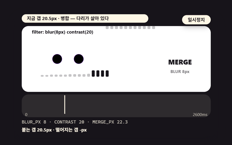 01 gy-basic-blur-contrast-threshold-button
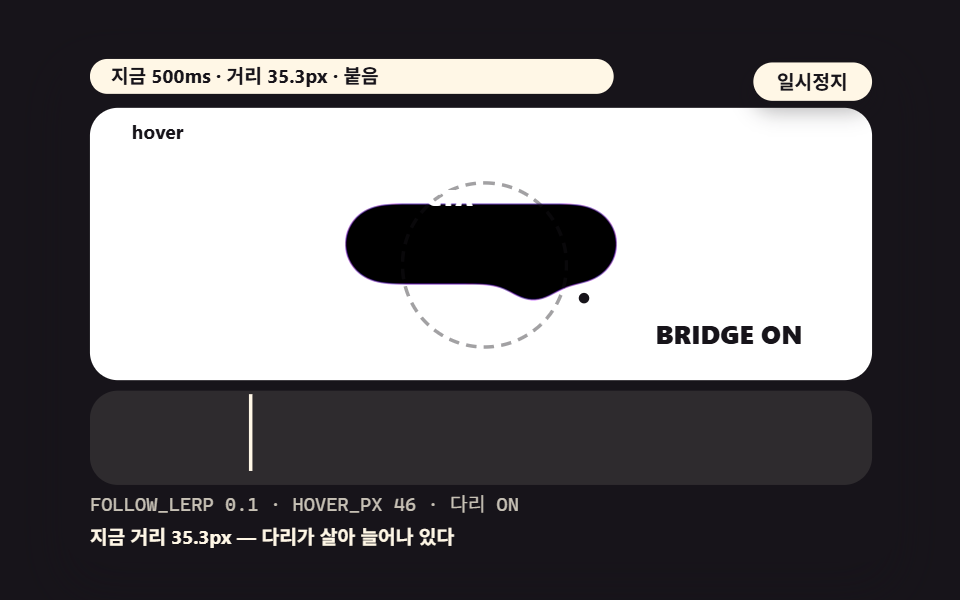 02 gy-hover-stretch-highlight-drag
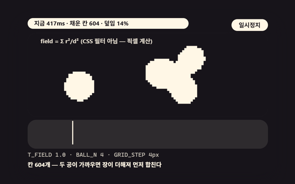 03 gy-metaball-loader-canvas-field
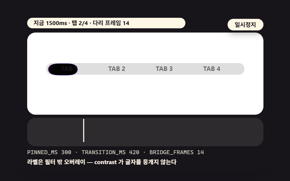 04 gy-tab-indicator-gooey-drag
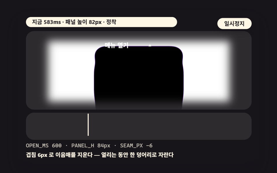 05 gy-dropdown-open-stretch
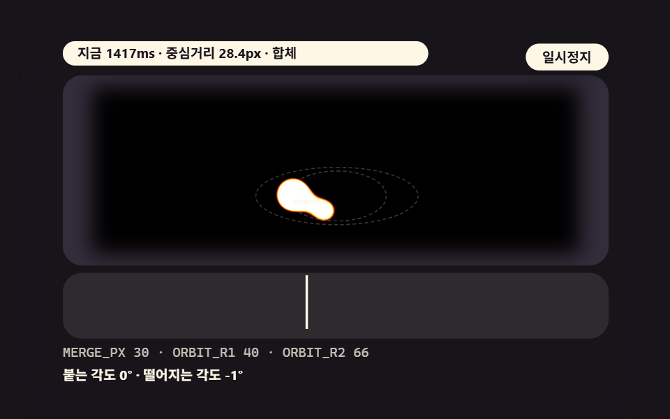 06 gy-orbit-merge-distance-field
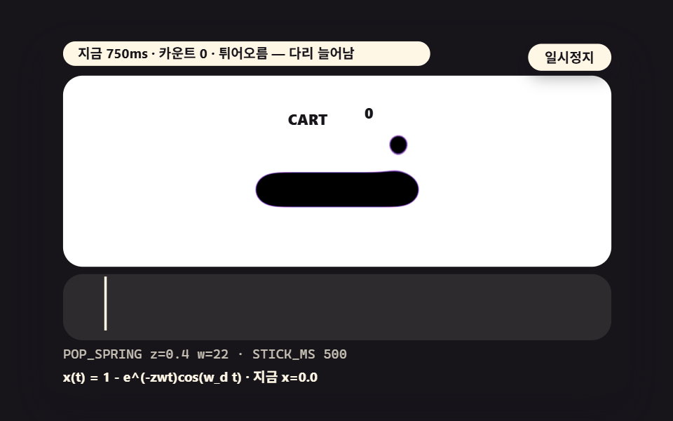 07 gy-badge-pop-stick-bottom
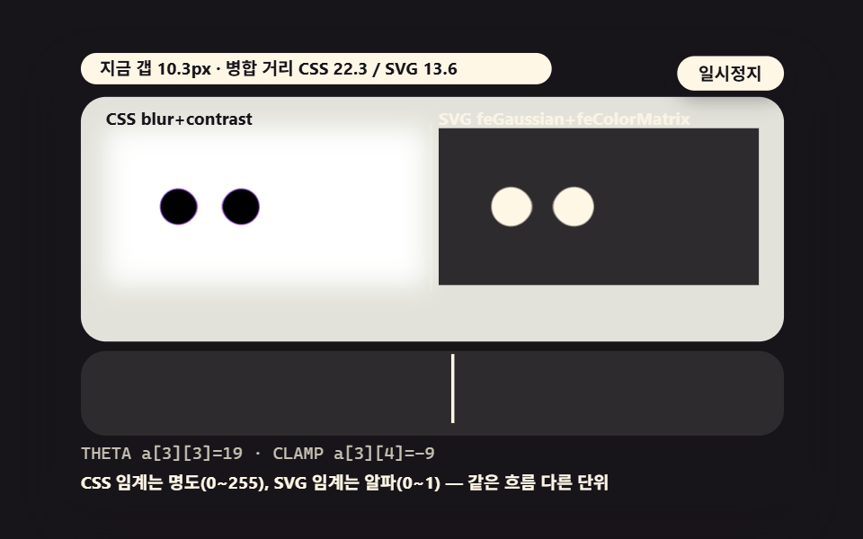 08 gy-svg-gaussian-colormatrix-vs-filter
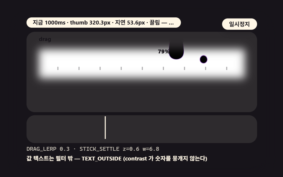 09 gy-slider-thumb-gooey-stick
- 01 A Blur-Contrast Threshold Button: the Smallest Unit of Stickiness
- 02 Hover-Stretch Highlight: Stickiness That Follows the Cursor
- 03 A Metaball Loader: Canvas Distance-Field Math
- 04 A Tab Indicator Dragged Along: a Transition With a Sticky Trail
- 05 Dropdown Open Stretch: a Panel Unfolding Stickily
- 06 Two Orbits Sticking: Distance-Based Merge Testing
- 07 A Bottom Badge Sticking: a Notification Dot Popping Stickily
- 08 The SVG Filter Camp: the feGaussianBlur+feColorMatrix Calculation Layer
- 09 A Slider Thumb Dragged Sticky: the Value Following Gooey
The word gooey means sticky, and on the web it names the moment two shapes grow a bridge between them as they approach and tear that bridge as they part. Nothing deforms a shape to produce it. Two filters do all the work, and the order they run in is the whole trick.
First blur() smears each shape's brightness outward in a Gaussian falloff. Then contrast() re-slices the smeared field around the 0.5 midpoint with a steep slope, binarizing it. Where the two smears overlap between approaching shapes, the sum stays above the threshold and survives as a bridge. Where a shape has moved away and its smear has thinned, brightness sinks below the threshold and dissolves back into the background.
The two camps come from the same idea. The CSS camp runs filter: blur(8px) contrast(20) on a container of plain shapes. The SVG camp runs feGaussianBlur followed by feColorMatrix with a thresholded alpha row. And a third road skips filters entirely — a canvas that computes a distance field per pixel and fills only the cells past the threshold, which is the classic metaball. All three appear in the nine scenes.
Filter order is what makes the threshold
In filter: blur(8px) contrast(20), the contrast slope decides where the binarizing cut lands. The cut sits at a luminance of 0.5 − 0.5/C, so C=20 puts it at 0.475 and the variant that lowers C to 12 puts it at 0.458 — probe math, not a render measurement, and scene 01 shows you where the cut lands on screen. Reverse the order and the sliced field gets blurred again, so the bridge survives half-thresholded and foggy instead of snapping solid. Blur first, contrast second, always.
How Do You Set the Threshold — Predicting the Merge Point From the Blur Radius
Once the contrast is fixed, the next question is practical: how many pixels apart can two shapes get before they stick? Scene 01 exists to answer it. Two ink blobs on a white layer sweep from a 40px gap down to 2px on a triangle wave, and the frame loop stamps the gap at every stick and every tear onto the stage.
The merge distance is an approximation you can compute before writing any markup
Scene 01 tests the bridge with MERGE_PX = r×0.9 + BLUR_PX×1.1, where r is the blob radius. At r=15 and blur 8px the merge distance is 22.3px; double the blur to 16px and it grows to 31.1px. Those are model values from a probe script. Each frame the scene compares the live gap against the formula, and a status strip under the blobs reports the current gap with a MERGE or SPLIT badge — so the approximation and the rendered bridge sit on the same screen and you can watch them agree.
The formula's two terms split the tuning work. The blur term dominates — doubling it added 8.8px of merge distance in the model — and the radius term shifts the floor. Scene 08 measures the same distance under the SVG camp's alpha threshold for comparison.
The nine scenes in measured numbers
The figures come from 도구/demo.py capturing each 480×300 stage in 24 frames and comparing the 23 deltas between adjacent frames. Cumulative area is the share of pixels that differ from the first frame at least once, intensity is the mean color distance of those pixels (0–255), and frames moved counts frames that differ from the previous one.
| Scene | Camp | Cumulative area | Mean intensity | Frames moved |
|---|---|---|---|---|
| 01 blur-contrast threshold button | CSS filter | 22.0% | 124.5 | 23/23 |
| 02 hover-stretch highlight | CSS filter | 20.2% | 121.8 | 23/23 |
| 03 metaball loader | canvas distance field | 20.7% | 193.3 | 23/23 |
| 04 tab indicator | CSS filter | 31.7% | 134.3 | 23/23 |
| 05 dropdown open | CSS filter | 10.6% | 157.9 | 23/23 |
| 06 two-orbit stick | CSS filter (inverted) | 14.9% | 141.3 | 23/23 |
| 07 bottom badge | CSS filter | 18.0% | 116.2 | 23/23 |
| 08 SVG camp comparison | SVG filter | 17.5% | 126.6 | 23/23 |
| 09 slider thumb | CSS filter | 10.7% | 135.8 | 23/23 |
All nine moved in 23/23 frames, so something is alive in every frame of every scene. The widest is 04 at 31.7% — the tab indicator drags a trail across the whole bar — and the narrowest are 05 and 09 at 10.6–10.7%, single-track scenes where one panel or one thumb moves. The highest intensity is 03 at 193.3, because the canvas loader fills its cells with saturated color against an empty ground. The numbers describe changes inside the capture box, not page performance. A note on how they got there: the component scenes reached these figures only after the state each one tracks — the badge trail, the orbit log, the background tone — was made to propagate, since a decoration that appears in the first frame only never enters a cumulative count.
When Do Two Shapes Stick — Reading Stickiness as a Distance You Can Dial
Knowing the merge distance turns a feel into a number — the dial that separates a heavy sticky effect css scene from a slick one. A bridge that comes alive from far away reads heavy and slow; a bridge that needs a near touch reads slick and light.
A larger blur sticks from farther away
At blur 8px the bridge forms at 22.3px; at 16px it forms at 31.1px — model values, same scene. The blob spends more of its travel joined, so the total amount of stickiness on screen grows. Halve the blur to 4px and the merge distance drops to 17.9px, a light touch.
A lower threshold makes a thicker, longer-lived bridge
Dropping contrast from 20 to 12 lowers the cut from 0.475 to 0.458, so fainter smear survives and the bridge is thicker at the same distance. When you want elements to read as attached longer, move this value first — the fine-tuning range is smaller than the blur's, and it does not push the merge distance around the way the blur does.
01A Blur-Contrast Threshold Button: the Smallest Unit of Stickiness
Demo and Explanation
Two ink blobs on a white layer sweep between a 40px and a 2px gap, sticking and tearing, while the scene logs each stick gap and tear gap below them. The ← and → keys toggle BLUR_PX between 8 and 16, so the same sweep splits into merge distances of 22.3px and 31.1px before your eyes — every idea in the post is already in this one snippet.
<main class="stage">
<div class="ez is-demo" id="ez">
  <div class="ez__in" data-role="inner">
    <div class="ez__pad" data-role="pad" tabindex="0" role="application" aria-label="Demo stage: Space or Enter pauses, R restarts, left and right arrows pick another value">
      <div class="ez__scene" data-role="scene" role="img" aria-label="Two ink blobs in a white gooey box: as they near, their blurs meet first and a bridge forms; as they part it sinks under the threshold"></div>
      <div class="ez__probe" data-role="probe" aria-hidden="true"></div>
      <div class="ez__chart" data-role="chart" aria-hidden="true"></div>
      <p class="ez__status" data-role="status" aria-live="off">Scene ready</p>
      <p class="ez__reada" data-role="reada" aria-hidden="true"></p>
      <p class="ez__readb" data-role="readb" aria-hidden="true"></p>
      <div class="ez__ctrl">
        <button class="ez__pause" data-role="pause" type="button" aria-pressed="false">Pause</button>
… (총 18줄 — 아래 「전체 코드」에서 원문 전체)
@use "../../../../site/static/demo-tokens" as *;
@include stage($stage-ink);
// gooey 장면 공통 — 먹 무대 위 파스텔 장식. gooey 계층 안은 명도가 기능이므로 순색만 (아래 .gy 참조)
$panel: mix($subject-cream, $subject-ink, 10%);
$grid: mix($subject-cream, $subject-ink, 7%);
$line: mix($subject-cream, $subject-ink, 26%);
$dim: mix($subject-cream, $subject-ink, 76%);
// 파스텔 장식 팔레트 — vivid 토큰(채도 .55+) 대신 이 값들을 쓴다 (BD26). gooey 계층 **안** 에는 못 쓴다
$stroke-blue: #d5daea; // $subject-blue 의 파스텔
$stroke-rose: #ebd6db; // 핑크 계열 파스텔
… (총 320줄 — 아래 「전체 코드」에서 원문 전체)html, body {
margin: 0;
overflow: hidden;
}
.stage {
box-sizing: border-box;
min-height: 100vh;
display: grid;
place-items: center;
margin: 0;
background: #17141a;
… (총 371줄 — 아래 「전체 코드」에서 원문 전체)(function () {
const rootEl = document.getElementById("ez");
if (!rootEl) return;
main(rootEl);
function cx(s) { return s; }
function main(root) {
// 무대 좌표 — 안쪽 상자는 늘 480x300 이고 화면 폭에 맞춰 통째로 줄인다
const W = 480;
const CX0 = 8;
const CW = 432;
const SVGW = 448;
const SVGH = 156;
… (총 445줄 — 아래 「전체 코드」에서 원문 전체)// GooeyThreshold - 같은 항목 vanilla index.html 의 React 판. 같은 계산을 useEffect 안에서 돌린다
import { useEffect, useRef } from "react";
import styles from "./GooeyThreshold.module.scss";
const cx = (s: string): string => s.split(" ").map((n) => styles[n] ?? n).join(" ");
function main(root: HTMLElement): () => void {
// 무대 좌표 — 안쪽 상자는 늘 480x300 이고 화면 폭에 맞춰 통째로 줄인다
const W = 480;
const CX0 = 8;
const CW = 432;
const SVGW = 448;
… (총 424줄 — 아래 「전체 코드」에서 원문 전체)01 · A Blur-Contrast Threshold Button: the Smallest Unit of Stickiness — Measured area 21.992% · moving frames 23/23Original by GODRICH · SCSS and React ship in the zip · See the password
Where to Look in the Code
    const BLUR_PX = 8;
    const CONTRAST = 20;
    const R = 15;
    const GAP_MAX = 40; // upper bound of the inner gap between blobs (px)
    const GAP_MIN = 2;
    const SWING_MS = 1300;
    const PRESETS = [8, 16]; // ←→ toggles BLUR_PX — the merge distance differs at the same gap
    let curBlur = 8;
    let gy = null;
    let aDot = null;
    let bDot = null;
    let gapNow = GAP_MAX;
    let stuck = false;
    let mergeGaps = [];
    let tearGaps = [];
The whole verdict is one line — stuck = gapNow < R * 0.9 + curBlur * 1.1 — and the badge and gap strip push that boolean out of the code and onto the screen.
02Hover-Stretch Highlight: Stickiness That Follows the Cursor
Demo and Explanation
A pill and a highlight blob share one filtered layer, and the highlight's center lerps toward the cursor with FOLLOW_LERP 0.12, growing and snapping a bridge between the two shapes; in the demo an automatic cursor traces a lemniscate so no input is needed. The upper bound of distance the highlight stays attached through is HOVER_PX 46, and BRIDGE_HOLD_MS 260 sets how long the bridge lingers over the threshold — the standard shape of a gooey hover effect on menu and CTA buttons.
<main class="stage">
<div class="ez is-demo" id="ez">
  <div class="ez__in" data-role="inner">
    <div class="ez__pad" data-role="pad" tabindex="0" role="application" aria-label="Demo stage: Space or Enter pauses, R restarts, left and right arrows pick another value">
      <div class="ez__scene" data-role="scene" role="img" aria-label="A pill and a highlight blob in one filtered layer stretch and stick as they follow the cursor"></div>
      <div class="ez__probe" data-role="probe" aria-hidden="true"></div>
      <div class="ez__chart" data-role="chart" aria-hidden="true"></div>
      <p class="ez__status" data-role="status" aria-live="off">Scene ready</p>
      <p class="ez__reada" data-role="reada" aria-hidden="true"></p>
      <p class="ez__readb" data-role="readb" aria-hidden="true"></p>
      <div class="ez__ctrl">
        <button class="ez__pause" data-role="pause" type="button" aria-pressed="false">Pause</button>
… (총 18줄 — 아래 「전체 코드」에서 원문 전체)
@use "../../../../site/static/demo-tokens" as *;
@include stage($stage-ink);
// gooey 장면 공통 — 먹 무대 위 파스텔 장식. gooey 계층 안은 명도가 기능이므로 순색만 (아래 .gy 참조)
$panel: mix($subject-cream, $subject-ink, 10%);
$grid: mix($subject-cream, $subject-ink, 7%);
$line: mix($subject-cream, $subject-ink, 26%);
$dim: mix($subject-cream, $subject-ink, 76%);
// 파스텔 장식 팔레트 — vivid 토큰(채도 .55+) 대신 이 값들을 쓴다 (BD26). gooey 계층 **안** 에는 못 쓴다
$stroke-blue: #d5daea; // $subject-blue 의 파스텔
$stroke-rose: #ebd6db; // 핑크 계열 파스텔
… (총 320줄 — 아래 「전체 코드」에서 원문 전체)html, body {
margin: 0;
overflow: hidden;
}
.stage {
box-sizing: border-box;
min-height: 100vh;
display: grid;
place-items: center;
margin: 0;
background: #17141a;
… (총 371줄 — 아래 「전체 코드」에서 원문 전체)(function () {
const rootEl = document.getElementById("ez");
if (!rootEl) return;
main(rootEl);
function cx(s) { return s; }
function main(root) {
// 무대 좌표 — 안쪽 상자는 늘 480x300 이고 화면 폭에 맞춰 통째로 줄인다
const W = 480;
const CX0 = 8;
const CW = 432;
const SVGW = 448;
const SVGH = 156;
… (총 417줄 — 아래 「전체 코드」에서 원문 전체)// HoverStretch - 같은 항목 vanilla index.html 의 React 판. 같은 계산을 useEffect 안에서 돌린다
import { useEffect, useRef } from "react";
import styles from "./HoverStretch.module.scss";
const cx = (s: string): string => s.split(" ").map((n) => styles[n] ?? n).join(" ");
function main(root: HTMLElement): () => void {
// 무대 좌표 — 안쪽 상자는 늘 480x300 이고 화면 폭에 맞춰 통째로 줄인다
const W = 480;
const CX0 = 8;
const CW = 432;
const SVGW = 448;
… (총 401줄 — 아래 「전체 코드」에서 원문 전체)02 · Hover-Stretch Highlight: Stickiness That Follows the Cursor — Measured area 20.234% · moving frames 23/23Original by GODRICH · SCSS and React ship in the zip · See the password
Where to Look in the Code
    const FOLLOW_LERP = 0.12;
    const LEMNISCATE = 70; // lemniscate width (px) — .is-demo auto cursor
    const HOVER_PX = 46; // upper distance the highlight stays attached to the pill
    const BRIDGE_HOLD_MS = 260; // how long the bridge stays above the threshold (chip)
    let gy = null;
    let pill = null;
    let hi = null;
    let curX = 0;
    let curY = 0;
    let hx = 0;
    let hy = 0;
    let ring = null;
    let cross = null;
    function frame(t) {
Raise the lerp to 0.3 and the highlight rides the cursor so closely that the bridge goes short and choppy; lower it to 0.05 and it trails far behind, stretching long and lazy — the coefficient, not the blur, is where this scene's feel lives.
03A Metaball Loader: Canvas Distance-Field Math
Demo and Explanation
On a 4px grid the canvas sums each nearby ball's r²/d² contribution and fills only the cells where the total crosses T_FIELD 1.0 — a field computed per pixel, not a CSS filter approximation, so no background constraint applies. When balls approach, their fields add and the blobs fuse before touching; the demo runs four balls on separate elliptical orbits — a 3-to-5-ball metaball that fills a loading screen's waiting time.
<main class="stage">
<div class="ez is-demo" id="ez">
  <div class="ez__in" data-role="inner">
    <div class="ez__pad" data-role="pad" tabindex="0" role="application" aria-label="Demo stage: Space or Enter pauses, R restarts, left and right arrows pick another value">
      <div class="ez__scene" data-role="scene" role="img" aria-label="Every canvas cell sums contributions from nearby balls and fills only cells past the threshold, so the balls merge and split"></div>
      <div class="ez__probe" data-role="probe" aria-hidden="true"></div>
      <div class="ez__chart" data-role="chart" aria-hidden="true"></div>
      <p class="ez__status" data-role="status" aria-live="off">Scene ready</p>
      <p class="ez__reada" data-role="reada" aria-hidden="true"></p>
      <p class="ez__readb" data-role="readb" aria-hidden="true"></p>
      <div class="ez__ctrl">
        <button class="ez__pause" data-role="pause" type="button" aria-pressed="false">Pause</button>
… (총 18줄 — 아래 「전체 코드」에서 원문 전체)
@use "../../../../site/static/demo-tokens" as *;
@include stage($stage-ink);
// gooey 장면 공통 — 먹 무대 위 파스텔 장식. gooey 계층 안은 명도가 기능이므로 순색만 (아래 .gy 참조)
$panel: mix($subject-cream, $subject-ink, 10%);
$grid: mix($subject-cream, $subject-ink, 7%);
$line: mix($subject-cream, $subject-ink, 26%);
$dim: mix($subject-cream, $subject-ink, 76%);
// 파스텔 장식 팔레트 — vivid 토큰(채도 .55+) 대신 이 값들을 쓴다 (BD26). gooey 계층 **안** 에는 못 쓴다
$stroke-blue: #d5daea; // $subject-blue 의 파스텔
$stroke-rose: #ebd6db; // 핑크 계열 파스텔
… (총 320줄 — 아래 「전체 코드」에서 원문 전체)html, body {
margin: 0;
overflow: hidden;
}
.stage {
box-sizing: border-box;
min-height: 100vh;
display: grid;
place-items: center;
margin: 0;
background: #17141a;
… (총 371줄 — 아래 「전체 코드」에서 원문 전체)(function () {
const rootEl = document.getElementById("ez");
if (!rootEl) return;
main(rootEl);
function cx(s) { return s; }
function main(root) {
// 무대 좌표 — 안쪽 상자는 늘 480x300 이고 화면 폭에 맞춰 통째로 줄인다
const W = 480;
const CX0 = 8;
const CW = 432;
const SVGW = 448;
const SVGH = 156;
… (총 399줄 — 아래 「전체 코드」에서 원문 전체)// MetaballLoader - 같은 항목 vanilla index.html 의 React 판. 같은 계산을 useEffect 안에서 돌린다
import { useEffect, useRef } from "react";
import styles from "./MetaballLoader.module.scss";
const cx = (s: string): string => s.split(" ").map((n) => styles[n] ?? n).join(" ");
function main(root: HTMLElement): () => void {
// 무대 좌표 — 안쪽 상자는 늘 480x300 이고 화면 폭에 맞춰 통째로 줄인다
const W = 480;
const CX0 = 8;
const CW = 432;
const SVGW = 448;
… (총 386줄 — 아래 「전체 코드」에서 원문 전체)03 · A Metaball Loader: Canvas Distance-Field Math — Measured area 20.692% · moving frames 23/23Original by GODRICH · SCSS and React ship in the zip · See the password
Where to Look in the Code
    const T_FIELD = 1.0;
    const BALL_N = 4;
    const GRID_STEP = 4;
    let cv = null;
    let ctx = null;
    let ballX = [];
    let ballY = [];
    let ballR = [];
    function build(_i) {
        const c = document.createElement('canvas');
        c.setAttribute('class', cx('cv'));
        c.width = 448;
        c.height = 156;
        scWrap.appendChild(c);
        cv = c;
        ctx = c.getContext('2d');
        ballX = [];
        ballY = [];
        ballR = [];
The inner loop is f += (ballR[k] * ballR[k]) / Math.max(d2, 1) over every ball, then if (f >= T_FIELD) fills the cell — two balls of radius 22 push the summed field past 1.0 once their centers come within 62.2px, a probe calculation of the model, not a render measurement.
04A Tab Indicator Dragged Along: a Transition With a Sticky Trail
Demo and Explanation
As the active tab blob moves to the next tab, a pinned afterimage stays at the old spot for PINNED_MS 300, then shrinks away over 150ms while the moving blob crosses in TRANSITION_MS 420 — the two blobs join through a threshold bridge and cut when the afterimage dies, so a tab switch reads as one sticky flow instead of a jump. Its render measurement of 31.7% cumulative area is the widest of the nine scenes.
<main class="stage">
<div class="ez is-demo" id="ez">
  <div class="ez__in" data-role="inner">
    <div class="ez__pad" data-role="pad" tabindex="0" role="application" aria-label="Demo stage: Space or Enter pauses, R restarts, left and right arrows pick another value">
      <div class="ez__scene" data-role="scene" role="img" aria-label="As the active tab blob moves on, a pinned afterimage stays behind and the two blobs join and cut through a bridge"></div>
      <div class="ez__probe" data-role="probe" aria-hidden="true"></div>
      <div class="ez__chart" data-role="chart" aria-hidden="true"></div>
      <p class="ez__status" data-role="status" aria-live="off">Scene ready</p>
      <p class="ez__reada" data-role="reada" aria-hidden="true"></p>
      <p class="ez__readb" data-role="readb" aria-hidden="true"></p>
      <div class="ez__ctrl">
        <button class="ez__pause" data-role="pause" type="button" aria-pressed="false">Pause</button>
… (총 18줄 — 아래 「전체 코드」에서 원문 전체)
@use "../../../../site/static/demo-tokens" as *;
@include stage($stage-ink);
// gooey 장면 공통 — 먹 무대 위 파스텔 장식. gooey 계층 안은 명도가 기능이므로 순색만 (아래 .gy 참조)
$panel: mix($subject-cream, $subject-ink, 10%);
$grid: mix($subject-cream, $subject-ink, 7%);
$line: mix($subject-cream, $subject-ink, 26%);
$dim: mix($subject-cream, $subject-ink, 76%);
// 파스텔 장식 팔레트 — vivid 토큰(채도 .55+) 대신 이 값들을 쓴다 (BD26). gooey 계층 **안** 에는 못 쓴다
$stroke-blue: #d5daea; // $subject-blue 의 파스텔
$stroke-rose: #ebd6db; // 핑크 계열 파스텔
… (총 320줄 — 아래 「전체 코드」에서 원문 전체)html, body {
margin: 0;
overflow: hidden;
}
.stage {
box-sizing: border-box;
min-height: 100vh;
display: grid;
place-items: center;
margin: 0;
background: #17141a;
… (총 371줄 — 아래 「전체 코드」에서 원문 전체)(function () {
const rootEl = document.getElementById("ez");
if (!rootEl) return;
main(rootEl);
function cx(s) { return s; }
function main(root) {
// 무대 좌표 — 안쪽 상자는 늘 480x300 이고 화면 폭에 맞춰 통째로 줄인다
const W = 480;
const CX0 = 8;
const CW = 432;
const SVGW = 448;
const SVGH = 156;
… (총 412줄 — 아래 「전체 코드」에서 원문 전체)// TabGooey - 같은 항목 vanilla index.html 의 React 판. 같은 계산을 useEffect 안에서 돌린다
import { useEffect, useRef } from "react";
import styles from "./TabGooey.module.scss";
const cx = (s: string): string => s.split(" ").map((n) => styles[n] ?? n).join(" ");
function main(root: HTMLElement): () => void {
// 무대 좌표 — 안쪽 상자는 늘 480x300 이고 화면 폭에 맞춰 통째로 줄인다
const W = 480;
const CX0 = 8;
const CW = 432;
const SVGW = 448;
… (총 399줄 — 아래 「전체 코드」에서 원문 전체)04 · A Tab Indicator Dragged Along: a Transition With a Sticky Trail — Measured area 31.737% · moving frames 23/23Original by GODRICH · SCSS and React ship in the zip · See the password
Where to Look in the Code
        if (prevDot) {
            const from = tabX(idx === 0 ? TABS - 1 : idx - 1);
            // afterimage — stays in place for PINNED_MS, then shrinks horizontally away over 150ms
            const since = t - t0;
            if (since < PINNED_MS) {
                put(prevDot, from - 32, 18, 64, 24);
                prevDot.style.opacity = '1';
            }
            else {
                const q = clamp((since - PINNED_MS) / 150, 0, 1);
                put(prevDot, from - 32 + q * 14, 18, 64 * (1 - q * 0.9), 24);
                prevDot.style.opacity = String(1 - q);
            }
            prevDot.style.borderRadius = '999px';
        }
The afterimage's dying shape is the calculation layer here — a plain fade would leave a hole in the middle of the crossing — and the tab labels sit on an overlay outside the filter, the rule the trap section returns to for smashed text.
05Dropdown Open Stretch: a Panel Unfolding Stickily
Demo and Explanation
A closed capsule and the panel about to open share one blur+contrast layer: raising the panel height from 0 to PANEL_H 84px over OPEN_MS 600 keeps the two joined by a bridge while the whole grows into a single mass, and a SEAM_PX −6 overlap erases the seam — for menus and filter panels that should unfold with material weight instead of popping into place. This scene is the deliberate exception to animating only transform and opacity: here the filter's per-frame recomputation of a growing form is the result itself, so height moves directly.
<main class="stage">
<div class="ez is-demo" id="ez">
  <div class="ez__in" data-role="inner">
    <div class="ez__pad" data-role="pad" tabindex="0" role="application" aria-label="Demo stage: Space or Enter pauses, R restarts, left and right arrows pick another value">
      <div class="ez__scene" data-role="scene" role="img" aria-label="A panel grows under its closed capsule, joining by a bridge into one sticky mass as it opens"></div>
      <div class="ez__probe" data-role="probe" aria-hidden="true"></div>
      <div class="ez__chart" data-role="chart" aria-hidden="true"></div>
      <p class="ez__status" data-role="status" aria-live="off">Scene ready</p>
      <p class="ez__reada" data-role="reada" aria-hidden="true"></p>
      <p class="ez__readb" data-role="readb" aria-hidden="true"></p>
      <div class="ez__ctrl">
        <button class="ez__pause" data-role="pause" type="button" aria-pressed="false">Pause</button>
… (총 18줄 — 아래 「전체 코드」에서 원문 전체)
@use "../../../../site/static/demo-tokens" as *;
@include stage($stage-ink);
// gooey 장면 공통 — 먹 무대 위 파스텔 장식. gooey 계층 안은 명도가 기능이므로 순색만 (아래 .gy 참조)
$panel: mix($subject-cream, $subject-ink, 10%);
$grid: mix($subject-cream, $subject-ink, 7%);
$line: mix($subject-cream, $subject-ink, 26%);
$dim: mix($subject-cream, $subject-ink, 76%);
// 파스텔 장식 팔레트 — vivid 토큰(채도 .55+) 대신 이 값들을 쓴다 (BD26). gooey 계층 **안** 에는 못 쓴다
$stroke-blue: #d5daea; // $subject-blue 의 파스텔
$stroke-rose: #ebd6db; // 핑크 계열 파스텔
… (총 320줄 — 아래 「전체 코드」에서 원문 전체)html, body {
margin: 0;
overflow: hidden;
}
.stage {
box-sizing: border-box;
min-height: 100vh;
display: grid;
place-items: center;
margin: 0;
background: #17141a;
… (총 371줄 — 아래 「전체 코드」에서 원문 전체)(function () {
const rootEl = document.getElementById("ez");
if (!rootEl) return;
main(rootEl);
function cx(s) { return s; }
function main(root) {
// 무대 좌표 — 안쪽 상자는 늘 480x300 이고 화면 폭에 맞춰 통째로 줄인다
const W = 480;
const CX0 = 8;
const CW = 432;
const SVGW = 448;
const SVGH = 156;
… (총 390줄 — 아래 「전체 코드」에서 원문 전체)// DropdownStretch - 같은 항목 vanilla index.html 의 React 판. 같은 계산을 useEffect 안에서 돌린다
import { useEffect, useRef } from "react";
import styles from "./DropdownStretch.module.scss";
const cx = (s: string): string => s.split(" ").map((n) => styles[n] ?? n).join(" ");
function main(root: HTMLElement): () => void {
// 무대 좌표 — 안쪽 상자는 늘 480x300 이고 화면 폭에 맞춰 통째로 줄인다
const W = 480;
const CX0 = 8;
const CW = 432;
const SVGW = 448;
… (총 382줄 — 아래 「전체 코드」에서 원문 전체)05 · Dropdown Open Stretch: a Panel Unfolding Stickily — Measured area 10.648% · moving frames 23/23Original by GODRICH · SCSS and React ship in the zip · See the password
Where to Look in the Code
    function frame(t) {
        const cyc = OPEN_MS + HOLD;
        const ph = t % (cyc * 2);
        const open = ph < cyc;
        const p = open ? clamp(ph / OPEN_MS, 0, 1) : clamp((ph - cyc) / OPEN_MS, 0, 1);
        const hp = open ? p : 1 - p; // the open and close curves are symmetric
        if (panel) {
            // filter recomputation is the protagonist, so height moves directly — the exception to transform
            const h = PANEL_H * hp;
            put(panel, 90, 46 + SEAM_PX * hp, 180, Math.max(0, h));
        }
The closing curve replays the opening curve reversed, so tuning one curve tunes both.
06Two Orbits Sticking: Distance-Based Merge Testing
Demo and Explanation
Two circles ride different orbits (ORBIT_R1 40, ORBIT_R2 66) and merge whenever their center distance narrows under MERGE_PX 30, splitting as they part — the stick and tear angles are logged every cycle. The layer is inverted — cream blobs on a pure black field — so the scene carries over to dark screens unchanged; it is the shape for hero backgrounds and intros where the geometry has to stay visibly alive.
<main class="stage">
<div class="ez is-demo" id="ez">
  <div class="ez__in" data-role="inner">
    <div class="ez__pad" data-role="pad" tabindex="0" role="application" aria-label="Demo stage: Space or Enter pauses, R restarts, left and right arrows pick another value">
      <div class="ez__scene" data-role="scene" role="img" aria-label="In a pure-black gooey box, two circles on separate orbits merge as their center distance narrows and split as it widens"></div>
      <div class="ez__probe" data-role="probe" aria-hidden="true"></div>
      <div class="ez__chart" data-role="chart" aria-hidden="true"></div>
      <p class="ez__status" data-role="status" aria-live="off">Scene ready</p>
      <p class="ez__reada" data-role="reada" aria-hidden="true"></p>
      <p class="ez__readb" data-role="readb" aria-hidden="true"></p>
      <div class="ez__ctrl">
        <button class="ez__pause" data-role="pause" type="button" aria-pressed="false">Pause</button>
… (총 18줄 — 아래 「전체 코드」에서 원문 전체)
@use "../../../../site/static/demo-tokens" as *;
@include stage($stage-ink);
// gooey 장면 공통 — 먹 무대 위 파스텔 장식. gooey 계층 안은 명도가 기능이므로 순색만 (아래 .gy 참조)
$panel: mix($subject-cream, $subject-ink, 10%);
$grid: mix($subject-cream, $subject-ink, 7%);
$line: mix($subject-cream, $subject-ink, 26%);
$dim: mix($subject-cream, $subject-ink, 76%);
// 파스텔 장식 팔레트 — vivid 토큰(채도 .55+) 대신 이 값들을 쓴다 (BD26). gooey 계층 **안** 에는 못 쓴다
$stroke-blue: #d5daea; // $subject-blue 의 파스텔
$stroke-rose: #ebd6db; // 핑크 계열 파스텔
… (총 320줄 — 아래 「전체 코드」에서 원문 전체)html, body {
margin: 0;
overflow: hidden;
}
.stage {
box-sizing: border-box;
min-height: 100vh;
display: grid;
place-items: center;
margin: 0;
background: #17141a;
… (총 371줄 — 아래 「전체 코드」에서 원문 전체)(function () {
const rootEl = document.getElementById("ez");
if (!rootEl) return;
main(rootEl);
function cx(s) { return s; }
function main(root) {
// 무대 좌표 — 안쪽 상자는 늘 480x300 이고 화면 폭에 맞춰 통째로 줄인다
const W = 480;
const CX0 = 8;
const CW = 432;
const SVGW = 448;
const SVGH = 156;
… (총 412줄 — 아래 「전체 코드」에서 원문 전체)// OrbitMerge - 같은 항목 vanilla index.html 의 React 판. 같은 계산을 useEffect 안에서 돌린다
import { useEffect, useRef } from "react";
import styles from "./OrbitMerge.module.scss";
const cx = (s: string): string => s.split(" ").map((n) => styles[n] ?? n).join(" ");
function main(root: HTMLElement): () => void {
// 무대 좌표 — 안쪽 상자는 늘 480x300 이고 화면 폭에 맞춰 통째로 줄인다
const W = 480;
const CX0 = 8;
const CW = 432;
const SVGW = 448;
… (총 389줄 — 아래 「전체 코드」에서 원문 전체)06 · Two Orbits Sticking: Distance-Based Merge Testing — Measured area 14.889% · moving frames 23/23Original by GODRICH · SCSS and React ship in the zip · See the password
Where to Look in the Code
    const MERGE_PX = 30;
    const ORBIT_R1 = 40;
    const ORBIT_R2 = 66;
    const BLUR6 = 8;
    const CONTRAST6 = 20;
    let gy = null;
    let c1 = null;
    let c2 = null;
    let stuck = false;
    let stickAngles = [];
    let tearAngles = [];
    function build(_i) {
        gy = make('div', 'gy gy--dark', scWrap);
        put(gy, 24, 10, 400, 136);
        gy.style.borderRadius = '0';
        c1 = make('i', '', gy);
        c2 = make('i', '', gy);
The verdict is Math.hypot(x2 - x1, y2 - y1) compared against MERGE_PX, one line — when the orbit radii spread farther apart than the two circles' combined size, sticks per revolution drop, and if you want more frequent sticking, narrowing the radius gap is easier to predict than raising MERGE_PX.
07A Bottom Badge Sticking: a Notification Dot Popping Stickily
Demo and Explanation
Each time the count rises, the badge blob pops up on a damped spring and sticks to its host through a blur+contrast bridge, settling after STICK_MS 500 — cart and notification feedback that says the number is alive. The spring is the closed-form damped oscillation with damping ratio POP_SPRING_Z 0.35 and natural frequency POP_SPRING_W 22, and the count climbs to COUNT_MAX 9, with gooey effect ui stickiness layered on top.
<main class="stage">
<div class="ez is-demo" id="ez">
  <div class="ez__in" data-role="inner">
    <div class="ez__pad" data-role="pad" tabindex="0" role="application" aria-label="Demo stage: Space or Enter pauses, R restarts, left and right arrows pick another value">
      <div class="ez__scene" data-role="scene" role="img" aria-label="Each time the count rises, the badge pops up on a damped oscillation and sticks to its host through a bridge before settling"></div>
      <div class="ez__probe" data-role="probe" aria-hidden="true"></div>
      <div class="ez__chart" data-role="chart" aria-hidden="true"></div>
      <p class="ez__status" data-role="status" aria-live="off">Scene ready</p>
      <p class="ez__reada" data-role="reada" aria-hidden="true"></p>
      <p class="ez__readb" data-role="readb" aria-hidden="true"></p>
      <div class="ez__ctrl">
        <button class="ez__pause" data-role="pause" type="button" aria-pressed="false">Pause</button>
… (총 18줄 — 아래 「전체 코드」에서 원문 전체)
@use "../../../../site/static/demo-tokens" as *;
@include stage($stage-ink);
// gooey 장면 공통 — 먹 무대 위 파스텔 장식. gooey 계층 안은 명도가 기능이므로 순색만 (아래 .gy 참조)
$panel: mix($subject-cream, $subject-ink, 10%);
$grid: mix($subject-cream, $subject-ink, 7%);
$line: mix($subject-cream, $subject-ink, 26%);
$dim: mix($subject-cream, $subject-ink, 76%);
// 파스텔 장식 팔레트 — vivid 토큰(채도 .55+) 대신 이 값들을 쓴다 (BD26). gooey 계층 **안** 에는 못 쓴다
$stroke-blue: #d5daea; // $subject-blue 의 파스텔
$stroke-rose: #ebd6db; // 핑크 계열 파스텔
… (총 320줄 — 아래 「전체 코드」에서 원문 전체)html, body {
margin: 0;
overflow: hidden;
}
.stage {
box-sizing: border-box;
min-height: 100vh;
display: grid;
place-items: center;
margin: 0;
background: #17141a;
… (총 371줄 — 아래 「전체 코드」에서 원문 전체)(function () {
const rootEl = document.getElementById("ez");
if (!rootEl) return;
main(rootEl);
function cx(s) { return s; }
function main(root) {
// 무대 좌표 — 안쪽 상자는 늘 480x300 이고 화면 폭에 맞춰 통째로 줄인다
const W = 480;
const CX0 = 8;
const CW = 432;
const SVGW = 448;
const SVGH = 156;
… (총 426줄 — 아래 「전체 코드」에서 원문 전체)// BadgePop - 같은 항목 vanilla index.html 의 React 판. 같은 계산을 useEffect 안에서 돌린다
import { useEffect, useRef } from "react";
import styles from "./BadgePop.module.scss";
const cx = (s: string): string => s.split(" ").map((n) => styles[n] ?? n).join(" ");
function main(root: HTMLElement): () => void {
// 무대 좌표 — 안쪽 상자는 늘 480x300 이고 화면 폭에 맞춰 통째로 줄인다
const W = 480;
const CX0 = 8;
const CW = 432;
const SVGW = 448;
… (총 412줄 — 아래 「전체 코드」에서 원문 전체)07 · A Bottom Badge Sticking: a Notification Dot Popping Stickily — Measured area 17.983% · moving frames 23/23Original by GODRICH · SCSS and React ship in the zip · See the password
Where to Look in the Code
    function springX(tms) {
        // x(t) = 1 - e^(-zwt) cos(w_d t)  — damped oscillation (the extra layer of math)
        const z = POP_SPRING_Z;
        const w = POP_SPRING_W / 1000;
        const wd = w * Math.sqrt(Math.max(0.0001, 1 - z * z));
        const ts = tms / 1000;
        return 1 - Math.exp(-z * w * ts) * Math.cos(wd * ts);
    }
The bounce is the analytic solution itself — time in, position out, a pure function with no state to manage — and the damping ratio 0.35 means one or two overshoots before settling, which keeps an alert from feeling aggressive; for more wobble, lower the ratio toward 0.2 rather than raising the frequency, so the bridge takes a natural shock instead of a fast one.
09A Slider Thumb Dragged Sticky: the Value Following Gooey
Demo and Explanation
The thumb and the value-readout blob share one filtered layer: dragging stretches and shrinks the bridge between them, and releasing settles the readout onto the thumb on a spring (STICK_SETTLE) — a range input where the selection feels physical. The value text stays outside the filter, exactly as the TEXT_OUTSIDE chip names it, so the contrast never smashes the digits.
<main class="stage">
<div class="ez is-demo" id="ez">
  <div class="ez__in" data-role="inner">
    <div class="ez__pad" data-role="pad" tabindex="0" role="application" aria-label="Demo stage: Space or Enter pauses, R restarts, left and right arrows pick another value">
      <div class="ez__scene" data-role="scene" role="img" aria-label="Dragging the slider thumb stretches a bridge to the value blob, and releasing settles it on with a spring"></div>
      <div class="ez__probe" data-role="probe" aria-hidden="true"></div>
      <div class="ez__chart" data-role="chart" aria-hidden="true"></div>
      <p class="ez__status" data-role="status" aria-live="off">Scene ready</p>
      <p class="ez__reada" data-role="reada" aria-hidden="true"></p>
      <p class="ez__readb" data-role="readb" aria-hidden="true"></p>
      <div class="ez__ctrl">
        <button class="ez__pause" data-role="pause" type="button" aria-pressed="false">Pause</button>
… (총 18줄 — 아래 「전체 코드」에서 원문 전체)
@use "../../../../site/static/demo-tokens" as *;
@include stage($stage-ink);
// gooey 장면 공통 — 먹 무대 위 파스텔 장식. gooey 계층 안은 명도가 기능이므로 순색만 (아래 .gy 참조)
$panel: mix($subject-cream, $subject-ink, 10%);
$grid: mix($subject-cream, $subject-ink, 7%);
$line: mix($subject-cream, $subject-ink, 26%);
$dim: mix($subject-cream, $subject-ink, 76%);
// 파스텔 장식 팔레트 — vivid 토큰(채도 .55+) 대신 이 값들을 쓴다 (BD26). gooey 계층 **안** 에는 못 쓴다
$stroke-blue: #d5daea; // $subject-blue 의 파스텔
$stroke-rose: #ebd6db; // 핑크 계열 파스텔
… (총 320줄 — 아래 「전체 코드」에서 원문 전체)html, body {
margin: 0;
overflow: hidden;
}
.stage {
box-sizing: border-box;
min-height: 100vh;
display: grid;
place-items: center;
margin: 0;
background: #17141a;
… (총 371줄 — 아래 「전체 코드」에서 원문 전체)(function () {
const rootEl = document.getElementById("ez");
if (!rootEl) return;
main(rootEl);
function cx(s) { return s; }
function main(root) {
// 무대 좌표 — 안쪽 상자는 늘 480x300 이고 화면 폭에 맞춰 통째로 줄인다
const W = 480;
const CX0 = 8;
const CW = 432;
const SVGW = 448;
const SVGH = 156;
… (총 422줄 — 아래 「전체 코드」에서 원문 전체)// SliderStick - 같은 항목 vanilla index.html 의 React 판. 같은 계산을 useEffect 안에서 돌린다
import { useEffect, useRef } from "react";
import styles from "./SliderStick.module.scss";
const cx = (s: string): string => s.split(" ").map((n) => styles[n] ?? n).join(" ");
function main(root: HTMLElement): () => void {
// 무대 좌표 — 안쪽 상자는 늘 480x300 이고 화면 폭에 맞춰 통째로 줄인다
const W = 480;
const CX0 = 8;
const CW = 432;
const SVGW = 448;
… (총 395줄 — 아래 「전체 코드」에서 원문 전체)09 · A Slider Thumb Dragged Sticky: the Value Following Gooey — Measured area 10.653% · moving frames 23/23Original by GODRICH · SCSS and React ship in the zip · See the password
Where to Look in the Code
    const DRAG_LERP = 0.30;
    function frame(t) {
        const cyc = 3000;
        const ph = (t % cyc) / cyc;
        // thumb auto round trip (sine easing) — a brief hold at each end (settle section)
        const hold = 0.08;
        let u;
        if (ph < 0.42) {
            u = ph / 0.42;
        }
        else if (ph < 0.5) {
            u = 1;
        }
        else if (ph < 0.92) {
            u = 1 - (ph - 0.5) / 0.42;
        }
        else {
            u = 0;
        }
        void hold;
        tx = 60 + u * 328;
        vx += (tx - vx) * DRAG_LERP;
The stickiness is a two-stage delay: the thumb eases toward its target and the readout lerps after the thumb again (DRAG_LERP 0.30) — the extra beat the readout spends catching up is exactly the time the bridge survives, and that surplus delay is the drag's tactile feel.
08The SVG Filter Camp: the feGaussianBlur+feColorMatrix Calculation Layer
Demo and Explanation
The same two-blob scene runs side by side — left, CSS blur+contrast slicing luminance; right, feGaussianBlur stdDeviation 8 followed by an feColorMatrix alpha-row threshold. The camps' merge distances, by probe calculation, are 22.3px for CSS and 13.6px for SVG — a MERGE_DELTA of 8.7px, which is the distance the two approximation formulas disagree by and nothing more: the flow of merge and tear is the same.
<main class="stage">
<div class="ez is-demo" id="ez">
  <div class="ez__in" data-role="inner">
    <div class="ez__pad" data-role="pad" tabindex="0" role="application" aria-label="Demo stage: Space or Enter pauses, R restarts, left and right arrows pick another value">
      <div class="ez__scene" data-role="scene" role="img" aria-label="The CSS blur+contrast approximation and an SVG feGaussianBlur+feColorMatrix alpha threshold run the same scene side by side"></div>
      <div class="ez__probe" data-role="probe" aria-hidden="true"></div>
      <div class="ez__chart" data-role="chart" aria-hidden="true"></div>
      <p class="ez__status" data-role="status" aria-live="off">Scene ready</p>
      <p class="ez__reada" data-role="reada" aria-hidden="true"></p>
      <p class="ez__readb" data-role="readb" aria-hidden="true"></p>
      <div class="ez__ctrl">
        <button class="ez__pause" data-role="pause" type="button" aria-pressed="false">Pause</button>
… (총 18줄 — 아래 「전체 코드」에서 원문 전체)
@use "../../../../site/static/demo-tokens" as *;
@include stage($stage-ink);
// gooey 장면 공통 — 먹 무대 위 파스텔 장식. gooey 계층 안은 명도가 기능이므로 순색만 (아래 .gy 참조)
$panel: mix($subject-cream, $subject-ink, 10%);
$grid: mix($subject-cream, $subject-ink, 7%);
$line: mix($subject-cream, $subject-ink, 26%);
$dim: mix($subject-cream, $subject-ink, 76%);
// 파스텔 장식 팔레트 — vivid 토큰(채도 .55+) 대신 이 값들을 쓴다 (BD26). gooey 계층 **안** 에는 못 쓴다
$stroke-blue: #d5daea; // $subject-blue 의 파스텔
$stroke-rose: #ebd6db; // 핑크 계열 파스텔
… (총 320줄 — 아래 「전체 코드」에서 원문 전체)html, body {
margin: 0;
overflow: hidden;
}
.stage {
box-sizing: border-box;
min-height: 100vh;
display: grid;
place-items: center;
margin: 0;
background: #17141a;
… (총 371줄 — 아래 「전체 코드」에서 원문 전체)(function () {
const rootEl = document.getElementById("ez");
if (!rootEl) return;
main(rootEl);
function cx(s) { return s; }
function main(root) {
// 무대 좌표 — 안쪽 상자는 늘 480x300 이고 화면 폭에 맞춰 통째로 줄인다
const W = 480;
const CX0 = 8;
const CW = 432;
const SVGW = 448;
const SVGH = 156;
… (총 446줄 — 아래 「전체 코드」에서 원문 전체)// SvgFilterCamp - 같은 항목 vanilla index.html 의 React 판. 같은 계산을 useEffect 안에서 돌린다
import { useEffect, useRef } from "react";
import styles from "./SvgFilterCamp.module.scss";
const cx = (s: string): string => s.split(" ").map((n) => styles[n] ?? n).join(" ");
function main(root: HTMLElement): () => void {
// 무대 좌표 — 안쪽 상자는 늘 480x300 이고 화면 폭에 맞춰 통째로 줄인다
const W = 480;
const CX0 = 8;
const CW = 432;
const SVGW = 448;
… (총 440줄 — 아래 「전체 코드」에서 원문 전체)08 · The SVG Filter Camp: the feGaussianBlur+feColorMatrix Calculation Layer — Measured area 17.511% · moving frames 23/23Original by GODRICH · SCSS and React ship in the zip · See the password
Where to Look in the Code
    const THETA_A = 19; // feColorMatrix alpha-row coefficient a[3][3] — scales 0..1 alpha 19x
    const CLAMP_V = -9; // a[3][4] offset — CLAMP cuts anything outside 0/1 (THETA·CLAMP)
    const MERGE_DELTA = 6.9; // merge-distance gap between the two camps (px) — model value (chip)
    const BLUR8 = 8;
    const CONTRAST8 = 20;
    const SWING8 = 1300;
The SVG threshold lives in one row of the matrix's twenty values: A' = 19·A − 9, clamped to 0..1, so alpha 0.4737 — where 19·A − 9 = 0 — is the threshold alpha, effectively the same spot as the CSS luminance cut at 0.475 in a different unit; when you change the coefficients, the THETA:CLAMP ≈ 1:−0.473 ratio must hold or the bridge dies or the whole layer saturates, and put the alpha row in the wrong slots and the right camp renders as one opaque rectangle — the measured record of exactly that is in the trap section.
Which Camp When — CSS Filter, Canvas Distance Field, or SVG Filter
The nine scenes split three ways: CSS filter in seven scenes (01, 02, 04, 05, 06, 07, 09), canvas distance field in one (03), SVG filter in one (08). Three conditions decide which camp a screen belongs to — the background, the text, and the performance budget.
| Condition | CSS blur+contrast | Canvas distance field (03) | SVG feGaussian+feColorMatrix (08) |
|---|---|---|---|
| Background | solid colors only — no pastel inside the layer | no constraint | transparent blobs over any background |
| Text | overlay outside the layer required | not drawn directly | alpha threshold keeps the background |
| Performance | recomputes with layer area | grid-quantized, steady | same blur cost as CSS |
| Merge distance | 22.3px (blur 8, r 15, model) | 62.2px (two balls r 22, model) | 13.6px (same conditions, model) |
The CSS camp wins on declaration: two lines, and a merge distance proportional to the blur radius that is easy to predict. Its cost is purity — the layer background must be pure white or pure black, because any tint blends into the blur and bends the threshold. The canvas field is free of that constraint and its cost is dialed by GRID_STEP, but it pays a triple loop per frame as the ball count grows. The SVG camp places transparent blobs over arbitrary backgrounds, which suits icons and logos, but its threshold works in alpha units and the matrix coefficients are harder to handle than a contrast number. By render measurement the camps land close in liveliness — 08 at 17.5% area and 126.6 intensity against 01 at 22.0% and 124.5 — so the choice is about constraints, not about one camp looking more alive.
Where This Kind of Stickiness Belongs on a Real Screen
Stickiness suits elements whose job is to announce a change. A cart badge (07) pops and re-sticks each time the count rises, turning a number change into something felt. A landing hero (06) keeps two masses periodically merging and splitting behind static copy, telling the viewer the screen is alive without competing with the words.
Navigation that switches often — tabs (04), dropdown panels (05) — uses the bridge to erase seams. While the active state travels, the surviving bridge lets the user read two states as one flow rather than two scenes. The opposite also holds: behind running copy, a gooey effect does not belong, because a bridge pulling at the letters steals the attention the text needs.
When you evaluate a snippet from a gooey effect codepen or anywhere else, two checks from this post's math settle it. Where does the contrast coefficient put the luminance cut, 0.5 − 0.5/C? Is every label outside the filtered layer? A snippet that passes both pastes in and needs only a blur radius matched to your stage size.
Where the Gooey Effect Breaks — Smashed Text, Tinted Backgrounds and a Slow Safari Hero
Text inside the contrast filter gets smashed
The threshold applies to every luminance inside the layer, letters included — text caught in the filter binarizes into blobs. All nine scenes put every label on an overlay outside the layer: the CTA copy of 02, the tab labels of 04, the menu items of 05, The count of 07 and the value percentage of 09. The spot a gooey effect button breaks first is the button's own label, so keep only the blobs inside the layer and move the label to an element that overlaps the layer from outside — the TEXT_OUTSIDE chip of scene 09 names that rule.
A background that is not a solid breaks the threshold
If the layer background is a pastel or a mid gray, the blur smears blob brightness into background brightness and the 0.475 cut no longer slices where you aimed. Keep pure white or pure black inside the layer and move ticks, guides and other decoration outside it. Scene 06 is the proof the rule survives the dark direction too — cream blobs on a pure black layer, the inverted plate.
An alpha row in the wrong slots renders the whole scene as one rectangle
A measured record from building 08. The feColorMatrix values attribute holds twenty numbers; the alpha row was meant to read 0 0 0 19 -9, but landed in the slots 19 0 0 -9 0, which computes A' = 19·R − 9·A instead. Every pixel with a red channel near 1 saturated to alpha 1, and the right camp rendered not as blobs but as one opaque rectangle filling the entire filter region. The poster frame caught it and the row moved to its correct slots. The matrix's other rows pass their channels through untouched, so RGB is harmless — one misplaced row is enough to kill the scene. When an SVG threshold does nothing, read the twenty slots before anything else.
Slow in Safari means switching to the canvas, not giving up
Support is not the bottleneck — checked against caniuse on 2026-11-15. CSS filter ships in Safari 6+, Chrome 18+ and Firefox 35+ (partial in 3.6–33), with IE unsupported; feColorMatrix ships in Chrome 5+, Firefox 3+, Safari 6+ and Edge 12+. Every current major browser runs both camps. What differs is speed: Safari recomputes large-layer blurs slowly, so a full-size gooey hero is exactly the wrong place for the CSS camp. Swap the hero to the canvas distance field of 03 and the cost is the grid, not the layer area. Where filter is unsupported at all, blur and contrast are ignored and the blobs show as raw shapes — a degraded fallback, not a crash.
What one changed value moves
The three variants each change one constant; the arrow keys cycle them live.
| Name | Value changed | The feel |
|---|---|---|
| A larger blur | 01 BLUR_PX 8 → 16 | The merge distance grows from 22.3px to 31.1px, 8.8px farther, so a bridge forms from farther away and the stickiness reads heavier and slower |
| A lower threshold | 01 CONTRAST 20 → 12 | The luminance cut drops from 0.475 to 0.458, fainter smear survives, the bridge thickens and elements stay attached longer before tearing |
| The alpha ratio | 08 THETA 19 · CLAMP −9 | Threshold alpha 0.4737 — effectively the same spot as the CSS luminance cut 0.475 in a different unit; the 8.7px MERGE_DELTA is the formulas disagreeing |
The blur radius owns the merge distance, the contrast owns the bridge's thickness and lifespan, and the alpha ratio owns the same seat in the SVG camp — three values that stay out of each other's territory, which is this post's tuning map. The sources of all nine scenes and the React versions are bundled in one zip downloadable from the card below, and it opens with the password 38kzgee7.
One Frame Before and After the Stick — Compatibility and Accessibility Under Reduced Motion
Which browser versions does it need?
Read directly from caniuse on 2026-11-15.
| Feature | Chrome | Firefox | Safari | Edge |
|---|---|---|---|---|
CSS filter (blur, contrast) |
18 | 35 | 6 | unsupported (legacy) |
SVG feColorMatrix |
5 | 3 | 6 | 12 |
| Canvas 2D context (03) | 1 | 1 | 2 | 12 |
prefers-reduced-motion |
74 | 63 | 10.3 | 79 |
The Firefox figure covers partial support in 3.6–33, and the Edge cell for CSS filter belongs to legacy Edge — current Chromium Edge tracks Chrome. Both camps, CSS or SVG, stay alive in all four current major browsers; the practical ceiling is Safari's blur recompute speed on large layers, which is a performance question the camp table above already answers.
Under the reduce setting, two static states replace the stretch
With prefers-reduced-motion on, every scene's reduce block kills the animation and core.ts draws one finished frame — the two static states, before the stick and after it — with the notice "reduce motion on · static contact states" left on screen. The block to carry into your own code is this whole snippet.
.gooey-layer { filter: blur(8px) contrast(20); }
@media (prefers-reduced-motion: reduce) {
  .gooey-layer { animation: none; }
}
The demo plays itself and answers the keyboard
All nine scenes run on a timetable and play through with no input. The pause button is a <button> carrying aria-pressed, Space and Enter pause, R restarts from the beginning, and the arrow keys switch preset values. Each scene box carries role="img" with an aria-label, and only the completion sentence is announced, through role="status" with aria-live="polite" — the per-frame status line stays at aria-live="off", so nothing reads out every frame.
The same site has the boundary-curve side of the family in nine canvas metaball marching-squares scenes, the physics-decay side in falling text physics scenes — pile, rope and jelly, and spring damping values in the easing functions guide.
Sources: MDN filter · MDN feGaussianBlur · MDN feColorMatrix · MDN CanvasRenderingContext2D
Gooey Effect FAQ — CSS Only, Smashed Text, Heavy Layers and Two Colors
Does the gooey effect work with CSS alone?
Yes — a gooey effect css layer is two declarations, filter: blur(8px) contrast(20), plus a few shapes, with no library involved. Search "goo effect css" and you land on the same blur-and-contrast trick under a shorter name; the math does not change. If the shapes need to move on a schedule, a script drives their positions, but the threshold math itself stays in CSS. Scenes 01, 04, 05, 06, 07 and 09 are exactly that composition. For text that mixes instead of sticking, the text scramble collection covers the letter side, and for a cool css text effects route into animation generally, the CSS text reveal collection is the neighbor.
What do I do when the label inside the filter smashes?
Move the label out. Keep the blobs inside the layer and place the label in an element that overlaps the layer from outside — the stickiness survives and the text escapes binarization. This post's tab labels, menu items, counts and value percentages all use the same structure, so any scene's source shows the overlay pattern ready to lift.
The layer runs heavy — where do I cut first?
Shrink the layer or switch camps. Blur recompute cost scales with layer area, so wrapping only the region around the blobs instead of the whole hero already cuts it. Where the area cannot shrink, scene 03's grid-quantized distance field keeps its cost steady in environments like Safari where large-layer blur recomputation drags.
You might also like
 FeedbackFalling Text Animation: 9 Letters With Physics
 FeedbackCircular Text CSS: 9 Rings Spaced by Letter Width
 FeedbackNumber Rolling Animation JS: 9 Odometer Scenes
 FeedbackDot Matrix Display: 9 Canvas LED Sign Scenes
 Feedback9 CSS Background Animation — One Line, Copy-Paste
 Feedback9 CSS Card Hover Effects — One Line, Copy-Paste
 Feedback9 CSS Text Shine Animation Effects — Copy-Paste
 Feedback9 CSS 3D Cube Effects — One Line, Copy-Paste
 Feedback9 CSS Particle Backgrounds — One Line, Copy-Paste
 FeedbackCookie Consent Banner UI — 9 Patterns to Paste In