Dual Range Slider CSS: 9 Two-Thumb Scenes
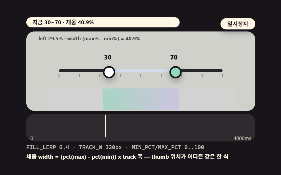
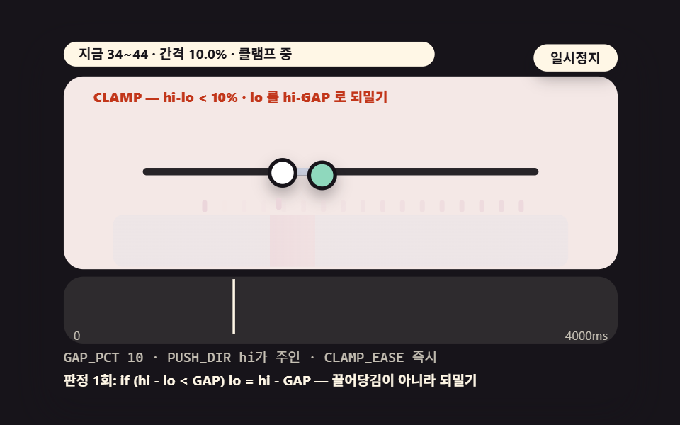
The fill bar of a dual range slider is plain arithmetic, (max%-min%)×track width — 03 blocks thumbs crossing below the minimum gap with a clamp test, and 04
A dual range slider is an input that lets a reader pick a span — both ends of a price range, both edges of opening hours — instead of a single value.Every layered behavior on top of it — a minimum gap, snapping, a vertical rail — is one small test sitting on that formula, and the nine scenes below run themselves so you can watch each test fire.
The Fill Bar Is One Formula Before It Is Any CSS
 01 dual-slider-range-fill-percent-arithmetic
 02 dual-slider-thumb-pair-grid-overlay
 03 dual-slider-min-gap-clamp-collision
 04 dual-slider-snap-step-round-ticks
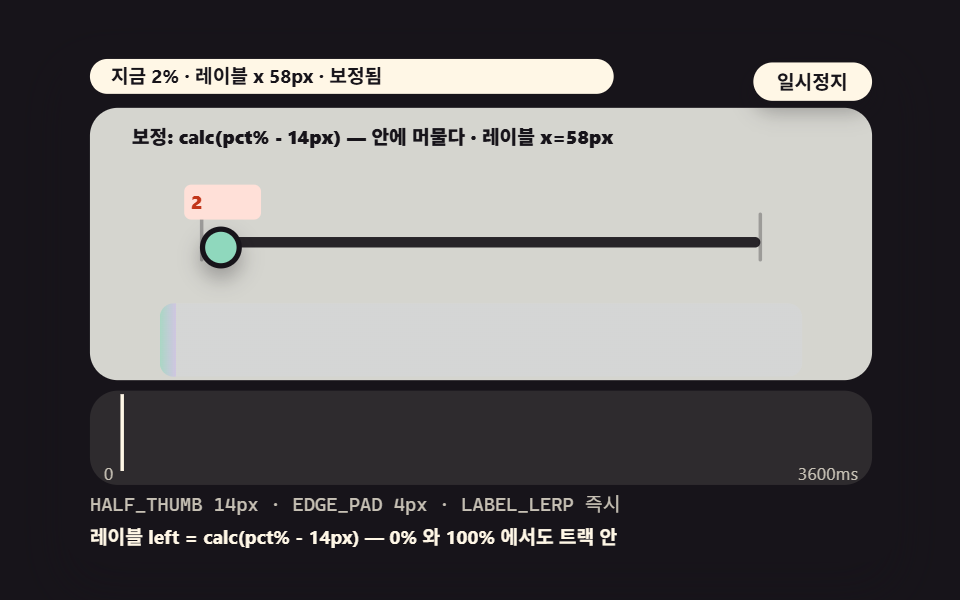 05 dual-slider-value-label-follow-mapping
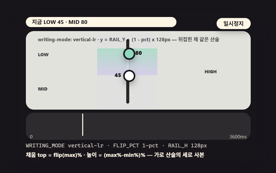 06 dual-slider-writing-mode-vertical
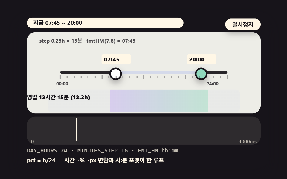 07 dual-slider-time-range-sixty-steps
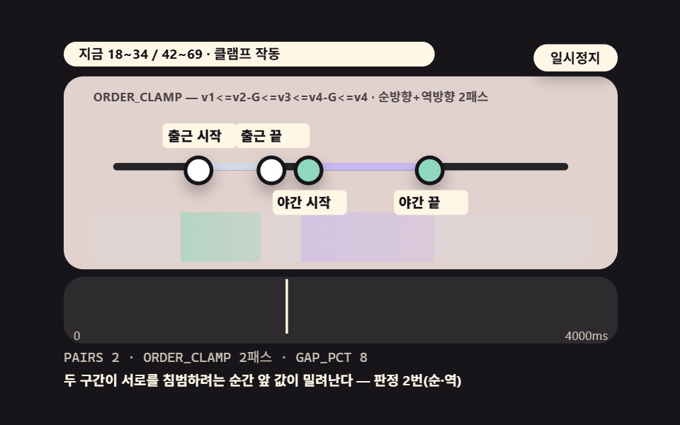 08 dual-slider-twin-track-two-ranges
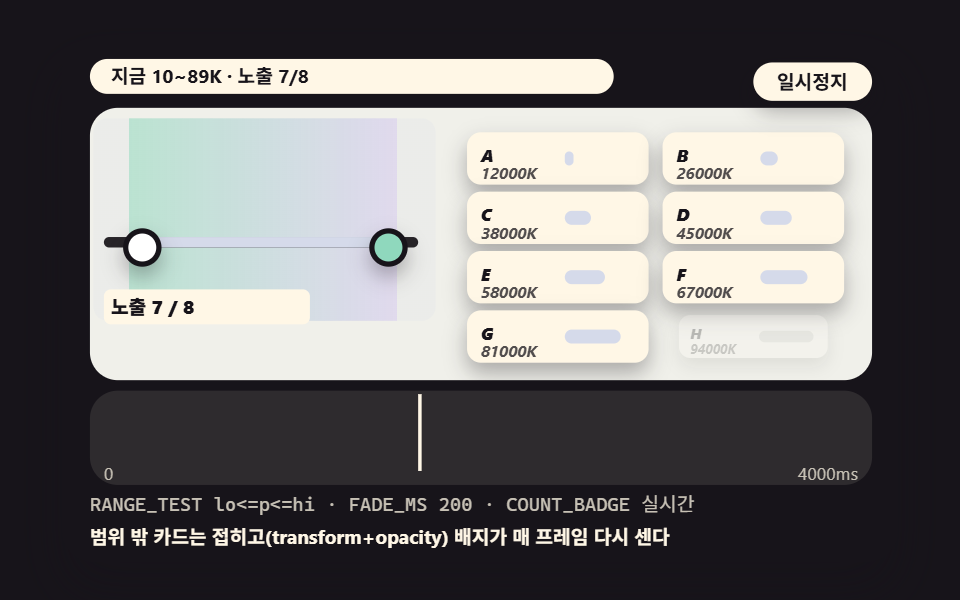 09 dual-slider-filter-panel-cards-live
- 01 A Basic Price Range Whose Fill Bar Fills Exactly from the Two Thumbs' Percents
- 02 An Overlay Where pointer-events Makes Two Tracks Act as One
- 03 A Clamp That Stops the Two Thumbs Dropping Below the Minimum Gap
- 04 Snap Steps That Land on Ticks by a Rounding Test
- 05 A Value Label That Follows Its Thumb Left and Right by Measured Position
- 06 A Vertical Equalizer-Style Dual Slider via writing-mode Rotation
- 07 A Time Range Picking Business Hours on a 60-Minute Tickscale
- 08 A Twin-Track Dual Slider Handling Two Ranges at Once
- 09 A Filter Panel Where Card Lists Filter Live on the Slider Values
A dual range slider needs two thumbs, and HTML does not ship an input that has two. A double range slider html css build therefore starts from two <input type="range"> elements stacked in the same spot — a lower input and an upper input — and everything else in this post hangs off that stack: how the two tracks share clicks, how the fill is drawn between the thumb positions, and how the values are kept from crossing.
Once the stack exists, the fill is not a mystery. Any value v sits at pct(v) = (v − MIN) / (MAX − MIN) along the track, so the fill bar is left = pct(lo) × track width and width = (pct(hi) − pct(lo)) × track width, and it stays glued to the track wherever the thumbs travel. On a 0–100 track with the thumbs at 30 and 70, that is left 30% and width 40%. The vertical rail of scene 06, the 24-hour axis of 07 and the live card filter of 09 are all the same formula with different inputs.
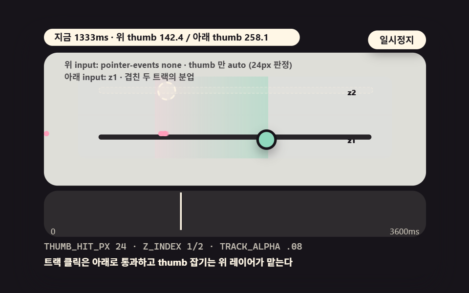
The stack's one structural problem is that the upper input's track sits on top and eats every click meant for the lower one. The standard division of labor, which scene 02 makes visible, is pointer-events: none on the whole upper input and pointer-events: auto returned to its thumb only through ::-webkit-slider-thumb — clicks on open track fall through to the lower layer while the upper thumb stays grabbable. The hit diameter should be larger than the visible circle, 24px against 18px here, because a finger that lands near the edge of the thumb still catches it. Thumb styling also needs both vendor pseudo-elements, ::-webkit-slider-thumb and ::-moz-range-thumb, with appearance: none on the input and the thumb — otherwise the thumb size drifts per browser and the fill's ends stop matching the thumb centers.
Demo and Explanation
Each scene runs itself on a timetable, and the keyboard always works: Space or Enter pauses, R restarts, and the arrow keys switch preset values — scene 05 uses the arrows to flip between its failing plate and its corrected plate.
The nine scenes in measured numbers
도구/demo.py rendered each 480×300 stage into 24 captured frames, and the table counts the 23 frame-to-frame deltas between them (measured 2026-11-15 23:51). Cumulative area is the share of pixels that changed at least once, intensity the mean color distance of those pixels on a 0–255 scale, and frames moved counts the frames that differ from their predecessor.
| Scene | Cumulative area | Mean intensity | Frames moved |
|---|---|---|---|
| 01 basic price range | 10.1% | 101.4 | 23/23 |
| 02 overlay pair | 34.4% | 80.7 | 23/23 |
| 03 minimum-gap clamp | 38.4% | 103.4 | 23/23 |
| 04 snap to ticks | 38.4% | 86.2 | 23/23 |
| 05 label follow | 38.8% | 86.3 | 23/23 |
| 06 vertical rail | 32.2% | 80.2 | 23/23 |
| 07 time range | 29.4% | 124.3 | 23/23 |
| 08 twin track | 35.3% | 107.5 | 23/23 |
| 09 filter panel | 26.3% | 75.6 | 23/23 |
Every scene moved in 23 of 23 frames, so each one is alive in every frame of its cycle. The three widest plates, 03, 04 and 05 at 38.4–38.8%, share one property: the computed values propagate into the background tone as well as the track, so pixels outside the track move too, while 01 is the smallest at 10.1% because it is the bare plate — two thumbs and a fill with nothing layered on. These figures describe changes inside the capture box, not page performance, and the scenes only reached them once the value propagation was wired, since an element that appears in the first frame and never moves again never enters a cumulative count.
01The Basic Price Range: Two Percents In, One Exact Fill Out
Demo and Explanation
The base pattern of shopping price filters: on a 320px track two thumbs sweep in opposite phase while the fill's left and width are recomputed from the percent arithmetic every frame, and the fill's width also feeds the background tone, so the wider the span the brighter the scene.
<main class="stage">
<div class="ez is-demo" id="ez">
  <div class="ez__in" data-role="inner">
    <div class="ez__pad" data-role="pad" tabindex="0" role="application" aria-label="Demo stage: Space or Enter pauses, R restarts, left and right arrows pick another value">
      <div class="ez__scene" data-role="scene" role="img" aria-label="The two thumbs' percents convert into the fill bar's left and width within one frame in this basic price range"></div>
      <div class="ez__probe" data-role="probe" aria-hidden="true"></div>
      <div class="ez__chart" data-role="chart" aria-hidden="true"></div>
      <p class="ez__status" data-role="status" aria-live="off">Scene ready</p>
      <p class="ez__reada" data-role="reada" aria-hidden="true"></p>
      <p class="ez__readb" data-role="readb" aria-hidden="true"></p>
      <div class="ez__ctrl">
        <button class="ez__pause" data-role="pause" type="button" aria-pressed="false">Pause</button>
… (총 18줄 — 아래 「전체 코드」에서 원문 전체)
@use "../../../../site/static/demo-tokens" as *;
@include stage($stage-ink);
// gooey 장면 공통 — 먹 무대 위 파스텔 장식. gooey 계층 안은 명도가 기능이므로 순색만 (아래 .gy 참조)
$panel: mix($subject-cream, $subject-ink, 10%);
$grid: mix($subject-cream, $subject-ink, 7%);
$line: mix($subject-cream, $subject-ink, 26%);
$dim: mix($subject-cream, $subject-ink, 76%);
// 파스텔 장식 팔레트 — vivid 토큰(채도 .55+) 대신 이 값들을 쓴다 (BD26). gooey 계층 **안** 에는 못 쓴다
$stroke-blue: #d5daea; // $subject-blue 의 파스텔
$stroke-rose: #ebd6db; // 핑크 계열 파스텔
… (총 306줄 — 아래 「전체 코드」에서 원문 전체)html, body {
margin: 0;
overflow: hidden;
}
.stage {
box-sizing: border-box;
min-height: 100vh;
display: grid;
place-items: center;
margin: 0;
background: #17141a;
… (총 381줄 — 아래 「전체 코드」에서 원문 전체)(function () {
const rootEl = document.getElementById("ez");
if (!rootEl) return;
main(rootEl);
function cx(s) { return s; }
function main(root) {
// 무대 좌표 — 안쪽 상자는 늘 480x300 이고 화면 폭에 맞춰 통째로 줄인다
const W = 480;
const CX0 = 8;
const CW = 432;
const SVGW = 448;
const SVGH = 156;
… (총 462줄 — 아래 「전체 코드」에서 원문 전체)// DualSliderFillPercent - 같은 항목 vanilla index.html 의 React 판. 같은 계산을 useEffect 안에서 돌린다
import { useEffect, useRef } from "react";
import styles from "./DualSliderFillPercent.module.scss";
const cx = (s: string): string => s.split(" ").map((n) => styles[n] ?? n).join(" ");
function main(root: HTMLElement): () => void {
// 무대 좌표 — 안쪽 상자는 늘 480x300 이고 화면 폭에 맞춰 통째로 줄인다
const W = 480;
const CX0 = 8;
const CW = 432;
const SVGW = 448;
… (총 436줄 — 아래 「전체 코드」에서 원문 전체)01 · A Basic Price Range Whose Fill Bar Fills Exactly from the Two Thumbs' Percents — Measured area 10.125% · moving frames 23/23Original by GODRICH · SCSS and React ship in the zip · See the password
Where to Look in the Code
        // fill arithmetic — left/width recomputed from the percents every frame
        const loPx = TRACK_X + pct(loVal) * TRACK_W;
        const hiPx = TRACK_X + pct(hiVal) * TRACK_W;
        filL += (loPx - filL) * FILL_LERP;
        filR += (hiPx - filR) * FILL_LERP;
        if (fil) {
            put(fil, filL, 74, Math.max(2, filR - filL), 6);
        }
The fill does not copy the thumbs — it trails them by FILL_LERP, closing 35% of the remaining distance each frame, so the values land exactly while the fill runs half a beat behind; those two lerp lines are the only state in the snippet.
02The Overlay Pair: How Two Tracks Act as One Bar
Demo and Explanation
The base overlay for understanding the stacking structure: a marker is stamped on the track wherever a click passes through the upper layer to the lower one, and the distance between the two thumbs feeds the background tone — the farther apart they sit, the brighter the scene grows.
<main class="stage">
<div class="ez is-demo" id="ez">
  <div class="ez__in" data-role="inner">
    <div class="ez__pad" data-role="pad" tabindex="0" role="application" aria-label="Demo stage: Space or Enter pauses, R restarts, left and right arrows pick another value">
      <div class="ez__scene" data-role="scene" role="img" aria-label="The upper track keeps pointer-events on its thumb only, so clicks pass through to the lower layer"></div>
      <div class="ez__probe" data-role="probe" aria-hidden="true"></div>
      <div class="ez__chart" data-role="chart" aria-hidden="true"></div>
      <p class="ez__status" data-role="status" aria-live="off">Scene ready</p>
      <p class="ez__reada" data-role="reada" aria-hidden="true"></p>
      <p class="ez__readb" data-role="readb" aria-hidden="true"></p>
      <div class="ez__ctrl">
        <button class="ez__pause" data-role="pause" type="button" aria-pressed="false">Pause</button>
… (총 18줄 — 아래 「전체 코드」에서 원문 전체)
@use "../../../../site/static/demo-tokens" as *;
@include stage($stage-ink);
// gooey 장면 공통 — 먹 무대 위 파스텔 장식. gooey 계층 안은 명도가 기능이므로 순색만 (아래 .gy 참조)
$panel: mix($subject-cream, $subject-ink, 10%);
$grid: mix($subject-cream, $subject-ink, 7%);
$line: mix($subject-cream, $subject-ink, 26%);
$dim: mix($subject-cream, $subject-ink, 76%);
// 파스텔 장식 팔레트 — vivid 토큰(채도 .55+) 대신 이 값들을 쓴다 (BD26). gooey 계층 **안** 에는 못 쓴다
$stroke-blue: #d5daea; // $subject-blue 의 파스텔
$stroke-rose: #ebd6db; // 핑크 계열 파스텔
… (총 306줄 — 아래 「전체 코드」에서 원문 전체)html, body {
margin: 0;
overflow: hidden;
}
.stage {
box-sizing: border-box;
min-height: 100vh;
display: grid;
place-items: center;
margin: 0;
background: #17141a;
… (총 381줄 — 아래 「전체 코드」에서 원문 전체)(function () {
const rootEl = document.getElementById("ez");
if (!rootEl) return;
main(rootEl);
function cx(s) { return s; }
function main(root) {
// 무대 좌표 — 안쪽 상자는 늘 480x300 이고 화면 폭에 맞춰 통째로 줄인다
const W = 480;
const CX0 = 8;
const CW = 432;
const SVGW = 448;
const SVGH = 156;
… (총 461줄 — 아래 「전체 코드」에서 원문 전체)// DualSliderOverlayPair - 같은 항목 vanilla index.html 의 React 판. 같은 계산을 useEffect 안에서 돌린다
import { useEffect, useRef } from "react";
import styles from "./DualSliderOverlayPair.module.scss";
const cx = (s: string): string => s.split(" ").map((n) => styles[n] ?? n).join(" ");
function main(root: HTMLElement): () => void {
// 무대 좌표 — 안쪽 상자는 늘 480x300 이고 화면 폭에 맞춰 통째로 줄인다
const W = 480;
const CX0 = 8;
const CW = 432;
const SVGW = 448;
… (총 439줄 — 아래 「전체 코드」에서 원문 전체)02 · An Overlay Where pointer-events Makes Two Tracks Act as One — Measured area 34.366% · moving frames 23/23Original by GODRICH · SCSS and React ship in the zip · See the password
Where to Look in the Code
        // upper-layer thumb hit zone (24px) — a larger click target than the visible 18px circle
        const hA = hits[hitI % hits.length];
        hitI += 1;
        if (hA) {
            put(hA, loX - 3, 92, 6, 6);
            hA.style.opacity = '0.9';
        }
        // older markers fade out gradually
        for (let k = 0; k < hits.length; k += 1) {
            const age = (hitI - k + hits.length) % hits.length;
            hits[k].style.opacity = String(clamp(1 - age / hits.length, 0, 0.9));
        }
The hit stamps are the proof the division of labor works, and old markers fade instead of vanishing, turning a stream of clicks into a trail readable at a glance.
03The Minimum-Gap Clamp: A Test, Not a Spring
Demo and Explanation
Built for filters with a minimum order amount or a minimum stay: pushing the high end down from 60 toward 25 drags the low end from 40 to 28 until the gap touches GAP_PCT 10%, from which point the low thumb rides pinned to the high one — a rose mark accumulates where the clamp bit, and the status strip prints the test itself.
<main class="stage">
<div class="ez is-demo" id="ez">
  <div class="ez__in" data-role="inner">
    <div class="ez__pad" data-role="pad" tabindex="0" role="application" aria-label="Demo stage: Space or Enter pauses, R restarts, left and right arrows pick another value">
      <div class="ez__scene" data-role="scene" role="img" aria-label="The instant the thumbs drop below the minimum gap, a single test pushes them back together"></div>
      <div class="ez__probe" data-role="probe" aria-hidden="true"></div>
      <div class="ez__chart" data-role="chart" aria-hidden="true"></div>
      <p class="ez__status" data-role="status" aria-live="off">Scene ready</p>
      <p class="ez__reada" data-role="reada" aria-hidden="true"></p>
      <p class="ez__readb" data-role="readb" aria-hidden="true"></p>
      <div class="ez__ctrl">
        <button class="ez__pause" data-role="pause" type="button" aria-pressed="false">Pause</button>
… (총 18줄 — 아래 「전체 코드」에서 원문 전체)
@use "../../../../site/static/demo-tokens" as *;
@include stage($stage-ink);
// gooey 장면 공통 — 먹 무대 위 파스텔 장식. gooey 계층 안은 명도가 기능이므로 순색만 (아래 .gy 참조)
$panel: mix($subject-cream, $subject-ink, 10%);
$grid: mix($subject-cream, $subject-ink, 7%);
$line: mix($subject-cream, $subject-ink, 26%);
$dim: mix($subject-cream, $subject-ink, 76%);
// 파스텔 장식 팔레트 — vivid 토큰(채도 .55+) 대신 이 값들을 쓴다 (BD26). gooey 계층 **안** 에는 못 쓴다
$stroke-blue: #d5daea; // $subject-blue 의 파스텔
$stroke-rose: #ebd6db; // 핑크 계열 파스텔
… (총 306줄 — 아래 「전체 코드」에서 원문 전체)html, body {
margin: 0;
overflow: hidden;
}
.stage {
box-sizing: border-box;
min-height: 100vh;
display: grid;
place-items: center;
margin: 0;
background: #17141a;
… (총 381줄 — 아래 「전체 코드」에서 원문 전체)(function () {
const rootEl = document.getElementById("ez");
if (!rootEl) return;
main(rootEl);
function cx(s) { return s; }
function main(root) {
// 무대 좌표 — 안쪽 상자는 늘 480x300 이고 화면 폭에 맞춰 통째로 줄인다
const W = 480;
const CX0 = 8;
const CW = 432;
const SVGW = 448;
const SVGH = 156;
… (총 472줄 — 아래 「전체 코드」에서 원문 전체)// DualSliderMinGapClamp - 같은 항목 vanilla index.html 의 React 판. 같은 계산을 useEffect 안에서 돌린다
import { useEffect, useRef } from "react";
import styles from "./DualSliderMinGapClamp.module.scss";
const cx = (s: string): string => s.split(" ").map((n) => styles[n] ?? n).join(" ");
function main(root: HTMLElement): () => void {
// 무대 좌표 — 안쪽 상자는 늘 480x300 이고 화면 폭에 맞춰 통째로 줄인다
const W = 480;
const CX0 = 8;
const CW = 432;
const SVGW = 448;
… (총 448줄 — 아래 「전체 코드」에서 원문 전체)03 · A Clamp That Stops the Two Thumbs Dropping Below the Minimum Gap — Measured area 38.358% · moving frames 23/23Original by GODRICH · SCSS and React ship in the zip · See the password
Where to Look in the Code
        // scenario: hi is pushed left — without the clamp it overlaps lo
        const hiRaw = 60 - 35 * s; // 60 → 25 → 60
        const loRaw = 40 - 12 * s; // 40 → 28 → 40 (dragged slightly)
        // one test — if hi - lo < GAP, lo is pushed back (PUSH_DIR: hi owns, lo is dragged)
        clamped = hiRaw - loRaw < GAP_PCT;
        if (clamped) {
            hiV = hiRaw;
            loV = hiV - GAP_PCT;
            if (loV < MIN) {
                loV = MIN;
                hiV = MIN + GAP_PCT;
            } // left-edge correction
Two decisions live in those lines: which thumb owns the drag — here the high thumb pushes, and in production the thumb the user last grabbed should own it — and the left-edge correction, without which the low value runs negative and draws outside the track.
04Snap Steps: A Rounding Test That Lands on Ticks
Demo and Explanation
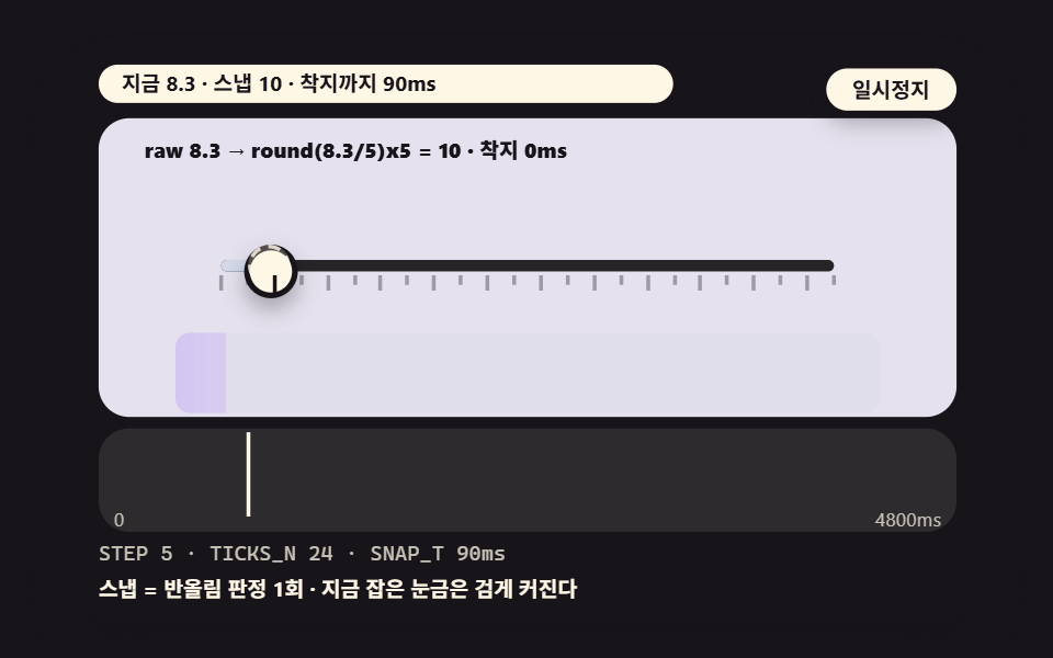
For prices in 5-unit steps or times in 10-minute steps: a ghost thumb follows the raw continuous value while the solid thumb is only allowed to sit on the 5-unit staircase, and the tick it last caught swells dark so the caught slot of the 24 is readable at a glance.
<main class="stage">
<div class="ez is-demo" id="ez">
  <div class="ez__in" data-role="inner">
    <div class="ez__pad" data-role="pad" tabindex="0" role="application" aria-label="Demo stage: Space or Enter pauses, R restarts, left and right arrows pick another value">
      <div class="ez__scene" data-role="scene" role="img" aria-label="The raw value passes a rounding test and settles firmly on a tick in these snap steps"></div>
      <div class="ez__probe" data-role="probe" aria-hidden="true"></div>
      <div class="ez__chart" data-role="chart" aria-hidden="true"></div>
      <p class="ez__status" data-role="status" aria-live="off">Scene ready</p>
      <p class="ez__reada" data-role="reada" aria-hidden="true"></p>
      <p class="ez__readb" data-role="readb" aria-hidden="true"></p>
      <div class="ez__ctrl">
        <button class="ez__pause" data-role="pause" type="button" aria-pressed="false">Pause</button>
… (총 18줄 — 아래 「전체 코드」에서 원문 전체)
@use "../../../../site/static/demo-tokens" as *;
@include stage($stage-ink);
// gooey 장면 공통 — 먹 무대 위 파스텔 장식. gooey 계층 안은 명도가 기능이므로 순색만 (아래 .gy 참조)
$panel: mix($subject-cream, $subject-ink, 10%);
$grid: mix($subject-cream, $subject-ink, 7%);
$line: mix($subject-cream, $subject-ink, 26%);
$dim: mix($subject-cream, $subject-ink, 76%);
// 파스텔 장식 팔레트 — vivid 토큰(채도 .55+) 대신 이 값들을 쓴다 (BD26). gooey 계층 **안** 에는 못 쓴다
$stroke-blue: #d5daea; // $subject-blue 의 파스텔
$stroke-rose: #ebd6db; // 핑크 계열 파스텔
… (총 306줄 — 아래 「전체 코드」에서 원문 전체)html, body {
margin: 0;
overflow: hidden;
}
.stage {
box-sizing: border-box;
min-height: 100vh;
display: grid;
place-items: center;
margin: 0;
background: #17141a;
… (총 381줄 — 아래 「전체 코드」에서 원문 전체)(function () {
const rootEl = document.getElementById("ez");
if (!rootEl) return;
main(rootEl);
function cx(s) { return s; }
function main(root) {
// 무대 좌표 — 안쪽 상자는 늘 480x300 이고 화면 폭에 맞춰 통째로 줄인다
const W = 480;
const CX0 = 8;
const CW = 432;
const SVGW = 448;
const SVGH = 156;
… (총 444줄 — 아래 「전체 코드」에서 원문 전체)// DualSliderSnapTicks - 같은 항목 vanilla index.html 의 React 판. 같은 계산을 useEffect 안에서 돌린다
import { useEffect, useRef } from "react";
import styles from "./DualSliderSnapTicks.module.scss";
const cx = (s: string): string => s.split(" ").map((n) => styles[n] ?? n).join(" ");
function main(root: HTMLElement): () => void {
// 무대 좌표 — 안쪽 상자는 늘 480x300 이고 화면 폭에 맞춰 통째로 줄인다
const W = 480;
const CX0 = 8;
const CW = 432;
const SVGW = 448;
… (총 430줄 — 아래 「전체 코드」에서 원문 전체)04 · Snap Steps That Land on Ticks by a Rounding Test — Measured area 38.366% · moving frames 23/23Original by GODRICH · SCSS and React ship in the zip · See the password
Where to Look in the Code
        // raw is continuous (a smooth sine) — snapped is the 5-unit staircase
        const ease = 0.5 - 0.5 * Math.cos(Math.PI * s); // sine easing — slow start, slow end
        raw = MIN + (MAX - MIN) * ease;
        const sn = snap(raw);
        if (sn !== snapPrev) {
            snapAt = t;
            snapPrev = sn;
        } // record the moment it crosses a tick
        snapped = sn;
        // landing ease — for SNAP_T ms after catching a tick, the thumb is drawn onto it
        const since = clamp((t - snapAt) / SNAP_T, 0, 1);
        const settle = 1 - Math.pow(1 - since, 3); // cubic-out
        const settledFlag = since >= 1;
        const shownPre = snapped + (raw - snapped) * (1 - settle);
The visible thumb reads snapped + (raw − snapped) × (1 − settle), lingering on the raw side until the settle finishes and then sitting exactly on the snapped value.
05The Following Label: Why left = pct% Fails at the Ends
Demo and Explanation
For live value readouts on price and time ranges — the arrow keys flip between a failing plate, where the label's left is the thumb's percent verbatim and the label slides outside the track at 0% and 100% under a red warning, and a corrected plate that subtracts half the thumb width and clamps at the edges instead.
<main class="stage">
<div class="ez is-demo" id="ez">
  <div class="ez__in" data-role="inner">
    <div class="ez__pad" data-role="pad" tabindex="0" role="application" aria-label="Demo stage: Space or Enter pauses, R restarts, left and right arrows pick another value">
      <div class="ez__scene" data-role="scene" role="img" aria-label="The value label slips outside at the ends without compensation, then stays inside with a calc fix"></div>
      <div class="ez__probe" data-role="probe" aria-hidden="true"></div>
      <div class="ez__chart" data-role="chart" aria-hidden="true"></div>
      <p class="ez__status" data-role="status" aria-live="off">Scene ready</p>
      <p class="ez__reada" data-role="reada" aria-hidden="true"></p>
      <p class="ez__readb" data-role="readb" aria-hidden="true"></p>
      <div class="ez__ctrl">
        <button class="ez__pause" data-role="pause" type="button" aria-pressed="false">Pause</button>
… (총 18줄 — 아래 「전체 코드」에서 원문 전체)
@use "../../../../site/static/demo-tokens" as *;
@include stage($stage-ink);
// gooey 장면 공통 — 먹 무대 위 파스텔 장식. gooey 계층 안은 명도가 기능이므로 순색만 (아래 .gy 참조)
$panel: mix($subject-cream, $subject-ink, 10%);
$grid: mix($subject-cream, $subject-ink, 7%);
$line: mix($subject-cream, $subject-ink, 26%);
$dim: mix($subject-cream, $subject-ink, 76%);
// 파스텔 장식 팔레트 — vivid 토큰(채도 .55+) 대신 이 값들을 쓴다 (BD26). gooey 계층 **안** 에는 못 쓴다
$stroke-blue: #d5daea; // $subject-blue 의 파스텔
$stroke-rose: #ebd6db; // 핑크 계열 파스텔
… (총 306줄 — 아래 「전체 코드」에서 원문 전체)html, body {
margin: 0;
overflow: hidden;
}
.stage {
box-sizing: border-box;
min-height: 100vh;
display: grid;
place-items: center;
margin: 0;
background: #17141a;
… (총 381줄 — 아래 「전체 코드」에서 원문 전체)(function () {
const rootEl = document.getElementById("ez");
if (!rootEl) return;
main(rootEl);
function cx(s) { return s; }
function main(root) {
// 무대 좌표 — 안쪽 상자는 늘 480x300 이고 화면 폭에 맞춰 통째로 줄인다
const W = 480;
const CX0 = 8;
const CW = 432;
const SVGW = 448;
const SVGH = 156;
… (총 455줄 — 아래 「전체 코드」에서 원문 전체)// DualSliderLabelFollow - 같은 항목 vanilla index.html 의 React 판. 같은 계산을 useEffect 안에서 돌린다
import { useEffect, useRef } from "react";
import styles from "./DualSliderLabelFollow.module.scss";
const cx = (s: string): string => s.split(" ").map((n) => styles[n] ?? n).join(" ");
function main(root: HTMLElement): () => void {
// 무대 좌표 — 안쪽 상자는 늘 480x300 이고 화면 폭에 맞춰 통째로 줄인다
const W = 480;
const CX0 = 8;
const CW = 432;
const SVGW = 448;
… (총 425줄 — 아래 「전체 코드」에서 원문 전체)05 · A Value Label That Follows Its Thumb Left and Right by Measured Position — Measured area 38.814% · moving frames 23/23Original by GODRICH · SCSS and React ship in the zip · See the password
Where to Look in the Code
        // corrected plate: left = pct% - HALF_THUMB, both ends clamped by EDGE_PAD
        const goodX = clamp(thPx - HALF_THUMB, TRACK_X - 10, TRACK_X + TRACK_W - HALF_THUMB * 2 + 10 - EDGE_PAD);
        if (labGood) {
            put(labGood, goodX, 44, 36, 20);
            labGood.textContent = f0(v);
        }
The fix is one clamp with HALF_THUMB 14 and EDGE_PAD 4 on a 36px-wide label, and the root cause is that left positions the label's left edge, not its center — that half-a-label offset is the whole bug.
06The Vertical Rail: writing-mode Instead of Rotation
Demo and Explanation
The plate for volume and band equalizer panels: transform: rotate(-90deg) turns the whole input, labels and all, while writing-mode: vertical-lr changes only the input's axis so the labels stay put — on a 128px rail the LOW band sweeps 42±13 on a sine as the MID band travels 80−10s, and the vertical fill propagates into the wide tone behind the rail.
<main class="stage">
<div class="ez is-demo" id="ez">
  <div class="ez__in" data-role="inner">
    <div class="ez__pad" data-role="pad" tabindex="0" role="application" aria-label="Demo stage: Space or Enter pauses, R restarts, left and right arrows pick another value">
      <div class="ez__scene" data-role="scene" role="img" aria-label="With a writing-mode rotation the thumb moves vertically and the same arithmetic runs with flipped percents"></div>
      <div class="ez__probe" data-role="probe" aria-hidden="true"></div>
      <div class="ez__chart" data-role="chart" aria-hidden="true"></div>
      <p class="ez__status" data-role="status" aria-live="off">Scene ready</p>
      <p class="ez__reada" data-role="reada" aria-hidden="true"></p>
      <p class="ez__readb" data-role="readb" aria-hidden="true"></p>
      <div class="ez__ctrl">
        <button class="ez__pause" data-role="pause" type="button" aria-pressed="false">Pause</button>
… (총 18줄 — 아래 「전체 코드」에서 원문 전체)
@use "../../../../site/static/demo-tokens" as *;
@include stage($stage-ink);
// gooey 장면 공통 — 먹 무대 위 파스텔 장식. gooey 계층 안은 명도가 기능이므로 순색만 (아래 .gy 참조)
$panel: mix($subject-cream, $subject-ink, 10%);
$grid: mix($subject-cream, $subject-ink, 7%);
$line: mix($subject-cream, $subject-ink, 26%);
$dim: mix($subject-cream, $subject-ink, 76%);
// 파스텔 장식 팔레트 — vivid 토큰(채도 .55+) 대신 이 값들을 쓴다 (BD26). gooey 계층 **안** 에는 못 쓴다
$stroke-blue: #d5daea; // $subject-blue 의 파스텔
$stroke-rose: #ebd6db; // 핑크 계열 파스텔
… (총 306줄 — 아래 「전체 코드」에서 원문 전체)html, body {
margin: 0;
overflow: hidden;
}
.stage {
box-sizing: border-box;
min-height: 100vh;
display: grid;
place-items: center;
margin: 0;
background: #17141a;
… (총 381줄 — 아래 「전체 코드」에서 원문 전체)(function () {
const rootEl = document.getElementById("ez");
if (!rootEl) return;
main(rootEl);
function cx(s) { return s; }
function main(root) {
// 무대 좌표 — 안쪽 상자는 늘 480x300 이고 화면 폭에 맞춰 통째로 줄인다
const W = 480;
const CX0 = 8;
const CW = 432;
const SVGW = 448;
const SVGH = 156;
… (총 468줄 — 아래 「전체 코드」에서 원문 전체)// DualSliderVerticalRail - 같은 항목 vanilla index.html 의 React 판. 같은 계산을 useEffect 안에서 돌린다
import { useEffect, useRef } from "react";
import styles from "./DualSliderVerticalRail.module.scss";
const cx = (s: string): string => s.split(" ").map((n) => styles[n] ?? n).join(" ");
function main(root: HTMLElement): () => void {
// 무대 좌표 — 안쪽 상자는 늘 480x300 이고 화면 폭에 맞춰 통째로 줄인다
const W = 480;
const CX0 = 8;
const CW = 432;
const SVGW = 448;
… (총 442줄 — 아래 「전체 코드」에서 원문 전체)06 · A Vertical Equalizer-Style Dual Slider via writing-mode Rotation — Measured area 32.185% · moving frames 23/23Original by GODRICH · SCSS and React ship in the zip · See the password
Where to Look in the Code
        // same arithmetic + flip: y = RAIL_Y + flip(pct) * RAIL_H (up = max)
        const loY = RAIL_Y + flip(loV / 100) * RAIL_H;
        const hiY = RAIL_Y + flip(hiV / 100) * RAIL_H;
        if (loThm) {
            put(loThm, RAIL_X - 6, loY - 9, 18, 18);
        }
        if (hiThm) {
            put(hiThm, RAIL_X - 6, hiY - 9, 18, 18);
        }
        // vertical fill — top = flip(max)% · height = (max%-min%)%
        if (fil) {
            put(fil, RAIL_X, hiY, 6, Math.max(2, loY - hiY));
        }
The only arithmetic that changes is direction — up is max, so flip(p) = 1 − p first, then the same formula, with the fill becoming top = flip(max)% and height (flip(min) − flip(max)) × rail height.
07The Time Range: Quarter-Hour Snapping on a 24-Hour Axis
Demo and Explanation
For booking screens and timetable selection: the day runs 0–24 at step 0.25, quarter-hour ticks, while a span like 9:00–18:45 round-trips across it, and the positions come from the same percent arithmetic even though the values are hours — time conversion and percent math run in one loop.
<main class="stage">
<div class="ez is-demo" id="ez">
  <div class="ez__in" data-role="inner">
    <div class="ez__pad" data-role="pad" tabindex="0" role="application" aria-label="Demo stage: Space or Enter pauses, R restarts, left and right arrows pick another value">
      <div class="ez__scene" data-role="scene" role="img" aria-label="From 0 to 24 hours snapping to 15-minute ticks, the hour-minute format runs in the same loop"></div>
      <div class="ez__probe" data-role="probe" aria-hidden="true"></div>
      <div class="ez__chart" data-role="chart" aria-hidden="true"></div>
      <p class="ez__status" data-role="status" aria-live="off">Scene ready</p>
      <p class="ez__reada" data-role="reada" aria-hidden="true"></p>
      <p class="ez__readb" data-role="readb" aria-hidden="true"></p>
      <div class="ez__ctrl">
        <button class="ez__pause" data-role="pause" type="button" aria-pressed="false">Pause</button>
… (총 18줄 — 아래 「전체 코드」에서 원문 전체)
@use "../../../../site/static/demo-tokens" as *;
@include stage($stage-ink);
// gooey 장면 공통 — 먹 무대 위 파스텔 장식. gooey 계층 안은 명도가 기능이므로 순색만 (아래 .gy 참조)
$panel: mix($subject-cream, $subject-ink, 10%);
$grid: mix($subject-cream, $subject-ink, 7%);
$line: mix($subject-cream, $subject-ink, 26%);
$dim: mix($subject-cream, $subject-ink, 76%);
// 파스텔 장식 팔레트 — vivid 토큰(채도 .55+) 대신 이 값들을 쓴다 (BD26). gooey 계층 **안** 에는 못 쓴다
$stroke-blue: #d5daea; // $subject-blue 의 파스텔
$stroke-rose: #ebd6db; // 핑크 계열 파스텔
… (총 306줄 — 아래 「전체 코드」에서 원문 전체)html, body {
margin: 0;
overflow: hidden;
}
.stage {
box-sizing: border-box;
min-height: 100vh;
display: grid;
place-items: center;
margin: 0;
background: #17141a;
… (총 381줄 — 아래 「전체 코드」에서 원문 전체)(function () {
const rootEl = document.getElementById("ez");
if (!rootEl) return;
main(rootEl);
function cx(s) { return s; }
function main(root) {
// 무대 좌표 — 안쪽 상자는 늘 480x300 이고 화면 폭에 맞춰 통째로 줄인다
const W = 480;
const CX0 = 8;
const CW = 432;
const SVGW = 448;
const SVGH = 156;
… (총 462줄 — 아래 「전체 코드」에서 원문 전체)// DualSliderTimeRange - 같은 항목 vanilla index.html 의 React 판. 같은 계산을 useEffect 안에서 돌린다
import { useEffect, useRef } from "react";
import styles from "./DualSliderTimeRange.module.scss";
const cx = (s: string): string => s.split(" ").map((n) => styles[n] ?? n).join(" ");
function main(root: HTMLElement): () => void {
// 무대 좌표 — 안쪽 상자는 늘 480x300 이고 화면 폭에 맞춰 통째로 줄인다
const W = 480;
const CX0 = 8;
const CW = 432;
const SVGW = 448;
… (총 438줄 — 아래 「전체 코드」에서 원문 전체)07 · A Time Range Picking Business Hours on a 60-Minute Tickscale — Measured area 29.373% · moving frames 23/23Original by GODRICH · SCSS and React ship in the zip · See the password
Where to Look in the Code
    function fmtHM(h) {
        // 9.25 → 09:15 · 18.75 → 18:45 — the time conversion is itself the snap (step 0.25 keeps 15-minute ticks)
        const hh = Math.floor(h + 1e-9);
        const mm = Math.round((h - hh) * 60);
        const H = mm === 60 ? hh + 1 : hh;
        const M = mm === 60 ? 0 : mm;
        return (H < 10 ? '0' : '') + H + ':' + (M < 10 ? '0' : '') + M;
    }
    function snapQ(h) { return clamp(Math.round(h * 4) / 4, 0, DAY_HOURS); }
Quarter-hour snapping is round(h × 4) / 4, and the carry — when the rounded minutes land on 60, the hour increments — is not optional: drop it and 8.995 hours prints as 8:60.
08The Twin Track: Four Thumbs, One Inequality Chain
Demo and Explanation
For two windows on one screen, such as commute and night hours: if each pair runs only its own clamp, the gap between the pairs is unguarded and the night span's start thumb walks straight past the commute span's end.
<main class="stage">
<div class="ez is-demo" id="ez">
  <div class="ez__in" data-role="inner">
    <div class="ez__pad" data-role="pad" tabindex="0" role="application" aria-label="Demo stage: Space or Enter pauses, R restarts, left and right arrows pick another value">
      <div class="ez__scene" data-role="scene" role="img" aria-label="Four thumb values pass an order clamp so the two spans never invade each other"></div>
      <div class="ez__probe" data-role="probe" aria-hidden="true"></div>
      <div class="ez__chart" data-role="chart" aria-hidden="true"></div>
      <p class="ez__status" data-role="status" aria-live="off">Scene ready</p>
      <p class="ez__reada" data-role="reada" aria-hidden="true"></p>
      <p class="ez__readb" data-role="readb" aria-hidden="true"></p>
      <div class="ez__ctrl">
        <button class="ez__pause" data-role="pause" type="button" aria-pressed="false">Pause</button>
… (총 18줄 — 아래 「전체 코드」에서 원문 전체)
@use "../../../../site/static/demo-tokens" as *;
@include stage($stage-ink);
// gooey 장면 공통 — 먹 무대 위 파스텔 장식. gooey 계층 안은 명도가 기능이므로 순색만 (아래 .gy 참조)
$panel: mix($subject-cream, $subject-ink, 10%);
$grid: mix($subject-cream, $subject-ink, 7%);
$line: mix($subject-cream, $subject-ink, 26%);
$dim: mix($subject-cream, $subject-ink, 76%);
// 파스텔 장식 팔레트 — vivid 토큰(채도 .55+) 대신 이 값들을 쓴다 (BD26). gooey 계층 **안** 에는 못 쓴다
$stroke-blue: #d5daea; // $subject-blue 의 파스텔
$stroke-rose: #ebd6db; // 핑크 계열 파스텔
… (총 306줄 — 아래 「전체 코드」에서 원문 전체)html, body {
margin: 0;
overflow: hidden;
}
.stage {
box-sizing: border-box;
min-height: 100vh;
display: grid;
place-items: center;
margin: 0;
background: #17141a;
… (총 381줄 — 아래 「전체 코드」에서 원문 전체)(function () {
const rootEl = document.getElementById("ez");
if (!rootEl) return;
main(rootEl);
function cx(s) { return s; }
function main(root) {
// 무대 좌표 — 안쪽 상자는 늘 480x300 이고 화면 폭에 맞춰 통째로 줄인다
const W = 480;
const CX0 = 8;
const CW = 432;
const SVGW = 448;
const SVGH = 156;
… (총 452줄 — 아래 「전체 코드」에서 원문 전체)// DualSliderTwinTrack - 같은 항목 vanilla index.html 의 React 판. 같은 계산을 useEffect 안에서 돌린다
import { useEffect, useRef } from "react";
import styles from "./DualSliderTwinTrack.module.scss";
const cx = (s: string): string => s.split(" ").map((n) => styles[n] ?? n).join(" ");
function main(root: HTMLElement): () => void {
// 무대 좌표 — 안쪽 상자는 늘 480x300 이고 화면 폭에 맞춰 통째로 줄인다
const W = 480;
const CX0 = 8;
const CW = 432;
const SVGW = 448;
… (총 436줄 — 아래 「전체 코드」에서 원문 전체)08 · A Twin-Track Dual Slider Handling Two Ranges at Once — Measured area 35.293% · moving frames 23/23Original by GODRICH · SCSS and React ship in the zip · See the password
Where to Look in the Code
    function orderClamp(v) {
        // order clamp — each adjacent pair v[k+1] >= v[k] + GAP, forward once then backward once
        const o = v.slice();
        for (let k = 0; k < o.length - 1; k += 1) {
            if (o[k + 1] < o[k] + GAP_PCT) {
                o[k + 1] = o[k] + GAP_PCT;
            }
        }
        for (let k = o.length - 1; k > 0; k -= 1) {
            if (o[k] > 100) {
                o[k] = 100;
            }
            if (o[k - 1] > o[k] - GAP_PCT) {
                o[k - 1] = o[k] - GAP_PCT;
            }
        }
        return o;
    }
Clamping all four values in order closes the hole. The chain v1+G ≤ v2 · v2+G ≤ v3 · v3+G ≤ v4 extends itself as the array grows to six or eight thumbs, and the reverse pass is what the ceiling buys — a forward-only clamp pushes overflow past 100, and the backward pass drags it back under.
09The Filter Panel: Where a Double Range Slider Meets a Real List
Demo and Explanation
The screen a double range slider js search is eventually headed for: the span on the left re-judges eight product cards, 12K to 94K, every frame — a card survives when its price satisfies the range test and an out-of-range card folds away — while a badge counts the survivors live.
<main class="stage">
<div class="ez is-demo" id="ez">
  <div class="ez__in" data-role="inner">
    <div class="ez__pad" data-role="pad" tabindex="0" role="application" aria-label="Demo stage: Space or Enter pauses, R restarts, left and right arrows pick another value">
      <div class="ez__scene" data-role="scene" role="img" aria-label="On every slider step each card's price passes the range test and out-of-range cards fold away"></div>
      <div class="ez__probe" data-role="probe" aria-hidden="true"></div>
      <div class="ez__chart" data-role="chart" aria-hidden="true"></div>
      <p class="ez__status" data-role="status" aria-live="off">Scene ready</p>
      <p class="ez__reada" data-role="reada" aria-hidden="true"></p>
      <p class="ez__readb" data-role="readb" aria-hidden="true"></p>
      <div class="ez__ctrl">
        <button class="ez__pause" data-role="pause" type="button" aria-pressed="false">Pause</button>
… (총 18줄 — 아래 「전체 코드」에서 원문 전체)
@use "../../../../site/static/demo-tokens" as *;
@include stage($stage-ink);
// gooey 장면 공통 — 먹 무대 위 파스텔 장식. gooey 계층 안은 명도가 기능이므로 순색만 (아래 .gy 참조)
$panel: mix($subject-cream, $subject-ink, 10%);
$grid: mix($subject-cream, $subject-ink, 7%);
$line: mix($subject-cream, $subject-ink, 26%);
$dim: mix($subject-cream, $subject-ink, 76%);
// 파스텔 장식 팔레트 — vivid 토큰(채도 .55+) 대신 이 값들을 쓴다 (BD26). gooey 계층 **안** 에는 못 쓴다
$stroke-blue: #d5daea; // $subject-blue 의 파스텔
$stroke-rose: #ebd6db; // 핑크 계열 파스텔
… (총 306줄 — 아래 「전체 코드」에서 원문 전체)html, body {
margin: 0;
overflow: hidden;
}
.stage {
box-sizing: border-box;
min-height: 100vh;
display: grid;
place-items: center;
margin: 0;
background: #17141a;
… (총 381줄 — 아래 「전체 코드」에서 원문 전체)(function () {
const rootEl = document.getElementById("ez");
if (!rootEl) return;
main(rootEl);
function cx(s) { return s; }
function main(root) {
// 무대 좌표 — 안쪽 상자는 늘 480x300 이고 화면 폭에 맞춰 통째로 줄인다
const W = 480;
const CX0 = 8;
const CW = 432;
const SVGW = 448;
const SVGH = 156;
… (총 457줄 — 아래 「전체 코드」에서 원문 전체)// DualSliderFilterCards - 같은 항목 vanilla index.html 의 React 판. 같은 계산을 useEffect 안에서 돌린다
import { useEffect, useRef } from "react";
import styles from "./DualSliderFilterCards.module.scss";
const cx = (s: string): string => s.split(" ").map((n) => styles[n] ?? n).join(" ");
function main(root: HTMLElement): () => void {
// 무대 좌표 — 안쪽 상자는 늘 480x300 이고 화면 폭에 맞춰 통째로 줄인다
const W = 480;
const CX0 = 8;
const CW = 432;
const SVGW = 448;
… (총 440줄 — 아래 「전체 코드」에서 원문 전체)09 · A Filter Panel Where Card Lists Filter Live on the Slider Values — Measured area 26.304% · moving frames 23/23Original by GODRICH · SCSS and React ship in the zip · See the password
Where to Look in the Code
        let inside = 0;
        for (let k = 0; k < cards.length; k += 1) {
            const cd = cards[k];
            cd.inside = cd.price >= loS && cd.price <= hiS;
            if (cd.inside) {
                inside += 1;
            }
            cd.el.className = cx('card') + (cd.inside ? '' : ' ' + cx('card--out'));
            // out-of-range cards fold vertically — scale(0.75) + opacity (transform/opacity only)
            cd.el.style.transform = cd.inside ? 'scale(1)' : 'scale(.82)';
            cd.barEl.style.background = cd.inside ? '' : 'rgba(23,20,26,.2)';
        }
Where the scenario narrows the range to 20–55, exposure falls to 3/8 and the badge count drops, delivering the narrow-range signal by number as well as value — and the fold animates only transform and opacity, which is what keeps a full list re-judged every frame cheap.
Single or Double — Which Slider Does the Setting Need?
The single slider vs double slider question is decided by whether the reader chooses a value or a span. A volume level, a single threshold, a brightness setting — one number, one thumb. A price band, a date interval, opening hours, any control that will be phrased as "from — to" — two thumbs, because forcing a reader to submit two forms or two sequential pickers for one span is exactly the friction a double range slider css build removes. A quick placement map for the scenes: price filters on product grids and stay searches lean on 01 and 09, booking and timetable spans on 07, vertical tone and band panels on 06 — all of them stand on the same percent arithmetic, and as the requirements grow you layer the clamp of 03 and the snap of 04 one at a time.
One working judgment for the price-filter case: set the minimum gap from the product distribution, not from a round number. If the catalog has an empty stretch between the cheapest and the dearest items, make GAP at least that wide — fewer readers slide into a span with nothing in it, and 09's badge shows the signal early.
Where a Dual Range Slider Breaks — Six Measured Traps
Six collisions hit while building these nine scenes, each with its reproduction and its fix.
The thumb fights the page scroll
Build the slider on real <input type="range"> elements and a thumb drag on a touch screen competes with page scrolling — move a finger and the page rolls instead of the thumb. The fix is touch-action: none scoped to the thumb alone; set it on the whole track and vertical scrolling dies with it. These demo stages reproduce the same arithmetic as self-running scenes rather than live inputs, because the render measurement assumes an automatic scenario, so the trap is argued here in words. The support facts are direct reads from caniuse on 2026-11-15: touch-action ships in Chrome 36+, Firefox 52+ and Safari 13+, with a JS preventDefault fallback before that.
The upper track eats the lower track's clicks
Two stacked inputs and the top input's track swallows every click meant for the bottom one — the z-index trap, shown by 02. pointer-events: none on the upper input with auto returned to its thumb only is the standard split; the hit diameter must exceed the visible circle, 24px against 18px, or the thumb stops catching glancing touches, and the 1/2 stacking order decides the feel.
One vendor prefix, two different sliders
Thumb styles must be written twice — ::-webkit-slider-thumb and ::-moz-range-thumb. Style one side only and the thumb's size and color differ per browser, so the fill's endpoints drift off the thumb centers; appearance: none belongs on both the input and the thumb.
The label walks off the track at 0% and 100%
Left at the thumb's percent verbatim, a label exits the track at both ends — shown by 05. The correction is calc(pct% − half width) plus an edge clamp, EDGE_PAD, together.
No clamp, thumbs crossing anyway
Without the clamp the high thumb simply overlaps the low one — shown by 03. One test, hi − lo < GAP, pushes the trailed side back — no spring force is needed — and skipping the left-edge correction lets the low value run negative inside the same plate.
A step that does not divide the range misses the last tick
round(v/STEP) × STEP lands on ticks only when STEP divides MAX − MIN. On 0–115 with STEP 5, 115/5 = 23 divides evenly and 24 ticks fit exactly; a step that leaves a remainder misplaces the final tick.
What one changed value moves
Each variant below changes a single constant, and the arrow keys flip the plates live.
| Name | Value changed | The feel |
|---|---|---|
| Fill lerp ratio | 01 FILL_LERP 0.35 → 0.08 | The fill that closed 35% of the remaining gap each frame now takes 8%, arriving 4.4× later — the values stay exact while the fill reads as flowing half a beat behind |
| Minimum gap | 03 GAP_PCT 10 → 2 | The clamp bites at hi−lo 2%, the two thumbs sit nearly touching, and the push-back shortens from 10% to 2% — short and sharp, reading like a rebound |
| Snap settle time | 04 SNAP_T 90 → 240 | The cubic-out landing slows 2.67×: 90ms is the mechanical click of catching each tick, 240ms is a landing you can watch |
The zip in the card below bundles every scene's source plus the React versions, opens with the password vb27jxjy, and lets you read the fill, clamp and snap math in full — a handful of library-free lines each.
Keyboard Operation and Accessibility — Focus Order and Reduced Motion
In production the two thumbs are reached in tab order, lower then upper, and moved with the arrow keys; the demo stages run themselves, so the keyboard drives pause, restart and presets — Space and Enter pause, R restarts, and the arrows switch values, including 05's failing-versus-corrected flip. Each stage carries role="img" with an aria-label, the per-frame status line stays at aria-live="off" so a screen reader does not read a number every frame, and only the completion sentence is announced through role="status" with aria-live="polite"; the pause button reports its state with aria-pressed.
With prefers-reduced-motion on, the reduce block kills every animation and the stage draws two static states, before and after contact, rendering the finished state immediately so input still shows on screen. Support read directly from caniuse on 2026-11-15: prefers-reduced-motion in Chrome 74+, Firefox 63+ and Safari 10.1+; writing-mode: vertical-lr in Chrome 48+, Firefox 41+ and Safari 10.1+; pointer-events in every current browser; and input[type=range] styling reachable in all of them through the two vendor pseudo-elements. With JS off the stages do not draw, but in production two <input type="range"> elements are the fallback itself — this post's arithmetic is the improvement layered on top.
Paste this into your own stylesheet:
@media (prefers-reduced-motion: reduce) {
  .dual-range { transition: none; }
}
The same site continues the family in dual range slider UI patterns, the single-thumb side in css range slider design, and form-field springs in floating label input fields.
Sources: MDN input type=range · MDN writing-modes · MDN prefers-reduced-motion
Dual Range Slider FAQ — CSS Only, Crossing Thumbs, Going Vertical
Can I build a double range slider css-only, with no JavaScript?
Not to two working thumbs and a fill. <input type="range"> carries exactly one thumb, so the moment you stack two, the pointer-events division and the crossing clamp become JavaScript's job — CSS cannot read the other input's value. The CSS share is real but bounded: appearance: none, the two vendor thumb blocks, and the fill's color.
What happens when the two thumbs meet — do they cross?
They cross, or one hides behind the other, unless you stop it. One test, hi − lo < GAP, pushes the trailed thumb back, and scene 03 is those four lines in full; the only addition worth remembering is the left-edge correction, pinning the low value at MIN when the push-back would drag it below.
How do I stand the slider up vertically?
Use writing-mode: vertical-lr, not a rotation. Rotation drags the labels along and disturbs the layout, while writing-mode changes only the input's axis; then flip the percents with flip(p) = 1 − p and reuse the same arithmetic — scene 06 is that copy.
You might also like
 InputsCheckout Page Design — 9 Cart Patterns, No Library
 InputsCredit Card Input UI: 9 Patterns
 InputsDual Range Slider UI — 9 Two-Handle Patterns
 InputsCSS Calculator Design: 9 Inputs, Unit Converter UI
 InputsCSS Floating Label: 9 Inputs on Spring Physics
 InputsVirtual Joystick JavaScript: 9 Touch Scenes
 InputsCSS Input Design: 9 Form Widgets You Can Paste In
 Inputs9 Form Validation UI Patterns — As You Type
 Inputs9 Multi Step Form UI Patterns — Branch and Resume
 InputsAutocomplete Input: 9 Search Dropdowns