Cursor Spotlight Effect CSS: 9 Scenes
A spotlight is not a circle but a distance calculation — 01 maps the cursor into percents to move a radial-gradient center and 02 attenuates that distance
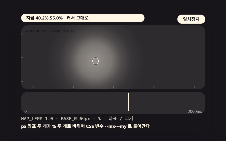 01 sl-basic-radial-tracking
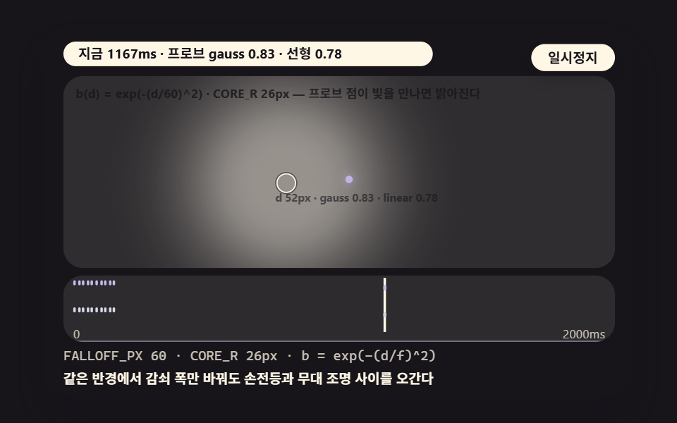 02 sl-gaussian-falloff
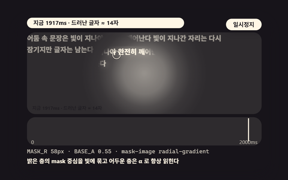 03 sl-mask-reveal-content
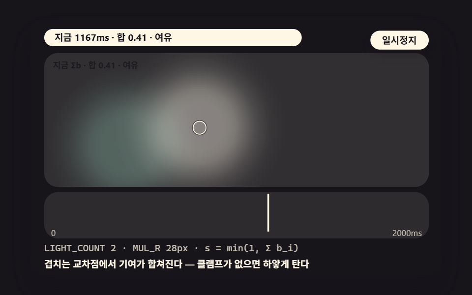 04 sl-multi-light-sum
 05 sl-canvas-pixel-rain
 06 sl-gallery-grid-cell
 07 sl-hero-lerp-inertia
 08 sl-tap-pulse-touch
 09 sl-focus-visible-light
- 01 A Basic Spotlight That Maps the Cursor Into Percents
- 02 A Gaussian Falloff Whose Brightness Varies by Distance
- 03 A Mask Inversion That Reveals Text as the Light Passes
- 04 Multi-Lighting That Sums Three Lights Onto One Pixel
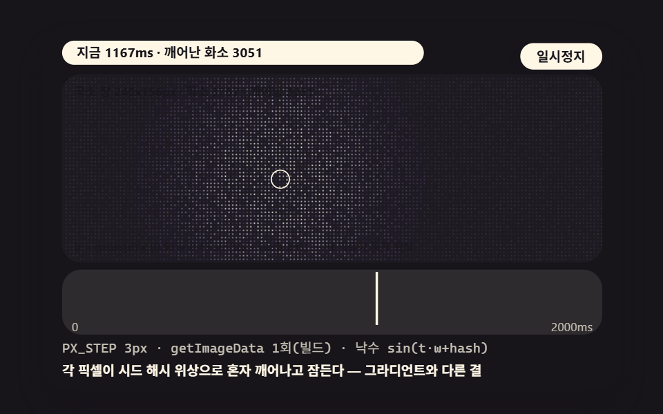
- 05 A Canvas Light Where Pixels Wake Through getImageData
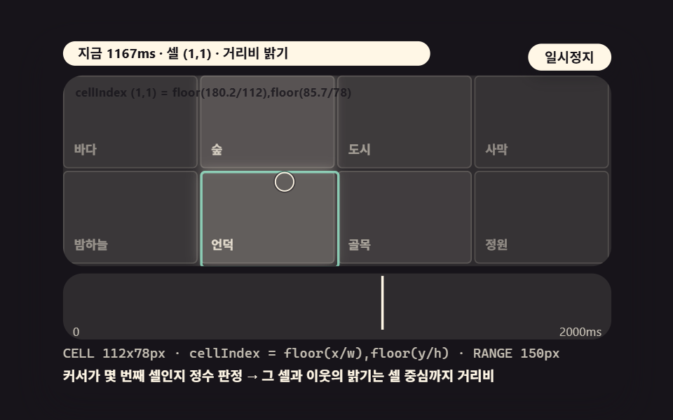
- 06 A Gallery That Lights Cells by Boundary Detection
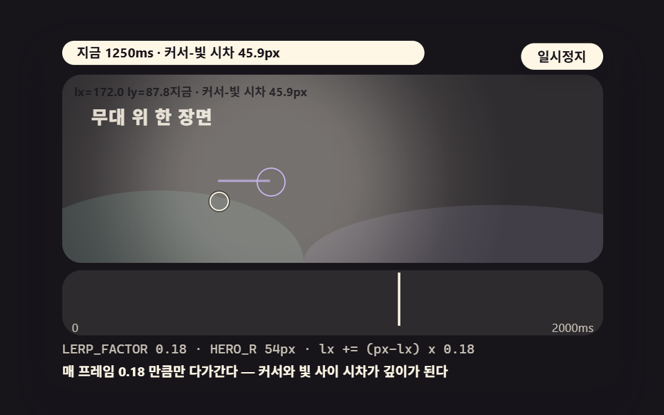
- 07 A Subtle Hero Light Trailing With Inertia
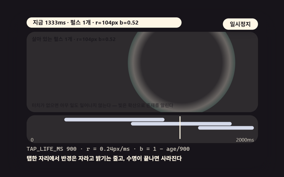
- 08 A Pulse Spreading From the Tap for Touch
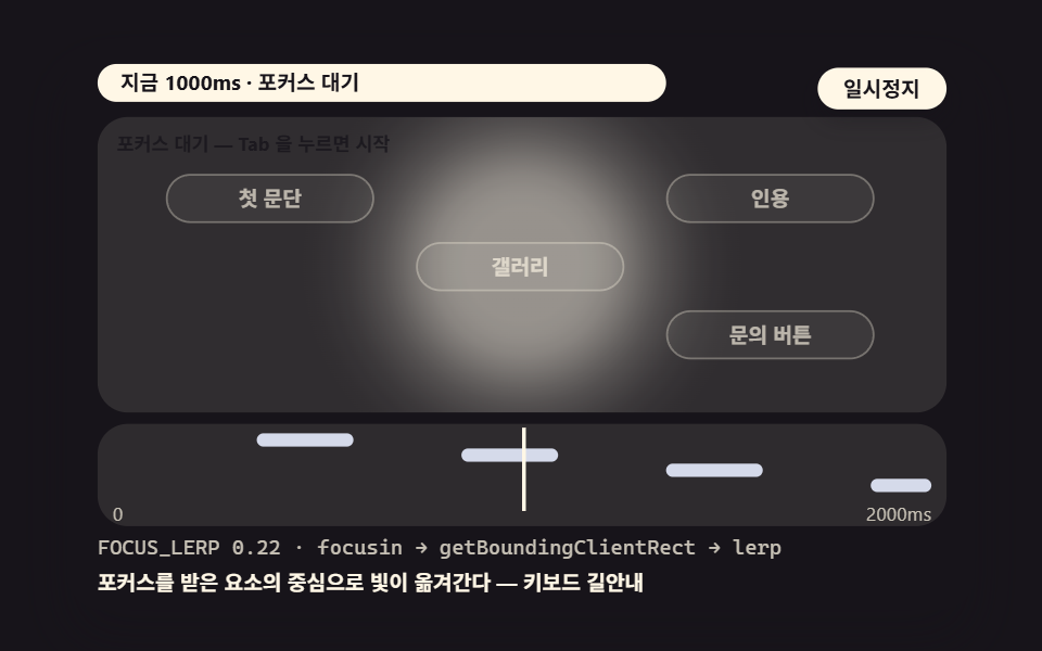
- 09 A Light That Brightens the Focused Element
The minimal version of this post is two lines that divide the px coordinates from pointermove by the container size into percents — slot those values into a radial-gradient center and the stage lights up only where the cursor is. Each remaining scene adds one layer on top: a falloff curve, several summed lights, per-pixel canvas work.
The nine scenes climb from thin math to thick. Scene 01 is the two-line arithmetic that turns coordinates into percents, 02 sets the grain of the light with a gaussian curve, and 04 sums the brightness of several lights onto a single pixel. Scene 05 drops to the canvas, where every pixel wakes on its own phase, and 06 re-assigns lighting per gallery cell. Scene 07 gives a hero background its quiet inertia, 08 swaps the mouse for a tap pulse on touch screens, and 09 closes with a light that follows keyboard focus.
Why Eight of Nine Scenes Measure 39% — What the Accumulated Area Says
The numbers come from 도구/demo.py, which renders each 480×300 stage into 24 frames and reads motion from the 23 deltas between neighboring captures. One thing to hold onto while reading the table: the autoplay in these demos is a deterministically injected route and schedule, not a human hand moving a mouse — the same handlers run for real pointer input, but the figures below are measured from the injected run.
| Scene | Accumulated area | Intensity | Frames moved |
|---|---|---|---|
| 01 Percent-mapping basic tracking | 39.0% | 43.0 | 23/23 |
| 02 Gaussian distance falloff | 39.5% | 40.6 | 23/23 |
| 03 Mask-inversion reveal | 9.9% | 91.9 | 23/23 |
| 04 Multi-light summing | 39.0% | 44.6 | 23/23 |
| 05 Canvas pixel rain | 13.9% | 48.2 | 23/23 |
| 06 Gallery cell partial lighting | 39.6% | 36.7 | 23/23 |
| 07 Hero inertia tracking | 39.2% | 45.2 | 23/23 |
| 08 Tap pulse spread | 39.1% | 62.0 | 23/23 |
| 09 Keyboard focus light | 2.2% | 120.9 | 23/23 |
Accumulated area is the share of pixels that differ from the first frame at least once, and intensity is the mean color difference of those pixels on a 0-to-255 scale. Eight scenes sit around 39% because a wide light sweeps broad territory as it crosses the stage — that is the character of a scene-style demo. Scene 03 measures 9.9% because the revealed sentence itself is narrow, and 09 is a component-style scene hopping between four chips at 2.2% — precisely because the change concentrates in a small area, its intensity readings of 91.9 and 120.9 are the sharpest of the nine. All nine scenes moved in 23 of 23 frames with no blank capture.
01A Basic Spotlight That Maps the Cursor Into Percents — the Arithmetic of Two Values
clientX/clientY from pointermove are divided by the container size into 0-to-100 percents and fed into the radial-gradient center through the CSS variables --mx and --my — wherever the cursor goes, the center follows exactly, and those two lines are the whole of a spotlight. The scale crosshair and the live percent readout put the mapping itself on screen, which makes this the right starting point if you are pasting spotlight effect html css for the first time.
<main class="stage">
<div class="ez is-demo" id="ez">
  <div class="ez__in" data-role="inner">
    <div class="ez__pad" data-role="pad" tabindex="0" role="application" aria-label="Demo stage: Space or Enter pauses, R restarts, left and right arrows pick another value">
      <div class="ez__scene" data-role="scene" role="img" aria-label="Two values of arithmetic turn cursor coordinates into percents and slot them into a radial-gradient center, so the light follows exactly"></div>
      <div class="ez__probe" data-role="probe" aria-hidden="true"></div>
      <div class="ez__chart" data-role="chart" aria-hidden="true"></div>
      <p class="ez__status" data-role="status" aria-live="off">Scene ready</p>
      <p class="ez__reada" data-role="reada" aria-hidden="true"></p>
      <p class="ez__readb" data-role="readb" aria-hidden="true"></p>
      <div class="ez__ctrl">
        <button class="ez__pause" data-role="pause" type="button" aria-pressed="false">Pause</button>
… (총 18줄 — 아래 「전체 코드」에서 원문 전체)
// 524 공통 — 스포트라이트 효과 (523 base.scss 계승, 카드→광원 팔레트로)
@use "../../../../site/static/demo-tokens" as *;
@include stage($stage-ink);
$panel: mix($subject-cream, $subject-ink, 10%);
$dim: mix($subject-cream, $subject-ink, 76%);
// 파스텔 액센트 — vivid 토큰 대신 (BD26)
$stroke-blue: #d5daea;
$stroke-rose: #ebd6db;
$stroke-mint: #8fd8bd;
$stroke-lilac: #c9b8f2;
… (총 371줄 — 아래 「전체 코드」에서 원문 전체)html, body {
margin: 0;
overflow: hidden;
}
.stage {
box-sizing: border-box;
min-height: 100vh;
display: grid;
place-items: center;
margin: 0;
background: #17141a;
… (총 464줄 — 아래 「전체 코드」에서 원문 전체)(function () {
const rootEl = document.getElementById("ez");
if (!rootEl) return;
main(rootEl);
function cx(s) { return s; }
function main(root) {
// ── 524 스포트라이트 공통 — 무대 좌표·문구 틀·요소 조립·광원 오버레이 (523 core.ts 계승)
const W = 480;
const CX0 = 8;
const CW = 432;
function clamp(v, lo, hi) { return v < lo ? lo : (v > hi ? hi : v); }
function lerp(a, b, k) { return a + (b - a) * k; }
… (총 351줄 — 아래 「전체 코드」에서 원문 전체)// SlBasicRadialTracking - 같은 항목 vanilla index.html 의 React 판. 같은 계산을 useEffect 안에서 돌린다
import { useEffect, useRef } from "react";
import styles from "./SlBasicRadialTracking.module.scss";
const cx = (s: string): string => s.split(" ").map((n) => styles[n] ?? n).join(" ");
function main(root: HTMLElement): () => void {
// ── 524 스포트라이트 공통 — 무대 좌표·문구 틀·요소 조립·광원 오버레이 (523 core.ts 계승)
const W = 480;
const CX0 = 8;
const CW = 432;
function clamp(v: number, lo: number, hi: number): number { return v < lo ? lo : (v > hi ? hi : v); }
… (총 347줄 — 아래 「전체 코드」에서 원문 전체)01 · A Basic Spotlight That Maps the Cursor Into Percents — Measured area 39.046% · moving frames 23/23Original by GODRICH · SCSS and React ship in the zip · See the password
Demo and Explanation
    // 01 basic % mapping — divide clientX/Y from pointermove by the container size into 0~100%
    //    and slot them into the radial-gradient center via CSS variables --mx/--my. Two values of arithmetic are the whole spotlight
    const MAP_LERP = 1.0; // 01 maps instantly (07 handles lerp inertia)
    const BASE_R = 64; // light radius px
    function applyLight(x, y) {
        // coordinate → % mapping — these two lines are the whole demo
        const px = clamp(x / 448 * 100, 0, 100);
        const py = clamp(y / 156 * 100, 0, 100);
        mrx += (px - mrx) * MAP_LERP;
        mry += (py - mry) * MAP_LERP;
        if (beamEl) {
            beamEl.style.setProperty('--mx', f1(mrx) + '%');
            beamEl.style.setProperty('--my', f1(mry) + '%');
        }
Where to Look in the Code
On the SCSS side one line receives the variables — background: radial-gradient(circle 64px at var(--mx) var(--my), cream-colored stops) — and .beam carries mix-blend-mode: screen to add cream light over the ink-colored stage, with the radius spelled out as 64px for the reason the trap section covers.
02A Gaussian Falloff Whose Brightness Varies by Distance — the Value That Sets the Grain
Each pixel's brightness is computed from its distance d to the light through the gaussian curve exp(-(d/FALLOFF_PX)²) — at the same radius it lands differently than a linear falloff, and a fixed probe point prints both curves as live numbers every frame. Holding the radius at 26px and changing only FALLOFF_PX 60 moves the feel between a flashlight and a stage light, with readout values of gauss 0.83 against linear 0.78 at d=52px as the light sweeps past the probe point (232,84) — and this one curve becomes the shared engine, since the summing in 04 and the pixel rain in 05 both call the same gauss().
<main class="stage">
<div class="ez is-demo" id="ez">
  <div class="ez__in" data-role="inner">
    <div class="ez__pad" data-role="pad" tabindex="0" role="application" aria-label="Demo stage: Space or Enter pauses, R restarts, left and right arrows pick another value">
      <div class="ez__scene" data-role="scene" role="img" aria-label="Distance to the light decays through a gaussian curve, giving the same radius a softer grain than a linear falloff"></div>
      <div class="ez__probe" data-role="probe" aria-hidden="true"></div>
      <div class="ez__chart" data-role="chart" aria-hidden="true"></div>
      <p class="ez__status" data-role="status" aria-live="off">Scene ready</p>
      <p class="ez__reada" data-role="reada" aria-hidden="true"></p>
      <p class="ez__readb" data-role="readb" aria-hidden="true"></p>
      <div class="ez__ctrl">
        <button class="ez__pause" data-role="pause" type="button" aria-pressed="false">Pause</button>
… (총 18줄 — 아래 「전체 코드」에서 원문 전체)
// 524 공통 — 스포트라이트 효과 (523 base.scss 계승, 카드→광원 팔레트로)
@use "../../../../site/static/demo-tokens" as *;
@include stage($stage-ink);
$panel: mix($subject-cream, $subject-ink, 10%);
$dim: mix($subject-cream, $subject-ink, 76%);
// 파스텔 액센트 — vivid 토큰 대신 (BD26)
$stroke-blue: #d5daea;
$stroke-rose: #ebd6db;
$stroke-mint: #8fd8bd;
$stroke-lilac: #c9b8f2;
… (총 371줄 — 아래 「전체 코드」에서 원문 전체)html, body {
margin: 0;
overflow: hidden;
}
.stage {
box-sizing: border-box;
min-height: 100vh;
display: grid;
place-items: center;
margin: 0;
background: #17141a;
… (총 464줄 — 아래 「전체 코드」에서 원문 전체)(function () {
const rootEl = document.getElementById("ez");
if (!rootEl) return;
main(rootEl);
function cx(s) { return s; }
function main(root) {
// ── 524 스포트라이트 공통 — 무대 좌표·문구 틀·요소 조립·광원 오버레이 (523 core.ts 계승)
const W = 480;
const CX0 = 8;
const CW = 432;
function clamp(v, lo, hi) { return v < lo ? lo : (v > hi ? hi : v); }
function lerp(a, b, k) { return a + (b - a) * k; }
… (총 367줄 — 아래 「전체 코드」에서 원문 전체)// SlGaussianFalloff - 같은 항목 vanilla index.html 의 React 판. 같은 계산을 useEffect 안에서 돌린다
import { useEffect, useRef } from "react";
import styles from "./SlGaussianFalloff.module.scss";
const cx = (s: string): string => s.split(" ").map((n) => styles[n] ?? n).join(" ");
function main(root: HTMLElement): () => void {
// ── 524 스포트라이트 공통 — 무대 좌표·문구 틀·요소 조립·광원 오버레이 (523 core.ts 계승)
const W = 480;
const CX0 = 8;
const CW = 432;
function clamp(v: number, lo: number, hi: number): number { return v < lo ? lo : (v > hi ? hi : v); }
… (총 352줄 — 아래 「전체 코드」에서 원문 전체)02 · A Gaussian Falloff Whose Brightness Varies by Distance — Measured area 39.458% · moving frames 23/23Original by GODRICH · SCSS and React ship in the zip · See the password
Demo and Explanation
    // 02 gaussian distance falloff — per-pixel brightness b = exp(-(d/FALLOFF_PX)^2). A different grain than linear (1-d/f) at the same radius
    const FALLOFF_PX = 60; // variant 1: 60 → 160 (light bleeds generously past its radius)
    const CORE_R = 26; // full-brightness core radius
    const PROBE_XY = { x: 232, y: 84 }; // fixed probe point — near the light path's center (rise/fall values stay alive at poster moments too)
    // gaussian distance falloff — brightness at d is b = exp(-(d/f)^2). f=FALLOFF_PX
    function gauss(d, f) { return Math.exp(-(d * d) / (f * f)); }
    // gaussGrad — light center (cx,cy) · radius r (1 inside) · falloff width f. Sampled into
    // a radial-gradient string at 11 stops. tint is 'r,g,b' (cream 255,247,230). maxA is the center alpha.
    function gaussGrad(cx, cy, r, f, tint, maxA) {
        const stops = [];
        const total = r + f * 2;
        for (let i = 0; i <= 10; i += 1) {
            const frac = i / 10;
            const d = r + frac * f * 2;
            const a = maxA * gauss(d - r, f);
            stops.push('rgba(' + tint + ',' + f2(a) + ') ' + f1(clamp(d / total, 0, 1) * 100) + '%');
        }
        return 'radial-gradient(circle ' + f1(total) + 'px at ' + f1(cx) + 'px ' + f1(cy) + 'px, rgba(' + tint + ',' + f2(maxA) + ') 0px, ' + stops.join(', ') + ')';
    }
Where to Look in the Code
As the comment in gaussGrad warns, leaving the radius off after circle expands the gradient box to farthest-corner and pads the last stop's alpha across the whole frame — that is what whitened the 04 poster during this post's build — while the gaussian itself keeps the near side brighter and kills the tail faster than a straight line.
03A Mask Inversion That Reveals Text as the Light Passes — the Same Sentence on Two Coats
The same sentence sits on a dark coat and a bright coat, and mask-image is tied to the light's position — the bright coat shows only inside the radius MASK_R 58px, while the dark coat carries an inverted mask that keeps the outside faintly present. The area the light has passed locks again, but the dark coat's base alpha of 0.55 keeps the sentence readable with no beam at all; of a 30-character sentence, roughly 14 characters sit inside the passing radius.
<main class="stage">
<div class="ez is-demo" id="ez">
  <div class="ez__in" data-role="inner">
    <div class="ez__pad" data-role="pad" tabindex="0" role="application" aria-label="Demo stage: Space or Enter pauses, R restarts, left and right arrows pick another value">
      <div class="ez__scene" data-role="scene" role="img" aria-label="The same sentence sits on a dark coat and a bright coat, and only inside the light's radius do the bright letters show"></div>
      <div class="ez__probe" data-role="probe" aria-hidden="true"></div>
      <div class="ez__chart" data-role="chart" aria-hidden="true"></div>
      <p class="ez__status" data-role="status" aria-live="off">Scene ready</p>
      <p class="ez__reada" data-role="reada" aria-hidden="true"></p>
      <p class="ez__readb" data-role="readb" aria-hidden="true"></p>
      <div class="ez__ctrl">
        <button class="ez__pause" data-role="pause" type="button" aria-pressed="false">Pause</button>
… (총 18줄 — 아래 「전체 코드」에서 원문 전체)
// 524 공통 — 스포트라이트 효과 (523 base.scss 계승, 카드→광원 팔레트로)
@use "../../../../site/static/demo-tokens" as *;
@include stage($stage-ink);
$panel: mix($subject-cream, $subject-ink, 10%);
$dim: mix($subject-cream, $subject-ink, 76%);
// 파스텔 액센트 — vivid 토큰 대신 (BD26)
$stroke-blue: #d5daea;
$stroke-rose: #ebd6db;
$stroke-mint: #8fd8bd;
$stroke-lilac: #c9b8f2;
… (총 371줄 — 아래 「전체 코드」에서 원문 전체)html, body {
margin: 0;
overflow: hidden;
}
.stage {
box-sizing: border-box;
min-height: 100vh;
display: grid;
place-items: center;
margin: 0;
background: #17141a;
… (총 464줄 — 아래 「전체 코드」에서 원문 전체)(function () {
const rootEl = document.getElementById("ez");
if (!rootEl) return;
main(rootEl);
function cx(s) { return s; }
function main(root) {
// ── 524 스포트라이트 공통 — 무대 좌표·문구 틀·요소 조립·광원 오버레이 (523 core.ts 계승)
const W = 480;
const CX0 = 8;
const CW = 432;
function clamp(v, lo, hi) { return v < lo ? lo : (v > hi ? hi : v); }
function lerp(a, b, k) { return a + (b - a) * k; }
… (총 357줄 — 아래 「전체 코드」에서 원문 전체)// SlMaskRevealContent - 같은 항목 vanilla index.html 의 React 판. 같은 계산을 useEffect 안에서 돌린다
import { useEffect, useRef } from "react";
import styles from "./SlMaskRevealContent.module.scss";
const cx = (s: string): string => s.split(" ").map((n) => styles[n] ?? n).join(" ");
function main(root: HTMLElement): () => void {
// ── 524 스포트라이트 공통 — 무대 좌표·문구 틀·요소 조립·광원 오버레이 (523 core.ts 계승)
const W = 480;
const CX0 = 8;
const CW = 432;
function clamp(v: number, lo: number, hi: number): number { return v < lo ? lo : (v > hi ? hi : v); }
… (총 353줄 — 아래 「전체 코드」에서 원문 전체)03 · A Mask Inversion That Reveals Text as the Light Passes — Measured area 9.9% · moving frames 23/23Original by GODRICH · SCSS and React ship in the zip · See the password
Demo and Explanation
    const MASK_R = 58; // mask radius
    const BASE_A = 0.55; // dark coat base alpha (base readability)
    function applyMask(x, y) {
        // mask inversion — the bright coat only inside the radius, the dark coat kept faint outside only (inverted mask)
        const m = 'radial-gradient(circle ' + MASK_R + 'px at ' + f1(x) + 'px ' + f1(y) + 'px, #000 ' + f0(MASK_R - 18) + 'px, transparent ' + MASK_R + 'px)';
        const mi = 'radial-gradient(circle ' + MASK_R + 'px at ' + f1(x) + 'px ' + f1(y) + 'px, transparent ' + f0(MASK_R - 18) + 'px, #000 ' + MASK_R + 'px)';
        if (litLayer) {
            litLayer.style.webkitMaskImage = m;
            litLayer.style.maskImage = m;
        }
Where to Look in the Code
The two strings are a matched pair — a black mask and its inversion at the same radius, where black marks the visible region — and writing webkitMaskImage and maskImage together is deliberate, for the reason the compatibility section explains.
04Multi-Lighting That Sums Three Lights Onto One Pixel — the Overexposure Clamp
One moving light and LIGHT_COUNT fixed lights have their contributions summed at a center pixel, and anything past 1 is clamped — the single line s = min(1, Σ b_i) is all the arithmetic that stops overexposure. On screen each light stacks its own .beam under screen blending to approximate the sum, and the brightness where beams cross is what gives the stage depth — remove the clamp and the overlapping intersections burn out white.
<main class="stage">
<div class="ez is-demo" id="ez">
  <div class="ez__in" data-role="inner">
    <div class="ez__pad" data-role="pad" tabindex="0" role="application" aria-label="Demo stage: Space or Enter pauses, R restarts, left and right arrows pick another value">
      <div class="ez__scene" data-role="scene" role="img" aria-label="Contributions from a moving light and fixed lights sum per pixel while an upper clamp keeps the overlaps from burning white"></div>
      <div class="ez__probe" data-role="probe" aria-hidden="true"></div>
      <div class="ez__chart" data-role="chart" aria-hidden="true"></div>
      <p class="ez__status" data-role="status" aria-live="off">Scene ready</p>
      <p class="ez__reada" data-role="reada" aria-hidden="true"></p>
      <p class="ez__readb" data-role="readb" aria-hidden="true"></p>
      <div class="ez__ctrl">
        <button class="ez__pause" data-role="pause" type="button" aria-pressed="false">Pause</button>
… (총 18줄 — 아래 「전체 코드」에서 원문 전체)
// 524 공통 — 스포트라이트 효과 (523 base.scss 계승, 카드→광원 팔레트로)
@use "../../../../site/static/demo-tokens" as *;
@include stage($stage-ink);
$panel: mix($subject-cream, $subject-ink, 10%);
$dim: mix($subject-cream, $subject-ink, 76%);
// 파스텔 액센트 — vivid 토큰 대신 (BD26)
$stroke-blue: #d5daea;
$stroke-rose: #ebd6db;
$stroke-mint: #8fd8bd;
$stroke-lilac: #c9b8f2;
… (총 371줄 — 아래 「전체 코드」에서 원문 전체)html, body {
margin: 0;
overflow: hidden;
}
.stage {
box-sizing: border-box;
min-height: 100vh;
display: grid;
place-items: center;
margin: 0;
background: #17141a;
… (총 464줄 — 아래 「전체 코드」에서 원문 전체)(function () {
const rootEl = document.getElementById("ez");
if (!rootEl) return;
main(rootEl);
function cx(s) { return s; }
function main(root) {
// ── 524 스포트라이트 공통 — 무대 좌표·문구 틀·요소 조립·광원 오버레이 (523 core.ts 계승)
const W = 480;
const CX0 = 8;
const CW = 432;
function clamp(v, lo, hi) { return v < lo ? lo : (v > hi ? hi : v); }
function lerp(a, b, k) { return a + (b - a) * k; }
… (총 362줄 — 아래 「전체 코드」에서 원문 전체)// SlMultiLightSum - 같은 항목 vanilla index.html 의 React 판. 같은 계산을 useEffect 안에서 돌린다
import { useEffect, useRef } from "react";
import styles from "./SlMultiLightSum.module.scss";
const cx = (s: string): string => s.split(" ").map((n) => styles[n] ?? n).join(" ");
function main(root: HTMLElement): () => void {
// ── 524 스포트라이트 공통 — 무대 좌표·문구 틀·요소 조립·광원 오버레이 (523 core.ts 계승)
const W = 480;
const CX0 = 8;
const CW = 432;
function clamp(v: number, lo: number, hi: number): number { return v < lo ? lo : (v > hi ? hi : v); }
… (총 352줄 — 아래 「전체 코드」에서 원문 전체)04 · Multi-Lighting That Sums Three Lights Onto One Pixel — Measured area 38.994% · moving frames 23/23Original by GODRICH · SCSS and React ship in the zip · See the password
Demo and Explanation
    const LIGHT_COUNT = 2; // variant 2: 2 → 3 (more intersections, stage depth)
    const FIXED = [{ x: 96, y: 108 }, { x: 352, y: 108 }, { x: 224, y: 30 }];
    const MUL_R = 28;
    const MUL_F = 38;
    function applyMulti(x, y) {
        // summing arithmetic — combine per-light contributions and clamp at 1 (sumClamp)
        const pts = [{ x: x, y: y }].concat(FIXED.slice(0, LIGHT_COUNT));
        // sum at the center pixel (224,78) — model value
        let sum = 0;
        for (let i = 0; i < pts.length; i += 1) {
            const dx = 224 - pts[i].x;
            const dy = 78 - pts[i].y;
            sum += gauss(Math.max(0, Math.sqrt(dx * dx + dy * dy) - MUL_R), MUL_F) * 0.5;
        }
        const s = Math.min(1, sum);
Where to Look in the Code
Each light contributes gauss(max(0, d - MUL_R), MUL_F) × 0.5, so the radius interior is full brightness and the exterior decays with distance, and the three .beam elements stack that sum on screen — when the injected route brings the tracking light past a fixed one, the center pixel's sum first touches the 1.0 ceiling and then falls back as the light moves on, a rise-and-fall that prints as a number.
05A Canvas Light Where Pixels Wake Through getImageData — a Grain No Gradient Has
The canvas base pixels are read exactly once with getImageData at build time and kept, and every frame repaints only a local window of radius 120px around the light — putImageData updates just the pixels inside the window. Each pixel's brightness multiplies gauss(d-20, 60) by an oscillation seeded per pixel, 0.55 + 0.45·sin(t·0.0032 + hash·2π), so unlike a CSS gradient every single pixel wakes and falls asleep at its own moment — the seed hash is a deterministic function that returns the same values on every replay.
<main class="stage">
<div class="ez is-demo" id="ez">
  <div class="ez__in" data-role="inner">
    <div class="ez__pad" data-role="pad" tabindex="0" role="application" aria-label="Demo stage: Space or Enter pauses, R restarts, left and right arrows pick another value">
      <div class="ez__scene" data-role="scene" role="img" aria-label="Every canvas pixel wakes and sleeps alone at its seeded-hash phase in a rain of light"></div>
      <div class="ez__probe" data-role="probe" aria-hidden="true"></div>
      <div class="ez__chart" data-role="chart" aria-hidden="true"></div>
      <p class="ez__status" data-role="status" aria-live="off">Scene ready</p>
      <p class="ez__reada" data-role="reada" aria-hidden="true"></p>
      <p class="ez__readb" data-role="readb" aria-hidden="true"></p>
      <div class="ez__ctrl">
        <button class="ez__pause" data-role="pause" type="button" aria-pressed="false">Pause</button>
… (총 18줄 — 아래 「전체 코드」에서 원문 전체)
// 524 공통 — 스포트라이트 효과 (523 base.scss 계승, 카드→광원 팔레트로)
@use "../../../../site/static/demo-tokens" as *;
@include stage($stage-ink);
$panel: mix($subject-cream, $subject-ink, 10%);
$dim: mix($subject-cream, $subject-ink, 76%);
// 파스텔 액센트 — vivid 토큰 대신 (BD26)
$stroke-blue: #d5daea;
$stroke-rose: #ebd6db;
$stroke-mint: #8fd8bd;
$stroke-lilac: #c9b8f2;
… (총 371줄 — 아래 「전체 코드」에서 원문 전체)html, body {
margin: 0;
overflow: hidden;
}
.stage {
box-sizing: border-box;
min-height: 100vh;
display: grid;
place-items: center;
margin: 0;
background: #17141a;
… (총 464줄 — 아래 「전체 코드」에서 원문 전체)(function () {
const rootEl = document.getElementById("ez");
if (!rootEl) return;
main(rootEl);
function cx(s) { return s; }
function main(root) {
// ── 524 스포트라이트 공통 — 무대 좌표·문구 틀·요소 조립·광원 오버레이 (523 core.ts 계승)
const W = 480;
const CX0 = 8;
const CW = 432;
function clamp(v, lo, hi) { return v < lo ? lo : (v > hi ? hi : v); }
function lerp(a, b, k) { return a + (b - a) * k; }
… (총 396줄 — 아래 「전체 코드」에서 원문 전체)// SlCanvasPixelRain - 같은 항목 vanilla index.html 의 React 판. 같은 계산을 useEffect 안에서 돌린다
import { useEffect, useRef } from "react";
import styles from "./SlCanvasPixelRain.module.scss";
const cx = (s: string): string => s.split(" ").map((n) => styles[n] ?? n).join(" ");
function main(root: HTMLElement): () => void {
// ── 524 스포트라이트 공통 — 무대 좌표·문구 틀·요소 조립·광원 오버레이 (523 core.ts 계승)
const W = 480;
const CX0 = 8;
const CW = 432;
function clamp(v: number, lo: number, hi: number): number { return v < lo ? lo : (v > hi ? hi : v); }
… (총 384줄 — 아래 「전체 코드」에서 원문 전체)05 · A Canvas Light Where Pixels Wake Through getImageData — Measured area 13.915% · moving frames 23/23Original by GODRICH · SCSS and React ship in the zip · See the password
Demo and Explanation
    const PX_STEP = 3; // pixel grid stride (compute cap — 448/3 x 156/3 pixels)
    const WAKE_F = 0.0032; // rain oscillation angular-speed factor
    const CANVAS_W = 448;
    const CANVAS_H = 156;
    let cvEl = null;
    let ctx2 = null;
    let baseData = null; // base pixels (once at build)
    // per-vertex offset — seed hash (same values on every replay). No Math.random
    function seedHash(i, seed) {
        const x = Math.sin(i * 12.9898 + seed * 78.233) * 43758.5453;
        return x - Math.floor(x);
    }
                const g = gauss(dist - 20, 60); // light contribution
                const h1 = seedHash(gx * 331 + gy, 7); // same seed as the base — phase reproduction
                const wake = 0.55 + 0.45 * Math.sin(t * WAKE_F + h1 * Math.PI * 2); // rain oscillation
                const b = g * wake;
                if (b > 0.06) {
                    lit += 1;
                }
                const idx = (gy * CANVAS_W + gx) * 4;
                const add = Math.round(b * 250);
                d[idx] = clamp(d[idx] + add, 0, 255);
                d[idx + 1] = clamp(d[idx + 1] + add - 8, 0, 255);
                d[idx + 2] = clamp(d[idx + 2] + add + 16, 0, 255);
Where to Look in the Code
These fences are the whole local loop that repaints the window — why a full per-frame scan is forbidden and how the window is structured are covered in the trap section below.
06A Gallery That Lights Cells by Boundary Detection — One Division as the Verdict
The cursor position is divided by the cell size into an integer cell index, and distance-proportional brightness is assigned to that cell and all its neighbors — cellIndex = floor(x/112), floor(y/78) is the entire verdict, and brightness follows the ratio (1 - d/150)^1.5. Even the order in which neighbors dim first as the beam crosses a boundary is part of the math.
<main class="stage">
<div class="ez is-demo" id="ez">
  <div class="ez__in" data-role="inner">
    <div class="ez__pad" data-role="pad" tabindex="0" role="application" aria-label="Demo stage: Space or Enter pauses, R restarts, left and right arrows pick another value">
      <div class="ez__scene" data-role="scene" role="img" aria-label="The cursor resolves to an integer gallery cell, and that cell and its neighbors share distance-proportional brightness"></div>
      <div class="ez__probe" data-role="probe" aria-hidden="true"></div>
      <div class="ez__chart" data-role="chart" aria-hidden="true"></div>
      <p class="ez__status" data-role="status" aria-live="off">Scene ready</p>
      <p class="ez__reada" data-role="reada" aria-hidden="true"></p>
      <p class="ez__readb" data-role="readb" aria-hidden="true"></p>
      <div class="ez__ctrl">
        <button class="ez__pause" data-role="pause" type="button" aria-pressed="false">Pause</button>
… (총 18줄 — 아래 「전체 코드」에서 원문 전체)
// 524 공통 — 스포트라이트 효과 (523 base.scss 계승, 카드→광원 팔레트로)
@use "../../../../site/static/demo-tokens" as *;
@include stage($stage-ink);
$panel: mix($subject-cream, $subject-ink, 10%);
$dim: mix($subject-cream, $subject-ink, 76%);
// 파스텔 액센트 — vivid 토큰 대신 (BD26)
$stroke-blue: #d5daea;
$stroke-rose: #ebd6db;
$stroke-mint: #8fd8bd;
$stroke-lilac: #c9b8f2;
… (총 371줄 — 아래 「전체 코드」에서 원문 전체)html, body {
margin: 0;
overflow: hidden;
}
.stage {
box-sizing: border-box;
min-height: 100vh;
display: grid;
place-items: center;
margin: 0;
background: #17141a;
… (총 464줄 — 아래 「전체 코드」에서 원문 전체)(function () {
const rootEl = document.getElementById("ez");
if (!rootEl) return;
main(rootEl);
function cx(s) { return s; }
function main(root) {
// ── 524 스포트라이트 공통 — 무대 좌표·문구 틀·요소 조립·광원 오버레이 (523 core.ts 계승)
const W = 480;
const CX0 = 8;
const CW = 432;
function clamp(v, lo, hi) { return v < lo ? lo : (v > hi ? hi : v); }
function lerp(a, b, k) { return a + (b - a) * k; }
… (총 374줄 — 아래 「전체 코드」에서 원문 전체)// SlGalleryGridCell - 같은 항목 vanilla index.html 의 React 판. 같은 계산을 useEffect 안에서 돌린다
import { useEffect, useRef } from "react";
import styles from "./SlGalleryGridCell.module.scss";
const cx = (s: string): string => s.split(" ").map((n) => styles[n] ?? n).join(" ");
function main(root: HTMLElement): () => void {
// ── 524 스포트라이트 공통 — 무대 좌표·문구 틀·요소 조립·광원 오버레이 (523 core.ts 계승)
const W = 480;
const CX0 = 8;
const CW = 432;
function clamp(v: number, lo: number, hi: number): number { return v < lo ? lo : (v > hi ? hi : v); }
… (총 366줄 — 아래 「전체 코드」에서 원문 전체)06 · A Gallery That Lights Cells by Boundary Detection — Measured area 39.638% · moving frames 23/23Original by GODRICH · SCSS and React ship in the zip · See the password
Demo and Explanation
    const CELL_W = 112;
    const CELL_H = 78;
    const COLS = 4;
    const ROWS = 2;
    const RANGE_PX = 150; // light influence radius
    const NEAR = 1.5; // distance-ratio exponent — (1 - d/RANGE)^1.5
    function applyGrid(x, y) {
        // cell verdict — one division into integer indexes
        const c = clamp(Math.floor(x / CELL_W), 0, COLS - 1);
        const r = clamp(Math.floor(y / CELL_H), 0, ROWS - 1);
Where to Look in the Code
The exponent NEAR 1.5 keeps brightness from falling off straight with distance — it holds the near side up and then kills it abruptly near the edge, which is why exactly one cell of the 4×2 photo gallery goes fully bright while its neighbors follow faintly as the cursor passes.
07A Subtle Hero Light Trailing With Inertia — the Gap Between Cursor and Light
Each frame the light's position moves only LERP_FACTOR (0.18) of the way toward the cursor, leaving a gap between them — lx += (x - lx) * 0.18 is the one line of inertia. Over pastel hills on a large hero background that gap becomes a quiet depth, and a delay line drawn between the cursor crosshair and the light ring shows the distance in px — measured along the injected route, the cursor-light gap runs about 52px.
<main class="stage">
<div class="ez is-demo" id="ez">
  <div class="ez__in" data-role="inner">
    <div class="ez__pad" data-role="pad" tabindex="0" role="application" aria-label="Demo stage: Space or Enter pauses, R restarts, left and right arrows pick another value">
      <div class="ez__scene" data-role="scene" role="img" aria-label="The light steps only partway toward the cursor each frame, and the delay becomes the hero's depth"></div>
      <div class="ez__probe" data-role="probe" aria-hidden="true"></div>
      <div class="ez__chart" data-role="chart" aria-hidden="true"></div>
      <p class="ez__status" data-role="status" aria-live="off">Scene ready</p>
      <p class="ez__reada" data-role="reada" aria-hidden="true"></p>
      <p class="ez__readb" data-role="readb" aria-hidden="true"></p>
      <div class="ez__ctrl">
        <button class="ez__pause" data-role="pause" type="button" aria-pressed="false">Pause</button>
… (총 18줄 — 아래 「전체 코드」에서 원문 전체)
// 524 공통 — 스포트라이트 효과 (523 base.scss 계승, 카드→광원 팔레트로)
@use "../../../../site/static/demo-tokens" as *;
@include stage($stage-ink);
$panel: mix($subject-cream, $subject-ink, 10%);
$dim: mix($subject-cream, $subject-ink, 76%);
// 파스텔 액센트 — vivid 토큰 대신 (BD26)
$stroke-blue: #d5daea;
$stroke-rose: #ebd6db;
$stroke-mint: #8fd8bd;
$stroke-lilac: #c9b8f2;
… (총 371줄 — 아래 「전체 코드」에서 원문 전체)html, body {
margin: 0;
overflow: hidden;
}
.stage {
box-sizing: border-box;
min-height: 100vh;
display: grid;
place-items: center;
margin: 0;
background: #17141a;
… (총 464줄 — 아래 「전체 코드」에서 원문 전체)(function () {
const rootEl = document.getElementById("ez");
if (!rootEl) return;
main(rootEl);
function cx(s) { return s; }
function main(root) {
// ── 524 스포트라이트 공통 — 무대 좌표·문구 틀·요소 조립·광원 오버레이 (523 core.ts 계승)
const W = 480;
const CX0 = 8;
const CW = 432;
function clamp(v, lo, hi) { return v < lo ? lo : (v > hi ? hi : v); }
function lerp(a, b, k) { return a + (b - a) * k; }
… (총 371줄 — 아래 「전체 코드」에서 원문 전체)// SlHeroLerpInertia - 같은 항목 vanilla index.html 의 React 판. 같은 계산을 useEffect 안에서 돌린다
import { useEffect, useRef } from "react";
import styles from "./SlHeroLerpInertia.module.scss";
const cx = (s: string): string => s.split(" ").map((n) => styles[n] ?? n).join(" ");
function main(root: HTMLElement): () => void {
// ── 524 스포트라이트 공통 — 무대 좌표·문구 틀·요소 조립·광원 오버레이 (523 core.ts 계승)
const W = 480;
const CX0 = 8;
const CW = 432;
function clamp(v: number, lo: number, hi: number): number { return v < lo ? lo : (v > hi ? hi : v); }
… (총 362줄 — 아래 「전체 코드」에서 원문 전체)07 · A Subtle Hero Light Trailing With Inertia — Measured area 39.199% · moving frames 23/23Original by GODRICH · SCSS and React ship in the zip · See the password
Demo and Explanation
    const LERP_FACTOR = 0.18; // variant 3: 0.18 → 0.06 (slow physical weight)
    const HERO_R = 54;
    const HERO_F = 80;
    function applyHero(x, y, dt) {
        // lerp — fixed factor with no dt correction (frame standard). Returns the cursor-light distance
        lx += (x - lx) * LERP_FACTOR;
        ly += (y - ly) * LERP_FACTOR;
        void dt;
        const dist = Math.sqrt((x - lx) * (x - lx) + (y - ly) * (y - ly));
Where to Look in the Code
Against the measured gap, cutting the factor to 0.06 widens the distance to roughly three times and gives the light a heavy, far-behind weight — pushing it toward 1.0 instead glues the light to the cursor the way scene 01 does.
08A Pulse Spreading From the Tap for Touch — a Light Source for Screens Without a Mouse
A pulse starts at the tap point, its radius growing with time while its brightness decays — r = age × 0.24px/ms and b = 1 - age/900ms are the two formulas of the spread, and once the lifetime TAP_LIFE_MS 900 passes the pulse is gone. On a mobile screen with no mouse, a single touch announces that the lighting exists — and real input arrives through one pointerdown listener that feeds mouse clicks, touches, and pen presses into the same addPulse() arithmetic.
<main class="stage">
<div class="ez is-demo" id="ez">
  <div class="ez__in" data-role="inner">
    <div class="ez__pad" data-role="pad" tabindex="0" role="application" aria-label="Demo stage: Space or Enter pauses, R restarts, left and right arrows pick another value">
      <div class="ez__scene" data-role="scene" role="img" aria-label="A pulse born at the tap grows in radius and fades in brightness, announcing the light by spreading"></div>
      <div class="ez__probe" data-role="probe" aria-hidden="true"></div>
      <div class="ez__chart" data-role="chart" aria-hidden="true"></div>
      <p class="ez__status" data-role="status" aria-live="off">Scene ready</p>
      <p class="ez__reada" data-role="reada" aria-hidden="true"></p>
      <p class="ez__readb" data-role="readb" aria-hidden="true"></p>
      <div class="ez__ctrl">
        <button class="ez__pause" data-role="pause" type="button" aria-pressed="false">Pause</button>
… (총 18줄 — 아래 「전체 코드」에서 원문 전체)
// 524 공통 — 스포트라이트 효과 (523 base.scss 계승, 카드→광원 팔레트로)
@use "../../../../site/static/demo-tokens" as *;
@include stage($stage-ink);
$panel: mix($subject-cream, $subject-ink, 10%);
$dim: mix($subject-cream, $subject-ink, 76%);
// 파스텔 액센트 — vivid 토큰 대신 (BD26)
$stroke-blue: #d5daea;
$stroke-rose: #ebd6db;
$stroke-mint: #8fd8bd;
$stroke-lilac: #c9b8f2;
… (총 371줄 — 아래 「전체 코드」에서 원문 전체)html, body {
margin: 0;
overflow: hidden;
}
.stage {
box-sizing: border-box;
min-height: 100vh;
display: grid;
place-items: center;
margin: 0;
background: #17141a;
… (총 464줄 — 아래 「전체 코드」에서 원문 전체)(function () {
const rootEl = document.getElementById("ez");
if (!rootEl) return;
main(rootEl);
function cx(s) { return s; }
function main(root) {
// ── 524 스포트라이트 공통 — 무대 좌표·문구 틀·요소 조립·광원 오버레이 (523 core.ts 계승)
const W = 480;
const CX0 = 8;
const CW = 432;
function clamp(v, lo, hi) { return v < lo ? lo : (v > hi ? hi : v); }
function lerp(a, b, k) { return a + (b - a) * k; }
… (총 385줄 — 아래 「전체 코드」에서 원문 전체)// SlTapPulseTouch - 같은 항목 vanilla index.html 의 React 판. 같은 계산을 useEffect 안에서 돌린다
import { useEffect, useRef } from "react";
import styles from "./SlTapPulseTouch.module.scss";
const cx = (s: string): string => s.split(" ").map((n) => styles[n] ?? n).join(" ");
function main(root: HTMLElement): () => void {
// ── 524 스포트라이트 공통 — 무대 좌표·문구 틀·요소 조립·광원 오버레이 (523 core.ts 계승)
const W = 480;
const CX0 = 8;
const CW = 432;
function clamp(v: number, lo: number, hi: number): number { return v < lo ? lo : (v > hi ? hi : v); }
… (총 375줄 — 아래 「전체 코드」에서 원문 전체)08 · A Pulse Spreading From the Tap for Touch — Measured area 39.076% · moving frames 23/23Original by GODRICH · SCSS and React ship in the zip · See the password
Demo and Explanation
    const TAP_LIFE_MS = 900; // pulse lifetime
    const TAP_SPEED = 0.24; // radius growth px/ms
    const TAP_MAX = 3; // concurrent pulse cap
    const TAP_AT = [300, 900, 1500]; // demo tap moments (first change t≥200ms)
    const TAP_XY = [{ x: 120, y: 88 }, { x: 300, y: 60 }, { x: 210, y: 110 }];
    function addPulse(x, y, t) {
        // new pulse — evicts the oldest first (concurrency cap)
        pulses.push({ x: x, y: y, t0: t });
        if (pulses.length > TAP_MAX) {
            pulses.shift();
        }
    }
            const age = t - p.t0;
            const r = age * TAP_SPEED;
            const b = clamp(1 - age / TAP_LIFE_MS, 0, 1);
Where to Look in the Code
A pulse injected at a TAP_AT moment and a pulse tapped by hand travel the same path — the concurrency cap TAP_MAX 3 evicts the oldest pulse first by shifting the array.
09A Light That Brightens the Focused Element — Tab as the Guide
When focus moves with the Tab key, the focused element's center is measured with getBoundingClientRect() and the light travels there — a focusin listener computes the coordinates and the light follows at FOCUS_LERP 0.22, so for a user who never touches the mouse the spotlight becomes a guide to the next stop. Scene 09 is the component-style entry with the narrowest accumulated area at 2.2% yet the sharpest intensity average of the nine at 120.9 — the change concentrates into four small chips, and the scene wins on that precision rather than on area.
<main class="stage">
<div class="ez is-demo" id="ez">
  <div class="ez__in" data-role="inner">
    <div class="ez__pad" data-role="pad" tabindex="0" role="application" aria-label="Demo stage: Space or Enter pauses, R restarts, left and right arrows pick another value">
      <div class="ez__scene" data-role="scene" role="img" aria-label="The light measures the center of whatever the Tab key focuses and travels there, a guide for keyboards"></div>
      <div class="ez__probe" data-role="probe" aria-hidden="true"></div>
      <div class="ez__chart" data-role="chart" aria-hidden="true"></div>
      <p class="ez__status" data-role="status" aria-live="off">Scene ready</p>
      <p class="ez__reada" data-role="reada" aria-hidden="true"></p>
      <p class="ez__readb" data-role="readb" aria-hidden="true"></p>
      <div class="ez__ctrl">
        <button class="ez__pause" data-role="pause" type="button" aria-pressed="false">Pause</button>
… (총 18줄 — 아래 「전체 코드」에서 원문 전체)
// 524 공통 — 스포트라이트 효과 (523 base.scss 계승, 카드→광원 팔레트로)
@use "../../../../site/static/demo-tokens" as *;
@include stage($stage-ink);
$panel: mix($subject-cream, $subject-ink, 10%);
$dim: mix($subject-cream, $subject-ink, 76%);
// 파스텔 액센트 — vivid 토큰 대신 (BD26)
$stroke-blue: #d5daea;
$stroke-rose: #ebd6db;
$stroke-mint: #8fd8bd;
$stroke-lilac: #c9b8f2;
… (총 371줄 — 아래 「전체 코드」에서 원문 전체)html, body {
margin: 0;
overflow: hidden;
}
.stage {
box-sizing: border-box;
min-height: 100vh;
display: grid;
place-items: center;
margin: 0;
background: #17141a;
… (총 464줄 — 아래 「전체 코드」에서 원문 전체)(function () {
const rootEl = document.getElementById("ez");
if (!rootEl) return;
main(rootEl);
function cx(s) { return s; }
function main(root) {
// ── 524 스포트라이트 공통 — 무대 좌표·문구 틀·요소 조립·광원 오버레이 (523 core.ts 계승)
const W = 480;
const CX0 = 8;
const CW = 432;
function clamp(v, lo, hi) { return v < lo ? lo : (v > hi ? hi : v); }
function lerp(a, b, k) { return a + (b - a) * k; }
… (총 381줄 — 아래 「전체 코드」에서 원문 전체)// SlFocusVisibleLight - 같은 항목 vanilla index.html 의 React 판. 같은 계산을 useEffect 안에서 돌린다
import { useEffect, useRef } from "react";
import styles from "./SlFocusVisibleLight.module.scss";
const cx = (s: string): string => s.split(" ").map((n) => styles[n] ?? n).join(" ");
function main(root: HTMLElement): () => void {
// ── 524 스포트라이트 공통 — 무대 좌표·문구 틀·요소 조립·광원 오버레이 (523 core.ts 계승)
const W = 480;
const CX0 = 8;
const CW = 432;
function clamp(v: number, lo: number, hi: number): number { return v < lo ? lo : (v > hi ? hi : v); }
… (총 372줄 — 아래 「전체 코드」에서 원문 전체)09 · A Light That Brightens the Focused Element — Measured area 2.209% · moving frames 23/23Original by GODRICH · SCSS and React ship in the zip · See the password
Demo and Explanation
    const FOCUS_LERP = 0.22;
    const FOCUS_AT = [350, 850, 1350, 1850]; // demo focus moments
    const ITEMS = ['First paragraph', 'Gallery', 'Quote', 'Contact button'];
    // real input path — focusin (Tab·Shift+Tab·click focus all). Measures the center with getBoundingClientRect
    sceneEl.addEventListener('focusin', function (ev) {
        const t9 = ev.target;
        const i = chips.indexOf(t9);
        if (i < 0) {
            return;
        }
        focusIdx = i;
        const r = t9.getBoundingClientRect();
        const k = (rootEl.clientWidth / W) || 1;
        const rr = sceneEl.getBoundingClientRect();
        tx = clamp((r.left + r.width / 2 - rr.left) / k - 8, 0, 448);
Where to Look in the Code
The chips are <button> elements at tab index 0, traveling the real keyboard path, with a 2px stroke-mint ring on :focus-visible — announcing focus moves as a sentence rather than an arrow (aria-live polite) completes this scene's accessibility role.
Where This Lighting Belongs on a Real Screen
Spotlights fit screens that are dark and content that is wide. A dark-mode dashboard (01, 02) brightens only around the cursor and leaves the rest of the information in darkness, narrowing the eye's path. A photo gallery (06) uses cell-level lighting to nudge the viewer toward the next photograph, and an onboarding tour (09) lights each next step as focus moves.
Large areas like a hero background (07) want inertia added — a light glued to the cursor reads as decoration, but one that follows a beat late gives the backdrop depth. A mobile landing with no mouse (08) announces the lighting with a tap pulse first, and an event page that needs a locked-away feel (03) makes a sentence fully readable only where the light passes. The reverse also holds: do not put this behind long columns of body text — a light that moves slower than the reading eye pulls the gaze off the words.
Where a Spotlight Breaks — Omitted Radius, Dead Probes, Capture Intervals
Omitting the radius in radial-gradient lights up the whole stage
Writing circle at x y with no radius makes farthest-corner the default, so the radius stretches to the gradient box's most distant corner and the last stop's alpha carries across the entire frame. The poster for scene 04 in this very post fell into that trap and rendered a fully lit stage — the shared function was fixed to spell out circle <radius>px at. If a pasted snippet spreads suspiciously wide, check the radius first.
Why a probe outside the light's path reads a flat zero
The probe point in 02 moved twice before settling at (232,84) — at its first position (392,34) the light's route never came near it, and the rise/fall values died at zero across the whole capture. When a scene demonstrates distance falloff through on-screen numbers, the observation point must sit inside the path the light actually travels.
A short time window gets skipped by the capture interval
The demo taps in 08 were first added under the condition t ∈ [TAP_AT, TAP_AT+60), but the roughly 83ms gap between the 24 captured frames stepped over the 60ms window entirely and left zero pulses in the poster. The fix was to switch to "once the moment has passed, add it exactly once per cycle" with a bitmask — always size a time-window condition longer than the frame period.
A full scan every frame stops the canvas
Letting 05 re-read all 448×156 pixels with getImageData every frame can halt rAF under a headless render (the 424 rule). So the base pixels are read once at build, and each frame repaints only a local window of radius 120px around the light through putImageData — the compute cost stays tied to the light's position and nothing else.
Teleporting demo coordinates read as missing frames
The injected route is built from sine curves so consecutive frames stay connected — if coordinates jump between frames, capture-interval aliasing produces frames where the light has vanished for an instant (again the 424 rule). When you add autoplay, always pull the coordinates from a continuous function of time.
What shifts when the falloff width, the light count and the follow factor change
| Name | Value changed | Effect |
|---|---|---|
| A wider falloff | 02 FALLOFF_PX 60 → 160 | The gaussian tail grows 2.7× longer and the light bleeds well past its radius into a generous stage glow — at d=160 the falloff value is 0.37 (0.06 at 60) |
| Three lights | 04 LIGHT_COUNT 2 → 3 | One more fixed light multiplies the intersections and gives the stage depth — without the clamp, the overlaps burn out white |
| A heavier follow | 07 LERP_FACTOR 0.18 → 0.06 | Closing only 6% of the gap each frame opens the cursor-light distance from 52px to roughly three times that, adding a slow physical weight |
The three values never invade each other's territory — the falloff width sets the grain of the light, the light count sets the depth of the overlap, and the lerp factor sets the weight of the follow. The archive with every scene's full source and the React version is in the box below, and the password to open it is gha43jmf.
Browser Compatibility and Accessibility — the Light Is Emphasis, Never Information
Which browsers can run these scenes
Values checked directly on caniuse on 2026-11-16.
| Feature | Chrome | Firefox | Safari | Edge |
|---|---|---|---|---|
CSS radial-gradient · CSS variables |
26+ / 49+ | partial / 31+ | partial / 9.1+ | 12 onward |
CSS mask-image (03) |
120+ full (4–119 -webkit-) | 53+ | 15.4+ | 120+ |
Canvas getImageData (05) |
4+ | 2+ | 4+ | 12+ |
:focus-visible (09) |
86+ | 85+ | 15.4+ | 86+ |
prefers-reduced-motion |
74+ | 63+ | 10.1+ | 79+ |
Notes on the table: the standard mask-image property alone is a 2024-and-later browser proposition, and everything older is covered by shipping -webkit-mask-image alongside it — which is exactly why 03 writes both properties. In the Safari family, full support for mask-image and :focus-visible both arrived in 15.4, so the mask reveal and the focus light can ship against the same update threshold. getImageData is supported effectively everywhere, which makes 05's calculation base the safest of the nine. And with JS off, the .beam overlay simply never appears — the dark coat's text at alpha 0.55, the gallery cells, and the chips all keep their base readability.
What remains when reduced motion is on
Every scene's reduce block switches animations off and the core engine draws one still light fixed at center — the screen keeps the sentence "Reduced motion on: one still centered light." That single frame sits exactly where scene 01's route begins, at (224,66), so a reduced-motion user's still screen inherits the opening frame of the demo and the stage looks the same no matter which path brought the reader in. The focus light in 09 still responds immediately to a focusin event under reduced motion — a direct update with no loop (the 393 rule). A few lines to carry into your own code:
.beam { background: radial-gradient(circle 64px at var(--mx) var(--my), rgba(255,247,230,0.5) 0px, rgba(255,247,230,0) 120px); }
@media (prefers-reduced-motion: reduce) {
  .beam { animation: none !important; }
}
The injected autoplay and the keyboard
The autoplay in all nine scenes is a deterministically injected route and schedule — a human's pointermove, pointerdown, and Tab presses run through the same applyLight, addPulse, and focusin handlers, so the arithmetic is identical; only the measured numbers above come from the injected run. Pause is a <button> using aria-pressed, with Space and Enter pausing and R restarting. The focus light settles onto a chip instantly even on a reduced-motion screen — keeping the reduced-motion setting and the next-stop guidance in one frame at once is the accessibility design here. The chips in 09 travel the real Tab and Shift+Tab keyboard path, focus moves are announced as sentences only when they happen (role=status, polite), and the scene's status line keeps aria-live off so nothing reads out every frame.
Related posts cover the general cursor-tracking side in 9 Mouse Follow Effects, cursor decoration in 9 CSS Mouse Cursor Effects, and distance falloff laid onto buttons in 9 Magnetic Button Hover Effects.
Sources: MDN radial-gradient · MDN getImageData · MDN :focus-visible · MDN prefers-reduced-motion
Spotlight Effect Questions — CSS Alone, Unreadable Text, Several Lights and Mobile
Can I build a spotlight hover effect css with CSS alone?
Yes. Fix the light's center and shift between a few positions with :hover — CSS variables and a radial-gradient declaration are enough for that pattern. Following the cursor continuously, though, needs the two script lines that turn coordinates into percents, and scene 01 is exactly that minimal form — every other scene in this post stacks on top of those two lines.
What do I do when the spotlight makes text unreadable?
Never render the dark side fully black. Scene 03 keeps a base alpha of 0.55 on its dark coat so the sentence reads with no light at all, and real information like labels and chips lives outside the lighting layer. Check that the screen loses no information when the light goes out — luminance contrast on the dark side is the order to verify first, and on a pastel palette you widen the gap by darkening the dark side and brightening the bright side.
How do I place several lights with a cursor spotlight effect css setup?
Compute each light's contribution, add them, and cut the sum at 1. Scene 04 does it with the single line s = min(1, Σ b_i) — without the clamp, the intersections where lights overlap burn out white. Keep the fixed lights in a coordinate array and tie only the moving light to the cursor; the screen blending then picks the sum up naturally.
You might also like
 Landing sectionsCoupon Design: 9 CSS Coupons, Stamp to Spin
 Landing sectionsCSS Card Design Examples — 9 Content Card Types
 Landing sectionsHero Section Design Examples: 9 Patterns
 Landing sections9 Profile Card Design Styles, Copy-Paste Ready
 Landing sectionsPricing Table Design: 9 Live Interactions
 Landing sectionsHero Section Design: 9 Patterns, No JS Libraries
 Landing sectionsBlockquote CSS: 9 Quote Box Designs (Copy-Paste)
 Landing sections9 Team Page Design Patterns (Copy-Paste)
 Landing sections9 Pricing Page Design Sections (Copy-Paste)
 Landing sections9 Case Study Page Design Sections (Copy-Paste)