쿠폰 디자인 9종 — 도장부터 돌림판까지 복붙 코드
쿠폰 디자인은 할인을 받고 싶어지게 쿠폰 카드의 생김새와 움직임을 짜는 일입니다. 여기 아홉 가지는 노치 티켓·도장 적립판·돌림판·스크래치·바코드처럼 가게에서 실제로 쓰는 쿠폰 부품을 CSS 와 약간의 JS 로 만들어 둔 것이라, 붙여 넣으면 그대로 돕니다.
 01 coupon-ticket-notch
 02 coupon-stamp-card
 03 coupon-spin-wheel
 04 coupon-scratch-reveal
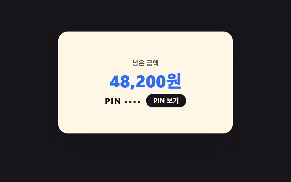 05 coupon-giftcard-flip
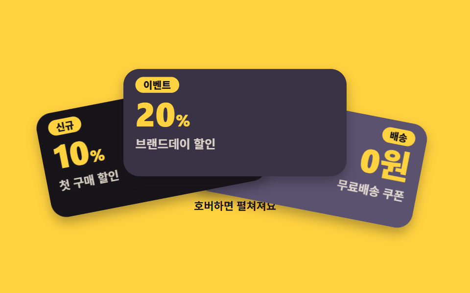 06 coupon-stack-fan
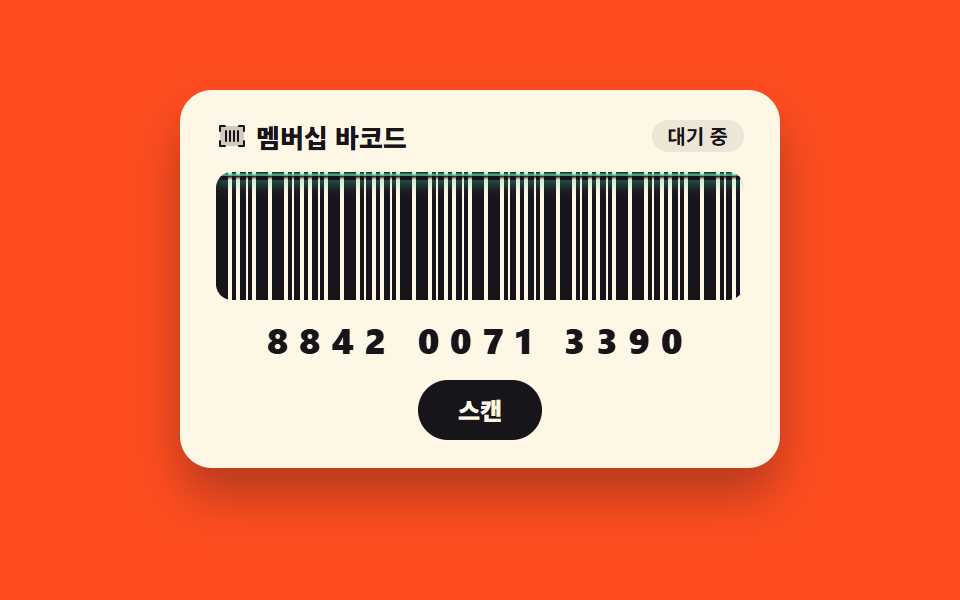 07 coupon-barcode-scan
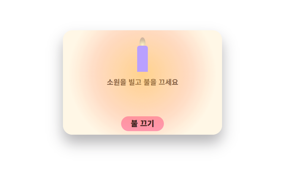 08 coupon-birthday-candle
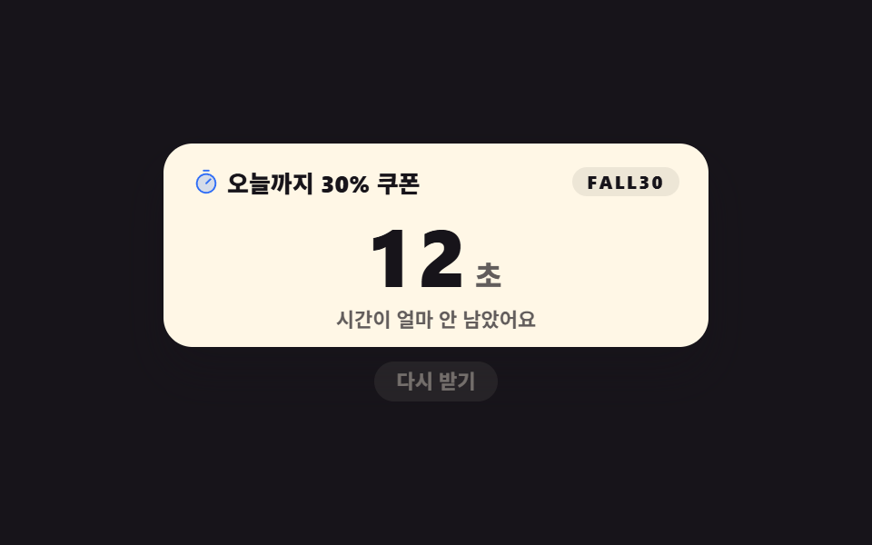 09 coupon-expiry-fade
자동 재생 · 눌러서 해당 항목으로 · 전부 한 zip
- 01 노치 티켓 쿠폰
- 02 스탬프 적립 카드
- 03 돌림판 쿠폰 룰렛
- 04 스크래치 쿠폰
- 05 기프트 카드 뒤집기
- 06 쿠폰 더미 부채꼴
- 07 바코드 스캔 쿠폰
- 08 생일 쿠폰 촛불
- 09 만료 임박 쿠폰
아홉 개를 늘어놓은 기준은 쿠폰 만들기 유행이 아니라 손님 한 사람이 쿠폰을 만나는 순서입니다. 먼저 받는 쪽 둘 — 반원 노치가 파인 티켓을 눌러 담고(01), 주문할 때마다 도장을 찍어 모읍니다(02). 다음은 뽑는 쪽 둘 — 판을 돌려 당첨 칸을 고르고(03), 은박을 긁어 숫자를 드러냅니다(04). 그다음은 주고받는 쪽 둘 — 기프트 카드를 뒤집어 잔액과 PIN 을 확인하고(05), 보관함에 겹친 더미를 부채꼴로 펼쳐 조건을 견줍니다(06). 마지막 셋은 쓰고 끝나는 쪽 — 계산대에서 바코드를 보여 결제하고(07), 생일에는 촛불을 끄고(08), 시간이 다 되면 회색으로 식습니다(09). 무대 색은 잉크 셋·옐로 둘·오렌지 둘·종이 둘로 돌려 격자 아홉 칸의 밝기가 한쪽으로 쏠리지 않게 맞췄습니다. 이 쿠폰들이 결제 흐름 어디에 끼는지는 장바구니·결제 UI 9종이 다루고, 같은 할인을 메일로 보내는 쪽은 뉴스레터 디자인 9종에 있습니다. 카드 위에 붙는 「한정」·「품절」 같은 작은 딱지는 상태 배지 모음이 따로 모아 두었습니다. 같은 종이 상자를 글에 얹으면 인용구 디자인이 되고, 쿠폰이 얼마나 쓰였는지를 숫자로 되돌려 보는 자리는 차트 인터랙션이 맡습니다.
01노치 티켓 쿠폰
할인 쿠폰 디자인에서 무엇이 보이나
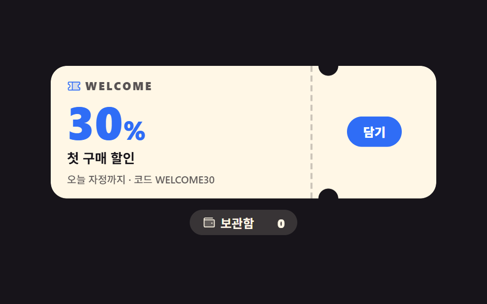
점선 재단선이 닿는 위아래 두 곳에 반원 노치가 파여 종이 티켓 모양을 만들고, 담기를 누르면 버튼이 살짝 눌렸다가 보관함 숫자가 0 에서 1 로 바뀝니다. 카드가 4px 떠오르는 정도만 계속 움직여 누적면적 5.972% 로 아홉 개 중 가장 조용하지만, 둥둥이 한 번도 끊기지 않아 움직인 프레임은 23/23 입니다.
<main class="stage">
<div class="tk is-demo" id="tk">
  <div class="tk__card" aria-label="첫 구매 30% 티켓 쿠폰">
    <div class="tk__main">
      <p class="tk__brand"><svg xmlns="http://www.w3.org/2000/svg" viewBox="0 0 256 256" fill="currentColor" class="tk__ico" aria-hidden="true"><path d="M200,128a32,32,0,0,0,32,32v32a8,8,0,0,1-8,8H96V56H224a8,8,0,0,1,8,8V96A32,32,0,0,0,200,128Z" opacity="0.2"/><path d="M232,104a8,8,0,0,0,8-8V64a16,16,0,0,0-16-16H32A16,16,0,0,0,16,64V96a8,8,0,0,0,8,8,24,24,0,0,1,0,48,8,8,0,0,0-8,8v32a16,16,0,0,0,16,16H224a16,16,0,0,0,16-16V160a8,8,0,0,0-8-8,24,24,0,0,1,0-48ZM32,167.2a40,40,0,0,0,0-78.4V64H88V192H32Zm192,0V192H104V64H224V88.8a40,40,0,0,0,0,78.4Z"/></svg><span>WELCOME</span></p>
      <p class="tk__pct">30<i>%</i></p>
      <p class="tk__label">첫 구매 할인</p>
      <p class="tk__meta">오늘 자정까지 · 코드 WELCOME30</p>
    </div>
    <div class="tk__stub">
      <button type="button" class="tk__btn" id="saveBtn" aria-pressed="false" aria-label="쿠폰 보관함에 담기">
        <span class="tk__btnLabel tk__btnLabel--save">담기</span>
        <span class="tk__btnLabel tk__btnLabel--done" aria-hidden="true"><svg xmlns="http://www.w3.org/2000/svg" viewBox="0 0 256 256" fill="currentColor" class="tk__tick" aria-hidden="true"><path d="M232,56V200a16,16,0,0,1-16,16H40a16,16,0,0,1-16-16V56A16,16,0,0,1,40,40H216A16,16,0,0,1,232,56Z" opacity="0.2"/><path d="M205.66,85.66l-96,96a8,8,0,0,1-11.32,0l-40-40a8,8,0,0,1,11.32-11.32L104,164.69l90.34-90.35a8,8,0,0,1,11.32,11.32Z"/></svg>담김</span>
      </button>
    </div>
  </div>
  <p class="tk__wallet" id="wallet" aria-live="polite">
    <svg xmlns="http://www.w3.org/2000/svg" viewBox="0 0 256 256" fill="currentColor" class="tk__ico" aria-hidden="true"><path d="M224,80V192a8,8,0,0,1-8,8H56a16,16,0,0,1-16-16V56A16,16,0,0,0,56,72H216A8,8,0,0,1,224,80Z" opacity="0.2"/><path d="M216,64H56a8,8,0,0,1,0-16H192a8,8,0,0,0,0-16H56A24,24,0,0,0,32,56V184a24,24,0,0,0,24,24H216a16,16,0,0,0,16-16V80A16,16,0,0,0,216,64Zm0,128H56a8,8,0,0,1-8-8V78.63A23.84,23.84,0,0,0,56,80H216Zm-48-60a12,12,0,1,1,12,12A12,12,0,0,1,168,132Z"/></svg>
    <span>보관함</span>
    <span class="tk__count"><b class="tk__num tk__num--zero" aria-hidden="true">0</b><b class="tk__num tk__num--one" aria-hidden="true">1</b><span class="tk__srNum" id="srNum">0장</span></span>
  </p>
</div>
</main>
@use "../../../../site/static/demo-tokens" as *;
// 노치 티켓 쿠폰 — 반원 노치는 mask + radial-gradient 로 진짜로 파고,
// 재단선은 점선 border. 격자 미리보기(.is-demo)는 2초 루프로 담기 동작을 보여준다.
$duration: $dur-loop;
$easing: $ease-pop;
$color: $subject-blue;
@include stage($stage-ink);
.tk { display: flex; flex-direction: column; align-items: center; gap: $sp-2; width: 100%; }
.tk__card {
  display: flex; width: min(100%, 380px); background: $subject-cream; border-radius: $r-card;
  box-shadow: $shadow-raised; overflow: hidden;
  // 반원 노치 두 개 — 오른쪽 경계 72% 지점 위·아래. mask-composite 로 두 구멍을 동시에.
  -webkit-mask:
    radial-gradient(circle 10px at 72% 0, transparent 96%, #000 100%),
    radial-gradient(circle 10px at 72% 100%, transparent 96%, #000 100%);
  -webkit-mask-composite: destination-in;
  mask:
    radial-gradient(circle 10px at 72% 0, transparent 96%, #000 100%),
    radial-gradient(circle 10px at 72% 100%, transparent 96%, #000 100%);
  mask-composite: intersect;
}
.tk.is-demo .tk__card { animation: tkFloat 2s ease-in-out infinite; }
.tk__main { flex: 1 1 72%; padding: $sp-3 $sp-4; min-width: 0; }
.tk__brand { display: flex; align-items: center; gap: $sp-1; margin: 0; font-weight: 800; font-size: clamp(9px, 2.6vw, 11px); letter-spacing: .14em; color: rgba(23,20,26,.72); }
.tk__ico { width: 14px; height: 14px; flex: 0 0 auto; color: $subject-blue; }
.tk__pct { margin: $sp-1 0 0; font-weight: 800; font-size: clamp(34px, 10vw, 46px); line-height: 1; color: $subject-blue; }
.tk__pct i { font-style: normal; font-size: .55em; }
.tk__label { margin: $sp-1 0 0; font-weight: 700; font-size: clamp(11px, 3.2vw, 13px); color: $subject-ink; }
.tk__meta { margin: $sp-1 0 0; font-weight: 500; font-size: clamp(9px, 2.6vw, 10px); color: rgba(23,20,26,.68); }
.tk__stub {
flex: 0 0 28%; border-left: 2px dashed rgba(23,20,26,.22);
display: flex; align-items: center; justify-content: center; padding: $sp-3 $sp-2;
}
.tk__btn {
position: relative; border: 0; cursor: pointer; background: $subject-blue; color: $stage-paper;
border-radius: $r-pill; font-weight: 800; font-size: clamp(11px, 3vw, 12px);
padding: $sp-2 $sp-4; font-family: inherit; line-height: 1.2;
transition: transform 140ms cubic-bezier(.2,.8,.2,1);
}
.tk__btn:focus-visible { outline: 3px solid $stage-yellow; outline-offset: 2px; }
.tk__btnLabel { display: inline-flex; align-items: center; gap: 4px; }
.tk__btnLabel--done { position: absolute; inset: 0; justify-content: center; visibility: hidden; }
.tk.is-saved .tk__btnLabel--save { visibility: hidden; }
.tk.is-saved .tk__btnLabel--done { visibility: visible; }
.tk__tick { width: 12px; height: 12px; }
.tk__wallet {
display: inline-flex; align-items: center; gap: $sp-1; margin: 0;
background: rgba(255,247,230,.14); color: $subject-cream; border-radius: $r-pill;
padding: $sp-1 $sp-3; font-weight: 700; font-size: clamp(10px, 2.8vw, 12px);
}
.tk__wallet .tk__ico { color: $subject-cream; }
.tk__count { position: relative; display: inline-block; min-width: 2.2em; text-align: right; font-weight: 800; }
.tk__num { position: absolute; right: 0; top: 50%; transform: translateY(-50%); }
.tk__num--one { visibility: hidden; }
.tk.is-saved .tk__num--zero { visibility: hidden; }
.tk.is-saved .tk__num--one { visibility: visible; }
.tk__srNum { position: absolute; width: 1px; height: 1px; overflow: hidden; clip-path: inset(50%); margin: 0; }
// ── 격자 미리보기 루프: 카드 둥둥(연속) + 버튼 눌림(42%) + 보관함 숫자 컷(55%) → 90% 복귀
@keyframes tkFloat { 0%, 100% { transform: translateY(0); } 50% { transform: translateY(-4px); } }
.tk.is-demo .tk__btn { animation: tkPress 2s $easing infinite; }
@keyframes tkPress {
0%, 40% { transform: scale(1); }
43% { transform: scale(.9); }
47%, 100% { transform: scale(1); }
}
.tk.is-demo .tk__btnLabel--save { animation: tkCutSave 2s steps(1, end) infinite; }
@keyframes tkCutSave { 0%, 45% { visibility: visible; } 45.5%, 89% { visibility: hidden; } 89.5%, 100% { visibility: visible; } }
.tk.is-demo .tk__btnLabel--done { animation: tkCutDone 2s steps(1, end) infinite; }
@keyframes tkCutDone { 0%, 45% { visibility: hidden; } 45.5%, 89% { visibility: visible; } 89.5%, 100% { visibility: hidden; } }
.tk.is-demo .tk__num--zero { animation: tkCutZero 2s steps(1, end) infinite; }
@keyframes tkCutZero { 0%, 54% { visibility: visible; } 54.5%, 89% { visibility: hidden; } 89.5%, 100% { visibility: visible; } }
.tk.is-demo .tk__num--one { animation: tkCutOne 2s steps(1, end) infinite; }
@keyframes tkCutOne { 0%, 54% { visibility: hidden; } 54.5%, 89% { visibility: visible; } 89.5%, 100% { visibility: hidden; } }
@media (max-width: 340px) {
.tk__main { padding: $sp-2 $sp-3; }
.tk__stub { padding: $sp-2 $sp-1; }
}
@media (prefers-reduced-motion: reduce) {
.tk.is-demo .tk__card,
.tk.is-demo .tk__btn,
.tk.is-demo .tk__btnLabel--save,
.tk.is-demo .tk__btnLabel--done,
.tk.is-demo .tk__num--zero,
.tk.is-demo .tk__num--one { animation: none !important; }
.tk__btn { transition: none !important; }
}html, body {
margin: 0;
overflow: hidden;
}
.stage {
box-sizing: border-box;
min-height: 100vh;
display: grid;
place-items: center;
margin: 0;
background: #17141a;
font-family: -apple-system, "Segoe UI", "Noto Sans KR", sans-serif;
padding: clamp(8px, 4vw, 24px);
}
.tk {
display: flex;
flex-direction: column;
align-items: center;
gap: 8px;
width: 100%;
}
.tk__card {
display: flex;
width: min(100%, 380px);
background: #fff7e6;
border-radius: 16px;
box-shadow: 0 14px 24px rgba(23, 20, 26, 0.32);
overflow: hidden;
-webkit-mask: radial-gradient(circle 10px at 72% 0, transparent 96%, #000 100%), radial-gradient(circle 10px at 72% 100%, transparent 96%, #000 100%);
-webkit-mask-composite: destination-in;
mask: radial-gradient(circle 10px at 72% 0, transparent 96%, #000 100%), radial-gradient(circle 10px at 72% 100%, transparent 96%, #000 100%);
mask-composite: intersect;
}
.tk.is-demo .tk__card {
animation: tkFloat 2s ease-in-out infinite;
}
.tk__main {
flex: 1 1 72%;
padding: 12px 16px;
min-width: 0;
}
.tk__brand {
display: flex;
align-items: center;
gap: 4px;
margin: 0;
font-weight: 800;
font-size: clamp(9px, 2.6vw, 11px);
letter-spacing: 0.14em;
color: rgba(23, 20, 26, 0.72);
}
.tk__ico {
width: 14px;
height: 14px;
flex: 0 0 auto;
color: #2f6df6;
}
.tk__pct {
margin: 4px 0 0;
font-weight: 800;
font-size: clamp(34px, 10vw, 46px);
line-height: 1;
color: #2f6df6;
}
.tk__pct i {
font-style: normal;
font-size: 0.55em;
}
.tk__label {
margin: 4px 0 0;
font-weight: 700;
font-size: clamp(11px, 3.2vw, 13px);
color: #17141a;
}
.tk__meta {
margin: 4px 0 0;
font-weight: 500;
font-size: clamp(9px, 2.6vw, 10px);
color: rgba(23, 20, 26, 0.68);
}
.tk__stub {
flex: 0 0 28%;
border-left: 2px dashed rgba(23, 20, 26, 0.22);
display: flex;
align-items: center;
justify-content: center;
padding: 12px 8px;
}
.tk__btn {
position: relative;
border: 0;
cursor: pointer;
background: #2f6df6;
color: #ffffff;
border-radius: 999px;
font-weight: 800;
font-size: clamp(11px, 3vw, 12px);
padding: 8px 16px;
font-family: inherit;
line-height: 1.2;
transition: transform 140ms cubic-bezier(0.2, 0.8, 0.2, 1);
}
.tk__btn:focus-visible {
outline: 3px solid #ffd23f;
outline-offset: 2px;
}
.tk__btnLabel {
display: inline-flex;
align-items: center;
gap: 4px;
}
.tk__btnLabel--done {
position: absolute;
inset: 0;
justify-content: center;
visibility: hidden;
}
.tk.is-saved .tk__btnLabel--save {
visibility: hidden;
}
.tk.is-saved .tk__btnLabel--done {
visibility: visible;
}
.tk__tick {
width: 12px;
height: 12px;
}
.tk__wallet {
display: inline-flex;
align-items: center;
gap: 4px;
margin: 0;
background: rgba(255, 247, 230, 0.14);
color: #fff7e6;
border-radius: 999px;
padding: 4px 12px;
font-weight: 700;
font-size: clamp(10px, 2.8vw, 12px);
}
.tk__wallet .tk__ico {
color: #fff7e6;
}
.tk__count {
position: relative;
display: inline-block;
min-width: 2.2em;
text-align: right;
font-weight: 800;
}
.tk__num {
position: absolute;
right: 0;
top: 50%;
transform: translateY(-50%);
}
.tk__num--one {
visibility: hidden;
}
.tk.is-saved .tk__num--zero {
visibility: hidden;
}
.tk.is-saved .tk__num--one {
visibility: visible;
}
.tk__srNum {
position: absolute;
width: 1px;
height: 1px;
overflow: hidden;
clip-path: inset(50%);
margin: 0;
}
@keyframes tkFloat {
0%, 100% {
transform: translateY(0);
}
50% {
transform: translateY(-4px);
}
}
.tk.is-demo .tk__btn {
animation: tkPress 2s cubic-bezier(0.2, 1.4, 0.4, 1) infinite;
}
@keyframes tkPress {
0%, 40% {
transform: scale(1);
}
43% {
transform: scale(0.9);
}
47%, 100% {
transform: scale(1);
}
}
.tk.is-demo .tk__btnLabel--save {
animation: tkCutSave 2s steps(1, end) infinite;
}
@keyframes tkCutSave {
0%, 45% {
visibility: visible;
}
45.5%, 89% {
visibility: hidden;
}
89.5%, 100% {
visibility: visible;
}
}
.tk.is-demo .tk__btnLabel--done {
animation: tkCutDone 2s steps(1, end) infinite;
}
@keyframes tkCutDone {
0%, 45% {
visibility: hidden;
}
45.5%, 89% {
visibility: visible;
}
89.5%, 100% {
visibility: hidden;
}
}
.tk.is-demo .tk__num--zero {
animation: tkCutZero 2s steps(1, end) infinite;
}
@keyframes tkCutZero {
0%, 54% {
visibility: visible;
}
54.5%, 89% {
visibility: hidden;
}
89.5%, 100% {
visibility: visible;
}
}
.tk.is-demo .tk__num--one {
animation: tkCutOne 2s steps(1, end) infinite;
}
@keyframes tkCutOne {
0%, 54% {
visibility: hidden;
}
54.5%, 89% {
visibility: visible;
}
89.5%, 100% {
visibility: hidden;
}
}
@media (max-width: 340px) {
.tk__main {
padding: 8px 12px;
}
.tk__stub {
padding: 8px 4px;
}
}
@media (prefers-reduced-motion: reduce) {
.tk.is-demo .tk__card,
.tk.is-demo .tk__btn,
.tk.is-demo .tk__btnLabel--save,
.tk.is-demo .tk__btnLabel--done,
.tk.is-demo .tk__num--zero,
.tk.is-demo .tk__num--one {
animation: none !important;
}
.tk__btn {
transition: none !important;
}
}var tk = document.getElementById('tk');
var saveBtn = document.getElementById('saveBtn');
var srNum = document.getElementById('srNum');
saveBtn.addEventListener('click', function () {
tk.classList.remove('is-demo');
var saved = tk.classList.toggle('is-saved');
saveBtn.setAttribute('aria-pressed', saved ? 'true' : 'false');
srNum.textContent = saved ? '1장' : '0장';
});// TicketNotchCoupon — vanilla 판(run/283/demo/01-coupon-ticket-notch/index.html) 의 React 포트.
// 반원 노치는 mask + radial-gradient 로 진짜로 파고, 재단선은 점선 border.
// 담기를 누르면 미리보기 루프가 꺼지고 보관함 장수가 0↔1 로 바뀐다(vanilla 와 같은 동작).
import { useState } from "react";
import type { CSSProperties } from "react";
import styles from "./TicketNotchCoupon.module.scss";
export type TicketNotchCouponProps = {
/** 격자 미리보기용 2초 자동 루프. 사람이 손대면 꺼진다 */
demo?: boolean;
duration?: number;
easing?: string;
color?: string;
};
type Vars = CSSProperties & { "--duration"?: string; "--easing"?: string; "--color"?: string };
export default function TicketNotchCoupon({
demo = true,
duration = 2000,
easing = "cubic-bezier(.2, 1.4, .4, 1)",
color = "#2f6df6",
}: TicketNotchCouponProps) {
const [live, setLive] = useState(demo);
const [saved, setSaved] = useState(false);
const vars: Vars = { "--duration": `${duration}ms`, "--easing": easing, "--color": color };
// vanilla 의 click 핸들러와 같은 순서: 미리보기 루프를 떼고 보관 상태를 뒤집는다
function applySave() {
setLive(false);
setSaved((prev: boolean) => !prev);
}
const cls = [styles.root, live ? styles.isDemo : "", saved ? styles.isSaved : ""].filter(Boolean).join(" ");
return (
<main className={styles.stage} style={vars}>
<div className={cls}>
<div className={styles.card} aria-label="첫 구매 30% 티켓 쿠폰">
<div className={styles.main}>
<p className={styles.brand}>
<svg xmlns="http://www.w3.org/2000/svg" viewBox="0 0 256 256" fill="currentColor" className={styles.ico} aria-hidden="true">
<path d="M200,128a32,32,0,0,0,32,32v32a8,8,0,0,1-8,8H96V56H224a8,8,0,0,1,8,8V96A32,32,0,0,0,200,128Z" opacity="0.2" />
<path d="M232,104a8,8,0,0,0,8-8V64a16,16,0,0,0-16-16H32A16,16,0,0,0,16,64V96a8,8,0,0,0,8,8,24,24,0,0,1,0,48,8,8,0,0,0-8,8v32a16,16,0,0,0,16,16H224a16,16,0,0,0,16-16V160a8,8,0,0,0-8-8,24,24,0,0,1,0-48ZM32,167.2a40,40,0,0,0,0-78.4V64H88V192H32Zm192,0V192H104V64H224V88.8a40,40,0,0,0,0,78.4Z" />
</svg>
<span>WELCOME</span>
</p>
<p className={styles.pct}>30<i>%</i></p>
<p className={styles.label}>첫 구매 할인</p>
<p className={styles.meta}>오늘 자정까지 · 코드 WELCOME30</p>
</div>
<div className={styles.stub}>
<button
type="button"
className={styles.btn}
aria-pressed={saved ? "true" : "false"}
aria-label="쿠폰 보관함에 담기"
onClick={applySave}
>
<span className={`${styles.btnLabel} ${styles.btnLabelSave}`}>담기</span>
<span className={`${styles.btnLabel} ${styles.btnLabelDone}`} aria-hidden="true">
<svg xmlns="http://www.w3.org/2000/svg" viewBox="0 0 256 256" fill="currentColor" className={styles.tick} aria-hidden="true">
<path d="M232,56V200a16,16,0,0,1-16,16H40a16,16,0,0,1-16-16V56A16,16,0,0,1,40,40H216A16,16,0,0,1,232,56Z" opacity="0.2" />
<path d="M205.66,85.66l-96,96a8,8,0,0,1-11.32,0l-40-40a8,8,0,0,1,11.32-11.32L104,164.69l90.34-90.35a8,8,0,0,1,11.32,11.32Z" />
</svg>담김
</span>
</button>
</div>
</div>
<p className={styles.wallet} aria-live="polite">
<svg xmlns="http://www.w3.org/2000/svg" viewBox="0 0 256 256" fill="currentColor" className={styles.ico} aria-hidden="true">
<path d="M224,80V192a8,8,0,0,1-8,8H56a16,16,0,0,1-16-16V56A16,16,0,0,0,56,72H216A8,8,0,0,1,224,80Z" opacity="0.2" />
<path d="M216,64H56a8,8,0,0,1,0-16H192a8,8,0,0,0,0-16H56A24,24,0,0,0,32,56V184a24,24,0,0,0,24,24H216a16,16,0,0,0,16-16V80A16,16,0,0,0,216,64Zm0,128H56a8,8,0,0,1-8-8V78.63A23.84,23.84,0,0,0,56,80H216Zm-48-60a12,12,0,1,1,12,12A12,12,0,0,1,168,132Z" />
</svg>
<span>보관함</span>
<span className={styles.count}>
<b className={`${styles.num} ${styles.numZero}`} aria-hidden="true">0</b>
<b className={`${styles.num} ${styles.numOne}`} aria-hidden="true">1</b>
<span className={styles.srNum}>{saved ? "1장" : "0장"}</span>
</span>
</p>
</div>
</main>
);
}01 · 노치 티켓 쿠폰 — 측정 누적면적 5.972% · 움직인 프레임 23/23GODRICH 원작 · zip 에 SCSS·React 포함 · 비밀번호 보기
코드에서 볼 곳
첫 구매 쿠폰 다운로드 카드와 프로모션 랜딩의 쿠폰 카드에 씁니다.
.tk__card {
display: flex; width: min(100%, 380px); background: $subject-cream; border-radius: $r-card;
box-shadow: $shadow-raised; overflow: hidden;
// 반원 노치 두 개 — 오른쪽 경계 72% 지점 위·아래. mask-composite 로 두 구멍을 동시에.
-webkit-mask:
radial-gradient(circle 10px at 72% 0, transparent 96%, #000 100%),
radial-gradient(circle 10px at 72% 100%, transparent 96%, #000 100%);
-webkit-mask-composite: destination-in;
mask:
radial-gradient(circle 10px at 72% 0, transparent 96%, #000 100%),
radial-gradient(circle 10px at 72% 100%, transparent 96%, #000 100%);
mask-composite: intersect;
}
02스탬프 적립 카드
화면에서 일어나는 일
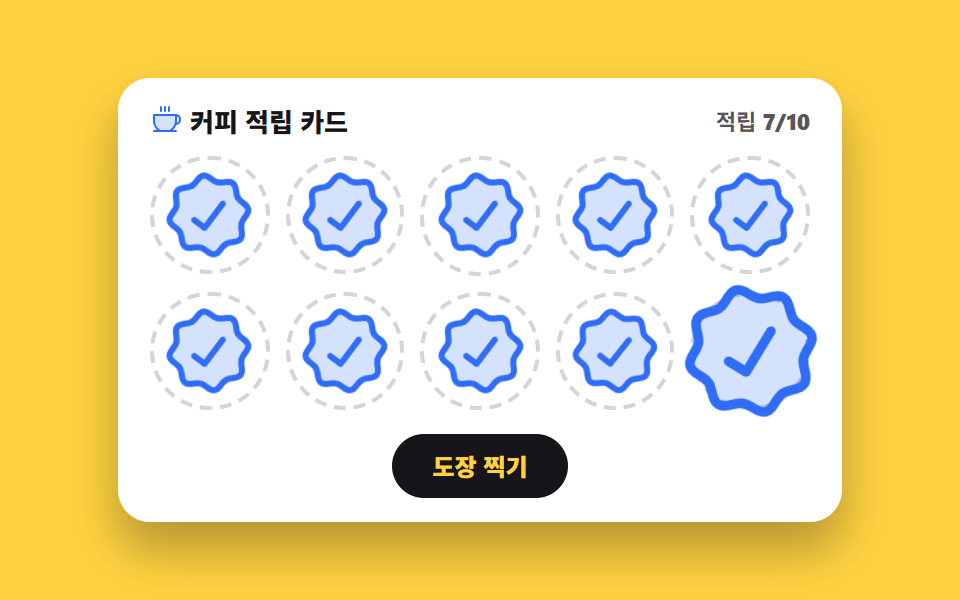
도장 열 칸이 0.12초 간격으로 차례차례 내리찍히고, 마지막 칸이 차면 발급 배지가 튀어 오릅니다. 도장 하나가 1.6배에서 제 크기로 줄며 기우는 동작이 열 번 이어져 누적면적 19.372%, 움직인 프레임 19/23 을 기록했습니다.
<svg width="0" height="0" style="position:absolute" aria-hidden="true">
  <defs>
    <symbol id="seal" viewBox="0 0 256 256" fill="currentColor"><path d="M232,128c0,12.51-17.82,21.95-22.68,33.69-4.68,11.32,1.42,30.65-7.78,39.85s-28.53,3.1-39.85,7.78C150,214.18,140.5,232,128,232s-22-17.82-33.69-22.68c-11.32-4.68-30.65,1.42-39.85-7.78s-3.1-28.53-7.78-39.85C41.82,150,24,140.5,24,128s17.82-22,22.68-33.69C51.36,83,45.26,63.66,54.46,54.46S83,51.36,94.31,46.68C106.05,41.82,115.5,24,128,24S150,41.82,161.69,46.68c11.32,4.68,30.65-1.42,39.85,7.78s3.1,28.53,7.78,39.85C214.18,106.05,232,115.5,232,128Z" opacity="0.2"/><path d="M225.86,102.82c-3.77-3.94-7.67-8-9.14-11.57-1.36-3.27-1.44-8.69-1.52-13.94-.15-9.76-.31-20.82-8-28.51s-18.75-7.85-28.51-8c-5.25-.08-10.67-.16-13.94-1.52-3.56-1.47-7.63-5.37-11.57-9.14C146.28,23.51,138.44,16,128,16s-18.27,7.51-25.18,14.14c-3.94,3.77-8,7.67-11.57,9.14C88,40.64,82.56,40.72,77.31,40.8c-9.76.15-20.82.31-28.51,8S41,67.55,40.8,77.31c-.08,5.25-.16,10.67-1.52,13.94-1.47,3.56-5.37,7.63-9.14,11.57C23.51,109.72,16,117.56,16,128s7.51,18.27,14.14,25.18c3.77,3.94,7.67,8,9.14,11.57,1.36,3.27,1.44,8.69,1.52,13.94.15,9.76.31,20.82,8,28.51s18.75,7.85,28.51,8c5.25.08,10.67.16,13.94,1.52,3.56,1.47,7.63,5.37,11.57,9.14C109.72,232.49,117.56,240,128,240s18.27-7.51,25.18-14.14c3.94-3.77,8-7.67,11.57-9.14,3.27-1.36,8.69-1.44,13.94-1.52,9.76-.15,20.82-.31,28.51-8s7.85-18.75,8-28.51c.08-5.25.16-10.67,1.52-13.94,1.47-3.56,5.37-7.63,9.14-11.57C232.49,146.28,240,138.44,240,128S232.49,109.73,225.86,102.82Zm-11.55,39.29c-4.79,5-9.75,10.17-12.38,16.52-2.52,6.1-2.63,13.07-2.73,19.82-.1,7-.21,14.33-3.32,17.43s-10.39,3.22-17.43,3.32c-6.75.1-13.72.21-19.82,2.73-6.35,2.63-11.52,7.59-16.52,12.38S132,224,128,224s-9.15-4.92-14.11-9.69-10.17-9.75-16.52-12.38c-6.1-2.52-13.07-2.63-19.82-2.73-7-.1-14.33-.21-17.43-3.32s-3.22-10.39-3.32-17.43c-.1-6.75-.21-13.72-2.73-19.82-2.63-6.35-7.59-11.52-12.38-16.52S32,132,32,128s4.92-9.15,9.69-14.11,9.75-10.17,12.38-16.52c2.52-6.1,2.63-13.07,2.73-19.82.1-7,.21-14.33,3.32-17.43S70.51,56.9,77.55,56.8c6.75-.1,13.72-.21,19.82-2.73,6.35-2.63,11.52-7.59,16.52-12.38S124,32,128,32s9.15,4.92,14.11,9.69,10.17,9.75,16.52,12.38c6.1,2.52,13.07,2.63,19.82,2.73,7,.1,14.33.21,17.43,3.32s3.22,10.39,3.32,17.43c.1,6.75.21,13.72,2.73,19.82,2.63,6.35,7.59,11.52,12.38,16.52S224,124,224,128,219.08,137.15,214.31,142.11ZM173.66,98.34a8,8,0,0,1,0,11.32l-56,56a8,8,0,0,1-11.32,0l-24-24a8,8,0,0,1,11.32-11.32L112,148.69l50.34-50.35A8,8,0,0,1,173.66,98.34Z"/></symbol>
    <symbol id="coffee" viewBox="0 0 256 256" fill="currentColor"><path d="M208,88v48a88,88,0,0,1-51.3,80H83.3A88,88,0,0,1,32,136V88Z" opacity="0.2"/><path d="M80,56V24a8,8,0,0,1,16,0V56a8,8,0,0,1-16,0Zm40,8a8,8,0,0,0,8-8V24a8,8,0,0,0-16,0V56A8,8,0,0,0,120,64Zm32,0a8,8,0,0,0,8-8V24a8,8,0,0,0-16,0V56A8,8,0,0,0,152,64Zm96,56v8a40,40,0,0,1-37.51,39.91,96.59,96.59,0,0,1-27,40.09H208a8,8,0,0,1,0,16H32a8,8,0,0,1,0-16H56.54A96.3,96.3,0,0,1,24,136V88a8,8,0,0,1,8-8H208A40,40,0,0,1,248,120ZM200,96H40v40a80.27,80.27,0,0,0,45.12,72h69.76A80.27,80.27,0,0,0,200,136Zm32,24a24,24,0,0,0-16-22.62V136a95.78,95.78,0,0,1-1.2,15A24,24,0,0,0,232,128Z"/></symbol>
  </defs>
</svg>
<main class="stage">
<div class="sp is-demo" id="sp">
  <div class="sp__card">
    <div class="sp__head">
      <p class="sp__title"><svg class="sp__ico" aria-hidden="true"><use href="#coffee"/></svg><span>커피 적립 카드</span></p>
      <p class="sp__count"><span>적립</span> <b id="countNum">7/10</b></p>
    </div>
    <div class="sp__grid" role="progressbar" aria-label="적립 도장 진행" aria-valuemin="0" aria-valuemax="10" aria-valuenow="7" id="bar">

      <span class="sp__slot"><span class="sp__stamp sp__stamp--in"><svg aria-hidden="true"><use href="#seal"/></svg></span></span>
      <span class="sp__slot"><span class="sp__stamp sp__stamp--in"><svg aria-hidden="true"><use href="#seal"/></svg></span></span>
      <span class="sp__slot"><span class="sp__stamp sp__stamp--in"><svg aria-hidden="true"><use href="#seal"/></svg></span></span>
      <span class="sp__slot"><span class="sp__stamp sp__stamp--in"><svg aria-hidden="true"><use href="#seal"/></svg></span></span>
      <span class="sp__slot"><span class="sp__stamp sp__stamp--in"><svg aria-hidden="true"><use href="#seal"/></svg></span></span>
      <span class="sp__slot"><span class="sp__stamp sp__stamp--in"><svg aria-hidden="true"><use href="#seal"/></svg></span></span>
      <span class="sp__slot"><span class="sp__stamp sp__stamp--in"><svg aria-hidden="true"><use href="#seal"/></svg></span></span>
      <span class="sp__slot"><span class="sp__stamp sp__stamp--in sp__stamp--idle"><svg aria-hidden="true"><use href="#seal"/></svg></span></span>
      <span class="sp__slot"><span class="sp__stamp sp__stamp--in sp__stamp--idle"><svg aria-hidden="true"><use href="#seal"/></svg></span></span>
      <span class="sp__slot"><span class="sp__stamp sp__stamp--in sp__stamp--idle"><svg aria-hidden="true"><use href="#seal"/></svg></span></span>
    </div>
    <div class="sp__foot">
      <button type="button" class="sp__btn" id="stampBtn">도장 찍기</button>
      <p class="sp__issued" id="issued" aria-live="polite"><span class="sp__issuedChip">쿠폰 발급 완료</span></p>
    </div>
  </div>
</div>
</main>@use "../../../../site/static/demo-tokens" as *;
// 스탬프 적립 카드 — 도장은 scale 2→1 내리찍기 + 살짝 기울임. 진행률은 aria-valuenow 에 반영.
// 격자 미리보기(.is-demo)는 열 도장이 순서대로 찍히고 마지막에 쿠폰 발급 배지가 뜨는 2초 루프.
$duration: $dur-loop;
$easing: $ease-pop;
$color: $subject-blue;
@include stage($stage-yellow);
.sp { display: flex; justify-content: center; width: 100%; }
.sp__card {
width: min(100%, 330px); background: $stage-paper; border-radius: $r-card;
box-shadow: $shadow-raised; padding: $sp-3 $sp-4; overflow: hidden;
}
.sp__head { display: flex; align-items: center; justify-content: space-between; gap: $sp-2; }
.sp__title { display: flex; align-items: center; gap: $sp-1; margin: 0; font-weight: 800; font-size: clamp(11px, 3.2vw, 13px); color: $subject-ink; }
.sp__ico { width: 16px; height: 16px; color: $subject-blue; }
.sp__count { margin: 0; font-weight: 700; font-size: clamp(10px, 2.8vw, 11px); color: rgba(23,20,26,.72); }
.sp__grid { display: grid; grid-template-columns: repeat(5, 1fr); gap: $sp-2; margin-top: $sp-2; }
.sp__slot {
display: flex; align-items: center; justify-content: center; aspect-ratio: 1;
border: 2px dashed rgba(23,20,26,.18); border-radius: 50%; min-width: 0;
}
.sp__stamp { display: flex; width: 88%; height: 88%; color: $subject-blue; }
.sp__stamp svg { width: 100%; height: 100%; }
.sp__stamp--in { transform: rotate(-8deg); }
.sp__slot:nth-child(3n) .sp__stamp--in { transform: rotate(5deg); }
.sp__slot:nth-child(4n) .sp__stamp--in { transform: rotate(-3deg); }
.sp__stamp--new { animation: spStampIn 300ms $easing both; transform-origin: 50% 50%; }
@keyframes spStampIn {
  0% { transform: scale(1.6) rotate(-14deg); }
  70% { transform: scale(.94) rotate(-6deg); }
  100% { transform: scale(1) rotate(-8deg); }
}
.sp__foot { position: relative; display: flex; justify-content: center; margin-top: $sp-3; min-height: 32px; }
.sp__btn {
border: 0; cursor: pointer; background: $subject-ink; color: $stage-yellow;
border-radius: $r-pill; font-weight: 800; font-size: clamp(11px, 3vw, 12px);
padding: $sp-2 $sp-5; font-family: inherit; line-height: 1.2;
transition: transform 140ms cubic-bezier(.2,.8,.2,1);
}
.sp__btn:active { transform: scale(.94); }
.sp__btn:focus-visible { outline: 3px solid $subject-blue; outline-offset: 2px; }
.sp__btn:disabled { cursor: default; }
.sp__issued { position: absolute; inset: 0; display: flex; align-items: center; justify-content: center; margin: 0; visibility: hidden; }
.sp__issued.is-on { visibility: visible; }
.sp__issuedChip {
background: #a86253; color: $subject-cream; border-radius: $r-pill;
font-weight: 800; font-size: clamp(11px, 3vw, 12px); padding: $sp-2 $sp-4;
animation: spBadgeIn 300ms $easing both;
}
@keyframes spBadgeIn { 0% { transform: scale(.4); } 70% { transform: scale(1.08); } 100% { transform: scale(1); } }
// ── 격자 미리보기 루프: 정적 도장 7개는 그대로 두고, 남은 3칸 + 리셋 컷으로 2초를 채운다.
// is-demo 동안은 정적 7개를 감추고 0→10 전체 시퀀스를 보여준다 (delay 는 낱개 속성 — 단축 리셋 함정).
.sp.is-demo .sp__stamp--in { visibility: hidden; }
.sp.is-demo .sp__slot:nth-child(n) .sp__stamp--in { animation: spLoop 2s ease-out infinite; animation-delay: calc(var(--k, 0) * 120ms); animation-fill-mode: backwards; }
.sp.is-demo .sp__slot:nth-child(1) .sp__stamp--in { --k: 0; }
.sp.is-demo .sp__slot:nth-child(2) .sp__stamp--in { --k: 1; }
.sp.is-demo .sp__slot:nth-child(3) .sp__stamp--in { --k: 2; }
.sp.is-demo .sp__slot:nth-child(4) .sp__stamp--in { --k: 3; }
.sp.is-demo .sp__slot:nth-child(5) .sp__stamp--in { --k: 4; }
.sp.is-demo .sp__slot:nth-child(6) .sp__stamp--in { --k: 5; }
.sp.is-demo .sp__slot:nth-child(7) .sp__stamp--in { --k: 6; }
.sp.is-demo .sp__slot:nth-child(8) .sp__stamp--in { --k: 7; }
.sp.is-demo .sp__slot:nth-child(9) .sp__stamp--in { --k: 8; }
.sp.is-demo .sp__slot:nth-child(10) .sp__stamp--in { --k: 9; }
// 슬롯 8~10 의 도장은 정적 상태에서는 비어 있는 칸으로 보이고 루프에서만 찍힌다
.sp:not(.is-demo) .sp__stamp--idle { visibility: hidden; }
@keyframes spLoop {
0% { visibility: hidden; transform: scale(1.6) rotate(-14deg); }
1.5% { visibility: visible; }
8% { transform: scale(.94) rotate(-6deg); }
12%, 96% { visibility: visible; transform: scale(1) rotate(-8deg); }
96.5%, 100% { visibility: hidden; transform: scale(1) rotate(-8deg); }
}
.sp.is-demo .sp__btn { animation: spBtnHide 2s steps(1, end) infinite; }
@keyframes spBtnHide { 0%, 72% { visibility: visible; } 72.5%, 96% { visibility: hidden; } 96.5%, 100% { visibility: visible; } }
.sp.is-demo .sp__issued { visibility: visible; }
.sp.is-demo .sp__issuedChip { animation: spBadgeLoop 2s ease-out infinite; }
@keyframes spBadgeLoop {
0%, 71% { transform: scale(0); }
74% { transform: scale(1.1); }
77%, 95% { transform: scale(1); }
97%, 100% { transform: scale(0); }
}
@media (max-width: 340px) {
.sp__card { padding: $sp-2 $sp-3; }
.sp__grid { gap: $sp-1; margin-top: $sp-1; }
.sp__foot { margin-top: $sp-1; min-height: 24px; }
.sp__slot { border-width: 1px; }
.sp__btn { padding: $sp-1 $sp-4; }
.sp__issuedChip { padding: $sp-1 $sp-3; }
}
@media (prefers-reduced-motion: reduce) {
.sp.is-demo .sp__slot .sp__stamp--in,
.sp.is-demo .sp__btn,
.sp.is-demo .sp__issuedChip,
.sp__stamp--new,
.sp__issuedChip { animation: none !important; }
.sp.is-demo .sp__stamp--in { visibility: visible !important; }
.sp__btn { transition: none !important; }
}html, body {
margin: 0;
overflow: hidden;
}
.stage {
box-sizing: border-box;
min-height: 100vh;
display: grid;
place-items: center;
margin: 0;
background: #ffd23f;
font-family: -apple-system, "Segoe UI", "Noto Sans KR", sans-serif;
padding: clamp(8px, 4vw, 24px);
}
.sp {
display: flex;
justify-content: center;
width: 100%;
}
.sp__card {
width: min(100%, 330px);
background: #ffffff;
border-radius: 16px;
box-shadow: 0 14px 24px rgba(23, 20, 26, 0.32);
padding: 12px 16px;
overflow: hidden;
}
.sp__head {
display: flex;
align-items: center;
justify-content: space-between;
gap: 8px;
}
.sp__title {
display: flex;
align-items: center;
gap: 4px;
margin: 0;
font-weight: 800;
font-size: clamp(11px, 3.2vw, 13px);
color: #17141a;
}
.sp__ico {
width: 16px;
height: 16px;
color: #2f6df6;
}
.sp__count {
margin: 0;
font-weight: 700;
font-size: clamp(10px, 2.8vw, 11px);
color: rgba(23, 20, 26, 0.72);
}
.sp__grid {
display: grid;
grid-template-columns: repeat(5, 1fr);
gap: 8px;
margin-top: 8px;
}
.sp__slot {
display: flex;
align-items: center;
justify-content: center;
aspect-ratio: 1;
border: 2px dashed rgba(23, 20, 26, 0.18);
border-radius: 50%;
min-width: 0;
}
.sp__stamp {
display: flex;
width: 88%;
height: 88%;
color: #2f6df6;
}
.sp__stamp svg {
width: 100%;
height: 100%;
}
.sp__stamp--in {
transform: rotate(-8deg);
}
.sp__slot:nth-child(3n) .sp__stamp--in {
transform: rotate(5deg);
}
.sp__slot:nth-child(4n) .sp__stamp--in {
transform: rotate(-3deg);
}
.sp__stamp--new {
animation: spStampIn 300ms cubic-bezier(0.2, 1.4, 0.4, 1) both;
transform-origin: 50% 50%;
}
@keyframes spStampIn {
0% {
transform: scale(1.6) rotate(-14deg);
}
70% {
transform: scale(0.94) rotate(-6deg);
}
100% {
transform: scale(1) rotate(-8deg);
}
}
.sp__foot {
position: relative;
display: flex;
justify-content: center;
margin-top: 12px;
min-height: 32px;
}
.sp__btn {
border: 0;
cursor: pointer;
background: #17141a;
color: #ffd23f;
border-radius: 999px;
font-weight: 800;
font-size: clamp(11px, 3vw, 12px);
padding: 8px 20px;
font-family: inherit;
line-height: 1.2;
transition: transform 140ms cubic-bezier(0.2, 0.8, 0.2, 1);
}
.sp__btn:active {
transform: scale(0.94);
}
.sp__btn:focus-visible {
outline: 3px solid #2f6df6;
outline-offset: 2px;
}
.sp__btn:disabled {
cursor: default;
}
.sp__issued {
position: absolute;
inset: 0;
display: flex;
align-items: center;
justify-content: center;
margin: 0;
visibility: hidden;
}
.sp__issued.is-on {
visibility: visible;
}
.sp__issuedChip {
background: #a86253;
color: #fff7e6;
border-radius: 999px;
font-weight: 800;
font-size: clamp(11px, 3vw, 12px);
padding: 8px 16px;
animation: spBadgeIn 300ms cubic-bezier(0.2, 1.4, 0.4, 1) both;
}
@keyframes spBadgeIn {
0% {
transform: scale(0.4);
}
70% {
transform: scale(1.08);
}
100% {
transform: scale(1);
}
}
.sp.is-demo .sp__stamp--in {
visibility: hidden;
}
.sp.is-demo .sp__slot:nth-child(n) .sp__stamp--in {
animation: spLoop 2s ease-out infinite;
animation-delay: calc(var(--k, 0) * 120ms);
animation-fill-mode: backwards;
}
.sp.is-demo .sp__slot:nth-child(1) .sp__stamp--in {
--k: 0;
}
.sp.is-demo .sp__slot:nth-child(2) .sp__stamp--in {
--k: 1;
}
.sp.is-demo .sp__slot:nth-child(3) .sp__stamp--in {
--k: 2;
}
.sp.is-demo .sp__slot:nth-child(4) .sp__stamp--in {
--k: 3;
}
.sp.is-demo .sp__slot:nth-child(5) .sp__stamp--in {
--k: 4;
}
.sp.is-demo .sp__slot:nth-child(6) .sp__stamp--in {
--k: 5;
}
.sp.is-demo .sp__slot:nth-child(7) .sp__stamp--in {
--k: 6;
}
.sp.is-demo .sp__slot:nth-child(8) .sp__stamp--in {
--k: 7;
}
.sp.is-demo .sp__slot:nth-child(9) .sp__stamp--in {
--k: 8;
}
.sp.is-demo .sp__slot:nth-child(10) .sp__stamp--in {
--k: 9;
}
.sp:not(.is-demo) .sp__stamp--idle {
visibility: hidden;
}
@keyframes spLoop {
0% {
visibility: hidden;
transform: scale(1.6) rotate(-14deg);
}
1.5% {
visibility: visible;
}
8% {
transform: scale(0.94) rotate(-6deg);
}
12%, 96% {
visibility: visible;
transform: scale(1) rotate(-8deg);
}
96.5%, 100% {
visibility: hidden;
transform: scale(1) rotate(-8deg);
}
}
.sp.is-demo .sp__btn {
animation: spBtnHide 2s steps(1, end) infinite;
}
@keyframes spBtnHide {
0%, 72% {
visibility: visible;
}
72.5%, 96% {
visibility: hidden;
}
96.5%, 100% {
visibility: visible;
}
}
.sp.is-demo .sp__issued {
visibility: visible;
}
.sp.is-demo .sp__issuedChip {
animation: spBadgeLoop 2s ease-out infinite;
}
@keyframes spBadgeLoop {
0%, 71% {
transform: scale(0);
}
74% {
transform: scale(1.1);
}
77%, 95% {
transform: scale(1);
}
97%, 100% {
transform: scale(0);
}
}
@media (max-width: 340px) {
.sp__card {
padding: 8px 12px;
}
.sp__grid {
gap: 4px;
margin-top: 4px;
}
.sp__foot {
margin-top: 4px;
min-height: 24px;
}
.sp__slot {
border-width: 1px;
}
.sp__btn {
padding: 4px 16px;
}
.sp__issuedChip {
padding: 4px 12px;
}
}
@media (prefers-reduced-motion: reduce) {
.sp.is-demo .sp__slot .sp__stamp--in,
.sp.is-demo .sp__btn,
.sp.is-demo .sp__issuedChip,
.sp__stamp--new,
.sp__issuedChip {
animation: none !important;
}
.sp.is-demo .sp__stamp--in {
visibility: visible !important;
}
.sp__btn {
transition: none !important;
}
}var sp = document.getElementById('sp');
var slots = Array.prototype.slice.call(document.querySelectorAll('.sp__slot'));
var stampBtn = document.getElementById('stampBtn');
var bar = document.getElementById('bar');
var issued = document.getElementById('issued');
var countNum = document.getElementById('countNum');
var count = 7;
function render() {
bar.setAttribute('aria-valuenow', String(count));
countNum.textContent = count + '/10';
var full = count >= 10;
issued.classList.toggle('is-on', full);
stampBtn.disabled = full;
}
stampBtn.addEventListener('click', function () {
sp.classList.remove('is-demo');
if (count >= 10) { return; }
var target = slots[count].querySelector('.sp__stamp');
target.classList.remove('sp__stamp--idle');
target.classList.add('sp__stamp--new');
count = count + 1;
render();
});
render();// StampCard — vanilla 판(run/283/demo/02-coupon-stamp-card/index.html) 의 React 포트.
// 도장은 scale 1.6→1 내리찍기 + 살짝 기울임. 진행률은 role="progressbar" 의 aria-valuenow 에 그대로 실린다.
import { useState } from "react";
import type { CSSProperties } from "react";
import styles from "./StampCard.module.scss";
export type StampCardProps = {
/** 격자 미리보기용 2초 자동 루프. 사람이 손대면 꺼진다 */
demo?: boolean;
duration?: number;
easing?: string;
color?: string;
};
type Vars = CSSProperties & { "--duration"?: string; "--easing"?: string; "--color"?: string };
/** 칸 열 개 — vanilla 의 열 개 .sp__slot 과 같은 수 */
const SLOTS: number[] = [0, 1, 2, 3, 4, 5, 6, 7, 8, 9];
/** 처음 찍혀 있는 도장 수. 이보다 뒤 칸은 이번에 찍은 것이라 내리찍기 애니메이션이 붙는다 */
const START = 7;
const GOAL = 10;
export default function StampCard({
demo = true,
duration = 2000,
easing = "cubic-bezier(.2, 1.4, .4, 1)",
color = "#2f6df6",
}: StampCardProps) {
const [live, setLive] = useState(demo);
const [count, setCount] = useState(START);
const vars: Vars = { "--duration": `${duration}ms`, "--easing": easing, "--color": color };
const full = count >= GOAL;
// vanilla 의 click 핸들러와 같은 순서: 미리보기 루프를 떼고 다음 칸에 도장을 찍는다
function applyStamp() {
setLive(false);
if (count >= GOAL) {
return;
}
setCount(count + 1);
}
const cls = [styles.root, live ? styles.isDemo : ""].filter(Boolean).join(" ");
return (
<main className={styles.stage} style={vars}>
<svg width="0" height="0" style={{ position: "absolute" }} aria-hidden="true">
<defs>
<symbol id="seal" viewBox="0 0 256 256" fill="currentColor">
<path d="M232,128c0,12.51-17.82,21.95-22.68,33.69-4.68,11.32,1.42,30.65-7.78,39.85s-28.53,3.1-39.85,7.78C150,214.18,140.5,232,128,232s-22-17.82-33.69-22.68c-11.32-4.68-30.65,1.42-39.85-7.78s-3.1-28.53-7.78-39.85C41.82,150,24,140.5,24,128s17.82-22,22.68-33.69C51.36,83,45.26,63.66,54.46,54.46S83,51.36,94.31,46.68C106.05,41.82,115.5,24,128,24S150,41.82,161.69,46.68c11.32,4.68,30.65-1.42,39.85,7.78s3.1,28.53,7.78,39.85C214.18,106.05,232,115.5,232,128Z" opacity="0.2" />
<path d="M225.86,102.82c-3.77-3.94-7.67-8-9.14-11.57-1.36-3.27-1.44-8.69-1.52-13.94-.15-9.76-.31-20.82-8-28.51s-18.75-7.85-28.51-8c-5.25-.08-10.67-.16-13.94-1.52-3.56-1.47-7.63-5.37-11.57-9.14C146.28,23.51,138.44,16,128,16s-18.27,7.51-25.18,14.14c-3.94,3.77-8,7.67-11.57,9.14C88,40.64,82.56,40.72,77.31,40.8c-9.76.15-20.82.31-28.51,8S41,67.55,40.8,77.31c-.08,5.25-.16,10.67-1.52,13.94-1.47,3.56-5.37,7.63-9.14,11.57C23.51,109.72,16,117.56,16,128s7.51,18.27,14.14,25.18c3.77,3.94,7.67,8,9.14,11.57,1.36,3.27,1.44,8.69,1.52,13.94.15,9.76.31,20.82,8,28.51s18.75,7.85,28.51,8c5.25.08,10.67.16,13.94,1.52,3.56,1.47,7.63,5.37,11.57,9.14C109.72,232.49,117.56,240,128,240s18.27-7.51,25.18-14.14c3.94-3.77,8-7.67,11.57-9.14,3.27-1.36,8.69-1.44,13.94-1.52,9.76-.15,20.82-.31,28.51-8s7.85-18.75,8-28.51c.08-5.25.16-10.67,1.52-13.94,1.47-3.56,5.37-7.63,9.14-11.57C232.49,146.28,240,138.44,240,128S232.49,109.73,225.86,102.82Zm-11.55,39.29c-4.79,5-9.75,10.17-12.38,16.52-2.52,6.1-2.63,13.07-2.73,19.82-.1,7-.21,14.33-3.32,17.43s-10.39,3.22-17.43,3.32c-6.75.1-13.72.21-19.82,2.73-6.35,2.63-11.52,7.59-16.52,12.38S132,224,128,224s-9.15-4.92-14.11-9.69-10.17-9.75-16.52-12.38c-6.1-2.52-13.07-2.63-19.82-2.73-7-.1-14.33-.21-17.43-3.32s-3.22-10.39-3.32-17.43c-.1-6.75-.21-13.72-2.73-19.82-2.63-6.35-7.59-11.52-12.38-16.52S32,132,32,128s4.92-9.15,9.69-14.11,9.75-10.17,12.38-16.52c2.52-6.1,2.63-13.07,2.73-19.82.1-7,.21-14.33,3.32-17.43S70.51,56.9,77.55,56.8c6.75-.1,13.72-.21,19.82-2.73,6.35-2.63,11.52-7.59,16.52-12.38S124,32,128,32s9.15,4.92,14.11,9.69,10.17,9.75,16.52,12.38c6.1,2.52,13.07,2.63,19.82,2.73,7,.1,14.33.21,17.43,3.32s3.22,10.39,3.32,17.43c.1,6.75.21,13.72,2.73,19.82,2.63,6.35,7.59,11.52,12.38,16.52S224,124,224,128,219.08,137.15,214.31,142.11ZM173.66,98.34a8,8,0,0,1,0,11.32l-56,56a8,8,0,0,1-11.32,0l-24-24a8,8,0,0,1,11.32-11.32L112,148.69l50.34-50.35A8,8,0,0,1,173.66,98.34Z" />
</symbol>
<symbol id="coffee" viewBox="0 0 256 256" fill="currentColor">
<path d="M208,88v48a88,88,0,0,1-51.3,80H83.3A88,88,0,0,1,32,136V88Z" opacity="0.2" />
<path d="M80,56V24a8,8,0,0,1,16,0V56a8,8,0,0,1-16,0Zm40,8a8,8,0,0,0,8-8V24a8,8,0,0,0-16,0V56A8,8,0,0,0,120,64Zm32,0a8,8,0,0,0,8-8V24a8,8,0,0,0-16,0V56A8,8,0,0,0,152,64Zm96,56v8a40,40,0,0,1-37.51,39.91,96.59,96.59,0,0,1-27,40.09H208a8,8,0,0,1,0,16H32a8,8,0,0,1,0-16H56.54A96.3,96.3,0,0,1,24,136V88a8,8,0,0,1,8-8H208A40,40,0,0,1,248,120ZM200,96H40v40a80.27,80.27,0,0,0,45.12,72h69.76A80.27,80.27,0,0,0,200,136Zm32,24a24,24,0,0,0-16-22.62V136a95.78,95.78,0,0,1-1.2,15A24,24,0,0,0,232,128Z" />
</symbol>
</defs>
</svg>
<div className={cls}>
<div className={styles.card}>
<div className={styles.head}>
<p className={styles.title}>
<svg className={styles.ico} aria-hidden="true"><use href="#coffee" /></svg>
<span>커피 적립 카드</span>
</p>
<p className={styles.count}><span>적립</span> <b>{count}/{GOAL}</b></p>
</div>
<div
className={styles.grid}
role="progressbar"
aria-label="적립 도장 진행"
aria-valuemin={0}
aria-valuemax={GOAL}
aria-valuenow={count}
>
{SLOTS.map(function (i: number) {
const idle = i >= count;
const fresh = i >= START && i < count;
const stampCls = [
styles.stamp,
styles.stampIn,
idle ? styles.stampIdle : "",
fresh ? styles.stampNew : "",
].filter(Boolean).join(" ");
return (
<span className={styles.slot} key={i}>
<span className={stampCls}><svg aria-hidden="true"><use href="#seal" /></svg></span>
</span>
);
})}
</div>
<div className={styles.foot}>
<button type="button" className={styles.btn} onClick={applyStamp} disabled={full}>도장 찍기</button>
<p className={`${styles.issued} ${full ? styles.issuedOn : ""}`} aria-live="polite">
<span className={styles.issuedChip}>쿠폰 발급 완료</span>
</p>
</div>
</div>
</div>
</main>
);
}02 · 스탬프 적립 카드 — 측정 누적면적 19.372% · 움직인 프레임 19/23GODRICH 원작 · zip 에 SCSS·React 포함 · 비밀번호 보기
코드 읽는 법
카페·멤버십 적립 카드와 주문 완료 화면의 도장판에 씁니다.
.sp__stamp--in { transform: rotate(-8deg); }
.sp__slot:nth-child(3n) .sp__stamp--in { transform: rotate(5deg); }
.sp__slot:nth-child(4n) .sp__stamp--in { transform: rotate(-3deg); }
.sp__stamp--new { animation: spStampIn 300ms $easing both; transform-origin: 50% 50%; }
@keyframes spStampIn {
0% { transform: scale(1.6) rotate(-14deg); }
70% { transform: scale(.94) rotate(-6deg); }
100% { transform: scale(1) rotate(-8deg); }
}
03돌림판 쿠폰 룰렛
어떤 움직임인가
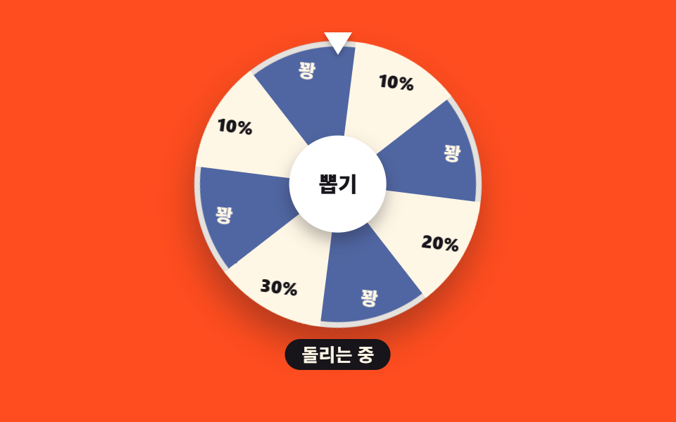
여덟 칸짜리 판을 conic-gradient 한 줄로 칠하고, 뽑기를 누르면 감속 이징으로 다섯 바퀴(1800deg)에 당첨 칸까지의 각을 더해 돌아 그 칸이 포인터 아래에 멈춥니다. 화면 가운데가 통째로 도는 만큼 누적면적 32.835%·강도 평균 114.8 으로, 카드 색이 통째로 죽는 09(139.9) 다음으로 세게 움직이고 움직인 프레임은 21/23 입니다.
<main class="stage">
<div class="wh is-demo" id="wh">
  <div class="wh__rig">
    <div class="wh__pointer" aria-hidden="true"></div>
    <div class="wh__disc" id="disc">
      <div class="wh__ring" aria-hidden="true"></div>
      <span class="wh__lbl" style="--k: 0"><b>10%</b></span>
      <span class="wh__lbl wh__lbl--b" style="--k: 1"><b>꽝</b></span>
      <span class="wh__lbl" style="--k: 2"><b>20%</b></span>
      <span class="wh__lbl wh__lbl--b" style="--k: 3"><b>꽝</b></span>
      <span class="wh__lbl" style="--k: 4"><b>30%</b></span>
      <span class="wh__lbl wh__lbl--b" style="--k: 5"><b>꽝</b></span>
      <span class="wh__lbl" style="--k: 6"><b>10%</b></span>
      <span class="wh__lbl wh__lbl--b" style="--k: 7"><b>꽝</b></span>
    </div>
    <button type="button" class="wh__hub" id="hub">뽑기</button>
  </div>
  <p class="wh__result" aria-live="polite"><span class="wh__msg wh__msg--idle">판을 돌려 할인을 뽑아보세요</span><span class="wh__msg wh__msg--spin" aria-hidden="true">돌리는 중</span><span class="wh__msg wh__msg--win" aria-hidden="true">30% 할인 당첨!</span></p>
</div>
</main>
@use "../../../../site/static/demo-tokens" as *;
// 돌림판 쿠폰 룰렛 — 여덟 칸은 conic-gradient 한 줄로 칠한다.
// 미리보기 루프는 1800deg(정확히 5바퀴)를 돌아 처음과 같은 각으로 돌아온다 — 텔레포트 없음.
// 실제 클릭은 transition 감속 회전(랜덤 당첨칸), 격자 루프와 별개.
$duration: $dur-loop;
$easing: $ease-out;
$color: $subject-cream;
@include stage($stage-orange);
.wh { display: flex; flex-direction: column; align-items: center; gap: $sp-2; width: 100%; }
.wh__rig { position: relative; width: clamp(168px, 48vw, 204px); aspect-ratio: 1; }
.wh__pointer {
position: absolute; top: -6px; left: 50%; transform: translateX(-50%);
width: 0; height: 0; border-left: 10px solid transparent; border-right: 10px solid transparent;
border-top: 16px solid $stage-paper; z-index: 2; filter: drop-shadow(0 2px 2px rgba(23,20,26,.3));
}
.wh__disc {
position: relative; width: 100%; height: 100%; border-radius: 50%;
background:
conic-gradient(
$subject-cream 0deg 45deg,
#5066a2 45deg 90deg,
$subject-cream 90deg 135deg,
#5066a2 135deg 180deg,
$subject-cream 180deg 225deg,
#5066a2 225deg 270deg,
$subject-cream 270deg 315deg,
#5066a2 315deg 360deg
);
box-shadow: $shadow-raised;
transition: transform 1.8s cubic-bezier(.12, .8, .08, 1);
}
// 링은 disc 안쪽에 — 바깥(-6px)에 두면 회전한 경계 상자가 무대를 넘어 BD9 가 깨진다
.wh__ring { position: absolute; inset: 0; border-radius: 50%; border: 4px solid rgba(255,247,230,.85); }
// 라벨은 칸마다 작은 조각으로 — inset:0 짜리 판을 통째로 돌리면 회전한 경계 상자가
// 원판 지름의 √2 배(224 → 310px)로 부풀어 무대를 넘는다(BD9 실측).
.wh__lbl {
position: absolute; left: calc(50% - 22px); top: calc(50% - 10px);
width: 44px; height: 20px; pointer-events: none;
// 칸 하나가 45deg 이므로 라벨은 칸 **중앙**인 k*45+22.5deg 에 놓는다
transform: rotate(calc(var(--k) * 45deg + 22.5deg)) translateY(var(--label-r, -84px));
}
.wh__lbl b {
display: block; text-align: center; line-height: 20px;
font-weight: 800; font-size: clamp(10px, 3vw, 13px); color: $subject-ink;
transform: rotate(calc(var(--k) * -45deg - 22.5deg));
}
.wh__lbl--b b { color: $subject-cream; }
// 허브는 판(.wh__disc) 밖 — 판 안에 두면 회전과 함께 「뽑기」 글자까지 거꾸로 돈다(클릭 실측)
.wh__hub {
position: absolute; left: 50%; top: 50%; transform: translate(-50%, -50%);
width: 34%; aspect-ratio: 1; border: 0; cursor: pointer; border-radius: 50%;
background: $stage-paper; color: $subject-ink; font-family: inherit;
font-weight: 800; font-size: clamp(12px, 3.6vw, 15px); line-height: 1;
box-shadow: $shadow-press; z-index: 1;
transition: transform 140ms cubic-bezier(.2,.8,.2,1);
}
.wh__hub:active { transform: translate(-50%, -50%) scale(.92); }
.wh__hub:focus-visible { outline: 3px solid $stage-yellow; outline-offset: 3px; }
// 주황 무대 위 흰 글자는 3.32:1 로 AA 미달(실측) — 문구는 잉크 알약 위에 올린다
.wh__result { position: relative; margin: 0; min-height: 1.9em; width: min(100%, 300px); text-align: center; }
.wh__msg {
display: inline-block; font-weight: 700; font-size: clamp(11px, 3.2vw, 13px);
color: $subject-cream; background: $subject-ink; border-radius: $r-pill; padding: 0 $sp-3; line-height: 1.7;
}
.wh__msg--spin, .wh__msg--win { position: absolute; left: 50%; top: 0; transform: translateX(-50%); visibility: hidden; }
.wh__msg--win { color: $stage-yellow; }
.wh.is-spinning .wh__msg--idle { visibility: hidden; }
.wh.is-spinning .wh__msg--spin { visibility: visible; }
.wh.is-won .wh__msg--idle { visibility: hidden; }
.wh.is-won .wh__msg--win { visibility: visible; }
// ── 격자 미리보기 루프: 5바퀴 감속 회전 → 82% 에 결과 컷 → 95% 복귀(회전각은 정확히 0으로)
.wh.is-demo .wh__disc { animation: whSpin 2s cubic-bezier(.12, .8, .08, 1) infinite; transition: none; }
@keyframes whSpin {
0% { transform: rotate(0deg); }
82%, 100% { transform: rotate(1800deg); }
}
.wh.is-demo .wh__msg--idle { animation: whCutIdle 2s steps(1, end) infinite; }
@keyframes whCutIdle { 0%, 8% { visibility: visible; } 8.5%, 94% { visibility: hidden; } 94.5%, 100% { visibility: visible; } }
.wh.is-demo .wh__msg--spin { animation: whCutSpin 2s steps(1, end) infinite; }
@keyframes whCutSpin { 0%, 8% { visibility: hidden; } 8.5%, 81% { visibility: visible; } 81.5%, 100% { visibility: hidden; } }
.wh.is-demo .wh__msg--win { animation: whCutWin 2s steps(1, end) infinite; }
@keyframes whCutWin { 0%, 81% { visibility: hidden; } 81.5%, 94% { visibility: visible; } 94.5%, 100% { visibility: hidden; } }
@media (max-width: 340px) {
// 320px 무대의 세로 여유는 174px 뿐 — 판 지름을 먼저 줄인다
.wh__rig { width: 132px; }
.wh { gap: $sp-1; --label-r: -48px; }
.wh__msg { font-size: 10px; padding: 0 $sp-2; }
.wh__lbl b { font-size: 10px; }
}
@media (prefers-reduced-motion: reduce) {
.wh.is-demo .wh__disc,
.wh.is-demo .wh__msg--idle,
.wh.is-demo .wh__msg--spin,
.wh.is-demo .wh__msg--win { animation: none !important; }
.wh__disc, .wh__hub { transition: none !important; }
// 회전 없이 결과만 즉시 보여준다
.wh.is-demo .wh__msg--idle { visibility: hidden; }
.wh.is-demo .wh__msg--win { visibility: visible; }
}html, body {
margin: 0;
overflow: hidden;
}
.stage {
box-sizing: border-box;
min-height: 100vh;
display: grid;
place-items: center;
margin: 0;
background: #ff4d1f;
font-family: -apple-system, "Segoe UI", "Noto Sans KR", sans-serif;
padding: clamp(8px, 4vw, 24px);
}
.wh {
display: flex;
flex-direction: column;
align-items: center;
gap: 8px;
width: 100%;
}
.wh__rig {
position: relative;
width: clamp(168px, 48vw, 204px);
aspect-ratio: 1;
}
.wh__pointer {
position: absolute;
top: -6px;
left: 50%;
transform: translateX(-50%);
width: 0;
height: 0;
border-left: 10px solid transparent;
border-right: 10px solid transparent;
border-top: 16px solid #ffffff;
z-index: 2;
filter: drop-shadow(0 2px 2px rgba(23, 20, 26, 0.3));
}
.wh__disc {
position: relative;
width: 100%;
height: 100%;
border-radius: 50%;
background: conic-gradient(#fff7e6 0deg 45deg, #5066a2 45deg 90deg, #fff7e6 90deg 135deg, #5066a2 135deg 180deg, #fff7e6 180deg 225deg, #5066a2 225deg 270deg, #fff7e6 270deg 315deg, #5066a2 315deg 360deg);
box-shadow: 0 14px 24px rgba(23, 20, 26, 0.32);
transition: transform 1.8s cubic-bezier(0.12, 0.8, 0.08, 1);
}
.wh__ring {
position: absolute;
inset: 0;
border-radius: 50%;
border: 4px solid rgba(255, 247, 230, 0.85);
}
.wh__lbl {
position: absolute;
left: calc(50% - 22px);
top: calc(50% - 10px);
width: 44px;
height: 20px;
pointer-events: none;
transform: rotate(calc(var(--k) * 45deg + 22.5deg)) translateY(var(--label-r, -84px));
}
.wh__lbl b {
display: block;
text-align: center;
line-height: 20px;
font-weight: 800;
font-size: clamp(10px, 3vw, 13px);
color: #17141a;
transform: rotate(calc(var(--k) * -45deg - 22.5deg));
}
.wh__lbl--b b {
color: #fff7e6;
}
.wh__hub {
position: absolute;
left: 50%;
top: 50%;
transform: translate(-50%, -50%);
width: 34%;
aspect-ratio: 1;
border: 0;
cursor: pointer;
border-radius: 50%;
background: #ffffff;
color: #17141a;
font-family: inherit;
font-weight: 800;
font-size: clamp(12px, 3.6vw, 15px);
line-height: 1;
box-shadow: 0 6px 12px rgba(23, 20, 26, 0.32);
z-index: 1;
transition: transform 140ms cubic-bezier(0.2, 0.8, 0.2, 1);
}
.wh__hub:active {
transform: translate(-50%, -50%) scale(0.92);
}
.wh__hub:focus-visible {
outline: 3px solid #ffd23f;
outline-offset: 3px;
}
.wh__result {
position: relative;
margin: 0;
min-height: 1.9em;
width: min(100%, 300px);
text-align: center;
}
.wh__msg {
display: inline-block;
font-weight: 700;
font-size: clamp(11px, 3.2vw, 13px);
color: #fff7e6;
background: #17141a;
border-radius: 999px;
padding: 0 12px;
line-height: 1.7;
}
.wh__msg--spin, .wh__msg--win {
position: absolute;
left: 50%;
top: 0;
transform: translateX(-50%);
visibility: hidden;
}
.wh__msg--win {
color: #ffd23f;
}
.wh.is-spinning .wh__msg--idle {
visibility: hidden;
}
.wh.is-spinning .wh__msg--spin {
visibility: visible;
}
.wh.is-won .wh__msg--idle {
visibility: hidden;
}
.wh.is-won .wh__msg--win {
visibility: visible;
}
.wh.is-demo .wh__disc {
animation: whSpin 2s cubic-bezier(0.12, 0.8, 0.08, 1) infinite;
transition: none;
}
@keyframes whSpin {
0% {
transform: rotate(0deg);
}
82%, 100% {
transform: rotate(1800deg);
}
}
.wh.is-demo .wh__msg--idle {
animation: whCutIdle 2s steps(1, end) infinite;
}
@keyframes whCutIdle {
0%, 8% {
visibility: visible;
}
8.5%, 94% {
visibility: hidden;
}
94.5%, 100% {
visibility: visible;
}
}
.wh.is-demo .wh__msg--spin {
animation: whCutSpin 2s steps(1, end) infinite;
}
@keyframes whCutSpin {
0%, 8% {
visibility: hidden;
}
8.5%, 81% {
visibility: visible;
}
81.5%, 100% {
visibility: hidden;
}
}
.wh.is-demo .wh__msg--win {
animation: whCutWin 2s steps(1, end) infinite;
}
@keyframes whCutWin {
0%, 81% {
visibility: hidden;
}
81.5%, 94% {
visibility: visible;
}
94.5%, 100% {
visibility: hidden;
}
}
@media (max-width: 340px) {
.wh__rig {
width: 132px;
}
.wh {
gap: 4px;
--label-r: -48px;
}
.wh__msg {
font-size: 10px;
padding: 0 8px;
}
.wh__lbl b {
font-size: 10px;
}
}
@media (prefers-reduced-motion: reduce) {
.wh.is-demo .wh__disc,
.wh.is-demo .wh__msg--idle,
.wh.is-demo .wh__msg--spin,
.wh.is-demo .wh__msg--win {
animation: none !important;
}
.wh__disc, .wh__hub {
transition: none !important;
}
.wh.is-demo .wh__msg--idle {
visibility: hidden;
}
.wh.is-demo .wh__msg--win {
visibility: visible;
}
}var wh = document.getElementById('wh');
var disc = document.getElementById('disc');
var hub = document.getElementById('hub');
var spinning = false;
hub.addEventListener('click', function () {
if (spinning) { return; }
wh.classList.remove('is-demo');
spinning = true;
wh.classList.add('is-spinning');
var picks = [0, 2, 4, 6];
var idx = picks[Math.floor(Math.random() * picks.length)];
var perSlice = 45;
var target = 1800 + (360 - (idx * perSlice + perSlice / 2));
disc.style.transform = 'rotate(' + target + 'deg)';
window.setTimeout(function () {
wh.classList.remove('is-spinning');
wh.classList.add('is-won');
spinning = false;
}, 1900);
});// SpinWheelCoupon — vanilla 판(run/283/demo/03-coupon-spin-wheel/index.html) 의 React 포트.
// 여덟 칸은 conic-gradient 한 줄, 라벨은 칸 중앙(k*45+22.5deg)에 놓고 글자만 역회전시킨다.
// 실제 클릭은 transition 감속 회전(랜덤 당첨칸), 격자 미리보기 루프와 별개.
import { useEffect, useRef, useState } from "react";
import type { CSSProperties } from "react";
import styles from "./SpinWheelCoupon.module.scss";
export type SpinWheelCouponProps = {
/** 격자 미리보기용 2초 자동 루프. 사람이 손대면 꺼진다 */
demo?: boolean;
duration?: number;
easing?: string;
color?: string;
};
type Vars = CSSProperties & { "--duration"?: string; "--easing"?: string; "--color"?: string };
type SliceVars = CSSProperties & { "--k"?: number };
type Slice = { k: number; text: string };
/** 여덟 칸 — 짝수 칸이 당첨(크림 바탕), 홀수 칸이 꽝(파란 바탕) */
const SLICES: Slice[] = [
{ k: 0, text: "10%" },
{ k: 1, text: "꽝" },
{ k: 2, text: "20%" },
{ k: 3, text: "꽝" },
{ k: 4, text: "30%" },
{ k: 5, text: "꽝" },
{ k: 6, text: "10%" },
{ k: 7, text: "꽝" },
];
/** 멈출 수 있는 칸(당첨칸만) — vanilla 의 picks 와 같다 */
const PICKS: number[] = [0, 2, 4, 6];
const PER_SLICE = 45;
/** 감속 회전이 끝나는 시각(ms) — vanilla 의 setTimeout 1900 과 같다 */
const SETTLE_MS = 1900;
export default function SpinWheelCoupon({
demo = true,
duration = 2000,
easing = "ease-out",
color = "#fff7e6",
}: SpinWheelCouponProps) {
const [live, setLive] = useState(demo);
const [spinning, setSpinning] = useState(false);
const [won, setWon] = useState(false);
const [angle, setAngle] = useState(0);
const timer = useRef<number>(null);
const vars: Vars = { "--duration": `${duration}ms`, "--easing": easing, "--color": color };
useEffect(function () {
return function () {
if (timer.current !== null) {
window.clearTimeout(timer.current);
}
};
}, []);
// vanilla 의 click 핸들러와 같은 순서·같은 수치
function applySpin() {
if (spinning) {
return;
}
setLive(false);
setWon(false);
setSpinning(true);
const idx = PICKS[Math.floor(Math.random() * PICKS.length)];
const target = 1800 + (360 - (idx * PER_SLICE + PER_SLICE / 2));
setAngle(target);
timer.current = window.setTimeout(function () {
setSpinning(false);
setWon(true);
}, SETTLE_MS);
}
const cls = [
styles.root,
live ? styles.isDemo : "",
spinning ? styles.isSpinning : "",
won ? styles.isWon : "",
].filter(Boolean).join(" ");
const discStyle: CSSProperties = live ? {} : { transform: `rotate(${angle}deg)` };
return (
<main className={styles.stage} style={vars}>
<div className={cls}>
<div className={styles.rig}>
<div className={styles.pointer} aria-hidden="true"></div>
<div className={styles.disc} style={discStyle}>
<div className={styles.ring} aria-hidden="true"></div>
{SLICES.map(function (slice: Slice) {
const sliceVars: SliceVars = { "--k": slice.k };
const lblCls = [styles.lbl, slice.k % 2 === 1 ? styles.lblB : ""].filter(Boolean).join(" ");
return (
<span className={lblCls} style={sliceVars} key={slice.k}><b>{slice.text}</b></span>
);
})}
<button type="button" className={styles.hub} onClick={applySpin}>뽑기</button>
</div>
</div>
<p className={styles.result} aria-live="polite">
<span className={`${styles.msg} ${styles.msgIdle}`}>판을 돌려 할인을 뽑아보세요</span>
<span className={`${styles.msg} ${styles.msgSpin}`} aria-hidden="true">돌리는 중</span>
<span className={`${styles.msg} ${styles.msgWin}`} aria-hidden="true">30% 할인 당첨!</span>
</p>
</div>
</main>
);
}03 · 돌림판 쿠폰 룰렛 — 측정 누적면적 32.835% · 움직인 프레임 21/23GODRICH 원작 · zip 에 SCSS·React 포함 · 비밀번호 보기
어디를 바꾸면 되나
가입 환영 이벤트 팝업과 앱 첫 실행 룰렛에 씁니다.
.wh__disc {
  position: relative; width: 100%; height: 100%; border-radius: 50%;
  background:
    conic-gradient(
      $subject-cream 0deg 45deg,
      #1c3f9e 45deg 90deg,
      $subject-cream 90deg 135deg,
      #1c3f9e 135deg 180deg,
      $subject-cream 180deg 225deg,
      #1c3f9e 225deg 270deg,
      $subject-cream 270deg 315deg,
      #1c3f9e 315deg 360deg
    );
  box-shadow: $shadow-raised;
  transition: transform 1.8s cubic-bezier(.12, .8, .08, 1);
}
04스크래치 쿠폰
무엇이 보이나
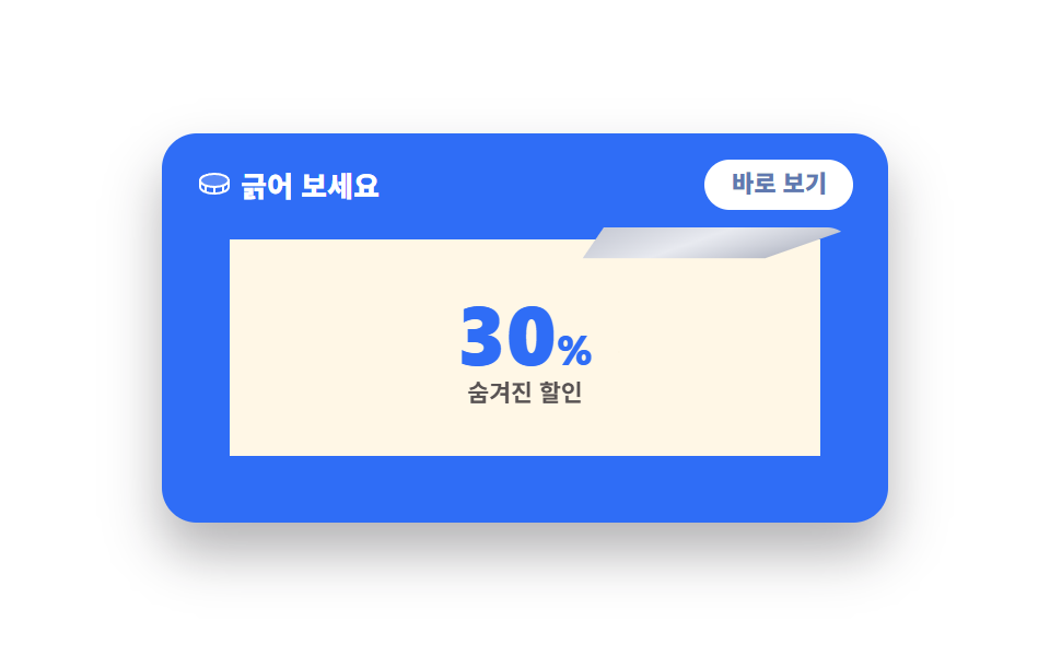
은박은 canvas 에 칠하고 포인터가 지나간 자리를 globalCompositeOperation 의 destination-out 으로 진짜로 지웁니다. 알파 값을 세어 잰 벗겨진 비율이 55% 를 넘으면 남은 은박이 저절로 걷히고, 격자 루프는 이 과정을 누적면적 22.853%·움직인 프레임 19/23 으로 재현합니다.
<main class="stage">
<div class="sc is-demo" id="sc">
  <div class="sc__card">
    <div class="sc__head">
      <p class="sc__title"><svg xmlns="http://www.w3.org/2000/svg" viewBox="0 0 256 256" fill="currentColor" class="sc__ico" aria-hidden="true"><path d="M232,104c0,24-40,48-104,48S24,128,24,104,64,56,128,56,232,80,232,104Z" opacity="0.2"/><path d="M207.58,63.84C186.85,53.48,159.33,48,128,48S69.15,53.48,48.42,63.84,16,88.78,16,104v48c0,15.22,11.82,29.85,32.42,40.16S96.67,208,128,208s58.85-5.48,79.58-15.84S240,167.22,240,152V104C240,88.78,228.18,74.15,207.58,63.84ZM128,64c62.64,0,96,23.23,96,40s-33.36,40-96,40-96-23.23-96-40S65.36,64,128,64Zm-8,95.86v32c-19-.62-35-3.42-48-7.49V153.05A203.43,203.43,0,0,0,120,159.86Zm16,0a203.43,203.43,0,0,0,48-6.81v31.31c-13,4.07-29,6.87-48,7.49ZM32,152V133.53a82.88,82.88,0,0,0,16.42,10.63c2.43,1.21,5,2.35,7.58,3.43V178C40.17,170.16,32,160.29,32,152Zm168,26V147.59c2.61-1.08,5.15-2.22,7.58-3.43A82.88,82.88,0,0,0,224,133.53V152C224,160.29,215.83,170.16,200,178Z"/></svg><span>긁어 보세요</span></p>
      <button type="button" class="sc__reveal" id="revealBtn">바로 보기</button>
    </div>
    <div class="sc__zone" id="zone">
      <div class="sc__prize">
        <p class="sc__pct">30<i>%</i></p>
        <p class="sc__say">숨겨진 할인</p>
      </div>
      <canvas class="sc__foil" id="foil" width="240" height="88" aria-hidden="true"></canvas>
      <div class="sc__demoFoil" aria-hidden="true"><span class="sc__demoText">은박을 긁어 주세요</span></div>
      <div class="sc__remnant" aria-hidden="true"></div>
      <div class="sc__coin" aria-hidden="true"></div>
    </div>
    <p class="sc__live" id="live" aria-live="polite"></p>
  </div>
</div>
</main>
@use "../../../../site/static/demo-tokens" as *;
// 스크래치 쿠폰 — 실제 긁기는 canvas 의 destination-out(포인터를 따라 은박을 지운다).
// 격자 미리보기(.is-demo)는 동전이 지나간 자리를 clip-path 로 wipe 해 긁히는 모양을 재현한다.
$duration: $dur-loop;
$easing: $ease-out;
$color: $subject-blue;
@include stage($stage-paper);
.sc { display: flex; justify-content: center; width: 100%; }
.sc__card {
width: min(100%, 300px); background: $subject-blue; border-radius: $r-card;
box-shadow: $shadow-raised; padding: $sp-3 $sp-4 $sp-2;
}
.sc__head { display: flex; align-items: center; justify-content: space-between; gap: $sp-2; }
.sc__title { display: flex; align-items: center; gap: $sp-1; margin: 0; font-weight: 800; font-size: clamp(11px, 3.2vw, 13px); color: $stage-paper; }
.sc__ico { width: 16px; height: 16px; color: $stage-paper; }
.sc__reveal {
border: 0; cursor: pointer; background: $stage-paper; color: #6079b0;
border-radius: $r-pill; font-family: inherit; font-weight: 800;
font-size: clamp(10px, 2.8vw, 11px); padding: $sp-1 $sp-3; line-height: 1.3;
}
.sc__reveal:focus-visible { outline: 3px solid $subject-ink; outline-offset: 2px; }
.sc__zone { position: relative; margin-top: $sp-2; border-radius: $r-control; overflow: hidden; }
.sc__prize {
display: flex; flex-direction: column; align-items: center; justify-content: center; gap: 0;
aspect-ratio: 240 / 88; background: $subject-cream;
}
.sc__pct { margin: 0; font-weight: 800; font-size: clamp(30px, 9vw, 42px); line-height: 1; color: $subject-blue; }
.sc__pct i { font-style: normal; font-size: .5em; }
.sc__say { margin: 0; font-weight: 700; font-size: clamp(10px, 2.8vw, 12px); color: rgba(23,20,26,.72); }
.sc__foil, .sc__demoFoil, .sc__remnant { position: absolute; inset: 0; }
.sc__foil { width: 100%; height: 100%; touch-action: none; }
.sc.is-open .sc__foil { visibility: hidden; }
.sc__demoFoil, .sc__remnant {
display: none; background: linear-gradient(100deg, #c9ccd6, #e8eaf0 45%, #b9bdc9);
}
.sc__demoFoil { align-items: center; justify-content: center; }
.sc__demoText { font-weight: 800; font-size: clamp(12px, 3.6vw, 15px); color: #4a4750; letter-spacing: .08em; }
.sc__remnant { left: 62%; transform-origin: top center; }
.sc__coin {
display: none; width: 30px; height: 30px; border-radius: 50%; top: calc(50% - 15px); left: 4%;
background: radial-gradient(circle at 34% 30%, #ebe6d6, #cab893 68%, #b59b69);
box-shadow: 0 4px 8px rgba(23,20,26,.35); border: 2px solid #ad9059;
}
.sc__live { margin: $sp-1 0 0; min-height: 1.2em; font-weight: 700; font-size: clamp(10px, 2.8vw, 11px); color: $stage-paper; }
// ── 격자 미리보기 루프: 동전이 왼쪽 62% 를 지나가며 wipe, 64% 에 남은 오른쪽 조각이
// 위로 말려 올라가고(rotateX) 76% 에 할인 확정 → 94% 복귀. zone 에 perspective.
.sc__zone { perspective: 300px; }
.sc.is-demo .sc__foil { visibility: hidden; }
.sc.is-demo .sc__demoFoil {
display: flex; clip-path: inset(0 0 0 0);
animation: scWipe 2s ease-out infinite;
}
@keyframes scWipe {
0%, 6% { clip-path: inset(0 0 0 0); }
63% { clip-path: inset(0 0 0 62%); }
63.5%, 100% { clip-path: inset(0 0 0 100%); }
}
.sc.is-demo .sc__remnant {
display: block;
animation: scCurl 2s ease-in-out infinite;
}
@keyframes scCurl {
0%, 63% { transform: rotateX(0deg); }
73%, 100% { transform: rotateX(-100deg); }
}
.sc.is-demo .sc__coin {
display: block; position: absolute;
animation: scCoin 2s ease-in-out infinite;
}
@keyframes scCoin {
0%, 6% { transform: translateX(0) rotate(0deg); }
63% { transform: translateX(var(--travel, 154px)) rotate(240deg); }
67% { transform: translateX(var(--travel, 154px)) rotate(240deg) scale(.6); }
71%, 100% { transform: translateX(calc(var(--travel, 154px) + 10px)) rotate(240deg) scale(0); }
}
.sc.is-demo .sc__prize { animation: scPop 2s ease-out infinite; }
@keyframes scPop {
0%, 74% { transform: scale(.9); }
79%, 93% { transform: scale(1); }
96%, 100% { transform: scale(.9); }
}
@media (max-width: 340px) {
.sc__card { padding: $sp-2 $sp-3; }
}
@media (prefers-reduced-motion: reduce) {
.sc.is-demo .sc__demoFoil,
.sc.is-demo .sc__remnant,
.sc.is-demo .sc__coin,
.sc.is-demo .sc__prize { animation: none !important; }
.sc.is-demo .sc__coin { display: none !important; }
// 움직임 없이 은박이 62% 까지 걷힌 정적 상태로 — 코인과 남은 조각은 감춘다
.sc.is-demo .sc__demoFoil { clip-path: inset(0 0 0 62%); }
.sc.is-demo .sc__remnant { display: none; }
}html, body {
margin: 0;
overflow: hidden;
}
.stage {
box-sizing: border-box;
min-height: 100vh;
display: grid;
place-items: center;
margin: 0;
background: #ffffff;
font-family: -apple-system, "Segoe UI", "Noto Sans KR", sans-serif;
padding: clamp(8px, 4vw, 24px);
}
.sc {
display: flex;
justify-content: center;
width: 100%;
}
.sc__card {
width: min(100%, 300px);
background: #2f6df6;
border-radius: 16px;
box-shadow: 0 14px 24px rgba(23, 20, 26, 0.32);
padding: 12px 16px 8px;
}
.sc__head {
display: flex;
align-items: center;
justify-content: space-between;
gap: 8px;
}
.sc__title {
display: flex;
align-items: center;
gap: 4px;
margin: 0;
font-weight: 800;
font-size: clamp(11px, 3.2vw, 13px);
color: #ffffff;
}
.sc__ico {
width: 16px;
height: 16px;
color: #ffffff;
}
.sc__reveal {
border: 0;
cursor: pointer;
background: #ffffff;
color: #6079b0;
border-radius: 999px;
font-family: inherit;
font-weight: 800;
font-size: clamp(10px, 2.8vw, 11px);
padding: 4px 12px;
line-height: 1.3;
}
.sc__reveal:focus-visible {
outline: 3px solid #17141a;
outline-offset: 2px;
}
.sc__zone {
position: relative;
margin-top: 8px;
border-radius: 12px;
overflow: hidden;
}
.sc__prize {
display: flex;
flex-direction: column;
align-items: center;
justify-content: center;
gap: 0;
aspect-ratio: 240/88;
background: #fff7e6;
}
.sc__pct {
margin: 0;
font-weight: 800;
font-size: clamp(30px, 9vw, 42px);
line-height: 1;
color: #2f6df6;
}
.sc__pct i {
font-style: normal;
font-size: 0.5em;
}
.sc__say {
margin: 0;
font-weight: 700;
font-size: clamp(10px, 2.8vw, 12px);
color: rgba(23, 20, 26, 0.72);
}
.sc__foil, .sc__demoFoil, .sc__remnant {
position: absolute;
inset: 0;
}
.sc__foil {
width: 100%;
height: 100%;
touch-action: none;
}
.sc.is-open .sc__foil {
visibility: hidden;
}
.sc__demoFoil, .sc__remnant {
display: none;
background: linear-gradient(100deg, #c9ccd6, #e8eaf0 45%, #b9bdc9);
}
.sc__demoFoil {
align-items: center;
justify-content: center;
}
.sc__demoText {
font-weight: 800;
font-size: clamp(12px, 3.6vw, 15px);
color: #4a4750;
letter-spacing: 0.08em;
}
.sc__remnant {
left: 62%;
transform-origin: top center;
}
.sc__coin {
display: none;
width: 30px;
height: 30px;
border-radius: 50%;
top: calc(50% - 15px);
left: 4%;
background: radial-gradient(circle at 34% 30%, #ebe6d6, #cab893 68%, #b59b69);
box-shadow: 0 4px 8px rgba(23, 20, 26, 0.35);
border: 2px solid #ad9059;
}
.sc__live {
margin: 4px 0 0;
min-height: 1.2em;
font-weight: 700;
font-size: clamp(10px, 2.8vw, 11px);
color: #ffffff;
}
.sc__zone {
perspective: 300px;
}
.sc.is-demo .sc__foil {
visibility: hidden;
}
.sc.is-demo .sc__demoFoil {
display: flex;
clip-path: inset(0 0 0 0);
animation: scWipe 2s ease-out infinite;
}
@keyframes scWipe {
0%, 6% {
clip-path: inset(0 0 0 0);
}
63% {
clip-path: inset(0 0 0 62%);
}
63.5%, 100% {
clip-path: inset(0 0 0 100%);
}
}
.sc.is-demo .sc__remnant {
display: block;
animation: scCurl 2s ease-in-out infinite;
}
@keyframes scCurl {
0%, 63% {
transform: rotateX(0deg);
}
73%, 100% {
transform: rotateX(-100deg);
}
}
.sc.is-demo .sc__coin {
display: block;
position: absolute;
animation: scCoin 2s ease-in-out infinite;
}
@keyframes scCoin {
0%, 6% {
transform: translateX(0) rotate(0deg);
}
63% {
transform: translateX(var(--travel, 154px)) rotate(240deg);
}
67% {
transform: translateX(var(--travel, 154px)) rotate(240deg) scale(0.6);
}
71%, 100% {
transform: translateX(calc(var(--travel, 154px) + 10px)) rotate(240deg) scale(0);
}
}
.sc.is-demo .sc__prize {
animation: scPop 2s ease-out infinite;
}
@keyframes scPop {
0%, 74% {
transform: scale(0.9);
}
79%, 93% {
transform: scale(1);
}
96%, 100% {
transform: scale(0.9);
}
}
@media (max-width: 340px) {
.sc__card {
padding: 8px 12px;
}
}
@media (prefers-reduced-motion: reduce) {
.sc.is-demo .sc__demoFoil,
.sc.is-demo .sc__remnant,
.sc.is-demo .sc__coin,
.sc.is-demo .sc__prize {
animation: none !important;
}
.sc.is-demo .sc__coin {
display: none !important;
}
.sc.is-demo .sc__demoFoil {
clip-path: inset(0 0 0 62%);
}
.sc.is-demo .sc__remnant {
display: none;
}
}var sc = document.getElementById('sc');
var zone = document.getElementById('zone');
var foil = document.getElementById('foil');
var ctx = foil.getContext('2d');
var revealBtn = document.getElementById('revealBtn');
var live = document.getElementById('live');
var scratched = false;
// 은박 칠 — 작은 틈 균열 무늬까지
function paintFoil() {
ctx.globalCompositeOperation = 'source-over';
ctx.clearRect(0, 0, foil.width, foil.height);
var grad = ctx.createLinearGradient(0, 0, foil.width, 0);
grad.addColorStop(0, '#c9ccd6');
grad.addColorStop(.5, '#e8eaf0');
grad.addColorStop(1, '#b9bdc9');
ctx.fillStyle = grad;
ctx.fillRect(0, 0, foil.width, foil.height);
ctx.strokeStyle = 'rgba(23,20,26,.14)';
ctx.lineWidth = 1;
for (var i = 0; i < 26; i++) {
ctx.beginPath();
var x = Math.random() * foil.width, y = Math.random() * foil.height;
ctx.moveTo(x, y);
ctx.lineTo(x + (Math.random() * 24 - 12), y + (Math.random() * 10 - 5));
ctx.stroke();
}
}
paintFoil();
// 실제 긁기 — pointermove 로 destination-out 원을 계속 지운다
var drawing = false;
function scratchAt(x, y) {
ctx.globalCompositeOperation = 'destination-out';
ctx.beginPath();
ctx.arc(x, y, 16, 0, Math.PI * 2);
ctx.fill();
}
function pos(e) {
var r = foil.getBoundingClientRect();
return { x: (e.clientX - r.left) * (foil.width / r.width), y: (e.clientY - r.top) * (foil.height / r.height) };
}
zone.addEventListener('pointerdown', function (e) {
if (scratched) { return; }
sc.classList.remove('is-demo');
drawing = true;
var p = pos(e);
scratchAt(p.x, p.y);
if (foil.setPointerCapture) { foil.setPointerCapture(e.pointerId); }
});
zone.addEventListener('pointermove', function (e) {
if (!drawing || scratched) { return; }
var p = pos(e);
scratchAt(p.x, p.y);
if (clearedRatio() > .55) { finish(); }
});
window.addEventListener('pointerup', function () { drawing = false; });
// 얼마나 벗겨졌나 — 알파 샘플로 실측
function clearedRatio() {
var data = ctx.getImageData(0, 0, foil.width, foil.height).data;
var clear = 0, total = data.length / 4;
for (var i = 3; i < data.length; i += 4) { if (data[i] < 40) { clear++; } }
return clear / total;
}
function finish() {
scratched = true;
ctx.globalCompositeOperation = 'destination-out';
ctx.fillRect(0, 0, foil.width, foil.height);
sc.classList.add('is-open');
live.textContent = '할인율은 30%였어요';
}
revealBtn.addEventListener('click', function () { if (!scratched) { finish(); } });// ScratchCoupon — vanilla 판(run/283/demo/04-coupon-scratch-reveal/index.html) 의 React 포트.
// canvas 에 은박을 칠하고 포인터를 따라 destination-out 으로 지운다. 알파 샘플로 벗겨진 비율을
// 실측해 55% 를 넘으면 통째로 지우고 할인율을 알린다. 값·수치는 vanilla 와 같다.
import { useEffect, useRef, useState } from "react";
import type { CSSProperties, PointerEvent as ReactPointerEvent } from "react";
import styles from "./ScratchCoupon.module.scss";
export type ScratchCouponProps = {
duration?: number;
easing?: string;
color?: string;
};
type Vars = CSSProperties & { "--duration"?: string; "--easing"?: string; "--color"?: string };
const FOIL_WIDTH = 240;
const FOIL_HEIGHT = 88;
const BRUSH_RADIUS = 16;
const CLEAR_THRESHOLD = 0.55;
// 은박 칠 — 작은 틈 균열 무늬까지
function applyPaint(ctx: CanvasRenderingContext2D, width: number, height: number): void {
ctx.globalCompositeOperation = "source-over";
ctx.clearRect(0, 0, width, height);
const grad = ctx.createLinearGradient(0, 0, width, 0);
grad.addColorStop(0, "#c9ccd6");
grad.addColorStop(0.5, "#e8eaf0");
grad.addColorStop(1, "#b9bdc9");
ctx.fillStyle = grad;
ctx.fillRect(0, 0, width, height);
ctx.strokeStyle = "rgba(23,20,26,.14)";
ctx.lineWidth = 1;
for (let i = 0; i < 26; i++) {
ctx.beginPath();
const x = Math.random() * width;
const y = Math.random() * height;
ctx.moveTo(x, y);
ctx.lineTo(x + (Math.random() * 24 - 12), y + (Math.random() * 10 - 5));
ctx.stroke();
}
}
// 실제 긁기 — destination-out 원을 계속 지운다
function applyScratch(ctx: CanvasRenderingContext2D, x: number, y: number): void {
ctx.globalCompositeOperation = "destination-out";
ctx.beginPath();
ctx.arc(x, y, BRUSH_RADIUS, 0, Math.PI * 2);
ctx.fill();
}
// 얼마나 벗겨졌나 — 알파 샘플로 실측
function clearedRatio(ctx: CanvasRenderingContext2D, width: number, height: number): number {
const data = ctx.getImageData(0, 0, width, height).data;
let clear = 0;
const total = data.length / 4;
for (let i = 3; i < data.length; i += 4) {
if (data[i] < 40) {
clear++;
}
}
return clear / total;
}
export default function ScratchCoupon({
duration = 2000,
easing = "ease-out",
color = "#2f6df6",
}: ScratchCouponProps) {
const foilRef = useRef<HTMLCanvasElement>(null);
const drawingRef = useRef<boolean>(false);
const [demo, setDemo] = useState(true);
const [scratched, setScratched] = useState(false);
const [live, setLive] = useState("");
const vars: Vars = { "--duration": `${duration}ms`, "--easing": easing, "--color": color };
// 은박은 마운트 때 한 번 칠한다 — 다시 칠하면 긁은 자리가 되살아난다
useEffect(() => {
const canvas = foilRef.current;
if (!canvas) return;
const ctx = canvas.getContext("2d");
if (!ctx) return;
applyPaint(ctx, FOIL_WIDTH, FOIL_HEIGHT);
}, []);
// 포인터를 떼면 어디서 떼든 긋기를 끝낸다
useEffect(() => {
function onUp(): void {
drawingRef.current = false;
}
window.addEventListener("pointerup", onUp);
return () => window.removeEventListener("pointerup", onUp);
}, []);
function getContext(): CanvasRenderingContext2D | null {
const canvas = foilRef.current;
if (!canvas) return null;
return canvas.getContext("2d");
}
function toCanvasPoint(event: ReactPointerEvent<HTMLDivElement>): { x: number; y: number } | null {
const canvas = foilRef.current;
if (!canvas) return null;
const r = canvas.getBoundingClientRect();
return {
x: (event.clientX - r.left) * (FOIL_WIDTH / r.width),
y: (event.clientY - r.top) * (FOIL_HEIGHT / r.height),
};
}
function applyFinish(ctx: CanvasRenderingContext2D): void {
setScratched(true);
ctx.globalCompositeOperation = "destination-out";
ctx.fillRect(0, 0, FOIL_WIDTH, FOIL_HEIGHT);
setLive("할인율은 30%였어요");
}
function onPointerDown(event: ReactPointerEvent<HTMLDivElement>): void {
if (scratched) return;
setDemo(false);
drawingRef.current = true;
const ctx = getContext();
const p = toCanvasPoint(event);
if (!ctx || !p) return;
applyScratch(ctx, p.x, p.y);
const canvas = foilRef.current;
if (canvas && canvas.setPointerCapture) {
canvas.setPointerCapture(event.pointerId);
}
}
function onPointerMove(event: ReactPointerEvent<HTMLDivElement>): void {
if (!drawingRef.current || scratched) return;
const ctx = getContext();
const p = toCanvasPoint(event);
if (!ctx || !p) return;
applyScratch(ctx, p.x, p.y);
if (clearedRatio(ctx, FOIL_WIDTH, FOIL_HEIGHT) > CLEAR_THRESHOLD) {
applyFinish(ctx);
}
}
function onReveal(): void {
if (scratched) return;
const ctx = getContext();
if (!ctx) return;
applyFinish(ctx);
}
const cls = [styles.root, demo ? styles.isDemo : "", scratched ? styles.isOpen : ""].filter(Boolean).join(" ");
return (
<main className={styles.stage}>
<div className={cls} style={vars}>
<div className={styles.card}>
<div className={styles.head}>
<p className={styles.title}>
<svg xmlns="http://www.w3.org/2000/svg" viewBox="0 0 256 256" fill="currentColor" className={styles.ico} aria-hidden="true"><path d="M232,104c0,24-40,48-104,48S24,128,24,104,64,56,128,56,232,80,232,104Z" opacity="0.2"/><path d="M207.58,63.84C186.85,53.48,159.33,48,128,48S69.15,53.48,48.42,63.84,16,88.78,16,104v48c0,15.22,11.82,29.85,32.42,40.16S96.67,208,128,208s58.85-5.48,79.58-15.84S240,167.22,240,152V104C240,88.78,228.18,74.15,207.58,63.84ZM128,64c62.64,0,96,23.23,96,40s-33.36,40-96,40-96-23.23-96-40S65.36,64,128,64Zm-8,95.86v32c-19-.62-35-3.42-48-7.49V153.05A203.43,203.43,0,0,0,120,159.86Zm16,0a203.43,203.43,0,0,0,48-6.81v31.31c-13,4.07-29,6.87-48,7.49ZM32,152V133.53a82.88,82.88,0,0,0,16.42,10.63c2.43,1.21,5,2.35,7.58,3.43V178C40.17,170.16,32,160.29,32,152Zm168,26V147.59c2.61-1.08,5.15-2.22,7.58-3.43A82.88,82.88,0,0,0,224,133.53V152C224,160.29,215.83,170.16,200,178Z"/></svg>
<span>긁어 보세요</span>
</p>
<button type="button" className={styles.reveal} onClick={onReveal}>바로 보기</button>
</div>
<div className={styles.zone} onPointerDown={onPointerDown} onPointerMove={onPointerMove}>
<div className={styles.prize}>
<p className={styles.pct}>30<i>%</i></p>
<p className={styles.say}>숨겨진 할인</p>
</div>
<canvas className={styles.foil} ref={foilRef} width={FOIL_WIDTH} height={FOIL_HEIGHT} aria-hidden="true"></canvas>
<div className={styles.demoFoil} aria-hidden="true"><span className={styles.demoText}>은박을 긁어 주세요</span></div>
<div className={styles.remnant} aria-hidden="true"></div>
<div className={styles.coin} aria-hidden="true"></div>
</div>
<p className={styles.live} aria-live="polite">{live}</p>
</div>
</div>
</main>
);
}04 · 스크래치 쿠폰 — 측정 누적면적 22.853% · 움직인 프레임 19/23GODRICH 원작 · zip 에 SCSS·React 포함 · 비밀번호 보기
코드에서 볼 곳
랜덤 보상 쿠폰과 이벤트 응모 결과 카드에 씁니다.
// 실제 긁기 — pointermove 로 destination-out 원을 계속 지운다
function scratchAt(x, y) {
  ctx.globalCompositeOperation = 'destination-out';
  ctx.beginPath();
  ctx.arc(x, y, 16, 0, Math.PI * 2);
  ctx.fill();
}
// 얼마나 벗겨졌나 — 알파 샘플로 실측
function clearedRatio() {
  var data = ctx.getImageData(0, 0, foil.width, foil.height).data;
  var clear = 0, total = data.length / 4;
  for (var i = 3; i < data.length; i += 4) { if (data[i] < 40) { clear++; } }
  return clear / total;
}
05기프트 카드 뒤집기
화면에서 일어나는 일
카드를 누르면 rotateY(180deg) 로 돌아가며 앞면의 금액이 뒷면의 잔액과 PIN 가림판으로 바뀌는데, 뒤판을 미리 180도 돌려 두고 backface-visibility: hidden 으로 등을 감춰 두 판이 한 장처럼 맞물립니다. 카드 면 전체가 돌아 누적면적 34.278% 로 아홉 개 중 가장 넓게 바뀌지만 앞뒤가 모두 밝은 색이라 강도 평균은 63.7 에 그쳐 눈에는 부드럽고, 움직인 프레임은 23/23 입니다.
<main class="stage">
<div class="gc is-demo" id="gc">
  <div class="gc__bob">
  <div class="gc__card" id="card">
    <div class="gc__face gc__face--front">
      <p class="gc__brand"><svg xmlns="http://www.w3.org/2000/svg" viewBox="0 0 256 256" fill="currentColor" class="gc__ico" aria-hidden="true"><path d="M208,128v72a8,8,0,0,1-8,8H56a8,8,0,0,1-8-8V128Z" opacity="0.2"/><path d="M216,72H180.92c.39-.33.79-.65,1.17-1A29.53,29.53,0,0,0,192,49.57,32.62,32.62,0,0,0,158.44,16,29.53,29.53,0,0,0,137,25.91a54.94,54.94,0,0,0-9,14.48,54.94,54.94,0,0,0-9-14.48A29.53,29.53,0,0,0,97.56,16,32.62,32.62,0,0,0,64,49.57,29.53,29.53,0,0,0,73.91,71c.38.33.78.65,1.17,1H40A16,16,0,0,0,24,88v32a16,16,0,0,0,16,16v64a16,16,0,0,0,16,16H200a16,16,0,0,0,16-16V136a16,16,0,0,0,16-16V88A16,16,0,0,0,216,72ZM149,36.51a13.69,13.69,0,0,1,10-4.5h.49A16.62,16.62,0,0,1,176,49.08a13.69,13.69,0,0,1-4.5,10c-9.49,8.4-25.24,11.36-35,12.4C137.7,60.89,141,45.5,149,36.51Zm-64.09.36A16.63,16.63,0,0,1,96.59,32h.49a13.69,13.69,0,0,1,10,4.5c8.39,9.48,11.35,25.2,12.39,34.92-9.72-1-25.44-4-34.92-12.39a13.69,13.69,0,0,1-4.5-10A16.6,16.6,0,0,1,84.87,36.87ZM40,88h80v32H40Zm16,48h64v64H56Zm144,64H136V136h64Zm16-80H136V88h80v32Z"/></svg><span>GIFT CARD</span></p>
      <p class="gc__amount">50,000원</p>
      <p class="gc__hint">눌러서 뒤집기</p>
    </div>
    <div class="gc__face gc__face--back" aria-hidden="true">
      <p class="gc__balLabel">남은 금액</p>
      <p class="gc__bal">48,200원</p>
      <div class="gc__pinRow">
        <span class="gc__pinDots" id="pinDots">PIN ••••</span>
        <button type="button" class="gc__pinBtn" id="pinBtn">PIN 보기</button>
      </div>
    </div>
  </div>
  </div>
  <p class="gc__live" id="live" aria-live="polite"></p>
</div>
</main>
@use "../../../../site/static/demo-tokens" as *;
// 기프트 카드 뒤집기 — rotateY + backface-visibility 로 두 판이 한 장처럼 맞물린다.
// 격자 미리보기(.is-demo)는 뒤집힘을 steps 컷으로 보여준다(회전 중간은 모서리뷰 한 줄이라 포스터가 죽는다 — 252-07 함정).
// 실제 클릭은 부드러운 transition 회전 그대로.
$duration: $dur-enter;
$easing: $ease-spring;
$color: $subject-lilac;
@include stage($stage-ink);
.gc { display: flex; flex-direction: column; align-items: center; gap: $sp-2; width: 100%; }
.gc__bob { display: flex; justify-content: center; width: 100%; }
.gc__card {
position: relative; width: min(100%, 288px); aspect-ratio: 288 / 168;
transform-style: preserve-3d; cursor: pointer;
transition: transform 600ms $easing;
}
.gc__card:focus-visible { outline: 3px solid $stage-yellow; outline-offset: 4px; border-radius: $r-card; }
.gc.is-flipped .gc__card { transform: rotateY(180deg); }
.gc__face {
position: absolute; inset: 0; display: flex; flex-direction: column;
align-items: center; justify-content: center; gap: $sp-1;
border-radius: $r-card; box-shadow: $shadow-raised;
backface-visibility: hidden; -webkit-backface-visibility: hidden;
padding: $sp-4;
}
.gc__face--front { background: $subject-lilac; color: $subject-ink; }
.gc__face--back { background: $subject-cream; color: $subject-ink; transform: rotateY(180deg); gap: $sp-2; }
.gc__brand { display: flex; align-items: center; gap: $sp-1; margin: 0; font-weight: 800; font-size: clamp(10px, 2.8vw, 12px); letter-spacing: .2em; color: rgba(23,20,26,.78); }
.gc__ico { width: 18px; height: 18px; color: $subject-ink; }
.gc__amount { margin: 0; font-weight: 800; font-size: clamp(28px, 8vw, 38px); line-height: 1; color: $subject-ink; }
.gc__hint { margin: 0; font-weight: 700; font-size: clamp(10px, 2.8vw, 11px); color: rgba(23,20,26,.78); }
.gc__balLabel { margin: 0; font-weight: 700; font-size: clamp(10px, 2.8vw, 11px); color: rgba(23,20,26,.72); }
.gc__bal { margin: 0; font-weight: 800; font-size: clamp(22px, 6.4vw, 28px); line-height: 1; color: $subject-blue; }
.gc__pinRow { display: flex; align-items: center; gap: $sp-2; }
.gc__pinDots { font-weight: 800; font-size: clamp(11px, 3.2vw, 13px); letter-spacing: .1em; color: $subject-ink; }
.gc__pinBtn {
border: 0; cursor: pointer; background: $subject-ink; color: $subject-cream;
border-radius: $r-pill; font-family: inherit; font-weight: 700;
font-size: clamp(10px, 2.8vw, 11px); padding: $sp-1 $sp-3; line-height: 1.3;
}
.gc__pinBtn:focus-visible { outline: 3px solid $subject-lilac; outline-offset: 2px; }
.gc__live { margin: 0; min-height: 1.2em; font-weight: 700; font-size: clamp(10px, 2.8vw, 11px); color: $subject-cream; }
// ── 격자 미리보기 루프: 바깥 .gc__bob 은 살짝 둥둥(연속), .gc__card 는 steps 컷으로
// 앞면 → 뒷면 → 앞면. 회전 중간(모서리뷰)을 그리지 않는다(252-07 함정).
.gc.is-demo .gc__bob { animation: gcFloat 2s ease-in-out infinite; }
@keyframes gcFloat { 0%, 100% { transform: translateY(0); } 50% { transform: translateY(-4px); } }
.gc.is-demo .gc__card { animation: gcCut 2s steps(1, end) infinite; transition: none; }
@keyframes gcCut { 0%, 30% { transform: rotateY(0deg); } 30.5%, 85% { transform: rotateY(180deg); } 85.5%, 100% { transform: rotateY(0deg); } }
.gc.is-demo .gc__pinDots { animation: gcPin 2s steps(1, end) infinite; }
@keyframes gcPin { 0%, 46% { opacity: 1; } 46.5%, 60% { opacity: .35; } 60.5%, 100% { opacity: 1; } }
@media (max-width: 340px) {
.gc__face { padding: $sp-2; }
.gc__card { width: min(100%, 232px); }
.gc { gap: $sp-1; }
}
@media (prefers-reduced-motion: reduce) {
.gc.is-demo .gc__bob,
.gc.is-demo .gc__card,
.gc.is-demo .gc__pinDots { animation: none !important; }
.gc__card { transition: none !important; }
.gc.is-demo .gc__card { transform: rotateY(180deg); }
}html, body {
margin: 0;
overflow: hidden;
}
.stage {
box-sizing: border-box;
min-height: 100vh;
display: grid;
place-items: center;
margin: 0;
background: #17141a;
font-family: -apple-system, "Segoe UI", "Noto Sans KR", sans-serif;
padding: clamp(8px, 4vw, 24px);
}
.gc {
display: flex;
flex-direction: column;
align-items: center;
gap: 8px;
width: 100%;
}
.gc__bob {
display: flex;
justify-content: center;
width: 100%;
}
.gc__card {
position: relative;
width: min(100%, 288px);
aspect-ratio: 288/168;
transform-style: preserve-3d;
cursor: pointer;
transition: transform 600ms cubic-bezier(0.2, 0.8, 0.2, 1);
}
.gc__card:focus-visible {
outline: 3px solid #ffd23f;
outline-offset: 4px;
border-radius: 16px;
}
.gc.is-flipped .gc__card {
transform: rotateY(180deg);
}
.gc__face {
position: absolute;
inset: 0;
display: flex;
flex-direction: column;
align-items: center;
justify-content: center;
gap: 4px;
border-radius: 16px;
box-shadow: 0 14px 24px rgba(23, 20, 26, 0.32);
backface-visibility: hidden;
-webkit-backface-visibility: hidden;
padding: 16px;
}
.gc__face--front {
background: #b9a0ff;
color: #17141a;
}
.gc__face--back {
background: #fff7e6;
color: #17141a;
transform: rotateY(180deg);
gap: 8px;
}
.gc__brand {
display: flex;
align-items: center;
gap: 4px;
margin: 0;
font-weight: 800;
font-size: clamp(10px, 2.8vw, 12px);
letter-spacing: 0.2em;
color: rgba(23, 20, 26, 0.78);
}
.gc__ico {
width: 18px;
height: 18px;
color: #17141a;
}
.gc__amount {
margin: 0;
font-weight: 800;
font-size: clamp(28px, 8vw, 38px);
line-height: 1;
color: #17141a;
}
.gc__hint {
margin: 0;
font-weight: 700;
font-size: clamp(10px, 2.8vw, 11px);
color: rgba(23, 20, 26, 0.78);
}
.gc__balLabel {
margin: 0;
font-weight: 700;
font-size: clamp(10px, 2.8vw, 11px);
color: rgba(23, 20, 26, 0.72);
}
.gc__bal {
margin: 0;
font-weight: 800;
font-size: clamp(22px, 6.4vw, 28px);
line-height: 1;
color: #2f6df6;
}
.gc__pinRow {
display: flex;
align-items: center;
gap: 8px;
}
.gc__pinDots {
font-weight: 800;
font-size: clamp(11px, 3.2vw, 13px);
letter-spacing: 0.1em;
color: #17141a;
}
.gc__pinBtn {
border: 0;
cursor: pointer;
background: #17141a;
color: #fff7e6;
border-radius: 999px;
font-family: inherit;
font-weight: 700;
font-size: clamp(10px, 2.8vw, 11px);
padding: 4px 12px;
line-height: 1.3;
}
.gc__pinBtn:focus-visible {
outline: 3px solid #b9a0ff;
outline-offset: 2px;
}
.gc__live {
margin: 0;
min-height: 1.2em;
font-weight: 700;
font-size: clamp(10px, 2.8vw, 11px);
color: #fff7e6;
}
.gc.is-demo .gc__bob {
animation: gcFloat 2s ease-in-out infinite;
}
@keyframes gcFloat {
0%, 100% {
transform: translateY(0);
}
50% {
transform: translateY(-4px);
}
}
.gc.is-demo .gc__card {
animation: gcCut 2s steps(1, end) infinite;
transition: none;
}
@keyframes gcCut {
0%, 30% {
transform: rotateY(0deg);
}
30.5%, 85% {
transform: rotateY(180deg);
}
85.5%, 100% {
transform: rotateY(0deg);
}
}
.gc.is-demo .gc__pinDots {
animation: gcPin 2s steps(1, end) infinite;
}
@keyframes gcPin {
0%, 46% {
opacity: 1;
}
46.5%, 60% {
opacity: 0.35;
}
60.5%, 100% {
opacity: 1;
}
}
@media (max-width: 340px) {
.gc__face {
padding: 8px;
}
.gc__card {
width: min(100%, 232px);
}
.gc {
gap: 4px;
}
}
@media (prefers-reduced-motion: reduce) {
.gc.is-demo .gc__bob,
.gc.is-demo .gc__card,
.gc.is-demo .gc__pinDots {
animation: none !important;
}
.gc__card {
transition: none !important;
}
.gc.is-demo .gc__card {
transform: rotateY(180deg);
}
}var gc = document.getElementById('gc');
var card = document.getElementById('card');
var pinBtn = document.getElementById('pinBtn');
var pinDots = document.getElementById('pinDots');
var live = document.getElementById('live');
var pinTimer = null;
var faces = {
front: document.querySelector('.gc__face--front'),
back: document.querySelector('.gc__face--back')
};
card.addEventListener('click', function () {
gc.classList.remove('is-demo');
var flipped = gc.classList.toggle('is-flipped');
faces.back.setAttribute('aria-hidden', flipped ? 'false' : 'true');
live.textContent = flipped ? '카드 뒷면이에요' : '카드 앞면이에요';
});
pinBtn.addEventListener('click', function (e) {
e.stopPropagation();
gc.classList.remove('is-demo');
pinDots.textContent = 'PIN 4820';
live.textContent = 'PIN 을 3초간 보여줘요';
window.clearTimeout(pinTimer);
pinTimer = window.setTimeout(function () {
pinDots.textContent = 'PIN ••••';
}, 3000);
});// GiftCardFlip — vanilla 판(run/283/demo/05-coupon-giftcard-flip/index.html) 의 React 포트.
// 카드를 누르면 rotateY 로 뒤집히고, PIN 보기는 3초 동안만 숫자를 드러냈다가 점으로 되돌아간다.
import { useEffect, useRef, useState } from "react";
import type { CSSProperties, MouseEvent as ReactMouseEvent } from "react";
import styles from "./GiftCardFlip.module.scss";
export type GiftCardFlipProps = {
duration?: number;
easing?: string;
color?: string;
};
type Vars = CSSProperties & { "--duration"?: string; "--easing"?: string; "--color"?: string };
const PIN_MASK = "PIN ••••";
const PIN_PLAIN = "PIN 4820";
const PIN_HOLD = 3000;
export default function GiftCardFlip({
duration = 600,
easing = "cubic-bezier(.2, .8, .2, 1)",
color = "#b9a0ff",
}: GiftCardFlipProps) {
const pinTimerRef = useRef<number>(0);
const [demo, setDemo] = useState(true);
const [flipped, setFlipped] = useState(false);
const [pinText, setPinText] = useState(PIN_MASK);
const [live, setLive] = useState("");
const vars: Vars = { "--duration": `${duration}ms`, "--easing": easing, "--color": color };
// 컴포넌트가 사라질 때 PIN 되돌리기 타이머를 남기지 않는다
useEffect(() => {
return () => window.clearTimeout(pinTimerRef.current ?? 0);
}, []);
function onCardClick(): void {
setDemo(false);
const next = !flipped;
setFlipped(next);
setLive(next ? "카드 뒷면이에요" : "카드 앞면이에요");
}
function onPinClick(event: ReactMouseEvent<HTMLButtonElement>): void {
event.stopPropagation();
setDemo(false);
setPinText(PIN_PLAIN);
setLive("PIN 을 3초간 보여줘요");
window.clearTimeout(pinTimerRef.current ?? 0);
pinTimerRef.current = window.setTimeout(() => {
setPinText(PIN_MASK);
}, PIN_HOLD);
}
const cls = [styles.root, demo ? styles.isDemo : "", flipped ? styles.isFlipped : ""].filter(Boolean).join(" ");
return (
<main className={styles.stage}>
<div className={cls} style={vars}>
<div className={styles.bob}>
<div className={styles.card} onClick={onCardClick}>
<div className={`${styles.face} ${styles.front}`}>
<p className={styles.brand}>
<svg xmlns="http://www.w3.org/2000/svg" viewBox="0 0 256 256" fill="currentColor" className={styles.ico} aria-hidden="true"><path d="M208,128v72a8,8,0,0,1-8,8H56a8,8,0,0,1-8-8V128Z" opacity="0.2"/><path d="M216,72H180.92c.39-.33.79-.65,1.17-1A29.53,29.53,0,0,0,192,49.57,32.62,32.62,0,0,0,158.44,16,29.53,29.53,0,0,0,137,25.91a54.94,54.94,0,0,0-9,14.48,54.94,54.94,0,0,0-9-14.48A29.53,29.53,0,0,0,97.56,16,32.62,32.62,0,0,0,64,49.57,29.53,29.53,0,0,0,73.91,71c.38.33.78.65,1.17,1H40A16,16,0,0,0,24,88v32a16,16,0,0,0,16,16v64a16,16,0,0,0,16,16H200a16,16,0,0,0,16-16V136a16,16,0,0,0,16-16V88A16,16,0,0,0,216,72ZM149,36.51a13.69,13.69,0,0,1,10-4.5h.49A16.62,16.62,0,0,1,176,49.08a13.69,13.69,0,0,1-4.5,10c-9.49,8.4-25.24,11.36-35,12.4C137.7,60.89,141,45.5,149,36.51Zm-64.09.36A16.63,16.63,0,0,1,96.59,32h.49a13.69,13.69,0,0,1,10,4.5c8.39,9.48,11.35,25.2,12.39,34.92-9.72-1-25.44-4-34.92-12.39a13.69,13.69,0,0,1-4.5-10A16.6,16.6,0,0,1,84.87,36.87ZM40,88h80v32H40Zm16,48h64v64H56Zm144,64H136V136h64Zm16-80H136V88h80v32Z"/></svg>
<span>GIFT CARD</span>
</p>
<p className={styles.amount}>50,000원</p>
<p className={styles.hint}>눌러서 뒤집기</p>
</div>
<div className={`${styles.face} ${styles.back}`} aria-hidden={flipped ? "false" : "true"}>
<p className={styles.balLabel}>남은 금액</p>
<p className={styles.bal}>48,200원</p>
<div className={styles.pinRow}>
<span className={styles.pinDots}>{pinText}</span>
<button type="button" className={styles.pinBtn} onClick={onPinClick}>PIN 보기</button>
</div>
</div>
</div>
</div>
<p className={styles.live} aria-live="polite">{live}</p>
</div>
</main>
);
}05 · 기프트 카드 뒤집기 — 측정 누적면적 34.278% · 움직인 프레임 23/23GODRICH 원작 · zip 에 SCSS·React 포함 · 비밀번호 보기
코드 읽는 법
선물하기 페이지와 금액권 선택 카드에 씁니다.
.gc__card {
  position: relative; width: min(100%, 288px); aspect-ratio: 288 / 168;
  transform-style: preserve-3d; cursor: pointer;
  transition: transform 600ms $easing;
}
.gc.is-flipped .gc__card { transform: rotateY(180deg); }
.gc__face {
  position: absolute; inset: 0; display: flex; flex-direction: column;
  align-items: center; justify-content: center; gap: $sp-1;
  border-radius: $r-card; box-shadow: $shadow-raised;
  backface-visibility: hidden; -webkit-backface-visibility: hidden;
  padding: $sp-4;
}
.gc__face--front { background: $subject-lilac; color: $subject-ink; }
.gc__face--back { background: $subject-cream; color: $subject-ink; transform: rotateY(180deg); gap: $sp-2; }
06쿠폰 더미 부채꼴
어떤 움직임인가
겹쳐 둔 카드 세 장이 --i 순서대로 좌우로 벌어져 조건을 한눈에 견주게 하고, 가운데 한 장이 들리며 결제에 올릴 카드를 고릅니다. 양옆 두 장이 서로 다른 폭으로 벌어졌다 모이며 누적면적 29.548%, 움직인 프레임 23/23 을 기록했습니다.
<main class="stage">
<div class="fan is-demo" id="fan">
  <div class="fan__stack" id="stack" role="group" aria-label="보관함 쿠폰 세 장">
    <button type="button" class="fan__card fan__card--1" style="--i: 0" data-msg="첫 구매 10%을 결제에 올렸어요" aria-pressed="false">
      <span class="fan__tag">신규</span>
      <span class="fan__pct">10<i>%</i></span>
      <span class="fan__name">첫 구매 할인</span>
    </button>
    <button type="button" class="fan__card fan__card--2" style="--i: 1" data-msg="브랜드데이 20%을 결제에 올렸어요" aria-pressed="false">
      <span class="fan__tag">이벤트</span>
      <span class="fan__pct">20<i>%</i></span>
      <span class="fan__name">브랜드데이 할인</span>
    </button>
    <button type="button" class="fan__card fan__card--3" style="--i: 2" data-msg="무료배송 쿠폰을 결제에 올렸어요" aria-pressed="false">
      <span class="fan__tag">배송</span>
      <span class="fan__pct">0원</span>
      <span class="fan__name">무료배송 쿠폰</span>
    </button>
  </div>
  <p class="fan__live" id="live" aria-live="polite">호버하면 펼쳐져요</p>
</div>
</main>
@use "../../../../site/static/demo-tokens" as *;
// 쿠폰 더미 부채꼴 — 겹친 카드가 --i 순서대로 rotate + translateX 로 부채꼴로 펼쳐진다.
// 실제 조작은 :hover / :focus-within 트랜지션, 격자 미리보기(.is-demo)는 펼침·접힘 루프.
$duration: $dur-base;
$easing: $ease-spring;
$color: $subject-cream;
@include stage($stage-yellow);
.fan { display: flex; flex-direction: column; align-items: center; gap: $sp-3; width: 100%; }
.fan__stack { position: relative; width: min(72%, 224px); aspect-ratio: 224 / 108; }
.fan__card {
position: absolute; inset: 0; display: flex; flex-direction: column; align-items: flex-start;
gap: 0; border: 0; cursor: pointer; border-radius: $r-card; padding: $sp-2 $sp-3;
background: $subject-ink; color: $subject-cream; font-family: inherit; text-align: left;
box-shadow: $shadow-press;
transition: transform 300ms $easing, box-shadow 300ms $easing;
}
.fan__card:focus-visible { outline: 3px solid $subject-blue; outline-offset: 3px; }
.fan__card--1 { z-index: 3; }
// 겹친 카드는 배경을 확실히 벌린다 — 비슷한 먹색끼리는 펼쳐도 몇 장인지 안 보인다(포스터 실측)
.fan__card--2 { z-index: 2; background: #3a3346; }
// 맨 뒤 장은 내용을 오른쪽 끝에 붙인다 — 왼쪽 위에 두면 앞 카드에 통째로 가린다(포스터 실측)
.fan__card--3 { z-index: 1; background: #5b5270; align-items: flex-end; text-align: right; }
.fan__tag {
background: $stage-yellow; color: $subject-ink; border-radius: $r-pill;
font-weight: 800; font-size: clamp(8px, 2.4vw, 10px); padding: 0 $sp-2; line-height: 1.6;
}
.fan__pct { margin-top: $sp-1; font-weight: 800; font-size: clamp(24px, 7vw, 34px); line-height: 1; color: $stage-yellow; }
.fan__pct i { font-style: normal; font-size: .5em; }
.fan__name { margin-top: $sp-1; font-weight: 700; font-size: clamp(10px, 3vw, 12px); color: rgba(255,247,230,.8); }
// 실제 조작: 스택에 호버·초점이 닿거나(마우스·키보드) 한 번 누르면(터치) 부채꼴로 펼침
.fan__stack:hover .fan__card--1,
.fan__stack:focus-within .fan__card--1,
.fan__stack.is-fanned .fan__card--1 { transform: rotate(-8deg) translateX(min(-34px, -9vw)) translateY(-4px); }
.fan__stack:hover .fan__card--2,
.fan__stack:focus-within .fan__card--2,
.fan__stack.is-fanned .fan__card--2 { transform: translateY(-12px); }
.fan__stack:hover .fan__card--3,
.fan__stack:focus-within .fan__card--3,
.fan__stack.is-fanned .fan__card--3 { transform: rotate(8deg) translateX(min(40px, 11vw)) translateY(8px); }
.fan__card[aria-pressed="true"] { transform: translateY(-8px); box-shadow: $shadow-raised; z-index: 4; }
// ── 격자 미리보기 루프: **펼친 상태를 유지**하고 그 안에서 한 장을 골라 들어올린다.
// 접었다 펴는 왕복을 루프에 넣으면 접히는 구간이 프레임당 변화가 가장 커서 대표 이미지가
// 늘 「겹쳐 있는 더미」가 된다(실측 3회) — 주제인 부채꼴이 안 보인다. 255-03 계열의 함정.
// 접힘→펼침 자체는 실사용 :hover / :focus-within 트랜지션으로 보여준다.
.fan.is-demo .fan__card {
transform: rotate(calc((var(--i) - 1) * 9deg)) translateX(calc((var(--i) - 1) * min(58px, 16vw))) translateY(calc(var(--i) * -4px));
}
.fan.is-demo .fan__card--1 { animation-name: fanSideL; animation-duration: 2s; animation-timing-function: ease-in-out; animation-iteration-count: infinite; }
.fan.is-demo .fan__card--3 { animation-name: fanSideR; animation-duration: 2s; animation-timing-function: ease-in-out; animation-iteration-count: infinite; }
@keyframes fanSideL {
0%, 100% { transform: rotate(-9deg) translateX(min(-58px, -16vw)) translateY(0px); }
50% { transform: rotate(-13deg) translateX(min(-72px, -20vw)) translateY(-4px); }
}
// 오른쪽 카드는 조금 더 벌리고 아래로 — 가운데 카드가 들리면 내용이 통째로 가린다(포스터 실측)
@keyframes fanSideR {
0%, 100% { transform: rotate(9deg) translateX(min(76px, 21vw)) translateY(12px); }
50% { transform: rotate(13deg) translateX(min(88px, 24vw)) translateY(8px); }
}
// 가운데 카드는 「이걸 고른다」로 들렸다 내려온다. 들린 동안은 맨 앞으로 온다
.fan.is-demo .fan__card--2 { animation-name: fanPick, fanPickZ; animation-duration: 2s, 2s; animation-timing-function: ease-in-out, steps(1, end); animation-iteration-count: infinite, infinite; }
@keyframes fanPickZ { 0%, 24% { z-index: 2; } 24.5%, 84% { z-index: 5; } 84.5%, 100% { z-index: 2; } }
@keyframes fanPick {
0%, 16% { transform: translateY(-4px) scale(1); }
40%, 70% { transform: translateY(-26px) scale(1.06); }
88%, 100% { transform: translateY(-4px) scale(1); }
}
.fan__live { margin: 0; min-height: 1.2em; font-weight: 700; font-size: clamp(10px, 2.8vw, 11px); color: $subject-ink; }
@media (max-width: 340px) {
// 부채꼴은 카드 폭 + 좌우 이동량이 전부 화면 안에 들어와야 한다(320px 실측 334px)
.fan__stack { width: 140px; }
.fan__card { padding: $sp-1 $sp-2; }
.fan { gap: $sp-2; }
}
@media (prefers-reduced-motion: reduce) {
.fan.is-demo .fan__card { animation: none !important; transform: rotate(calc((var(--i) - 1) * 9deg)) translateX(calc((var(--i) - 1) * min(58px, 16vw))) translateY(calc(var(--i) * -4px)); }
.fan__card { transition: none !important; }
}html, body {
margin: 0;
overflow: hidden;
}
.stage {
box-sizing: border-box;
min-height: 100vh;
display: grid;
place-items: center;
margin: 0;
background: #ffd23f;
font-family: -apple-system, "Segoe UI", "Noto Sans KR", sans-serif;
padding: clamp(8px, 4vw, 24px);
}
.fan {
display: flex;
flex-direction: column;
align-items: center;
gap: 12px;
width: 100%;
}
.fan__stack {
position: relative;
width: min(72%, 224px);
aspect-ratio: 224/108;
}
.fan__card {
position: absolute;
inset: 0;
display: flex;
flex-direction: column;
align-items: flex-start;
gap: 0;
border: 0;
cursor: pointer;
border-radius: 16px;
padding: 8px 12px;
background: #17141a;
color: #fff7e6;
font-family: inherit;
text-align: left;
box-shadow: 0 6px 12px rgba(23, 20, 26, 0.32);
transition: transform 300ms cubic-bezier(0.2, 0.8, 0.2, 1), box-shadow 300ms cubic-bezier(0.2, 0.8, 0.2, 1);
}
.fan__card:focus-visible {
outline: 3px solid #2f6df6;
outline-offset: 3px;
}
.fan__card--1 {
z-index: 3;
}
.fan__card--2 {
z-index: 2;
background: #3a3346;
}
.fan__card--3 {
z-index: 1;
background: #5b5270;
align-items: flex-end;
text-align: right;
}
.fan__tag {
background: #ffd23f;
color: #17141a;
border-radius: 999px;
font-weight: 800;
font-size: clamp(8px, 2.4vw, 10px);
padding: 0 8px;
line-height: 1.6;
}
.fan__pct {
margin-top: 4px;
font-weight: 800;
font-size: clamp(24px, 7vw, 34px);
line-height: 1;
color: #ffd23f;
}
.fan__pct i {
font-style: normal;
font-size: 0.5em;
}
.fan__name {
margin-top: 4px;
font-weight: 700;
font-size: clamp(10px, 3vw, 12px);
color: rgba(255, 247, 230, 0.8);
}
.fan__stack:hover .fan__card--1,
.fan__stack:focus-within .fan__card--1,
.fan__stack.is-fanned .fan__card--1 {
transform: rotate(-8deg) translateX(min(-34px, -9vw)) translateY(-4px);
}
.fan__stack:hover .fan__card--2,
.fan__stack:focus-within .fan__card--2,
.fan__stack.is-fanned .fan__card--2 {
transform: translateY(-12px);
}
.fan__stack:hover .fan__card--3,
.fan__stack:focus-within .fan__card--3,
.fan__stack.is-fanned .fan__card--3 {
transform: rotate(8deg) translateX(min(40px, 11vw)) translateY(8px);
}
.fan__card[aria-pressed=true] {
transform: translateY(-8px);
box-shadow: 0 14px 24px rgba(23, 20, 26, 0.32);
z-index: 4;
}
.fan.is-demo .fan__card {
transform: rotate(calc((var(--i) - 1) * 9deg)) translateX(calc((var(--i) - 1) * min(58px, 16vw))) translateY(calc(var(--i) * -4px));
}
.fan.is-demo .fan__card--1 {
animation-name: fanSideL;
animation-duration: 2s;
animation-timing-function: ease-in-out;
animation-iteration-count: infinite;
}
.fan.is-demo .fan__card--3 {
animation-name: fanSideR;
animation-duration: 2s;
animation-timing-function: ease-in-out;
animation-iteration-count: infinite;
}
@keyframes fanSideL {
0%, 100% {
transform: rotate(-9deg) translateX(min(-58px, -16vw)) translateY(0px);
}
50% {
transform: rotate(-13deg) translateX(min(-72px, -20vw)) translateY(-4px);
}
}
@keyframes fanSideR {
0%, 100% {
transform: rotate(9deg) translateX(min(76px, 21vw)) translateY(12px);
}
50% {
transform: rotate(13deg) translateX(min(88px, 24vw)) translateY(8px);
}
}
.fan.is-demo .fan__card--2 {
animation-name: fanPick, fanPickZ;
animation-duration: 2s, 2s;
animation-timing-function: ease-in-out, steps(1, end);
animation-iteration-count: infinite, infinite;
}
@keyframes fanPickZ {
0%, 24% {
z-index: 2;
}
24.5%, 84% {
z-index: 5;
}
84.5%, 100% {
z-index: 2;
}
}
@keyframes fanPick {
0%, 16% {
transform: translateY(-4px) scale(1);
}
40%, 70% {
transform: translateY(-26px) scale(1.06);
}
88%, 100% {
transform: translateY(-4px) scale(1);
}
}
.fan__live {
margin: 0;
min-height: 1.2em;
font-weight: 700;
font-size: clamp(10px, 2.8vw, 11px);
color: #17141a;
}
@media (max-width: 340px) {
.fan__stack {
width: 140px;
}
.fan__card {
padding: 4px 8px;
}
.fan {
gap: 8px;
}
}
@media (prefers-reduced-motion: reduce) {
.fan.is-demo .fan__card {
animation: none !important;
transform: rotate(calc((var(--i) - 1) * 9deg)) translateX(calc((var(--i) - 1) * min(58px, 16vw))) translateY(calc(var(--i) * -4px));
}
.fan__card {
transition: none !important;
}
}var fan = document.getElementById('fan');
var stack = document.getElementById('stack');
var live = document.getElementById('live');
var cards = Array.prototype.slice.call(document.querySelectorAll('.fan__card'));
// 호버가 없는 터치 기기에서는 겹친 뒤 카드를 영영 누를 수 없다 — 첫 탭이 더미를 펼친다
stack.addEventListener('pointerdown', function () {
fan.classList.remove('is-demo');
stack.classList.add('is-fanned');
});
cards.forEach(function (c) {
c.addEventListener('click', function () {
fan.classList.remove('is-demo');
var on = c.getAttribute('aria-pressed') === 'true';
cards.forEach(function (o) { o.setAttribute('aria-pressed', 'false'); });
c.setAttribute('aria-pressed', on ? 'false' : 'true');
live.textContent = on ? '선택을 해제했어요' : c.getAttribute('data-msg');
});
});// CouponStackFan — vanilla 판(run/283/demo/06-coupon-stack-fan/index.html) 의 React 포트.
// 겹친 쿠폰 세 장이 --i 순서대로 부채꼴로 펼쳐지고, 한 장을 고르면 그 장만 위로 들린다.
import { useState } from "react";
import type { CSSProperties } from "react";
import styles from "./CouponStackFan.module.scss";
export type CouponStackFanProps = {
duration?: number;
easing?: string;
color?: string;
};
type Vars = CSSProperties & { "--duration"?: string; "--easing"?: string; "--color"?: string };
type CardVars = CSSProperties & { "--i"?: number };
type FanCard = {
id: string;
tag: string;
/** 큰 숫자 — unit 이 있으면 작은 글씨 단위가 뒤에 붙는다 */
amount: string;
unit: string;
name: string;
message: string;
};
const CARDS: FanCard[] = [
{ id: "first", tag: "신규", amount: "10", unit: "%", name: "첫 구매 할인", message: "첫 구매 10%을 결제에 올렸어요" },
{ id: "brandday", tag: "이벤트", amount: "20", unit: "%", name: "브랜드데이 할인", message: "브랜드데이 20%을 결제에 올렸어요" },
{ id: "shipping", tag: "배송", amount: "0원", unit: "", name: "무료배송 쿠폰", message: "무료배송 쿠폰을 결제에 올렸어요" },
];
const ORDER_CLASS = [styles.card1, styles.card2, styles.card3];
export default function CouponStackFan({
duration = 300,
easing = "cubic-bezier(.2, .8, .2, 1)",
color = "#fff7e6",
}: CouponStackFanProps) {
const [demo, setDemo] = useState(true);
const [picked, setPicked] = useState(-1);
const [live, setLive] = useState("호버하면 펼쳐져요");
const vars: Vars = { "--duration": `${duration}ms`, "--easing": easing, "--color": color };
// 한 장만 눌린 상태를 유지한다 — 눌린 장을 다시 누르면 해제
function applyPick(index: number): void {
setDemo(false);
const on = picked === index;
setPicked(on ? -1 : index);
setLive(on ? "선택을 해제했어요" : CARDS[index].message);
}
const cls = [styles.root, demo ? styles.isDemo : ""].filter(Boolean).join(" ");
return (
<main className={styles.stage}>
<div className={cls} style={vars}>
<div className={styles.stack} role="group" aria-label="보관함 쿠폰 세 장">
{CARDS.map((card, i) => {
const cardVars: CardVars = { ["--i" as string]: i };
return (
<button
key={card.id}
type="button"
className={`${styles.card} ${ORDER_CLASS[i]}`}
style={cardVars}
aria-pressed={picked === i ? "true" : "false"}
onClick={() => applyPick(i)}
>
<span className={styles.tag}>{card.tag}</span>
<span className={styles.pct}>{card.amount}{card.unit ? <i>{card.unit}</i> : null}</span>
<span className={styles.name}>{card.name}</span>
</button>
);
})}
</div>
<p className={styles.live} aria-live="polite">{live}</p>
</div>
</main>
);
}06 · 쿠폰 더미 부채꼴 — 측정 누적면적 29.548% · 움직인 프레임 23/23GODRICH 원작 · zip 에 SCSS·React 포함 · 비밀번호 보기
어디를 바꾸면 되나
마이페이지 쿠폰 보관함과 결제 직전 쿠폰 선택에 씁니다.
// 실제 조작: 스택에 호버·초점이 닿거나(마우스·키보드) 한 번 누르면(터치) 부채꼴로 펼침
.fan__stack:hover .fan__card--1,
.fan__stack:focus-within .fan__card--1,
.fan__stack.is-fanned .fan__card--1 { transform: rotate(-8deg) translateX(min(-34px, -9vw)) translateY(-4px); }
.fan__stack:hover .fan__card--2,
.fan__stack:focus-within .fan__card--2,
.fan__stack.is-fanned .fan__card--2 { transform: translateY(-12px); }
.fan__stack:hover .fan__card--3,
.fan__stack:focus-within .fan__card--3,
.fan__stack.is-fanned .fan__card--3 { transform: rotate(8deg) translateX(min(40px, 11vw)) translateY(8px); }
.fan__card[aria-pressed="true"] { transform: translateY(-8px); box-shadow: $shadow-raised; z-index: 4; }
07바코드 스캔 쿠폰
무엇이 보이나
굵기가 제각각인 막대는 주기 4px·9px 짜리 repeating-linear-gradient 두 겹을 3px 어긋나게 겹쳐 그렸고, 스캔을 누르면 초록 빔이 60px 내려간 뒤 결제 완료로 컷 전환합니다. 움직이는 것이 4px 높이 빔 한 줄뿐이라 강도 평균 53.5 로 아홉 개 중 변화의 세기가 가장 약하고, 누적면적 12.737%·움직인 프레임 15/23 입니다.
<main class="stage">
<div class="bc is-demo" id="bc">
  <div class="bc__card" id="card">
    <div class="bc__head">
      <p class="bc__title"><svg xmlns="http://www.w3.org/2000/svg" viewBox="0 0 256 256" fill="currentColor" class="bc__ico" aria-hidden="true"><path d="M224,48V208H32V48Z" opacity="0.2"/><path d="M232,48V88a8,8,0,0,1-16,0V56H184a8,8,0,0,1,0-16h40A8,8,0,0,1,232,48ZM72,200H40V168a8,8,0,0,0-16,0v40a8,8,0,0,0,8,8H72a8,8,0,0,0,0-16Zm152-40a8,8,0,0,0-8,8v32H184a8,8,0,0,0,0,16h40a8,8,0,0,0,8-8V168A8,8,0,0,0,224,160ZM32,96a8,8,0,0,0,8-8V56H72a8,8,0,0,0,0-16H32a8,8,0,0,0-8,8V88A8,8,0,0,0,32,96ZM80,80a8,8,0,0,0-8,8v80a8,8,0,0,0,16,0V88A8,8,0,0,0,80,80Zm104,88V88a8,8,0,0,0-16,0v80a8,8,0,0,0,16,0ZM144,80a8,8,0,0,0-8,8v80a8,8,0,0,0,16,0V88A8,8,0,0,0,144,80Zm-32,0a8,8,0,0,0-8,8v80a8,8,0,0,0,16,0V88A8,8,0,0,0,112,80Z"/></svg><span>멤버십 바코드</span></p>
      <span class="bc__state" id="stateTxt">대기 중</span>
    </div>
    <div class="bc__bars" aria-hidden="true">
      <span class="bc__beam"></span>
    </div>
    <p class="bc__digits">8842 0071 3390</p>
    <div class="bc__foot">
      <button type="button" class="bc__btn" id="scanBtn">스캔</button>
      <p class="bc__done" id="done"><svg xmlns="http://www.w3.org/2000/svg" viewBox="0 0 256 256" fill="currentColor" class="bc__tick" aria-hidden="true"><path d="M232,56V200a16,16,0,0,1-16,16H40a16,16,0,0,1-16-16V56A16,16,0,0,1,40,40H216A16,16,0,0,1,232,56Z" opacity="0.2"/><path d="M205.66,85.66l-96,96a8,8,0,0,1-11.32,0l-40-40a8,8,0,0,1,11.32-11.32L104,164.69l90.34-90.35a8,8,0,0,1,11.32,11.32Z"/></svg><span>결제 완료</span></p>
    </div>
  </div>
  <p class="bc__live" id="live" aria-live="polite"></p>
</div>
</main>
@use "../../../../site/static/demo-tokens" as *;
// 바코드 스캔 쿠폰 — 바코드는 repeating-linear-gradient 두 겹(주기 4px·9px)로 불규칙한 막대를 만들고,
// 스캔 빔이 translateY 로 훑고 지나간 뒤 결제 완료 상태로 컷 전환한다.
$duration: $dur-quick;
$easing: $ease-out;
$color: $subject-cream;
@include stage($stage-orange);
.bc { display: flex; flex-direction: column; align-items: center; gap: $sp-2; width: 100%; }
.bc__card {
width: min(100%, 264px); background: $subject-cream; border-radius: $r-card;
box-shadow: $shadow-raised; padding: $sp-3 $sp-4; border: 2px solid transparent;
}
.bc__head { display: flex; align-items: center; justify-content: space-between; gap: $sp-2; }
.bc__title { display: flex; align-items: center; gap: $sp-1; margin: 0; font-weight: 800; font-size: clamp(11px, 3.2vw, 13px); color: $subject-ink; }
.bc__ico { width: 16px; height: 16px; color: $subject-ink; }
.bc__state {
background: rgba(23,20,26,.08); color: $subject-ink; border-radius: $r-pill;
font-weight: 700; font-size: clamp(9px, 2.6vw, 10px); padding: 0 $sp-2; line-height: 1.6;
}
.bc__bars {
  position: relative; margin-top: $sp-2; height: 64px; border-radius: $r-sm; overflow: hidden;
  background:
    repeating-linear-gradient(90deg, $subject-ink 0 2px, transparent 2px 4px),
    repeating-linear-gradient(90deg, $subject-ink 0 3px, transparent 3px 9px);
  background-position: 0 0, 3px 0;
}
.bc__beam {
  position: absolute; left: 0; right: 0; top: 0; height: 4px; visibility: hidden;
  background: linear-gradient(180deg, transparent, rgba(76,212,166,.95) 40%, rgba(23,20,26,.9) 55%, transparent);
  box-shadow: 0 0 8px rgba(76,212,166,.8);
}
.bc.is-scanning .bc__beam { visibility: visible; animation: bcBeamOnce 800ms ease-in-out; }
@keyframes bcBeamOnce { 0% { transform: translateY(0); } 100% { transform: translateY(60px); } }
.bc__digits { margin: $sp-2 0 0; font-weight: 800; font-size: clamp(14px, 4.2vw, 18px); letter-spacing: .3em; color: $subject-ink; text-align: center; }
.bc__foot { position: relative; display: flex; justify-content: center; margin-top: $sp-2; min-height: 30px; }
.bc__btn {
border: 0; cursor: pointer; background: $subject-ink; color: $subject-cream;
border-radius: $r-pill; font-family: inherit; font-weight: 800;
font-size: clamp(11px, 3vw, 12px); padding: $sp-1 $sp-5; line-height: 1.4;
transition: transform 140ms cubic-bezier(.2,.8,.2,1);
}
.bc__btn:active { transform: scale(.94); }
.bc__btn:focus-visible { outline: 3px solid $subject-blue; outline-offset: 2px; }
.bc__done { position: absolute; inset: 0; display: flex; align-items: center; justify-content: center; gap: $sp-1; margin: 0; visibility: hidden; }
.bc.is-done .bc__done { visibility: visible; }
.bc.is-done .bc__btn { visibility: hidden; }
.bc.is-done .bc__bars { opacity: .3; }
.bc.is-done .bc__digits { text-decoration: line-through; color: rgba(23,20,26,.4); }
.bc__tick { width: 14px; height: 14px; color: #479074; }
.bc__done span { font-weight: 800; font-size: clamp(11px, 3vw, 12px); color: #479074; }
.bc__live { margin: 0; min-height: 1.2em; font-weight: 700; font-size: clamp(10px, 2.8vw, 11px); color: $subject-cream; }
// ── 격자 미리보기 루프: 빔이 위→아래로 훑고(10~68%) 74% 결제 완료 컷 → 94% 복귀
.bc.is-demo .bc__beam { visibility: visible; animation: bcBeamLoop 2s ease-in-out infinite; }
@keyframes bcBeamLoop {
0%, 10% { transform: translateY(0); }
68% { transform: translateY(60px); }
68.5%, 93% { transform: translateY(60px); opacity: 0; }
93.5%, 100% { transform: translateY(0); opacity: 1; }
}
.bc.is-demo .bc__btn { animation: bcBtnCut 2s steps(1, end) infinite; }
@keyframes bcBtnCut { 0%, 73% { visibility: visible; } 73.5%, 93% { visibility: hidden; } 93.5%, 100% { visibility: visible; } }
.bc.is-demo .bc__done { visibility: visible; }
.bc.is-demo .bc__done { animation: bcDonePop 2s ease-out infinite; }
@keyframes bcDonePop { 0%, 73% { transform: scale(0); } 77%, 92% { transform: scale(1); } 94%, 100% { transform: scale(0); } }
.bc.is-demo .bc__bars { animation: bcBarsCut 2s steps(1, end) infinite; }
@keyframes bcBarsCut { 0%, 73% { opacity: 1; } 73.5%, 93% { opacity: .3; } 93.5%, 100% { opacity: 1; } }
.bc.is-demo .bc__digits { animation: bcDigitsCut 2s steps(1, end) infinite; }
@keyframes bcDigitsCut { 0%, 73% { opacity: 1; } 73.5%, 93% { opacity: .4; } 93.5%, 100% { opacity: 1; } }
@media (max-width: 340px) {
.bc__card { padding: $sp-2 $sp-3; }
.bc__bars { height: 40px; margin-top: $sp-1; }
.bc__digits { margin-top: $sp-1; }
.bc__foot { margin-top: $sp-1; min-height: 26px; }
.bc { gap: $sp-1; }
}
@media (prefers-reduced-motion: reduce) {
.bc.is-demo .bc__beam,
.bc.is-demo .bc__btn,
.bc.is-demo .bc__done,
.bc.is-demo .bc__bars,
.bc.is-demo .bc__digits { animation: none !important; }
.bc__btn { transition: none !important; }
.bc.is-demo .bc__beam { transform: translateY(28px); }
.bc.is-demo .bc__done { transform: scale(1); }
.bc.is-demo .bc__btn { visibility: hidden; }
.bc.is-demo .bc__bars { opacity: .3; }
.bc.is-demo .bc__digits { opacity: .4; }
}html, body {
margin: 0;
overflow: hidden;
}
.stage {
box-sizing: border-box;
min-height: 100vh;
display: grid;
place-items: center;
margin: 0;
background: #ff4d1f;
font-family: -apple-system, "Segoe UI", "Noto Sans KR", sans-serif;
padding: clamp(8px, 4vw, 24px);
}
.bc {
display: flex;
flex-direction: column;
align-items: center;
gap: 8px;
width: 100%;
}
.bc__card {
width: min(100%, 264px);
background: #fff7e6;
border-radius: 16px;
box-shadow: 0 14px 24px rgba(23, 20, 26, 0.32);
padding: 12px 16px;
border: 2px solid transparent;
}
.bc__head {
display: flex;
align-items: center;
justify-content: space-between;
gap: 8px;
}
.bc__title {
display: flex;
align-items: center;
gap: 4px;
margin: 0;
font-weight: 800;
font-size: clamp(11px, 3.2vw, 13px);
color: #17141a;
}
.bc__ico {
width: 16px;
height: 16px;
color: #17141a;
}
.bc__state {
background: rgba(23, 20, 26, 0.08);
color: #17141a;
border-radius: 999px;
font-weight: 700;
font-size: clamp(9px, 2.6vw, 10px);
padding: 0 8px;
line-height: 1.6;
}
.bc__bars {
position: relative;
margin-top: 8px;
height: 64px;
border-radius: 8px;
overflow: hidden;
background: repeating-linear-gradient(90deg, #17141a 0 2px, transparent 2px 4px), repeating-linear-gradient(90deg, #17141a 0 3px, transparent 3px 9px);
background-position: 0 0, 3px 0;
}
.bc__beam {
position: absolute;
left: 0;
right: 0;
top: 0;
height: 4px;
visibility: hidden;
background: linear-gradient(180deg, transparent, rgba(76, 212, 166, 0.95) 40%, rgba(23, 20, 26, 0.9) 55%, transparent);
box-shadow: 0 0 8px rgba(76, 212, 166, 0.8);
}
.bc.is-scanning .bc__beam {
visibility: visible;
animation: bcBeamOnce 800ms ease-in-out;
}
@keyframes bcBeamOnce {
0% {
transform: translateY(0);
}
100% {
transform: translateY(60px);
}
}
.bc__digits {
margin: 8px 0 0;
font-weight: 800;
font-size: clamp(14px, 4.2vw, 18px);
letter-spacing: 0.3em;
color: #17141a;
text-align: center;
}
.bc__foot {
position: relative;
display: flex;
justify-content: center;
margin-top: 8px;
min-height: 30px;
}
.bc__btn {
border: 0;
cursor: pointer;
background: #17141a;
color: #fff7e6;
border-radius: 999px;
font-family: inherit;
font-weight: 800;
font-size: clamp(11px, 3vw, 12px);
padding: 4px 20px;
line-height: 1.4;
transition: transform 140ms cubic-bezier(0.2, 0.8, 0.2, 1);
}
.bc__btn:active {
transform: scale(0.94);
}
.bc__btn:focus-visible {
outline: 3px solid #2f6df6;
outline-offset: 2px;
}
.bc__done {
position: absolute;
inset: 0;
display: flex;
align-items: center;
justify-content: center;
gap: 4px;
margin: 0;
visibility: hidden;
}
.bc.is-done .bc__done {
visibility: visible;
}
.bc.is-done .bc__btn {
visibility: hidden;
}
.bc.is-done .bc__bars {
opacity: 0.3;
}
.bc.is-done .bc__digits {
text-decoration: line-through;
color: rgba(23, 20, 26, 0.4);
}
.bc__tick {
width: 14px;
height: 14px;
color: #479074;
}
.bc__done span {
font-weight: 800;
font-size: clamp(11px, 3vw, 12px);
color: #479074;
}
.bc__live {
margin: 0;
min-height: 1.2em;
font-weight: 700;
font-size: clamp(10px, 2.8vw, 11px);
color: #fff7e6;
}
.bc.is-demo .bc__beam {
visibility: visible;
animation: bcBeamLoop 2s ease-in-out infinite;
}
@keyframes bcBeamLoop {
0%, 10% {
transform: translateY(0);
}
68% {
transform: translateY(60px);
}
68.5%, 93% {
transform: translateY(60px);
opacity: 0;
}
93.5%, 100% {
transform: translateY(0);
opacity: 1;
}
}
.bc.is-demo .bc__btn {
animation: bcBtnCut 2s steps(1, end) infinite;
}
@keyframes bcBtnCut {
0%, 73% {
visibility: visible;
}
73.5%, 93% {
visibility: hidden;
}
93.5%, 100% {
visibility: visible;
}
}
.bc.is-demo .bc__done {
visibility: visible;
}
.bc.is-demo .bc__done {
animation: bcDonePop 2s ease-out infinite;
}
@keyframes bcDonePop {
0%, 73% {
transform: scale(0);
}
77%, 92% {
transform: scale(1);
}
94%, 100% {
transform: scale(0);
}
}
.bc.is-demo .bc__bars {
animation: bcBarsCut 2s steps(1, end) infinite;
}
@keyframes bcBarsCut {
0%, 73% {
opacity: 1;
}
73.5%, 93% {
opacity: 0.3;
}
93.5%, 100% {
opacity: 1;
}
}
.bc.is-demo .bc__digits {
animation: bcDigitsCut 2s steps(1, end) infinite;
}
@keyframes bcDigitsCut {
0%, 73% {
opacity: 1;
}
73.5%, 93% {
opacity: 0.4;
}
93.5%, 100% {
opacity: 1;
}
}
@media (max-width: 340px) {
.bc__card {
padding: 8px 12px;
}
.bc__bars {
height: 40px;
margin-top: 4px;
}
.bc__digits {
margin-top: 4px;
}
.bc__foot {
margin-top: 4px;
min-height: 26px;
}
.bc {
gap: 4px;
}
}
@media (prefers-reduced-motion: reduce) {
.bc.is-demo .bc__beam,
.bc.is-demo .bc__btn,
.bc.is-demo .bc__done,
.bc.is-demo .bc__bars,
.bc.is-demo .bc__digits {
animation: none !important;
}
.bc__btn {
transition: none !important;
}
.bc.is-demo .bc__beam {
transform: translateY(28px);
}
.bc.is-demo .bc__done {
transform: scale(1);
}
.bc.is-demo .bc__btn {
visibility: hidden;
}
.bc.is-demo .bc__bars {
opacity: 0.3;
}
.bc.is-demo .bc__digits {
opacity: 0.4;
}
}var bc = document.getElementById('bc');
var scanBtn = document.getElementById('scanBtn');
var stateTxt = document.getElementById('stateTxt');
var live = document.getElementById('live');
var bars = document.querySelector('.bc__bars');
scanBtn.addEventListener('click', function () {
bc.classList.remove('is-demo');
if (bc.classList.contains('is-done')) { return; }
bc.classList.add('is-scanning');
stateTxt.textContent = '스캔 중';
window.setTimeout(function () {
bc.classList.remove('is-scanning');
bc.classList.add('is-done');
stateTxt.textContent = '결제 완료';
live.textContent = '바코드를 읽어 결제를 끝냈어요';
}, 800);
});// BarcodeScanCoupon — vanilla 판(run/283/demo/07-coupon-barcode-scan/index.html) 의 React 포트.
// 스캔 버튼을 누르면 미리보기 루프에서 빠져나와 빔이 한 번 훑고(800ms) 결제 완료로 컷 전환한다.
import { useEffect, useRef, useState } from "react";
import type { CSSProperties } from "react";
import styles from "./BarcodeScanCoupon.module.scss";
export type BarcodeScanCouponProps = {
/** 격자 미리보기 루프 한 바퀴 (vanilla 2s) */
duration?: number;
easing?: string;
color?: string;
};
type Vars = CSSProperties & { "--duration"?: string; "--easing"?: string; "--color"?: string };
/** 빔이 바코드를 훑는 시간 — scss 의 bcBeamOnce 800ms 와 같은 값 */
const SCAN_MS = 800;
export default function BarcodeScanCoupon({
duration = 2000,
easing = "ease-out",
color = "#fff7e6",
}: BarcodeScanCouponProps) {
const [demo, setDemo] = useState(true);
const [scanning, setScanning] = useState(false);
const [done, setDone] = useState(false);
const [stateText, setStateText] = useState("대기 중");
const [liveText, setLiveText] = useState("");
const timerRef = useRef<number>(null);
useEffect(() => {
return () => {
if (timerRef.current !== null) { window.clearTimeout(timerRef.current); }
};
}, []);
function applyScan(): void {
setDemo(false);
if (done) { return; }
setScanning(true);
setStateText("스캔 중");
timerRef.current = window.setTimeout(() => {
setScanning(false);
setDone(true);
setStateText("결제 완료");
setLiveText("바코드를 읽어 결제를 끝냈어요");
}, SCAN_MS);
}
const vars: Vars = { "--duration": `${duration}ms`, "--easing": easing, "--color": color };
const cls: string = [
styles.root,
demo ? styles.isDemo : "",
scanning ? styles.isScanning : "",
done ? styles.isDone : "",
].filter(Boolean).join(" ");
return (
<main className={styles.stage}>
<div className={cls} style={vars}>
<div className={styles.card}>
<div className={styles.head}>
<p className={styles.title}>
<svg xmlns="http://www.w3.org/2000/svg" viewBox="0 0 256 256" fill="currentColor" className={styles.ico} aria-hidden="true"><path d="M224,48V208H32V48Z" opacity="0.2" /><path d="M232,48V88a8,8,0,0,1-16,0V56H184a8,8,0,0,1,0-16h40A8,8,0,0,1,232,48ZM72,200H40V168a8,8,0,0,0-16,0v40a8,8,0,0,0,8,8H72a8,8,0,0,0,0-16Zm152-40a8,8,0,0,0-8,8v32H184a8,8,0,0,0,0,16h40a8,8,0,0,0,8-8V168A8,8,0,0,0,224,160ZM32,96a8,8,0,0,0,8-8V56H72a8,8,0,0,0,0-16H32a8,8,0,0,0-8,8V88A8,8,0,0,0,32,96ZM80,80a8,8,0,0,0-8,8v80a8,8,0,0,0,16,0V88A8,8,0,0,0,80,80Zm104,88V88a8,8,0,0,0-16,0v80a8,8,0,0,0,16,0ZM144,80a8,8,0,0,0-8,8v80a8,8,0,0,0,16,0V88A8,8,0,0,0,144,80Zm-32,0a8,8,0,0,0-8,8v80a8,8,0,0,0,16,0V88A8,8,0,0,0,112,80Z" /></svg>
<span>멤버십 바코드</span>
</p>
<span className={styles.state}>{stateText}</span>
</div>
<div className={styles.bars} aria-hidden="true">
<span className={styles.beam} />
</div>
<p className={styles.digits}>8842 0071 3390</p>
<div className={styles.foot}>
<button type="button" className={styles.btn} onClick={applyScan}>스캔</button>
<p className={styles.done}>
<svg xmlns="http://www.w3.org/2000/svg" viewBox="0 0 256 256" fill="currentColor" className={styles.tick} aria-hidden="true"><path d="M232,56V200a16,16,0,0,1-16,16H40a16,16,0,0,1-16-16V56A16,16,0,0,1,40,40H216A16,16,0,0,1,232,56Z" opacity="0.2" /><path d="M205.66,85.66l-96,96a8,8,0,0,1-11.32,0l-40-40a8,8,0,0,1,11.32-11.32L104,164.69l90.34-90.35a8,8,0,0,1,11.32,11.32Z" /></svg>
<span>결제 완료</span>
</p>
</div>
</div>
<p className={styles.live} aria-live="polite">{liveText}</p>
</div>
</main>
);
}07 · 바코드 스캔 쿠폰 — 측정 누적면적 12.737% · 움직인 프레임 15/23GODRICH 원작 · zip 에 SCSS·React 포함 · 비밀번호 보기
코드에서 볼 곳
매장 결제 화면과 멤버십 바코드 카드에 씁니다.
.bc__bars {
position: relative; margin-top: $sp-2; height: 64px; border-radius: $r-sm; overflow: hidden;
background:
repeating-linear-gradient(90deg, $subject-ink 0 2px, transparent 2px 4px),
repeating-linear-gradient(90deg, $subject-ink 0 3px, transparent 3px 9px);
background-position: 0 0, 3px 0;
}
.bc__beam {
position: absolute; left: 0; right: 0; top: 0; height: 4px; visibility: hidden;
background: linear-gradient(180deg, transparent, rgba(76,212,166,.95) 40%, rgba(23,20,26,.9) 55%, transparent);
box-shadow: 0 0 8px rgba(76,212,166,.8);
}
.bc.is-scanning .bc__beam { visibility: visible; animation: bcBeamOnce 800ms ease-in-out; }
@keyframes bcBeamOnce { 0% { transform: translateY(0); } 100% { transform: translateY(60px); } }
08생일 쿠폰 촛불
화면에서 일어나는 일
분홍 카드가 열리면 촛불이 켜지고, 불꽃은 심지 쪽 고정축(transform-origin: 50% 100%)을 중심으로 좌우로 기울며 늘었다 줄었다 흔들립니다. 불 끄기를 누르면 불꽃이 세로로 납작해지고 카드를 물들이던 주황 조명도 같이 꺼져 누적면적 22.044%·움직인 프레임 17/23 을 기록했습니다.
<main class="stage">
<div class="bd is-demo" id="bd">
  <div class="bd__card" id="card">
    <div class="bd__closed">
      <p class="bd__closedTitle"><svg xmlns="http://www.w3.org/2000/svg" viewBox="0 0 256 256" fill="currentColor" class="bd__ico" aria-hidden="true"><path d="M104,48c0-24,24-40,24-40s24,16,24,40a24,24,0,0,1-48,0ZM208,96H48a16,16,0,0,0-16,16v23.33c0,17.44,13.67,32.18,31.1,32.66A32,32,0,0,0,96,136a32,32,0,0,0,64,0,32,32,0,0,0,32.9,32c17.43-.48,31.1-15.22,31.1-32.66V112A16,16,0,0,0,208,96Z" opacity="0.2"/><path d="M232,112a24,24,0,0,0-24-24H136V79a32.06,32.06,0,0,0,24-31c0-28-26.44-45.91-27.56-46.66a8,8,0,0,0-8.88,0C122.44,2.09,96,20,96,48a32.06,32.06,0,0,0,24,31v9H48a24,24,0,0,0-24,24v23.33a40.84,40.84,0,0,0,8,24.24V200a24,24,0,0,0,24,24H200a24,24,0,0,0,24-24V159.57a40.84,40.84,0,0,0,8-24.24ZM112,48c0-13.57,10-24.46,16-29.79,6,5.33,16,16.22,16,29.79a16,16,0,0,1-32,0ZM40,112a8,8,0,0,1,8-8H208a8,8,0,0,1,8,8v23.33c0,13.25-10.46,24.31-23.32,24.66A24,24,0,0,1,168,136a8,8,0,0,0-16,0,24,24,0,0,1-48,0,8,8,0,0,0-16,0,24,24,0,0,1-24.68,24C50.46,159.64,40,148.58,40,135.33Zm160,96H56a8,8,0,0,1-8-8V172.56A38.77,38.77,0,0,0,62.88,176a39.69,39.69,0,0,0,29-11.31A40.36,40.36,0,0,0,96,160a40,40,0,0,0,64,0,40.36,40.36,0,0,0,4.13,4.67A39.67,39.67,0,0,0,192,176c.38,0,.76,0,1.14,0A38.77,38.77,0,0,0,208,172.56V200A8,8,0,0,1,200,208Z"/></svg><span>생일 축하해요!</span></p>
      <button type="button" class="bd__openBtn" id="openBtn">리본 풀기</button>
    </div>
    <div class="bd__open" aria-hidden="true">
      <span class="bd__room" aria-hidden="true"></span>
      <div class="bd__candle">
        <span class="bd__flame" aria-hidden="true"></span>
        <span class="bd__glow" aria-hidden="true"></span>
        <span class="bd__wax" aria-hidden="true"></span>
      </div>
      <p class="bd__say">소원을 빌고 불을 끄세요</p>
      <p class="bd__pct">생일 <b>20%</b></p>
      <button type="button" class="bd__blowBtn" id="blowBtn">불 끄기</button>
    </div>
  </div>
  <p class="bd__live" id="live" aria-live="polite"></p>
</div>
</main>
@use "../../../../site/static/demo-tokens" as *;
// 생일 쿠폰 — 리본을 풀면(clip-path 개봉) 촛불이 나타나고, 불꽃은 아래 고정축(transform-origin)으로 흔들린다.
// 불 끄기 → 불꽃이 스르르 줄어들고(역시 아래축) 연기 오르며 할인 확정.
$duration: $dur-enter;
$easing: $ease-spring;
$color: $subject-pink;
@include stage($stage-paper);
.bd { display: flex; flex-direction: column; align-items: center; gap: $sp-2; width: 100%; }
.bd__card {
position: relative; width: min(100%, 268px); aspect-ratio: 268 / 176;
background: $subject-cream; border-radius: $r-card; box-shadow: $shadow-raised; overflow: hidden;
}
.bd__closed, .bd__open { position: absolute; inset: 0; display: flex; flex-direction: column; align-items: center; justify-content: center; gap: $sp-2; }
.bd__closed { background: linear-gradient(160deg, $subject-pink, #ebd6dc); }
.bd__closedTitle { display: flex; align-items: center; gap: $sp-1; margin: 0; font-weight: 800; font-size: clamp(15px, 4.6vw, 20px); color: $subject-ink; }
.bd__ico { width: 22px; height: 22px; color: $subject-ink; }
.bd__openBtn {
border: 0; cursor: pointer; background: $subject-ink; color: $subject-cream;
border-radius: $r-pill; font-family: inherit; font-weight: 800;
font-size: clamp(11px, 3.2vw, 13px); padding: $sp-2 $sp-5; line-height: 1.2;
transition: transform 140ms cubic-bezier(.2,.8,.2,1);
}
.bd__openBtn:active { transform: scale(.94); }
.bd__openBtn:focus-visible { outline: 3px solid $subject-blue; outline-offset: 2px; }
.bd__open { background: $subject-cream; clip-path: inset(0 0 100% 0); }
.bd.is-open .bd__open { clip-path: inset(0 0 0 0); transition: clip-path 600ms $ease-out; }
.bd.is-open .bd__closed { visibility: hidden; }
.bd__candle { position: relative; width: 24px; height: 64px; }
.bd__wax {
position: absolute; left: 50%; bottom: 0; transform: translateX(-50%);
width: 18px; height: 44px; border-radius: $r-xs $r-xs 0 0; background: $subject-lilac;
}
.bd__flame {
position: absolute; left: calc(50% - 5px); bottom: 42px;
width: 10px; height: 16px; border-radius: 50% 50% 50% 50% / 62% 62% 38% 38%;
background: radial-gradient(circle at 50% 78%, #fff3c4, #d1bda1 62%, #d1ada1 100%);
transform-origin: 50% 100%;
}
.bd__glow {
position: absolute; left: calc(50% - 13px); bottom: 32px;
width: 26px; height: 26px; border-radius: 50%;
background: radial-gradient(circle, rgba(255,176,58,.5), transparent 70%);
filter: blur(4px);
}
// 촛불이 방 전체를 물들인다 — 불이 켜진 동안만 카드 바탕이 따뜻해진다
.bd__room {
position: absolute; inset: 0; pointer-events: none; opacity: 0;
background: radial-gradient(circle at 50% 42%, rgba(255,176,58,.55), rgba(255,109,58,.22) 46%, transparent 74%);
}
.bd.is-lit-off .bd__room { opacity: 0 !important; animation: none !important; }
.bd__say { margin: 0; font-weight: 700; font-size: clamp(10px, 3vw, 12px); color: rgba(23,20,26,.78); }
.bd__pct { margin: 0; font-weight: 700; font-size: clamp(13px, 4vw, 16px); color: $subject-ink; }
.bd__pct b { font-weight: 800; font-size: 1.6em; color: $subject-blue; }
.bd__blowBtn {
border: 0; cursor: pointer; background: $subject-pink; color: $subject-ink;
border-radius: $r-pill; font-family: inherit; font-weight: 800;
font-size: clamp(11px, 3.2vw, 13px); padding: $sp-1 $sp-4; line-height: 1.3;
transition: transform 140ms cubic-bezier(.2,.8,.2,1);
}
.bd__blowBtn:active { transform: scale(.94); }
.bd__blowBtn:focus-visible { outline: 3px solid $subject-blue; outline-offset: 2px; }
.bd.is-lit-off .bd__flame { animation: none; transform: scaleY(0); }
.bd.is-lit-off .bd__glow { animation: none; opacity: 0; }
.bd.is-lit-off .bd__say { visibility: hidden; }
.bd__live { margin: 0; min-height: 1.2em; font-weight: 700; font-size: clamp(10px, 2.8vw, 11px); color: rgba(23,20,26,.6); }
// 불꽃 흔들림 — 실사용에서도 계속 산다(장식이 아니라 상태 표시)
.bd__flame { animation: bdFlicker 900ms ease-in-out infinite; }
@keyframes bdFlicker {
0%, 100% { transform: skewX(0deg) scaleY(1) scaleX(1); }
25% { transform: skewX(4deg) scaleY(1.08) scaleX(.94); }
55% { transform: skewX(-3deg) scaleY(.94) scaleX(1.05); }
80% { transform: skewX(2deg) scaleY(1.05) scaleX(.97); }
}
.bd__glow { animation: bdGlow 900ms ease-in-out infinite; }
@keyframes bdGlow { 0%, 100% { transform: scale(1); opacity: .9; } 50% { transform: scale(1.25); opacity: .55; } }
// ── 격자 미리보기 루프: 카드는 **열린 채로** 시작한다. 개봉 wipe 를 루프에 넣으면
// 그 중간 프레임이 언제나 최대 변화라 대표 이미지가 닫힌 분홍 카드가 된다(실측) —
// 주인공인 촛불이 안 보인다. 점화(10%) → 흔들림 → 62% 불 끄기 → 70% 할인 확정 → 94% 복귀
.bd.is-demo .bd__open { clip-path: inset(0 0 0 0); }
.bd.is-demo .bd__closed { visibility: hidden; }
.bd.is-demo .bd__flame { animation: bdFlameLoop 2s ease-in-out infinite; }
@keyframes bdFlameLoop {
0%, 10% { transform: scaleY(0); }
16% { transform: scaleY(1); }
22% { transform: skewX(4deg) scaleY(1.08) scaleX(.94); }
30% { transform: skewX(-3deg) scaleY(.94) scaleX(1.05); }
38% { transform: skewX(2deg) scaleY(1.05) scaleX(.97); }
46% { transform: skewX(-4deg) scaleY(1.1) scaleX(.93); }
54% { transform: skewX(3deg) scaleY(.96) scaleX(1.04); }
62% { transform: skewX(0deg) scaleY(1); }
67%, 92% { transform: scaleY(0); }
92.5%, 100% { transform: scaleY(0); }
}
.bd.is-demo .bd__glow { animation: bdGlowLoop 2s ease-in-out infinite; }
@keyframes bdGlowLoop {
0%, 16% { transform: scale(.6); opacity: 0; }
22% { transform: scale(1); opacity: .9; }
40% { transform: scale(1.2); opacity: .6; }
56% { transform: scale(1.05); opacity: .85; }
62%, 92% { transform: scale(.4); opacity: 0; }
92.5%, 100% { transform: scale(.4); opacity: 0; }
}
// 점화는 한 프레임 컷 — 방이 밝아지는 그 장이 대표 이미지(poster)가 되게 한다.
// 서서히 밝히면 최대 변화 프레임이 「아직 어두운 중간」 이라 촛불빛이 안 찍힌다(실측).
.bd.is-demo .bd__room { animation: bdRoom 2s infinite; }
@keyframes bdRoom {
0%, 13% { opacity: 0; animation-timing-function: steps(1, end); }
14%, 40% { opacity: .95; animation-timing-function: ease-in-out; }
52% { opacity: .7; }
60% { opacity: .95; animation-timing-function: steps(1, end); }
62%, 100% { opacity: 0; }
}
// 불이 켜져 있는 동안은 실사용에서도 방이 밝다
.bd.is-open:not(.is-lit-off) .bd__room { opacity: .85; animation: bdRoomLive 900ms ease-in-out infinite; }
@keyframes bdRoomLive { 0%, 100% { opacity: .85; } 50% { opacity: .62; } }
.bd.is-demo .bd__pct { animation: bdPop 2s ease-out infinite; }
@keyframes bdPop { 0%, 68% { transform: scale(.6); opacity: 0; } 74%, 92% { transform: scale(1); opacity: 1; } 94%, 100% { transform: scale(.6); opacity: 0; } }
.bd.is-demo .bd__say { animation: bdSayCut 2s steps(1, end) infinite; }
@keyframes bdSayCut { 0%, 62% { visibility: visible; } 62.5%, 92% { visibility: hidden; } 92.5%, 100% { visibility: visible; } }
@media (max-width: 340px) {
.bd__candle { height: 44px; width: 20px; }
.bd__wax { height: 28px; width: 14px; }
.bd__flame { bottom: 26px; }
.bd__glow { bottom: 16px; }
.bd__card { width: min(100%, 228px); }
.bd__closed, .bd__open { gap: $sp-1; }
.bd { gap: $sp-1; }
}
@media (prefers-reduced-motion: reduce) {
.bd.is-demo .bd__flame,
.bd.is-demo .bd__glow,
.bd.is-demo .bd__room,
.bd.is-demo .bd__pct,
.bd.is-demo .bd__say,
.bd.is-open:not(.is-lit-off) .bd__room,
.bd__flame,
.bd__glow { animation: none !important; }
.bd.is-demo .bd__room { opacity: .85; }
.bd__openBtn, .bd__blowBtn { transition: none !important; }
.bd.is-demo .bd__flame { transform: scaleY(1); }
.bd.is-demo .bd__glow { transform: scale(1); opacity: .8; }
.bd.is-demo .bd__pct { transform: scale(1); opacity: 1; }
.bd.is-demo .bd__say { visibility: hidden; }
}html, body {
margin: 0;
overflow: hidden;
}
.stage {
box-sizing: border-box;
min-height: 100vh;
display: grid;
place-items: center;
margin: 0;
background: #ffffff;
font-family: -apple-system, "Segoe UI", "Noto Sans KR", sans-serif;
padding: clamp(8px, 4vw, 24px);
}
.bd {
display: flex;
flex-direction: column;
align-items: center;
gap: 8px;
width: 100%;
}
.bd__card {
position: relative;
width: min(100%, 268px);
aspect-ratio: 268/176;
background: #fff7e6;
border-radius: 16px;
box-shadow: 0 14px 24px rgba(23, 20, 26, 0.32);
overflow: hidden;
}
.bd__closed, .bd__open {
position: absolute;
inset: 0;
display: flex;
flex-direction: column;
align-items: center;
justify-content: center;
gap: 8px;
}
.bd__closed {
background: linear-gradient(160deg, #ff9ebb, #ebd6dc);
}
.bd__closedTitle {
display: flex;
align-items: center;
gap: 4px;
margin: 0;
font-weight: 800;
font-size: clamp(15px, 4.6vw, 20px);
color: #17141a;
}
.bd__ico {
width: 22px;
height: 22px;
color: #17141a;
}
.bd__openBtn {
border: 0;
cursor: pointer;
background: #17141a;
color: #fff7e6;
border-radius: 999px;
font-family: inherit;
font-weight: 800;
font-size: clamp(11px, 3.2vw, 13px);
padding: 8px 20px;
line-height: 1.2;
transition: transform 140ms cubic-bezier(0.2, 0.8, 0.2, 1);
}
.bd__openBtn:active {
transform: scale(0.94);
}
.bd__openBtn:focus-visible {
outline: 3px solid #2f6df6;
outline-offset: 2px;
}
.bd__open {
background: #fff7e6;
clip-path: inset(0 0 100% 0);
}
.bd.is-open .bd__open {
clip-path: inset(0 0 0 0);
transition: clip-path 600ms ease-out;
}
.bd.is-open .bd__closed {
visibility: hidden;
}
.bd__candle {
position: relative;
width: 24px;
height: 64px;
}
.bd__wax {
position: absolute;
left: 50%;
bottom: 0;
transform: translateX(-50%);
width: 18px;
height: 44px;
border-radius: 4px 4px 0 0;
background: #b9a0ff;
}
.bd__flame {
position: absolute;
left: calc(50% - 5px);
bottom: 42px;
width: 10px;
height: 16px;
border-radius: 50% 50% 50% 50%/62% 62% 38% 38%;
background: radial-gradient(circle at 50% 78%, #fff3c4, #d1bda1 62%, #d1ada1 100%);
transform-origin: 50% 100%;
}
.bd__glow {
position: absolute;
left: calc(50% - 13px);
bottom: 32px;
width: 26px;
height: 26px;
border-radius: 50%;
background: radial-gradient(circle, rgba(255, 176, 58, 0.5), transparent 70%);
filter: blur(4px);
}
.bd__room {
position: absolute;
inset: 0;
pointer-events: none;
opacity: 0;
background: radial-gradient(circle at 50% 42%, rgba(255, 176, 58, 0.55), rgba(255, 109, 58, 0.22) 46%, transparent 74%);
}
.bd.is-lit-off .bd__room {
opacity: 0 !important;
animation: none !important;
}
.bd__say {
margin: 0;
font-weight: 700;
font-size: clamp(10px, 3vw, 12px);
color: rgba(23, 20, 26, 0.78);
}
.bd__pct {
margin: 0;
font-weight: 700;
font-size: clamp(13px, 4vw, 16px);
color: #17141a;
}
.bd__pct b {
font-weight: 800;
font-size: 1.6em;
color: #2f6df6;
}
.bd__blowBtn {
border: 0;
cursor: pointer;
background: #ff9ebb;
color: #17141a;
border-radius: 999px;
font-family: inherit;
font-weight: 800;
font-size: clamp(11px, 3.2vw, 13px);
padding: 4px 16px;
line-height: 1.3;
transition: transform 140ms cubic-bezier(0.2, 0.8, 0.2, 1);
}
.bd__blowBtn:active {
transform: scale(0.94);
}
.bd__blowBtn:focus-visible {
outline: 3px solid #2f6df6;
outline-offset: 2px;
}
.bd.is-lit-off .bd__flame {
animation: none;
transform: scaleY(0);
}
.bd.is-lit-off .bd__glow {
animation: none;
opacity: 0;
}
.bd.is-lit-off .bd__say {
visibility: hidden;
}
.bd__live {
margin: 0;
min-height: 1.2em;
font-weight: 700;
font-size: clamp(10px, 2.8vw, 11px);
color: rgba(23, 20, 26, 0.6);
}
.bd__flame {
animation: bdFlicker 900ms ease-in-out infinite;
}
@keyframes bdFlicker {
0%, 100% {
transform: skewX(0deg) scaleY(1) scaleX(1);
}
25% {
transform: skewX(4deg) scaleY(1.08) scaleX(0.94);
}
55% {
transform: skewX(-3deg) scaleY(0.94) scaleX(1.05);
}
80% {
transform: skewX(2deg) scaleY(1.05) scaleX(0.97);
}
}
.bd__glow {
animation: bdGlow 900ms ease-in-out infinite;
}
@keyframes bdGlow {
0%, 100% {
transform: scale(1);
opacity: 0.9;
}
50% {
transform: scale(1.25);
opacity: 0.55;
}
}
.bd.is-demo .bd__open {
clip-path: inset(0 0 0 0);
}
.bd.is-demo .bd__closed {
visibility: hidden;
}
.bd.is-demo .bd__flame {
animation: bdFlameLoop 2s ease-in-out infinite;
}
@keyframes bdFlameLoop {
0%, 10% {
transform: scaleY(0);
}
16% {
transform: scaleY(1);
}
22% {
transform: skewX(4deg) scaleY(1.08) scaleX(0.94);
}
30% {
transform: skewX(-3deg) scaleY(0.94) scaleX(1.05);
}
38% {
transform: skewX(2deg) scaleY(1.05) scaleX(0.97);
}
46% {
transform: skewX(-4deg) scaleY(1.1) scaleX(0.93);
}
54% {
transform: skewX(3deg) scaleY(0.96) scaleX(1.04);
}
62% {
transform: skewX(0deg) scaleY(1);
}
67%, 92% {
transform: scaleY(0);
}
92.5%, 100% {
transform: scaleY(0);
}
}
.bd.is-demo .bd__glow {
animation: bdGlowLoop 2s ease-in-out infinite;
}
@keyframes bdGlowLoop {
0%, 16% {
transform: scale(0.6);
opacity: 0;
}
22% {
transform: scale(1);
opacity: 0.9;
}
40% {
transform: scale(1.2);
opacity: 0.6;
}
56% {
transform: scale(1.05);
opacity: 0.85;
}
62%, 92% {
transform: scale(0.4);
opacity: 0;
}
92.5%, 100% {
transform: scale(0.4);
opacity: 0;
}
}
.bd.is-demo .bd__room {
animation: bdRoom 2s infinite;
}
@keyframes bdRoom {
0%, 13% {
opacity: 0;
animation-timing-function: steps(1, end);
}
14%, 40% {
opacity: 0.95;
animation-timing-function: ease-in-out;
}
52% {
opacity: 0.7;
}
60% {
opacity: 0.95;
animation-timing-function: steps(1, end);
}
62%, 100% {
opacity: 0;
}
}
.bd.is-open:not(.is-lit-off) .bd__room {
opacity: 0.85;
animation: bdRoomLive 900ms ease-in-out infinite;
}
@keyframes bdRoomLive {
0%, 100% {
opacity: 0.85;
}
50% {
opacity: 0.62;
}
}
.bd.is-demo .bd__pct {
animation: bdPop 2s ease-out infinite;
}
@keyframes bdPop {
0%, 68% {
transform: scale(0.6);
opacity: 0;
}
74%, 92% {
transform: scale(1);
opacity: 1;
}
94%, 100% {
transform: scale(0.6);
opacity: 0;
}
}
.bd.is-demo .bd__say {
animation: bdSayCut 2s steps(1, end) infinite;
}
@keyframes bdSayCut {
0%, 62% {
visibility: visible;
}
62.5%, 92% {
visibility: hidden;
}
92.5%, 100% {
visibility: visible;
}
}
@media (max-width: 340px) {
.bd__candle {
height: 44px;
width: 20px;
}
.bd__wax {
height: 28px;
width: 14px;
}
.bd__flame {
bottom: 26px;
}
.bd__glow {
bottom: 16px;
}
.bd__card {
width: min(100%, 228px);
}
.bd__closed, .bd__open {
gap: 4px;
}
.bd {
gap: 4px;
}
}
@media (prefers-reduced-motion: reduce) {
.bd.is-demo .bd__flame,
.bd.is-demo .bd__glow,
.bd.is-demo .bd__room,
.bd.is-demo .bd__pct,
.bd.is-demo .bd__say,
.bd.is-open:not(.is-lit-off) .bd__room,
.bd__flame,
.bd__glow {
animation: none !important;
}
.bd.is-demo .bd__room {
opacity: 0.85;
}
.bd__openBtn, .bd__blowBtn {
transition: none !important;
}
.bd.is-demo .bd__flame {
transform: scaleY(1);
}
.bd.is-demo .bd__glow {
transform: scale(1);
opacity: 0.8;
}
.bd.is-demo .bd__pct {
transform: scale(1);
opacity: 1;
}
.bd.is-demo .bd__say {
visibility: hidden;
}
}var bd = document.getElementById('bd');
var openBtn = document.getElementById('openBtn');
var blowBtn = document.getElementById('blowBtn');
var openPane = document.querySelector('.bd__open');
var live = document.getElementById('live');
openBtn.addEventListener('click', function () {
bd.classList.remove('is-demo');
bd.classList.add('is-open');
openPane.setAttribute('aria-hidden', 'false');
live.textContent = '생일 쿠폰이 열렸어요';
});
blowBtn.addEventListener('click', function () {
bd.classList.remove('is-demo');
bd.classList.add('is-lit-off');
live.textContent = '불을 껐어요 — 20% 할인이 확정됐어요';
});// BirthdayCandleCoupon — vanilla 판(run/283/demo/08-coupon-birthday-candle/index.html) 의 React 포트.
// 「리본 풀기」로 카드를 열고(clip-path), 「불 끄기」로 촛불을 꺼서 할인을 확정한다.
import { useState } from "react";
import type { CSSProperties } from "react";
import styles from "./BirthdayCandleCoupon.module.scss";
export type BirthdayCandleCouponProps = {
/** 격자 미리보기 루프 한 바퀴 (vanilla 2s) */
duration?: number;
easing?: string;
color?: string;
};
type Vars = CSSProperties & { "--duration"?: string; "--easing"?: string; "--color"?: string };
export default function BirthdayCandleCoupon({
duration = 2000,
easing = "cubic-bezier(.2, .8, .2, 1)",
color = "#ff9ebb",
}: BirthdayCandleCouponProps) {
const [demo, setDemo] = useState(true);
const [opened, setOpened] = useState(false);
const [litOff, setLitOff] = useState(false);
const [liveText, setLiveText] = useState("");
function applyOpen(): void {
setDemo(false);
setOpened(true);
setLiveText("생일 쿠폰이 열렸어요");
}
function applyBlow(): void {
setDemo(false);
setLitOff(true);
setLiveText("불을 껐어요 — 20% 할인이 확정됐어요");
}
const vars: Vars = { "--duration": `${duration}ms`, "--easing": easing, "--color": color };
const cls: string = [
styles.root,
demo ? styles.isDemo : "",
opened ? styles.isOpen : "",
litOff ? styles.isLitOff : "",
].filter(Boolean).join(" ");
return (
<main className={styles.stage}>
<div className={cls} style={vars}>
<div className={styles.card}>
<div className={styles.closed}>
<p className={styles.closedTitle}>
<svg xmlns="http://www.w3.org/2000/svg" viewBox="0 0 256 256" fill="currentColor" className={styles.ico} aria-hidden="true"><path d="M104,48c0-24,24-40,24-40s24,16,24,40a24,24,0,0,1-48,0ZM208,96H48a16,16,0,0,0-16,16v23.33c0,17.44,13.67,32.18,31.1,32.66A32,32,0,0,0,96,136a32,32,0,0,0,64,0,32,32,0,0,0,32.9,32c17.43-.48,31.1-15.22,31.1-32.66V112A16,16,0,0,0,208,96Z" opacity="0.2" /><path d="M232,112a24,24,0,0,0-24-24H136V79a32.06,32.06,0,0,0,24-31c0-28-26.44-45.91-27.56-46.66a8,8,0,0,0-8.88,0C122.44,2.09,96,20,96,48a32.06,32.06,0,0,0,24,31v9H48a24,24,0,0,0-24,24v23.33a40.84,40.84,0,0,0,8,24.24V200a24,24,0,0,0,24,24H200a24,24,0,0,0,24-24V159.57a40.84,40.84,0,0,0,8-24.24ZM112,48c0-13.57,10-24.46,16-29.79,6,5.33,16,16.22,16,29.79a16,16,0,0,1-32,0ZM40,112a8,8,0,0,1,8-8H208a8,8,0,0,1,8,8v23.33c0,13.25-10.46,24.31-23.32,24.66A24,24,0,0,1,168,136a8,8,0,0,0-16,0,24,24,0,0,1-48,0,8,8,0,0,0-16,0,24,24,0,0,1-24.68,24C50.46,159.64,40,148.58,40,135.33Zm160,96H56a8,8,0,0,1-8-8V172.56A38.77,38.77,0,0,0,62.88,176a39.69,39.69,0,0,0,29-11.31A40.36,40.36,0,0,0,96,160a40,40,0,0,0,64,0,40.36,40.36,0,0,0,4.13,4.67A39.67,39.67,0,0,0,192,176c.38,0,.76,0,1.14,0A38.77,38.77,0,0,0,208,172.56V200A8,8,0,0,1,200,208Z" /></svg>
<span>생일 축하해요!</span>
</p>
<button type="button" className={styles.openBtn} onClick={applyOpen}>리본 풀기</button>
</div>
<div className={styles.open} aria-hidden={opened ? "false" : "true"}>
<span className={styles.room} aria-hidden="true" />
<div className={styles.candle}>
<span className={styles.flame} aria-hidden="true" />
<span className={styles.glow} aria-hidden="true" />
<span className={styles.wax} aria-hidden="true" />
</div>
<p className={styles.say}>소원을 빌고 불을 끄세요</p>
<p className={styles.pct}>생일 <b>20%</b></p>
<button type="button" className={styles.blowBtn} onClick={applyBlow}>불 끄기</button>
</div>
</div>
<p className={styles.live} aria-live="polite">{liveText}</p>
</div>
</main>
);
}08 · 생일 쿠폰 촛불 — 측정 누적면적 22.044% · 움직인 프레임 17/23GODRICH 원작 · zip 에 SCSS·React 포함 · 비밀번호 보기
코드 읽는 법
생일 축하 메시지 카드와 기념일 쿠폰에 씁니다.
.bd__flame {
  position: absolute; left: calc(50% - 5px); bottom: 42px;
  width: 10px; height: 16px; border-radius: 50% 50% 50% 50% / 62% 62% 38% 38%;
  background: radial-gradient(circle at 50% 78%, #fff3c4, #ffb03a 62%, #ff6d3a 100%);
  transform-origin: 50% 100%;
}
// 불꽃 흔들림 — 실사용에서도 계속 산다(장식이 아니라 상태 표시)
.bd__flame { animation: bdFlicker 900ms ease-in-out infinite; }
@keyframes bdFlicker {
  0%, 100% { transform: skewX(0deg) scaleY(1) scaleX(1); }
  25% { transform: skewX(4deg) scaleY(1.08) scaleX(.94); }
  55% { transform: skewX(-3deg) scaleY(.94) scaleX(1.05); }
  80% { transform: skewX(2deg) scaleY(1.05) scaleX(.97); }
}
09만료 임박 쿠폰
어떤 움직임인가
남은 시간은 requestAnimationFrame 이 매 프레임 다시 계산해 숫자 릴 두 개를 한 칸씩 밀어 올리고, 0 이 되면 카드에 회색 필터가 씌워지고 쿠폰 코드에 취소선이 그어져 지나간 쿠폰이 됩니다. 초반에는 숫자만 바뀌다 끝에서 카드 전체 색이 죽는 구성이라 강도 평균이 139.9 로 아홉 개 중 가장 높고, 누적면적 22.603%·움직인 프레임 15/23 입니다.
<main class="stage">
<div class="ex is-demo" id="ex">
  <div class="ex__card" id="card">
    <div class="ex__top">
      <p class="ex__title"><svg xmlns="http://www.w3.org/2000/svg" viewBox="0 0 256 256" fill="currentColor" class="ex__ico" aria-hidden="true"><path d="M216,136a88,88,0,1,1-88-88A88,88,0,0,1,216,136Z" opacity="0.2"/><path d="M128,40a96,96,0,1,0,96,96A96.11,96.11,0,0,0,128,40Zm0,176a80,80,0,1,1,80-80A80.09,80.09,0,0,1,128,216ZM173.66,90.34a8,8,0,0,1,0,11.32l-40,40a8,8,0,0,1-11.32-11.32l40-40A8,8,0,0,1,173.66,90.34ZM96,16a8,8,0,0,1,8-8h48a8,8,0,0,1,0,16H104A8,8,0,0,1,96,16Z"/></svg><span>오늘까지 30% 쿠폰</span></p>
      <span class="ex__code" id="code">FALL30</span>
    </div>
    <div class="ex__timer" aria-hidden="true">
      <span class="ex__digit"><span class="ex__reel ex__reel--ten"><b>1</b><b>0</b></span></span>
      <span class="ex__digit"><span class="ex__reel ex__reel--one"><b>2</b><b>1</b><b>0</b><b>9</b><b>8</b><b>7</b><b>6</b><b>5</b><b>4</b><b>3</b><b>2</b><b>1</b><b>0</b></span></span>
      <span class="ex__unit">초</span>
    </div>
    <p class="ex__warn" id="warn" aria-live="polite"><span class="ex__warnMsg">시간이 얼마 안 남았어요</span></p>
    <div class="ex__stampWrap"><span class="ex__stamp">기한 지남</span></div>
  </div>
  <button type="button" class="ex__again" id="again">다시 받기</button>
</div>
</main>
@use "../../../../site/static/demo-tokens" as *;
// 만료 임박 쿠폰 — 남은 시간은 숫자 릴 두 개(steps)로 세고, 0 이 되면 회색 필터와 취소선으로 지나간 쿠폰이 된다.
// 실사용은 requestAnimationFrame 실시간 카운트다운, 격자 미리보기(.is-demo)는 2초로 압축한 루프.
$duration: $dur-loop;
$easing: $ease-out;
$color: $subject-cream;
@include stage($stage-ink);
.ex { display: flex; flex-direction: column; align-items: center; gap: $sp-2; width: 100%; }
.ex__card {
position: relative; width: min(100%, 268px); background: $subject-cream;
border-radius: $r-card; box-shadow: $shadow-raised; padding: $sp-3 $sp-4 $sp-2;
overflow: hidden;
}
.ex__top { display: flex; align-items: center; justify-content: space-between; gap: $sp-2; }
.ex__title { display: flex; align-items: center; gap: $sp-1; margin: 0; font-weight: 800; font-size: clamp(11px, 3.2vw, 13px); color: $subject-ink; }
.ex__ico { width: 15px; height: 15px; color: $subject-blue; }
.ex__code {
background: rgba(23,20,26,.08); border-radius: $r-pill; color: $subject-ink;
font-weight: 800; font-size: clamp(9px, 2.6vw, 10px); letter-spacing: .12em; padding: 0 $sp-2; line-height: 1.6;
}
.ex.is-expired .ex__code { text-decoration: line-through; color: rgba(23,20,26,.4); }
.ex__timer { display: flex; align-items: baseline; justify-content: center; gap: 0; margin-top: $sp-2; font-weight: 800; color: $subject-ink; }
.ex__digit { display: inline-block; height: 1em; overflow: hidden; line-height: 1; font-size: clamp(34px, 10vw, 44px); }
.ex__reel { display: flex; flex-direction: column; }
.ex__reel b { display: block; height: 1em; line-height: 1; }
.ex__unit { margin-left: $sp-1; font-weight: 800; font-size: clamp(12px, 3.6vw, 16px); color: rgba(23,20,26,.68); }
.ex.is-urgent .ex__timer { color: $error; }
.ex__warn { margin: $sp-1 0 0; text-align: center; font-weight: 700; font-size: clamp(10px, 2.8vw, 11px); color: rgba(23,20,26,.68); min-height: 1.2em; }
.ex.is-urgent .ex__warn { color: $error; }
.ex.is-expired .ex__warn { visibility: hidden; }
.ex.is-expired .ex__card { filter: grayscale(1); }
// 도장은 숫자 위가 아니라 카드 아래쪽 — 겹치면 남은 시간을 못 읽는다(포스터 실측)
.ex__stampWrap { position: absolute; inset: auto 0 $sp-2 0; display: flex; align-items: center; justify-content: center; pointer-events: none; visibility: hidden; }
.ex.is-expired .ex__stampWrap { visibility: visible; }
.ex__stamp {
background: $error; color: $subject-cream; border-radius: $r-pill;
font-weight: 800; font-size: clamp(14px, 4.4vw, 18px); padding: $sp-1 $sp-5;
transform: rotate(-8deg); box-shadow: $shadow-press;
}
.ex__again {
border: 0; cursor: pointer; background: rgba(255,247,230,.16); color: $subject-cream;
border-radius: $r-pill; font-family: inherit; font-weight: 700;
font-size: clamp(10px, 2.8vw, 11px); padding: $sp-1 $sp-3; line-height: 1.3;
transition: transform 140ms cubic-bezier(.2,.8,.2,1), opacity 300ms ease-out;
}
.ex:not(.is-expired) .ex__again { opacity: .4; }
.ex__again:active { transform: scale(.94); }
.ex__again:focus-visible { outline: 3px solid $stage-yellow; outline-offset: 2px; }
// ── 격자 미리보기 루프: 카운트다운 12→00 (5~80%, steps 13칸) → 80% 만료 컷(회색+취소선+도장)
// → 94% 복귀. 일의 자릿수 릴은 구간마다 타이밍을 달리 한다(셀 구간 steps, 복귀 컷).
.ex.is-demo .ex__reel--one { animation: exOnes 2s infinite; }
@keyframes exOnes {
0%, 5% { transform: translateY(0); animation-timing-function: steps(13, end); }
80%, 94% { transform: translateY(-12em); animation-timing-function: steps(1, end); }
94.5%, 100% { transform: translateY(0); }
}
.ex.is-demo .ex__reel--ten { animation: exTens 2s steps(1, end) infinite; }
@keyframes exTens { 0%, 21% { transform: translateY(0); } 21.5%, 94% { transform: translateY(-1em); } 94.5%, 100% { transform: translateY(0); } }
.ex.is-demo .ex__card { animation: exCard 2s steps(1, end) infinite; }
@keyframes exCard { 0%, 79% { filter: grayscale(0); } 79.5%, 93% { filter: grayscale(1); } 93.5%, 100% { filter: grayscale(0); } }
.ex.is-demo .ex__stampWrap { visibility: visible; }
.ex.is-demo .ex__stampWrap { animation: exStamp 2s ease-out infinite; }
@keyframes exStamp { 0%, 79% { transform: scale(0); opacity: 0; } 84%, 92% { transform: scale(1); opacity: 1; } 94%, 100% { transform: scale(0); opacity: 0; } }
.ex.is-demo .ex__code { animation: exCode 2s steps(1, end) infinite; }
@keyframes exCode {
0%, 79% { text-decoration-line: none; color: $subject-ink; }
79.5%, 93% { text-decoration-line: line-through; color: rgba(23,20,26,.4); }
93.5%, 100% { text-decoration-line: none; color: $subject-ink; }
}
@media (max-width: 340px) {
.ex__card { padding: $sp-2 $sp-3 $sp-1; }
}
@media (prefers-reduced-motion: reduce) {
.ex.is-demo .ex__reel--one,
.ex.is-demo .ex__reel--ten,
.ex.is-demo .ex__card,
.ex.is-demo .ex__stampWrap,
.ex.is-demo .ex__code { animation: none !important; }
.ex__again { transition: none !important; }
// 정지 상태: 카운트 초반(12초)의 생생한 쿠폰
.ex.is-demo .ex__reel--ten { transform: translateY(0); }
.ex.is-demo .ex__reel--one { transform: translateY(0); }
.ex.is-demo .ex__card { filter: grayscale(0); }
.ex.is-demo .ex__stampWrap { visibility: hidden; }
}html, body {
margin: 0;
overflow: hidden;
}
.stage {
box-sizing: border-box;
min-height: 100vh;
display: grid;
place-items: center;
margin: 0;
background: #17141a;
font-family: -apple-system, "Segoe UI", "Noto Sans KR", sans-serif;
padding: clamp(8px, 4vw, 24px);
}
.ex {
display: flex;
flex-direction: column;
align-items: center;
gap: 8px;
width: 100%;
}
.ex__card {
position: relative;
width: min(100%, 268px);
background: #fff7e6;
border-radius: 16px;
box-shadow: 0 14px 24px rgba(23, 20, 26, 0.32);
padding: 12px 16px 8px;
overflow: hidden;
}
.ex__top {
display: flex;
align-items: center;
justify-content: space-between;
gap: 8px;
}
.ex__title {
display: flex;
align-items: center;
gap: 4px;
margin: 0;
font-weight: 800;
font-size: clamp(11px, 3.2vw, 13px);
color: #17141a;
}
.ex__ico {
width: 15px;
height: 15px;
color: #2f6df6;
}
.ex__code {
background: rgba(23, 20, 26, 0.08);
border-radius: 999px;
color: #17141a;
font-weight: 800;
font-size: clamp(9px, 2.6vw, 10px);
letter-spacing: 0.12em;
padding: 0 8px;
line-height: 1.6;
}
.ex.is-expired .ex__code {
text-decoration: line-through;
color: rgba(23, 20, 26, 0.4);
}
.ex__timer {
display: flex;
align-items: baseline;
justify-content: center;
gap: 0;
margin-top: 8px;
font-weight: 800;
color: #17141a;
}
.ex__digit {
display: inline-block;
height: 1em;
overflow: hidden;
line-height: 1;
font-size: clamp(34px, 10vw, 44px);
}
.ex__reel {
display: flex;
flex-direction: column;
}
.ex__reel b {
display: block;
height: 1em;
line-height: 1;
}
.ex__unit {
margin-left: 4px;
font-weight: 800;
font-size: clamp(12px, 3.6vw, 16px);
color: rgba(23, 20, 26, 0.68);
}
.ex.is-urgent .ex__timer {
color: #c2361a;
}
.ex__warn {
margin: 4px 0 0;
text-align: center;
font-weight: 700;
font-size: clamp(10px, 2.8vw, 11px);
color: rgba(23, 20, 26, 0.68);
min-height: 1.2em;
}
.ex.is-urgent .ex__warn {
color: #c2361a;
}
.ex.is-expired .ex__warn {
visibility: hidden;
}
.ex.is-expired .ex__card {
filter: grayscale(1);
}
.ex__stampWrap {
position: absolute;
inset: auto 0 8px 0;
display: flex;
align-items: center;
justify-content: center;
pointer-events: none;
visibility: hidden;
}
.ex.is-expired .ex__stampWrap {
visibility: visible;
}
.ex__stamp {
background: #c2361a;
color: #fff7e6;
border-radius: 999px;
font-weight: 800;
font-size: clamp(14px, 4.4vw, 18px);
padding: 4px 20px;
transform: rotate(-8deg);
box-shadow: 0 6px 12px rgba(23, 20, 26, 0.32);
}
.ex__again {
border: 0;
cursor: pointer;
background: rgba(255, 247, 230, 0.16);
color: #fff7e6;
border-radius: 999px;
font-family: inherit;
font-weight: 700;
font-size: clamp(10px, 2.8vw, 11px);
padding: 4px 12px;
line-height: 1.3;
transition: transform 140ms cubic-bezier(0.2, 0.8, 0.2, 1), opacity 300ms ease-out;
}
.ex:not(.is-expired) .ex__again {
opacity: 0.4;
}
.ex__again:active {
transform: scale(0.94);
}
.ex__again:focus-visible {
outline: 3px solid #ffd23f;
outline-offset: 2px;
}
.ex.is-demo .ex__reel--one {
animation: exOnes 2s infinite;
}
@keyframes exOnes {
0%, 5% {
transform: translateY(0);
animation-timing-function: steps(13, end);
}
80%, 94% {
transform: translateY(-12em);
animation-timing-function: steps(1, end);
}
94.5%, 100% {
transform: translateY(0);
}
}
.ex.is-demo .ex__reel--ten {
animation: exTens 2s steps(1, end) infinite;
}
@keyframes exTens {
0%, 21% {
transform: translateY(0);
}
21.5%, 94% {
transform: translateY(-1em);
}
94.5%, 100% {
transform: translateY(0);
}
}
.ex.is-demo .ex__card {
animation: exCard 2s steps(1, end) infinite;
}
@keyframes exCard {
0%, 79% {
filter: grayscale(0);
}
79.5%, 93% {
filter: grayscale(1);
}
93.5%, 100% {
filter: grayscale(0);
}
}
.ex.is-demo .ex__stampWrap {
visibility: visible;
}
.ex.is-demo .ex__stampWrap {
animation: exStamp 2s ease-out infinite;
}
@keyframes exStamp {
0%, 79% {
transform: scale(0);
opacity: 0;
}
84%, 92% {
transform: scale(1);
opacity: 1;
}
94%, 100% {
transform: scale(0);
opacity: 0;
}
}
.ex.is-demo .ex__code {
animation: exCode 2s steps(1, end) infinite;
}
@keyframes exCode {
0%, 79% {
text-decoration-line: none;
color: #17141a;
}
79.5%, 93% {
text-decoration-line: line-through;
color: rgba(23, 20, 26, 0.4);
}
93.5%, 100% {
text-decoration-line: none;
color: #17141a;
}
}
@media (max-width: 340px) {
.ex__card {
padding: 8px 12px 4px;
}
}
@media (prefers-reduced-motion: reduce) {
.ex.is-demo .ex__reel--one,
.ex.is-demo .ex__reel--ten,
.ex.is-demo .ex__card,
.ex.is-demo .ex__stampWrap,
.ex.is-demo .ex__code {
animation: none !important;
}
.ex__again {
transition: none !important;
}
.ex.is-demo .ex__reel--ten {
transform: translateY(0);
}
.ex.is-demo .ex__reel--one {
transform: translateY(0);
}
.ex.is-demo .ex__card {
filter: grayscale(0);
}
.ex.is-demo .ex__stampWrap {
visibility: hidden;
}
}var ex = document.getElementById('ex');
var again = document.getElementById('again');
var warn = document.getElementById('warn');
var code = document.getElementById('code');
var start = null;
var DURATION = 12000;
function tick(ts) {
  if (ex.classList.contains('is-demo')) { requestAnimationFrame(tick); return; }  // 격자 루프 중에는 실시간 만료를 멈춘다
  if (start === null) { start = ts; }
  var left = Math.max(0, DURATION - (ts - start));
  var sec = Math.min(12, Math.ceil(left / 1000));
  var oneK = 12 - sec;                       // 릴 셀: 2, 1, 0, 그다음 9 부터 0 까지 — 위에서부터 12-sec 칸째
  var tenK = sec >= 10 ? 0 : 1;
  document.querySelector('.ex__reel--ten').style.transform = 'translateY(' + (-tenK) + 'em)';
  document.querySelector('.ex__reel--one').style.transform = 'translateY(' + (-oneK) + 'em)';
  if (left <= 0) {
    ex.classList.add('is-expired');
    warn.textContent = '쿠폰 기한이 지났어요';
    return;
  }
  if (sec <= 5) { ex.classList.add('is-urgent'); }
  requestAnimationFrame(tick);
}
again.addEventListener('click', function () {
if (!ex.classList.contains('is-expired')) { return; }
ex.classList.remove('is-expired', 'is-urgent');
start = null;
warn.textContent = '시간이 얼마 안 남았어요';
requestAnimationFrame(tick);
});
requestAnimationFrame(tick);// ExpiringCoupon — vanilla 판(run/283/demo/09-coupon-expiry-fade/index.html) 의 React 포트.
// 실사용은 requestAnimationFrame 실시간 카운트다운(12초), 격자 미리보기(demo)는 CSS 루프에 맡기고
// vanilla 처럼 세는 일을 건너뛴다. React 에선 정리 함수에서 cancelAnimationFrame 을 반드시 부른다.
import { useEffect, useState } from "react";
import type { CSSProperties } from "react";
import styles from "./ExpiringCoupon.module.scss";
export type ExpiringCouponProps = {
/** 격자 미리보기 루프 한 바퀴 (vanilla 2s) */
duration?: number;
easing?: string;
color?: string;
};
type Vars = CSSProperties & { "--duration"?: string; "--easing"?: string; "--color"?: string };
/** 실시간 카운트다운 길이 — vanilla 의 DURATION 과 같은 값 */
const COUNTDOWN_MS = 12000;
const WARN_LEFT = "시간이 얼마 안 남았어요";
const WARN_OVER = "쿠폰 기한이 지났어요";
/** 일의 자릿수 릴 셀: 2, 1, 0, 그다음 9 부터 0 까지 */
const ONE_CELLS: string[] = ["2", "1", "0", "9", "8", "7", "6", "5", "4", "3", "2", "1", "0"];
const TEN_CELLS: string[] = ["1", "0"];
export default function ExpiringCoupon({
duration = 2000,
easing = "ease-out",
color = "#fff7e6",
}: ExpiringCouponProps) {
const [demo] = useState(true);
const [expired, setExpired] = useState(false);
const [urgent, setUrgent] = useState(false);
const [warnText, setWarnText] = useState(WARN_LEFT);
const [tenK, setTenK] = useState(0);
const [oneK, setOneK] = useState(0);
/** 다시 받기를 누를 때마다 올려 rAF 루프를 처음부터 다시 건다 */
const [runId, setRunId] = useState(0);
useEffect(() => {
let raf = 0;
let start: number | null = null;
let stopped = false;
function tick(ts: number): void {
if (stopped) { return; }
// 격자 루프 중에는 실시간 만료를 멈춘다
if (demo) { raf = window.requestAnimationFrame(tick); return; }
if (start === null) { start = ts; }
const base: number = start ?? ts;
const left = Math.max(0, COUNTDOWN_MS - (ts - base));
const sec = Math.min(12, Math.ceil(left / 1000));
setOneK(12 - sec);
setTenK(sec >= 10 ? 0 : 1);
if (left <= 0) {
setExpired(true);
setWarnText(WARN_OVER);
return;
}
if (sec <= 5) { setUrgent(true); }
raf = window.requestAnimationFrame(tick);
}
raf = window.requestAnimationFrame(tick);
return () => {
stopped = true;
window.cancelAnimationFrame(raf);
};
}, [demo, runId]);
function applyAgain(): void {
if (!expired) { return; }
setExpired(false);
setUrgent(false);
setWarnText(WARN_LEFT);
setRunId((p) => p + 1);
}
/** 미리보기 루프 중에는 인라인 transform 을 얹지 않는다 — CSS 애니메이션이 릴을 돌린다 */
function reelStyle(cell: number): CSSProperties | undefined {
return demo ? undefined : { transform: `translateY(${-cell}em)` };
}
const vars: Vars = { "--duration": `${duration}ms`, "--easing": easing, "--color": color };
const cls: string = [
styles.root,
demo ? styles.isDemo : "",
urgent ? styles.isUrgent : "",
expired ? styles.isExpired : "",
].filter(Boolean).join(" ");
return (
<main className={styles.stage}>
<div className={cls} style={vars}>
<div className={styles.card}>
<div className={styles.top}>
<p className={styles.title}>
<svg xmlns="http://www.w3.org/2000/svg" viewBox="0 0 256 256" fill="currentColor" className={styles.ico} aria-hidden="true"><path d="M216,136a88,88,0,1,1-88-88A88,88,0,0,1,216,136Z" opacity="0.2" /><path d="M128,40a96,96,0,1,0,96,96A96.11,96.11,0,0,0,128,40Zm0,176a80,80,0,1,1,80-80A80.09,80.09,0,0,1,128,216ZM173.66,90.34a8,8,0,0,1,0,11.32l-40,40a8,8,0,0,1-11.32-11.32l40-40A8,8,0,0,1,173.66,90.34ZM96,16a8,8,0,0,1,8-8h48a8,8,0,0,1,0,16H104A8,8,0,0,1,96,16Z" /></svg>
<span>오늘까지 30% 쿠폰</span>
</p>
<span className={styles.code}>FALL30</span>
</div>
<div className={styles.timer} aria-hidden="true">
<span className={styles.digit}>
<span className={`${styles.reel} ${styles.reelTen}`} style={reelStyle(tenK)}>
{TEN_CELLS.map((n, i) => <b key={`ten-${i}`}>{n}</b>)}
</span>
</span>
<span className={styles.digit}>
<span className={`${styles.reel} ${styles.reelOne}`} style={reelStyle(oneK)}>
{ONE_CELLS.map((n, i) => <b key={`one-${i}`}>{n}</b>)}
</span>
</span>
<span className={styles.unit}>초</span>
</div>
<p className={styles.warn} aria-live="polite">{warnText}</p>
<div className={styles.stampWrap}><span className={styles.stamp}>기한 지남</span></div>
</div>
<button type="button" className={styles.again} onClick={applyAgain}>다시 받기</button>
</div>
</main>
);
}09 · 만료 임박 쿠폰 — 측정 누적면적 22.603% · 움직인 프레임 15/23GODRICH 원작 · zip 에 SCSS·React 포함 · 비밀번호 보기
어디를 바꾸면 되나
프로모션 마감 안내와 장바구니 쿠폰 만료 알림에 씁니다.
function tick(ts) {
if (ex.classList.contains('is-demo')) { requestAnimationFrame(tick); return; } // 격자 루프 중에는 실시간 만료를 멈춘다
if (start === null) { start = ts; }
var left = Math.max(0, DURATION - (ts - start));
var sec = Math.min(12, Math.ceil(left / 1000));
var oneK = 12 - sec; // 릴 셀: 2, 1, 0, 그다음 9 부터 0 까지 — 위에서부터 12-sec 칸째
var tenK = sec >= 10 ? 0 : 1;
document.querySelector('.ex__reel--ten').style.transform = 'translateY(' + (-tenK) + 'em)';
document.querySelector('.ex__reel--one').style.transform = 'translateY(' + (-oneK) + 'em)';
if (left <= 0) {
ex.classList.add('is-expired');
warn.textContent = '쿠폰 기한이 지났어요';
return;
}
if (sec <= 5) { ex.classList.add('is-urgent'); }
requestAnimationFrame(tick);
}
어디서 깨지는가 — 함정
이 아홉 개에서 가장 많이 시간을 잡아먹은 것은 회전한 요소의 경계 상자였습니다. 03 돌림판의 라벨을 처음에는 inset: 0 짜리 큰 판에 얹어 원판과 함께 통째로 돌렸는데, 정사각형 판이 45도 기울면 경계 상자가 한 변의 √2 배 가까이 부푸는 탓에 수리 전 Playwright 로 잰 판 높이가 지름 224px 에서 310px 로 늘어 300px 짜리 무대를 넘었습니다. 라벨을 44×20px 조각 여덟 개로 쪼개 rotate(k*45deg + 22.5deg) translateY(var(--label-r)) 로 칸 중앙에 놓고 같은 측정에서 257px 로 들어왔는데, 여기서 22.5deg 를 빼먹으면 라벨이 칸 경계선에 정확히 걸립니다. 같은 03 에서 라벨 반지름을 translateY(-84px) 로 못 박아 두었더니 판 지름이 132px 로 줄어드는 좁은 화면에서는 반지름이 66px 뿐이라 라벨이 판 밖으로 18px 삐져나왔고, 이 값을 var(--label-r) 로 빼서 좁은 화면에만 -48px 을 주어 막았습니다. 「뽑기」 버튼도 처음에는 판 안에 있어서 눌러 보니 글자까지 같이 거꾸로 돌았습니다 — 허브는 판의 자식이 아니라 형제여야 합니다.
두 번째는 대표 이미지가 항상 최대 변화 프레임에서 뽑힌다는 점입니다. 06 부채꼴에서 접었다 펴는 왕복을 미리보기 루프에 넣었더니 접히는 구간이 프레임당 변화가 가장 커서 세 번 다시 렌더할 때마다 대표 이미지가 「겹쳐 있는 더미」로 나왔습니다. 주제인 부채꼴이 안 보이니 루프는 펼친 상태를 유지하고 한 장을 골라 드는 연출만 남겼고, 접힘에서 펼침으로 가는 전환은 실사용의 :hover·:focus-within 쪽에 두었습니다. 08 촛불도 같은 문제를 겪었습니다. 개봉 wipe 를 루프에 넣으면 대표 이미지가 늘 닫힌 분홍 카드라 촛불이 아예 안 보여 루프를 열린 상태에서 시작하게 했고, 점화까지 서서히 밝히자 이번에는 최대 변화 프레임이 「아직 어두운 중간」이 되어 촛불빛이 안 찍혔습니다. 점화만 steps(1, end) 컷으로 바꾸니 방이 환해지는 그 장이 잡혔습니다.
세 번째는 작은 화면과 대비입니다. 수리 전 320×200 에서 02·03·05·06·07·08 여섯 개가 5~32px 씩 넘쳐 좁은 화면 미디어쿼리를 붙였는데, 이때 값을 키우지 않고 줄이는 쪽으로만 풀었습니다 — 도장 칸 테두리 2px 을 1px 로, 판 지름 204px 을 132px 로, 카드 폭 268px 을 228px 로 줄이는 식입니다. 대비도 Playwright 로 화면 글자를 전수 측정해 수리 전 미달 22건을 고쳤습니다. 03 안내 문구는 주황 무대 위라 크림일 때 3.11:1, 흰색으로 올려도 3.32:1 이라 잉크 알약 배경 위로 옮겼고, 06 태그는 주황 배경(#ff4d1f) 위 크림 글자 3.11:1 을 노랑 태그에 잉크 글자로 뒤집어 12.63:1 이 됐습니다. 크림·흰 카드 위 옅은 잉크 글자 2.78~4.04:1(01·02·04·05·08·09)은 불투명도를 .5~.6 에서 .68~.78 로 올렸습니다. 06 에는 터치 함정도 하나 있습니다. 호버가 없는 기기에서는 카드가 영영 겹친 채라 뒤 두 장을 누를 수 없어, 첫 탭이 더미를 펼치는 is-fanned 경로를 따로 넣었습니다. 이 쿠폰들을 관리자 화면 한 칸에 얹을 때의 규격은 위젯 부품 단위 모음과 같습니다. 이렇게 손으로 고친 자리까지 전부 담긴 원본 아홉 벌은 아래 zip 안에 있고, 여는 비밀번호는 <span class="pw-inline" id="pw">rnpgy6qn</span> 입니다.
변형 3개
| 이름 | 바꾼 값 | 느낌 |
|---|---|---|
| 넓은 노치 | 01 circle 10px → circle 16px |
파인 자리가 깊어져 종이 티켓 느낌이 세집니다 |
| 12칸 룰렛 | 03 conic-gradient 색 구간과 라벨 각도를 45deg → 30deg |
당첨 확률이 낮아 보여 이벤트 긴장감이 올라갑니다 |
| 얕은 부채꼴 | 06 rotate(-8deg) → rotate(-4deg), translateX(min(-34px, -9vw)) → -20px |
카드가 덜 벌어져 좁은 보관함에서도 안 잘립니다 |
AI 프롬프트
바이브코딩으로 쿠폰 하나를 새로 만들 때는 모양·움직임·멈춤 조건 셋을 한 번에 못 박는 편이 고쳐 쓰는 횟수를 줄입니다. 아래는 04 스크래치를 만들 때 쓴 조각입니다.
캔버스 한 장으로 스크래치 쿠폰을 만든다.
모양: 크림색 카드 안 240x88 영역, 은박은 좌우 밝기가 다른 선형 그라데이션 + 잔금 26개.
움직임: pointerdown 부터 pointermove 를 따라 반지름 16px 원을 destination-out 으로 지운다.
멈춤 조건: 알파 40 미만 픽셀 비율이 0.55 를 넘으면 남은 은박을 한 번에 지우고 aria-live 로 할인율을 알린다.
금지: 마우스 전용 이벤트, 고정 px 폰트, 300ms 넘는 지연.
destination-out 자리를 destination-in 으로 바꾸면 긁은 자리만 남고 나머지가 지워지니, 원하는 결과와 반대로 나올 때는 이 한 낱말부터 봅니다.
접근성
prefers-reduced-motion: reduce 에서 아홉 개 모두 애니메이션을 끄되 결과가 보이는 정지 화면을 남깁니다. 01 은 티켓과 숫자를 담기 전 상태로 세우고, 02 는 감춰 두었던 도장 열 칸을 visibility: visible 로 전부 보여 줍니다. 03 은 회전을 없애고 당첨 문구만 바로 띄우며, 04 는 동전을 없앤 뒤 은박을 inset(0 0 0 62%) 로 62% 지점까지 걷어 둡니다. 05 는 뒷면을 펼친 채로, 07 은 빔을 가운데 세우고 결제 완료 상태로, 08 은 불이 켜져 방이 환한 상태로, 09 는 아직 12초가 남은 생생한 쿠폰으로 멈춥니다. 06 은 부채꼴로 펼친 자세를 그대로 두어 세 장을 동시에 읽을 수 있습니다. 상태를 말로도 전하려고 02 는 진행률을 aria-valuenow 에, 04·07·09 는 결과를 aria-live 영역에 적고, 버튼마다 :focus-visible 윤곽선을 무대 색과 다른 색으로 줬습니다.
FAQ
스탬프 쿠폰 디자인에 쓴 conic-gradient 와 mask 는 지금 브라우저에서 다 되나요
caniuse 기준 conic-gradient() 는 전역 96.44%(Chrome 69·Safari 12.1·Firefox 83·Edge 79 이상, Opera Mini 는 미지원), CSS masks 는 전역 97.03% 입니다. 다만 mask 는 Chrome 120·Safari 15.4·Firefox 53 이전이 부분 지원이라, 01 노치는 -webkit-mask·-webkit-mask-composite: destination-in 과 표준 mask-composite: intersect 를 나란히 적어 양쪽 엔진을 모두 맞췄습니다. 할인 폭을 요금제 화면에서 토글로 견주게 하려면 요금제 인터랙션이 그 계산까지 돌려 줍니다.
돌림판 당첨을 서버에서 정하려면 어디를 고치나요
.wh__disc 의 최종 각도를 결정하는 자리 한 곳만 서버 응답으로 바꾸면 됩니다. 당첨 칸 번호 n 을 받아 360 * 바퀴수 + (360 - n * 45 - 22.5) 를 회전각으로 넣으면 그 칸 중앙이 포인터 아래에 서고, 감속은 transition: transform 1.8s cubic-bezier(.12, .8, .08, 1) 가 그대로 맡습니다.
스크래치를 모바일에서 확대되지 않게 하려면
긁는 영역에 touch-action: none 을 주어 브라우저가 그 제스처를 스크롤이나 확대로 가져가지 않게 합니다. 여기서는 pointerdown 때 setPointerCapture 로 포인터를 캔버스에 묶어 손가락이 영역 밖으로 나가도 선이 끊기지 않게 했고, 긁기를 못 하는 환경을 위해 「바로 보기」 버튼을 따로 두었습니다.
이런 글이랑 어울려요
 랜딩 섹션요금제 디자인 인터랙션 9종 — 토글부터 결제 버튼까지
 랜딩 섹션CSS 카드 디자인 9종 — 도시·팀원·바로가기부터
 랜딩 섹션팀 소개 페이지 UI 9종 — 인원수·소개글 길이·시차까지 계산해서 보여주는
 랜딩 섹션가격표 디자인 UI 9종 — 연/월 전환·할인율까지 계산해서 보여주는
 랜딩 섹션프로필 카드 디자인 9종 — 복붙하면 되는 스타일 모음
 랜딩 섹션고객 후기 디자인 패턴 9종, 신뢰를 보여 주는
 랜딩 섹션인용구 디자인 CSS 9종 — 블로그에 바로 붙이는 인용구 박스 코드
 랜딩 섹션케이스 스터디 사이트 UI 9종 — 성과 수치까지 계산해 보여주는
 랜딩 섹션랜딩페이지 히어로섹션 디자인 9종 — 통계 카운터까지
 버튼CSS 버튼 애니메이션 9종 — 복붙하면 되는 SCSS + React