맥시멀리즘 디자인 랜딩 키트, 겹쳐 붙인 콜라주 9종
맥시멀리즘 디자인은 여백을 비우는 대신 색면·큰 활자·스티커를 겹쳐 붙여 화면을 꽉 채우는 스타일입니다. 잡지에서 오려 붙인 콜라주가 그 대표 얼굴이고, 이 키트는 사진 파일 없이 CSS 값만으로 그 인상을 냅니다.
핀터레스트에서 이런 화면을 저장해 놓고 막상 만들려고 하면 어디부터 손대야 할지 막막합니다. 요소가 많아서가 아니라 겹치는 규칙이 없어서입니다. 아래 원페이지를 먼저 훑어보면서, 이 화면에서 마음대로 정해진 것이 몇 개나 되는지 세어 보세요. 셋입니다.

저 페이지를 이루는 부품 아홉 개를 하나씩 떼어 아래 격자에 늘어놓았습니다. 순서는 인기순이 아니라, 에디토리얼 디자인 뜻 그대로 콜라주 한 장을 실제로 만드는 순서입니다. 바탕에 사진 프레임을 겹치고, 목차를 얹고, 조각을 배열하고, 도장을 찍고, 띠를 두르고, 밑줄을 긋고, 카드를 포개고, 가장자리를 파내고, 마지막으로 서명을 남깁니다. 같은 랜딩 키트끼리 비교하면 겹침을 종이로 푼 쪽은 종이 질감 디자인 랜딩 키트이고, 질감을 실물 촉감까지 밀어낸 쪽은 스큐어모피즘 디자인 랜딩 키트입니다. 프레임을 겹치는 개수는 화면을 아래로 내려갈수록 줄이는 규칙을 정했고, 서명까지 남은 마지막 섹션에서는 겹침을 딱 한 번만 허용했습니다. 그래야 아무리 많이 붙여도 시선이 바닥에서 한 번에 정리되고 스크롤이 쉴 곳을 압니다. 도장과 밑줄은 그 예외로 가운데에만 둡니다.
 01 hero-collage
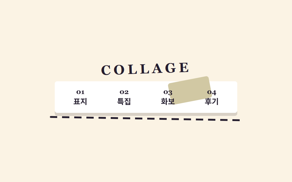 02 nav-collage
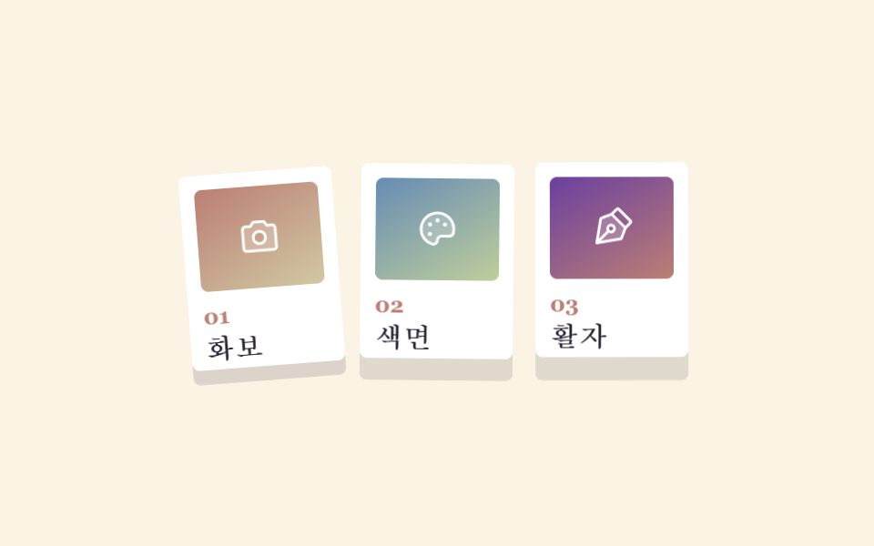 03 card-grid-collage
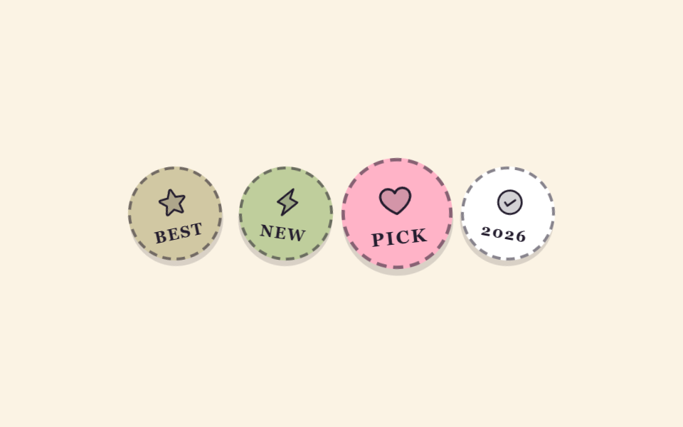 04 sticker-badges-collage
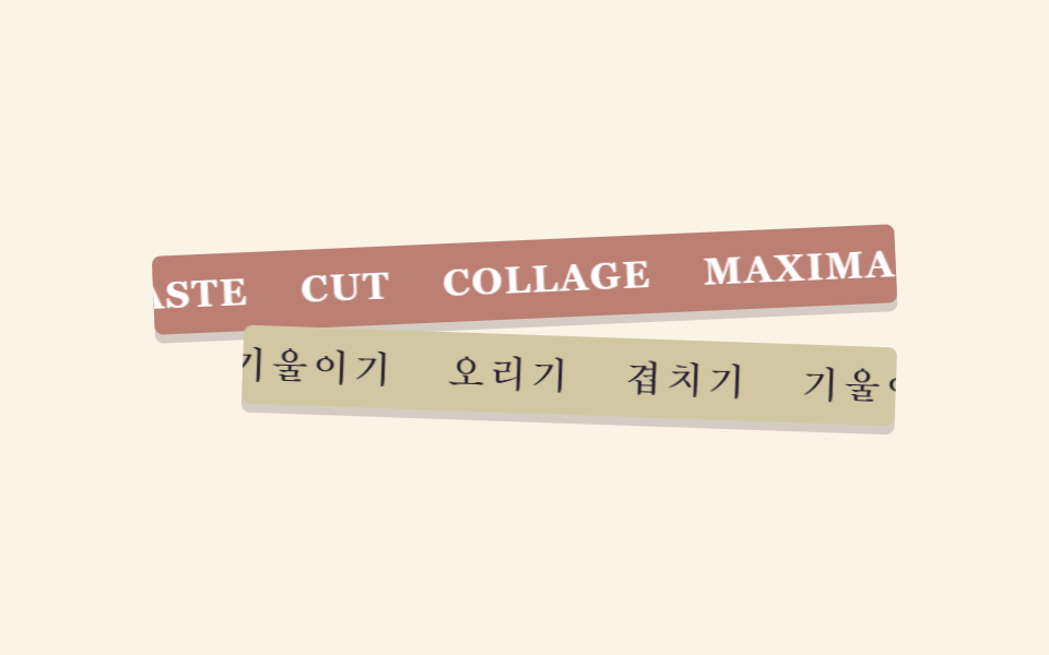 05 marquee-band-collage
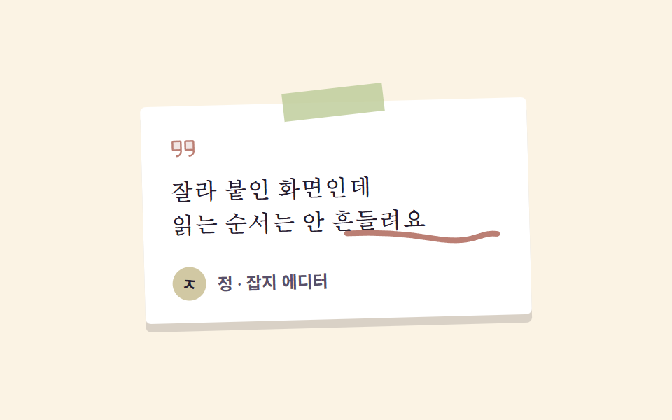 06 testimonial-collage
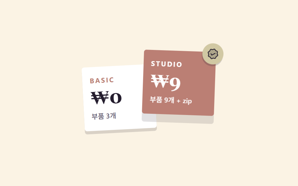 07 pricing-collage
 08 cta-band-collage
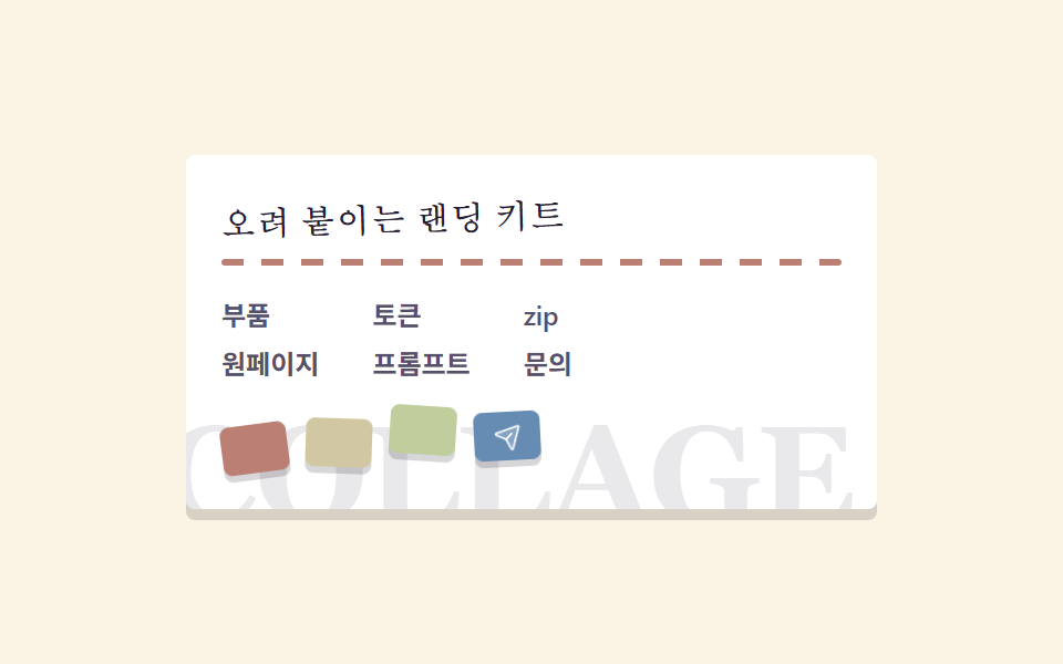 09 footer-collage
자동 재생 · 눌러서 해당 항목으로 · 전부 한 zip
- 01 겹친 프레임 히어로
- 02 잡지 목차형 내비
- 03 오려낸 프레임 카드 격자
- 04 회전 스탬프 배지
- 05 마키 텍스트 띠
- 06 손글씨 밑줄 후기
- 07 겹침 레이어 요금제
- 08 스탬프 CTA 밴드
- 09 콜라주 푸터
01겹친 프레임 히어로
콜라주 디자인에서 무엇이 보이나
색면 그라디언트로 채운 사진 프레임 세 장이 각자 다른 위상으로 흔들리고, 그 위에 얹힌 제목 카드만 제자리에서 떠오릅니다.
<main class="stage">
  <section class="hcol">
    <span class="hcol__frame hcol__frame--coral" aria-hidden="true"></span>
    <span class="hcol__frame hcol__frame--sky" aria-hidden="true"></span>
    <span class="hcol__frame hcol__frame--lime" aria-hidden="true"></span>
    <div class="hcol__card">
      <p class="hcol__eyebrow">ISSUE 04</p>
      <h1 class="hcol__title">오려 붙인 편집</h1>
      <p class="hcol__desc">겹치고 기울인 화면</p>
      <button class="hcol__cta" type="button">지금 보기</button>
    </div>
    <span class="hcol__stamp" aria-hidden="true">
      <svg xmlns="http://www.w3.org/2000/svg" width="1em" height="1em" viewBox="0 0 256 256" fill="currentColor"><path d="M40.2,95.8a28,28,0,1,1,39.6,0A28,28,0,0,1,40.2,95.8Zm0,64.4a28,28,0,1,0,39.6,0A28,28,0,0,0,40.2,160.2Z" opacity="0.2"/><path d="M157.73,113.13A8,8,0,0,1,159.82,102L227.48,55.7a8,8,0,0,1,9,13.21l-67.67,46.3a7.92,7.92,0,0,1-4.51,1.4A8,8,0,0,1,157.73,113.13Zm80.87,85.09a8,8,0,0,1-11.12,2.08L136,137.7,93.49,166.78a36,36,0,1,1-9-13.19L121.83,128,84.44,102.41a35.86,35.86,0,1,1,9-13.19l143,97.87A8,8,0,0,1,238.6,198.22ZM80,180a20,20,0,1,0-5.86,14.14A19.85,19.85,0,0,0,80,180ZM74.14,90.13a20,20,0,1,0-28.28,0A19.85,19.85,0,0,0,74.14,90.13Z"/></svg>
    </span>
  </section>
</main>
@use "../../../../site/static/demo-tokens" as *;
// 콜라주·맥시멀 팔레트 — 크림 바탕 한 장 위에 오려 붙인 상큼한 다섯 색.
// 대비 실측(WCAG 상대휘도 직접 계산): ink/cream 14.76:1 · slate/cream 6.90:1 · sheet/coral 4.59:1
$cg-cream: #fbf3e4;
$cg-sheet: #ffffff;
$cg-ink: #241d2e;
$cg-slate: #57506a;
$cg-coral: #bb7f74;
$cg-sky: #668cb4;
$cg-lime: #bfce9c;
$cg-lemon: #d1c8a3;
$serif: Georgia, "Nanum Myeongjo", "Times New Roman", serif;
$duration: $dur-loop; // 프레임 한 장이 흔들렸다 돌아오는 한 주기
$easing: $ease-spring; // 종이는 붙어 있으니 끝에서 살짝 눌린다
$color: $cg-coral; // 맨 뒤 프레임의 대표색
@include stage($cg-cream);
.hcol {
position: relative;
width: clamp(196px, 62vw, 268px);
isolation: isolate;
}
// 뒤에 오려 붙인 사진 프레임 — 흰 여백 테두리 + 색면(사진 자리)
.hcol__frame {
position: absolute;
z-index: 0;
border: 6px solid $cg-sheet;
border-radius: $r-xs;
box-shadow: 0 4px 0 rgba($cg-ink, .16);
animation-name: frameSway;
animation-duration: $duration;
animation-timing-function: $easing;
animation-iteration-count: infinite;
}
.hcol__frame--coral {
--rot: -9deg;
left: -30px;
top: -14px;
width: 72px;
height: 88px;
background: linear-gradient(150deg, $cg-coral 0%, $cg-lemon 100%);
}
.hcol__frame--sky {
--rot: 8deg;
right: -28px;
top: -22px;
width: 64px;
height: 76px;
background: linear-gradient(200deg, $cg-sky 0%, $cg-lime 100%);
animation-delay: -.7s;
}
.hcol__frame--lime {
--rot: -5deg;
right: -16px;
bottom: -26px;
width: 88px;
height: 52px;
background: linear-gradient(90deg, $cg-lime 0%, $cg-sky 100%);
animation-delay: -1.4s;
}
// 맨 위에 붙인 제목 카드 — 층이 하나 더 있다는 걸 그림자 폭으로 알린다
.hcol__card {
position: relative;
z-index: 2;
box-sizing: border-box;
display: flex;
flex-direction: column;
align-items: flex-start;
gap: $sp-2;
padding: $sp-4 $sp-5;
border-radius: $r-xs;
background: $cg-sheet;
box-shadow: 0 6px 0 rgba($cg-ink, .18);
animation-name: cardRise;
animation-duration: $duration;
animation-timing-function: $easing;
animation-iteration-count: infinite;
}
.hcol__eyebrow {
margin: 0;
color: $cg-coral;
font-weight: 700;
font-size: clamp(9px, 2.4vw, 11px);
line-height: 1;
letter-spacing: .18em;
}
.hcol__title {
margin: 0;
color: $cg-ink;
font-family: $serif;
font-weight: 700;
font-size: clamp(20px, 5.4vw, 30px);
line-height: 1.1;
}
.hcol__desc {
margin: 0;
color: $cg-slate;
font-weight: 500;
font-size: clamp(11px, 2.6vw, 13px);
line-height: 1.4;
}
.hcol__cta {
border: 0;
border-radius: $r-pill;
background: $cg-ink;
color: $cg-sheet;
padding: $sp-2 $sp-4;
font-family: inherit;
font-weight: 700;
font-size: clamp(11px, 2.6vw, 12px);
line-height: 1;
}
.hcol__cta:focus-visible {
outline: 3px solid $cg-sky;
outline-offset: 2px;
}
// 기울여 붙인 스탬프 — 맨 위 층이라 카드보다 앞
.hcol__stamp {
position: absolute;
z-index: 3;
right: -22px;
top: -26px;
width: 40px;
aspect-ratio: 1;
display: grid;
place-items: center;
border-radius: 50%;
background: $cg-lemon;
color: $cg-ink;
font-size: 20px;
transform: rotate(-14deg);
box-shadow: 0 4px 0 rgba($cg-ink, .2);
}
// 데모: 뒤 프레임 세 장은 서로 다른 위상으로 흔들리고, 앞 카드만 제자리에서 뜬다
@keyframes frameSway {
0%, 100% { transform: translateY(0) rotate(var(--rot)); }
50% { transform: translateY(8px) rotate(calc(var(--rot) + 5deg)); }
}
@keyframes cardRise {
0%, 100% { transform: translateY(0); box-shadow: 0 6px 0 rgba($cg-ink, .18); }
50% { transform: translateY(-10px); box-shadow: 0 16px 0 rgba($cg-ink, .12); }
}
@media (max-width: 360px), (max-height: 230px) {
.hcol { width: 168px; }
.hcol__card { padding: $sp-3; gap: $sp-1; }
.hcol__desc { display: none; }
.hcol__title { font-size: 18px; }
.hcol__frame--coral { width: 48px; height: 60px; left: -20px; top: -10px; }
.hcol__frame--sky { width: 44px; height: 52px; right: -18px; top: -14px; }
.hcol__frame--lime { width: 56px; height: 36px; right: -12px; bottom: -16px; }
.hcol__stamp { width: 28px; font-size: 14px; right: -14px; top: -16px; }
}
@media (prefers-reduced-motion: reduce) {
.hcol__frame, .hcol__card { animation: none !important; }
.hcol__frame--coral { transform: rotate(-9deg); }
.hcol__frame--sky { transform: rotate(8deg); }
.hcol__frame--lime { transform: rotate(-5deg); }
}html, body {
margin: 0;
overflow: hidden;
}
.stage {
box-sizing: border-box;
min-height: 100vh;
display: grid;
place-items: center;
margin: 0;
background: #fbf3e4;
font-family: -apple-system, "Segoe UI", "Noto Sans KR", sans-serif;
padding: clamp(8px, 4vw, 24px);
}
.hcol {
position: relative;
width: clamp(196px, 62vw, 268px);
isolation: isolate;
}
.hcol__frame {
position: absolute;
z-index: 0;
border: 6px solid #ffffff;
border-radius: 4px;
box-shadow: 0 4px 0 rgba(36, 29, 46, 0.16);
animation-name: frameSway;
animation-duration: 2s;
animation-timing-function: cubic-bezier(0.2, 0.8, 0.2, 1);
animation-iteration-count: infinite;
}
.hcol__frame--coral {
--rot: -9deg;
left: -30px;
top: -14px;
width: 72px;
height: 88px;
background: linear-gradient(150deg, #bb7f74 0%, #d1c8a3 100%);
}
.hcol__frame--sky {
--rot: 8deg;
right: -28px;
top: -22px;
width: 64px;
height: 76px;
background: linear-gradient(200deg, #668cb4 0%, #bfce9c 100%);
animation-delay: -0.7s;
}
.hcol__frame--lime {
--rot: -5deg;
right: -16px;
bottom: -26px;
width: 88px;
height: 52px;
background: linear-gradient(90deg, #bfce9c 0%, #668cb4 100%);
animation-delay: -1.4s;
}
.hcol__card {
position: relative;
z-index: 2;
box-sizing: border-box;
display: flex;
flex-direction: column;
align-items: flex-start;
gap: 8px;
padding: 16px 20px;
border-radius: 4px;
background: #ffffff;
box-shadow: 0 6px 0 rgba(36, 29, 46, 0.18);
animation-name: cardRise;
animation-duration: 2s;
animation-timing-function: cubic-bezier(0.2, 0.8, 0.2, 1);
animation-iteration-count: infinite;
}
.hcol__eyebrow {
margin: 0;
color: #bb7f74;
font-weight: 700;
font-size: clamp(9px, 2.4vw, 11px);
line-height: 1;
letter-spacing: 0.18em;
}
.hcol__title {
margin: 0;
color: #241d2e;
font-family: Georgia, "Nanum Myeongjo", "Times New Roman", serif;
font-weight: 700;
font-size: clamp(20px, 5.4vw, 30px);
line-height: 1.1;
}
.hcol__desc {
margin: 0;
color: #57506a;
font-weight: 500;
font-size: clamp(11px, 2.6vw, 13px);
line-height: 1.4;
}
.hcol__cta {
border: 0;
border-radius: 999px;
background: #241d2e;
color: #ffffff;
padding: 8px 16px;
font-family: inherit;
font-weight: 700;
font-size: clamp(11px, 2.6vw, 12px);
line-height: 1;
}
.hcol__cta:focus-visible {
outline: 3px solid #668cb4;
outline-offset: 2px;
}
.hcol__stamp {
position: absolute;
z-index: 3;
right: -22px;
top: -26px;
width: 40px;
aspect-ratio: 1;
display: grid;
place-items: center;
border-radius: 50%;
background: #d1c8a3;
color: #241d2e;
font-size: 20px;
transform: rotate(-14deg);
box-shadow: 0 4px 0 rgba(36, 29, 46, 0.2);
}
@keyframes frameSway {
0%, 100% {
transform: translateY(0) rotate(var(--rot));
}
50% {
transform: translateY(8px) rotate(calc(var(--rot) + 5deg));
}
}
@keyframes cardRise {
0%, 100% {
transform: translateY(0);
box-shadow: 0 6px 0 rgba(36, 29, 46, 0.18);
}
50% {
transform: translateY(-10px);
box-shadow: 0 16px 0 rgba(36, 29, 46, 0.12);
}
}
@media (max-width: 360px), (max-height: 230px) {
.hcol {
width: 168px;
}
.hcol__card {
padding: 12px;
gap: 4px;
}
.hcol__desc {
display: none;
}
.hcol__title {
font-size: 18px;
}
.hcol__frame--coral {
width: 48px;
height: 60px;
left: -20px;
top: -10px;
}
.hcol__frame--sky {
width: 44px;
height: 52px;
right: -18px;
top: -14px;
}
.hcol__frame--lime {
width: 56px;
height: 36px;
right: -12px;
bottom: -16px;
}
.hcol__stamp {
width: 28px;
font-size: 14px;
right: -14px;
top: -16px;
}
}
@media (prefers-reduced-motion: reduce) {
.hcol__frame, .hcol__card {
animation: none !important;
}
.hcol__frame--coral {
transform: rotate(-9deg);
}
.hcol__frame--sky {
transform: rotate(8deg);
}
.hcol__frame--lime {
transform: rotate(-5deg);
}
}import type { CSSProperties } from "react";
import styles from "./HeroCollage.module.scss";
export type HeroCollageProps = {
eyebrow?: string;
title?: string;
desc?: string;
cta?: string;
/** 한 주기(기본 2000ms) */
duration?: number;
easing?: string;
color?: string;
};
type Vars = CSSProperties & { "--duration"?: string; "--easing"?: string; "--color"?: string };
export default function HeroCollage({
eyebrow = "ISSUE 04",
title = "오려 붙인 편집",
desc = "겹치고 기울인 화면",
cta = "지금 보기",
duration = 2000,
easing = "cubic-bezier(.2, .8, .2, 1)",
color = "#d93a1e",
}: HeroCollageProps) {
const vars: Vars = { "--duration": `${duration}ms`, "--easing": easing, "--color": color };
return (
<section className={styles.hcol} style={vars}>
<span className={`${styles.frame} ${styles.frameCoral}`} aria-hidden="true" />
<span className={`${styles.frame} ${styles.frameSky}`} aria-hidden="true" />
<span className={`${styles.frame} ${styles.frameLime}`} aria-hidden="true" />
<div className={styles.card}>
<p className={styles.eyebrow}>{eyebrow}</p>
<h1 className={styles.title}>{title}</h1>
<p className={styles.desc}>{desc}</p>
<button type="button" className={styles.cta}>{cta}</button>
</div>
<span className={styles.stamp} aria-hidden="true">
<svg xmlns="http://www.w3.org/2000/svg" width="1em" height="1em" viewBox="0 0 256 256" fill="currentColor"><path d="M40.2,95.8a28,28,0,1,1,39.6,0A28,28,0,0,1,40.2,95.8Zm0,64.4a28,28,0,1,0,39.6,0A28,28,0,0,0,40.2,160.2Z" opacity="0.2"/><path d="M157.73,113.13A8,8,0,0,1,159.82,102L227.48,55.7a8,8,0,0,1,9,13.21l-67.67,46.3a7.92,7.92,0,0,1-4.51,1.4A8,8,0,0,1,157.73,113.13Zm80.87,85.09a8,8,0,0,1-11.12,2.08L136,137.7,93.49,166.78a36,36,0,1,1-9-13.19L121.83,128,84.44,102.41a35.86,35.86,0,1,1,9-13.19l143,97.87A8,8,0,0,1,238.6,198.22ZM80,180a20,20,0,1,0-5.86,14.14A19.85,19.85,0,0,0,80,180ZM74.14,90.13a20,20,0,1,0-28.28,0A19.85,19.85,0,0,0,74.14,90.13Z"/></svg>
</span>
</section>
);
}01 · 겹친 프레임 히어로 — 측정 누적면적 13.358% · 움직인 프레임 23/23GODRICH 원작 · zip 에 SCSS·React 포함 · 비밀번호 보기
코드에서 볼 곳
뒤와 앞이 같은 방향으로 움직이면 겹침이 한 장으로 뭉쳐 보입니다.
.hcol__frame {
  border: 6px solid #fff;            // 흰 여백이 사진 테두리 노릇을 한다
  animation-name: frameSway;
  animation-duration: 2s;
  animation-iteration-count: infinite;
}
.hcol__frame--sky  { --rot: 8deg;  animation-delay: -.7s; }
.hcol__frame--lime { --rot: -5deg; animation-delay: -1.4s; }

@keyframes frameSway {
  0%, 100% { transform: translateY(0) rotate(var(--rot)); }
  50%      { transform: translateY(8px) rotate(calc(var(--rot) + 5deg)); }
}
02잡지 목차형 내비
화면에서 일어나는 일
메뉴마다 두 자리 쪽번호를 붙이면 그것만으로 화면이 잡지 목차가 됩니다.
<main class="stage">
  <nav class="ncol" aria-label="목차">
    <p class="ncol__mark">COLLAGE</p>
    <div class="ncol__bar">
      <span class="ncol__chip" aria-hidden="true"></span>
      <ul class="ncol__tabs">
        <li class="ncol__tab"><span class="ncol__no">01</span><span class="ncol__label">표지</span></li>
        <li class="ncol__tab"><span class="ncol__no">02</span><span class="ncol__label">특집</span></li>
        <li class="ncol__tab"><span class="ncol__no">03</span><span class="ncol__label">화보</span></li>
        <li class="ncol__tab"><span class="ncol__no">04</span><span class="ncol__label">후기</span></li>
      </ul>
    </div>
    <p class="ncol__rule" aria-hidden="true"></p>
  </nav>
</main>
@use "../../../../site/static/demo-tokens" as *;
// 콜라주·맥시멀 팔레트 (01 과 같은 값). 글자는 ink·slate 뿐, 레몬은 면적 전용
$cg-cream: #fbf3e4;
$cg-sheet: #ffffff;
$cg-ink: #241d2e;
$cg-slate: #57506a;
$cg-coral: #bb7f74;
$cg-sky: #668cb4;
$cg-lemon: #d1c8a3;
$serif: Georgia, "Nanum Myeongjo", "Times New Roman", serif;
$duration: $dur-loop; // 칩이 네 칸을 왕복하는 한 주기
$easing: $ease-spring;
$color: $cg-lemon; // 현재 위치를 표시하는 종이 칩 색
@include stage($cg-cream);
.ncol {
position: relative;
width: clamp(236px, 82vw, 316px);
display: flex;
flex-direction: column;
align-items: center;
gap: $sp-2;
}
.ncol__mark {
margin: 0;
color: $cg-ink;
font-family: $serif;
font-weight: 700;
font-size: clamp(18px, 4.6vw, 24px);
line-height: 1;
letter-spacing: .22em;
transform: rotate(-2deg);
}
.ncol__bar {
position: relative;
box-sizing: border-box;
padding: $sp-2;
border-radius: $r-xs;
background: $cg-sheet;
box-shadow: 0 5px 0 rgba($cg-ink, .16);
}
.ncol__tabs {
position: relative;
z-index: 1;
display: flex;
margin: 0;
padding: 0;
list-style: none;
}
// BD19 — 이동량이 고정 px 이므로 탭은 반드시 내용 폭이 아니라 고정 폭이어야 한다
.ncol__tab {
flex: 0 0 var(--tab);
display: flex;
flex-direction: column;
align-items: center;
gap: $sp-1;
padding: $sp-1 0;
margin-right: $sp-1;
}
.ncol__tab:last-child { margin-right: 0; }
.ncol__no {
color: $cg-ink;
font-family: $serif;
font-weight: 700;
font-size: clamp(10px, 2.4vw, 12px);
line-height: 1;
}
.ncol__label {
color: $cg-ink;
font-weight: 700;
font-size: clamp(11px, 2.6vw, 13px);
line-height: 1;
}
// 종이 칩 — 탭 뒤에서 한 칸씩 뛴다. 칸 간격(--step) = 탭 폭 + 간격
.ncol__chip {
position: absolute;
z-index: 0;
left: $sp-2;
top: $sp-2;
width: var(--tab);
height: calc(100% - #{$sp-4});
border-radius: $r-xs;
background: $cg-lemon;
animation-name: chipHop;
animation-duration: $duration;
animation-timing-function: $easing;
animation-iteration-count: infinite;
}
.ncol__rule {
width: 100%;
height: 3px;
margin: 0;
border-radius: $r-xs;
background: repeating-linear-gradient(90deg, $cg-ink 0 12px, transparent 12px 20px);
transform: rotate(1deg);
}
.ncol { --tab: 68px; --step: 72px; }
// 데모: 칸마다 잠깐 앉았다가 다음 칸으로 뛴다. 네 칸을 갔다가 같은 길로 돌아오므로
// 끝에서 처음으로 건너뛰는 구간이 없다 — 마지막 프레임과 첫 프레임이 같은 자리다
@keyframes chipHop {
0%, 10% { transform: translateX(0) translateY(0) rotate(-3deg); }
13.3% { transform: translateX(calc(var(--step) * .5)) translateY(-11px) rotate(5deg); }
16.6%, 26.6% { transform: translateX(var(--step)) translateY(0) rotate(-3deg); }
30% { transform: translateX(calc(var(--step) * 1.5)) translateY(-11px) rotate(5deg); }
33.3%, 43.3% { transform: translateX(calc(var(--step) * 2)) translateY(0) rotate(-3deg); }
46.6% { transform: translateX(calc(var(--step) * 2.5)) translateY(-11px) rotate(5deg); }
50%, 60% { transform: translateX(calc(var(--step) * 3)) translateY(0) rotate(-3deg); }
63.3% { transform: translateX(calc(var(--step) * 2.5)) translateY(-11px) rotate(-11deg); }
66.6%, 76.6% { transform: translateX(calc(var(--step) * 2)) translateY(0) rotate(-3deg); }
80% { transform: translateX(calc(var(--step) * 1.5)) translateY(-11px) rotate(-11deg); }
83.3%, 93.3% { transform: translateX(var(--step)) translateY(0) rotate(-3deg); }
96.6% { transform: translateX(calc(var(--step) * .5)) translateY(-11px) rotate(-11deg); }
100% { transform: translateX(0) translateY(0) rotate(-3deg); }
}
@media (max-width: 360px), (max-height: 230px) {
.ncol { width: 232px; --tab: 48px; --step: 52px; gap: $sp-2; }
.ncol__mark { font-size: 15px; letter-spacing: .14em; }
.ncol__label { font-size: 11px; }
}
@media (prefers-reduced-motion: reduce) {
.ncol__chip { animation: none !important; transform: rotate(-3deg); }
}html, body {
margin: 0;
overflow: hidden;
}
.stage {
box-sizing: border-box;
min-height: 100vh;
display: grid;
place-items: center;
margin: 0;
background: #fbf3e4;
font-family: -apple-system, "Segoe UI", "Noto Sans KR", sans-serif;
padding: clamp(8px, 4vw, 24px);
}
.ncol {
position: relative;
width: clamp(236px, 82vw, 316px);
display: flex;
flex-direction: column;
align-items: center;
gap: 8px;
}
.ncol__mark {
margin: 0;
color: #241d2e;
font-family: Georgia, "Nanum Myeongjo", "Times New Roman", serif;
font-weight: 700;
font-size: clamp(18px, 4.6vw, 24px);
line-height: 1;
letter-spacing: 0.22em;
transform: rotate(-2deg);
}
.ncol__bar {
position: relative;
box-sizing: border-box;
padding: 8px;
border-radius: 4px;
background: #ffffff;
box-shadow: 0 5px 0 rgba(36, 29, 46, 0.16);
}
.ncol__tabs {
position: relative;
z-index: 1;
display: flex;
margin: 0;
padding: 0;
list-style: none;
}
.ncol__tab {
flex: 0 0 var(--tab);
display: flex;
flex-direction: column;
align-items: center;
gap: 4px;
padding: 4px 0;
margin-right: 4px;
}
.ncol__tab:last-child {
margin-right: 0;
}
.ncol__no {
color: #241d2e;
font-family: Georgia, "Nanum Myeongjo", "Times New Roman", serif;
font-weight: 700;
font-size: clamp(10px, 2.4vw, 12px);
line-height: 1;
}
.ncol__label {
color: #241d2e;
font-weight: 700;
font-size: clamp(11px, 2.6vw, 13px);
line-height: 1;
}
.ncol__chip {
position: absolute;
z-index: 0;
left: 8px;
top: 8px;
width: var(--tab);
height: calc(100% - 16px);
border-radius: 4px;
background: #d1c8a3;
animation-name: chipHop;
animation-duration: 2s;
animation-timing-function: cubic-bezier(0.2, 0.8, 0.2, 1);
animation-iteration-count: infinite;
}
.ncol__rule {
width: 100%;
height: 3px;
margin: 0;
border-radius: 4px;
background: repeating-linear-gradient(90deg, #241d2e 0 12px, transparent 12px 20px);
transform: rotate(1deg);
}
.ncol {
--tab: 68px;
--step: 72px;
}
@keyframes chipHop {
0%, 10% {
transform: translateX(0) translateY(0) rotate(-3deg);
}
13.3% {
transform: translateX(calc(var(--step) * 0.5)) translateY(-11px) rotate(5deg);
}
16.6%, 26.6% {
transform: translateX(var(--step)) translateY(0) rotate(-3deg);
}
30% {
transform: translateX(calc(var(--step) * 1.5)) translateY(-11px) rotate(5deg);
}
33.3%, 43.3% {
transform: translateX(calc(var(--step) * 2)) translateY(0) rotate(-3deg);
}
46.6% {
transform: translateX(calc(var(--step) * 2.5)) translateY(-11px) rotate(5deg);
}
50%, 60% {
transform: translateX(calc(var(--step) * 3)) translateY(0) rotate(-3deg);
}
63.3% {
transform: translateX(calc(var(--step) * 2.5)) translateY(-11px) rotate(-11deg);
}
66.6%, 76.6% {
transform: translateX(calc(var(--step) * 2)) translateY(0) rotate(-3deg);
}
80% {
transform: translateX(calc(var(--step) * 1.5)) translateY(-11px) rotate(-11deg);
}
83.3%, 93.3% {
transform: translateX(var(--step)) translateY(0) rotate(-3deg);
}
96.6% {
transform: translateX(calc(var(--step) * 0.5)) translateY(-11px) rotate(-11deg);
}
100% {
transform: translateX(0) translateY(0) rotate(-3deg);
}
}
@media (max-width: 360px), (max-height: 230px) {
.ncol {
width: 232px;
--tab: 48px;
--step: 52px;
gap: 8px;
}
.ncol__mark {
font-size: 15px;
letter-spacing: 0.14em;
}
.ncol__label {
font-size: 11px;
}
}
@media (prefers-reduced-motion: reduce) {
.ncol__chip {
animation: none !important;
transform: rotate(-3deg);
}
}import type { CSSProperties } from "react";
import styles from "./NavCollage.module.scss";
export type NavCollageItem = { no: string; label: string };
export type NavCollageProps = {
mark?: string;
items?: NavCollageItem[];
/** 탭 한 칸의 고정 폭(px). 이동량이 고정 px 이라 탭도 고정 폭이어야 한다 */
tab?: number;
/** 탭 사이 간격(px) */
gap?: number;
duration?: number;
easing?: string;
color?: string;
};
type Vars = CSSProperties & {
"--duration"?: string; "--easing"?: string; "--color"?: string;
"--tab"?: string; "--step"?: string;
};
const defaultItems: NavCollageItem[] = [
{ no: "01", label: "표지" },
{ no: "02", label: "특집" },
{ no: "03", label: "화보" },
{ no: "04", label: "후기" },
];
export default function NavCollage({
mark = "COLLAGE",
items = defaultItems,
tab = 68,
gap = 4,
duration = 2000,
easing = "cubic-bezier(.2, .8, .2, 1)",
color = "#ffd93d",
}: NavCollageProps) {
const vars: Vars = {
"--duration": `${duration}ms`,
"--easing": easing,
"--color": color,
"--tab": `${tab}px`,
"--step": `${tab + gap}px`,
};
return (
<nav className={styles.ncol} style={vars} aria-label={mark}>
<p className={styles.mark}>{mark}</p>
<div className={styles.bar}>
<span className={styles.chip} aria-hidden="true" />
<ul className={styles.tabs}>
{items.map((x) => (
<li key={x.no} className={styles.tab}>
<span className={styles.no}>{x.no}</span>
<span className={styles.label}>{x.label}</span>
</li>
))}
</ul>
</div>
<p className={styles.rule} aria-hidden="true" />
</nav>
);
}02 · 잡지 목차형 내비 — 측정 누적면적 8.741% · 움직인 프레임 11/23GODRICH 원작 · zip 에 SCSS·React 포함 · 비밀번호 보기
코드 읽는 법
레몬색 칩은 칸마다 잠깐 앉았다가 다음 칸으로 뛰는데, 앉아 있는 구간이 있어야 어느 칸이 켜져 있는지 읽힙니다.
.ncol { --tab: 68px; --step: 72px; }   // 실측: 탭 68px + 간격 4px
.ncol__tab  { flex: 0 0 var(--tab); }  // 균등분배로 두면 이동량과 렌더 폭이 어긋난다

@keyframes chipHop {
  0%, 10%      { transform: translateX(0) rotate(-3deg); }
  13.3%        { transform: translateX(calc(var(--step) * .5)) translateY(-11px) rotate(5deg); }
  16.6%, 26.6% { transform: translateX(var(--step)) rotate(-3deg); }
  50%, 60%     { transform: translateX(calc(var(--step) * 3)) rotate(-3deg); }
  100%         { transform: translateX(0) rotate(-3deg); }
}
03오려낸 프레임 카드 격자
어떤 움직임인가
세 장이 각자 붙인 각도에서 0도까지 펴졌다 되돌아갑니다.
<main class="stage">
  <section class="ccol">
    <article class="ccol__card ccol__card--coral">
      <span class="ccol__photo" aria-hidden="true">
        <svg xmlns="http://www.w3.org/2000/svg" width="1em" height="1em" viewBox="0 0 256 256" fill="currentColor"><path d="M208,64H176L160,40H96L80,64H48A16,16,0,0,0,32,80V192a16,16,0,0,0,16,16H208a16,16,0,0,0,16-16V80A16,16,0,0,0,208,64ZM128,168a36,36,0,1,1,36-36A36,36,0,0,1,128,168Z" opacity="0.2"/><path d="M208,56H180.28L166.65,35.56A8,8,0,0,0,160,32H96a8,8,0,0,0-6.65,3.56L75.71,56H48A24,24,0,0,0,24,80V192a24,24,0,0,0,24,24H208a24,24,0,0,0,24-24V80A24,24,0,0,0,208,56Zm8,136a8,8,0,0,1-8,8H48a8,8,0,0,1-8-8V80a8,8,0,0,1,8-8H80a8,8,0,0,0,6.66-3.56L100.28,48h55.43l13.63,20.44A8,8,0,0,0,176,72h32a8,8,0,0,1,8,8ZM128,88a44,44,0,1,0,44,44A44.05,44.05,0,0,0,128,88Zm0,72a28,28,0,1,1,28-28A28,28,0,0,1,128,160Z"/></svg>
      </span>
      <p class="ccol__no">01</p>
      <p class="ccol__name">화보</p>
    </article>
    <article class="ccol__card ccol__card--sky">
      <span class="ccol__photo" aria-hidden="true">
        <svg xmlns="http://www.w3.org/2000/svg" width="1em" height="1em" viewBox="0 0 256 256" fill="currentColor"><path d="M224,127.17a96.48,96.48,0,0,1-2.39,22.18A24,24,0,0,1,198.21,168H152a24,24,0,0,0-24,24,24,24,0,0,1-32,22.61C58.73,201.44,32,169.81,32,128a96,96,0,0,1,95-96C179.84,31.47,223.55,74.35,224,127.17Z" opacity="0.2"/><path d="M200.77,53.89A103.27,103.27,0,0,0,128,24h-1.07A104,104,0,0,0,24,128c0,43,26.58,79.06,69.36,94.17A32,32,0,0,0,136,192a16,16,0,0,1,16-16h46.21a31.81,31.81,0,0,0,31.2-24.88,104.43,104.43,0,0,0,2.59-24A103.28,103.28,0,0,0,200.77,53.89Zm13,93.71A15.89,15.89,0,0,1,198.21,160H152a32,32,0,0,0-32,32,16,16,0,0,1-21.31,15.07C62.49,194.3,40,164,40,128a88,88,0,0,1,87.09-88h.9a88.35,88.35,0,0,1,88,87.25A88.86,88.86,0,0,1,213.81,147.6ZM140,76a12,12,0,1,1-12-12A12,12,0,0,1,140,76ZM96,100A12,12,0,1,1,84,88,12,12,0,0,1,96,100Zm0,56a12,12,0,1,1-12-12A12,12,0,0,1,96,156Zm88-56a12,12,0,1,1-12-12A12,12,0,0,1,184,100Z"/></svg>
      </span>
      <p class="ccol__no">02</p>
      <p class="ccol__name">색면</p>
    </article>
    <article class="ccol__card ccol__card--grape">
      <span class="ccol__photo" aria-hidden="true">
        <svg xmlns="http://www.w3.org/2000/svg" width="1em" height="1em" viewBox="0 0 256 256" fill="currentColor"><path d="M128,48,68.32,70.38a8,8,0,0,0-5.08,6.17L40,216l139.45-23.24a8,8,0,0,0,6.17-5.08L208,128Zm-4,104a20,20,0,1,1,20-20A20,20,0,0,1,124,152Z" opacity="0.2"/><path d="M248,92.68a15.86,15.86,0,0,0-4.69-11.31L174.63,12.68a16,16,0,0,0-22.63,0L123.57,41.11l-58,21.77A16.06,16.06,0,0,0,55.35,75.23L32.11,214.68A8,8,0,0,0,40,224a8.4,8.4,0,0,0,1.32-.11l139.44-23.24a16,16,0,0,0,12.35-10.17l21.77-58L243.31,104A15.87,15.87,0,0,0,248,92.68Zm-69.87,92.19L63.32,204l47.37-47.37a28,28,0,1,0-11.32-11.32L52,192.7,71.13,77.86,126,57.29,198.7,130ZM112,132a12,12,0,1,1,12,12A12,12,0,0,1,112,132Zm96-15.32L139.31,48l24-24L232,92.68Z"/></svg>
      </span>
      <p class="ccol__no">03</p>
      <p class="ccol__name">활자</p>
    </article>
  </section>
</main>@use "../../../../site/static/demo-tokens" as *;
// 콜라주·맥시멀 팔레트 (01 과 같은 값). 색면 위 글자는 흰색, 크림 위 글자는 ink·slate
$cg-cream: #fbf3e4;
$cg-sheet: #ffffff;
$cg-ink: #241d2e;
$cg-slate: #57506a;
$cg-coral: #bb7f74;
$cg-sky: #668cb4;
$cg-grape: #6b3fa0;
$cg-lemon: #d1c8a3;
$cg-lime: #bfce9c;
$serif: Georgia, "Nanum Myeongjo", "Times New Roman", serif;
$duration: $dur-loop; // 카드 한 장이 펴졌다 다시 기우는 한 주기
$easing: $ease-spring;
$color: $cg-coral; // 첫 카드의 색면
@include stage($cg-cream);
.ccol {
display: flex;
align-items: flex-start;
gap: $sp-3;
}
// 오려 붙인 카드 — 흰 여백이 사진 테두리 노릇을 한다
.ccol__card {
box-sizing: border-box;
width: 84px;
padding: $sp-2 $sp-2 $sp-1;
border-radius: $r-xs;
background: $cg-sheet;
box-shadow: 0 5px 0 rgba($cg-ink, .16);
animation-name: cardStraighten;
animation-duration: $duration;
animation-timing-function: $easing;
animation-iteration-count: infinite;
}
.ccol__card--coral { --rot: -7deg; }
.ccol__card--sky { --rot: 5deg; animation-delay: -.24s; }
.ccol__card--grape { --rot: -4deg; animation-delay: -.48s; }
.ccol__photo {
display: grid;
place-items: center;
height: 56px;
border-radius: $r-xs;
color: $cg-sheet;
font-size: 24px;
}
.ccol__card--coral .ccol__photo { background: linear-gradient(150deg, $cg-coral 0%, $cg-lemon 100%); }
.ccol__card--sky .ccol__photo { background: linear-gradient(150deg, $cg-sky 0%, $cg-lime 100%); }
.ccol__card--grape .ccol__photo { background: linear-gradient(150deg, $cg-grape 0%, $cg-coral 100%); }
.ccol__no {
margin: $sp-2 0 0;
color: $cg-coral;
font-family: $serif;
font-weight: 700;
font-size: 12px;
line-height: 1;
}
.ccol__name {
margin: $sp-1 0 0;
color: $cg-ink;
font-family: $serif;
font-weight: 700;
font-size: 15px;
line-height: 1;
}
// 데모: 붙인 각도에서 0도까지 펴졌다 되돌아간다 — 세 장이 0.24초씩 어긋난다
@keyframes cardStraighten {
0%, 100% { transform: rotate(var(--rot)); box-shadow: 0 5px 0 rgba($cg-ink, .16); }
45% { transform: rotate(0deg) translateY(-8px); box-shadow: 0 13px 0 rgba($cg-ink, .12); }
}
@media (max-width: 360px), (max-height: 230px) {
.ccol { gap: $sp-2; }
.ccol__card { width: 64px; padding: $sp-1; }
.ccol__photo { height: 40px; font-size: 18px; }
.ccol__name { font-size: 13px; }
}
@media (prefers-reduced-motion: reduce) {
.ccol__card { animation: none !important; transform: rotate(var(--rot)); }
}html, body {
margin: 0;
overflow: hidden;
}
.stage {
box-sizing: border-box;
min-height: 100vh;
display: grid;
place-items: center;
margin: 0;
background: #fbf3e4;
font-family: -apple-system, "Segoe UI", "Noto Sans KR", sans-serif;
padding: clamp(8px, 4vw, 24px);
}
.ccol {
display: flex;
align-items: flex-start;
gap: 12px;
}
.ccol__card {
box-sizing: border-box;
width: 84px;
padding: 8px 8px 4px;
border-radius: 4px;
background: #ffffff;
box-shadow: 0 5px 0 rgba(36, 29, 46, 0.16);
animation-name: cardStraighten;
animation-duration: 2s;
animation-timing-function: cubic-bezier(0.2, 0.8, 0.2, 1);
animation-iteration-count: infinite;
}
.ccol__card--coral {
--rot: -7deg;
}
.ccol__card--sky {
--rot: 5deg;
animation-delay: -0.24s;
}
.ccol__card--grape {
--rot: -4deg;
animation-delay: -0.48s;
}
.ccol__photo {
display: grid;
place-items: center;
height: 56px;
border-radius: 4px;
color: #ffffff;
font-size: 24px;
}
.ccol__card--coral .ccol__photo {
background: linear-gradient(150deg, #bb7f74 0%, #d1c8a3 100%);
}
.ccol__card--sky .ccol__photo {
background: linear-gradient(150deg, #668cb4 0%, #bfce9c 100%);
}
.ccol__card--grape .ccol__photo {
background: linear-gradient(150deg, #6b3fa0 0%, #bb7f74 100%);
}
.ccol__no {
margin: 8px 0 0;
color: #bb7f74;
font-family: Georgia, "Nanum Myeongjo", "Times New Roman", serif;
font-weight: 700;
font-size: 12px;
line-height: 1;
}
.ccol__name {
margin: 4px 0 0;
color: #241d2e;
font-family: Georgia, "Nanum Myeongjo", "Times New Roman", serif;
font-weight: 700;
font-size: 15px;
line-height: 1;
}
@keyframes cardStraighten {
0%, 100% {
transform: rotate(var(--rot));
box-shadow: 0 5px 0 rgba(36, 29, 46, 0.16);
}
45% {
transform: rotate(0deg) translateY(-8px);
box-shadow: 0 13px 0 rgba(36, 29, 46, 0.12);
}
}
@media (max-width: 360px), (max-height: 230px) {
.ccol {
gap: 8px;
}
.ccol__card {
width: 64px;
padding: 4px;
}
.ccol__photo {
height: 40px;
font-size: 18px;
}
.ccol__name {
font-size: 13px;
}
}
@media (prefers-reduced-motion: reduce) {
.ccol__card {
animation: none !important;
transform: rotate(var(--rot));
}
}import type { CSSProperties, ReactNode } from "react";
import styles from "./CardGridCollage.module.scss";
export type CardGridCollageCard = { no: string; name: string; icon?: ReactNode };
export type CardGridCollageProps = {
cards?: CardGridCollageCard[];
/** 카드끼리 어긋나는 간격(ms) */
stagger?: number;
duration?: number;
easing?: string;
color?: string;
};
type Vars = CSSProperties & { "--duration"?: string; "--easing"?: string; "--color"?: string };
type CardVars = CSSProperties & { "--rot"?: string; animationDelay?: string };
const defaultCards: CardGridCollageCard[] = [
{ no: "01", name: "화보" },
{ no: "02", name: "색면" },
{ no: "03", name: "활자" },
];
const angles = ["-7deg", "5deg", "-4deg"];
const colorFills = [
"linear-gradient(150deg, #d93a1e 0%, #ffd93d 100%)",
"linear-gradient(150deg, #2d6fb5 0%, #b6e34f 100%)",
"linear-gradient(150deg, #6b3fa0 0%, #d93a1e 100%)",
];
export default function CardGridCollage({
cards = defaultCards,
stagger = 240,
duration = 2000,
easing = "cubic-bezier(.2, .8, .2, 1)",
color = "#d93a1e",
}: CardGridCollageProps) {
const vars: Vars = { "--duration": `${duration}ms`, "--easing": easing, "--color": color };
return (
<section className={styles.ccol} style={vars}>
{cards.map((c, i) => {
const cv: CardVars = { "--rot": angles[i % angles.length], animationDelay: `${-stagger * i}ms` };
return (
<article key={c.no} className={styles.card} style={cv}>
<span className={styles.photo} style={{ background: colorFills[i % colorFills.length] }} aria-hidden="true">
{c.icon}
</span>
<p className={styles.no}>{c.no}</p>
<p className={styles.name}>{c.name}</p>
</article>
);
})}
</section>
);
}03 · 오려낸 프레임 카드 격자 — 측정 누적면적 9.509% · 움직인 프레임 23/23GODRICH 원작 · zip 에 SCSS·React 포함 · 비밀번호 보기
어디를 바꾸면 되나
0.24초씩 어긋나게 두면 세 장이 한 덩어리가 아니라 따로 붙인 종이로 보입니다.
.ccol__card--coral { --rot: -7deg; }
.ccol__card--sky   { --rot: 5deg;  animation-delay: -.24s; }
.ccol__card--grape { --rot: -4deg; animation-delay: -.48s; }

@keyframes cardStraighten {
  0%, 100% { transform: rotate(var(--rot)); box-shadow: 0 5px 0 rgba(36, 29, 46, .16); }
  45%      { transform: rotate(0deg) translateY(-8px); box-shadow: 0 13px 0 rgba(36, 29, 46, .12); }
}
04회전 스탬프 배지
무엇이 보이나
점선 테두리 하나로 원이 도장이 됩니다.
<main class="stage">
  <section class="scol">
    <span class="scol__badge scol__badge--lemon">
      <span class="scol__icon" aria-hidden="true">
        <svg xmlns="http://www.w3.org/2000/svg" width="1em" height="1em" viewBox="0 0 256 256" fill="currentColor"><path d="M229.06,108.79l-48.7,42,14.88,62.79a8.4,8.4,0,0,1-12.52,9.17L128,189.09,73.28,222.74a8.4,8.4,0,0,1-12.52-9.17l14.88-62.79-48.7-42A8.46,8.46,0,0,1,31.73,94L95.64,88.8l24.62-59.6a8.36,8.36,0,0,1,15.48,0l24.62,59.6L224.27,94A8.46,8.46,0,0,1,229.06,108.79Z" opacity="0.2"/><path d="M239.18,97.26A16.38,16.38,0,0,0,224.92,86l-59-4.76L143.14,26.15a16.36,16.36,0,0,0-30.27,0L90.11,81.23,31.08,86a16.46,16.46,0,0,0-9.37,28.86l45,38.83L53,211.75a16.38,16.38,0,0,0,24.5,17.82L128,198.49l50.53,31.08A16.4,16.4,0,0,0,203,211.75l-13.76-58.07,45-38.83A16.43,16.43,0,0,0,239.18,97.26Zm-15.34,5.47-48.7,42a8,8,0,0,0-2.56,7.91l14.88,62.8a.37.37,0,0,1-.17.48c-.18.14-.23.11-.38,0l-54.72-33.65a8,8,0,0,0-8.38,0L69.09,215.94c-.15.09-.19.12-.38,0a.37.37,0,0,1-.17-.48l14.88-62.8a8,8,0,0,0-2.56-7.91l-48.7-42c-.12-.1-.23-.19-.13-.5s.18-.27.33-.29l63.92-5.16A8,8,0,0,0,103,91.86l24.62-59.61c.08-.17.11-.25.35-.25s.27.08.35.25L153,91.86a8,8,0,0,0,6.75,4.92l63.92,5.16c.15,0,.24,0,.33.29S224,102.63,223.84,102.73Z"/></svg>
      </span>
      <span class="scol__word">BEST</span>
    </span>
    <span class="scol__badge scol__badge--lime">
      <span class="scol__icon" aria-hidden="true">
        <svg xmlns="http://www.w3.org/2000/svg" width="1em" height="1em" viewBox="0 0 256 256" fill="currentColor"><path d="M96,240l16-80L48,136,160,16,144,96l64,24Z" opacity="0.2"/><path d="M215.79,118.17a8,8,0,0,0-5-5.66L153.18,90.9l14.66-73.33a8,8,0,0,0-13.69-7l-112,120a8,8,0,0,0,3,13l57.63,21.61L88.16,238.43a8,8,0,0,0,13.69,7l112-120A8,8,0,0,0,215.79,118.17ZM109.37,214l10.47-52.38a8,8,0,0,0-5-9.06L62,132.71l84.62-90.66L136.16,94.43a8,8,0,0,0,5,9.06l52.8,19.8Z"/></svg>
      </span>
      <span class="scol__word">NEW</span>
    </span>
    <span class="scol__badge scol__badge--blush">
      <span class="scol__icon" aria-hidden="true">
        <svg xmlns="http://www.w3.org/2000/svg" width="1em" height="1em" viewBox="0 0 256 256" fill="currentColor"><path d="M232,102c0,66-104,122-104,122S24,168,24,102A54,54,0,0,1,78,48c22.59,0,41.94,12.31,50,32,8.06-19.69,27.41-32,50-32A54,54,0,0,1,232,102Z" opacity="0.2"/><path d="M178,40c-20.65,0-38.73,8.88-50,23.89C116.73,48.88,98.65,40,78,40a62.07,62.07,0,0,0-62,62c0,70,103.79,126.66,108.21,129a8,8,0,0,0,7.58,0C136.21,228.66,240,172,240,102A62.07,62.07,0,0,0,178,40ZM128,214.8C109.74,204.16,32,155.69,32,102A46.06,46.06,0,0,1,78,56c19.45,0,35.78,10.36,42.6,27a8,8,0,0,0,14.8,0c6.82-16.67,23.15-27,42.6-27a46.06,46.06,0,0,1,46,46C224,155.61,146.24,204.15,128,214.8Z"/></svg>
      </span>
      <span class="scol__word">PICK</span>
    </span>
    <span class="scol__badge scol__badge--sheet">
      <span class="scol__icon" aria-hidden="true">
        <svg xmlns="http://www.w3.org/2000/svg" width="1em" height="1em" viewBox="0 0 256 256" fill="currentColor"><path d="M224,128a96,96,0,1,1-96-96A96,96,0,0,1,224,128Z" opacity="0.2"/><path d="M173.66,98.34a8,8,0,0,1,0,11.32l-56,56a8,8,0,0,1-11.32,0l-24-24a8,8,0,0,1,11.32-11.32L112,148.69l50.34-50.35A8,8,0,0,1,173.66,98.34ZM232,128A104,104,0,1,1,128,24,104.11,104.11,0,0,1,232,128Zm-16,0a88,88,0,1,0-88,88A88.1,88.1,0,0,0,216,128Z"/></svg>
      </span>
      <span class="scol__word">2026</span>
    </span>
  </section>
</main>@use "../../../../site/static/demo-tokens" as *;
// 콜라주·맥시멀 팔레트 (01 과 같은 값). 레몬·라임·블러시는 밝아서 ink 글자만 얹는다
$cg-cream: #fbf3e4;
$cg-sheet: #ffffff;
$cg-ink: #241d2e;
$cg-coral: #bb7f74;
$cg-lemon: #d1c8a3;
$cg-lime: #bfce9c;
$cg-blush: #ffb3c7;
$serif: Georgia, "Nanum Myeongjo", "Times New Roman", serif;
$duration: $dur-loop; // 배지 네 개가 한 바퀴 다 찍히는 한 주기
$easing: $ease-pop; // 도장은 끝에서 튄다
$color: $cg-lemon; // 첫 배지의 면 색
@include stage($cg-cream);
.scol {
display: flex;
align-items: center;
gap: $sp-3;
}
// 도장 배지 — 점선 테두리가 스탬프 가장자리, 기울기는 배지마다 고정
.scol__badge {
box-sizing: border-box;
width: 66px;
aspect-ratio: 1;
display: flex;
flex-direction: column;
align-items: center;
justify-content: center;
gap: $sp-1;
border: 2px dashed rgba($cg-ink, .55);
border-radius: 50%;
color: $cg-ink;
box-shadow: 0 4px 0 rgba($cg-ink, .16);
animation-name: stampPress;
animation-duration: $duration;
animation-timing-function: $easing;
animation-iteration-count: infinite;
}
.scol__badge--lemon { --rot: -12deg; background: $cg-lemon; }
.scol__badge--lime { --rot: 8deg; background: $cg-lime; animation-delay: -.5s; }
.scol__badge--blush { --rot: -6deg; background: $cg-blush; animation-delay: -1s; }
.scol__badge--sheet { --rot: 10deg; background: $cg-sheet; animation-delay: -1.5s; }
.scol__icon { font-size: 22px; line-height: 1; }
.scol__word {
font-family: $serif;
font-weight: 700;
font-size: 11px;
line-height: 1;
letter-spacing: .1em;
}
// 데모: 눌렸다(0.55) 튀어 오른(1.16) 뒤 제자리. 기울기는 keyframe 마다 다시 써야 유지된다
@keyframes stampPress {
0%, 55%, 100% { transform: rotate(var(--rot)) scale(1); }
8% { transform: rotate(var(--rot)) scale(.55); }
20% { transform: rotate(var(--rot)) scale(1.16); }
32% { transform: rotate(var(--rot)) scale(1); }
}
@media (max-width: 360px), (max-height: 230px) {
.scol { gap: $sp-2; }
.scol__badge { width: 52px; }
.scol__icon { font-size: 16px; }
.scol__word { font-size: 9px; }
}
@media (prefers-reduced-motion: reduce) {
.scol__badge { animation: none !important; transform: rotate(var(--rot)); }
}html, body {
margin: 0;
overflow: hidden;
}
.stage {
box-sizing: border-box;
min-height: 100vh;
display: grid;
place-items: center;
margin: 0;
background: #fbf3e4;
font-family: -apple-system, "Segoe UI", "Noto Sans KR", sans-serif;
padding: clamp(8px, 4vw, 24px);
}
.scol {
display: flex;
align-items: center;
gap: 12px;
}
.scol__badge {
box-sizing: border-box;
width: 66px;
aspect-ratio: 1;
display: flex;
flex-direction: column;
align-items: center;
justify-content: center;
gap: 4px;
border: 2px dashed rgba(36, 29, 46, 0.55);
border-radius: 50%;
color: #241d2e;
box-shadow: 0 4px 0 rgba(36, 29, 46, 0.16);
animation-name: stampPress;
animation-duration: 2s;
animation-timing-function: cubic-bezier(0.2, 1.4, 0.4, 1);
animation-iteration-count: infinite;
}
.scol__badge--lemon {
--rot: -12deg;
background: #d1c8a3;
}
.scol__badge--lime {
--rot: 8deg;
background: #bfce9c;
animation-delay: -0.5s;
}
.scol__badge--blush {
--rot: -6deg;
background: #ffb3c7;
animation-delay: -1s;
}
.scol__badge--sheet {
--rot: 10deg;
background: #ffffff;
animation-delay: -1.5s;
}
.scol__icon {
font-size: 22px;
line-height: 1;
}
.scol__word {
font-family: Georgia, "Nanum Myeongjo", "Times New Roman", serif;
font-weight: 700;
font-size: 11px;
line-height: 1;
letter-spacing: 0.1em;
}
@keyframes stampPress {
0%, 55%, 100% {
transform: rotate(var(--rot)) scale(1);
}
8% {
transform: rotate(var(--rot)) scale(0.55);
}
20% {
transform: rotate(var(--rot)) scale(1.16);
}
32% {
transform: rotate(var(--rot)) scale(1);
}
}
@media (max-width: 360px), (max-height: 230px) {
.scol {
gap: 8px;
}
.scol__badge {
width: 52px;
}
.scol__icon {
font-size: 16px;
}
.scol__word {
font-size: 9px;
}
}
@media (prefers-reduced-motion: reduce) {
.scol__badge {
animation: none !important;
transform: rotate(var(--rot));
}
}import type { CSSProperties, ReactNode } from "react";
import styles from "./StickerBadgesCollage.module.scss";
export type StickerBadge = { word: string; bg?: string; rot?: string; icon?: ReactNode };
export type StickerBadgesCollageProps = {
badges?: StickerBadge[];
/** 배지끼리 어긋나는 간격(ms) */
stagger?: number;
duration?: number;
easing?: string;
color?: string;
};
type Vars = CSSProperties & { "--duration"?: string; "--easing"?: string; "--color"?: string };
type BadgeVars = CSSProperties & { "--rot"?: string; background?: string; animationDelay?: string };
const defaultBadges: StickerBadge[] = [
{ word: "BEST", bg: "#ffd93d", rot: "-12deg" },
{ word: "NEW", bg: "#b6e34f", rot: "8deg" },
{ word: "PICK", bg: "#ffb3c7", rot: "-6deg" },
{ word: "2026", bg: "#ffffff", rot: "10deg" },
];
export default function StickerBadgesCollage({
badges = defaultBadges,
stagger = 500,
duration = 2000,
easing = "cubic-bezier(.2, 1.4, .4, 1)",
color = "#ffd93d",
}: StickerBadgesCollageProps) {
const vars: Vars = { "--duration": `${duration}ms`, "--easing": easing, "--color": color };
return (
<section className={styles.scol} style={vars}>
{badges.map((b, i) => {
const bv: BadgeVars = {
"--rot": b.rot ?? "0deg",
background: b.bg ?? "#fff",
animationDelay: `${-stagger * i}ms`,
};
return (
<span key={b.word} className={styles.badge} style={bv}>
<span className={styles.icon} aria-hidden="true">{b.icon}</span>
<span className={styles.word}>{b.word}</span>
</span>
);
})}
</section>
);
}04 · 회전 스탬프 배지 — 측정 누적면적 13.465% · 움직인 프레임 23/23GODRICH 원작 · zip 에 SCSS·React 포함 · 비밀번호 보기
코드에서 볼 곳
0.55배까지 눌렸다가 1.16배로 튀어 오르는데, 기울기를 유지하려면 transform 값 하나 안에 rotate 를 매번 같이 써 줘야 합니다.
.scol__badge--lemon { --rot: -12deg; background: #ffd93d; }
.scol__badge--lime  { --rot: 8deg;   animation-delay: -.5s; }

@keyframes stampPress {
  0%, 55%, 100% { transform: rotate(var(--rot)) scale(1); }
  8%            { transform: rotate(var(--rot)) scale(.55); }
  20%           { transform: rotate(var(--rot)) scale(1.16); }
  32%           { transform: rotate(var(--rot)) scale(1); }
}
05마키 텍스트 띠
화면에서 일어나는 일
같은 낱말 묶음을 두 벌 깔고 한 벌 폭만큼만 밀면, 한 바퀴가 끝난 순간이 첫 프레임과 픽셀 단위로 같아집니다.
<main class="stage">
  <section class="mcol">
    <div class="mcol__band mcol__band--coral">
      <div class="mcol__track">
        <span class="mcol__bit">COLLAGE</span>
        <span class="mcol__bit">MAXIMAL</span>
        <span class="mcol__bit">PASTE</span>
        <span class="mcol__bit">CUT</span>
        <span class="mcol__bit" aria-hidden="true">COLLAGE</span>
        <span class="mcol__bit" aria-hidden="true">MAXIMAL</span>
        <span class="mcol__bit" aria-hidden="true">PASTE</span>
        <span class="mcol__bit" aria-hidden="true">CUT</span>
      </div>
    </div>
    <div class="mcol__band mcol__band--lemon">
      <div class="mcol__track mcol__track--back">
        <span class="mcol__bit">겹치기</span>
        <span class="mcol__bit">기울이기</span>
        <span class="mcol__bit">오리기</span>
        <span class="mcol__bit" aria-hidden="true">겹치기</span>
        <span class="mcol__bit" aria-hidden="true">기울이기</span>
        <span class="mcol__bit" aria-hidden="true">오리기</span>
      </div>
    </div>
  </section>
</main>@use "../../../../site/static/demo-tokens" as *;
// 콜라주·맥시멀 팔레트 (01 과 같은 값). 코랄 위는 흰 글자(4.59:1), 레몬 위는 ink 글자(11.82:1)
$cg-cream: #fbf3e4;
$cg-sheet: #ffffff;
$cg-ink: #241d2e;
$cg-coral: #bb7f74;
$cg-lemon: #d1c8a3;
$serif: Georgia, "Nanum Myeongjo", "Times New Roman", serif;
$duration: $dur-loop; // 한 벌 폭을 다 흘려보내는 한 주기
$easing: linear; // 띠는 등속이어야 이음매가 안 보인다
$color: $cg-coral; // 위 띠의 바탕색
@include stage($cg-cream);
.mcol {
width: clamp(240px, 82vw, 340px);
display: flex;
flex-direction: column;
}
.mcol__band {
box-sizing: border-box;
overflow: hidden;
padding: $sp-2 0;
border-radius: $r-xs;
box-shadow: 0 4px 0 rgba($cg-ink, .18);
}
.mcol__band--coral {
z-index: 1;
background: $cg-coral;
color: $cg-sheet;
transform: rotate(-2.5deg);
}
// 아래 띠는 조금 좁게, 오른쪽으로 밀어 붙인다. 겹치는 건 띠 가장자리끼리만 — 글자를 덮으면 콜라주가 아니라 사고다
.mcol__band--lemon {
z-index: 2;
width: 88%;
margin-top: $sp-2;
margin-left: auto;
background: $cg-lemon;
color: $cg-ink;
transform: rotate(2deg);
}
// 트랙 — 같은 낱말 묶음을 두 벌 이어 붙이고 한 벌 폭(=50%)만 민다
.mcol__track {
display: flex;
width: max-content;
animation-name: stripFlow;
animation-duration: $duration;
animation-timing-function: $easing;
animation-iteration-count: infinite;
}
.mcol__track--back { animation-name: stripFlowBack; }
// 간격은 gap 이 아니라 낱개 margin-right — gap 은 2N 조각 사이에 2N-1 개뿐이라 -50% 가 어긋난다
.mcol__bit {
margin-right: $sp-6;
font-family: $serif;
font-weight: 700;
font-size: 17px;
line-height: 1.2;
letter-spacing: .06em;
white-space: nowrap;
}
@keyframes stripFlow {
from { transform: translateX(0); }
to { transform: translateX(-50%); }
}
@keyframes stripFlowBack {
from { transform: translateX(-50%); }
to { transform: translateX(0); }
}
@media (max-width: 360px), (max-height: 230px) {
.mcol { width: 236px; }
.mcol__bit { font-size: 13px; margin-right: $sp-4; }
}
@media (prefers-reduced-motion: reduce) {
.mcol__track { animation: none !important; transform: translateX(0); }
}html, body {
margin: 0;
overflow: hidden;
}
.stage {
box-sizing: border-box;
min-height: 100vh;
display: grid;
place-items: center;
margin: 0;
background: #fbf3e4;
font-family: -apple-system, "Segoe UI", "Noto Sans KR", sans-serif;
padding: clamp(8px, 4vw, 24px);
}
.mcol {
width: clamp(240px, 82vw, 340px);
display: flex;
flex-direction: column;
}
.mcol__band {
box-sizing: border-box;
overflow: hidden;
padding: 8px 0;
border-radius: 4px;
box-shadow: 0 4px 0 rgba(36, 29, 46, 0.18);
}
.mcol__band--coral {
z-index: 1;
background: #bb7f74;
color: #ffffff;
transform: rotate(-2.5deg);
}
.mcol__band--lemon {
z-index: 2;
width: 88%;
margin-top: 8px;
margin-left: auto;
background: #d1c8a3;
color: #241d2e;
transform: rotate(2deg);
}
.mcol__track {
display: flex;
width: max-content;
animation-name: stripFlow;
animation-duration: 2s;
animation-timing-function: linear;
animation-iteration-count: infinite;
}
.mcol__track--back {
animation-name: stripFlowBack;
}
.mcol__bit {
margin-right: 24px;
font-family: Georgia, "Nanum Myeongjo", "Times New Roman", serif;
font-weight: 700;
font-size: 17px;
line-height: 1.2;
letter-spacing: 0.06em;
white-space: nowrap;
}
@keyframes stripFlow {
from {
transform: translateX(0);
}
to {
transform: translateX(-50%);
}
}
@keyframes stripFlowBack {
from {
transform: translateX(-50%);
}
to {
transform: translateX(0);
}
}
@media (max-width: 360px), (max-height: 230px) {
.mcol {
width: 236px;
}
.mcol__bit {
font-size: 13px;
margin-right: 16px;
}
}
@media (prefers-reduced-motion: reduce) {
.mcol__track {
animation: none !important;
transform: translateX(0);
}
}import type { CSSProperties } from "react";
import styles from "./MarqueeBandCollage.module.scss";
export type MarqueeBandCollageProps = {
/** 위 띠의 낱말 한 벌. 화면에는 두 벌이 깔린다 */
top?: string[];
/** 아래 띠의 낱말 한 벌 */
bottom?: string[];
duration?: number;
easing?: string;
color?: string;
};
type Vars = CSSProperties & { "--duration"?: string; "--easing"?: string; "--color"?: string };
const defaultTop = ["COLLAGE", "MAXIMAL", "PASTE", "CUT"];
const defaultBottom = ["겹치기", "기울이기", "오리기"];
export default function MarqueeBandCollage({
top = defaultTop,
bottom = defaultBottom,
duration = 2000,
easing = "linear",
color = "#d93a1e",
}: MarqueeBandCollageProps) {
const vars: Vars = { "--duration": `${duration}ms`, "--easing": easing, "--color": color };
// 한 벌을 그대로 복제해 두 벌을 깐다. 복제본은 스크린리더에서 숨긴다
const doubled = (xs: string[]) => [...xs, ...xs];
return (
<section className={styles.mcol} style={vars}>
<div className={`${styles.band} ${styles.bandCoral}`}>
<div className={styles.track}>
{doubled(top).map((w, i) => (
<span key={`t${i}`} className={styles.bit} aria-hidden={i >= top.length}>{w}</span>
))}
</div>
</div>
<div className={`${styles.band} ${styles.bandLemon}`}>
<div className={`${styles.track} ${styles.trackBack}`}>
{doubled(bottom).map((w, i) => (
<span key={`b${i}`} className={styles.bit} aria-hidden={i >= bottom.length}>{w}</span>
))}
</div>
</div>
</section>
);
}05 · 마키 텍스트 띠 — 측정 누적면적 6.316% · 움직인 프레임 23/23GODRICH 원작 · zip 에 SCSS·React 포함 · 비밀번호 보기
코드 읽는 법
위아래 띠를 반대로 흘려보내면 두 줄이 서로 밀어내는 것처럼 읽힙니다.
.mcol__track {
  display: flex;
  width: max-content;
  animation-name: stripFlow;
  animation-duration: 2s;
  animation-timing-function: linear;
  animation-iteration-count: infinite;
}
.mcol__track--back { animation-name: stripFlowBack; }
.mcol__bit { margin-right: 24px; }     // gap 으로 주면 -50% 가 어긋난다

@keyframes stripFlow { from { transform: translateX(0); } to { transform: translateX(-50%); } }
06손글씨 밑줄 후기
어떤 움직임인가
SVG 선 하나에 stroke-dashoffset 을 양수에서 0, 다시 음수로 보내면 왼쪽부터 그어졌다가 왼쪽부터 지워집니다.
<main class="stage">
  <figure class="tcol">
    <span class="tcol__tape" aria-hidden="true"></span>
    <span class="tcol__quote" aria-hidden="true">
      <svg xmlns="http://www.w3.org/2000/svg" width="1em" height="1em" viewBox="0 0 256 256" fill="currentColor"><path d="M108,72v72H40a8,8,0,0,1-8-8V72a8,8,0,0,1,8-8h60A8,8,0,0,1,108,72Zm108-8H156a8,8,0,0,0-8,8v64a8,8,0,0,0,8,8h68V72A8,8,0,0,0,216,64Z" opacity="0.2"/><path d="M100,56H40A16,16,0,0,0,24,72v64a16,16,0,0,0,16,16h60v8a32,32,0,0,1-32,32,8,8,0,0,0,0,16,48.05,48.05,0,0,0,48-48V72A16,16,0,0,0,100,56Zm0,80H40V72h60ZM216,56H156a16,16,0,0,0-16,16v64a16,16,0,0,0,16,16h60v8a32,32,0,0,1-32,32,8,8,0,0,0,0,16,48.05,48.05,0,0,0,48-48V72A16,16,0,0,0,216,56Zm0,80H156V72h60Z"/></svg>
    </span>
    <blockquote class="tcol__text">
      잘라 붙인 화면인데<br>
      <span class="tcol__mark">읽는 순서는 안 흔들려요</span>
      <svg class="tcol__line" viewBox="0 0 200 12" aria-hidden="true" preserveAspectRatio="none">
        <path d="M3 8 C 28 2, 52 11, 78 6 S 132 2, 158 8 S 186 4, 197 6" />
      </svg>
    </blockquote>
    <figcaption class="tcol__by">
      <span class="tcol__dot" aria-hidden="true">ㅈ</span>
      <span class="tcol__who">정 · 잡지 에디터</span>
    </figcaption>
  </figure>
</main>
@use "../../../../site/static/demo-tokens" as *;
// 콜라주·맥시멀 팔레트 (01 과 같은 값)
$cg-cream: #fbf3e4;
$cg-sheet: #ffffff;
$cg-ink: #241d2e;
$cg-slate: #57506a;
$cg-coral: #bb7f74;
$cg-lemon: #d1c8a3;
$cg-lime: #bfce9c;
$serif: Georgia, "Nanum Myeongjo", "Times New Roman", serif;
$duration: $dur-loop; // 선이 다 그어지고 지워지는 한 주기
$easing: $ease-out; // 손으로 긋는 선은 끝에서 느려진다
$color: $cg-coral; // 밑줄 색
$line-len: 230; // path 실측 길이보다 넉넉히 — dasharray·dashoffset 에 같이 쓴다
@include stage($cg-cream);
.tcol {
position: relative;
box-sizing: border-box;
width: clamp(216px, 74vw, 276px);
margin: 0;
padding: $sp-5 $sp-5 $sp-4;
border-radius: $r-xs;
background: $cg-sheet;
box-shadow: 0 6px 0 rgba($cg-ink, .16);
transform: rotate(-1.5deg);
}
// 비뚤게 붙인 마스킹 테이프 한 장
.tcol__tape {
position: absolute;
top: -10px;
left: 50%;
width: 72px;
height: 20px;
margin-left: -36px;
border-radius: 0;
background: rgba($cg-lime, .85);
transform: rotate(-5deg);
}
.tcol__quote {
display: block;
color: $cg-coral;
font-size: 20px;
line-height: 1;
}
.tcol__text {
position: relative;
margin: $sp-2 0 0;
color: $cg-ink;
font-family: $serif;
font-weight: 700;
font-size: clamp(14px, 3.4vw, 17px);
line-height: 1.5;
}
.tcol__mark { position: relative; z-index: 1; }
// 손으로 그은 것 같은 밑줄 — 글자 줄 아래에 딱 붙는다
.tcol__line {
position: absolute;
left: 0;
bottom: -4px;
width: 100%;
height: 12px;
overflow: visible;
fill: none;
stroke: $cg-coral;
stroke-width: 4;
stroke-linecap: round;
stroke-dasharray: $line-len;
animation-name: inkDraw;
animation-duration: $duration;
animation-timing-function: $easing;
animation-iteration-count: infinite;
}
.tcol__by {
display: flex;
align-items: center;
gap: $sp-2;
margin-top: $sp-4;
}
.tcol__dot {
width: 24px;
aspect-ratio: 1;
display: grid;
place-items: center;
border-radius: 50%;
background: $cg-lemon;
color: $cg-ink;
font-weight: 700;
font-size: 12px;
line-height: 1;
transform: rotate(6deg);
}
.tcol__who {
color: $cg-slate;
font-weight: 600;
font-size: 12px;
line-height: 1;
}
// 데모: 왼쪽부터 그어졌다가(오프셋 +→0) 왼쪽부터 지워진다(0→-) — 되돌아가는 구간이 없다
@keyframes inkDraw {
0% { stroke-dashoffset: #{$line-len}; }
45% { stroke-dashoffset: 0; }
70% { stroke-dashoffset: 0; }
100% { stroke-dashoffset: -#{$line-len}; }
}
@media (max-width: 360px), (max-height: 230px) {
.tcol { width: 208px; padding: $sp-4 $sp-3 $sp-3; }
.tcol__quote { font-size: 15px; }
.tcol__text { font-size: 13px; }
.tcol__by { margin-top: $sp-2; }
}
@media (prefers-reduced-motion: reduce) {
.tcol__line { animation: none !important; stroke-dashoffset: 0; }
}html, body {
margin: 0;
overflow: hidden;
}
.stage {
box-sizing: border-box;
min-height: 100vh;
display: grid;
place-items: center;
margin: 0;
background: #fbf3e4;
font-family: -apple-system, "Segoe UI", "Noto Sans KR", sans-serif;
padding: clamp(8px, 4vw, 24px);
}
.tcol {
position: relative;
box-sizing: border-box;
width: clamp(216px, 74vw, 276px);
margin: 0;
padding: 20px 20px 16px;
border-radius: 4px;
background: #ffffff;
box-shadow: 0 6px 0 rgba(36, 29, 46, 0.16);
transform: rotate(-1.5deg);
}
.tcol__tape {
position: absolute;
top: -10px;
left: 50%;
width: 72px;
height: 20px;
margin-left: -36px;
border-radius: 0;
background: rgba(191, 206, 156, 0.85);
transform: rotate(-5deg);
}
.tcol__quote {
display: block;
color: #bb7f74;
font-size: 20px;
line-height: 1;
}
.tcol__text {
position: relative;
margin: 8px 0 0;
color: #241d2e;
font-family: Georgia, "Nanum Myeongjo", "Times New Roman", serif;
font-weight: 700;
font-size: clamp(14px, 3.4vw, 17px);
line-height: 1.5;
}
.tcol__mark {
position: relative;
z-index: 1;
}
.tcol__line {
position: absolute;
left: 0;
bottom: -4px;
width: 100%;
height: 12px;
overflow: visible;
fill: none;
stroke: #bb7f74;
stroke-width: 4;
stroke-linecap: round;
stroke-dasharray: 230;
animation-name: inkDraw;
animation-duration: 2s;
animation-timing-function: ease-out;
animation-iteration-count: infinite;
}
.tcol__by {
display: flex;
align-items: center;
gap: 8px;
margin-top: 16px;
}
.tcol__dot {
width: 24px;
aspect-ratio: 1;
display: grid;
place-items: center;
border-radius: 50%;
background: #d1c8a3;
color: #241d2e;
font-weight: 700;
font-size: 12px;
line-height: 1;
transform: rotate(6deg);
}
.tcol__who {
color: #57506a;
font-weight: 600;
font-size: 12px;
line-height: 1;
}
@keyframes inkDraw {
0% {
stroke-dashoffset: 230;
}
45% {
stroke-dashoffset: 0;
}
70% {
stroke-dashoffset: 0;
}
100% {
stroke-dashoffset: -230;
}
}
@media (max-width: 360px), (max-height: 230px) {
.tcol {
width: 208px;
padding: 16px 12px 12px;
}
.tcol__quote {
font-size: 15px;
}
.tcol__text {
font-size: 13px;
}
.tcol__by {
margin-top: 8px;
}
}
@media (prefers-reduced-motion: reduce) {
.tcol__line {
animation: none !important;
stroke-dashoffset: 0;
}
}import type { CSSProperties, ReactNode } from "react";
import styles from "./TestimonialCollage.module.scss";
export type TestimonialCollageProps = {
lead?: string;
/** 밑줄이 그어지는 구절 */
marked?: string;
initial?: string;
who?: string;
quoteIcon?: ReactNode;
duration?: number;
easing?: string;
color?: string;
};
type Vars = CSSProperties & { "--duration"?: string; "--easing"?: string; "--color"?: string };
export default function TestimonialCollage({
lead = "잘라 붙인 화면인데",
marked = "읽는 순서는 안 흔들려요",
initial = "ㅈ",
who = "정 · 잡지 에디터",
quoteIcon,
duration = 2000,
easing = "ease-out",
color = "#d93a1e",
}: TestimonialCollageProps) {
const vars: Vars = { "--duration": `${duration}ms`, "--easing": easing, "--color": color };
return (
<figure className={styles.tcol} style={vars}>
<span className={styles.tape} aria-hidden="true" />
<span className={styles.quote} aria-hidden="true">{quoteIcon}</span>
<blockquote className={styles.text}>
{lead}<br />
<span className={styles.mark}>{marked}</span>
<svg className={styles.line} viewBox="0 0 200 12" aria-hidden="true" preserveAspectRatio="none">
<path d="M3 8 C 28 2, 52 11, 78 6 S 132 2, 158 8 S 186 4, 197 6" />
</svg>
</blockquote>
<figcaption className={styles.by}>
<span className={styles.dot} aria-hidden="true">{initial}</span>
<span className={styles.who}>{who}</span>
</figcaption>
</figure>
);
}06 · 손글씨 밑줄 후기 — 측정 누적면적 0.803% · 움직인 프레임 14/23GODRICH 원작 · zip 에 SCSS·React 포함 · 비밀번호 보기
어디를 바꾸면 되나
되돌아가는 구간이 없으니 루프 이음매가 눈에 안 띕니다.
.tcol__line {
  fill: none;
  stroke: #d93a1e;
  stroke-width: 4;
  stroke-linecap: round;
  stroke-dasharray: 230;               // path 실측 길이보다 넉넉히
  animation-name: inkDraw;
  animation-duration: 2s;
  animation-iteration-count: infinite;
}
@keyframes inkDraw {
  0%   { stroke-dashoffset: 230; }
  45%  { stroke-dashoffset: 0; }
  70%  { stroke-dashoffset: 0; }
  100% { stroke-dashoffset: -230; }
}
07겹침 레이어 요금제
무엇이 보이나
카드 두 장을 음수 margin 으로 포개고 z-index 로 순서를 정합니다.
<main class="stage">
  <section class="pcol">
    <article class="pcol__plan pcol__plan--base">
      <p class="pcol__tier">BASIC</p>
      <p class="pcol__price">₩0</p>
      <p class="pcol__note">부품 3개</p>
    </article>
    <article class="pcol__plan pcol__plan--pick">
      <span class="pcol__stamp" aria-hidden="true">
        <svg xmlns="http://www.w3.org/2000/svg" width="1em" height="1em" viewBox="0 0 256 256" fill="currentColor"><path d="M232,128c0,12.51-17.82,21.95-22.68,33.69-4.68,11.32,1.42,30.65-7.78,39.85s-28.53,3.1-39.85,7.78C150,214.18,140.5,232,128,232s-22-17.82-33.69-22.68c-11.32-4.68-30.65,1.42-39.85-7.78s-3.1-28.53-7.78-39.85C41.82,150,24,140.5,24,128s17.82-22,22.68-33.69C51.36,83,45.26,63.66,54.46,54.46S83,51.36,94.31,46.68C106.05,41.82,115.5,24,128,24S150,41.82,161.69,46.68c11.32,4.68,30.65-1.42,39.85,7.78s3.1,28.53,7.78,39.85C214.18,106.05,232,115.5,232,128Z" opacity="0.2"/><path d="M225.86,102.82c-3.77-3.94-7.67-8-9.14-11.57-1.36-3.27-1.44-8.69-1.52-13.94-.15-9.76-.31-20.82-8-28.51s-18.75-7.85-28.51-8c-5.25-.08-10.67-.16-13.94-1.52-3.56-1.47-7.63-5.37-11.57-9.14C146.28,23.51,138.44,16,128,16s-18.27,7.51-25.18,14.14c-3.94,3.77-8,7.67-11.57,9.14C88,40.64,82.56,40.72,77.31,40.8c-9.76.15-20.82.31-28.51,8S41,67.55,40.8,77.31c-.08,5.25-.16,10.67-1.52,13.94-1.47,3.56-5.37,7.63-9.14,11.57C23.51,109.72,16,117.56,16,128s7.51,18.27,14.14,25.18c3.77,3.94,7.67,8,9.14,11.57,1.36,3.27,1.44,8.69,1.52,13.94.15,9.76.31,20.82,8,28.51s18.75,7.85,28.51,8c5.25.08,10.67.16,13.94,1.52,3.56,1.47,7.63,5.37,11.57,9.14C109.72,232.49,117.56,240,128,240s18.27-7.51,25.18-14.14c3.94-3.77,8-7.67,11.57-9.14,3.27-1.36,8.69-1.44,13.94-1.52,9.76-.15,20.82-.31,28.51-8s7.85-18.75,8-28.51c.08-5.25.16-10.67,1.52-13.94,1.47-3.56,5.37-7.63,9.14-11.57C232.49,146.28,240,138.44,240,128S232.49,109.73,225.86,102.82Zm-11.55,39.29c-4.79,5-9.75,10.17-12.38,16.52-2.52,6.1-2.63,13.07-2.73,19.82-.1,7-.21,14.33-3.32,17.43s-10.39,3.22-17.43,3.32c-6.75.1-13.72.21-19.82,2.73-6.35,2.63-11.52,7.59-16.52,12.38S132,224,128,224s-9.15-4.92-14.11-9.69-10.17-9.75-16.52-12.38c-6.1-2.52-13.07-2.63-19.82-2.73-7-.1-14.33-.21-17.43-3.32s-3.22-10.39-3.32-17.43c-.1-6.75-.21-13.72-2.73-19.82-2.63-6.35-7.59-11.52-12.38-16.52S32,132,32,128s4.92-9.15,9.69-14.11,9.75-10.17,12.38-16.52c2.52-6.1,2.63-13.07,2.73-19.82.1-7,.21-14.33,3.32-17.43S70.51,56.9,77.55,56.8c6.75-.1,13.72-.21,19.82-2.73,6.35-2.63,11.52-7.59,16.52-12.38S124,32,128,32s9.15,4.92,14.11,9.69,10.17,9.75,16.52,12.38c6.1,2.52,13.07,2.63,19.82,2.73,7,.1,14.33.21,17.43,3.32s3.22,10.39,3.32,17.43c.1,6.75.21,13.72,2.73,19.82,2.63,6.35,7.59,11.52,12.38,16.52S224,124,224,128,219.08,137.15,214.31,142.11ZM173.66,98.34a8,8,0,0,1,0,11.32l-56,56a8,8,0,0,1-11.32,0l-24-24a8,8,0,0,1,11.32-11.32L112,148.69l50.34-50.35A8,8,0,0,1,173.66,98.34Z"/></svg>
      </span>
      <p class="pcol__tier">STUDIO</p>
      <p class="pcol__price">₩9</p>
      <p class="pcol__note">부품 9개 + zip</p>
    </article>
  </section>
</main>
@use "../../../../site/static/demo-tokens" as *;
// 콜라주·맥시멀 팔레트 (01 과 같은 값). 코랄 면 위 글자만 흰색(4.59:1)
$cg-cream: #fbf3e4;
$cg-sheet: #ffffff;
$cg-ink: #241d2e;
$cg-slate: #57506a;
$cg-coral: #bb7f74;
$cg-lemon: #d1c8a3;
$serif: Georgia, "Nanum Myeongjo", "Times New Roman", serif;
$duration: $dur-loop; // 추천 카드가 떴다 내려앉는 한 주기
$easing: $ease-spring;
$color: $cg-coral; // 추천 카드의 면 색
@include stage($cg-cream);
.pcol {
display: flex;
align-items: flex-end;
isolation: isolate;
}
.pcol__plan {
position: relative;
box-sizing: border-box;
width: 116px;
padding: $sp-4 $sp-3;
border-radius: $r-xs;
box-shadow: 0 5px 0 rgba($cg-ink, .16);
}
// 뒤 카드 — 앞 카드에 모서리를 덮인다
.pcol__plan--base {
z-index: 1;
background: $cg-sheet;
color: $cg-ink;
transform: rotate(-3deg);
}
// 앞 카드 — 음수 margin 으로 겹치고 z-index 로 위에 올라간다
.pcol__plan--pick {
z-index: 2;
margin-left: -$sp-5;
margin-bottom: $sp-4;
background: $cg-coral;
color: $cg-sheet;
animation-name: planLift;
animation-duration: $duration;
animation-timing-function: $easing;
animation-iteration-count: infinite;
}
.pcol__stamp {
position: absolute;
z-index: 3;
top: -14px;
right: -12px;
width: 34px;
aspect-ratio: 1;
display: grid;
place-items: center;
border-radius: 50%;
background: $cg-lemon;
color: $cg-ink;
font-size: 20px;
transform: rotate(16deg);
box-shadow: 0 3px 0 rgba($cg-ink, .2);
}
.pcol__tier {
margin: 0;
font-weight: 700;
font-size: 11px;
line-height: 1;
letter-spacing: .16em;
}
.pcol__plan--base .pcol__tier { color: $cg-coral; }
.pcol__price {
margin: $sp-2 0 0;
font-family: $serif;
font-weight: 700;
font-size: 30px;
line-height: 1;
}
.pcol__note {
margin: $sp-2 0 0;
font-weight: 500;
font-size: 11px;
line-height: 1.3;
}
.pcol__plan--base .pcol__note { color: $cg-slate; }
// 데모: 앞 카드가 뜨는 동안 그림자 두께가 같이 늘어난다 — 겹친 층이 층으로 읽힌다
@keyframes planLift {
0%, 100% { transform: rotate(2deg) translateY(0); box-shadow: 0 5px 0 rgba($cg-ink, .16); }
50% { transform: rotate(2deg) translateY(-12px); box-shadow: 0 17px 0 rgba($cg-ink, .12); }
}
@media (max-width: 360px), (max-height: 230px) {
.pcol__plan { width: 92px; padding: $sp-3 $sp-2; }
.pcol__price { font-size: 22px; }
.pcol__note { font-size: 10px; }
.pcol__stamp { width: 26px; font-size: 15px; top: -10px; right: -8px; }
}
@media (prefers-reduced-motion: reduce) {
.pcol__plan--pick { animation: none !important; transform: rotate(2deg); }
}html, body {
margin: 0;
overflow: hidden;
}
.stage {
box-sizing: border-box;
min-height: 100vh;
display: grid;
place-items: center;
margin: 0;
background: #fbf3e4;
font-family: -apple-system, "Segoe UI", "Noto Sans KR", sans-serif;
padding: clamp(8px, 4vw, 24px);
}
.pcol {
display: flex;
align-items: flex-end;
isolation: isolate;
}
.pcol__plan {
position: relative;
box-sizing: border-box;
width: 116px;
padding: 16px 12px;
border-radius: 4px;
box-shadow: 0 5px 0 rgba(36, 29, 46, 0.16);
}
.pcol__plan--base {
z-index: 1;
background: #ffffff;
color: #241d2e;
transform: rotate(-3deg);
}
.pcol__plan--pick {
z-index: 2;
margin-left: -20px;
margin-bottom: 16px;
background: #bb7f74;
color: #ffffff;
animation-name: planLift;
animation-duration: 2s;
animation-timing-function: cubic-bezier(0.2, 0.8, 0.2, 1);
animation-iteration-count: infinite;
}
.pcol__stamp {
position: absolute;
z-index: 3;
top: -14px;
right: -12px;
width: 34px;
aspect-ratio: 1;
display: grid;
place-items: center;
border-radius: 50%;
background: #d1c8a3;
color: #241d2e;
font-size: 20px;
transform: rotate(16deg);
box-shadow: 0 3px 0 rgba(36, 29, 46, 0.2);
}
.pcol__tier {
margin: 0;
font-weight: 700;
font-size: 11px;
line-height: 1;
letter-spacing: 0.16em;
}
.pcol__plan--base .pcol__tier {
color: #bb7f74;
}
.pcol__price {
margin: 8px 0 0;
font-family: Georgia, "Nanum Myeongjo", "Times New Roman", serif;
font-weight: 700;
font-size: 30px;
line-height: 1;
}
.pcol__note {
margin: 8px 0 0;
font-weight: 500;
font-size: 11px;
line-height: 1.3;
}
.pcol__plan--base .pcol__note {
color: #57506a;
}
@keyframes planLift {
0%, 100% {
transform: rotate(2deg) translateY(0);
box-shadow: 0 5px 0 rgba(36, 29, 46, 0.16);
}
50% {
transform: rotate(2deg) translateY(-12px);
box-shadow: 0 17px 0 rgba(36, 29, 46, 0.12);
}
}
@media (max-width: 360px), (max-height: 230px) {
.pcol__plan {
width: 92px;
padding: 12px 8px;
}
.pcol__price {
font-size: 22px;
}
.pcol__note {
font-size: 10px;
}
.pcol__stamp {
width: 26px;
font-size: 15px;
top: -10px;
right: -8px;
}
}
@media (prefers-reduced-motion: reduce) {
.pcol__plan--pick {
animation: none !important;
transform: rotate(2deg);
}
}import type { CSSProperties, ReactNode } from "react";
import styles from "./PricingCollage.module.scss";
export type PricingCollagePlan = { tier: string; price: string; note: string };
export type PricingCollageProps = {
base?: PricingCollagePlan;
pick?: PricingCollagePlan;
stampIcon?: ReactNode;
duration?: number;
easing?: string;
color?: string;
};
type Vars = CSSProperties & { "--duration"?: string; "--easing"?: string; "--color"?: string };
export default function PricingCollage({
base = { tier: "BASIC", price: "₩0", note: "부품 3개" },
pick = { tier: "STUDIO", price: "₩9", note: "부품 9개 + zip" },
stampIcon,
duration = 2000,
easing = "cubic-bezier(.2, .8, .2, 1)",
color = "#d93a1e",
}: PricingCollageProps) {
const vars: Vars = { "--duration": `${duration}ms`, "--easing": easing, "--color": color };
return (
<section className={styles.pcol} style={vars}>
<article className={`${styles.plan} ${styles.planBase}`}>
<p className={styles.tier}>{base.tier}</p>
<p className={styles.price}>{base.price}</p>
<p className={styles.note}>{base.note}</p>
</article>
<article className={`${styles.plan} ${styles.planPick}`}>
<span className={styles.stamp} aria-hidden="true">{stampIcon}</span>
<p className={styles.tier}>{pick.tier}</p>
<p className={styles.price}>{pick.price}</p>
<p className={styles.note}>{pick.note}</p>
</article>
</section>
);
}07 · 겹침 레이어 요금제 — 측정 누적면적 5.199% · 움직인 프레임 18/23GODRICH 원작 · zip 에 SCSS·React 포함 · 비밀번호 보기
코드에서 볼 곳
앞 카드가 떠오를 때 그림자 두께가 5px에서 17px로 늘어나야 층이 층으로 읽힙니다.
.pcol__plan--base { z-index: 1; transform: rotate(-3deg); }
.pcol__plan--pick {
  z-index: 2;
  margin-left: -20px;                  // 앞 카드가 뒤 카드 모서리를 덮는다
  margin-bottom: 16px;
}
@keyframes planLift {
  0%, 100% { transform: rotate(2deg) translateY(0);     box-shadow: 0 5px 0 rgba(36, 29, 46, .16); }
  50%      { transform: rotate(2deg) translateY(-12px); box-shadow: 0 17px 0 rgba(36, 29, 46, .12); }
}
08스탬프 CTA 밴드
화면에서 일어나는 일
띠 아래쪽을 반원으로 파냅니다. 마스크 두 겹이면 되는데, 원의 어느 쪽을 남기느냐가 전부입니다.
<main class="stage">
  <section class="bcol">
    <p class="bcol__lead">부품 9개, 한 번에</p>
    <button class="bcol__btn" type="button">
      키트 받기
      <span class="bcol__arrow" aria-hidden="true">
        <svg xmlns="http://www.w3.org/2000/svg" width="1em" height="1em" viewBox="0 0 256 256" fill="currentColor"><path d="M216,128l-72,72V56Z" opacity="0.2"/><path d="M221.66,122.34l-72-72A8,8,0,0,0,136,56v64H40a8,8,0,0,0,0,16h96v64a8,8,0,0,0,13.66,5.66l72-72A8,8,0,0,0,221.66,122.34ZM152,180.69V75.31L204.69,128Z"/></svg>
      </span>
    </button>
  </section>
</main>
@use "../../../../site/static/demo-tokens" as *;
// 콜라주·맥시멀 팔레트 (01 과 같은 값). 코랄 면 위 흰 글자 4.59:1
$cg-cream: #fbf3e4;
$cg-sheet: #ffffff;
$cg-ink: #241d2e;
$cg-coral: #bb7f74;
$cg-lemon: #d1c8a3;
$serif: Georgia, "Nanum Myeongjo", "Times New Roman", serif;
$duration: $dur-loop; // 버튼이 도장처럼 눌렸다 떠오르는 한 주기
$easing: $ease-spring;
$color: $cg-coral; // 띠 바탕색
$scallop: 8px; // 아래쪽에서 파내는 반원의 반지름
@include stage($cg-cream);
.bcol {
box-sizing: border-box;
width: clamp(232px, 78vw, 304px);
display: flex;
flex-direction: column;
align-items: center;
gap: $sp-3;
padding: $sp-5 $sp-4 calc(#{$scallop} + #{$sp-5});
border-radius: $r-xs $r-xs 0 0;
background: $cg-coral;
transform: rotate(-1.5deg);
// 아래 가장자리를 반원 물결로 — 이미지가 아니라 마스크 두 겹.
// 원 안쪽을 남기면 부채꼴이 아래로 매달리고(물결), 바깥을 남기면 톱니가 된다
mask:
radial-gradient(circle #{$scallop} at 50% 0, #000 98%, #0000 100%) 0 100% / #{$scallop * 2} #{$scallop} repeat-x,
linear-gradient(#000 0 0) 0 0 / 100% calc(100% - #{$scallop}) no-repeat;
}
.bcol__lead {
margin: 0;
color: $cg-sheet;
font-family: $serif;
font-weight: 700;
font-size: clamp(16px, 4.2vw, 21px);
line-height: 1.2;
}
.bcol__btn {
display: inline-flex;
align-items: center;
gap: $sp-2;
border: 0;
border-radius: $r-pill;
background: $cg-lemon;
color: $cg-ink;
padding: $sp-3 $sp-5;
font-family: inherit;
font-weight: 700;
font-size: clamp(12px, 3vw, 14px);
line-height: 1;
box-shadow: 0 8px 0 rgba($cg-ink, .35);
animation-name: stampPush;
animation-duration: $duration;
animation-timing-function: $easing;
animation-iteration-count: infinite;
}
.bcol__btn:focus-visible {
outline: 3px solid $cg-sheet;
outline-offset: 3px;
}
.bcol__arrow { font-size: 16px; line-height: 1; }
// 데모: 8px 두께가 눌린 만큼 사라진다 — 그림자가 두께라는 약속을 지킨다
@keyframes stampPush {
0%, 100% { transform: translateY(-6px) rotate(-2deg); box-shadow: 0 14px 0 rgba($cg-ink, .35); }
50% { transform: translateY(0) rotate(1.5deg); box-shadow: 0 2px 0 rgba($cg-ink, .35); }
}
@media (max-width: 360px), (max-height: 230px) {
.bcol { width: 224px; padding: $sp-3 $sp-3 calc(#{$scallop} + #{$sp-3}); gap: $sp-2; }
.bcol__lead { font-size: 14px; }
.bcol__btn { padding: $sp-2 $sp-4; }
}
@media (prefers-reduced-motion: reduce) {
.bcol__btn { animation: none !important; transform: rotate(-2deg); }
}html, body {
margin: 0;
overflow: hidden;
}
.stage {
box-sizing: border-box;
min-height: 100vh;
display: grid;
place-items: center;
margin: 0;
background: #fbf3e4;
font-family: -apple-system, "Segoe UI", "Noto Sans KR", sans-serif;
padding: clamp(8px, 4vw, 24px);
}
.bcol {
box-sizing: border-box;
width: clamp(232px, 78vw, 304px);
display: flex;
flex-direction: column;
align-items: center;
gap: 12px;
padding: 20px 16px calc(8px + 20px);
border-radius: 4px 4px 0 0;
background: #bb7f74;
transform: rotate(-1.5deg);
mask: radial-gradient(circle 8px at 50% 0, #000 98%, rgba(0, 0, 0, 0) 100%) 0 100%/16px 8px repeat-x, linear-gradient(#000 0 0) 0 0/100% calc(100% - 8px) no-repeat;
}
.bcol__lead {
margin: 0;
color: #ffffff;
font-family: Georgia, "Nanum Myeongjo", "Times New Roman", serif;
font-weight: 700;
font-size: clamp(16px, 4.2vw, 21px);
line-height: 1.2;
}
.bcol__btn {
display: inline-flex;
align-items: center;
gap: 8px;
border: 0;
border-radius: 999px;
background: #d1c8a3;
color: #241d2e;
padding: 12px 20px;
font-family: inherit;
font-weight: 700;
font-size: clamp(12px, 3vw, 14px);
line-height: 1;
box-shadow: 0 8px 0 rgba(36, 29, 46, 0.35);
animation-name: stampPush;
animation-duration: 2s;
animation-timing-function: cubic-bezier(0.2, 0.8, 0.2, 1);
animation-iteration-count: infinite;
}
.bcol__btn:focus-visible {
outline: 3px solid #ffffff;
outline-offset: 3px;
}
.bcol__arrow {
font-size: 16px;
line-height: 1;
}
@keyframes stampPush {
0%, 100% {
transform: translateY(-6px) rotate(-2deg);
box-shadow: 0 14px 0 rgba(36, 29, 46, 0.35);
}
50% {
transform: translateY(0) rotate(1.5deg);
box-shadow: 0 2px 0 rgba(36, 29, 46, 0.35);
}
}
@media (max-width: 360px), (max-height: 230px) {
.bcol {
width: 224px;
padding: 12px 12px calc(8px + 12px);
gap: 8px;
}
.bcol__lead {
font-size: 14px;
}
.bcol__btn {
padding: 8px 16px;
}
}
@media (prefers-reduced-motion: reduce) {
.bcol__btn {
animation: none !important;
transform: rotate(-2deg);
}
}import type { CSSProperties, ReactNode } from "react";
import styles from "./CtaBandCollage.module.scss";
export type CtaBandCollageProps = {
lead?: string;
cta?: string;
arrowIcon?: ReactNode;
/** 아래 가장자리 물결의 반지름(px) */
scallop?: number;
onClick?: () => void;
duration?: number;
easing?: string;
color?: string;
};
type Vars = CSSProperties & {
"--duration"?: string; "--easing"?: string; "--color"?: string; "--scallop"?: string;
};
export default function CtaBandCollage({
lead = "부품 9개, 한 번에",
cta = "키트 받기",
arrowIcon,
scallop = 8,
onClick,
duration = 2000,
easing = "cubic-bezier(.2, .8, .2, 1)",
color = "#d93a1e",
}: CtaBandCollageProps) {
const vars: Vars = {
"--duration": `${duration}ms`,
"--easing": easing,
"--color": color,
"--scallop": `${scallop}px`,
};
return (
<section className={styles.bcol} style={vars}>
<p className={styles.lead}>{lead}</p>
<button type="button" className={styles.btn} onClick={onClick}>
{cta}
<span className={styles.arrow} aria-hidden="true">{arrowIcon}</span>
</button>
</section>
);
}08 · 스탬프 CTA 밴드 — 측정 누적면적 2.449% · 움직인 프레임 16/23GODRICH 원작 · zip 에 SCSS·React 포함 · 비밀번호 보기
코드 읽는 법
버튼은 도장처럼 기울며 눌리고, 내려가는 동안 그림자 두께도 14px에서 2px로 얇아집니다.
.bcol {
  mask:
    radial-gradient(circle 8px at 50% 0, #000 98%, #0000 100%) 0 100% / 16px 8px repeat-x,
    linear-gradient(#000 0 0) 0 0 / 100% calc(100% - 8px) no-repeat;
}
@keyframes stampPush {
  0%, 100% { transform: translateY(-6px) rotate(-2deg); box-shadow: 0 14px 0 rgba(36, 29, 46, .35); }
  50%      { transform: translateY(0) rotate(1.5deg);   box-shadow: 0 2px 0 rgba(36, 29, 46, .35); }
}
09콜라주 푸터
어떤 움직임인가
큰 세리프 낱말을 일부러 잘리게 깔면 글자가 아니라 면으로 읽힙니다.
<main class="stage">
  <footer class="fcol">
    <span class="fcol__word" aria-hidden="true">COLLAGE</span>
    <p class="fcol__brand">오려 붙이는 랜딩 키트</p>
    <span class="fcol__rule" aria-hidden="true"></span>
    <div class="fcol__cols">
      <ul class="fcol__list">
        <li>부품</li>
        <li>원페이지</li>
      </ul>
      <ul class="fcol__list">
        <li>토큰</li>
        <li>프롬프트</li>
      </ul>
      <ul class="fcol__list">
        <li>zip</li>
        <li>문의</li>
      </ul>
    </div>
    <div class="fcol__chips" aria-hidden="true">
      <span class="fcol__chip fcol__chip--coral"></span>
      <span class="fcol__chip fcol__chip--lemon"></span>
      <span class="fcol__chip fcol__chip--lime"></span>
      <span class="fcol__chip fcol__chip--sky">
        <svg xmlns="http://www.w3.org/2000/svg" width="1em" height="1em" viewBox="0 0 256 256" fill="currentColor"><path d="M223.69,42.18l-58.22,192a8,8,0,0,1-14.92,1.25L108,148,20.58,105.45a8,8,0,0,1,1.25-14.92l192-58.22A8,8,0,0,1,223.69,42.18Z" opacity="0.2"/><path d="M227.32,28.68a16,16,0,0,0-15.66-4.08l-.15,0L19.57,82.84a16,16,0,0,0-2.49,29.8L102,154l41.3,84.87A15.86,15.86,0,0,0,157.74,248q.69,0,1.38-.06a15.88,15.88,0,0,0,14-11.51l58.2-191.94c0-.05,0-.1,0-.15A16,16,0,0,0,227.32,28.68ZM157.83,231.85l-.05.14,0-.07-40.06-82.3,48-48a8,8,0,0,0-11.31-11.31l-48,48L24.08,98.25l-.07,0,.14,0L216,40Z"/></svg>
      </span>
    </div>
  </footer>
</main>@use "../../../../site/static/demo-tokens" as *;
// 콜라주·맥시멀 팔레트 (01 과 같은 값)
$cg-cream: #fbf3e4;
$cg-sheet: #ffffff;
$cg-ink: #241d2e;
$cg-slate: #57506a;
$cg-coral: #bb7f74;
$cg-sky: #668cb4;
$cg-lemon: #d1c8a3;
$cg-lime: #bfce9c;
$serif: Georgia, "Nanum Myeongjo", "Times New Roman", serif;
$duration: $dur-loop; // 조각 하나가 떴다 내려오는 한 주기
$easing: $ease-spring;
$color: $cg-coral; // 첫 조각 색
@include stage($cg-cream);
.fcol {
position: relative;
box-sizing: border-box;
width: clamp(232px, 80vw, 312px);
overflow: hidden;
padding: $sp-5 $sp-4 $sp-4;
border-radius: $r-xs;
background: $cg-sheet;
box-shadow: 0 5px 0 rgba($cg-ink, .16);
isolation: isolate;
}
// 배경 워드마크 — 일부러 잘리게 둔다. 글자가 아니라 면으로 읽힌다
.fcol__word {
position: absolute;
z-index: 0;
left: -$sp-3;
bottom: -$sp-4;
color: rgba($cg-ink, .1);
font-family: $serif;
font-weight: 700;
font-size: 62px;
line-height: 1;
letter-spacing: -.02em;
white-space: nowrap;
}
.fcol__brand {
position: relative;
z-index: 1;
margin: 0;
color: $cg-ink;
font-family: $serif;
font-weight: 700;
font-size: 15px;
line-height: 1;
transform: rotate(-1.5deg);
}
.fcol__rule {
position: relative;
z-index: 1;
display: block;
height: 3px;
margin: $sp-3 0;
border-radius: $r-xs;
background: repeating-linear-gradient(90deg, $cg-coral 0 10px, transparent 10px 18px);
}
.fcol__cols {
position: relative;
z-index: 1;
display: flex;
gap: $sp-6;
}
.fcol__list {
margin: 0;
padding: 0;
list-style: none;
color: $cg-slate;
font-weight: 600;
font-size: 12px;
line-height: 1.8;
}
.fcol__chips {
position: relative;
z-index: 2;
display: flex;
gap: $sp-2;
margin-top: $sp-4;
}
.fcol__chip {
width: 30px;
height: 22px;
display: grid;
place-items: center;
border-radius: $r-xs;
color: $cg-sheet;
font-size: 13px;
box-shadow: 0 3px 0 rgba($cg-ink, .18);
animation-name: chipBob;
animation-duration: $duration;
animation-timing-function: $easing;
animation-iteration-count: infinite;
}
.fcol__chip--coral { --rot: -8deg; background: $cg-coral; }
.fcol__chip--lemon { --rot: 6deg; background: $cg-lemon; animation-delay: -.5s; }
.fcol__chip--lime { --rot: -4deg; background: $cg-lime; animation-delay: -1s; }
.fcol__chip--sky { --rot: 9deg; background: $cg-sky; animation-delay: -1.5s; }
// 데모: 네 조각이 반 박자씩 어긋나 떠다닌다 — 붙인 각도는 그대로
@keyframes chipBob {
0%, 100% { transform: translateY(0) rotate(var(--rot)); }
50% { transform: translateY(-9px) rotate(calc(var(--rot) * -1)); }
}
@media (max-width: 360px), (max-height: 230px) {
.fcol { width: 236px; padding: $sp-3; }
.fcol__word { font-size: 44px; }
.fcol__brand { font-size: 12px; }
.fcol__rule { margin: $sp-2 0; }
.fcol__cols { gap: $sp-4; }
.fcol__list { font-size: 11px; line-height: 1.6; }
.fcol__chips { margin-top: $sp-2; }
.fcol__chip { width: 24px; height: 18px; font-size: 11px; }
}
@media (prefers-reduced-motion: reduce) {
.fcol__chip { animation: none !important; transform: rotate(var(--rot)); }
}html, body {
margin: 0;
overflow: hidden;
}
.stage {
box-sizing: border-box;
min-height: 100vh;
display: grid;
place-items: center;
margin: 0;
background: #fbf3e4;
font-family: -apple-system, "Segoe UI", "Noto Sans KR", sans-serif;
padding: clamp(8px, 4vw, 24px);
}
.fcol {
position: relative;
box-sizing: border-box;
width: clamp(232px, 80vw, 312px);
overflow: hidden;
padding: 20px 16px 16px;
border-radius: 4px;
background: #ffffff;
box-shadow: 0 5px 0 rgba(36, 29, 46, 0.16);
isolation: isolate;
}
.fcol__word {
position: absolute;
z-index: 0;
left: -12px;
bottom: -16px;
color: rgba(36, 29, 46, 0.1);
font-family: Georgia, "Nanum Myeongjo", "Times New Roman", serif;
font-weight: 700;
font-size: 62px;
line-height: 1;
letter-spacing: -0.02em;
white-space: nowrap;
}
.fcol__brand {
position: relative;
z-index: 1;
margin: 0;
color: #241d2e;
font-family: Georgia, "Nanum Myeongjo", "Times New Roman", serif;
font-weight: 700;
font-size: 15px;
line-height: 1;
transform: rotate(-1.5deg);
}
.fcol__rule {
position: relative;
z-index: 1;
display: block;
height: 3px;
margin: 12px 0;
border-radius: 4px;
background: repeating-linear-gradient(90deg, #bb7f74 0 10px, transparent 10px 18px);
}
.fcol__cols {
position: relative;
z-index: 1;
display: flex;
gap: 24px;
}
.fcol__list {
margin: 0;
padding: 0;
list-style: none;
color: #57506a;
font-weight: 600;
font-size: 12px;
line-height: 1.8;
}
.fcol__chips {
position: relative;
z-index: 2;
display: flex;
gap: 8px;
margin-top: 16px;
}
.fcol__chip {
width: 30px;
height: 22px;
display: grid;
place-items: center;
border-radius: 4px;
color: #ffffff;
font-size: 13px;
box-shadow: 0 3px 0 rgba(36, 29, 46, 0.18);
animation-name: chipBob;
animation-duration: 2s;
animation-timing-function: cubic-bezier(0.2, 0.8, 0.2, 1);
animation-iteration-count: infinite;
}
.fcol__chip--coral {
--rot: -8deg;
background: #bb7f74;
}
.fcol__chip--lemon {
--rot: 6deg;
background: #d1c8a3;
animation-delay: -0.5s;
}
.fcol__chip--lime {
--rot: -4deg;
background: #bfce9c;
animation-delay: -1s;
}
.fcol__chip--sky {
--rot: 9deg;
background: #668cb4;
animation-delay: -1.5s;
}
@keyframes chipBob {
0%, 100% {
transform: translateY(0) rotate(var(--rot));
}
50% {
transform: translateY(-9px) rotate(calc(var(--rot) * -1));
}
}
@media (max-width: 360px), (max-height: 230px) {
.fcol {
width: 236px;
padding: 12px;
}
.fcol__word {
font-size: 44px;
}
.fcol__brand {
font-size: 12px;
}
.fcol__rule {
margin: 8px 0;
}
.fcol__cols {
gap: 16px;
}
.fcol__list {
font-size: 11px;
line-height: 1.6;
}
.fcol__chips {
margin-top: 8px;
}
.fcol__chip {
width: 24px;
height: 18px;
font-size: 11px;
}
}
@media (prefers-reduced-motion: reduce) {
.fcol__chip {
animation: none !important;
transform: rotate(var(--rot));
}
}import type { CSSProperties, ReactNode } from "react";
import styles from "./FooterCollage.module.scss";
export type FooterCollageProps = {
word?: string;
brand?: string;
columns?: string[][];
/** 조각끼리 어긋나는 간격(ms) */
stagger?: number;
planeIcon?: ReactNode;
duration?: number;
easing?: string;
color?: string;
};
type Vars = CSSProperties & { "--duration"?: string; "--easing"?: string; "--color"?: string };
type ChipVars = CSSProperties & { "--rot"?: string; background?: string; animationDelay?: string };
const defaultColumns: string[][] = [
["부품", "원페이지"],
["토큰", "프롬프트"],
["zip", "문의"],
];
const pieces = [
{ bg: "#d93a1e", rot: "-8deg" },
{ bg: "#ffd93d", rot: "6deg" },
{ bg: "#b6e34f", rot: "-4deg" },
{ bg: "#2d6fb5", rot: "9deg" },
];
export default function FooterCollage({
word = "COLLAGE",
brand = "오려 붙이는 랜딩 키트",
columns = defaultColumns,
stagger = 500,
planeIcon,
duration = 2000,
easing = "cubic-bezier(.2, .8, .2, 1)",
color = "#d93a1e",
}: FooterCollageProps) {
const vars: Vars = { "--duration": `${duration}ms`, "--easing": easing, "--color": color };
return (
<footer className={styles.fcol} style={vars}>
<span className={styles.word} aria-hidden="true">{word}</span>
<p className={styles.brand}>{brand}</p>
<span className={styles.rule} aria-hidden="true" />
<div className={styles.cols}>
{columns.map((col, i) => (
<ul key={i} className={styles.list}>
{col.map((x) => <li key={x}>{x}</li>)}
</ul>
))}
</div>
<div className={styles.chips} aria-hidden="true">
{pieces.map((c, i) => {
const cv: ChipVars = { "--rot": c.rot, background: c.bg, animationDelay: `${-stagger * i}ms` };
return (
<span key={c.bg} className={styles.chip} style={cv}>
{i === pieces.length - 1 ? planeIcon : null}
</span>
);
})}
</div>
</footer>
);
}09 · 콜라주 푸터 — 측정 누적면적 2.096% · 움직인 프레임 23/23GODRICH 원작 · zip 에 SCSS·React 포함 · 비밀번호 보기
어디를 바꾸면 되나
그 앞의 조각 넷은 0.5초씩 어긋나 떠다니는데, 올라갈 때 기울기 부호가 뒤집히면 종이가 뒤집히는 것처럼 보입니다.
.fcol__word {
  position: absolute;
  left: -12px; bottom: -16px;
  color: rgba(36, 29, 46, .1);         // 면으로만 읽히게 10%
  font-size: 62px;
  white-space: nowrap;
}
@keyframes chipBob {
  0%, 100% { transform: translateY(0) rotate(var(--rot)); }
  50%      { transform: translateY(-9px) rotate(calc(var(--rot) * -1)); }
}
tailwind.config 커스텀
이 스타일에서 한 곳에 모아야 하는 값은 색이 아니라 각도입니다. 요소마다 기분대로 각도를 주면 겹침이 의도가 아니라 사고로 보입니다. 그래서 각도를 유틸리티 이름으로 바꿔 넷만 남깁니다.
theme: {
  extend: {
    colors: {
      cream: "#fbf3e4", sheet: "#ffffff", ink: "#241d2e", slate: "#57506a",
      coral: "#d93a1e", sky: "#2d6fb5", grape: "#6b3fa0",
      lemon: "#ffd93d", lime: "#b6e34f", blush: "#ffb3c7",
    },
    borderRadius: { chip: "4px", control: "12px", card: "16px", pill: "999px" },
    boxShadow: {
      paste: "0 5px 0 rgba(36,29,46,.16)",   // 붙어 있는 상태 = 두께
      stamp: "0 4px 0 rgba(36,29,46,.2)",
      lift:  "0 16px 0 rgba(36,29,46,.12)",  // 들어올렸을 때만
    },
    rotate: { a: "-3deg", b: "2deg", c: "-1.5deg", d: "5deg" },
  },
},
| 역할 | 토큰 | 언제 |
|---|---|---|
| 오려 붙인 각도 | rotate-a ~ rotate-d |
프레임·카드·배지·띠 전부 |
| 붙어 있는 두께 | shadow-paste |
바닥에 놓인 상태 |
| 들어올림 | shadow-lift |
떠오르는 순간에만 |
바이브코딩 프롬프트
설정 파일을 넣었다면 AI 편집기에 건네는 지시는 아래 한 덩어리로 끝납니다. 색 목록보다 각도 목록이 먼저 오는 순서가 중요합니다. 자르지 않은 원문은 zip 안의 prompt.md 에 있습니다.
각도는 네 개만 쓴다: -3deg, 2deg, -1.5deg, 5deg. 이 목록 밖의 각도를 만들지 않는다.
바닥에 붙은 요소의 그림자는 흐림 0 의 0 5px 0 rgba(36,29,46,.16), 들어올릴 때만
0 16px 0 으로 두껍게 바꾼다. 배경은 cream(#fbf3e4) 한 톤, 면은 sheet(#ffffff) 한 톤.
흰 글자는 coral·sky·grape 위에만 얹고, lemon·lime·blush 위에는 ink 글자만 얹는다.
사진은 쓰지 않는다 — 사진 자리는 두 색 linear-gradient 와 흰 테두리 6px 으로 대신한다.
위 지시로 나온 page/index.html 을 1280px 뷰포트에 띄워 페이지 전체를 한 장으로 찍었습니다.
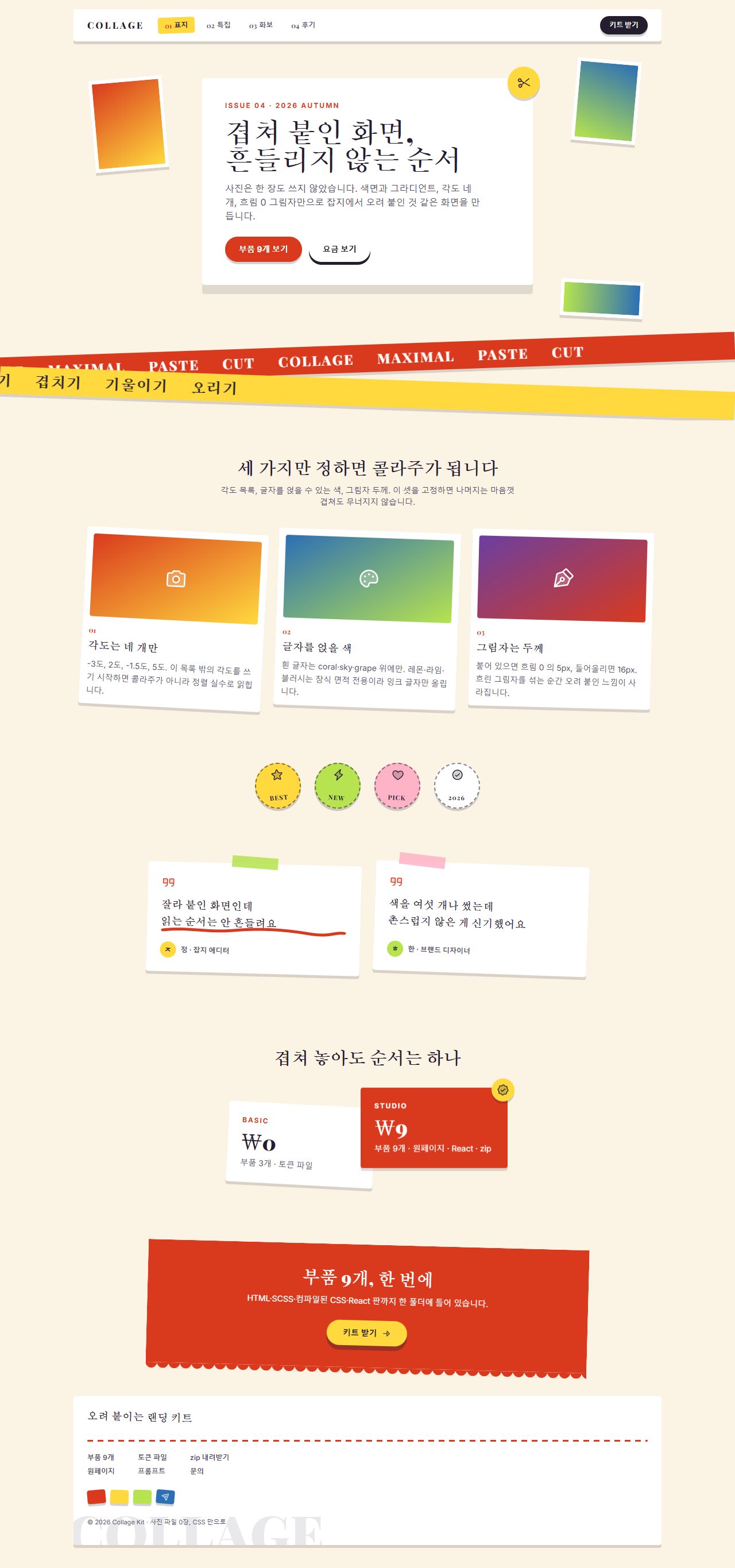
어디서 깨지는가 — 함정
제일 오래 헤맨 것은 CTA 띠의 가장자리였습니다. 아래쪽을 물결처럼 파내려고 radial-gradient 마스크를 깔았는데, 처음 쓴 circle 8px at 50% 0, #0000 98%, #000 100% 는 원의 바깥을 남기는 식이라 화면에는 아래로 뾰족한 삼각 톱니가 줄줄이 달렸습니다. 포스터를 열어 보고서야 알았습니다. 파도가 아니라 이빨이었습니다. 색 순서를 뒤집어 #000 98%, #0000 100% 로 원 안쪽을 남기자 그제야 반원이 아래로 매달렸습니다. 마스크는 "무엇을 지울까"가 아니라 "무엇을 남길까"로 읽어야 합니다.
두 번째는 마키 띠였습니다. 위아래 두 띠를 각각 -2.5도와 2도로 기울이고 음수 margin-top 으로 겹쳤더니, 렌더된 화면에서 아래 띠가 위 띠의 글자 밑동을 그대로 덮었습니다. 기울인 요소의 실제 점유 높이는 회전 전 높이보다 크기 때문에, 회전 전 기준으로 계산한 겹침 값이 그대로 통하지 않습니다. 아래 띠를 88% 폭으로 줄이고 오른쪽으로 붙여 띠 가장자리끼리만 겹치게 바꾸자 두 줄이 다 읽혔습니다. 같은 김에 트랙 폭도 Playwright 의 offsetWidth 로 다시 쟀습니다. 회전한 요소는 getBoundingClientRect 가 회전 후 경계 상자를 주므로 이 계산에는 쓸 수 없습니다. 위 띠 796px에 한 벌 398px, 아래 띠 524px에 한 벌 262px — 둘 다 정확히 절반이라 translateX(-50%) 한 바퀴의 이음매가 0px입니다. 겹치는 요소가 많은 화면을 메일로 옮겨도 같은 규칙이 필요한데 뉴스레터 디자인이 Outlook 깨짐 기준까지 짚어 둡니다. 두 함정을 다 손본 파일은 압축 비밀번호 s3yjtjja 으로 열리는 zip 안에 그대로 들어 있습니다.
접근성
색이 많을수록 대비를 눈으로 판정하면 안 됩니다. WCAG 2.1 최소 대비 기준의 상대 휘도 공식으로 열 가지 색을 전부 계산해 표로 정리했습니다. 본문 기준은 4.5:1입니다.
| 색 | 값 | 크림 바탕 위 | 흰 면 위 | 잉크 글자를 얹으면 |
|---|---|---|---|---|
| 잉크 | #241d2e |
14.76:1 | 16.28:1 | — |
| 슬레이트 | #57506a |
6.90:1 | 7.61:1 | — |
| 코랄 | #d93a1e |
4.16:1 | 4.59:1 | 3.55:1 |
| 스카이 | #2d6fb5 |
4.70:1 | 5.18:1 | 3.14:1 |
| 그레이프 | #6b3fa0 |
6.70:1 | 7.38:1 | 2.20:1 |
| 레몬 | #ffd93d |
1.25:1 | 1.38:1 | 11.82:1 |
| 라임 | #b6e34f |
1.35:1 | 1.49:1 | 10.92:1 |
| 블러시 | #ffb3c7 |
1.52:1 | 1.68:1 | 9.71:1 |
여기서 쓰임이 두 갈래로 갈립니다. 코랄 글자는 흰 면 위에서 4.59:1로 통과하지만 크림 바탕에서는 4.16:1이라 본문으로 쓰면 안 됩니다. 그래서 부품 아홉 개의 코랄 글자는 전부 흰 카드 안에만 있습니다. 반대로 레몬·라임·블러시는 어느 바탕에서도 글자로 못 쓰는 대신 잉크 글자를 얹으면 9:1을 넘으므로, 배지와 띠의 면으로만 씁니다.
움직임 쪽은 MDN prefers-reduced-motion 문서의 미디어 쿼리를 아홉 개 전부에 넣었습니다. 동작 줄이기를 켜면 흔들림과 흐름은 멈추지만 붙인 각도는 그대로 남습니다. MDN transform 문서의 rotate 로 만든 기울기가 이 스타일의 정체성이라, 각도까지 0으로 되돌리면 다른 디자인이 되기 때문입니다.
다른 밝은 톤 스타일이 궁금하면 종이 질감 디자인 랜딩 키트를 같이 보시고, 이 블로그가 뭘 주는 곳인지는 소개 페이지에 적어 뒀습니다.
FAQ
색을 여섯 개나 쓰면 촌스러워지지 않나요?
색 개수가 아니라 역할이 겹칠 때 촌스러워집니다. 이 키트에서 코랄·스카이·그레이프는 글자를 얹는 면이고 레몬·라임·블러시는 글자를 안 얹는 장식 면입니다. 역할이 갈려 있으면 한 화면에 여섯 색이 있어도 눈은 두 무리로 읽습니다. 콜라주가 믿음을 말해야 하는 구석에는 고객 후기 디자인 패턴이 맞는 부품입니다.
각도를 왜 네 개로 묶나요?
기울기는 값이 아니라 목록이기 때문입니다. 요소마다 -2도, -7도, 3도처럼 제각각 주면 보는 사람은 그것을 "일부러 기울였다"가 아니라 "정렬이 틀렸다"로 읽습니다. 네 개를 돌려 쓰면 같은 손이 붙인 것처럼 보입니다.
사진 콜라주 디자인 없이 만든 프레임이 어색하지 않나요?
사진 자리를 비워 두면 어색하지만, 두 색 그라디언트로 채우고 흰 테두리를 6px 두르면 액자 안에 무언가 들어 있는 것으로 읽힙니다. 실제 사진을 넣을 때도 이 구조 그대로 background 만 이미지로 바꾸면 되므로, 시안 단계에서 파일을 기다릴 필요가 없습니다.
이런 글이랑 어울려요
 디자인 트렌드벤토 그리드 디자인 — 요즘 핀터레스트에서 유행하는 부품 9개
 디자인 트렌드다크 SaaS 랜딩에 스며든 리니어 디자인 시스템 9종
 디자인 트렌드키네틱 타이포그래피 랜딩페이지, 코드로 뜯어봤다
 디자인 트렌드클레이모피즘 랜딩 UI 키트, 통통한 섹션 9개
 디자인 트렌드그레인 얹은 오로라 그라디언트 랜딩 부품 9개
 디자인 트렌드네오브루탈리즘 UI 랜딩 부품 9개, 그림자는 안 번진다
 디자인 트렌드번쩍이는 Y2K 웹 디자인, 크롬·홀로그램 부품 9개
 디자인 트렌드HUD 디자인, 화면이 나를 겨누는 랜딩 부품 9개
 디자인 트렌드뉴모피즘 디자인 랜딩 UI 키트, 그림자 두 겹 섹션 9개
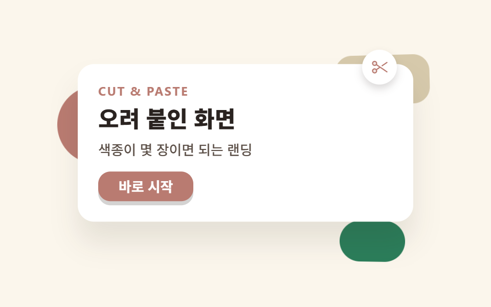 디자인 트렌드종이 질감 디자인 랜딩 키트, 오려 붙인 섹션 9개