멤피스 디자인 패턴 랜딩 키트, 점·물결 섹션 9개
멤피스 디자인은 1980년대 밀라노에서 시작된, 점·물결선·지그재그 같은 기하 형상을 밝은 색 위에 물들이듯 반복하는 스타일입니다. 이 글은 이미지 한 장 없이 CSS 그라디언트 타일과 도형만으로 멤피스 패턴을 재현해 코퍼레이트 랜딩 섹션 아홉 개로 묶은 키트입니다.
핀터레스트에서 "memphis pattern"으로 저장되는 화면 대부분은 일러스트 파일입니다. 일러스트를 통째로 올리면 용량이 무거워지고 색을 바꿀 때마다 다시 그려야 합니다. 여기서는 무늬 전부를 그라디언트 한 줄씩으로 만들어, 색 값만 바꾸면 패턴 전체가 따라 바뀌게 했습니다. 아래 원페이지를 스크롤하면서 어느 경계에서 무늬가 살아나는지 먼저 찾아보세요.

저 페이지를 이루는 부품 아홉 개를 떼어내 격자에 늘어놓았습니다. 순서는 화면에 무늬가 스며드는 차례를 따랐습니다. 배경이 무늬 바다가 되고, 형상이 길을 잡고, 무늬가 흐르기 시작하고, 상자에 담기고, 스티커로 증언하고, 값이 매겨지고, 섹션이 톱니로 잘리고, 띠가 흘러가고, 마지막으로 물결이 밀어낸니다. 멤피스 디자인 가구에서 먼저 눈에 익은 색과 형상이 화면으로 넘어온 것이라, 무늬가 레이아웃보다 먼저 자리를 잡습니다. 질감을 앞세운 이웃은 스큐어모피즘 랜딩 키트이고, 빛으로 페이지를 물들이는 이웃은 AI 오브 랜딩 키트입니다. 무늬·질감·빛 중 무엇으로 화면을 채울지는 세 키트를 실제로 겹쳐 보면 바로 결정됩니다.
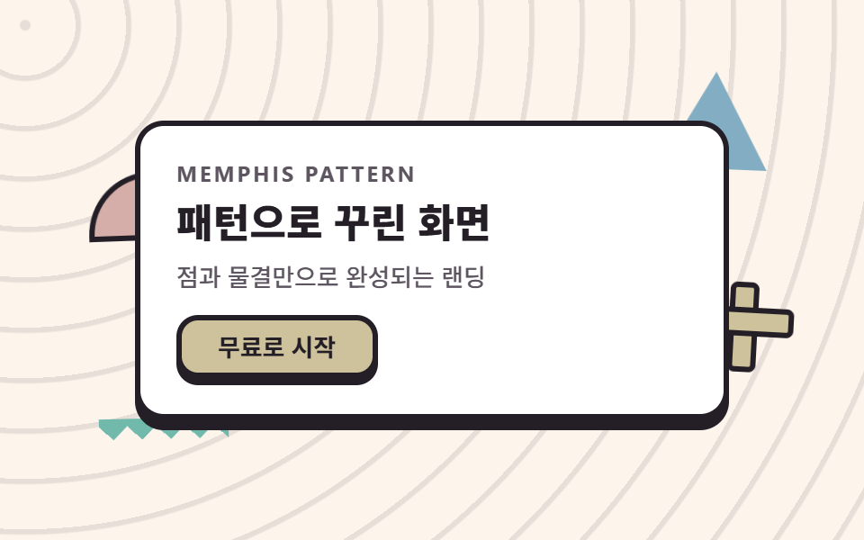 01 hero-memphis
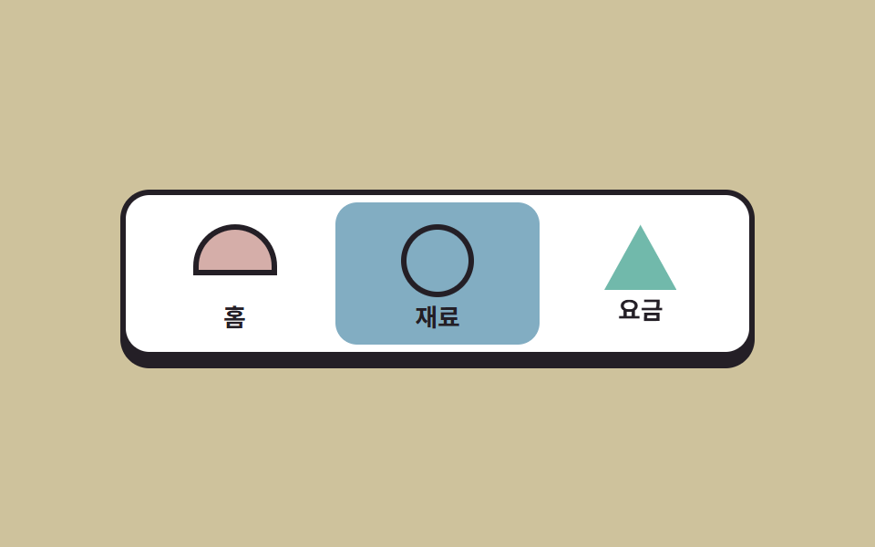 02 nav-memphis
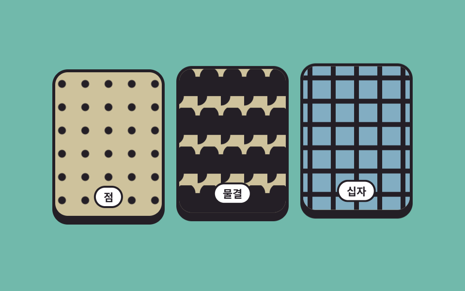 03 pattern-band-memphis
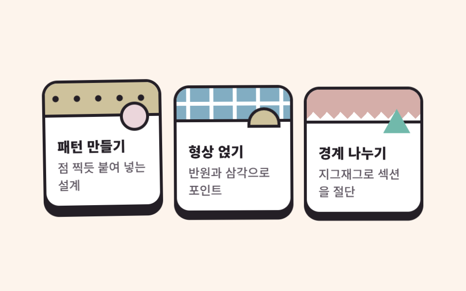 04 card-grid-memphis
 05 sticker-testimonial-memphis
 06 pricing-memphis
 07 zigzag-divider-memphis
 08 marquee-band-memphis
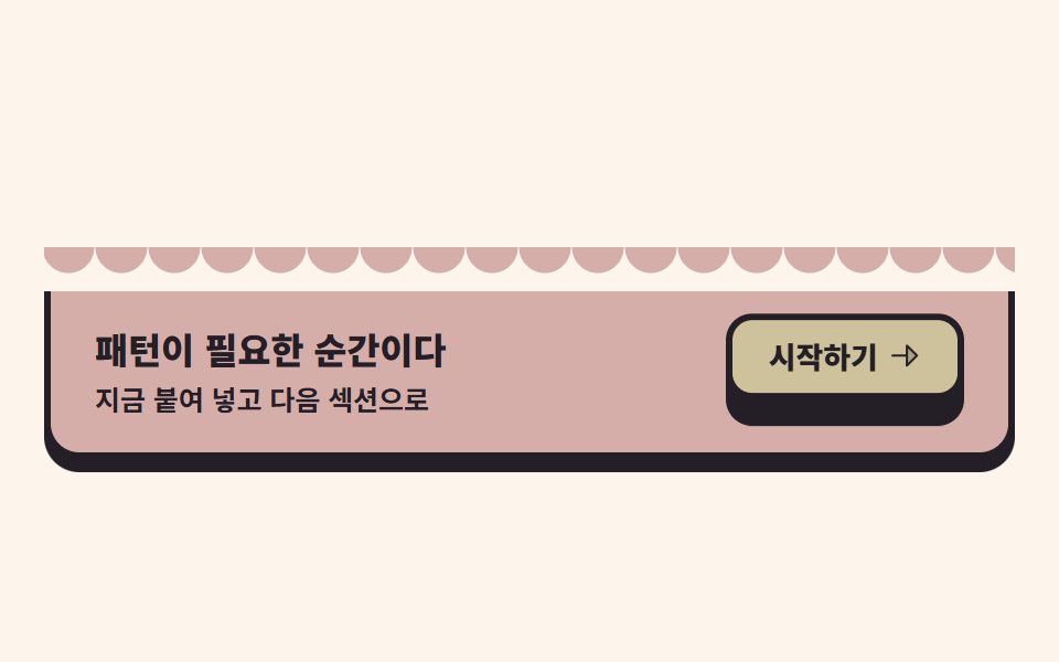 09 cta-wave-memphis
자동 재생 · 눌러서 해당 항목으로 · 전부 한 zip
- 01 패턴 바다 히어로
- 02 형상 배지 내비
- 03 반복 패턴 밴드
- 04 검은 외곽선 카드 격자
- 05 스티커 후기 더미
- 06 패턴 머리띠 요금제
- 07 지그재그 구분선
- 08 패턴 마퀴 띠
- 09 물결 CTA 밴드
01패턴 바다 히어로
무엇이 보이나
무대 자체가 repeating-radial-gradient 한 줄로 그린 동심원 잔물결입니다. 흰 안내판은 정지해 있고 반원·삼각·십자·톱니 조각 네 개가 둘레에 떠 있는데, 주기는 전부 2초로 같고 음수 딜레이로 위상만 서로 엇갈리게 했습니다. 주기를 섞으면 2초짜리 루프가 한 바퀴 돌아올 때 한 조각이 다른 구간에 있어 화면이 튑니다.
<main class="stage">
  <section class="herom">
    <span class="herom__shape herom__shape--half" aria-hidden="true"></span>
    <span class="herom__shape herom__shape--tri" aria-hidden="true"></span>
    <span class="herom__shape herom__shape--cross" aria-hidden="true"></span>
    <span class="herom__shape herom__shape--zig" aria-hidden="true"></span>
    <div class="herom__panel">
      <p class="herom__eyebrow">Memphis pattern</p>
      <h1 class="herom__title">패턴으로 꾸린 화면</h1>
      <p class="herom__desc">점과 물결만으로 완성되는 랜딩</p>
      <button class="herom__cta" type="button">무료로 시작</button>
    </div>
  </section>
</main>
@use "../../../../site/static/demo-tokens" as *;
// 멤피스 팔레트 — 밝은 코랄·레몬·스카이. 글자는 전부 잉크(밝은 면 위 검은 글자가 멤피스의 원칙).
// 대비 실측(WCAG 상대휘도 공식): ink/base 14.88:1 · ink/sheet 16.17:1 · stone/base 6.59:1 · ink/coral 5.29:1
$mem-base: #fdf4ec;
$mem-sheet: #ffffff;
$mem-ink: #241f26;
$mem-stone: #5d5560;
$mem-coral: #d5aea9;
$mem-lemon: #cec29c;
$mem-sky: #82adc2;
$mem-mint: #71b9ab;
$mem-pink: #ebd6db;
$duration: $dur-loop; // 도형 하나가 바다에서 떠오르는 한 주기
$easing: $ease-out; // 부유는 튀지 않고 같은 속도로 왕복한다
$color: $mem-coral; // 반원 형상의 대표색
@include stage($mem-base);
// 무대 자체가 점 무늬 바다 — 반복 반경 그라디언트 한 줄로 타일을 만든다
.stage {
background-image: repeating-radial-gradient(circle at 14px 14px, rgba($mem-ink, .1) 0 2.5px, transparent 3.5px 28px);
}
.herom {
position: relative;
width: clamp(224px, 72vw, 330px);
isolation: isolate;
}
// 판 주변의 멤피스 형상 — 같은 2초 주기에 서로 다른 위상(음수 delay)으로 부유한다
.herom__shape {
position: absolute;
z-index: 0;
animation: shapeFloat $duration $easing infinite;
}
.herom__shape--half {
left: -26px;
top: 30px;
width: 64px;
height: 32px;
border-radius: $r-pill $r-pill 0 0; // 반원 — 파일 값은 알약 토큰
background: $color;
border: 3px solid $mem-ink;
animation-delay: -.5s;
}
.herom__shape--tri {
right: -22px;
top: -18px;
width: 60px;
height: 54px;
background: $mem-sky;
clip-path: polygon(50% 0, 100% 100%, 0 100%); // 삼각형 — 외곽선 대신 면이 주역
animation-delay: -1s;
}
// 십자 — 가로·세로 막대 두 개로 만든다(손그림 아이콘이 아니라 순수 장식 도형)
.herom__shape--cross {
right: -30px;
bottom: 22px;
width: 44px;
height: 44px;
animation-delay: -1.5s;
}
.herom__shape--cross::before,
.herom__shape--cross::after {
content: "";
position: absolute;
background: $mem-lemon;
border: 3px solid $mem-ink;
border-radius: $r-xs;
}
.herom__shape--cross::before { left: 50%; top: 0; width: 10px; height: 100%; transform: translateX(-50%); }
.herom__shape--cross::after { top: 50%; left: 0; height: 10px; width: 100%; transform: translateY(-50%); }
// 지그재그 줄 — 원뿔 그라디언트 톱니 한 줄(07 구분선과 같은 재료)
.herom__shape--zig {
left: -20px;
bottom: -14px;
width: 72px;
height: 12px;
background: conic-gradient(from 315deg at 50% 100%, $mem-mint 0 90deg, transparent 90deg 360deg) 0 0 / 16px 12px repeat-x;
}
// 흰 안내판 — 무늬 바다 위 본문은 반드시 흰 판 위에 올린다(대비 확보)
.herom__panel {
position: relative;
z-index: 1;
box-sizing: border-box;
display: flex;
flex-direction: column;
align-items: flex-start;
gap: $sp-2;
padding: $sp-5;
border-radius: $r-card;
background: $mem-sheet;
border: 3px solid $mem-ink;
box-shadow: 0 6px 0 $mem-ink; // 딱 붙은 그림자 = 멤피스의 두께
}
.herom__eyebrow {
margin: 0;
color: $mem-stone;
font-weight: 700; font-size: clamp(10px, 2.6vw, 12px); line-height: 1;
font-family: inherit;
letter-spacing: .12em;
text-transform: uppercase;
}
.herom__title {
margin: 0;
color: $mem-ink;
font-weight: 800; font-size: clamp(18px, 4.6vw, 27px); line-height: 1.2;
font-family: inherit;
}
.herom__desc {
margin: 0;
color: $mem-stone;
font-weight: 500; font-size: clamp(12px, 2.8vw, 14px); line-height: 1.4;
font-family: inherit;
}
.herom__cta {
margin-top: $sp-1;
border: 3px solid $mem-ink;
border-radius: $r-control;
background: $mem-lemon;
color: $mem-ink;
padding: $sp-2 $sp-5;
font-weight: 700; font-size: clamp(12px, 2.8vw, 14px); line-height: 1;
font-family: inherit;
box-shadow: 0 4px 0 $mem-ink;
}
.herom__cta:active { transform: translateY(4px); box-shadow: 0 0 0 $mem-ink; }
.herom__cta:focus-visible { outline: 3px solid $mem-sky; outline-offset: 2px; }
// 데모: 네 형상이 서로 반대 위상으로 왕복한다 — 바다 위에서 서로 엇갈려 떠다니는 것처럼 보인다
@keyframes shapeFloat {
0%, 100% { transform: translateY(0) rotate(-3deg); }
50% { transform: translateY(-12px) rotate(4deg); }
}
@media (max-width: 340px), (max-height: 220px) {
.herom { width: 208px; }
.herom__panel { padding: $sp-3 $sp-4; gap: $sp-1; }
.herom__eyebrow { display: none; }
.herom__title { font-size: 17px; line-height: 1.15; }
.herom__desc { display: none; }
.herom__cta { padding: $sp-1 $sp-4; margin-top: 0; }
.herom__shape--half { width: 44px; height: 22px; left: -14px; top: 24px; }
.herom__shape--tri { width: 44px; height: 40px; right: -14px; top: -12px; }
.herom__shape--cross { width: 32px; height: 32px; right: -18px; bottom: 16px; }
.herom__shape--zig { width: 56px; height: 10px; left: -12px; bottom: -10px;
background: conic-gradient(from 315deg at 50% 100%, $mem-mint 0 90deg, transparent 90deg 360deg) 0 0 / 13px 10px repeat-x;
}
}
@media (prefers-reduced-motion: reduce) {
.herom__shape { animation: none !important; transform: none; }
}html, body {
margin: 0;
overflow: hidden;
}
.stage {
box-sizing: border-box;
min-height: 100vh;
display: grid;
place-items: center;
margin: 0;
background: #fdf4ec;
font-family: -apple-system, "Segoe UI", "Noto Sans KR", sans-serif;
padding: clamp(8px, 4vw, 24px);
}
.stage {
background-image: repeating-radial-gradient(circle at 14px 14px, rgba(36, 31, 38, 0.1) 0 2.5px, transparent 3.5px 28px);
}
.herom {
position: relative;
width: clamp(224px, 72vw, 330px);
isolation: isolate;
}
.herom__shape {
position: absolute;
z-index: 0;
animation: shapeFloat 2s ease-out infinite;
}
.herom__shape--half {
left: -26px;
top: 30px;
width: 64px;
height: 32px;
border-radius: 999px 999px 0 0;
background: #d5aea9;
border: 3px solid #241f26;
animation-delay: -0.5s;
}
.herom__shape--tri {
right: -22px;
top: -18px;
width: 60px;
height: 54px;
background: #82adc2;
clip-path: polygon(50% 0, 100% 100%, 0 100%);
animation-delay: -1s;
}
.herom__shape--cross {
right: -30px;
bottom: 22px;
width: 44px;
height: 44px;
animation-delay: -1.5s;
}
.herom__shape--cross::before,
.herom__shape--cross::after {
content: "";
position: absolute;
background: #cec29c;
border: 3px solid #241f26;
border-radius: 4px;
}
.herom__shape--cross::before {
left: 50%;
top: 0;
width: 10px;
height: 100%;
transform: translateX(-50%);
}
.herom__shape--cross::after {
top: 50%;
left: 0;
height: 10px;
width: 100%;
transform: translateY(-50%);
}
.herom__shape--zig {
left: -20px;
bottom: -14px;
width: 72px;
height: 12px;
background: conic-gradient(from 315deg at 50% 100%, #71b9ab 0 90deg, transparent 90deg 360deg) 0 0/16px 12px repeat-x;
}
.herom__panel {
position: relative;
z-index: 1;
box-sizing: border-box;
display: flex;
flex-direction: column;
align-items: flex-start;
gap: 8px;
padding: 20px;
border-radius: 16px;
background: #ffffff;
border: 3px solid #241f26;
box-shadow: 0 6px 0 #241f26;
}
.herom__eyebrow {
margin: 0;
color: #5d5560;
font-weight: 700;
font-size: clamp(10px, 2.6vw, 12px);
line-height: 1;
font-family: inherit;
letter-spacing: 0.12em;
text-transform: uppercase;
}
.herom__title {
margin: 0;
color: #241f26;
font-weight: 800;
font-size: clamp(18px, 4.6vw, 27px);
line-height: 1.2;
font-family: inherit;
}
.herom__desc {
margin: 0;
color: #5d5560;
font-weight: 500;
font-size: clamp(12px, 2.8vw, 14px);
line-height: 1.4;
font-family: inherit;
}
.herom__cta {
margin-top: 4px;
border: 3px solid #241f26;
border-radius: 12px;
background: #cec29c;
color: #241f26;
padding: 8px 20px;
font-weight: 700;
font-size: clamp(12px, 2.8vw, 14px);
line-height: 1;
font-family: inherit;
box-shadow: 0 4px 0 #241f26;
}
.herom__cta:active {
transform: translateY(4px);
box-shadow: 0 0 0 #241f26;
}
.herom__cta:focus-visible {
outline: 3px solid #82adc2;
outline-offset: 2px;
}
@keyframes shapeFloat {
0%, 100% {
transform: translateY(0) rotate(-3deg);
}
50% {
transform: translateY(-12px) rotate(4deg);
}
}
@media (max-width: 340px), (max-height: 220px) {
.herom {
width: 208px;
}
.herom__panel {
padding: 12px 16px;
gap: 4px;
}
.herom__eyebrow {
display: none;
}
.herom__title {
font-size: 17px;
line-height: 1.15;
}
.herom__desc {
display: none;
}
.herom__cta {
padding: 4px 16px;
margin-top: 0;
}
.herom__shape--half {
width: 44px;
height: 22px;
left: -14px;
top: 24px;
}
.herom__shape--tri {
width: 44px;
height: 40px;
right: -14px;
top: -12px;
}
.herom__shape--cross {
width: 32px;
height: 32px;
right: -18px;
bottom: 16px;
}
.herom__shape--zig {
width: 56px;
height: 10px;
left: -12px;
bottom: -10px;
background: conic-gradient(from 315deg at 50% 100%, #71b9ab 0 90deg, transparent 90deg 360deg) 0 0/13px 10px repeat-x;
}
}
@media (prefers-reduced-motion: reduce) {
.herom__shape {
animation: none !important;
transform: none;
}
}import type { CSSProperties } from "react";
import styles from "./HeroMemphis.module.scss";
export type HeroMemphisProps = {
eyebrow?: string;
title?: string;
desc?: string;
cta?: string;
/** 한 주기(기본 2000ms) */
duration?: number;
easing?: string;
/** 반원 형상의 대표색 */
color?: string;
};
type Vars = CSSProperties & { "--duration"?: string; "--easing"?: string; "--color"?: string };
export default function HeroMemphis({
eyebrow = "Memphis pattern",
title = "패턴으로 꾸린 화면",
desc = "점과 물결만으로 완성되는 랜딩",
cta = "무료로 시작",
duration = 2000,
easing = "ease-out",
color = "#ff5c47",
}: HeroMemphisProps) {
const vars: Vars = { "--duration": `${duration}ms`, "--easing": easing, "--color": color };
return (
<section className={styles.herom} style={vars}>
<span className={`${styles.shape} ${styles.shapeHalf}`} aria-hidden="true" />
<span className={`${styles.shape} ${styles.shapeTri}`} aria-hidden="true" />
<span className={`${styles.shape} ${styles.shapeCross}`} aria-hidden="true" />
<span className={`${styles.shape} ${styles.shapeZig}`} aria-hidden="true" />
<div className={styles.panel}>
<p className={styles.eyebrow}>{eyebrow}</p>
<h1 className={styles.title}>{title}</h1>
<p className={styles.desc}>{desc}</p>
<button className={styles.cta} type="button">{cta}</button>
</div>
</section>
);
}01 · 패턴 바다 히어로 — 측정 누적면적 2.806% · 움직인 프레임 23/23GODRICH 원작 · zip 에 SCSS·React 포함 · 비밀번호 보기
코드에서 볼 곳
측정에서 누적면적 2.806%, 움직인 프레임 23/23이 나왔습니다.
// 동심원 잔물결 — 원점 하나에서 퍼지는 반경 그라디언트의 반복
.stage {
  background-image: repeating-radial-gradient(circle at 14px 14px, rgba(36, 31, 38, .1) 0 2.5px, transparent 3.5px 28px);
}
// 네 형상은 같은 2초, 다른 위상
.herom__shape       { animation: shapeFloat 2s ease-out infinite; }
.herom__shape--half { animation-delay: -.5s; }
.herom__shape--tri  { animation-delay: -1s; }
@keyframes shapeFloat {
  0%, 100% { transform: translateY(0) rotate(-3deg); }
  50%      { transform: translateY(-12px) rotate(4deg); }
}
02형상 배지 내비
멤피스 디자인 특징이 내비에서는 어떻게 보이나
메뉴 세 칸이 각각 원·반원·삼각 배지를 담고, 활성 칸이 돌아가며 바뀝니다. 활성 교체는 steps(1, end) 타이밍으로 한 프레임에 컷하는데, 페이드로 섞으면 두 색이 반투명하게 겹친 유령 프레임이 24프레임 사이에 몇 장 끼어듭니다. 컷으로 교체하고 살아 있는 움직임은 배지가 위로 튀는 transform에만 담았습니다.
<main class="stage">
  <nav class="navm" aria-label="데모 내비게이션">
    <a class="navm__tab" href="#">
      <span class="navm__badge navm__badge--half" aria-hidden="true"></span>
      <span class="navm__label">홈</span>
    </a>
    <a class="navm__tab" href="#">
      <span class="navm__badge navm__badge--circle" aria-hidden="true"></span>
      <span class="navm__label">재료</span>
    </a>
    <a class="navm__tab" href="#">
      <span class="navm__badge navm__badge--tri" aria-hidden="true"></span>
      <span class="navm__label">요금</span>
    </a>
  </nav>
</main>
@use "../../../../site/static/demo-tokens" as *;
// 멤피스 팔레트 — 01 과 같은 값 (대비 실측치는 01 참고)
$mem-base: #fdf4ec;
$mem-sheet: #ffffff;
$mem-ink: #241f26;
$mem-stone: #5d5560;
$mem-coral: #d5aea9;
$mem-lemon: #cec29c;
$mem-sky: #82adc2;
$mem-mint: #71b9ab;
$mem-pink: #ebd6db;
$duration: $dur-loop; // 활성 칸이 세 개를 한 바퀴 도는 주기
$easing: $ease-pop; // 배지가 튀어 오를 때만 튕긴다
$color: $mem-lemon; // 무대(레몬)
@include stage($mem-lemon);
.navm {
box-sizing: border-box;
display: grid;
grid-template-columns: repeat(3, 1fr); // 칸 폭은 그리드가 정한다 — 고정 px 인디케이터가 없다(BD19 무관)
width: clamp(232px, 76vw, 348px);
padding: $sp-1;
border-radius: $r-card;
background: $mem-sheet;
border: 3px solid $mem-ink;
box-shadow: 0 6px 0 $mem-ink;
}
.navm__tab {
--on: #{$mem-coral};
position: relative;
box-sizing: border-box;
display: flex;
flex-direction: column;
align-items: center;
gap: $sp-1;
padding: $sp-3 $sp-2 $sp-2;
border-radius: $r-control;
text-decoration: none;
}
.navm__tab:nth-child(1) { --on: #{$mem-coral}; }
.navm__tab:nth-child(2) { --on: #{$mem-sky}; }
.navm__tab:nth-child(3) { --on: #{$mem-mint}; }
// 활성 칸은 한 프레임 컷(steps)으로 바뀐다 — 반투명 유령 프레임이 생기지 않는다
.navm__tab {
animation: tabFill $duration steps(1, end) infinite;
}
.navm__tab:nth-child(2) { animation-delay: -.6667s; }
.navm__tab:nth-child(3) { animation-delay: -1.3333s; }
.navm__tab:focus-visible {
outline: 3px solid $mem-ink;
outline-offset: 2px;
}
// 형상 배지 — 원·반원·삼각. 활성 칸 차례에 위로 튀어 오른다
.navm__badge {
display: block;
width: 34px;
height: 34px;
animation: badgePop $duration $easing infinite;
}
.navm__tab:nth-child(2) .navm__badge { animation-delay: -.6667s; }
.navm__tab:nth-child(3) .navm__badge { animation-delay: -1.3333s; }
.navm__badge--circle {
border-radius: 50%;
background: var(--on);
border: 3px solid $mem-ink;
}
.navm__badge--half {
width: 40px;
height: 22px;
margin-bottom: 12px; // 반원 높이를 원과 맞춘다
border-radius: $r-pill $r-pill 0 0;
background: var(--on);
border: 3px solid $mem-ink;
}
.navm__badge--tri {
width: 40px;
height: 36px;
background: var(--on);
clip-path: polygon(50% 0, 100% 100%, 0 100%);
}
.navm__label {
color: $mem-ink;
font-weight: 700; font-size: clamp(12px, 2.8vw, 14px); line-height: 1;
font-family: inherit;
}
// 활성 창(0~33%) 동안: 칸 배경 = 자기 색(컷 교체), 배지 = translateY 팝(부드럽게)
@keyframes tabFill {
0%, 33.32% { background: var(--on); }
33.33%, 100% { background: transparent; }
}
@keyframes badgePop {
0% { transform: translateY(0); }
6%, 28% { transform: translateY(-7px); }
33.33%, 100% { transform: translateY(0); }
}
@media (max-width: 340px), (max-height: 220px) {
.navm { width: 220px; }
.navm__tab { padding: $sp-2 $sp-1; }
.navm__badge { width: 26px; height: 26px; }
.navm__badge--half { width: 30px; height: 16px; margin-bottom: $sp-2; }
.navm__badge--tri { width: 30px; height: 27px; }
.navm__label { font-size: 11px; }
}
@media (prefers-reduced-motion: reduce) {
.navm__tab, .navm__badge { animation: none !important; }
// 움직임을 끊은 뒤에도 활성 상태 하나는 보여 준다 — 두 번째 칸
.navm__tab:nth-child(2) { background: $mem-sky; }
}html, body {
margin: 0;
overflow: hidden;
}
.stage {
box-sizing: border-box;
min-height: 100vh;
display: grid;
place-items: center;
margin: 0;
background: #cec29c;
font-family: -apple-system, "Segoe UI", "Noto Sans KR", sans-serif;
padding: clamp(8px, 4vw, 24px);
}
.navm {
box-sizing: border-box;
display: grid;
grid-template-columns: repeat(3, 1fr);
width: clamp(232px, 76vw, 348px);
padding: 4px;
border-radius: 16px;
background: #ffffff;
border: 3px solid #241f26;
box-shadow: 0 6px 0 #241f26;
}
.navm__tab {
--on: #d5aea9;
position: relative;
box-sizing: border-box;
display: flex;
flex-direction: column;
align-items: center;
gap: 4px;
padding: 12px 8px 8px;
border-radius: 12px;
text-decoration: none;
}
.navm__tab:nth-child(1) {
--on: #d5aea9;
}
.navm__tab:nth-child(2) {
--on: #82adc2;
}
.navm__tab:nth-child(3) {
--on: #71b9ab;
}
.navm__tab {
animation: tabFill 2s steps(1, end) infinite;
}
.navm__tab:nth-child(2) {
animation-delay: -0.6667s;
}
.navm__tab:nth-child(3) {
animation-delay: -1.3333s;
}
.navm__tab:focus-visible {
outline: 3px solid #241f26;
outline-offset: 2px;
}
.navm__badge {
display: block;
width: 34px;
height: 34px;
animation: badgePop 2s cubic-bezier(0.2, 1.4, 0.4, 1) infinite;
}
.navm__tab:nth-child(2) .navm__badge {
animation-delay: -0.6667s;
}
.navm__tab:nth-child(3) .navm__badge {
animation-delay: -1.3333s;
}
.navm__badge--circle {
border-radius: 50%;
background: var(--on);
border: 3px solid #241f26;
}
.navm__badge--half {
width: 40px;
height: 22px;
margin-bottom: 12px;
border-radius: 999px 999px 0 0;
background: var(--on);
border: 3px solid #241f26;
}
.navm__badge--tri {
width: 40px;
height: 36px;
background: var(--on);
clip-path: polygon(50% 0, 100% 100%, 0 100%);
}
.navm__label {
color: #241f26;
font-weight: 700;
font-size: clamp(12px, 2.8vw, 14px);
line-height: 1;
font-family: inherit;
}
@keyframes tabFill {
0%, 33.32% {
background: var(--on);
}
33.33%, 100% {
background: transparent;
}
}
@keyframes badgePop {
0% {
transform: translateY(0);
}
6%, 28% {
transform: translateY(-7px);
}
33.33%, 100% {
transform: translateY(0);
}
}
@media (max-width: 340px), (max-height: 220px) {
.navm {
width: 220px;
}
.navm__tab {
padding: 8px 4px;
}
.navm__badge {
width: 26px;
height: 26px;
}
.navm__badge--half {
width: 30px;
height: 16px;
margin-bottom: 8px;
}
.navm__badge--tri {
width: 30px;
height: 27px;
}
.navm__label {
font-size: 11px;
}
}
@media (prefers-reduced-motion: reduce) {
.navm__tab, .navm__badge {
animation: none !important;
}
.navm__tab:nth-child(2) {
background: #82adc2;
}
}import type { CSSProperties } from "react";
import styles from "./NavMemphis.module.scss";
export type NavMemphisProps = {
/** 탭 이름 3개 */
tabs?: string[];
/** 한 주기(기본 2000ms) */
duration?: number;
easing?: string;
/** 데모 무대 색(참고용 — 칸마다 색은 고정) */
color?: string;
};
type Vars = CSSProperties & { "--duration"?: string; "--easing"?: string; "--color"?: string };
export default function NavMemphis({
tabs = ["홈", "재료", "요금"],
duration = 2000,
easing = "cubic-bezier(.2,1.4,.4,1)",
color = "#ffcf33",
}: NavMemphisProps) {
const vars: Vars = { "--duration": `${duration}ms`, "--easing": easing, "--color": color };
/* 배지 모양은 칸 순서대로 고정 — 반원 · 원 · 삼각 */
const badges = [styles.badgeHalf, styles.badgeCircle, styles.badgeTri];
return (
<nav className={styles.navm} style={vars} aria-label="데모 내비게이션">
{tabs.map((t, i) => (
<a key={t} className={styles.tab} href="#">
<span className={`${styles.badge} ${badges[i % badges.length]}`} aria-hidden="true" />
<span className={styles.label}>{t}</span>
</a>
))}
</nav>
);
}02 · 형상 배지 내비 — 측정 누적면적 16.499% · 움직인 프레임 9/23GODRICH 원작 · zip 에 SCSS·React 포함 · 비밀번호 보기
코드 읽는 법
컷 덕분에 이 데모는 변화가 있는 프레임이 9/23으로 적지만, 면적과 강도는 넉넉합니다.
.navm__tab {
  --on: #ff5c47;                     // 칸마다 자기 색
  animation: tabFill 2s steps(1, end) infinite;
}
.navm__tab:nth-child(2) { animation-delay: -.6667s; }
.navm__tab:nth-child(3) { animation-delay: -1.3333s; }
@keyframes tabFill {
  0%, 33.32%   { background: var(--on); }   // 활성 창 동안 색 유지
  33.33%, 100% { background: transparent; }
}
@keyframes badgePop {
  0%           { transform: translateY(0); }
  6%, 28%      { transform: translateY(-7px); }
  33.33%, 100% { transform: translateY(0); }
}
03반복 패턴 밴드
어떤 움직임인가
점·물결·십자 무늬 판 세 개가 나란히 서고 각 판의 무늬 바닥이 옆으로 흐릅니다. 무늬 층은 폭을 타일(24px)의 정수배인 240px로 고정하고 translateX(-120px), 즉 타일 다섯 칸만큼만 밉니다. 120px은 24px의 배수라 민 순간 무늬가 처음과 픽셀 단위로 같아져 이음매가 생기지 않습니다. 세 판은 0.22초씩 어긋나 들렸다 앉습니다.
<main class="stage">
  <section class="bandm">
    <article class="bandm__panel bandm__panel--dots">
      <div class="bandm__fill bandm__fill--dots" aria-hidden="true"></div>
      <span class="bandm__name">점</span>
    </article>
    <article class="bandm__panel bandm__panel--wave">
      <div class="bandm__fill bandm__fill--wave" aria-hidden="true"></div>
      <span class="bandm__name">물결</span>
    </article>
    <article class="bandm__panel bandm__panel--cross">
      <div class="bandm__fill bandm__fill--cross" aria-hidden="true"></div>
      <span class="bandm__name">십자</span>
    </article>
  </section>
</main>
@use "../../../../site/static/demo-tokens" as *;
// 멤피스 팔레트 — 01 과 같은 값
$mem-base: #fdf4ec;
$mem-sheet: #ffffff;
$mem-ink: #241f26;
$mem-stone: #5d5560;
$mem-coral: #d5aea9;
$mem-lemon: #cec29c;
$mem-sky: #82adc2;
$mem-mint: #71b9ab;
$mem-pink: #ebd6db;
$duration: $dur-loop; // 무늬 바닥이 자기 폭의 절반만큼 흐르는 주기
$easing: linear; // 흐름은 일정 속도 — 이음매가 보이지 않는다
$color: $mem-mint; // 무대(민트)
@include stage($mem-mint);
.bandm {
box-sizing: border-box;
display: flex;
gap: $sp-3;
width: clamp(252px, 82vw, 372px);
}
// 무늬 판 — 흰 테두리판 안에 무늬 바닥이 들어 있다
.bandm__panel {
position: relative;
flex: 1 1 0;
height: clamp(148px, 46vh, 208px);
border-radius: $r-card;
background: $mem-lemon;
border: 3px solid $mem-ink;
box-shadow: 0 6px 0 $mem-ink;
overflow: hidden;
animation: panelLift $duration $ease-out infinite;
}
.bandm__panel:nth-child(2) { animation-delay: -.22s; }
.bandm__panel:nth-child(3) { animation-delay: -.44s; }
// 무늬 바닥 — 폭을 타일의 정수배(240px = 20칸 × 12px)로 고정하고 절반을 민다
.bandm__fill {
position: absolute;
inset: 0 auto 0 0;
width: 240px;
animation: fillFlow $duration $easing infinite;
}
// 점 — 반경 그라디언트 원을 타일로 찍는다
.bandm__fill--dots {
background-image: radial-gradient(circle at 12px 12px, $mem-ink 3.5px, transparent 4.5px);
background-size: 24px 24px;
}
// 물결 — 잉크 리본(타일 안 y8~28)의 위 가장자리에 산을, 아래 가장자리 경계에 골을 만든다
.bandm__fill--wave {
background-image:
linear-gradient(to bottom, transparent 8px, $mem-ink 8px 28px, transparent 28px),
radial-gradient(circle 10px at 12px 8px, $mem-ink 0 9.5px, transparent 10px),
radial-gradient(circle 10px at 0 28px, $mem-ink 0 9.5px, transparent 10px);
background-size: 24px 40px;
background-repeat: repeat;
}
// 십자 — 타일(24px) 안에 세로 막대(x 9.5~14.5)와 가로 막대(y 9.5~14.5)를 얹는다
.bandm__fill--cross {
background-color: $mem-sky;
background-image:
linear-gradient(to right, transparent 9.5px, $mem-ink 9.5px 14.5px, transparent 14.5px),
linear-gradient(to bottom, transparent 9.5px, $mem-ink 9.5px 14.5px, transparent 14.5px);
background-size: 24px 24px;
background-repeat: repeat;
}
// 이름표 — 무늬 위 글자는 흰 알약 하나에 잉크로만
.bandm__name {
position: absolute;
left: 50%;
bottom: $sp-2;
transform: translateX(-50%);
padding: $sp-1 $sp-2;
border-radius: $r-pill;
background: $mem-sheet;
border: 2px solid $mem-ink;
color: $mem-ink;
font-weight: 700; font-size: 11px; line-height: 1;
font-family: inherit;
}
// 절반(120px = 타일 10칸)만 밀면 한 바퀴 — 무늬가 주기적이므로 이음매가 없다
@keyframes fillFlow {
from { transform: translateX(0); }
to { transform: translateX(-120px); }
}
// 세 판이 0.22초씩 어긋나 들렸다 내려앉는다
@keyframes panelLift {
0%, 100% { transform: translateY(0); }
45% { transform: translateY(-10px); }
}
@media (max-width: 340px), (max-height: 220px) {
.bandm { width: 232px; gap: $sp-2; }
.bandm__panel { height: 128px; }
.bandm__name { bottom: $sp-1; font-size: 10px; }
}
@media (prefers-reduced-motion: reduce) {
.bandm__fill, .bandm__panel { animation: none !important; transform: none; }
}html, body {
margin: 0;
overflow: hidden;
}
.stage {
box-sizing: border-box;
min-height: 100vh;
display: grid;
place-items: center;
margin: 0;
background: #71b9ab;
font-family: -apple-system, "Segoe UI", "Noto Sans KR", sans-serif;
padding: clamp(8px, 4vw, 24px);
}
.bandm {
box-sizing: border-box;
display: flex;
gap: 12px;
width: clamp(252px, 82vw, 372px);
}
.bandm__panel {
position: relative;
flex: 1 1 0;
height: clamp(148px, 46vh, 208px);
border-radius: 16px;
background: #cec29c;
border: 3px solid #241f26;
box-shadow: 0 6px 0 #241f26;
overflow: hidden;
animation: panelLift 2s ease-out infinite;
}
.bandm__panel:nth-child(2) {
animation-delay: -0.22s;
}
.bandm__panel:nth-child(3) {
animation-delay: -0.44s;
}
.bandm__fill {
position: absolute;
inset: 0 auto 0 0;
width: 240px;
animation: fillFlow 2s linear infinite;
}
.bandm__fill--dots {
background-image: radial-gradient(circle at 12px 12px, #241f26 3.5px, transparent 4.5px);
background-size: 24px 24px;
}
.bandm__fill--wave {
background-image: linear-gradient(to bottom, transparent 8px, #241f26 8px 28px, transparent 28px), radial-gradient(circle 10px at 12px 8px, #241f26 0 9.5px, transparent 10px), radial-gradient(circle 10px at 0 28px, #241f26 0 9.5px, transparent 10px);
background-size: 24px 40px;
background-repeat: repeat;
}
.bandm__fill--cross {
background-color: #82adc2;
background-image: linear-gradient(to right, transparent 9.5px, #241f26 9.5px 14.5px, transparent 14.5px), linear-gradient(to bottom, transparent 9.5px, #241f26 9.5px 14.5px, transparent 14.5px);
background-size: 24px 24px;
background-repeat: repeat;
}
.bandm__name {
position: absolute;
left: 50%;
bottom: 8px;
transform: translateX(-50%);
padding: 4px 8px;
border-radius: 999px;
background: #ffffff;
border: 2px solid #241f26;
color: #241f26;
font-weight: 700;
font-size: 11px;
line-height: 1;
font-family: inherit;
}
@keyframes fillFlow {
from {
transform: translateX(0);
}
to {
transform: translateX(-120px);
}
}
@keyframes panelLift {
0%, 100% {
transform: translateY(0);
}
45% {
transform: translateY(-10px);
}
}
@media (max-width: 340px), (max-height: 220px) {
.bandm {
width: 232px;
gap: 8px;
}
.bandm__panel {
height: 128px;
}
.bandm__name {
bottom: 4px;
font-size: 10px;
}
}
@media (prefers-reduced-motion: reduce) {
.bandm__fill, .bandm__panel {
animation: none !important;
transform: none;
}
}import type { CSSProperties } from "react";
import styles from "./PatternBandMemphis.module.scss";
export type PatternBandMemphisProps = {
/** 판 이름 3개 (점 · 물결 · 십자 순서로 무늬가 고정) */
names?: string[];
/** 한 주기(기본 2000ms) */
duration?: number;
easing?: string;
/** 데모 무대 색(참고용 — 판 배경은 고정) */
color?: string;
};
type Vars = CSSProperties & { "--duration"?: string; "--easing"?: string; "--color"?: string };
export default function PatternBandMemphis({
names = ["점", "물결", "십자"],
duration = 2000,
easing = "linear",
color = "#2ec4a6",
}: PatternBandMemphisProps) {
const vars: Vars = { "--duration": `${duration}ms`, "--easing": easing, "--color": color };
/* 무늬는 순서대로 고정 — 점 · 물결 · 십자 */
const fills = [
[styles.panelDots, styles.fillDots],
[styles.panelWave, styles.fillWave],
[styles.panelCross, styles.fillCross],
];
return (
<section className={styles.bandm} style={vars}>
{names.map((n, i) => {
const [panel, fill] = fills[i % fills.length];
return (
<article key={n} className={`${styles.panel} ${panel}`}>
<div className={`${styles.fill} ${fill}`} aria-hidden="true" />
<span className={styles.name}>{n}</span>
</article>
);
})}
</section>
);
}03 · 반복 패턴 밴드 — 측정 누적면적 33.612% · 움직인 프레임 23/23GODRICH 원작 · zip 에 SCSS·React 포함 · 비밀번호 보기
어디를 바꾸면 되나
누적면적 33.612%로 아홉 개 중 가장 넓게 움직입니다.
.bandm__fill {
  position: absolute; inset: 0 auto 0 0;
  width: 240px;                       // 타일 24px × 10 — 절반은 정확히 5타일
  animation: fillFlow 2s linear infinite;
}
// 물결 리본 — 타일(24×40) 안에 띠(y 8~28)와 위·아래 가장자리 반원
.bandm__fill--wave {
  background-image:
    linear-gradient(to bottom, transparent 8px, #241f26 8px 28px, transparent 28px),
    radial-gradient(circle 10px at 12px 8px, #241f26 0 9.5px, transparent 10px),
    radial-gradient(circle 10px at 0 28px, #241f26 0 9.5px, transparent 10px);
  background-size: 24px 40px;
}
@keyframes fillFlow { from { transform: translateX(0); } to { transform: translateX(-120px); } }
04검은 외곽선 카드 격자
무엇이 보이나
흰 카드에 잉크 테두리 3px와 흐림 0 그림자 0 6px 0 을 함께 줬습니다. 이 조합은 네오브루탈리즘과 닮았지만 여기서는 테두리가 주역이 아니라 머리띠의 액자입니다. 세 카드가 각각 점·십자·톱니 무늬 머리띠를 이고, 0.22초씩 어긋나 들렸다 앉으면서 들 때 그림자 두께가 6px에서 10px로 늘어납니다.
<main class="stage">
  <section class="gridm">
    <article class="gridm__card">
      <span class="gridm__sticker gridm__sticker--circle" aria-hidden="true"></span>
      <div class="gridm__band gridm__band--dots" aria-hidden="true"></div>
      <h2 class="gridm__title">패턴 만들기</h2>
      <p class="gridm__desc">점 찍듯 붙여 넣는 설계</p>
    </article>
    <article class="gridm__card">
      <span class="gridm__sticker gridm__sticker--half" aria-hidden="true"></span>
      <div class="gridm__band gridm__band--cross" aria-hidden="true"></div>
      <h2 class="gridm__title">형상 얹기</h2>
      <p class="gridm__desc">반원과 삼각으로 포인트</p>
    </article>
    <article class="gridm__card">
      <span class="gridm__sticker gridm__sticker--tri" aria-hidden="true"></span>
      <div class="gridm__band gridm__band--zig" aria-hidden="true"></div>
      <h2 class="gridm__title">경계 나누기</h2>
      <p class="gridm__desc">지그재그로 섹션을 절단</p>
    </article>
  </section>
</main>
@use "../../../../site/static/demo-tokens" as *;
// 멤피스 팔레트 — 01 과 같은 값
$mem-base: #fdf4ec;
$mem-sheet: #ffffff;
$mem-ink: #241f26;
$mem-stone: #5d5560;
$mem-coral: #d5aea9;
$mem-lemon: #cec29c;
$mem-sky: #82adc2;
$mem-mint: #71b9ab;
$mem-pink: #ebd6db;
$duration: $dur-loop; // 카드가 들렸다 내려앉는 한 주기
$easing: $ease-spring; // 스티커가 붙는 끝에 살짝 튕긴다
$color: $mem-ink; // 이번 편의 주역은 굵은 잉크 테두리
@include stage($mem-base);
.gridm {
box-sizing: border-box;
display: flex;
gap: $sp-3;
width: clamp(268px, 86vw, 392px);
padding-top: $sp-3;
}
// 흰 카드 — 3px 잉크 테두리 + 딱 붙은 잉크 그림자. 무늬는 머리띠에만(네오브루탈과의 차이)
.gridm__card {
position: relative;
flex: 1 1 0;
box-sizing: border-box;
padding: $sp-12 $sp-3 $sp-3;
border-radius: $r-card;
background: $mem-sheet;
border: 3px solid $mem-ink;
box-shadow: 0 6px 0 $mem-ink;
overflow: hidden;
animation: cardRise $duration $easing infinite;
}
.gridm__card:nth-child(2) { animation-delay: -.22s; }
.gridm__card:nth-child(3) { animation-delay: -.44s; }
// 무늬 머리띠 — 카드의 맨 꼭대기를 채운다(테두리 안쪽)
.gridm__band {
position: absolute;
left: 0;
right: 0;
top: 0;
height: 32px;
border-bottom: 3px solid $mem-ink;
}
.gridm__band--dots {
background-color: $mem-lemon;
background-image: radial-gradient(circle at 11px 16px, $mem-ink 0 3px, transparent 3.5px);
background-size: 22px 22px;
}
.gridm__band--cross {
background-color: $mem-sky;
background-image:
linear-gradient(to right, transparent 10px, $mem-sheet 10px 14px, transparent 14px),
linear-gradient(to bottom, transparent 14px, $mem-sheet 14px 18px, transparent 18px);
background-size: 24px 32px;
background-repeat: repeat;
}
.gridm__band--zig {
background-color: $mem-coral;
background-image: conic-gradient(from 135deg at 50% 0%, $mem-sheet 0 90deg, transparent 90deg 360deg);
background-size: 14px 9px;
background-position: 0 100%;
background-repeat: repeat-x;
}
// 귀퉁이 스티커 — 테두리를 걸터앉은 형상 하나
.gridm__sticker {
position: absolute;
z-index: 1;
top: 20px;
right: 10px;
}
.gridm__sticker--circle {
width: 24px;
height: 24px;
border-radius: 50%;
background: $mem-pink;
border: 3px solid $mem-ink;
}
.gridm__sticker--half {
width: 28px;
height: 15px;
border-radius: $r-pill $r-pill 0 0;
background: $mem-lemon;
border: 3px solid $mem-ink;
}
.gridm__sticker--tri {
width: 28px;
height: 25px;
background: $mem-mint;
clip-path: polygon(50% 0, 100% 100%, 0 100%);
}
.gridm__title {
margin: $sp-2 0 0;
color: $mem-ink;
font-weight: 800; font-size: clamp(13px, 3vw, 16px); line-height: 1.25;
font-family: inherit;
}
.gridm__desc {
margin: $sp-1 0 0;
color: $mem-stone;
font-weight: 500; font-size: clamp(11px, 2.6vw, 12.5px); line-height: 1.45;
font-family: inherit;
}
// 세 장이 0.22초씩 어긋나 들렸다 앉는다 — 딱 붙은 그림자가 살짝 늘어난다
@keyframes cardRise {
0%, 100% { transform: translateY(0) rotate(0deg); box-shadow: 0 6px 0 $mem-ink; }
45% { transform: translateY(-12px) rotate(-1.5deg); box-shadow: 0 10px 0 $mem-ink; }
}
@media (max-width: 340px), (max-height: 220px) {
.gridm { width: 240px; gap: $sp-2; }
.gridm__card { padding: $sp-10 $sp-2 $sp-2; }
.gridm__title { font-size: 12px; }
.gridm__desc { font-size: 10.5px; }
.gridm__band { height: 26px; }
.gridm__sticker { top: 16px; right: 6px; }
}
@media (prefers-reduced-motion: reduce) {
.gridm__card { animation: none !important; transform: none; box-shadow: 0 6px 0 $mem-ink; }
}html, body {
margin: 0;
overflow: hidden;
}
.stage {
box-sizing: border-box;
min-height: 100vh;
display: grid;
place-items: center;
margin: 0;
background: #fdf4ec;
font-family: -apple-system, "Segoe UI", "Noto Sans KR", sans-serif;
padding: clamp(8px, 4vw, 24px);
}
.gridm {
box-sizing: border-box;
display: flex;
gap: 12px;
width: clamp(268px, 86vw, 392px);
padding-top: 12px;
}
.gridm__card {
position: relative;
flex: 1 1 0;
box-sizing: border-box;
padding: 48px 12px 12px;
border-radius: 16px;
background: #ffffff;
border: 3px solid #241f26;
box-shadow: 0 6px 0 #241f26;
overflow: hidden;
animation: cardRise 2s cubic-bezier(0.2, 0.8, 0.2, 1) infinite;
}
.gridm__card:nth-child(2) {
animation-delay: -0.22s;
}
.gridm__card:nth-child(3) {
animation-delay: -0.44s;
}
.gridm__band {
position: absolute;
left: 0;
right: 0;
top: 0;
height: 32px;
border-bottom: 3px solid #241f26;
}
.gridm__band--dots {
background-color: #cec29c;
background-image: radial-gradient(circle at 11px 16px, #241f26 0 3px, transparent 3.5px);
background-size: 22px 22px;
}
.gridm__band--cross {
background-color: #82adc2;
background-image: linear-gradient(to right, transparent 10px, #ffffff 10px 14px, transparent 14px), linear-gradient(to bottom, transparent 14px, #ffffff 14px 18px, transparent 18px);
background-size: 24px 32px;
background-repeat: repeat;
}
.gridm__band--zig {
background-color: #d5aea9;
background-image: conic-gradient(from 135deg at 50% 0%, #ffffff 0 90deg, transparent 90deg 360deg);
background-size: 14px 9px;
background-position: 0 100%;
background-repeat: repeat-x;
}
.gridm__sticker {
position: absolute;
z-index: 1;
top: 20px;
right: 10px;
}
.gridm__sticker--circle {
width: 24px;
height: 24px;
border-radius: 50%;
background: #ebd6db;
border: 3px solid #241f26;
}
.gridm__sticker--half {
width: 28px;
height: 15px;
border-radius: 999px 999px 0 0;
background: #cec29c;
border: 3px solid #241f26;
}
.gridm__sticker--tri {
width: 28px;
height: 25px;
background: #71b9ab;
clip-path: polygon(50% 0, 100% 100%, 0 100%);
}
.gridm__title {
margin: 8px 0 0;
color: #241f26;
font-weight: 800;
font-size: clamp(13px, 3vw, 16px);
line-height: 1.25;
font-family: inherit;
}
.gridm__desc {
margin: 4px 0 0;
color: #5d5560;
font-weight: 500;
font-size: clamp(11px, 2.6vw, 12.5px);
line-height: 1.45;
font-family: inherit;
}
@keyframes cardRise {
0%, 100% {
transform: translateY(0) rotate(0deg);
box-shadow: 0 6px 0 #241f26;
}
45% {
transform: translateY(-12px) rotate(-1.5deg);
box-shadow: 0 10px 0 #241f26;
}
}
@media (max-width: 340px), (max-height: 220px) {
.gridm {
width: 240px;
gap: 8px;
}
.gridm__card {
padding: 40px 8px 8px;
}
.gridm__title {
font-size: 12px;
}
.gridm__desc {
font-size: 10.5px;
}
.gridm__band {
height: 26px;
}
.gridm__sticker {
top: 16px;
right: 6px;
}
}
@media (prefers-reduced-motion: reduce) {
.gridm__card {
animation: none !important;
transform: none;
box-shadow: 0 6px 0 #241f26;
}
}import type { CSSProperties } from "react";
import styles from "./CardGridMemphis.module.scss";
export type CardGridMemphisCard = { title: string; desc: string };
export type CardGridMemphisProps = {
/** 카드 3장 (스티커·머리띠 무늬는 순서대로 고정) */
cards?: CardGridMemphisCard[];
/** 한 주기(기본 2000ms) */
duration?: number;
easing?: string;
/** 이번 편의 주역 — 굵은 잉크 테두리색 */
color?: string;
};
type Vars = CSSProperties & { "--duration"?: string; "--easing"?: string; "--color"?: string };
export default function CardGridMemphis({
cards = [
{ title: "패턴 만들기", desc: "점 찍듯 붙여 넣는 설계" },
{ title: "형상 얹기", desc: "반원과 삼각으로 포인트" },
{ title: "경계 나누기", desc: "지그재그로 섹션을 절단" },
],
duration = 2000,
easing = "cubic-bezier(.2,.8,.2,1)",
color = "#241f26",
}: CardGridMemphisProps) {
const vars: Vars = { "--duration": `${duration}ms`, "--easing": easing, "--color": color };
/* 귀퉁이 스티커와 머리띠 무늬는 카드 순서대로 고정 */
const deco = [
[styles.stickerCircle, styles.bandDots],
[styles.stickerHalf, styles.bandCross],
[styles.stickerTri, styles.bandZig],
];
return (
<section className={styles.gridm} style={vars}>
{cards.map((c, i) => {
const [sticker, band] = deco[i % deco.length];
return (
<article key={c.title} className={styles.card}>
<span className={`${styles.sticker} ${sticker}`} aria-hidden="true" />
<div className={`${styles.band} ${band}`} aria-hidden="true" />
<h2 className={styles.title}>{c.title}</h2>
<p className={styles.desc}>{c.desc}</p>
</article>
);
})}
</section>
);
}04 · 검은 외곽선 카드 격자 — 측정 누적면적 24.256% · 움직인 프레임 23/23GODRICH 원작 · zip 에 SCSS·React 포함 · 비밀번호 보기
코드에서 볼 곳
누적면적 24.256%.
.gridm__card {
  border: 3px solid #241f26;
  box-shadow: 0 6px 0 #241f26;         // 딱 붙은 그림자 = 두께
  animation: cardRise 2s cubic-bezier(.2, .8, .2, 1) infinite;
}
.gridm__card:nth-child(2) { animation-delay: -.22s; }
.gridm__card:nth-child(3) { animation-delay: -.44s; }
@keyframes cardRise {
  0%, 100% { transform: translateY(0) rotate(0);        box-shadow: 0 6px 0 #241f26; }
  45%      { transform: translateY(-12px) rotate(-1.5deg); box-shadow: 0 10px 0 #241f26; }
}
05스티커 후기 더미
화면에서 일어나는 일
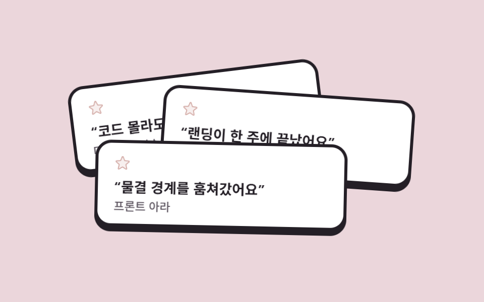
후기 스티커 세 장이 비스듬히 겹쳐 쌓여 있고 제 차례에 한 장씩 앞으로 나옵니다. 나오는 장은 기울기가 0도로 펴지면서 8px 들고, 차례가 지나면 제 각도로 물러납니다. 겹침 순서(z-index)는 고정하고 앞으로 나옴을 들어올림과 각도로만 표현했는데, z-index를 애니메이션하면 값이 계단으로 건너뛰어 카드가 깜빡이기 때문입니다.
<main class="stage">
  <section class="stickm">
    <article class="stickm__card stickm__card--one">
      <p class="stickm__stars" aria-label="별 5개 중 5개">
        <svg xmlns="http://www.w3.org/2000/svg" width="1em" height="1em" viewBox="0 0 256 256" aria-hidden="true" focusable="false"><g fill="currentColor"><path d="m229.06 108.79l-48.7 42l14.88 62.79a8.4 8.4 0 0 1-12.52 9.17L128 189.09l-54.72 33.65a8.4 8.4 0 0 1-12.52-9.17l14.88-62.79l-48.7-42A8.46 8.46 0 0 1 31.73 94l63.91-5.2l24.62-59.6a8.36 8.36 0 0 1 15.48 0l24.62 59.6l63.91 5.2a8.46 8.46 0 0 1 4.79 14.79" opacity=".2"/><path d="M239.18 97.26A16.38 16.38 0 0 0 224.92 86l-59-4.76l-22.78-55.09a16.36 16.36 0 0 0-30.27 0L90.11 81.23L31.08 86a16.46 16.46 0 0 0-9.37 28.86l45 38.83L53 211.75a16.38 16.38 0 0 0 24.5 17.82l50.5-31.08l50.53 31.08A16.4 16.4 0 0 0 203 211.75l-13.76-58.07l45-38.83a16.43 16.43 0 0 0 4.94-17.59m-15.34 5.47l-48.7 42a8 8 0 0 0-2.56 7.91l14.88 62.8a.37.37 0 0 1-.17.48c-.18.14-.23.11-.38 0l-54.72-33.65a8 8 0 0 0-8.38 0l-54.72 33.67c-.15.09-.19.12-.38 0a.37.37 0 0 1-.17-.48l14.88-62.8a8 8 0 0 0-2.56-7.91l-48.7-42c-.12-.1-.23-.19-.13-.5s.18-.27.33-.29l63.92-5.16a8 8 0 0 0 6.72-4.94l24.62-59.61c.08-.17.11-.25.35-.25s.27.08.35.25L153 91.86a8 8 0 0 0 6.75 4.92l63.92 5.16c.15 0 .24 0 .33.29s0 .4-.16.5"/></g></svg>
      </p>
      <p class="stickm__quote">“코드 몰라도 붙여서 됐어요”</p>
      <p class="stickm__name">디자이너 지수</p>
    </article>
    <article class="stickm__card stickm__card--two">
      <p class="stickm__stars" aria-label="별 5개 중 5개">
        <svg xmlns="http://www.w3.org/2000/svg" width="1em" height="1em" viewBox="0 0 256 256" aria-hidden="true" focusable="false"><g fill="currentColor"><path d="m229.06 108.79l-48.7 42l14.88 62.79a8.4 8.4 0 0 1-12.52 9.17L128 189.09l-54.72 33.65a8.4 8.4 0 0 1-12.52-9.17l14.88-62.79l-48.7-42A8.46 8.46 0 0 1 31.73 94l63.91-5.2l24.62-59.6a8.36 8.36 0 0 1 15.48 0l24.62 59.6l63.91 5.2a8.46 8.46 0 0 1 4.79 14.79" opacity=".2"/><path d="M239.18 97.26A16.38 16.38 0 0 0 224.92 86l-59-4.76l-22.78-55.09a16.36 16.36 0 0 0-30.27 0L90.11 81.23L31.08 86a16.46 16.46 0 0 0-9.37 28.86l45 38.83L53 211.75a16.38 16.38 0 0 0 24.5 17.82l50.5-31.08l50.53 31.08A16.4 16.4 0 0 0 203 211.75l-13.76-58.07l45-38.83a16.43 16.43 0 0 0 4.94-17.59m-15.34 5.47l-48.7 42a8 8 0 0 0-2.56 7.91l14.88 62.8a.37.37 0 0 1-.17.48c-.18.14-.23.11-.38 0l-54.72-33.65a8 8 0 0 0-8.38 0l-54.72 33.67c-.15.09-.19.12-.38 0a.37.37 0 0 1-.17-.48l14.88-62.8a8 8 0 0 0-2.56-7.91l-48.7-42c-.12-.1-.23-.19-.13-.5s.18-.27.33-.29l63.92-5.16a8 8 0 0 0 6.72-4.94l24.62-59.61c.08-.17.11-.25.35-.25s.27.08.35.25L153 91.86a8 8 0 0 0 6.75 4.92l63.92 5.16c.15 0 .24 0 .33.29s0 .4-.16.5"/></g></svg>
      </p>
      <p class="stickm__quote">“랜딩이 한 주에 끝났어요”</p>
      <p class="stickm__name">창업자 민준</p>
    </article>
    <article class="stickm__card stickm__card--three">
      <p class="stickm__stars" aria-label="별 5개 중 5개">
        <svg xmlns="http://www.w3.org/2000/svg" width="1em" height="1em" viewBox="0 0 256 256" aria-hidden="true" focusable="false"><g fill="currentColor"><path d="m229.06 108.79l-48.7 42l14.88 62.79a8.4 8.4 0 0 1-12.52 9.17L128 189.09l-54.72 33.65a8.4 8.4 0 0 1-12.52-9.17l14.88-62.79l-48.7-42A8.46 8.46 0 0 1 31.73 94l63.91-5.2l24.62-59.6a8.36 8.36 0 0 0 15.48 0l24.62 59.6l63.91 5.2a8.46 8.46 0 0 1 4.79 14.79" opacity=".2"/><path d="M239.18 97.26A16.38 16.38 0 0 0 224.92 86l-59-4.76l-22.78-55.09a16.36 16.36 0 0 0-30.27 0L90.11 81.23L31.08 86a16.46 16.46 0 0 0-9.37 28.86l45 38.83L53 211.75a16.38 16.38 0 0 0 24.5 17.82l50.5-31.08l50.53 31.08A16.4 16.4 0 0 0 203 211.75l-13.76-58.07l45-38.83a16.43 16.43 0 0 0 4.94-17.59m-15.34 5.47l-48.7 42a8 8 0 0 0-2.56 7.91l14.88 62.8a.37.37 0 0 1-.17.48c-.18.14-.23.11-.38 0l-54.72-33.65a8 8 0 0 0-8.38 0l-54.72 33.67c-.15.09-.19.12-.38 0a.37.37 0 0 1-.17-.48l14.88-62.8a8 8 0 0 0-2.56-7.91l-48.7-42c-.12-.1-.23-.19-.13-.5s.18-.27.33-.29l63.92-5.16a8 8 0 0 0 6.72-4.94l24.62-59.61c.08-.17.11-.25.35-.25s.27.08.35.25L153 91.86a8 8 0 0 0 6.75 4.92l63.92 5.16c.15 0 .24 0 .33.29s0 .4-.16.5"/></g></svg>
      </p>
      <p class="stickm__quote">“물결 경계를 훔쳐갔어요”</p>
      <p class="stickm__name">프론트 아라</p>
    </article>
  </section>
</main>@use "../../../../site/static/demo-tokens" as *;
// 멤피스 팔레트 — 01 과 같은 값
$mem-base: #fdf4ec;
$mem-sheet: #ffffff;
$mem-ink: #241f26;
$mem-stone: #5d5560;
$mem-coral: #d5aea9;
$mem-lemon: #cec29c;
$mem-sky: #82adc2;
$mem-mint: #71b9ab;
$mem-pink: #ebd6db;
$duration: $dur-loop; // 스티커 세 장이 한 바퀴 도는 주기
$easing: $ease-out; // 앞으로 나올 때도 물러날 때도 같은 속도로
$color: $mem-pink; // 무대(핑크)
@include stage($mem-pink);
.stickm {
position: relative;
width: clamp(240px, 76vw, 340px);
height: clamp(168px, 52vh, 232px);
}
// 후기 스티커 — 세 장이 비스듬히 겹쳐 쌓여 있다
.stickm__card {
position: absolute;
box-sizing: border-box;
width: clamp(176px, 56vw, 250px);
padding: $sp-3 $sp-4;
border-radius: $r-card;
background: $mem-sheet;
border: 3px solid $mem-ink;
box-shadow: 0 5px 0 $mem-ink;
animation: toFront $duration $easing infinite;
}
.stickm__card--one {
left: 0;
top: 6px;
z-index: 1;
--tilt: -7deg;
}
.stickm__card--two {
right: 0;
top: 26px;
z-index: 2;
--tilt: 4deg;
animation-delay: -.6667s;
}
.stickm__card--three {
left: 24px;
bottom: 0;
z-index: 3;
--tilt: 9deg;
animation-delay: -1.3333s;
}
.stickm__stars {
margin: 0 0 $sp-1;
color: $mem-coral;
font-size: 16px;
line-height: 1;
}
.stickm__quote {
margin: 0;
color: $mem-ink;
font-weight: 700; font-size: clamp(12px, 2.9vw, 14.5px); line-height: 1.35;
font-family: inherit;
}
.stickm__name {
margin: $sp-1 0 0;
color: $mem-stone;
font-weight: 500; font-size: clamp(10px, 2.4vw, 11.5px); line-height: 1;
font-family: inherit;
}
// 제 차례(자기 1/3 창)에 기울기가 펴지며 8px 들어와 앞으로 나오고, 창이 끝나면 제 각도로 물러난다
@keyframes toFront {
0% { transform: rotate(var(--tilt)) translateY(0); }
6%, 28% { transform: rotate(0deg) translateY(-8px); }
34%, 100% { transform: rotate(var(--tilt)) translateY(0); }
}
@media (max-width: 340px), (max-height: 220px) {
.stickm { width: 216px; height: 156px; }
.stickm__card { width: 160px; padding: $sp-2 $sp-3; }
.stickm__card--two { top: 22px; }
.stickm__card--three { left: 16px; }
.stickm__stars { font-size: 13px; }
.stickm__quote { font-size: 11px; }
.stickm__name { font-size: 9.5px; }
}
@media (prefers-reduced-motion: reduce) {
.stickm__card { animation: none !important; transform: rotate(var(--tilt)); }
}html, body {
margin: 0;
overflow: hidden;
}
.stage {
box-sizing: border-box;
min-height: 100vh;
display: grid;
place-items: center;
margin: 0;
background: #ebd6db;
font-family: -apple-system, "Segoe UI", "Noto Sans KR", sans-serif;
padding: clamp(8px, 4vw, 24px);
}
.stickm {
position: relative;
width: clamp(240px, 76vw, 340px);
height: clamp(168px, 52vh, 232px);
}
.stickm__card {
position: absolute;
box-sizing: border-box;
width: clamp(176px, 56vw, 250px);
padding: 12px 16px;
border-radius: 16px;
background: #ffffff;
border: 3px solid #241f26;
box-shadow: 0 5px 0 #241f26;
animation: toFront 2s ease-out infinite;
}
.stickm__card--one {
left: 0;
top: 6px;
z-index: 1;
--tilt: -7deg;
}
.stickm__card--two {
right: 0;
top: 26px;
z-index: 2;
--tilt: 4deg;
animation-delay: -0.6667s;
}
.stickm__card--three {
left: 24px;
bottom: 0;
z-index: 3;
--tilt: 9deg;
animation-delay: -1.3333s;
}
.stickm__stars {
margin: 0 0 4px;
color: #d5aea9;
font-size: 16px;
line-height: 1;
}
.stickm__quote {
margin: 0;
color: #241f26;
font-weight: 700;
font-size: clamp(12px, 2.9vw, 14.5px);
line-height: 1.35;
font-family: inherit;
}
.stickm__name {
margin: 4px 0 0;
color: #5d5560;
font-weight: 500;
font-size: clamp(10px, 2.4vw, 11.5px);
line-height: 1;
font-family: inherit;
}
@keyframes toFront {
0% {
transform: rotate(var(--tilt)) translateY(0);
}
6%, 28% {
transform: rotate(0deg) translateY(-8px);
}
34%, 100% {
transform: rotate(var(--tilt)) translateY(0);
}
}
@media (max-width: 340px), (max-height: 220px) {
.stickm {
width: 216px;
height: 156px;
}
.stickm__card {
width: 160px;
padding: 8px 12px;
}
.stickm__card--two {
top: 22px;
}
.stickm__card--three {
left: 16px;
}
.stickm__stars {
font-size: 13px;
}
.stickm__quote {
font-size: 11px;
}
.stickm__name {
font-size: 9.5px;
}
}
@media (prefers-reduced-motion: reduce) {
.stickm__card {
animation: none !important;
transform: rotate(var(--tilt));
}
}import type { CSSProperties, ReactNode } from "react";
import styles from "./StickerTestimonialMemphis.module.scss";
export type StickerTestimonialMemphisItem = { quote: string; name: string };
export type StickerTestimonialMemphisProps = {
/** 후기 스티커 3장 */
items?: StickerTestimonialMemphisItem[];
/** 별점 스크린리더 라벨 */
starsLabel?: string;
/** 한 주기(기본 2000ms) */
duration?: number;
easing?: string;
/** 데모 무대 색(참고용) */
color?: string;
};
type Vars = CSSProperties & { "--duration"?: string; "--easing"?: string; "--color"?: string };
/* Phosphor duotone 별 — 색은 currentColor(코랄) */
const STAR: ReactNode = (
<svg xmlns="http://www.w3.org/2000/svg" width="1em" height="1em" viewBox="0 0 256 256" aria-hidden="true" focusable="false"><g fill="currentColor"><path d="m229.06 108.79l-48.7 42l14.88 62.79a8.4 8.4 0 0 1-12.52 9.17L128 189.09l-54.72 33.65a8.4 8.4 0 0 1-12.52-9.17l14.88-62.79l-48.7-42A8.46 8.46 0 0 1 31.73 94l63.91-5.2l24.62-59.6a8.36 8.36 0 0 1 15.48 0l24.62 59.6l63.91 5.2a8.46 8.46 0 0 1 4.79 14.79" opacity=".2"/><path d="M239.18 97.26A16.38 16.38 0 0 0 224.92 86l-59-4.76l-22.78-55.09a16.36 16.36 0 0 0-30.27 0L90.11 81.23L31.08 86a16.46 16.46 0 0 0-9.37 28.86l45 38.83L53 211.75a16.38 16.38 0 0 0 24.5 17.82l50.5-31.08l50.53 31.08A16.4 16.4 0 0 0 203 211.75l-13.76-58.07l45-38.83a16.43 16.43 0 0 0 4.94-17.59m-15.34 5.47l-48.7 42a8 8 0 0 0-2.56 7.91l14.88 62.8a.37.37 0 0 1-.17.48c-.18.14-.23.11-.38 0l-54.72-33.65a8 8 0 0 0-8.38 0l-54.72 33.67c-.15.09-.19.12-.38 0a.37.37 0 0 1-.17-.48l14.88-62.8a8 8 0 0 0-2.56-7.91l-48.7-42c-.12-.1-.23-.19-.13-.5s.18-.27.33-.29l63.92-5.16a8 8 0 0 0 6.72-4.94l24.62-59.61c.08-.17.11-.25.35-.25s.27.08.35.25L153 91.86a8 8 0 0 0 6.75 4.92l63.92 5.16c.15 0 .24 0 .33.29s0 .4-.16.5"/></g></svg>
);
const CARDS = [styles.cardOne, styles.cardTwo, styles.cardThree];
export default function StickerTestimonialMemphis({
items = [
{ quote: "“코드 몰라도 붙여서 됐어요”", name: "디자이너 지수" },
{ quote: "“랜딩이 한 주에 끝났어요”", name: "창업자 민준" },
{ quote: "“물결 경계를 훔쳐갔어요”", name: "프론트 아라" },
],
starsLabel = "별 5개 중 5개",
duration = 2000,
easing = "ease-out",
color = "#ff8fab",
}: StickerTestimonialMemphisProps) {
const vars: Vars = { "--duration": `${duration}ms`, "--easing": easing, "--color": color };
return (
<section className={styles.stickm} style={vars}>
{items.map((it, i) => (
<article key={it.name} className={`${styles.card} ${CARDS[i % CARDS.length]}`}>
<p className={styles.stars} aria-label={starsLabel}>{STAR}</p>
<p className={styles.quote}>{it.quote}</p>
<p className={styles.name}>{it.name}</p>
</article>
))}
</section>
);
}05 · 스티커 후기 더미 — 측정 누적면적 15.901% · 움직인 프레임 11/23GODRICH 원작 · zip 에 SCSS·React 포함 · 비밀번호 보기
코드 읽는 법
움직인 프레임은 11/23.
.stickm__card {
  --tilt: -7deg;                       // 제자리 각도
  animation: toFront 2s ease-out infinite;
}
.stickm__card--two   { animation-delay: -.6667s; }
.stickm__card--three { animation-delay: -1.3333s; }
@keyframes toFront {
  0%        { transform: rotate(var(--tilt)) translateY(0); }
  6%, 28%   { transform: rotate(0deg) translateY(-8px); }
  34%, 100% { transform: rotate(var(--tilt)) translateY(0); }
}
06패턴 머리띠 요금제
어떤 움직임인가
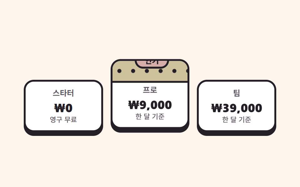
가운데 추천 플랜만 점 무늬 머리띠와 인기 배지를 답니다. 플랜이 6px 들었다 앉는 동안 배지는 반 주기 딜레이로 반대 위상에 맥박치는데, 플랜이 가장 높을 때 배지가 가장 작고 플랜이 내려앉을 때 배지가 커집니다. 두 움직임이 엇갈리면 카드 하나가 움직이는 것보다 살아 있는 인상이 됩니다.
<main class="stage">
  <section class="pricem">
    <article class="pricem__plan">
      <h2 class="pricem__tier">스타터</h2>
      <p class="pricem__price">₩0</p>
      <p class="pricem__per">영구 무료</p>
    </article>
    <article class="pricem__plan pricem__plan--best">
      <span class="pricem__badge">인기</span>
      <h2 class="pricem__tier">프로</h2>
      <p class="pricem__price">₩9,000</p>
      <p class="pricem__per">한 달 기준</p>
    </article>
    <article class="pricem__plan">
      <h2 class="pricem__tier">팀</h2>
      <p class="pricem__price">₩39,000</p>
      <p class="pricem__per">한 달 기준</p>
    </article>
  </section>
</main>
@use "../../../../site/static/demo-tokens" as *;
// 멤피스 팔레트 — 01 과 같은 값
$mem-base: #fdf4ec;
$mem-sheet: #ffffff;
$mem-ink: #241f26;
$mem-stone: #5d5560;
$mem-coral: #d5aea9;
$mem-lemon: #cec29c;
$mem-sky: #82adc2;
$mem-mint: #71b9ab;
$mem-pink: #ebd6db;
$duration: $dur-loop; // 추천 플랜이 들렀다 앉는 한 주기
$easing: $ease-out; // 둥실 — 튕기지 않는다
$color: $mem-lemon; // 추천 플랜의 점 무늬 머리띠 색
@include stage($mem-base);
.pricem {
box-sizing: border-box;
display: flex;
align-items: flex-end;
gap: $sp-3;
width: clamp(280px, 88vw, 404px);
padding-top: $sp-3;
}
.pricem__plan {
position: relative;
box-sizing: border-box;
flex: 1 1 0;
padding: $sp-3 $sp-2 $sp-3;
border-radius: $r-card;
background: $mem-sheet;
border: 3px solid $mem-ink;
box-shadow: 0 6px 0 $mem-ink;
text-align: center;
}
// 추천 플랜 — 점 무늬 머리띠(반경 그라디언트)를 이고 혼자서 둥실 뜬다
.pricem__plan--best {
padding-top: $sp-10;
overflow: hidden;
animation: bestFloat $duration $easing infinite;
}
.pricem__plan--best::before {
content: "";
position: absolute;
left: 0;
right: 0;
top: 0;
height: 32px;
border-bottom: 3px solid $mem-ink;
background-color: $color;
background-image: radial-gradient(circle at 11px 16px, $mem-ink 0 3px, transparent 3.5px);
background-size: 22px 22px;
}
// 인기 배지 — 머리띠 위에 걸터앉은 동그라미. 플랜과 반대 위상으로 맥박친다
.pricem__badge {
position: absolute;
z-index: 1;
top: -14px;
left: 50%;
margin-left: -24px;
width: 48px;
padding: $sp-1 0;
border-radius: $r-pill;
background: $mem-coral;
border: 3px solid $mem-ink;
color: $mem-ink;
font-weight: 800; font-size: 12px; line-height: 1;
font-family: inherit;
animation: badgePulse $duration $easing infinite;
animation-delay: -1s; // 반 주기 딜레이 = 플랜과 반대 위상
}
.pricem__tier {
margin: 0;
color: $mem-stone;
font-weight: 700; font-size: clamp(11px, 2.6vw, 13px); line-height: 1;
font-family: inherit;
}
.pricem__price {
margin: $sp-2 0 0;
color: $mem-ink;
font-weight: 800; font-size: clamp(16px, 4vw, 22px); line-height: 1;
font-family: inherit;
}
.pricem__per {
margin: $sp-1 0 0;
color: $mem-stone;
font-weight: 500; font-size: clamp(10px, 2.4vw, 11px); line-height: 1;
font-family: inherit;
}
// 플랜은 6px 둥실, 배지는 그 반대 위상(반 주기 딜레이)으로 크기 맥박
@keyframes bestFloat {
0%, 100% { transform: translateY(0); }
50% { transform: translateY(-6px); }
}
@keyframes badgePulse {
0%, 100% { transform: scale(1); }
50% { transform: scale(1.12); }
}
@media (max-width: 340px), (max-height: 220px) {
.pricem { width: 248px; gap: $sp-2; }
.pricem__plan { padding: $sp-2 $sp-1; }
.pricem__plan--best { padding-top: $sp-8; }
.pricem__plan--best::before { height: 26px; }
.pricem__badge { width: 40px; margin-left: -20px; top: -12px; font-size: 10px; }
.pricem__price { font-size: 14px; }
}
@media (prefers-reduced-motion: reduce) {
.pricem__plan--best, .pricem__badge { animation: none !important; transform: none; }
}html, body {
margin: 0;
overflow: hidden;
}
.stage {
box-sizing: border-box;
min-height: 100vh;
display: grid;
place-items: center;
margin: 0;
background: #fdf4ec;
font-family: -apple-system, "Segoe UI", "Noto Sans KR", sans-serif;
padding: clamp(8px, 4vw, 24px);
}
.pricem {
box-sizing: border-box;
display: flex;
align-items: flex-end;
gap: 12px;
width: clamp(280px, 88vw, 404px);
padding-top: 12px;
}
.pricem__plan {
position: relative;
box-sizing: border-box;
flex: 1 1 0;
padding: 12px 8px 12px;
border-radius: 16px;
background: #ffffff;
border: 3px solid #241f26;
box-shadow: 0 6px 0 #241f26;
text-align: center;
}
.pricem__plan--best {
padding-top: 40px;
overflow: hidden;
animation: bestFloat 2s ease-out infinite;
}
.pricem__plan--best::before {
content: "";
position: absolute;
left: 0;
right: 0;
top: 0;
height: 32px;
border-bottom: 3px solid #241f26;
background-color: #cec29c;
background-image: radial-gradient(circle at 11px 16px, #241f26 0 3px, transparent 3.5px);
background-size: 22px 22px;
}
.pricem__badge {
position: absolute;
z-index: 1;
top: -14px;
left: 50%;
margin-left: -24px;
width: 48px;
padding: 4px 0;
border-radius: 999px;
background: #d5aea9;
border: 3px solid #241f26;
color: #241f26;
font-weight: 800;
font-size: 12px;
line-height: 1;
font-family: inherit;
animation: badgePulse 2s ease-out infinite;
animation-delay: -1s;
}
.pricem__tier {
margin: 0;
color: #5d5560;
font-weight: 700;
font-size: clamp(11px, 2.6vw, 13px);
line-height: 1;
font-family: inherit;
}
.pricem__price {
margin: 8px 0 0;
color: #241f26;
font-weight: 800;
font-size: clamp(16px, 4vw, 22px);
line-height: 1;
font-family: inherit;
}
.pricem__per {
margin: 4px 0 0;
color: #5d5560;
font-weight: 500;
font-size: clamp(10px, 2.4vw, 11px);
line-height: 1;
font-family: inherit;
}
@keyframes bestFloat {
0%, 100% {
transform: translateY(0);
}
50% {
transform: translateY(-6px);
}
}
@keyframes badgePulse {
0%, 100% {
transform: scale(1);
}
50% {
transform: scale(1.12);
}
}
@media (max-width: 340px), (max-height: 220px) {
.pricem {
width: 248px;
gap: 8px;
}
.pricem__plan {
padding: 8px 4px;
}
.pricem__plan--best {
padding-top: 32px;
}
.pricem__plan--best::before {
height: 26px;
}
.pricem__badge {
width: 40px;
margin-left: -20px;
top: -12px;
font-size: 10px;
}
.pricem__price {
font-size: 14px;
}
}
@media (prefers-reduced-motion: reduce) {
.pricem__plan--best, .pricem__badge {
animation: none !important;
transform: none;
}
}import type { CSSProperties } from "react";
import styles from "./PricingMemphis.module.scss";
export type PricingMemphisPlan = { tier: string; price: string; per: string; best?: boolean };
export type PricingMemphisProps = {
/** 플랜 3개. best 가 true 인 플랜이 점 무늬 머리띠를 이고 뜬다 */
plans?: PricingMemphisPlan[];
/** 추천 플랜 배지 글자 */
badge?: string;
/** 한 주기(기본 2000ms) */
duration?: number;
easing?: string;
/** 추천 플랜의 점 무늬 머리띠 색 */
color?: string;
};
type Vars = CSSProperties & { "--duration"?: string; "--easing"?: string; "--color"?: string };
export default function PricingMemphis({
plans = [
{ tier: "스타터", price: "₩0", per: "영구 무료" },
{ tier: "프로", price: "₩9,000", per: "한 달 기준", best: true },
{ tier: "팀", price: "₩39,000", per: "한 달 기준" },
],
badge = "인기",
duration = 2000,
easing = "ease-out",
color = "#ffcf33",
}: PricingMemphisProps) {
const vars: Vars = { "--duration": `${duration}ms`, "--easing": easing, "--color": color };
return (
<section className={styles.pricem} style={vars}>
{plans.map((p) => (
<article
key={p.tier}
className={p.best ? `${styles.plan} ${styles.planBest}` : styles.plan}
>
{p.best ? <span className={styles.badge}>{badge}</span> : null}
<h2 className={styles.tier}>{p.tier}</h2>
<p className={styles.price}>{p.price}</p>
<p className={styles.per}>{p.per}</p>
</article>
))}
</section>
);
}06 · 패턴 머리띠 요금제 — 측정 누적면적 5.376% · 움직인 프레임 23/23GODRICH 원작 · zip 에 SCSS·React 포함 · 비밀번호 보기
어디를 바꾸면 되나
누적면적 5.376%, 23/23 프레임.
.pricem__plan--best { animation: bestFloat 2s ease-out infinite; }
.pricem__badge {
  animation: badgePulse 2s ease-out infinite;
  animation-delay: -1s;                // 반 주기 = 반대 위상
}
@keyframes bestFloat { 0%, 100% { transform: translateY(0); } 50% { transform: translateY(-6px); } }
@keyframes badgePulse { 0%, 100% { transform: scale(1); } 50% { transform: scale(1.12); } }
07지그재그 구분선
무엇이 보이나
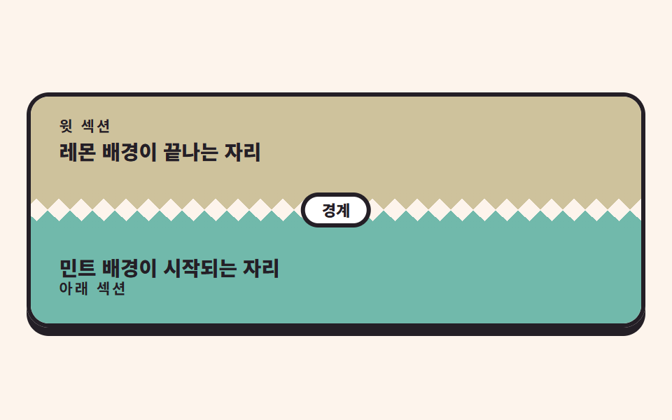
두 섹션 사이에 톱니 두 줄을 넣고 서로 반대 방향으로 흘려 지퍼처럼 맞물리게 합니다. 톱니 하나는 conic-gradient 쐐기인데, 아래를 향하는 이는 꼭짓점을 타일 아래 변에 두고 from 315deg, 위를 향하는 이는 꼭짓점을 위 변에 두고 from 135deg 에 반 타일(8px) 오프셋을 줍니다. 흐름은 타일 두 칸(32px)만큼 이동합니다. 무늬가 주기적이므로 순환 지점에 이음매가 없습니다.
<main class="stage">
  <section class="zzm">
    <header class="zzm__sec zzm__sec--top">
      <p class="zzm__kicker">윗 섹션</p>
      <h2 class="zzm__head">레몬 배경이 끝나는 자리</h2>
    </header>
    <div class="zzm__zip" aria-hidden="true">
      <span class="zzm__teeth zzm__teeth--down"></span>
      <span class="zzm__teeth zzm__teeth--up"></span>
      <span class="zzm__chip">경계</span>
    </div>
    <footer class="zzm__sec zzm__sec--bottom">
      <h2 class="zzm__head">민트 배경이 시작되는 자리</h2>
      <p class="zzm__kicker">아래 섹션</p>
    </footer>
  </section>
</main>
@use "../../../../site/static/demo-tokens" as *;
// 멤피스 팔레트 — 01 과 같은 값
$mem-base: #fdf4ec;
$mem-sheet: #ffffff;
$mem-ink: #241f26;
$mem-stone: #5d5560;
$mem-coral: #d5aea9;
$mem-lemon: #cec29c;
$mem-sky: #82adc2;
$mem-mint: #71b9ab;
$mem-pink: #ebd6db;
$tile: 16px; // 톱니 하나의 폭 — 두 줄이 같아야 맞물린다
$duration: $dur-loop; // 톱니가 타일 두 칸만큼 흐르는 주기
$easing: linear; // 맞물림은 일정 속도로 흘러야 쉬지 않고 물려 있다
$color: $mem-lemon; // 윗 섹션 색
@include stage($mem-base);
.zzm {
box-sizing: border-box;
width: clamp(280px, 92vw, 448px);
border: 3px solid $mem-ink;
border-radius: $r-card;
overflow: hidden;
box-shadow: 0 6px 0 $mem-ink;
}
.zzm__sec {
box-sizing: border-box;
padding: $sp-4 $sp-5;
}
.zzm__sec--top { background: $mem-lemon; }
.zzm__sec--bottom { background: $mem-mint; }
.zzm__kicker {
margin: 0 0 $sp-1;
color: $mem-ink;
font-weight: 700; font-size: clamp(9px, 2.2vw, 10.5px); line-height: 1;
font-family: inherit;
letter-spacing: .14em;
}
.zzm__head {
margin: 0;
color: $mem-ink;
font-weight: 800; font-size: clamp(13px, 3vw, 16px); line-height: 1.3;
font-family: inherit;
}
// 지퍼 띠 — 높이 32px(톱니 16 + 겹침 16). 두 줄이 반대 방향으로 흘러 맞물린다
.zzm__zip {
position: relative;
height: 32px;
background: $mem-base; // 맞물림 사이로 보이는 바탕
}
.zzm__teeth {
position: absolute;
top: 0;
left: 0;
width: 200%;
height: 32px;
}
// 윗 색의 이 — 아래로 뻗는 쐐기(꼭짓점이 타일 아래쪽 변). 타일 16px
.zzm__teeth--down {
background: conic-gradient(from 315deg at 50% 100%, $mem-lemon 0 90deg, transparent 90deg 360deg);
background-size: $tile $tile;
background-repeat: repeat-x;
animation: teethFlow $duration $easing infinite;
}
// 아랫 색의 이 — 위로 뻗되 타일 절반(8px) 옆으로 밀려 옆 이와 빈틈없이 물린다
.zzm__teeth--up {
top: 16px;
background: conic-gradient(from 135deg at 50% 0%, $mem-mint 0 90deg, transparent 90deg 360deg);
background-size: $tile $tile;
background-repeat: repeat-x;
background-position: 8px 0;
animation: teethFlow $duration $easing infinite reverse; // reverse = 반대 방향
}
// 가운데 알약 — 경계임을 알리는 표식(정지)
.zzm__chip {
position: absolute;
z-index: 1;
top: 50%;
left: 50%;
transform: translate(-50%, -50%);
padding: $sp-1 $sp-3;
border-radius: $r-pill;
background: $mem-sheet;
border: 3px solid $mem-ink;
color: $mem-ink;
font-weight: 800; font-size: 11px; line-height: 1;
font-family: inherit;
}
// 타일 두 칸(32px)만큼 흐른 뒤 처음과 같은 무늬 — 이동 거리가 주기의 배수라 텔레포트가 없다
@keyframes teethFlow {
from { transform: translateX(0); }
to { transform: translateX(-2 * $tile); }
}
@media (max-width: 340px), (max-height: 220px) {
.zzm { width: 244px; }
.zzm__sec { padding: $sp-3 $sp-4; }
.zzm__head { font-size: 12px; }
}
@media (prefers-reduced-motion: reduce) {
.zzm__teeth { animation: none !important; transform: none; }
}html, body {
margin: 0;
overflow: hidden;
}
.stage {
box-sizing: border-box;
min-height: 100vh;
display: grid;
place-items: center;
margin: 0;
background: #fdf4ec;
font-family: -apple-system, "Segoe UI", "Noto Sans KR", sans-serif;
padding: clamp(8px, 4vw, 24px);
}
.zzm {
box-sizing: border-box;
width: clamp(280px, 92vw, 448px);
border: 3px solid #241f26;
border-radius: 16px;
overflow: hidden;
box-shadow: 0 6px 0 #241f26;
}
.zzm__sec {
box-sizing: border-box;
padding: 16px 20px;
}
.zzm__sec--top {
background: #cec29c;
}
.zzm__sec--bottom {
background: #71b9ab;
}
.zzm__kicker {
margin: 0 0 4px;
color: #241f26;
font-weight: 700;
font-size: clamp(9px, 2.2vw, 10.5px);
line-height: 1;
font-family: inherit;
letter-spacing: 0.14em;
}
.zzm__head {
margin: 0;
color: #241f26;
font-weight: 800;
font-size: clamp(13px, 3vw, 16px);
line-height: 1.3;
font-family: inherit;
}
.zzm__zip {
position: relative;
height: 32px;
background: #fdf4ec;
}
.zzm__teeth {
position: absolute;
top: 0;
left: 0;
width: 200%;
height: 32px;
}
.zzm__teeth--down {
background: conic-gradient(from 315deg at 50% 100%, #cec29c 0 90deg, transparent 90deg 360deg);
background-size: 16px 16px;
background-repeat: repeat-x;
animation: teethFlow 2s linear infinite;
}
.zzm__teeth--up {
top: 16px;
background: conic-gradient(from 135deg at 50% 0%, #71b9ab 0 90deg, transparent 90deg 360deg);
background-size: 16px 16px;
background-repeat: repeat-x;
background-position: 8px 0;
animation: teethFlow 2s linear infinite reverse;
}
.zzm__chip {
position: absolute;
z-index: 1;
top: 50%;
left: 50%;
transform: translate(-50%, -50%);
padding: 4px 12px;
border-radius: 999px;
background: #ffffff;
border: 3px solid #241f26;
color: #241f26;
font-weight: 800;
font-size: 11px;
line-height: 1;
font-family: inherit;
}
@keyframes teethFlow {
from {
transform: translateX(0);
}
to {
transform: translateX(-32px);
}
}
@media (max-width: 340px), (max-height: 220px) {
.zzm {
width: 244px;
}
.zzm__sec {
padding: 12px 16px;
}
.zzm__head {
font-size: 12px;
}
}
@media (prefers-reduced-motion: reduce) {
.zzm__teeth {
animation: none !important;
transform: none;
}
}import type { CSSProperties } from "react";
import styles from "./ZigzagDividerMemphis.module.scss";
export type ZigzagDividerMemphisProps = {
topKicker?: string;
topHead?: string;
bottomHead?: string;
bottomKicker?: string;
chip?: string;
/** 한 주기(기본 2000ms) */
duration?: number;
easing?: string;
/** 윗 섹션 색(데모 기준값 — 톱니 색은 고정) */
color?: string;
};
type Vars = CSSProperties & { "--duration"?: string; "--easing"?: string; "--color"?: string };
export default function ZigzagDividerMemphis({
topKicker = "윗 섹션",
topHead = "레몬 배경이 끝나는 자리",
bottomHead = "민트 배경이 시작되는 자리",
bottomKicker = "아래 섹션",
chip = "경계",
duration = 2000,
easing = "linear",
color = "#ffcf33",
}: ZigzagDividerMemphisProps) {
const vars: Vars = { "--duration": `${duration}ms`, "--easing": easing, "--color": color };
return (
<section className={styles.zzm} style={vars}>
<header className={`${styles.sec} ${styles.secTop}`}>
<p className={styles.kicker}>{topKicker}</p>
<h2 className={styles.head}>{topHead}</h2>
</header>
<div className={styles.zip} aria-hidden="true">
<span className={`${styles.teeth} ${styles.teethDown}`} />
<span className={`${styles.teeth} ${styles.teethUp}`} />
<span className={styles.chip}>{chip}</span>
</div>
<footer className={`${styles.sec} ${styles.secBottom}`}>
<h2 className={styles.head}>{bottomHead}</h2>
<p className={styles.kicker}>{bottomKicker}</p>
</footer>
</section>
);
}07 · 지그재그 구분선 — 측정 누적면적 3.781% · 움직인 프레임 23/23GODRICH 원작 · zip 에 SCSS·React 포함 · 비밀번호 보기
코드에서 볼 곳
두 줄이 같은 타일 폭(16px)을 쓰는 것이 맞물림의 조건입니다.
.zzm__teeth--down {
  height: 32px;
  background: conic-gradient(from 315deg at 50% 100%, #ffcf33 0 90deg, transparent 90deg 360deg);
  background-size: 16px 16px; background-repeat: repeat-x;
  animation: teethFlow 2s linear infinite;
}
.zzm__teeth--up {
  top: 16px;
  background: conic-gradient(from 135deg at 50% 0%, #2ec4a6 0 90deg, transparent 90deg 360deg);
  background-size: 16px 16px; background-repeat: repeat-x; background-position: 8px 0;
  animation: teethFlow 2s linear infinite reverse;   // 반대 방향
}
@keyframes teethFlow { from { transform: translateX(0); } to { transform: translateX(-32px); } }
08패턴 마퀴 띠
화면에서 일어나는 일
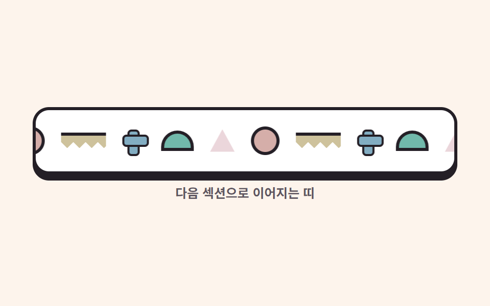
점·물결·십자·반원·삼각 조각 다섯 개를 한 벌로 만들고 그대로 두 벌 깔았습니다. 트랙의 실측 폭은 460px, 한 벌(조각 다섯 개와 오른쪽 여백 다섯 개)은 230px로 정확히 절반이므로 translateX(-50%) 는 230px 이동과 같고 한 바퀴가 끝나는 순간 화면이 첫 프레임과 같습니다.
<main class="stage">
  <section class="marqm" aria-label="패턴 마퀴 띠">
    <div class="marqm__viewport">
      <div class="marqm__track">
        <span class="marqm__tok marqm__tok--dot"></span>
        <span class="marqm__tok marqm__tok--squig"></span>
        <span class="marqm__tok marqm__tok--cross"></span>
        <span class="marqm__tok marqm__tok--half"></span>
        <span class="marqm__tok marqm__tok--tri"></span>
        <span class="marqm__tok marqm__tok--dot"></span>
        <span class="marqm__tok marqm__tok--squig"></span>
        <span class="marqm__tok marqm__tok--cross"></span>
        <span class="marqm__tok marqm__tok--half"></span>
        <span class="marqm__tok marqm__tok--tri"></span>
      </div>
    </div>
    <p class="marqm__hint">다음 섹션으로 이어지는 띠</p>
  </section>
</main>
@use "../../../../site/static/demo-tokens" as *;
// 멤피스 팔레트 — 01 과 같은 값
$mem-base: #fdf4ec;
$mem-sheet: #ffffff;
$mem-ink: #241f26;
$mem-stone: #5d5560;
$mem-coral: #d5aea9;
$mem-lemon: #cec29c;
$mem-sky: #82adc2;
$mem-mint: #71b9ab;
$mem-pink: #ebd6db;
$duration: $dur-loop; // 조각 한 벌이 띠를 한 바퀴 도는 주기
$easing: linear; // 흐름은 일정 속도 — 절반 지점과 한 바퀴 지점이 픽셀까지 같아야 한다
$color: $mem-coral; // 점 조각의 색
@include stage($mem-base);
.marqm {
box-sizing: border-box;
width: clamp(272px, 90vw, 416px);
}
.marqm__viewport {
overflow: hidden;
border-radius: $r-card;
background: $mem-sheet;
border: 3px solid $mem-ink;
box-shadow: 0 6px 0 $mem-ink;
}
// 트랙 — 같은 다섯 조각을 두 벌 깐다. 간격은 gap 이 아니라 margin-right(2N 개 사이 gap 은 2N-1 개라 -50% 가 어긋난다)
.marqm__track {
display: flex;
width: max-content;
align-items: center;
padding: $sp-4 0;
animation: trackFlow $duration $easing infinite;
}
.marqm__tok {
margin-right: $sp-4;
}
// 점 — 동그라미 하나
.marqm__tok--dot {
width: 22px;
height: 22px;
border-radius: 50%;
background: $color;
border: 3px solid $mem-ink;
}
// 물결 — 톱니 원뿔 한 줄짜리 리본
.marqm__tok--squig {
width: 44px;
height: 12px;
background: conic-gradient(from 315deg at 50% 100%, $mem-lemon 0 90deg, transparent 90deg 360deg) 0 0 / 12px 12px repeat-x;
border-top: 3px solid $mem-ink;
}
// 십자 — 막대 두 개
.marqm__tok--cross {
position: relative;
width: 22px;
height: 22px;
}
.marqm__tok--cross::before,
.marqm__tok--cross::after {
content: "";
position: absolute;
background: $mem-sky;
border: 2px solid $mem-ink;
border-radius: $r-xs;
}
.marqm__tok--cross::before { left: 50%; top: 0; width: 8px; height: 100%; transform: translateX(-50%); }
.marqm__tok--cross::after { top: 50%; left: 0; height: 8px; width: 100%; transform: translateY(-50%); }
// 반원
.marqm__tok--half {
width: 26px;
height: 14px;
border-radius: $r-pill $r-pill 0 0;
background: $mem-mint;
border: 3px solid $mem-ink;
}
// 삼각
.marqm__tok--tri {
width: 24px;
height: 22px;
background: $mem-pink;
clip-path: polygon(50% 0, 100% 100%, 0 100%);
}
.marqm__hint {
margin: $sp-3 0 0;
color: $mem-stone;
font-weight: 600; font-size: clamp(11px, 2.6vw, 13px); line-height: 1;
font-family: inherit;
text-align: center;
}
// 한 벌만큼(-50%) 민다 — 두 벌이 픽셀 단위로 같으므로 이음매가 없다
@keyframes trackFlow {
from { transform: translateX(0); }
to { transform: translateX(-50%); }
}
@media (max-width: 340px), (max-height: 220px) {
.marqm { width: 240px; }
.marqm__track { padding: $sp-3 0; }
.marqm__tok { margin-right: $sp-3; }
.marqm__tok--dot { width: 18px; height: 18px; }
.marqm__tok--squig { width: 36px; }
.marqm__tok--cross { width: 18px; height: 18px; }
.marqm__tok--half { width: 22px; height: 12px; }
.marqm__tok--tri { width: 20px; height: 18px; }
.marqm__hint { margin-top: $sp-2; font-size: 10px; }
}
@media (prefers-reduced-motion: reduce) {
.marqm__track { animation: none !important; transform: none; }
}html, body {
margin: 0;
overflow: hidden;
}
.stage {
box-sizing: border-box;
min-height: 100vh;
display: grid;
place-items: center;
margin: 0;
background: #fdf4ec;
font-family: -apple-system, "Segoe UI", "Noto Sans KR", sans-serif;
padding: clamp(8px, 4vw, 24px);
}
.marqm {
box-sizing: border-box;
width: clamp(272px, 90vw, 416px);
}
.marqm__viewport {
overflow: hidden;
border-radius: 16px;
background: #ffffff;
border: 3px solid #241f26;
box-shadow: 0 6px 0 #241f26;
}
.marqm__track {
display: flex;
width: max-content;
align-items: center;
padding: 16px 0;
animation: trackFlow 2s linear infinite;
}
.marqm__tok {
margin-right: 16px;
}
.marqm__tok--dot {
width: 22px;
height: 22px;
border-radius: 50%;
background: #d5aea9;
border: 3px solid #241f26;
}
.marqm__tok--squig {
width: 44px;
height: 12px;
background: conic-gradient(from 315deg at 50% 100%, #cec29c 0 90deg, transparent 90deg 360deg) 0 0/12px 12px repeat-x;
border-top: 3px solid #241f26;
}
.marqm__tok--cross {
position: relative;
width: 22px;
height: 22px;
}
.marqm__tok--cross::before,
.marqm__tok--cross::after {
content: "";
position: absolute;
background: #82adc2;
border: 2px solid #241f26;
border-radius: 4px;
}
.marqm__tok--cross::before {
left: 50%;
top: 0;
width: 8px;
height: 100%;
transform: translateX(-50%);
}
.marqm__tok--cross::after {
top: 50%;
left: 0;
height: 8px;
width: 100%;
transform: translateY(-50%);
}
.marqm__tok--half {
width: 26px;
height: 14px;
border-radius: 999px 999px 0 0;
background: #71b9ab;
border: 3px solid #241f26;
}
.marqm__tok--tri {
width: 24px;
height: 22px;
background: #ebd6db;
clip-path: polygon(50% 0, 100% 100%, 0 100%);
}
.marqm__hint {
margin: 12px 0 0;
color: #5d5560;
font-weight: 600;
font-size: clamp(11px, 2.6vw, 13px);
line-height: 1;
font-family: inherit;
text-align: center;
}
@keyframes trackFlow {
from {
transform: translateX(0);
}
to {
transform: translateX(-50%);
}
}
@media (max-width: 340px), (max-height: 220px) {
.marqm {
width: 240px;
}
.marqm__track {
padding: 12px 0;
}
.marqm__tok {
margin-right: 12px;
}
.marqm__tok--dot {
width: 18px;
height: 18px;
}
.marqm__tok--squig {
width: 36px;
}
.marqm__tok--cross {
width: 18px;
height: 18px;
}
.marqm__tok--half {
width: 22px;
height: 12px;
}
.marqm__tok--tri {
width: 20px;
height: 18px;
}
.marqm__hint {
margin-top: 8px;
font-size: 10px;
}
}
@media (prefers-reduced-motion: reduce) {
.marqm__track {
animation: none !important;
transform: none;
}
}import type { CSSProperties } from "react";
import styles from "./MarqueeBandMemphis.module.scss";
export type MarqueeBandMemphisProps = {
hint?: string;
/** 한 주기(기본 2000ms) */
duration?: number;
easing?: string;
/** 점 조각의 색 */
color?: string;
};
type Vars = CSSProperties & { "--duration"?: string; "--easing"?: string; "--color"?: string };
/* 같은 다섯 조각(점·물결·십자·반원·삼각)을 두 벌 깐다 */
const TOKS = [styles.tokDot, styles.tokSquig, styles.tokCross, styles.tokHalf, styles.tokTri];
export default function MarqueeBandMemphis({
hint = "다음 섹션으로 이어지는 띠",
duration = 2000,
easing = "linear",
color = "#ff5c47",
}: MarqueeBandMemphisProps) {
const vars: Vars = { "--duration": `${duration}ms`, "--easing": easing, "--color": color };
const track = [...TOKS, ...TOKS];
return (
<section className={styles.marqm} style={vars} aria-label="패턴 마퀴 띠">
<div className={styles.viewport}>
<div className={styles.track}>
{track.map((t, i) => (
<span key={i} className={`${styles.tok} ${t}`} />
))}
</div>
</div>
<p className={styles.hint}>{hint}</p>
</section>
);
}08 · 패턴 마퀴 띠 — 측정 누적면적 7.698% · 움직인 프레임 23/23GODRICH 원작 · zip 에 SCSS·React 포함 · 비밀번호 보기
코드 읽는 법
조각 사이 간격을 flex gap 으로 주면 두 벌 사이에 gap이 하나 모자라 -50%가 8px씩 어긋나므로 margin-right 로 줍니다.
.marqm__track {
  display: flex;
  width: max-content;          // 실측 460px = 한 벌 230px × 2
  animation: trackFlow 2s linear infinite;
}
.marqm__tok { margin-right: 16px; }   // gap 은 2N 사이 2N-1 개뿐이라 -50% 가 어긋난다
@keyframes trackFlow {
  from { transform: translateX(0); }
  to   { transform: translateX(-50%); }
}
09물결 CTA 밴드
어떤 움직임인가
산호색 밴드의 윗가장자리가 반원 볏의 물결입니다. 볏은 반경 12px 원을 타일 위 가장자리에 반복해 그리고, 층 폭을 타일의 20배(480px)로 잡아 translateX(-24px), 즉 한 타일만큼 흐릅니다. 밴드 안의 버튼은 8px 들었다가 바닥에 앉으면서 딱 붙은 그림자가 13px에서 5px로 줄어듭니다.
<main class="stage">
  <section class="ctam">
    <div class="ctam__crest" aria-hidden="true"><span class="ctam__wave"></span></div>
    <div class="ctam__body">
      <div class="ctam__text">
        <h2 class="ctam__head">패턴이 필요한 순간이다</h2>
        <p class="ctam__sub">지금 붙여 넣고 다음 섹션으로</p>
      </div>
      <button class="ctam__btn" type="button">
        시작하기
        <svg xmlns="http://www.w3.org/2000/svg" width="1em" height="1em" viewBox="0 0 256 256" aria-hidden="true" focusable="false"><g fill="currentColor"><path d="m216 128l-72 72V56Z" opacity=".2"/><path d="m221.66 122.34l-72-72A8 8 0 0 0 136 56v64H40a8 8 0 0 0 0 16h96v64a8 8 0 0 0 13.66 5.66l72-72a8 8 0 0 0 0-11.32M152 180.69V75.31L204.69 128Z"/></g></svg>
      </button>
    </div>
  </section>
</main>
@use "../../../../site/static/demo-tokens" as *;
// 멤피스 팔레트 — 01 과 같은 값
$mem-base: #fdf4ec;
$mem-sheet: #ffffff;
$mem-ink: #241f26;
$mem-stone: #5d5560;
$mem-coral: #d5aea9;
$mem-lemon: #cec29c;
$mem-sky: #82adc2;
$mem-mint: #71b9ab;
$mem-pink: #ebd6db;
$duration: $dur-loop; // 물결이 한 칸(타일 폭) 흐르는 주기
$easing: $ease-out; // 버튼의 들렀다 앉음은 부드럽게
$color: $mem-coral; // 밴드 색 — 그 위 글자는 잉크(5.29:1)
@include stage($mem-base);
.ctam {
box-sizing: border-box;
width: clamp(288px, 92vw, 440px);
padding-top: $sp-5; // 물결 마루가 차지하는 높이(간격이 아니라 무늬 영역)
}
// 물결 마루 — 반경 그라디언트 반원이 도는 볏. 트랙은 타일 정수배 폭으로 넓혀 놓는다
.ctam__crest {
position: relative;
height: 20px;
overflow: hidden;
}
.ctam__wave {
position: absolute;
top: 0;
left: 0;
width: 480px; // 타일 24px 의 20배 — 24px 만 흐르면 처음과 같은 무늬
height: 20px;
background: radial-gradient(circle 12px at 12px 0, $color 0 11.5px, transparent 12px);
background-size: 24px 24px;
background-repeat: repeat-x;
animation: waveDrift $duration linear infinite;
}
// 밴드 본체 — 코랄에 잉크 글자(밝은 면 위 검은 글자가 멤피스의 원칙)
.ctam__body {
box-sizing: border-box;
display: flex;
align-items: center;
justify-content: space-between;
gap: $sp-3;
padding: $sp-4 $sp-5;
border-radius: 0 0 $r-card $r-card;
background: $color;
border: 3px solid $mem-ink;
border-top: 0;
box-shadow: 0 6px 0 $mem-ink;
}
.ctam__head {
margin: 0;
color: $mem-ink;
font-weight: 800; font-size: clamp(14px, 3.4vw, 18px); line-height: 1.25;
font-family: inherit;
}
.ctam__sub {
margin: $sp-1 0 0;
color: $mem-ink;
font-weight: 600; font-size: clamp(11px, 2.6vw, 13px); line-height: 1.3;
font-family: inherit;
}
// 버튼 — 레몬 면에 잉크 글자. 들렀다 바닥에 앉으면서 딱 붙은 그림자가 줄어든다
.ctam__btn {
display: inline-flex;
align-items: center;
gap: $sp-1;
flex: 0 0 auto;
padding: $sp-2 $sp-4;
border-radius: $r-control;
background: $mem-lemon;
border: 3px solid $mem-ink;
color: $mem-ink;
font-weight: 800; font-size: clamp(12px, 2.8vw, 14px); line-height: 1;
font-family: inherit;
box-shadow: 0 5px 0 $mem-ink;
animation: btnFloat $duration $easing infinite;
}
.ctam__btn svg { font-size: 1.2em; }
.ctam__btn:focus-visible { outline: 3px solid $mem-sheet; outline-offset: 2px; }
// 물결은 한 타일(24px)만 옆으로 — 무늬가 주기적이므로 이음매가 없다
@keyframes waveDrift {
from { transform: translateX(0); }
to { transform: translateX(-24px); }
}
// 버튼은 8px 들었다가 앉는다 — 그림자 두께가 사라지는 쪽으로 같이 줄어든다
@keyframes btnFloat {
0%, 100% { transform: translateY(-8px); box-shadow: 0 13px 0 $mem-ink; }
50% { transform: translateY(0); box-shadow: 0 5px 0 $mem-ink; }
}
@media (max-width: 340px), (max-height: 220px) {
.ctam { width: 248px; padding-top: $sp-4; }
.ctam__crest { height: 16px; }
.ctam__wave {
width: 480px;
height: 16px;
background: radial-gradient(circle 10px at 10px 0, $color 0 9.5px, transparent 10px);
background-size: 20px 20px;
background-repeat: repeat-x;
}
.ctam__body { flex-direction: column; align-items: flex-start; gap: $sp-2; padding: $sp-3 $sp-4; }
.ctam__head { font-size: 13px; }
}
@media (prefers-reduced-motion: reduce) {
.ctam__wave, .ctam__btn { animation: none !important; transform: none; }
.ctam__btn { box-shadow: 0 5px 0 $mem-ink; }
}html, body {
margin: 0;
overflow: hidden;
}
.stage {
box-sizing: border-box;
min-height: 100vh;
display: grid;
place-items: center;
margin: 0;
background: #fdf4ec;
font-family: -apple-system, "Segoe UI", "Noto Sans KR", sans-serif;
padding: clamp(8px, 4vw, 24px);
}
.ctam {
box-sizing: border-box;
width: clamp(288px, 92vw, 440px);
padding-top: 20px;
}
.ctam__crest {
position: relative;
height: 20px;
overflow: hidden;
}
.ctam__wave {
position: absolute;
top: 0;
left: 0;
width: 480px;
height: 20px;
background: radial-gradient(circle 12px at 12px 0, #d5aea9 0 11.5px, transparent 12px);
background-size: 24px 24px;
background-repeat: repeat-x;
animation: waveDrift 2s linear infinite;
}
.ctam__body {
box-sizing: border-box;
display: flex;
align-items: center;
justify-content: space-between;
gap: 12px;
padding: 16px 20px;
border-radius: 0 0 16px 16px;
background: #d5aea9;
border: 3px solid #241f26;
border-top: 0;
box-shadow: 0 6px 0 #241f26;
}
.ctam__head {
margin: 0;
color: #241f26;
font-weight: 800;
font-size: clamp(14px, 3.4vw, 18px);
line-height: 1.25;
font-family: inherit;
}
.ctam__sub {
margin: 4px 0 0;
color: #241f26;
font-weight: 600;
font-size: clamp(11px, 2.6vw, 13px);
line-height: 1.3;
font-family: inherit;
}
.ctam__btn {
display: inline-flex;
align-items: center;
gap: 4px;
flex: 0 0 auto;
padding: 8px 16px;
border-radius: 12px;
background: #cec29c;
border: 3px solid #241f26;
color: #241f26;
font-weight: 800;
font-size: clamp(12px, 2.8vw, 14px);
line-height: 1;
font-family: inherit;
box-shadow: 0 5px 0 #241f26;
animation: btnFloat 2s ease-out infinite;
}
.ctam__btn svg {
font-size: 1.2em;
}
.ctam__btn:focus-visible {
outline: 3px solid #ffffff;
outline-offset: 2px;
}
@keyframes waveDrift {
from {
transform: translateX(0);
}
to {
transform: translateX(-24px);
}
}
@keyframes btnFloat {
0%, 100% {
transform: translateY(-8px);
box-shadow: 0 13px 0 #241f26;
}
50% {
transform: translateY(0);
box-shadow: 0 5px 0 #241f26;
}
}
@media (max-width: 340px), (max-height: 220px) {
.ctam {
width: 248px;
padding-top: 16px;
}
.ctam__crest {
height: 16px;
}
.ctam__wave {
width: 480px;
height: 16px;
background: radial-gradient(circle 10px at 10px 0, #d5aea9 0 9.5px, transparent 10px);
background-size: 20px 20px;
background-repeat: repeat-x;
}
.ctam__body {
flex-direction: column;
align-items: flex-start;
gap: 8px;
padding: 12px 16px;
}
.ctam__head {
font-size: 13px;
}
}
@media (prefers-reduced-motion: reduce) {
.ctam__wave, .ctam__btn {
animation: none !important;
transform: none;
}
.ctam__btn {
box-shadow: 0 5px 0 #241f26;
}
}import type { CSSProperties } from "react";
import styles from "./CtaWaveMemphis.module.scss";
export type CtaWaveMemphisProps = {
head?: string;
sub?: string;
cta?: string;
/** 한 주기(기본 2000ms) */
duration?: number;
easing?: string;
/** 밴드 색 — 그 위 글자는 잉크 */
color?: string;
};
type Vars = CSSProperties & { "--duration"?: string; "--easing"?: string; "--color"?: string };
export default function CtaWaveMemphis({
head = "패턴이 필요한 순간이다",
sub = "지금 붙여 넣고 다음 섹션으로",
cta = "시작하기",
duration = 2000,
easing = "ease-out",
color = "#ff5c47",
}: CtaWaveMemphisProps) {
const vars: Vars = { "--duration": `${duration}ms`, "--easing": easing, "--color": color };
return (
<section className={styles.ctam} style={vars}>
<div className={styles.crest} aria-hidden="true"><span className={styles.wave} /></div>
<div className={styles.body}>
<div className={styles.text}>
<h2 className={styles.head}>{head}</h2>
<p className={styles.sub}>{sub}</p>
</div>
<button className={styles.btn} type="button">
{cta}
<svg xmlns="http://www.w3.org/2000/svg" width="1em" height="1em" viewBox="0 0 256 256" aria-hidden="true" focusable="false"><g fill="currentColor"><path d="m216 128l-72 72V56Z" opacity=".2"/><path d="m221.66 122.34l-72-72A8 8 0 0 0 136 56v64H40a8 8 0 0 0 0 16h96v64a8 8 0 0 0 13.66 5.66l72-72a8 8 0 0 0 0-11.32M152 180.69V75.31L204.69 128Z"/></g></svg>
</button>
</div>
</section>
);
}09 · 물결 CTA 밴드 — 측정 누적면적 5.55% · 움직인 프레임 23/23GODRICH 원작 · zip 에 SCSS·React 포함 · 비밀번호 보기
어디를 바꾸면 되나
누적면적 5.550%.
.ctam__wave {
  width: 480px; height: 20px;   // 타일 24px × 20
  background: radial-gradient(circle 12px at 12px 0, #ff5c47 0 11.5px, transparent 12px);
  background-size: 24px 24px; background-repeat: repeat-x;
  animation: waveDrift 2s linear infinite;
}
@keyframes waveDrift { from { transform: translateX(0); } to { transform: translateX(-24px); } }
@keyframes btnFloat {
  0%, 100% { transform: translateY(-8px); box-shadow: 0 13px 0 #241f26; }
  50%      { transform: translateY(0);    box-shadow: 0 5px 0 #241f26; }
}
tailwind.config 커스텀
이 트렌드에서 값을 한 곳에 모아야 하는 이유는 색이 아니라 무늬 타일과 두께입니다. 타일 폭이 항목마다 다르면 이음매 없이 흐리는 이동량이 제각각이 되고, 그림자가 흐려지면 멤피스의 평평한 힘이 사라집니다.
theme: {
  extend: {
    colors: {
      base: "#fdf4ec", sheet: "#ffffff", ink: "#241f26", stone: "#5d5560",
      coral: "#ff5c47", lemon: "#ffcf33", sky: "#2fa3dd",
      mint: "#2ec4a6", pink: "#ff8fab",
    },
    borderRadius: { card: "16px", control: "12px", chip: "4px", pill: "999px" },
    boxShadow: {
      hard: "0 6px 0 #241f26",      // 딱 붙은 그림자 = 두께
      "hard-sm": "0 4px 0 #241f26",
      lift: "0 10px 0 #241f26",     // 들었을 때 두께가 늘어난다
    },
  },
},
| 역할 | 토큰 | 언제 |
|---|---|---|
| 두께 | shadow-hard |
카드·밴드가 바닥에 붙어 있을 때 |
| 들어올림 | shadow-lift |
카드가 떠 있는 동안만 |
| 테두리 | border 3px ink |
형상·카드 전부 — 이 둘은 세트다 |
바이브코딩 프롬프트
준비가 끝났으면 AI 도구에 건넬 덩어리는 아래 하나로 족합니다. 색 목록보다 무늬 만드는 법이 먼저 오는 순서가 중요합니다. 줄이지 않은 원문과 변형 세 개는 zip 안의 prompt.md 에 있습니다.
무늬는 전부 CSS 그라디언트 타일로 만든다. 이미지를 한 장도 쓰지 않는다. 점은
radial-gradient(circle at 12px 16px, #241f26 0 3px, transparent 3.5px) 를 24px
타일로 반복한다. 톱니는 conic-gradient(from 315deg at 50% 100%, 색 0 90deg,
transparent 90deg) 을 24px 타일 repeat-x 로 늘어놓는다. 무늬가 흐를 때는 이동량을
타일 폭의 정수배로만 준다. 그러면 한 바퀴 뒤 무늬가 원래 자리와 픽셀 단위로 같아진다.
카드·형상에 3px 잉크 테두리와 0 6px 0 #241f26 그림자를 함께 준다.
이 지시대로 page/index.html 을 만들어 1280·768·390px 세 폭에서 렌더한 것이 아래 그림입니다. 세 폭 모두 가로 넘침 0을 실측했습니다.
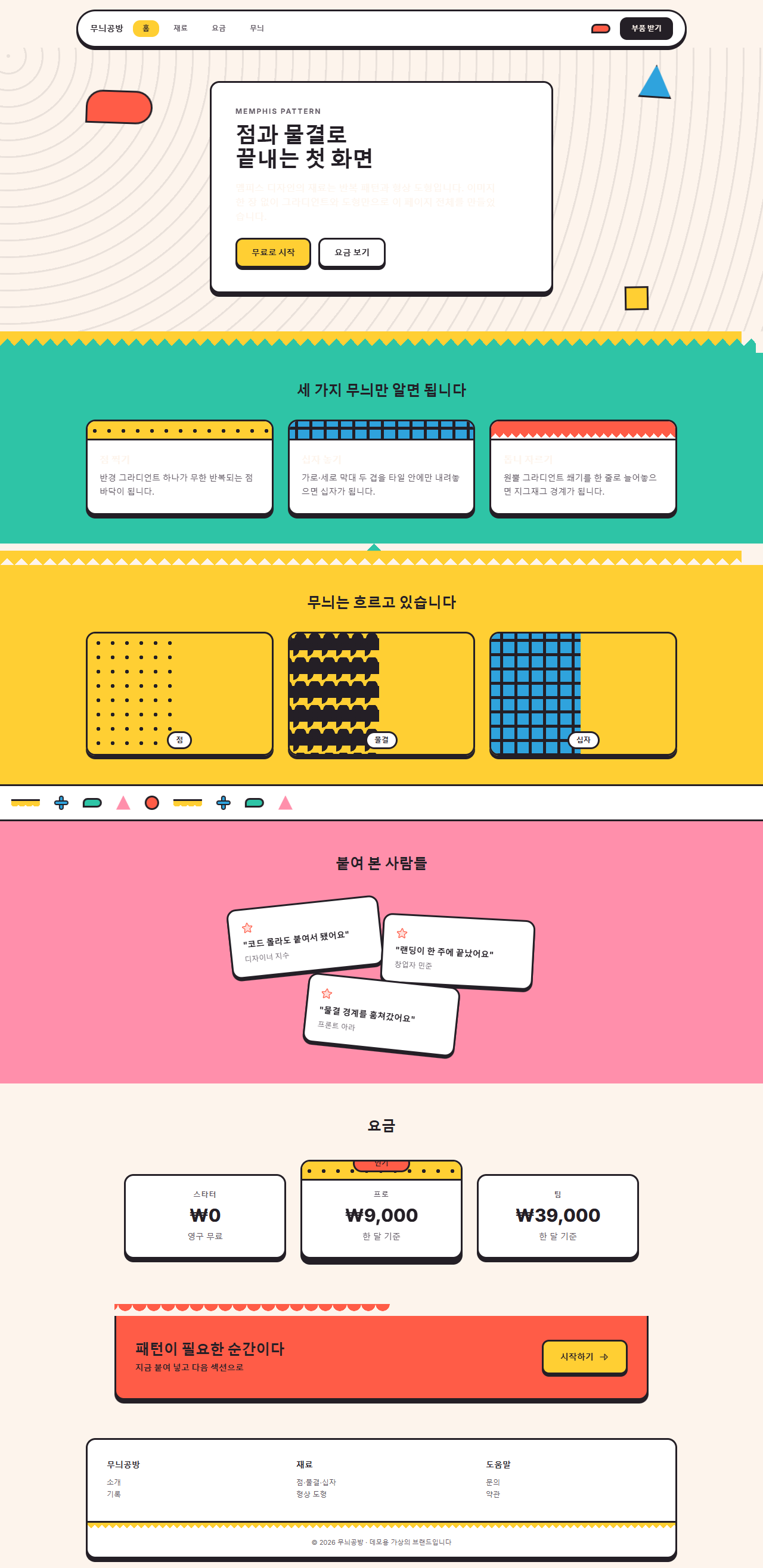
어디서 깨지는가 — 함정
가장 오래 헤맨 것은 십자 무늬였습니다. 막대 두 개를 겹치면 십자가 되니 linear-gradient(#241f26, #241f26) 두 장을 background-size: 5px 17px 로 줬는데, 렌더된 세 번째 판은 하늘색이 아니라 잉크로 통째로 칠해진 판이었습니다. 막대용 그라디언트는 타일 전체가 아니라 막대 폭만 반복하므로, 세로 막대가 5px 간격으로 화면 전체에 도배된 것입니다. 십자가 되려면 타일(24px)을 먼저 정의하고 그 안에서 transparent 9.5px, 잉크 9.5px 14.5px, transparent 14.5px 처럼 막대의 위치를 지정해야 합니다. 같은 실수가 카드 머리띠에도 숨어 있어 두 곳을 함께 고쳤습니다.
두 번째는 톱니의 방향입니다. 콘 그라디언트에서 꼭짓점을 at 50% 100% 에 두고 from 135deg 를 주면 쐐기가 아래쪽, 즉 타일 밖으로 열려 아무것도 그려지지 않습니다. 아래를 향하는 이는 from 315deg 부터 시작해야 꼭짓점에서 위로 벌어집니다. 방향이 반대여도 컴파일도 콘솔도 조용해서, 첫 렌더에서 지그재그 줄이 그저 비어 있는 것으로만 보였습니다. 세 번째로 마퀴는 앞에서 적은 대로 트랙 실측 460px가 한 벌 230px의 정확히 두 배인지를 Playwright offsetWidth 로 확인하고 넘어갔습니다. 그려지지 않는데도 에러가 없는 이 침묵은 이메일 템플릿 디자인의 다크 모드 반전에서도 같은 얼굴로 나타납니다. 이 세 가지를 다 손본 부품과 원페이지 전체는 압축 비밀번호 yqayt28g으로 열리는 zip 에 그대로 들어 있습니다.
접근성
멤피스 팔레트의 밝은 색은 어느 것도 흰 글자를 지탱하지 못합니다. WCAG 2.1 대비 기준의 상대 휘도 공식으로 직접 계산하면 가장 어두운 산호색 #ff5c47조차 흰 글자와 3.06:1로 본문 기준 4.5:1에 못 미칩니다. 그래서 이 키트는 색을 고르는 대신 글자색을 하나로 정했습니다. 잉크(#241f26)라면 모든 면에서 기준을 넉넉히 넘습니다.
| 앞 | 뒤 | 실측 대비 | 본문 기준 |
|---|---|---|---|
| 잉크 #241f26 | 흰 면 #ffffff | 16.17:1 | 통과 |
| 잉크 #241f26 | 크림 바탕 #fdf4ec | 14.88:1 | 통과 |
| 잉크 #241f26 | 레몬 #ffcf33 | 10.95:1 | 통과 |
| 잉크 #241f26 | 민트 #2ec4a6 | 7.36:1 | 통과 |
| 잉크 #241f26 | 산호 #ff5c47 | 5.29:1 | 통과 |
| 잉크 #241f26 | 하늘 #2fa3dd | 5.7:1 | 통과 |
| 흰 글자 | 산호 #ff5c47 | 3.06:1 | 미달 — 쓰지 않는다 |
무늬 위에 글자를 얹을 때는 반드시 흰 판을 하나 깔고 그 위에 잉크로 썼습니다. 무늬의 밝기가 칸마다 달라 대비가 글자 위치에 따라 변하는 것을 판으로 차단하는 것입니다. 움직임은 MDN prefers-reduced-motion 문서의 미디어 쿼리를 아홉 부품 전부에 넣어 동작 줄이기를 켠 방문자에게는 정지 상태만 보이게 했고, 형상 배지 내비는 움직임이 꺼진 뒤에도 두 번째 칸이 활성으로 보이는 정적 규칙을 남겼습니다. 마퀴와 물결처럼 흐르는 무늬가 멈추면 그것은 잘못이 아니라 완성된 패턴 벽지입니다.
무늬가 마음에 드셨다면 디자인 트렌드 모아보기에서 이웃 스타일들을 만나보시고, 이 사이트가 무엇을 나눠 주는 곳인지는 소개에 정리해 뒀습니다.
FAQ
멤피스 디자인 그룹의 무늬와 네오브루탈리즘은 뭐가 다른가요?
둘 다 굵은 검은 테두리를 쓰지만 주역이 다릅니다. 네오브루탈리즘은 테두리와 오프셋 그림자 자체가 정체성이라 색이 두세 가지면 성립합니다. 멤피스는 테두리가 무늬의 액자일 뿐, 점·물결·톱니·기하 형상이 반복되는 패턴 채움이 주역입니다. 이 글의 04번 카드처럼 테두리는 그대로 두고 머리띠의 무늬를 빼면 멤피스가 아님을 확인할 수 있습니다. 무늬를 행사 안내에 쓰는 다른 결은 이벤트 페이지 템플릿에 세워 두었습니다.
패턴 배경 위에서 본문을 읽기 힘들지 않나요?
무늬를 본문 바로 밑에 깔지 않으면 됩니다. 이 키트의 모든 본문은 흰 판 위에 잉크로 쓰고, 무늬는 판의 바깥, 즉 무대와 머리띠와 경계에만 둡니다. 대비 실측표의 숫자는 이 원칙을 지킨 화면에서 잰 값입니다. 판 없이 무늬 위에 글자를 얹는 순간 대비는 글자가 놓인 칸의 밝기에 따라 제각각이 됩니다.
진중한 브랜드에는 너무 장난스럽지 않나요?
팔레트를 잉크와 크림 두 색으로 줄이면 멤피스의 구조는 남으면서 장난기가 빠집니다. zip 안의 변형 표의 모노 멤피스가 그 상태입니다. 반대로 형상 크기를 줄이고 타일 간격을 넓히면 무늬가 배경 소음 수준으로 가라앉으므로, 밝은 색 한두 개만 남겨도 코퍼레이트 톤을 유지할 수 있습니다.
이런 글이랑 어울려요
 디자인 트렌드손그림 디자인 랜딩 UI 키트, 크레용 섹션 9개
 디자인 트렌드벤토 그리드 디자인 — 요즘 핀터레스트에서 유행하는 부품 9개
 디자인 트렌드다크 SaaS 랜딩에 스며든 리니어 디자인 시스템 9종
 디자인 트렌드키네틱 타이포그래피 랜딩페이지, 코드로 뜯어봤다
 디자인 트렌드클레이모피즘 랜딩 UI 키트, 통통한 섹션 9개
 디자인 트렌드그레인 얹은 오로라 그라디언트 랜딩 부품 9개
 디자인 트렌드네오브루탈리즘 UI 랜딩 부품 9개, 그림자는 안 번진다
 디자인 트렌드번쩍이는 Y2K 웹 디자인, 크롬·홀로그램 부품 9개
 디자인 트렌드HUD 디자인, 화면이 나를 겨누는 랜딩 부품 9개
 디자인 트렌드뉴모피즘 디자인 랜딩 UI 키트, 그림자 두 겹 섹션 9개