뉴모피즘 디자인 랜딩 UI 키트, 그림자 두 겹 섹션 9개
뉴모피즘 디자인은 카드나 버튼의 배경색을 화면 배경과 거의 같게 두고, 밝은 그림자와 어두운 그림자를 반대 방향으로 얹어 색이 아니라 그림자만으로 입체감을 만드는 스타일입니다. 이름도 모르고 어떻게 만드는지도 몰랐던 그 "말랑하게 튀어나온 버튼"이 바로 이겁니다.
핀터레스트·드리블에 스크린샷으로만 떠돌던 이 스타일을 실제로 만든 원페이지로 아래에 그대로 올렸습니다. 내비게이션에서 푸터까지 스크롤하면서 전체 인상을 먼저 확인하십시오.

위 화면을 이루는 부품 아홉 개를 하나씩 떼어 아래 격자에 다시 늘어놓았습니다. 방문자가 화면을 처음 열 때 실제로 눈길이 가는 차례 — 시선을 끌기, 둘러보기, 가격 확인, 신뢰, 행동 유도, 가입 — 그대로 순서를 잡았습니다. 그중 셋(파묻힌 뉴모피즘 아이콘 목록·숨쉬는 글로우 CTA 밴드·버튼과 입력창)은 같은 표면 하나가 raised에서 inset으로 그림자 부호만 바뀌어 튀어나온 것도 파인 것도 될 수 있다는 뉴모피즘의 핵심을 애니메이션으로 직접 보여줍니다. 같은 design 기둥에서 이 회색 캔버스를 어두운 계기판으로 바꾼 쪽이 HUD 랜딩 부품이고, 캔디 색으로 밝게 걷어 올린 쪽이 파스텔 톤 랜딩 UI 키트입니다. 뉴모피즘 키트를 골라 잡는 기준도 그래서 단순합니다 — 부품이 얼마나 다양한가보다, 같은 표면을 눌렀다 떼었다 할 때 그림자 부호 하나로 얼마나 안정적으로 오가는지가 먼저입니다.
 01 hero-neu
 02 nav-neu
 03 card-grid-neu
 04 feature-list-neu
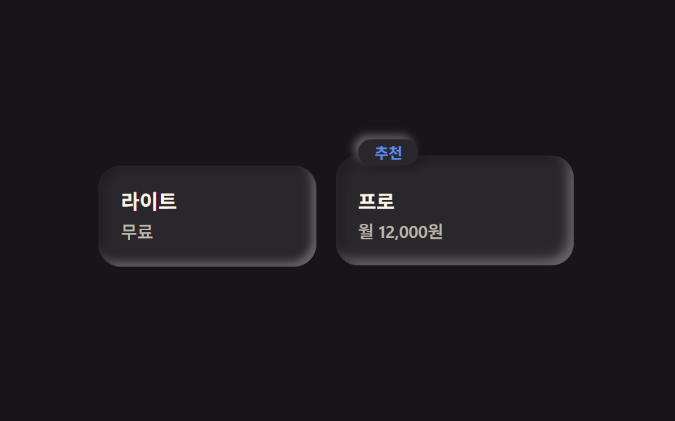 05 pricing-neu
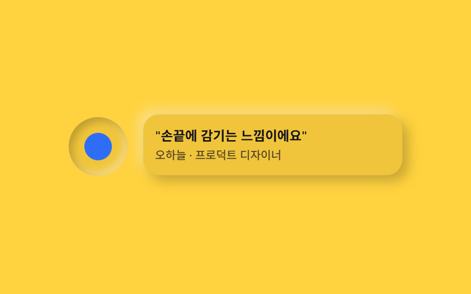 06 testimonial-neu
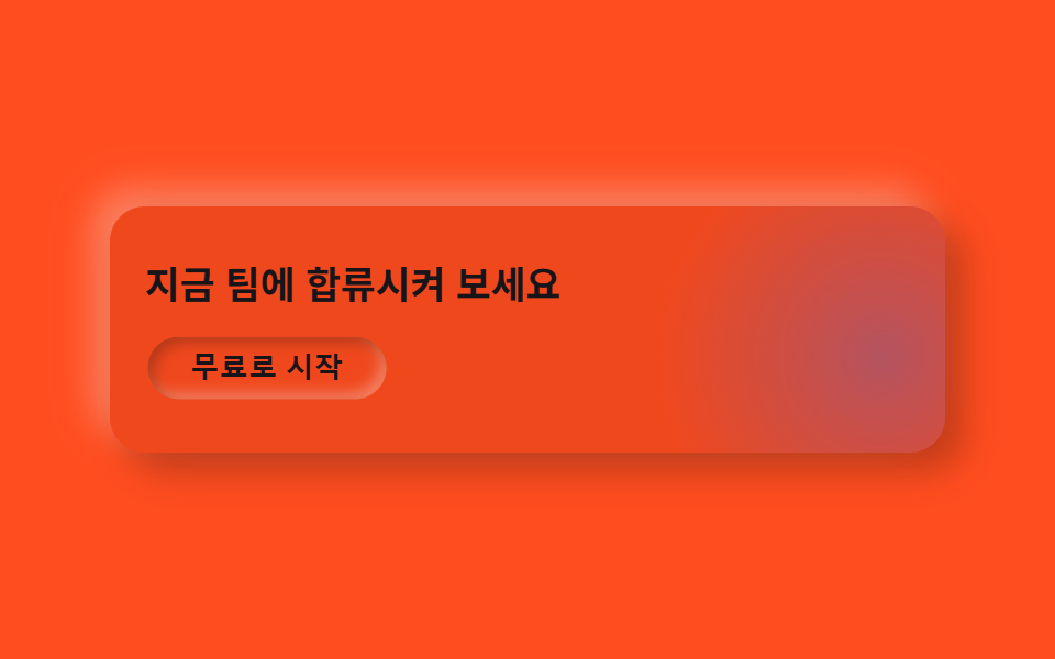 07 cta-band-neu
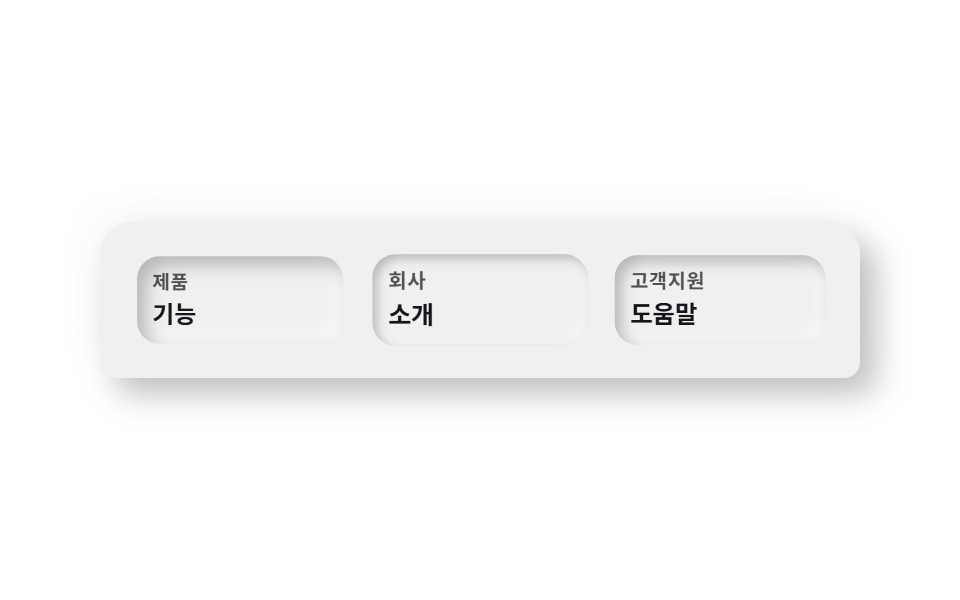 08 footer-neu
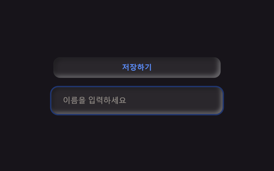 09 buttons-inputs-neu
자동 재생 · 눌러서 해당 항목으로 · 전부 한 zip
- 01 눌린 듯 떠 있는 히어로
- 02 눌린 인디케이터 내비
- 03 돋을새김 카드 격자
- 04 파묻힌 아이콘 목록
- 05 튀어나온 추천 요금제
- 06 소켓 아바타+말풍선
- 07 숨쉬는 글로우 CTA 밴드
- 08 둥근 상단 푸터
- 09 뉴모피즘 버튼·인풋
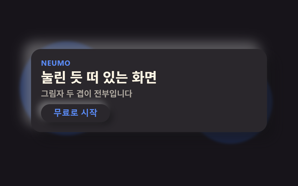
01눌린 듯 떠 있는 히어로
무엇이 움직이나
카드 배경을 무대와 거의 같은 색으로 두고 밝은·어두운 그림자 두 겹만 반대 방향으로 얹어, 색 대비 없이 그림자만으로 카드가 떠 보이게 합니다.
<main class="stage">
  <section class="heroneu">
    <span class="heroneu__orb heroneu__orb--a is-demo" aria-hidden="true"></span>
    <span class="heroneu__orb heroneu__orb--b is-demo" aria-hidden="true"></span>
    <div class="heroneu__card is-demo">
      <p class="heroneu__eyebrow">Neumo</p>
      <h1 class="heroneu__title">눌린 듯 떠 있는 화면</h1>
      <p class="heroneu__desc">그림자 두 겹이 전부입니다</p>
      <button class="heroneu__cta" type="button">무료로 시작</button>
    </div>
  </section>
</main>
@use "../../../../site/static/demo-tokens" as *;
$duration: $dur-loop; // 오브가 떠도는 한 주기
$easing: $ease-spring; // 떠오르는 곡선
$color: $subject-blue; // 강조 색 — 배경과 분리되는 유일한 색
@include stage($stage-ink);
// 뉴모피즘의 정의: 표면이 배경과 거의 같은 색이어야 그림자만으로 입체감이 생긴다.
// 완전히 같은 값이면 밝은 쪽 그림자가 갈 곳이 없어(검은 배경보다 밝힐 여지는 있다) 배경보다 살짝 밝게 둔다.
$neu-surface: mix($stage-ink, white, 92%);
$neu-light: rgba(mix($neu-surface, white, 40%), .5);
$neu-dark: rgba(mix($neu-surface, black, 40%), .5);
.heroneu {
position: relative;
width: clamp(240px, 82vw, 380px);
}
.heroneu__orb {
position: absolute;
width: clamp(90px, 34vw, 140px);
aspect-ratio: 1;
border-radius: 50%;
background: rgba($color, .3);
pointer-events: none;
filter: blur(2px);
}
.heroneu__orb--a {
top: -18px;
left: -18px;
animation: orbA $duration $easing infinite;
}
.heroneu__orb--b {
bottom: -20px;
right: -14px;
background: rgba($color, .18);
animation: orbB $duration $easing infinite;
animation-delay: -1s;
}
.heroneu__card {
position: relative;
box-sizing: border-box;
width: 100%;
display: flex;
flex-direction: column;
align-items: flex-start;
gap: $sp-1;
padding: $sp-4;
border-radius: $r-card;
background: $neu-surface;
box-shadow: 9px 9px 16px $neu-dark, -9px -9px 16px $neu-light;
animation: cardFloat $duration $easing infinite;
}
.heroneu__eyebrow {
margin: 0;
color: $subject-blue-light;
font-weight: 700; font-size: clamp(10px, 2.6vw, 12px); line-height: 1;
letter-spacing: .04em;
text-transform: uppercase;
}
.heroneu__title {
margin: 0;
color: $subject-cream;
font-weight: 700; font-size: clamp(18px, 4.6vw, 24px); line-height: 1.2;
}
.heroneu__desc {
margin: 0;
color: rgba($subject-cream, .65);
font-weight: 500; font-size: clamp(12px, 2.8vw, 14px); line-height: 1.4;
}
.heroneu__cta {
margin-top: $sp-1;
border: 0;
border-radius: $r-pill;
background: $neu-surface;
color: $subject-blue-light;
padding: $sp-2 $sp-5;
font-weight: 700; font-size: clamp(12px, 2.8vw, 14px); line-height: 1;
box-shadow: 5px 5px 10px $neu-dark, -5px -5px 10px $neu-light;
}
.heroneu__cta:focus-visible {
outline: 3px solid $color;
outline-offset: 2px;
}
// 데모: 오브 두 개가 반대 위상으로 떠돌고, 카드는 살짝 떠올랐다 가라앉는다 (WAAPI 시계가 잡을 수 있게 keyframes)
@keyframes orbA {
0%, 100% { transform: translate(0, 0) scale(1); }
50% { transform: translate(6%, 8%) scale(1.12); }
}
@keyframes orbB {
0%, 100% { transform: translate(0, 0) scale(1); }
50% { transform: translate(-6%, -6%) scale(.9); }
}
@keyframes cardFloat {
0%, 100% { transform: translateY(0); box-shadow: 9px 9px 16px $neu-dark, -9px -9px 16px $neu-light; }
50% { transform: translateY(-6px); box-shadow: 12px 12px 20px $neu-dark, -12px -12px 20px $neu-light; }
}
@media (prefers-reduced-motion: reduce) {
.heroneu__orb, .heroneu__card { animation: none !important; transform: none; }
}html, body {
margin: 0;
overflow: hidden;
}
.stage {
box-sizing: border-box;
min-height: 100vh;
display: grid;
place-items: center;
margin: 0;
background: #17141a;
font-family: -apple-system, "Segoe UI", "Noto Sans KR", sans-serif;
padding: clamp(8px, 4vw, 24px);
}
.heroneu {
position: relative;
width: clamp(240px, 82vw, 380px);
}
.heroneu__orb {
position: absolute;
width: clamp(90px, 34vw, 140px);
aspect-ratio: 1;
border-radius: 50%;
background: rgba(47, 109, 246, 0.3);
pointer-events: none;
filter: blur(2px);
}
.heroneu__orb--a {
top: -18px;
left: -18px;
animation: orbA 2s cubic-bezier(0.2, 0.8, 0.2, 1) infinite;
}
.heroneu__orb--b {
bottom: -20px;
right: -14px;
background: rgba(47, 109, 246, 0.18);
animation: orbB 2s cubic-bezier(0.2, 0.8, 0.2, 1) infinite;
animation-delay: -1s;
}
.heroneu__card {
position: relative;
box-sizing: border-box;
width: 100%;
display: flex;
flex-direction: column;
align-items: flex-start;
gap: 4px;
padding: 16px;
border-radius: 16px;
background: rgb(16.2980392157%, 15.2156862745%, 17.3803921569%);
box-shadow: 9px 9px 16px rgba(6.5192156863%, 6.0862745098%, 6.9521568627%, 0.5), -9px -9px 16px rgba(66.5192156863%, 66.0862745098%, 66.9521568627%, 0.5);
animation: cardFloat 2s cubic-bezier(0.2, 0.8, 0.2, 1) infinite;
}
.heroneu__eyebrow {
margin: 0;
color: #5b8cf8;
font-weight: 700;
font-size: clamp(10px, 2.6vw, 12px);
line-height: 1;
letter-spacing: 0.04em;
text-transform: uppercase;
}
.heroneu__title {
margin: 0;
color: #fff7e6;
font-weight: 700;
font-size: clamp(18px, 4.6vw, 24px);
line-height: 1.2;
}
.heroneu__desc {
margin: 0;
color: rgba(255, 247, 230, 0.65);
font-weight: 500;
font-size: clamp(12px, 2.8vw, 14px);
line-height: 1.4;
}
.heroneu__cta {
margin-top: 4px;
border: 0;
border-radius: 999px;
background: rgb(16.2980392157%, 15.2156862745%, 17.3803921569%);
color: #5b8cf8;
padding: 8px 20px;
font-weight: 700;
font-size: clamp(12px, 2.8vw, 14px);
line-height: 1;
box-shadow: 5px 5px 10px rgba(6.5192156863%, 6.0862745098%, 6.9521568627%, 0.5), -5px -5px 10px rgba(66.5192156863%, 66.0862745098%, 66.9521568627%, 0.5);
}
.heroneu__cta:focus-visible {
outline: 3px solid #2f6df6;
outline-offset: 2px;
}
@keyframes orbA {
0%, 100% {
transform: translate(0, 0) scale(1);
}
50% {
transform: translate(6%, 8%) scale(1.12);
}
}
@keyframes orbB {
0%, 100% {
transform: translate(0, 0) scale(1);
}
50% {
transform: translate(-6%, -6%) scale(0.9);
}
}
@keyframes cardFloat {
0%, 100% {
transform: translateY(0);
box-shadow: 9px 9px 16px rgba(6.5192156863%, 6.0862745098%, 6.9521568627%, 0.5), -9px -9px 16px rgba(66.5192156863%, 66.0862745098%, 66.9521568627%, 0.5);
}
50% {
transform: translateY(-6px);
box-shadow: 12px 12px 20px rgba(6.5192156863%, 6.0862745098%, 6.9521568627%, 0.5), -12px -12px 20px rgba(66.5192156863%, 66.0862745098%, 66.9521568627%, 0.5);
}
}
@media (prefers-reduced-motion: reduce) {
.heroneu__orb, .heroneu__card {
animation: none !important;
transform: none;
}
}import type { CSSProperties } from "react";
import styles from "./HeroNeu.module.scss";
export type HeroNeuProps = {
eyebrow?: string;
title?: string;
desc?: string;
cta?: string;
/** 한 주기(기본 2000ms) */
duration?: number;
easing?: string;
color?: string;
};
type Vars = CSSProperties & { "--duration"?: string; "--easing"?: string; "--color"?: string };
export default function HeroNeu({
eyebrow = "Neumo",
title = "눌린 듯 떠 있는 화면",
desc = "그림자 두 겹이 전부입니다",
cta = "무료로 시작",
duration = 2000,
easing = "cubic-bezier(.2,.8,.2,1)",
color = "#2f6df6",
}: HeroNeuProps) {
const vars: Vars = { "--duration": `${duration}ms`, "--easing": easing, "--color": color };
return (
<section className={styles.hero} style={vars}>
<span className={`${styles.orb} ${styles.orbA}`} aria-hidden="true" />
<span className={`${styles.orb} ${styles.orbB}`} aria-hidden="true" />
<div className={styles.card}>
<p className={styles.eyebrow}>{eyebrow}</p>
<h1 className={styles.title}>{title}</h1>
<p className={styles.desc}>{desc}</p>
<button type="button" className={styles.cta}>{cta}</button>
</div>
</section>
);
}01 · 눌린 듯 떠 있는 히어로 — 측정 누적면적 16.376% · 움직인 프레임 12/23GODRICH 원작 · zip 에 SCSS·React 포함 · 비밀번호 보기
코드에서 볼 곳
뒤에 흐릿하게 뜬 강조색 원 두 개만 색이 다른 유일한 요소입니다.
<div class="relative mx-auto max-w-xl flex flex-col items-start gap-4
            rounded-neu bg-surface p-10 shadow-neu-raised">
  <p class="text-xs font-bold uppercase text-accent">Neumo</p>
  <h1 class="text-4xl font-extrabold leading-tight">눌린 듯 떠 있는 화면</h1>
  <button class="rounded-pill bg-surface px-6 py-3 text-sm font-bold text-accent
                 shadow-neu-raised">무료로 시작</button>
</div>
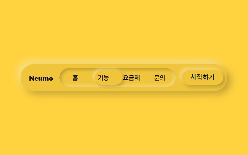
02눌린 인디케이터 내비
무엇이 움직이나
메뉴 트랙 전체는 안쪽으로 파인 인셋 그림자로 눌려 있고, 그 안에서 활성 탭만 반대로 볼록한 그림자를 얹어 트랙 위로 도드라져 보입니다.
<main class="stage">
  <nav class="navneu">
    <span class="navneu__brand">Neumo</span>
    <div class="navneu__track is-demo">
      <span class="navneu__indicator" aria-hidden="true"></span>
      <span class="navneu__item">홈</span>
      <span class="navneu__item">기능</span>
      <span class="navneu__item">요금제</span>
      <span class="navneu__item">문의</span>
    </div>
    <button class="navneu__cta" type="button">시작하기</button>
  </nav>
</main>
@use "../../../../site/static/demo-tokens" as *;
$duration: $dur-loop; // 인디케이터가 4칸을 한 바퀴 도는 시간
$easing: $ease-spring; // 미끄러지는 곡선
$color: $subject-blue; // 강조 색
@include stage($stage-yellow);
$neu-surface: mix($stage-yellow, black, 94%);
$neu-light: rgba(mix($neu-surface, white, 40%), .6);
$neu-dark: rgba(mix($neu-surface, black, 40%), .35);
.navneu {
box-sizing: border-box;
width: clamp(260px, 84vw, 400px);
display: flex;
align-items: center;
gap: $sp-3;
border-radius: $r-pill;
background: $neu-surface;
padding: $sp-2;
box-shadow: 7px 7px 14px $neu-dark, -7px -7px 14px $neu-light;
}
.navneu__brand {
padding-left: $sp-2;
color: $subject-ink;
font-weight: 800; font-size: clamp(11px, 2.8vw, 13px); line-height: 1;
white-space: nowrap;
}
.navneu__track {
position: relative;
flex: 1;
display: flex;
border-radius: $r-pill;
background: $neu-surface;
padding: $sp-1;
// 눌린 트랙 — 안쪽으로 파인 뉴모피즘 인셋 그림자
box-shadow: inset 3px 3px 6px $neu-dark, inset -3px -3px 6px $neu-light;
}
.navneu__indicator {
position: absolute;
top: $sp-1;
bottom: $sp-1;
left: $sp-1;
width: calc((100% - #{$sp-1} * 2) / 4);
border-radius: $r-pill;
background: $neu-surface;
// 인디케이터만 볼록하게 — 트랙(오목)과 대비되는 유일한 볼록 표면
box-shadow: 3px 3px 6px $neu-dark, -3px -3px 6px $neu-light;
animation: navSlide $duration $easing infinite;
}
.navneu__item {
position: relative;
z-index: 1;
flex: 1;
text-align: center;
padding: $sp-2 0;
color: $subject-ink;
font-weight: 600; font-size: clamp(10.5px, 2.6vw, 12px); line-height: 1;
}
.navneu__cta {
border: 0;
border-radius: $r-pill;
background: $neu-surface;
color: $subject-ink;
padding: $sp-2 $sp-4;
font-weight: 700; font-size: clamp(10.5px, 2.6vw, 12px); line-height: 1;
white-space: nowrap;
box-shadow: 4px 4px 8px $neu-dark, -4px -4px 8px $neu-light;
}
.navneu__cta:focus-visible {
outline: 3px solid $color;
outline-offset: 2px;
}
// 데모: 캡슐 안 인디케이터가 4칸을 순서대로 돈다. width 25% 이므로 translateX(100%) = 제 폭만큼 = 한 칸
@keyframes navSlide {
0%, 15% { transform: translateX(0%); }
25%, 40% { transform: translateX(100%); }
50%, 65% { transform: translateX(200%); }
75%, 90% { transform: translateX(300%); }
100% { transform: translateX(0%); }
}
@media (prefers-reduced-motion: reduce) {
.navneu__indicator { animation: none !important; transform: translateX(0%); }
}html, body {
margin: 0;
overflow: hidden;
}
.stage {
box-sizing: border-box;
min-height: 100vh;
display: grid;
place-items: center;
margin: 0;
background: #ffd23f;
font-family: -apple-system, "Segoe UI", "Noto Sans KR", sans-serif;
padding: clamp(8px, 4vw, 24px);
}
.navneu {
box-sizing: border-box;
width: clamp(260px, 84vw, 400px);
display: flex;
align-items: center;
gap: 12px;
border-radius: 999px;
background: rgb(94%, 77.4117647059%, 23.2235294118%);
padding: 8px;
box-shadow: 7px 7px 14px rgba(37.6%, 30.9647058824%, 9.2894117647%, 0.35), -7px -7px 14px rgba(97.6%, 90.9647058824%, 69.2894117647%, 0.6);
}
.navneu__brand {
padding-left: 8px;
color: #17141a;
font-weight: 800;
font-size: clamp(11px, 2.8vw, 13px);
line-height: 1;
white-space: nowrap;
}
.navneu__track {
position: relative;
flex: 1;
display: flex;
border-radius: 999px;
background: rgb(94%, 77.4117647059%, 23.2235294118%);
padding: 4px;
box-shadow: inset 3px 3px 6px rgba(37.6%, 30.9647058824%, 9.2894117647%, 0.35), inset -3px -3px 6px rgba(97.6%, 90.9647058824%, 69.2894117647%, 0.6);
}
.navneu__indicator {
position: absolute;
top: 4px;
bottom: 4px;
left: 4px;
width: calc((100% - 4px * 2) / 4);
border-radius: 999px;
background: rgb(94%, 77.4117647059%, 23.2235294118%);
box-shadow: 3px 3px 6px rgba(37.6%, 30.9647058824%, 9.2894117647%, 0.35), -3px -3px 6px rgba(97.6%, 90.9647058824%, 69.2894117647%, 0.6);
animation: navSlide 2s cubic-bezier(0.2, 0.8, 0.2, 1) infinite;
}
.navneu__item {
position: relative;
z-index: 1;
flex: 1;
text-align: center;
padding: 8px 0;
color: #17141a;
font-weight: 600;
font-size: clamp(10.5px, 2.6vw, 12px);
line-height: 1;
}
.navneu__cta {
border: 0;
border-radius: 999px;
background: rgb(94%, 77.4117647059%, 23.2235294118%);
color: #17141a;
padding: 8px 16px;
font-weight: 700;
font-size: clamp(10.5px, 2.6vw, 12px);
line-height: 1;
white-space: nowrap;
box-shadow: 4px 4px 8px rgba(37.6%, 30.9647058824%, 9.2894117647%, 0.35), -4px -4px 8px rgba(97.6%, 90.9647058824%, 69.2894117647%, 0.6);
}
.navneu__cta:focus-visible {
outline: 3px solid #2f6df6;
outline-offset: 2px;
}
@keyframes navSlide {
0%, 15% {
transform: translateX(0%);
}
25%, 40% {
transform: translateX(100%);
}
50%, 65% {
transform: translateX(200%);
}
75%, 90% {
transform: translateX(300%);
}
100% {
transform: translateX(0%);
}
}
@media (prefers-reduced-motion: reduce) {
.navneu__indicator {
animation: none !important;
transform: translateX(0%);
}
}import type { CSSProperties } from "react";
import styles from "./NavNeu.module.scss";
export type NavNeuProps = {
brand?: string;
items?: string[];
cta?: string;
/** 인디케이터가 항목 전부를 한 바퀴 도는 시간(기본 2000ms) */
duration?: number;
easing?: string;
color?: string;
};
type Vars = CSSProperties & { "--duration"?: string; "--easing"?: string; "--color"?: string };
export default function NavNeu({
brand = "Neumo",
items = ["홈", "기능", "요금제", "문의"],
cta = "시작하기",
duration = 2000,
easing = "cubic-bezier(.2,.8,.2,1)",
color = "#2f6df6",
}: NavNeuProps) {
const vars: Vars = { "--duration": `${duration}ms`, "--easing": easing, "--color": color };
return (
<nav className={styles.nav} style={vars}>
<span className={styles.brand}>{brand}</span>
<div className={styles.track}>
<span className={styles.indicator} aria-hidden="true" style={{ width: `calc((100% - 8px) / ${items.length})` }} />
{items.map((label) => (
<span key={label} className={styles.item}>{label}</span>
))}
</div>
<button type="button" className={styles.cta}>{cta}</button>
</nav>
);
}02 · 눌린 인디케이터 내비 — 측정 누적면적 3.481% · 움직인 프레임 11/23GODRICH 원작 · zip 에 SCSS·React 포함 · 비밀번호 보기
코드에서 볼 곳
탭 폭을 25%로 두면 translateX(100%) 한 번이 정확히 이웃 칸 하나를 옮깁니다.
<nav class="flex items-center gap-4 rounded-pill bg-surface px-3 py-2
            shadow-neu-raised">
  <div class="relative flex flex-1 rounded-pill bg-surface p-1 shadow-neu-press">
    <span class="absolute inset-y-1 left-1 w-1/4 rounded-pill bg-surface
                 shadow-neu-raised"></span>
    <span class="relative z-10 flex-1 text-center text-xs font-semibold py-2">홈</span>
  </div>
</nav>
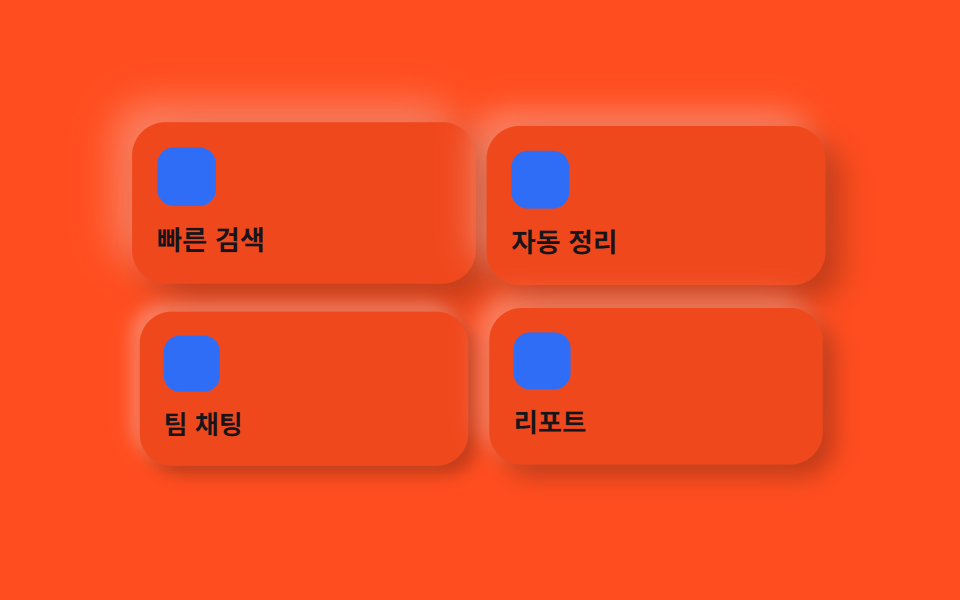
03돋을새김 카드 격자
무엇이 움직이나
격자의 카드마다 배경과 같은 색 표면을 유지한 채 그림자 깊이와 살짝 떠오르는 정도가 함께 순간적으로 커졌다 잦아들어, 색은 그대로인데 입체감만 오르내립니다.
<main class="stage">
  <div class="cardneu is-demo">
    <div class="cardneu__item cardneu__item--a">
      <span class="cardneu__icon" aria-hidden="true"></span>
      <p class="cardneu__label">빠른 검색</p>
    </div>
    <div class="cardneu__item cardneu__item--b">
      <span class="cardneu__icon" aria-hidden="true"></span>
      <p class="cardneu__label">자동 정리</p>
    </div>
    <div class="cardneu__item cardneu__item--c">
      <span class="cardneu__icon" aria-hidden="true"></span>
      <p class="cardneu__label">팀 채팅</p>
    </div>
    <div class="cardneu__item cardneu__item--d">
      <span class="cardneu__icon" aria-hidden="true"></span>
      <p class="cardneu__label">리포트</p>
    </div>
  </div>
</main>
@use "../../../../site/static/demo-tokens" as *;
$duration: $dur-loop; // 카드마다 솟아오르는 한 주기
$easing: $ease-spring; // 솟아오르는 곡선
$color: $subject-blue; // 아이콘 강조 색
@include stage($stage-orange);
$neu-surface: mix($stage-orange, black, 94%);
$neu-light: rgba(mix($neu-surface, white, 40%), .5);
$neu-dark: rgba(mix($neu-surface, black, 40%), .4);
.cardneu {
display: grid;
grid-template-columns: repeat(2, 1fr);
gap: $sp-3;
width: clamp(220px, 78vw, 340px);
}
.cardneu__item {
box-sizing: border-box;
display: flex;
flex-direction: column;
align-items: flex-start;
gap: $sp-2;
padding: $sp-3;
border-radius: $r-card;
background: $neu-surface;
box-shadow: 7px 7px 14px $neu-dark, -7px -7px 14px $neu-light;
animation: emboss $duration $easing infinite;
}
.cardneu__item--a { animation-delay: 0s; }
.cardneu__item--b { animation-delay: -0.5s; }
.cardneu__item--c { animation-delay: -1s; }
.cardneu__item--d { animation-delay: -1.5s; }
.cardneu__icon {
display: block;
width: clamp(20px, 8vw, 28px);
height: clamp(20px, 8vw, 28px);
border-radius: $r-sm;
background: $color;
}
.cardneu__label {
margin: 0;
color: $subject-ink;
font-weight: 700; font-size: clamp(11px, 2.8vw, 13px); line-height: 1.3;
}
// 데모: 네 칸이 서로 다른 박자로 그림자가 깊어지며 솟아올랐다 가라앉는다 (raised 정도 자체가 움직인다)
@keyframes emboss {
0%, 100% {
transform: scale(1) translateY(0);
box-shadow: 4px 4px 8px $neu-dark, -4px -4px 8px $neu-light;
}
50% {
transform: scale(1.05) translateY(-4px);
box-shadow: 9px 9px 18px $neu-dark, -9px -9px 18px $neu-light;
}
}
@media (prefers-reduced-motion: reduce) {
.cardneu__item { animation: none !important; transform: none; box-shadow: 7px 7px 14px $neu-dark, -7px -7px 14px $neu-light; }
}html, body {
margin: 0;
overflow: hidden;
}
.stage {
box-sizing: border-box;
min-height: 100vh;
display: grid;
place-items: center;
margin: 0;
background: #ff4d1f;
font-family: -apple-system, "Segoe UI", "Noto Sans KR", sans-serif;
padding: clamp(8px, 4vw, 24px);
}
.cardneu {
display: grid;
grid-template-columns: repeat(2, 1fr);
gap: 12px;
width: clamp(220px, 78vw, 340px);
}
.cardneu__item {
box-sizing: border-box;
display: flex;
flex-direction: column;
align-items: flex-start;
gap: 8px;
padding: 12px;
border-radius: 16px;
background: rgb(94%, 28.3843137255%, 11.4274509804%);
box-shadow: 7px 7px 14px rgba(37.6%, 11.3537254902%, 4.5709803922%, 0.4), -7px -7px 14px rgba(97.6%, 71.3537254902%, 64.5709803922%, 0.5);
animation: emboss 2s cubic-bezier(0.2, 0.8, 0.2, 1) infinite;
}
.cardneu__item--a {
animation-delay: 0s;
}
.cardneu__item--b {
animation-delay: -0.5s;
}
.cardneu__item--c {
animation-delay: -1s;
}
.cardneu__item--d {
animation-delay: -1.5s;
}
.cardneu__icon {
display: block;
width: clamp(20px, 8vw, 28px);
height: clamp(20px, 8vw, 28px);
border-radius: 8px;
background: #2f6df6;
}
.cardneu__label {
margin: 0;
color: #17141a;
font-weight: 700;
font-size: clamp(11px, 2.8vw, 13px);
line-height: 1.3;
}
@keyframes emboss {
0%, 100% {
transform: scale(1) translateY(0);
box-shadow: 4px 4px 8px rgba(37.6%, 11.3537254902%, 4.5709803922%, 0.4), -4px -4px 8px rgba(97.6%, 71.3537254902%, 64.5709803922%, 0.5);
}
50% {
transform: scale(1.05) translateY(-4px);
box-shadow: 9px 9px 18px rgba(37.6%, 11.3537254902%, 4.5709803922%, 0.4), -9px -9px 18px rgba(97.6%, 71.3537254902%, 64.5709803922%, 0.5);
}
}
@media (prefers-reduced-motion: reduce) {
.cardneu__item {
animation: none !important;
transform: none;
box-shadow: 7px 7px 14px rgba(37.6%, 11.3537254902%, 4.5709803922%, 0.4), -7px -7px 14px rgba(97.6%, 71.3537254902%, 64.5709803922%, 0.5);
}
}import type { CSSProperties } from "react";
import styles from "./CardGridNeu.module.scss";
export type CardGridNeuItem = { label: string };
export type CardGridNeuProps = {
items?: CardGridNeuItem[];
duration?: number;
easing?: string;
color?: string;
};
type Vars = CSSProperties & { "--duration"?: string; "--easing"?: string; "--color"?: string };
export default function CardGridNeu({
items = [{ label: "빠른 검색" }, { label: "자동 정리" }, { label: "팀 채팅" }, { label: "리포트" }],
duration = 2000,
easing = "cubic-bezier(.2,.8,.2,1)",
color = "#2f6df6",
}: CardGridNeuProps) {
const vars: Vars = { "--duration": `${duration}ms`, "--easing": easing, "--color": color };
return (
<div className={styles.grid} style={vars}>
{items.map((it, i) => (
<div key={it.label} className={styles.item} style={{ animationDelay: `${-i * 0.5}s` }}>
<span className={styles.icon} aria-hidden="true" />
<p className={styles.label}>{it.label}</p>
</div>
))}
</div>
);
}03 · 돋을새김 카드 격자 — 측정 누적면적 23.212% · 움직인 프레임 23/23GODRICH 원작 · zip 에 SCSS·React 포함 · 비밀번호 보기
코드에서 볼 곳
카드마다 시작 시각을 어긋내면 네 칸이 파도처럼 순서대로 솟아오릅니다.
<div class="grid grid-cols-2 gap-4 sm:grid-cols-4">
  <div class="flex flex-col gap-3 rounded-neu bg-surface p-5 shadow-neu-raised">
    <span class="h-7 w-7 rounded-control bg-accent"></span>
    <p class="text-sm font-semibold">빠른 검색</p>
  </div>
</div>
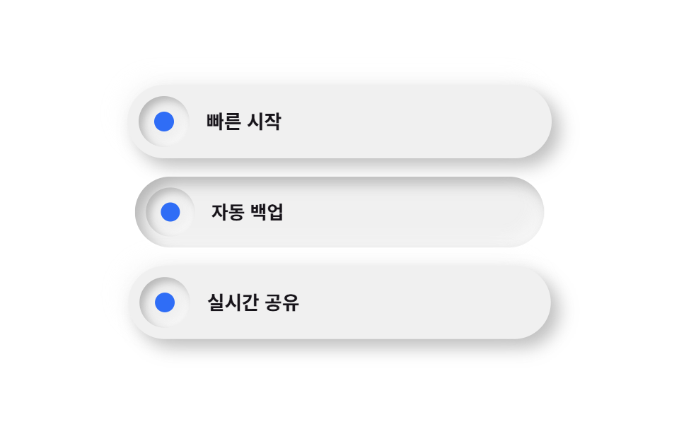
04파묻힌 아이콘 목록
무엇이 움직이나
알약 모양 행은 볼록하게 튀어나와 있고 그 안의 아이콘 칩만 안쪽으로 파묻혀, 한 행 안에서 raised와 inset이 동시에 보입니다.
<main class="stage">
  <ul class="listneu">
    <li class="listneu__row listneu__row--a is-demo">
      <span class="listneu__chip" aria-hidden="true"></span>
      <span class="listneu__text">빠른 시작</span>
    </li>
    <li class="listneu__row listneu__row--b is-demo">
      <span class="listneu__chip" aria-hidden="true"></span>
      <span class="listneu__text">자동 백업</span>
    </li>
    <li class="listneu__row listneu__row--c is-demo">
      <span class="listneu__chip" aria-hidden="true"></span>
      <span class="listneu__text">실시간 공유</span>
    </li>
  </ul>
</main>
@use "../../../../site/static/demo-tokens" as *;
$duration: $dur-loop; // 칩이 눌렸다 돌아오는 한 주기
$easing: $ease-pop; // 눌림 곡선
$color: $subject-blue; // 칩 강조 색
@include stage($stage-paper);
// 순백 배경은 밝은 쪽 그림자가 갈 곳이 없다(배경보다 밝힐 여지가 없음) — 6% 만큼 어둡게 눌러
// 두 방향 모두 보이게 한다. 실제 뉴모피즘 튜토리얼이 순백 대신 옅은 회색 캔버스에서 시작하는 이유다.
$neu-surface: mix($stage-paper, black, 94%);
$neu-light: rgba(mix($neu-surface, white, 40%), .85);
$neu-dark: rgba(mix($neu-surface, black, 40%), .4);
.listneu {
list-style: none;
margin: 0;
padding: 0;
display: flex;
flex-direction: column;
gap: $sp-3;
width: clamp(220px, 70vw, 300px);
}
.listneu__row {
box-sizing: border-box;
display: flex;
align-items: center;
gap: $sp-3;
padding: $sp-2 $sp-4 $sp-2 $sp-2;
border-radius: $r-pill;
background: $neu-surface;
box-shadow: 6px 6px 12px $neu-dark, -6px -6px 12px $neu-light;
}
.listneu__row--a { animation: chipPress $duration $easing infinite; animation-delay: 0s; }
.listneu__row--b { animation: chipPress $duration $easing infinite; animation-delay: -0.6s; }
.listneu__row--c { animation: chipPress $duration $easing infinite; animation-delay: -1.2s; }
.listneu__chip {
flex: none;
width: clamp(30px, 9vw, 36px);
height: clamp(30px, 9vw, 36px);
border-radius: $r-pill;
background: $neu-surface;
// 칩만 안쪽으로 파인 표면 — 튀어나온 알약 안에서 유일하게 눌려 있는 지점으로 대비를 만든다
box-shadow: inset 3px 3px 6px $neu-dark, inset -3px -3px 6px $neu-light;
position: relative;
}
.listneu__chip::after {
content: "";
position: absolute;
inset: 30%;
border-radius: 50%;
background: $color;
}
.listneu__text {
color: $subject-ink;
font-weight: 600; font-size: clamp(12px, 2.8vw, 14px); line-height: 1;
}
// 데모: 행 전체가 살짝 눌리며(scale) 그림자 부호가 raised→inset 으로 뒤집혔다가 돌아온다
@keyframes chipPress {
0%, 40%, 100% {
transform: scale(1);
box-shadow: 6px 6px 12px $neu-dark, -6px -6px 12px $neu-light;
}
70% {
transform: scale(.96);
box-shadow: inset 5px 5px 10px $neu-dark, inset -5px -5px 10px $neu-light;
}
}
@media (prefers-reduced-motion: reduce) {
.listneu__row { animation: none !important; transform: none; }
}html, body {
margin: 0;
overflow: hidden;
}
.stage {
box-sizing: border-box;
min-height: 100vh;
display: grid;
place-items: center;
margin: 0;
background: #ffffff;
font-family: -apple-system, "Segoe UI", "Noto Sans KR", sans-serif;
padding: clamp(8px, 4vw, 24px);
}
.listneu {
list-style: none;
margin: 0;
padding: 0;
display: flex;
flex-direction: column;
gap: 12px;
width: clamp(220px, 70vw, 300px);
}
.listneu__row {
box-sizing: border-box;
display: flex;
align-items: center;
gap: 12px;
padding: 8px 16px 8px 8px;
border-radius: 999px;
background: rgb(94%, 94%, 94%);
box-shadow: 6px 6px 12px rgba(37.6%, 37.6%, 37.6%, 0.4), -6px -6px 12px rgba(97.6%, 97.6%, 97.6%, 0.85);
}
.listneu__row--a {
animation: chipPress 2s cubic-bezier(0.2, 1.4, 0.4, 1) infinite;
animation-delay: 0s;
}
.listneu__row--b {
animation: chipPress 2s cubic-bezier(0.2, 1.4, 0.4, 1) infinite;
animation-delay: -0.6s;
}
.listneu__row--c {
animation: chipPress 2s cubic-bezier(0.2, 1.4, 0.4, 1) infinite;
animation-delay: -1.2s;
}
.listneu__chip {
flex: none;
width: clamp(30px, 9vw, 36px);
height: clamp(30px, 9vw, 36px);
border-radius: 999px;
background: rgb(94%, 94%, 94%);
box-shadow: inset 3px 3px 6px rgba(37.6%, 37.6%, 37.6%, 0.4), inset -3px -3px 6px rgba(97.6%, 97.6%, 97.6%, 0.85);
position: relative;
}
.listneu__chip::after {
content: "";
position: absolute;
inset: 30%;
border-radius: 50%;
background: #2f6df6;
}
.listneu__text {
color: #17141a;
font-weight: 600;
font-size: clamp(12px, 2.8vw, 14px);
line-height: 1;
}
@keyframes chipPress {
0%, 40%, 100% {
transform: scale(1);
box-shadow: 6px 6px 12px rgba(37.6%, 37.6%, 37.6%, 0.4), -6px -6px 12px rgba(97.6%, 97.6%, 97.6%, 0.85);
}
70% {
transform: scale(0.96);
box-shadow: inset 5px 5px 10px rgba(37.6%, 37.6%, 37.6%, 0.4), inset -5px -5px 10px rgba(97.6%, 97.6%, 97.6%, 0.85);
}
}
@media (prefers-reduced-motion: reduce) {
.listneu__row {
animation: none !important;
transform: none;
}
}import type { CSSProperties } from "react";
import styles from "./FeatureListNeu.module.scss";
export type FeatureListNeuProps = {
items?: string[];
duration?: number;
easing?: string;
color?: string;
};
type Vars = CSSProperties & { "--duration"?: string; "--easing"?: string; "--color"?: string };
export default function FeatureListNeu({
items = ["빠른 시작", "자동 백업", "실시간 공유"],
duration = 2000,
easing = "cubic-bezier(.2,1.4,.4,1)",
color = "#2f6df6",
}: FeatureListNeuProps) {
const vars: Vars = { "--duration": `${duration}ms`, "--easing": easing, "--color": color };
return (
<ul className={styles.list} style={vars}>
{items.map((label, i) => (
<li key={label} className={styles.row} style={{ animationDelay: `${-i * 0.6}s` }}>
<span className={styles.chip} aria-hidden="true" />
<span className={styles.text}>{label}</span>
</li>
))}
</ul>
);
}04 · 파묻힌 아이콘 목록 — 측정 누적면적 16.408% · 움직인 프레임 22/23GODRICH 원작 · zip 에 SCSS·React 포함 · 비밀번호 보기
코드에서 볼 곳
순백 배경 대신 6%만큼 눌러 둔 캔버스라 두 방향 그림자가 다 보입니다.
<li class="flex items-center gap-3 rounded-pill bg-surface p-2 pr-5
           shadow-neu-raised">
  <span class="h-9 w-9 flex-none rounded-pill bg-surface
               shadow-neu-press"></span>
  <span class="text-sm font-semibold">빠른 시작</span>
</li>
05튀어나온 추천 요금제
무엇이 움직이나
일반 플랜은 안쪽으로 파여 있고 추천 플랜만 크게 튀어나온 raised 그림자를 얹어, 표 없이도 그림자 방향만으로 어떤 플랜이 우선인지 보여줍니다.
<main class="stage">
  <div class="priceneu">
    <div class="priceneu__plan">
      <p class="priceneu__name">라이트</p>
      <p class="priceneu__cost">무료</p>
    </div>
    <div class="priceneu__plan priceneu__plan--pro is-demo">
      <span class="priceneu__badge">추천</span>
      <p class="priceneu__name">프로</p>
      <p class="priceneu__cost">월 12,000원</p>
    </div>
  </div>
</main>
@use "../../../../site/static/demo-tokens" as *;
$duration: $dur-loop; // 추천 카드가 눌렸다 튀는 한 주기
$easing: $ease-pop; // 눌림·튐 곡선
$color: $subject-blue; // 배지 강조 색
@include stage($stage-ink);
$neu-surface: mix($stage-ink, white, 92%);
$neu-light: rgba(mix($neu-surface, white, 40%), .5);
$neu-dark: rgba(mix($neu-surface, black, 40%), .5);
.priceneu {
display: flex;
align-items: flex-end;
gap: $sp-3;
width: clamp(220px, 78vw, 340px);
}
.priceneu__plan {
box-sizing: border-box;
flex: 1;
padding: $sp-4;
border-radius: $r-card;
background: $neu-surface;
// 일반 플랜은 얕게 눌려 있어 존재감이 낮다
box-shadow: inset 3px 3px 6px $neu-dark, inset -3px -3px 6px $neu-light;
}
.priceneu__plan--pro {
position: relative;
flex: 1.15;
padding-top: $sp-6;
// 추천 플랜만 튀어나온 뉴모피즘 표면 — 더 깊은 raised 그림자로 위계를 만든다
box-shadow: 9px 9px 18px $neu-dark, -9px -9px 18px $neu-light;
animation: proPress $duration $easing infinite;
}
.priceneu__badge {
position: absolute;
top: -$sp-3;
left: $sp-4;
border-radius: $r-pill;
background: $neu-surface;
color: $subject-blue-light;
padding: $sp-1 $sp-3;
font-weight: 700; font-size: clamp(10px, 2.4vw, 11px); line-height: 1;
box-shadow: 3px 3px 6px $neu-dark, -3px -3px 6px $neu-light;
}
.priceneu__name {
margin: 0;
color: $subject-cream;
font-weight: 700; font-size: clamp(13px, 3vw, 15px); line-height: 1.3;
}
.priceneu__cost {
margin: $sp-1 0 0;
color: rgba($subject-cream, .7);
font-weight: 500; font-size: clamp(11px, 2.6vw, 13px); line-height: 1.4;
}
// 데모: 추천 카드만 눌렸다가(raised→press) 다시 튀어 오른다
@keyframes proPress {
0%, 55%, 100% {
transform: scale(1);
box-shadow: 9px 9px 18px $neu-dark, -9px -9px 18px $neu-light;
}
75% {
transform: scale(.97);
box-shadow: inset 4px 4px 8px $neu-dark, inset -4px -4px 8px $neu-light;
}
}
@media (prefers-reduced-motion: reduce) {
.priceneu__plan--pro { animation: none !important; transform: none; }
}html, body {
margin: 0;
overflow: hidden;
}
.stage {
box-sizing: border-box;
min-height: 100vh;
display: grid;
place-items: center;
margin: 0;
background: #17141a;
font-family: -apple-system, "Segoe UI", "Noto Sans KR", sans-serif;
padding: clamp(8px, 4vw, 24px);
}
.priceneu {
display: flex;
align-items: flex-end;
gap: 12px;
width: clamp(220px, 78vw, 340px);
}
.priceneu__plan {
box-sizing: border-box;
flex: 1;
padding: 16px;
border-radius: 16px;
background: rgb(16.2980392157%, 15.2156862745%, 17.3803921569%);
box-shadow: inset 3px 3px 6px rgba(6.5192156863%, 6.0862745098%, 6.9521568627%, 0.5), inset -3px -3px 6px rgba(66.5192156863%, 66.0862745098%, 66.9521568627%, 0.5);
}
.priceneu__plan--pro {
position: relative;
flex: 1.15;
padding-top: 24px;
box-shadow: 9px 9px 18px rgba(6.5192156863%, 6.0862745098%, 6.9521568627%, 0.5), -9px -9px 18px rgba(66.5192156863%, 66.0862745098%, 66.9521568627%, 0.5);
animation: proPress 2s cubic-bezier(0.2, 1.4, 0.4, 1) infinite;
}
.priceneu__badge {
position: absolute;
top: -12px;
left: 16px;
border-radius: 999px;
background: rgb(16.2980392157%, 15.2156862745%, 17.3803921569%);
color: #5b8cf8;
padding: 4px 12px;
font-weight: 700;
font-size: clamp(10px, 2.4vw, 11px);
line-height: 1;
box-shadow: 3px 3px 6px rgba(6.5192156863%, 6.0862745098%, 6.9521568627%, 0.5), -3px -3px 6px rgba(66.5192156863%, 66.0862745098%, 66.9521568627%, 0.5);
}
.priceneu__name {
margin: 0;
color: #fff7e6;
font-weight: 700;
font-size: clamp(13px, 3vw, 15px);
line-height: 1.3;
}
.priceneu__cost {
margin: 4px 0 0;
color: rgba(255, 247, 230, 0.7);
font-weight: 500;
font-size: clamp(11px, 2.6vw, 13px);
line-height: 1.4;
}
@keyframes proPress {
0%, 55%, 100% {
transform: scale(1);
box-shadow: 9px 9px 18px rgba(6.5192156863%, 6.0862745098%, 6.9521568627%, 0.5), -9px -9px 18px rgba(66.5192156863%, 66.0862745098%, 66.9521568627%, 0.5);
}
75% {
transform: scale(0.97);
box-shadow: inset 4px 4px 8px rgba(6.5192156863%, 6.0862745098%, 6.9521568627%, 0.5), inset -4px -4px 8px rgba(66.5192156863%, 66.0862745098%, 66.9521568627%, 0.5);
}
}
@media (prefers-reduced-motion: reduce) {
.priceneu__plan--pro {
animation: none !important;
transform: none;
}
}import type { CSSProperties } from "react";
import styles from "./PricingNeu.module.scss";
export type PricingNeuProps = {
liteName?: string;
liteCost?: string;
proName?: string;
proCost?: string;
badge?: string;
duration?: number;
easing?: string;
color?: string;
};
type Vars = CSSProperties & { "--duration"?: string; "--easing"?: string; "--color"?: string };
export default function PricingNeu({
liteName = "라이트",
liteCost = "무료",
proName = "프로",
proCost = "월 12,000원",
badge = "추천",
duration = 2000,
easing = "cubic-bezier(.2,1.4,.4,1)",
color = "#2f6df6",
}: PricingNeuProps) {
const vars: Vars = { "--duration": `${duration}ms`, "--easing": easing, "--color": color };
return (
<div className={styles.pricing} style={vars}>
<div className={styles.plan}>
<p className={styles.name}>{liteName}</p>
<p className={styles.cost}>{liteCost}</p>
</div>
<div className={`${styles.plan} ${styles.pro}`}>
<span className={styles.badge}>{badge}</span>
<p className={styles.name}>{proName}</p>
<p className={styles.cost}>{proCost}</p>
</div>
</div>
);
}05 · 튀어나온 추천 요금제 — 측정 누적면적 4.956% · 움직인 프레임 9/23GODRICH 원작 · zip 에 SCSS·React 포함 · 비밀번호 보기
코드에서 볼 곳
추천 배지는 카드 테두리 바깥에 반쯤 걸쳐야 아래 글자와 안 겹칩니다.
<div class="relative flex-[1.1] rounded-neu bg-surface p-6 pt-8
            shadow-neu-raised">
  <span class="absolute -top-3 left-6 rounded-pill bg-surface px-3 py-1
               text-xs font-bold text-accent shadow-neu-raised">추천</span>
  <p class="font-bold">프로</p>
</div>
06소켓 아바타+말풍선
무엇이 움직이나
아바타는 둥근 소켓에 파묻히듯 안쪽 그림자를 얹고, 옆의 말풍선은 반대로 볼록하게 튀어나와 서로 다른 시각에 떠오릅니다.
<main class="stage">
  <div class="testneu is-demo">
    <span class="testneu__avatar" aria-hidden="true"></span>
    <div class="testneu__bubble">
      <p class="testneu__quote">"손끝에 감기는 느낌이에요"</p>
      <p class="testneu__who">오하늘 · 프로덕트 디자이너</p>
    </div>
  </div>
</main>
@use "../../../../site/static/demo-tokens" as *;
$duration: $dur-loop; // 아바타·말풍선이 어긋난 박자로 떠도는 한 주기
$easing: $ease-spring; // 떠오르는 곡선
$color: $subject-blue; // 아바타 강조 색
@include stage($stage-yellow);
$neu-surface: mix($stage-yellow, black, 94%);
$neu-light: rgba(mix($neu-surface, white, 40%), .6);
$neu-dark: rgba(mix($neu-surface, black, 40%), .35);
.testneu {
display: flex;
align-items: center;
gap: $sp-4;
width: clamp(220px, 78vw, 340px);
}
.testneu__avatar {
flex: none;
width: clamp(48px, 15vw, 60px);
height: clamp(48px, 15vw, 60px);
border-radius: 50%;
background: $neu-surface;
// 아바타는 소켓에 파묻힌 듯 안쪽 그림자 — 말풍선(볼록)과 대비되는 오목 표면
box-shadow: inset 4px 4px 8px $neu-dark, inset -4px -4px 8px $neu-light;
position: relative;
animation: bob $duration $easing infinite;
}
.testneu__avatar::after {
content: "";
position: absolute;
inset: 26%;
border-radius: 50%;
background: $color;
}
.testneu__bubble {
flex: 1;
box-sizing: border-box;
padding: $sp-3;
border-radius: $r-card;
background: $neu-surface;
box-shadow: 6px 6px 12px $neu-dark, -6px -6px 12px $neu-light;
animation: bob $duration $easing infinite;
animation-delay: -0.7s;
}
.testneu__quote {
margin: 0;
color: $subject-ink;
font-weight: 600; font-size: clamp(12px, 2.8vw, 14px); line-height: 1.4;
}
.testneu__who {
margin: $sp-1 0 0;
color: rgba($subject-ink, .72);
font-weight: 500; font-size: clamp(10.5px, 2.4vw, 12px); line-height: 1.3;
}
// 데모: 아바타와 말풍선이 서로 다른 시작 시각으로 살짝 떠오른다
@keyframes bob {
0%, 100% { transform: translateY(0); }
50% { transform: translateY(-5px); }
}
@media (prefers-reduced-motion: reduce) {
.testneu__avatar, .testneu__bubble { animation: none !important; transform: none; }
}html, body {
margin: 0;
overflow: hidden;
}
.stage {
box-sizing: border-box;
min-height: 100vh;
display: grid;
place-items: center;
margin: 0;
background: #ffd23f;
font-family: -apple-system, "Segoe UI", "Noto Sans KR", sans-serif;
padding: clamp(8px, 4vw, 24px);
}
.testneu {
display: flex;
align-items: center;
gap: 16px;
width: clamp(220px, 78vw, 340px);
}
.testneu__avatar {
flex: none;
width: clamp(48px, 15vw, 60px);
height: clamp(48px, 15vw, 60px);
border-radius: 50%;
background: rgb(94%, 77.4117647059%, 23.2235294118%);
box-shadow: inset 4px 4px 8px rgba(37.6%, 30.9647058824%, 9.2894117647%, 0.35), inset -4px -4px 8px rgba(97.6%, 90.9647058824%, 69.2894117647%, 0.6);
position: relative;
animation: bob 2s cubic-bezier(0.2, 0.8, 0.2, 1) infinite;
}
.testneu__avatar::after {
content: "";
position: absolute;
inset: 26%;
border-radius: 50%;
background: #2f6df6;
}
.testneu__bubble {
flex: 1;
box-sizing: border-box;
padding: 12px;
border-radius: 16px;
background: rgb(94%, 77.4117647059%, 23.2235294118%);
box-shadow: 6px 6px 12px rgba(37.6%, 30.9647058824%, 9.2894117647%, 0.35), -6px -6px 12px rgba(97.6%, 90.9647058824%, 69.2894117647%, 0.6);
animation: bob 2s cubic-bezier(0.2, 0.8, 0.2, 1) infinite;
animation-delay: -0.7s;
}
.testneu__quote {
margin: 0;
color: #17141a;
font-weight: 600;
font-size: clamp(12px, 2.8vw, 14px);
line-height: 1.4;
}
.testneu__who {
margin: 4px 0 0;
color: rgba(23, 20, 26, 0.72);
font-weight: 500;
font-size: clamp(10.5px, 2.4vw, 12px);
line-height: 1.3;
}
@keyframes bob {
0%, 100% {
transform: translateY(0);
}
50% {
transform: translateY(-5px);
}
}
@media (prefers-reduced-motion: reduce) {
.testneu__avatar, .testneu__bubble {
animation: none !important;
transform: none;
}
}import type { CSSProperties } from "react";
import styles from "./TestimonialNeu.module.scss";
export type TestimonialNeuProps = {
quote?: string;
who?: string;
duration?: number;
easing?: string;
color?: string;
};
type Vars = CSSProperties & { "--duration"?: string; "--easing"?: string; "--color"?: string };
export default function TestimonialNeu({
quote = '"손끝에 감기는 느낌이에요"',
who = "오하늘 · 프로덕트 디자이너",
duration = 2000,
easing = "cubic-bezier(.2,.8,.2,1)",
color = "#2f6df6",
}: TestimonialNeuProps) {
const vars: Vars = { "--duration": `${duration}ms`, "--easing": easing, "--color": color };
return (
<div className={styles.wrap} style={vars}>
<span className={styles.avatar} aria-hidden="true" />
<div className={styles.bubble}>
<p className={styles.quote}>{quote}</p>
<p className={styles.who}>{who}</p>
</div>
</div>
);
}06 · 소켓 아바타+말풍선 — 측정 누적면적 8.492% · 움직인 프레임 23/23GODRICH 원작 · zip 에 SCSS·React 포함 · 비밀번호 보기
코드에서 볼 곳
두 요소의 애니메이션 시작 시각을 어긋내면 서로 다른 물체처럼 보입니다.
<div class="flex items-center gap-4">
  <span class="h-14 w-14 flex-none rounded-pill bg-surface
               shadow-neu-press"></span>
  <div class="flex-1 rounded-neu bg-surface p-5 shadow-neu-raised">
    <p class="text-sm font-semibold">"손끝에 감기는 느낌이에요"</p>
  </div>
</div>
07숨쉬는 글로우 CTA 밴드
무엇이 움직이나
raised 밴드 뒤에 숨은 원형 빛이 숨쉬듯 커졌다 작아지고, 버튼은 그 위에서 눌렸다 돌아오는 동작을 반복합니다.
<main class="stage">
  <div class="ctaneu">
    <span class="ctaneu__glow is-demo" aria-hidden="true"></span>
    <h3 class="ctaneu__title">지금 팀에 합류시켜 보세요</h3>
    <button class="ctaneu__btn is-demo" type="button">무료로 시작</button>
  </div>
</main>
@use "../../../../site/static/demo-tokens" as *;
$duration: $dur-loop; // 글로우가 숨쉬듯 커졌다 작아지는 한 주기
$easing: $ease-out; // 번지는 곡선
$color: $subject-blue; // 글로우·버튼 강조 색
@include stage($stage-orange);
$neu-surface: mix($stage-orange, black, 94%);
$neu-light: rgba(mix($neu-surface, white, 40%), .5);
$neu-dark: rgba(mix($neu-surface, black, 40%), .4);
.ctaneu {
position: relative;
box-sizing: border-box;
width: clamp(240px, 84vw, 380px);
padding: $sp-6 $sp-4;
border-radius: $r-card;
background: $neu-surface;
box-shadow: 8px 8px 16px $neu-dark, -8px -8px 16px $neu-light;
overflow: hidden;
display: flex;
flex-direction: column;
align-items: flex-start;
gap: $sp-3;
}
.ctaneu__glow {
position: absolute;
top: -20%;
right: -16%;
width: clamp(120px, 40vw, 180px);
aspect-ratio: 1;
border-radius: 50%;
background: radial-gradient(circle, rgba($color, .35), rgba($color, 0) 70%);
animation: breathe $duration $easing infinite;
}
.ctaneu__title {
position: relative;
margin: 0;
max-width: 260px;
color: $subject-ink;
font-weight: 700; font-size: clamp(15px, 3.6vw, 19px); line-height: 1.3;
}
.ctaneu__btn {
position: relative;
border: 0;
border-radius: $r-pill;
background: $neu-surface;
color: $subject-ink;
padding: $sp-2 $sp-5;
font-weight: 700; font-size: clamp(12px, 2.8vw, 14px); line-height: 1;
box-shadow: 5px 5px 10px $neu-dark, -5px -5px 10px $neu-light;
animation: btnPulse $duration $easing infinite;
}
.ctaneu__btn:focus-visible {
outline: 3px solid $color;
outline-offset: 2px;
}
// 데모: 배경 글로우가 숨쉬듯 커졌다 작아지고, 버튼은 살짝 눌렸다 돌아온다
@keyframes breathe {
0%, 100% { transform: scale(1); opacity: .7; }
50% { transform: scale(1.25); opacity: 1; }
}
@keyframes btnPulse {
0%, 55%, 100% { box-shadow: 5px 5px 10px $neu-dark, -5px -5px 10px $neu-light; transform: scale(1); }
75% { box-shadow: inset 3px 3px 6px $neu-dark, inset -3px -3px 6px $neu-light; transform: scale(.96); }
}
@media (prefers-reduced-motion: reduce) {
.ctaneu__glow, .ctaneu__btn { animation: none !important; transform: none; }
}html, body {
margin: 0;
overflow: hidden;
}
.stage {
box-sizing: border-box;
min-height: 100vh;
display: grid;
place-items: center;
margin: 0;
background: #ff4d1f;
font-family: -apple-system, "Segoe UI", "Noto Sans KR", sans-serif;
padding: clamp(8px, 4vw, 24px);
}
.ctaneu {
position: relative;
box-sizing: border-box;
width: clamp(240px, 84vw, 380px);
padding: 24px 16px;
border-radius: 16px;
background: rgb(94%, 28.3843137255%, 11.4274509804%);
box-shadow: 8px 8px 16px rgba(37.6%, 11.3537254902%, 4.5709803922%, 0.4), -8px -8px 16px rgba(97.6%, 71.3537254902%, 64.5709803922%, 0.5);
overflow: hidden;
display: flex;
flex-direction: column;
align-items: flex-start;
gap: 12px;
}
.ctaneu__glow {
position: absolute;
top: -20%;
right: -16%;
width: clamp(120px, 40vw, 180px);
aspect-ratio: 1;
border-radius: 50%;
background: radial-gradient(circle, rgba(47, 109, 246, 0.35), rgba(47, 109, 246, 0) 70%);
animation: breathe 2s ease-out infinite;
}
.ctaneu__title {
position: relative;
margin: 0;
max-width: 260px;
color: #17141a;
font-weight: 700;
font-size: clamp(15px, 3.6vw, 19px);
line-height: 1.3;
}
.ctaneu__btn {
position: relative;
border: 0;
border-radius: 999px;
background: rgb(94%, 28.3843137255%, 11.4274509804%);
color: #17141a;
padding: 8px 20px;
font-weight: 700;
font-size: clamp(12px, 2.8vw, 14px);
line-height: 1;
box-shadow: 5px 5px 10px rgba(37.6%, 11.3537254902%, 4.5709803922%, 0.4), -5px -5px 10px rgba(97.6%, 71.3537254902%, 64.5709803922%, 0.5);
animation: btnPulse 2s ease-out infinite;
}
.ctaneu__btn:focus-visible {
outline: 3px solid #2f6df6;
outline-offset: 2px;
}
@keyframes breathe {
0%, 100% {
transform: scale(1);
opacity: 0.7;
}
50% {
transform: scale(1.25);
opacity: 1;
}
}
@keyframes btnPulse {
0%, 55%, 100% {
box-shadow: 5px 5px 10px rgba(37.6%, 11.3537254902%, 4.5709803922%, 0.4), -5px -5px 10px rgba(97.6%, 71.3537254902%, 64.5709803922%, 0.5);
transform: scale(1);
}
75% {
box-shadow: inset 3px 3px 6px rgba(37.6%, 11.3537254902%, 4.5709803922%, 0.4), inset -3px -3px 6px rgba(97.6%, 71.3537254902%, 64.5709803922%, 0.5);
transform: scale(0.96);
}
}
@media (prefers-reduced-motion: reduce) {
.ctaneu__glow, .ctaneu__btn {
animation: none !important;
transform: none;
}
}import type { CSSProperties } from "react";
import styles from "./CtaBandNeu.module.scss";
export type CtaBandNeuProps = {
title?: string;
cta?: string;
duration?: number;
easing?: string;
color?: string;
};
type Vars = CSSProperties & { "--duration"?: string; "--easing"?: string; "--color"?: string };
export default function CtaBandNeu({
title = "지금 팀에 합류시켜 보세요",
cta = "무료로 시작",
duration = 2000,
easing = "ease-out",
color = "#2f6df6",
}: CtaBandNeuProps) {
const vars: Vars = { "--duration": `${duration}ms`, "--easing": easing, "--color": color };
return (
<div className={styles.band} style={vars}>
<span className={styles.glow} aria-hidden="true" />
<h3 className={styles.title}>{title}</h3>
<button type="button" className={styles.btn}>{cta}</button>
</div>
);
}07 · 숨쉬는 글로우 CTA 밴드 — 측정 누적면적 11.604% · 움직인 프레임 10/23GODRICH 원작 · zip 에 SCSS·React 포함 · 비밀번호 보기
코드에서 볼 곳
밴드에는 overflow: hidden을 걸어 빛이 밴드 밖으로 새지 않게 가둡니다.
<div class="relative overflow-hidden rounded-neu bg-surface px-10 py-12
            shadow-neu-raised">
  <span class="absolute -right-16 -top-24 h-64 w-64 rounded-pill
               bg-accent opacity-20 blur-md"></span>
  <h3 class="relative max-w-md text-3xl font-extrabold">지금 팀에 합류시켜 보세요</h3>
</div>
08둥근 상단 푸터
무엇이 움직이나
푸터 패널 자체는 raised로 떠오르고, 안의 칸마다 inset 깊이가 서로 다른 박자로 얕아졌다 깊어지는 파도를 만듭니다.
<main class="stage">
  <footer class="footneu is-demo">
    <div class="footneu__col footneu__col--a">
      <p class="footneu__label">제품</p>
      <p class="footneu__link">기능</p>
    </div>
    <div class="footneu__col footneu__col--b">
      <p class="footneu__label">회사</p>
      <p class="footneu__link">소개</p>
    </div>
    <div class="footneu__col footneu__col--c">
      <p class="footneu__label">고객지원</p>
      <p class="footneu__link">도움말</p>
    </div>
  </footer>
</main>
@use "../../../../site/static/demo-tokens" as *;
$duration: $dur-loop; // 칸마다 눌렸다 돌아오는 파도 한 주기
$easing: $ease-spring; // 파도 곡선
$color: $subject-blue; // 강조 색
@include stage($stage-paper);
$neu-surface: mix($stage-paper, black, 94%);
$neu-light: rgba(mix($neu-surface, white, 40%), .85);
$neu-dark: rgba(mix($neu-surface, black, 40%), .4);
.footneu {
box-sizing: border-box;
display: grid;
grid-template-columns: repeat(3, 1fr);
gap: $sp-3;
width: clamp(240px, 84vw, 380px);
padding: $sp-4;
border-radius: $r-card $r-card $r-sm $r-sm;
background: $neu-surface;
box-shadow: 8px 8px 16px $neu-dark, -8px -8px 16px $neu-light;
}
.footneu__col {
box-sizing: border-box;
padding: $sp-2;
border-radius: $r-control;
background: $neu-surface;
box-shadow: inset 2px 2px 5px $neu-dark, inset -2px -2px 5px $neu-light;
animation: settle $duration $easing infinite;
}
.footneu__col--a { animation-delay: 0s; }
.footneu__col--b { animation-delay: -0.5s; }
.footneu__col--c { animation-delay: -1s; }
.footneu__label {
margin: 0;
color: rgba($subject-ink, .72);
font-weight: 700; font-size: clamp(9px, 2.2vw, 10px); line-height: 1;
text-transform: uppercase;
letter-spacing: .04em;
}
.footneu__link {
margin: $sp-1 0 0;
color: $subject-ink;
font-weight: 600; font-size: clamp(11px, 2.6vw, 12.5px); line-height: 1.3;
}
// 데모: 칸마다 눌린 깊이가 다른 박자로 얕아졌다 깊어지며, 살짝 오그라들었다 편다
@keyframes settle {
0%, 100% { transform: scale(1); box-shadow: inset 2px 2px 5px $neu-dark, inset -2px -2px 5px $neu-light; }
50% { transform: scale(.93); box-shadow: inset 6px 6px 11px $neu-dark, inset -6px -6px 11px $neu-light; }
}
@media (prefers-reduced-motion: reduce) {
.footneu__col { animation: none !important; transform: none; }
}html, body {
margin: 0;
overflow: hidden;
}
.stage {
box-sizing: border-box;
min-height: 100vh;
display: grid;
place-items: center;
margin: 0;
background: #ffffff;
font-family: -apple-system, "Segoe UI", "Noto Sans KR", sans-serif;
padding: clamp(8px, 4vw, 24px);
}
.footneu {
box-sizing: border-box;
display: grid;
grid-template-columns: repeat(3, 1fr);
gap: 12px;
width: clamp(240px, 84vw, 380px);
padding: 16px;
border-radius: 16px 16px 8px 8px;
background: rgb(94%, 94%, 94%);
box-shadow: 8px 8px 16px rgba(37.6%, 37.6%, 37.6%, 0.4), -8px -8px 16px rgba(97.6%, 97.6%, 97.6%, 0.85);
}
.footneu__col {
box-sizing: border-box;
padding: 8px;
border-radius: 12px;
background: rgb(94%, 94%, 94%);
box-shadow: inset 2px 2px 5px rgba(37.6%, 37.6%, 37.6%, 0.4), inset -2px -2px 5px rgba(97.6%, 97.6%, 97.6%, 0.85);
animation: settle 2s cubic-bezier(0.2, 0.8, 0.2, 1) infinite;
}
.footneu__col--a {
animation-delay: 0s;
}
.footneu__col--b {
animation-delay: -0.5s;
}
.footneu__col--c {
animation-delay: -1s;
}
.footneu__label {
margin: 0;
color: rgba(23, 20, 26, 0.72);
font-weight: 700;
font-size: clamp(9px, 2.2vw, 10px);
line-height: 1;
text-transform: uppercase;
letter-spacing: 0.04em;
}
.footneu__link {
margin: 4px 0 0;
color: #17141a;
font-weight: 600;
font-size: clamp(11px, 2.6vw, 12.5px);
line-height: 1.3;
}
@keyframes settle {
0%, 100% {
transform: scale(1);
box-shadow: inset 2px 2px 5px rgba(37.6%, 37.6%, 37.6%, 0.4), inset -2px -2px 5px rgba(97.6%, 97.6%, 97.6%, 0.85);
}
50% {
transform: scale(0.93);
box-shadow: inset 6px 6px 11px rgba(37.6%, 37.6%, 37.6%, 0.4), inset -6px -6px 11px rgba(97.6%, 97.6%, 97.6%, 0.85);
}
}
@media (prefers-reduced-motion: reduce) {
.footneu__col {
animation: none !important;
transform: none;
}
}import type { CSSProperties } from "react";
import styles from "./FooterNeu.module.scss";
export type FooterNeuCol = { label: string; link: string };
export type FooterNeuProps = {
cols?: FooterNeuCol[];
duration?: number;
easing?: string;
color?: string;
};
type Vars = CSSProperties & { "--duration"?: string; "--easing"?: string; "--color"?: string };
export default function FooterNeu({
cols = [
{ label: "제품", link: "기능" },
{ label: "회사", link: "소개" },
{ label: "고객지원", link: "도움말" },
],
duration = 2000,
easing = "cubic-bezier(.2,.8,.2,1)",
color = "#2f6df6",
}: FooterNeuProps) {
const vars: Vars = { "--duration": `${duration}ms`, "--easing": easing, "--color": color };
return (
<footer className={styles.footer} style={vars}>
{cols.map((c, i) => (
<div key={c.label} className={styles.col} style={{ animationDelay: `${-i * 0.5}s` }}>
<p className={styles.label}>{c.label}</p>
<p className={styles.link}>{c.link}</p>
</div>
))}
</footer>
);
}08 · 둥근 상단 푸터 — 측정 누적면적 4.024% · 움직인 프레임 23/23GODRICH 원작 · zip 에 SCSS·React 포함 · 비밀번호 보기
코드에서 볼 곳
칸마다 옅은 눌림만 주고 구분선은 두지 않아 격자 스타일을 끝까지 끌고 갑니다.
<footer class="grid grid-cols-3 gap-4 rounded-t-neu bg-surface px-4
               pt-8 pb-6 shadow-neu-raised">
  <div class="rounded-control bg-surface p-5 shadow-neu-press">
    <p class="text-xs font-bold uppercase text-ink/50">제품</p>
    <p class="text-sm font-semibold">기능</p>
  </div>
</footer>
09뉴모피즘 버튼·인풋
무엇이 움직이나
버튼은 raised에서 inset으로 그림자 부호가 뒤집히며 눌리고, 입력창은 항상 inset인 채로 포커스 시에만 강조 색 링이 더해집니다.
<main class="stage">
  <div class="uineu">
    <button class="uineu__btn is-demo" type="button">저장하기</button>
    <label class="uineu__field is-demo">
      <input class="uineu__input" type="text" placeholder="이름을 입력하세요" readonly>
    </label>
  </div>
</main>
@use "../../../../site/static/demo-tokens" as *;
$duration: $dur-loop; // 눌림·포커스 전환의 한 주기
$easing: $ease-pop; // 눌림 곡선
$color: $subject-blue; // 포커스 글로우·강조 색
@include stage($stage-ink);
$neu-surface: mix($stage-ink, white, 92%);
$neu-light: rgba(mix($neu-surface, white, 40%), .5);
$neu-dark: rgba(mix($neu-surface, black, 40%), .5);
.uineu {
display: flex;
flex-direction: column;
gap: $sp-4;
width: clamp(220px, 70vw, 300px);
}
// 이 항목이 뉴모피즘의 핵심 원리다: 같은 표면(surface)이 튀어나온 것처럼도(raised),
// 파인 것처럼도(inset) 보일 수 있는 건 box-shadow 값 하나 때문이다.
// 라이트-다크 그림자 쌍의 offset 부호만 뒤집으면(raised → inset) 촉감이 반전된다.
.uineu__btn {
border: 0;
border-radius: $r-control;
background: $neu-surface;
color: $subject-blue-light;
padding: $sp-3 $sp-5;
font-weight: 700; font-size: clamp(12px, 2.8vw, 14px); line-height: 1;
box-shadow: 6px 6px 12px $neu-dark, -6px -6px 12px $neu-light;
animation: btnPress $duration $easing infinite;
}
.uineu__btn:focus-visible {
// 뉴모피즘은 표면과 배경이 거의 같은 색이라 대기 상태의 테두리 대비가 사실상 0에 가깝다(WCAG 1.4.11 비텍스트 대비 미달).
// 그림자만으로는 키보드 사용자·저시력 사용자에게 초점 위치가 안 보이므로, 포커스만은 고대비 링으로 별도 표시한다.
outline: 3px solid $color;
outline-offset: 2px;
}
.uineu__field {
position: relative;
display: block;
border-radius: $r-control;
background: $neu-surface;
padding: $sp-1;
box-shadow: inset 4px 4px 8px $neu-dark, inset -4px -4px 8px $neu-light;
animation: focusGlow $duration $easing infinite;
}
.uineu__input {
width: 100%;
box-sizing: border-box;
border: 0;
background: transparent;
border-radius: $r-control;
padding: $sp-3 $sp-4;
color: $subject-cream;
font-weight: 500; font-size: clamp(12px, 2.8vw, 14px); line-height: 1;
outline: none;
}
.uineu__input::placeholder { color: rgba($subject-cream, .5); }
// 데모: 버튼은 raised → inset 로 눌리며 그림자가 안으로 뒤집히고, 입력창은 포커스 글로우가 켜졌다 꺼진다
@keyframes btnPress {
0%, 55%, 100% {
box-shadow: 6px 6px 12px $neu-dark, -6px -6px 12px $neu-light;
transform: scale(1);
}
75% {
box-shadow: inset 4px 4px 8px $neu-dark, inset -4px -4px 8px $neu-light;
transform: scale(.97);
}
}
@keyframes focusGlow {
0%, 55%, 100% {
box-shadow: inset 4px 4px 8px $neu-dark, inset -4px -4px 8px $neu-light;
}
75% {
box-shadow: inset 3px 3px 6px $neu-dark, inset -3px -3px 6px $neu-light, 0 0 0 3px rgba($color, .5);
}
}
@media (prefers-reduced-motion: reduce) {
.uineu__btn, .uineu__field { animation: none !important; transform: none; }
}html, body {
margin: 0;
overflow: hidden;
}
.stage {
box-sizing: border-box;
min-height: 100vh;
display: grid;
place-items: center;
margin: 0;
background: #17141a;
font-family: -apple-system, "Segoe UI", "Noto Sans KR", sans-serif;
padding: clamp(8px, 4vw, 24px);
}
.uineu {
display: flex;
flex-direction: column;
gap: 16px;
width: clamp(220px, 70vw, 300px);
}
.uineu__btn {
border: 0;
border-radius: 12px;
background: rgb(16.2980392157%, 15.2156862745%, 17.3803921569%);
color: #5b8cf8;
padding: 12px 20px;
font-weight: 700;
font-size: clamp(12px, 2.8vw, 14px);
line-height: 1;
box-shadow: 6px 6px 12px rgba(6.5192156863%, 6.0862745098%, 6.9521568627%, 0.5), -6px -6px 12px rgba(66.5192156863%, 66.0862745098%, 66.9521568627%, 0.5);
animation: btnPress 2s cubic-bezier(0.2, 1.4, 0.4, 1) infinite;
}
.uineu__btn:focus-visible {
outline: 3px solid #2f6df6;
outline-offset: 2px;
}
.uineu__field {
position: relative;
display: block;
border-radius: 12px;
background: rgb(16.2980392157%, 15.2156862745%, 17.3803921569%);
padding: 4px;
box-shadow: inset 4px 4px 8px rgba(6.5192156863%, 6.0862745098%, 6.9521568627%, 0.5), inset -4px -4px 8px rgba(66.5192156863%, 66.0862745098%, 66.9521568627%, 0.5);
animation: focusGlow 2s cubic-bezier(0.2, 1.4, 0.4, 1) infinite;
}
.uineu__input {
width: 100%;
box-sizing: border-box;
border: 0;
background: transparent;
border-radius: 12px;
padding: 12px 16px;
color: #fff7e6;
font-weight: 500;
font-size: clamp(12px, 2.8vw, 14px);
line-height: 1;
outline: none;
}
.uineu__input::placeholder {
color: rgba(255, 247, 230, 0.5);
}
@keyframes btnPress {
0%, 55%, 100% {
box-shadow: 6px 6px 12px rgba(6.5192156863%, 6.0862745098%, 6.9521568627%, 0.5), -6px -6px 12px rgba(66.5192156863%, 66.0862745098%, 66.9521568627%, 0.5);
transform: scale(1);
}
75% {
box-shadow: inset 4px 4px 8px rgba(6.5192156863%, 6.0862745098%, 6.9521568627%, 0.5), inset -4px -4px 8px rgba(66.5192156863%, 66.0862745098%, 66.9521568627%, 0.5);
transform: scale(0.97);
}
}
@keyframes focusGlow {
0%, 55%, 100% {
box-shadow: inset 4px 4px 8px rgba(6.5192156863%, 6.0862745098%, 6.9521568627%, 0.5), inset -4px -4px 8px rgba(66.5192156863%, 66.0862745098%, 66.9521568627%, 0.5);
}
75% {
box-shadow: inset 3px 3px 6px rgba(6.5192156863%, 6.0862745098%, 6.9521568627%, 0.5), inset -3px -3px 6px rgba(66.5192156863%, 66.0862745098%, 66.9521568627%, 0.5), 0 0 0 3px rgba(47, 109, 246, 0.5);
}
}
@media (prefers-reduced-motion: reduce) {
.uineu__btn, .uineu__field {
animation: none !important;
transform: none;
}
}import type { CSSProperties } from "react";
import styles from "./ButtonsInputsNeu.module.scss";
export type ButtonsInputsNeuProps = {
buttonLabel?: string;
placeholder?: string;
duration?: number;
easing?: string;
color?: string;
};
type Vars = CSSProperties & { "--duration"?: string; "--easing"?: string; "--color"?: string };
export default function ButtonsInputsNeu({
buttonLabel = "저장하기",
placeholder = "이름을 입력하세요",
duration = 2000,
easing = "cubic-bezier(.2,1.4,.4,1)",
color = "#2f6df6",
}: ButtonsInputsNeuProps) {
const vars: Vars = { "--duration": `${duration}ms`, "--easing": easing, "--color": color };
return (
<div className={styles.wrap} style={vars}>
<button type="button" className={styles.btn}>{buttonLabel}</button>
<label className={styles.field}>
<input className={styles.input} type="text" placeholder={placeholder} />
</label>
</div>
);
}09 · 뉴모피즘 버튼·인풋 — 측정 누적면적 6.993% · 움직인 프레임 7/23GODRICH 원작 · zip 에 SCSS·React 포함 · 비밀번호 보기
코드에서 볼 곳
이 항목 하나가 뉴모피즘의 원리 전체를 담고 있습니다 — 같은 표면이 그림자 부호만 바뀌어도 튀어나온 것도 파인 것도 됩니다.
<button class="rounded-control bg-surface px-5 py-3 text-sm font-bold
               text-accent shadow-neu-raised">저장하기</button>
<label class="relative block rounded-control bg-surface p-1
              shadow-neu-press">
  <input class="w-full rounded-control bg-transparent px-4 py-3
                text-sm outline-none" type="text">
</label>
tailwind.config 커스텀
색·반경·그림자를 이 한 곳에만 적어 두면 원페이지와 부품 아홉 개가 전부 같은 표면 색을 따라갑니다. 뉴모피즘 특유의 raised·press 그림자 쌍도 매번 새로 쓰지 않고 shadow-neu-raised·shadow-neu-press 두 이름으로 부릅니다.
theme: {
  extend: {
    colors: {
      surface: "#e0e5ec",
      ink: "#3d4457",
      accent: "#2f6df6",
    },
    borderRadius: {
      neu: "20px",
      control: "12px",
    },
    boxShadow: {
      "neu-raised": "9px 9px 16px rgba(163,177,198,.6), -9px -9px 16px rgba(255,255,255,.6)",
      "neu-press": "inset 6px 6px 10px rgba(163,177,198,.5), inset -6px -6px 10px rgba(255,255,255,.6)",
    },
  },
},
바이브코딩 프롬프트
위 설정 파일을 그대로 프로젝트에 두고, Claude Code나 Cursor에는 아래 지시문만 넘기면 됩니다. 전체 문구는 zip 속 prompt.md에 그대로 들어 있습니다.
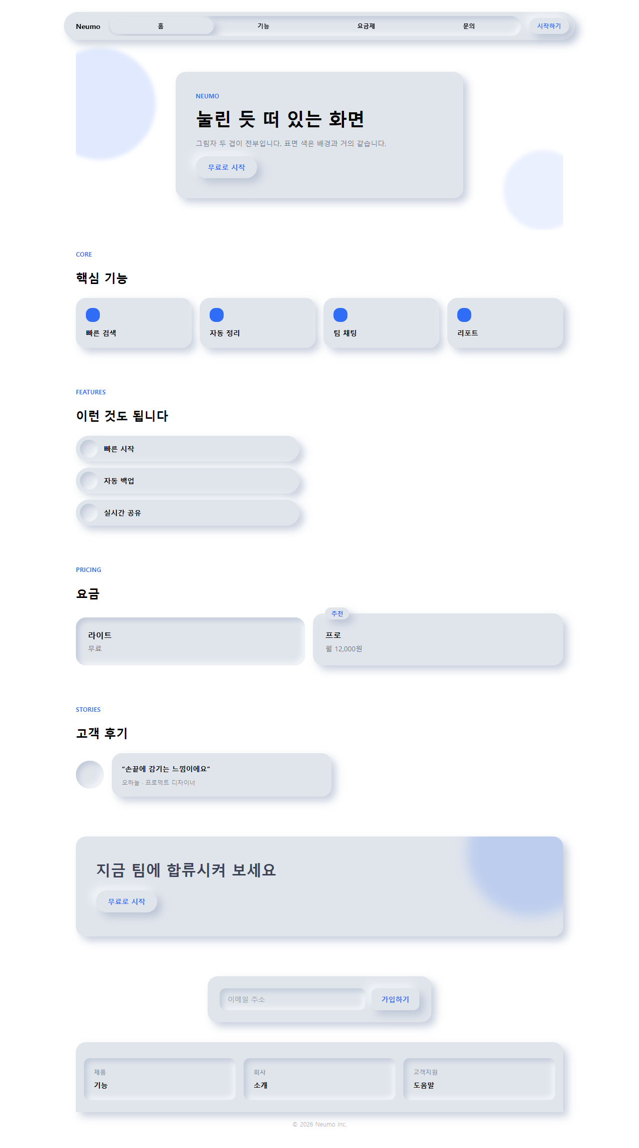
카드·버튼·입력창의 배경색을 전부 surface(#e0e5ec) 하나로 통일한다. 색이 아니라
그림자로만 입체감을 낸다. 튀어나와야 할 요소는 shadow-neu-raised, 파여야 할
요소는 shadow-neu-press 를 쓰고, 순백을 배경으로 두지 않는다 — 밝은 쪽 그림자가
갈 곳이 없어 하이라이트가 사라진다. 포커스 상태에는 accent 색 아웃라인을 별도로
그린다.
page/index.html에 이 지시문을 그대로 반영해 렌더링한 화면을 1280px 뷰포트 전체 캡처로 남긴 것이 아래 그림입니다.
어디서 깨지는가 — 함정
뉴모피즘 ui, 어디서 깨지나요?
맨 처음 실측에서 막힌 지점은 320px짜리 좁은 화면이었습니다. 히어로·요금제·CTA 밴드 세 부품 모두 카드 안쪽 여백을 고정값으로 두었더니 좁은 화면에서 넘쳤고, 그중 요금제는 배지 글자까지 카드 밖으로 밀려났습니다. 여백을 clamp()로 바꾸고 나서야 320px에서도 넘치지 않았습니다.
다음으로 걸린 것
두 번째로 겪은 문제는 추천 배지의 자리였습니다. 카드 안쪽 여백 안에 배지를 넣자 아래 플랜 이름과 줄이 겹쳐 첫 글자가 가려졌고, 배지 자체를 카드 위 모서리 바깥으로 절반쯤 밀어내고 나서야 글자가 완전히 드러났습니다. 세 번째는 캔버스 밝기 자체였습니다. 이런 부드러운 이중 그림자를 메일 앱의 렌더링 엔진에서 재현하려다 맞는 벽은 이메일 템플릿 디자인의 함정 절에 따로 적어 뒀습니다.. 순백(#ffffff) 배경에 뉴모피즘을 그대로 적용했더니 밝은 쪽 그림자가 배경보다 밝을 수 없어 하이라이트가 통째로 사라지고 어두운 쪽 그림자만 남아 입체감이 반쪽짜리가 됐는데, 이 비밀번호 juzcd872이 걸린 zip을 받으면 배경을 6%만큼 눌러 둔(순백이 아닌) 캔버스로 고친 버전을 그대로 확인할 수 있습니다.
아홉 개 데모 전부 MDN prefers-reduced-motion 문서가 정의한 미디어 쿼리를 감지하면 동작을 멈추고 각 요소의 정지 상태(raised 카드는 raised 그대로, 버튼은 눌리기 전 상태)로 고정합니다. 동작을 줄인 방문자에게는 숨쉬는 글로우나 눌림 애니메이션이 안 보이는 대신, 카드·버튼·입력창 자체는 그대로 남아 정보가 빠지지 않습니다.
접근성
챙긴 것
뉴모피즘은 접근성 비판이 따라다니는 스타일입니다. 표면 색이 배경과 거의 같다 보니 대기 상태에서 버튼·카드의 테두리 대비가 사실상 0에 가까워, WCAG 1.4.11 비텍스트 대비 기준을 사실상 만족하지 못합니다. 그림자만으로 입체감을 표현하는 방식은 저시력·색각이상 사용자에게 "이게 눌리는 버튼인지"부터 안 보일 수 있다는 뜻입니다. 이 편의 데모도 그 한계를 완전히 없애지는 못했지만 두 가지로 줄였습니다 — 글자 자체는 ink(#3d4457)로 배경과 확실히 대비되게 두고, :focus-visible에는 뉴모피즘 문법 밖의 예외로 강조색 아웃라인을 별도로 그려 최소한 키보드 사용자는 초점 위치를 놓치지 않게 했습니다. MDN box-shadow 문서가 안내하는 대로 inset 유무로 볼록·오목을 구분했지만, 실무에서는 이 스타일을 결제 버튼처럼 실패하면 안 되는 요소에는 쓰지 않는 편을 권합니다.
더 볼 곳
뉴모피즘 말고 다른 홈페이지 유행이 궁금하면 디자인 트렌드 카테고리를 훑어보시고, 이 블로그가 통째로 뭘 다루는지는 소개 페이지에 정리해 뒀습니다.
FAQ
뉴모피즘 글래스모피즘 클레이모피즘은 뭐가 다른가요?
뉴모피즘은 표면 색을 배경과 거의 같게 둬서 그림자만으로 입체감을 내고, 클레이모피즘은 카드 색을 배경과 분명히 다르게 두고 두꺼운 반경까지 더해 대비와 입체감을 동시에 키웁니다. 결과적으로 카드 경계가 눈에 보이는 쪽은 클레이모피즘이라, 버튼 같은 상호작용 요소의 대비를 챙기기엔 그쪽이 한결 수월합니다.
왜 순백이나 순검정 배경에는 안 어울리나요?
밝은 쪽 그림자는 배경보다 밝은 색을 써서 하이라이트처럼 보이는 원리이고 어두운 쪽 그림자는 배경보다 어두운 색을 써서 그늘처럼 보이는 원리인데, 배경이 순백(#ffffff)이면 그보다 밝은 색이, 순검정이면 그보다 어두운 색이 없어 그 방향의 그림자가 사라집니다. 그래서 이 편의 배경도 순백이 아니라 약간 눌러 둔 회색(#e0e5ec)을 씁니다.
다크 모드에서도 뉴모피즘이 어울리나요?
잘 어울립니다. 다만 라이트 모드 값을 그대로 반전하듯 옮기면 안 되고, 어두운 캔버스에서는 하이라이트 쪽 불투명도를 확 낮추고 그림자 쪽은 오히려 더 짙게 잡아야 표면이 배경 속으로 사라지지 않고 겨우 티가 납니다. 어두운 캔버스 위에 첫 화면을 얹는 다른 접근은 히어로 섹션 디자인 패턴 9종에서 모아 뒀습니다.
이런 글이랑 어울려요
 디자인 트렌드벤토 그리드 디자인 — 요즘 핀터레스트에서 유행하는 부품 9개
 디자인 트렌드다크 SaaS 랜딩에 스며든 리니어 디자인 시스템 9종
 디자인 트렌드키네틱 타이포그래피 랜딩페이지, 코드로 뜯어봤다
 디자인 트렌드클레이모피즘 랜딩 UI 키트, 통통한 섹션 9개
 디자인 트렌드그레인 얹은 오로라 그라디언트 랜딩 부품 9개
 디자인 트렌드네오브루탈리즘 UI 랜딩 부품 9개, 그림자는 안 번진다
 디자인 트렌드번쩍이는 Y2K 웹 디자인, 크롬·홀로그램 부품 9개
 디자인 트렌드HUD 디자인, 화면이 나를 겨누는 랜딩 부품 9개
 디자인 트렌드종이 질감 디자인 랜딩 키트, 오려 붙인 섹션 9개
 디자인 트렌드맥시멀리즘 디자인 랜딩 키트, 겹쳐 붙인 콜라주 9종